Over the first half of the past 100 years, Germany was seen leapfrogging across the centuries, combining astounding progress in science, technology and the arts with shocking amounts of barbarism, which culminated in the Holocaust. Literally destroyed and dismembered, the country then spent the next fifty years trying to come to terms with its past, an endeavour that can only be described as incomplete in many ways. The country was insecure and uncertain of its power at the beginning of the 20th century, and it’s even more insecure and uncertain of its power now.
What exactly is Germany, or what does it mean to be German – nobody seems to know. As a matter of fact, in Germany it is widely considered to be either self-indulgent or politically undesirable (or, as is usually the case, both) to even think or talk about that. With the exception of Michael Schmidt, very few German photographers have ventured into looking at the country itself, looking at its identity (given so much contemporary art is so apolitical, one could make the point that this is hardly something unique to German photography). In the case of Schmidt, there is, for example, Ein-Heit (even though the book hardly has any text in it, there is an English version called U-Ni-Ty). Just as an aside, the book combined images from all kinds of different sources before this idea of photobook making became en vogue more than ten years later.
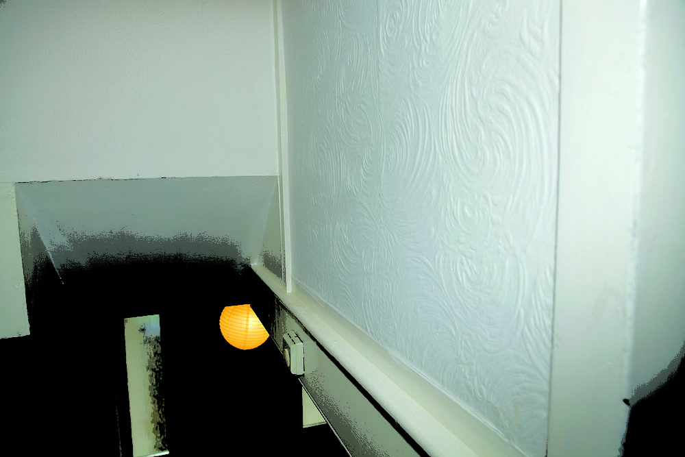
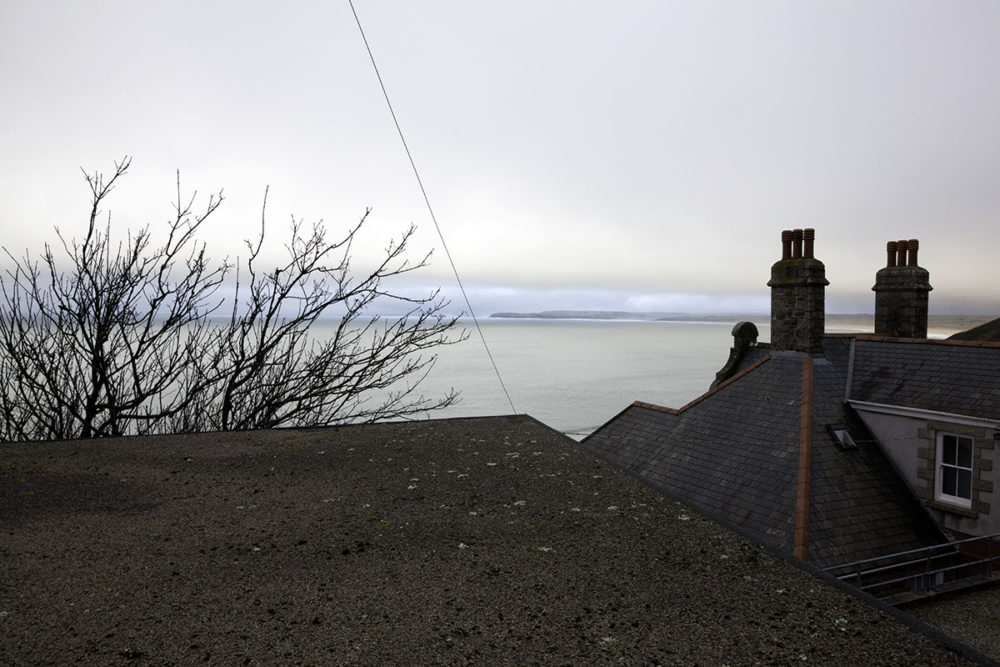
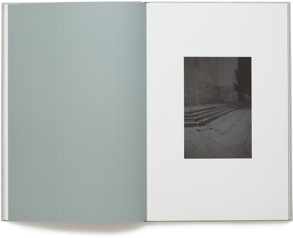
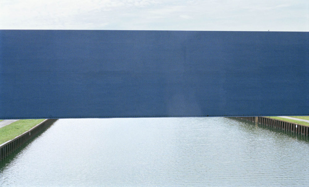
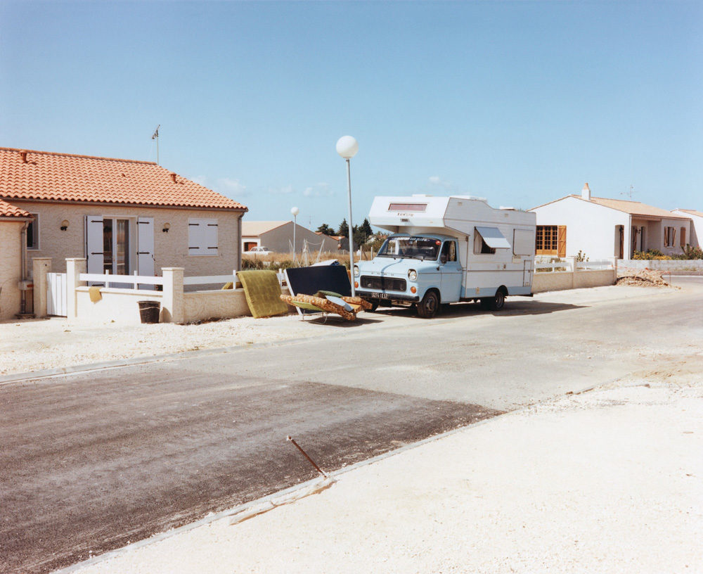
Against Ein-Heit we could set Gerry Johansson‘s recent Deutschland (see my review here), a portrait of the country produced by a Swedish photographer, a book in which politics and history play no role whatsoever. We could think of Ein-Heit and Deutschland as the extreme ends of a spectrum that covers the different approaches to this peculiar country in the very heart of Europe. I’m tempted to think that Oliver Kern‘s recent A German View (German title: Die deutsche Aussicht) falls somewhere in the middle of that spectrum.
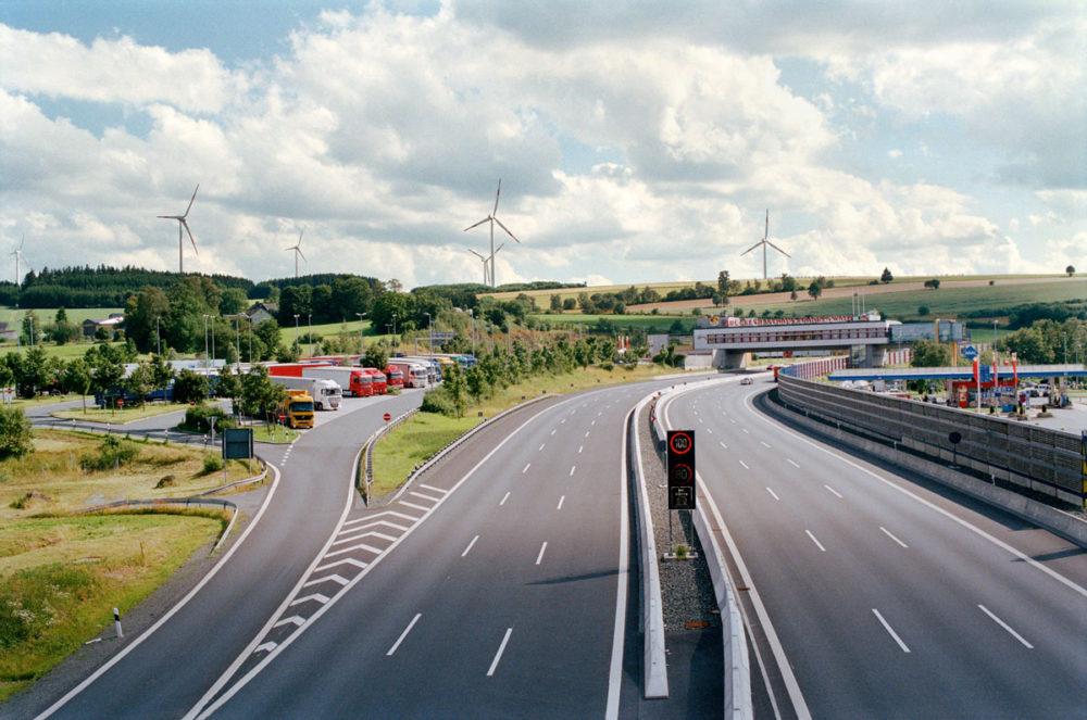
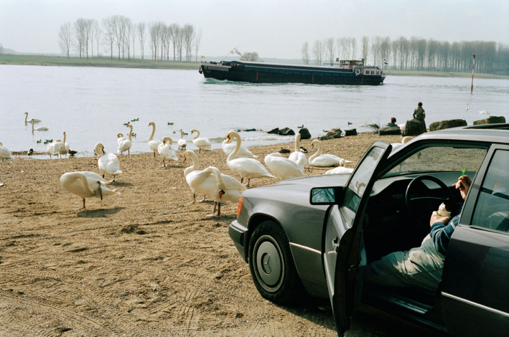
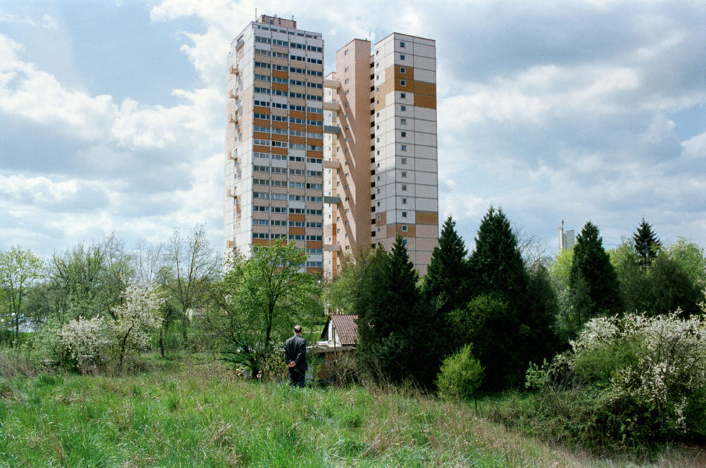
The strength of A German View lies in the fact that it portrays the country as a perfectly mundane place that, for the most part, is quite boring. Of course, seen from a German point of view that might really be the ideal solution, because being not boring, being extraordinary would carry all kinds of risks. If anything, Germans are risk-averse to an extent that often makes it hard for non-Germans to understand what is going on, given the amount of dread that is layered on the ubiquitous Gemütlichkeit (coziness).
Needless to say, you need to be careful with everything I’m writing here, given that I am German, at least on paper. Having lived in the US for over a decade now, I have no idea how German I still am (whatever that might mean) and/or how Americanized I have become. I simply don’t worry about it (which might indicate that I’m more Americanized than I might want to admit – Germans, after all, love worrying about things).
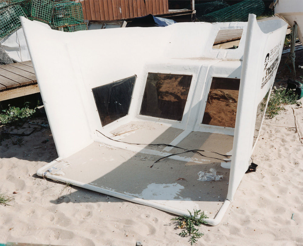
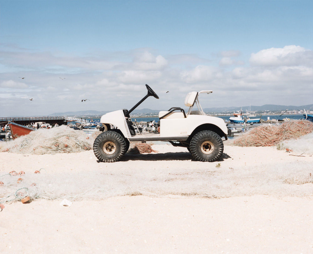
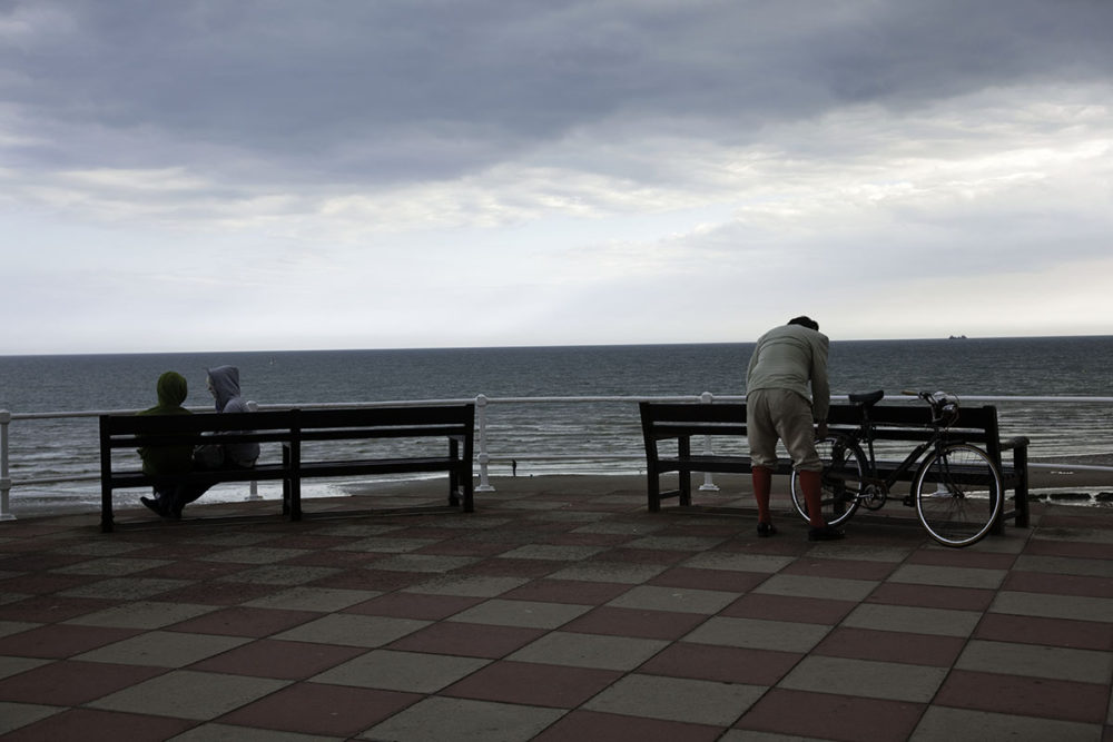
Coming back to the dread, I don’t know to what extent non-Germans who visit the country will be able to perceive it. Having spoken with expatriates living in Germany, it’s certainly something that people pick up on once they have lived there for a while. But A German View certainly isn’t about that dread. It’s mostly about looking at the land in a way that doesn’t appear to be too constrained. There is a lightness of touch to these photographs. You half expect to see some stuff – there’s your Autobahn, for example; but you certainly don’t expect to see a lot of the other imagery.
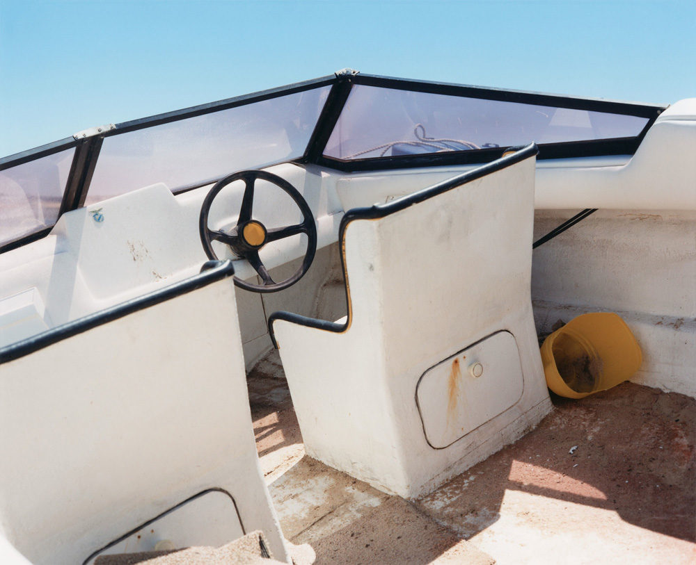
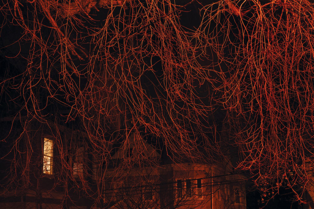
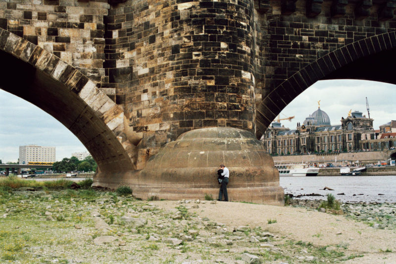
As a result, A German View confounds expectations easily, and it thus injects some fresh air into the idea and depiction of Germany. The picture at the top of this article is my favourite from the whole body of work. In a strange way, it sums up so much of this country, with its past and present, and those people going about their business, whatever that might be.
A German View; photographs by Oliver Kern; essays by Michaela Heissenberger, Fabian Lasarzik, Horst Kløver; Hatje Cantz; 2013
During my most recent trip to Berlin, I ran into Joachim Brohm at an opening of an exhibition some of his photographs were part of. I have been enjoying his book Ohio ever since it came out a few years ago. Plus, they also had copies of Ruhr on sale, which I had been looking for (some of those photographs were at display right there). I had always wanted to ask Joachim whether he would be interested in an interview, and much to my delight he was.
Jörg Colberg: I’d like to start with a very simple question. Imagine you had to explain what you are interested in and how you work as a photographer, addressing someone who doesn’t know your pictures and who also doesn’t know photography well. What would you say?
Joachim Brohm: I’m interested in aspects of the world as they appear in our everyday environment. Using photography I look at places and marginal areas with all their seeming lack of significance or even irrelevance. I often photograph them multiple times, over longer periods of time, and I work on projects. The process itself that this work entails is important, because the photographs develop from the experience of seeing, and not from a single moment. This results in bodies of work and/or archives, the full extent of which are shown in the form of exhibitions or books.
JC: What does this mean for the individual photograph? Does it make sense outside of the framework ‘project’? Or can you only understand it when seeing it in relation to all the other photographs from the project?
JB: Usually, the work follows criteria that are defined either through a subject matter or formally, whether it’s a project or not. That way, the eye becomes sensitive to specific qualities when perceiving reality. In that sense, each individual photograph is the result of preceding images and experiences, and it also develops a perspective for the ones coming after it. Throughout this process I pay careful attention to the qualities of each individual photograph, which is made and selected very carefully.
JC: I started that “simple” on purpose, because when someone sees a Joachim Brohm photograph, your signature style seems very apparent right away, however one would want to define it. How did you arrive at it when you started out? How did it form, and what difficulties did you have to struggle with?
JB: Initially, developing a so-called signature style was not my intention, but it developed over time from various specific artistic interests. Difficulties lay mostly at the beginning of my career, because at that time such an image language was new in Germany, and it got rejected even by my early teachers.
I think that my bodies of work keep evolving. I’m not interested in cultivating one specific style. Instead I am interested in practicing my work in a lively and artistically authentic manner, which always includes breaks with the past.
JC: The following might be an impossible question, but still: How does that work? To what extent can you say “OK, I want to do things differently now?”, to what extent does that just happen? And to what extent does age play a role, the fact that one ages and gets wiser?
JB: Changes always result during the process of working, if you bring a certain openness to it. Someone who is aware of her or his own work, who also studies intermediate results and who makes decisions for or against approaches to individual images will automatically gain new criteria that might deviate from previous ones. In addition, there is knowledge gained along the way, there are changing interests, new experiences, specific conditions of work etc. You have to be pretty stubborn to be able to repeat yourself all the time! The fact that one is getting older certainly helps to be more relaxed concerning the work. You don’t have to prove yourself all the time any longer, and you should be able to make decisions more easily.
Changes always result during the process of working, if you bring a certain openness to it. […] You have to be pretty stubborn to be able to repeat yourself all the time! – Joachim Brohm
JC: When reading about you some topics re-occur frequently, such as colour photography and art or the influence of American artists. To what extent was there an influence before you went to spend a year in the US? Which photographers were you aware of, and in what way did their work inspire you?
JB: One of the first and most important books for me was Renato Danese’s American Images: New Work by Twenty Contemporary Photographers, published in 1979. Studying the work of Robert Adams, Lewis Baltz, William Eggleston, Frank Gohlke and also John Gossage, Joel Meyerowitz, Nicholas Nixon, and Stephen Shore allowed me to define and refine the criteria of my work. When I attended Michael Schmidt’s Werkstatt für Fotografie in Berlin-Kreuzberg I was able to meet some of the protagonists in person. I also saw exhibitions or discussed the work with other people. At the beginning of the 1980s, this all motivated me very much.
Joachim Brohm – Dashboard, from Ohio, 1983-84
JC: And then there was the year in the US, in Ohio. There is the book, which I always thought had been overdue. To what extent did the stay in the US change your artistic perspectives and positions?
JB: I went to Columbus, OH, to learn more about the history and theory of photography. I studied for one year with Allan Sekula and Jonathan Green. My own work from Ohio is more like a side product. It just happened, when I photographed my new environment. I had never been to the US before, but I knew a number of books or projects of photographers I liked. Back then, I was reminded quite a bit of those other projects when making my work. My book “Ohio” was then published 25 years after the pictures were made – a pleasant experience!
JC: Did the experiences you gained from photographing in Ohio change your view of, let’s say, Germany and how to photograph in Germany?
JB: My view of photography itself had been broadened. But this was more through the theoretical and historical studies and less through making my own pictures. In 1984, Allan Sekula’s Photography Against the Grain was published, as was Jonathan Green’s American Photography – A Critical History 1945 to The Present. As a student, I was involved in discussing the books of my then teachers, both with fellow students and with the authors themselves. These books have remained crucially important till today. It was a very productive and lucky situation, which, I’m sure, also changed my view of the situation in Germany.
JC: Would you say that it is important for photographers and especially for students to engage with the theory and history of photography? I’m under the impression that especially for large parts of the younger generation the history of photography essentially is a completely uncharted territory.
JB: Yes, I’d definitely say that. And I would add that it won’t hurt to add looking at other image-based forms of art or film. What you don’t know you can’t see, what you don’t know you won’t be able to think about! Apart from the history of photography, for my understanding of photographic images references to painting and film are unavoidable.
JC: Now, in the second decade of the 21st century, photography, yet again, has evolved. How do you view these recent developments, especially given you have been teaching photography for a while?
JB: The type of photography I teach is part of the fine arts. The medium itself is marked by its enormous potential of different types of use and appearances, but also by a marked trivialization. The history of photography as a singular medium has come to an end. I think it is problematic to try to merely continue using old notions and ideas. The challenge our students face is to position themselves artistically straight away. That’s not an easy task, and it involves having to make more decisions than when I was a student. At the same time, it’s also very exciting!
JC: You mention trivialization. I’d like to learn more about that. In what sense and/or how has the medium become trivialized?
JB: More than ever photography has become a widely accessible and understood mass medium. There is a camera in every cell phone, photography is all over social networks, it is present in numerous online archives, and you can access it digitally pretty much everywhere. Nobody has to know anything about photography to be able to use it. Instead, it’s there, and it doesn’t cost anything any longer. I don’t have a problem with that at all, but of course, this poses questions, such as: what exactly do you study when you study photography?
JC: So what do you study when you study photography?
JB: That’s something every potential student should think and get informed about carefully. There is an infinity of ways how photography can be used, and many of them are now embedded in other types of media. I already mentioned that the history of photography will not just continue the way it has evolved so far. This includes a fundamental change in photographic practices, which are constantly expanding and creating new connections to other media.
At different universities, fine-art photography is already being divided into different types: still versus moving images, time-based media, documentary concepts, archives, biographical research etc. What is more, there are programs to study applied photography, photography design, journalism, there are private school, academies, and there are some degrees whose usefulness seems questionable. This is a confusing situation, as a result of which many institutions will have to re-think the content and goals of their programs to be able to participate in recent developments!
The history of photography will not just continue the way it has evolved so far. This includes a fundamental change in photographic practices, which are constantly expanding and creating new connections to other media. – Joachim Brohm
JC: Would you say that the medium’s enormous potential is being used by artists, or are there things left to be desired for you? Which photographers do you enjoy looking at right now?
JB: I wouldn’t want to assume I have a good answer for that. But artists certainly were among the first who investigated the possibilities of digital technologies in photography. Think of, for example, Thomas Ruff’s series “Houses,” begun in 1987, which already included digital “optimizations.” Today’s spectrum of photography-based processes and their applications are already being used widely in the area of fine arts. At the same time, there is a photography movement with a strong inclination to keep the good old, often documentary ideas of the image.
That all aside, right now I enjoy the works of Roe Ethridge, Taiyo Oronato/Nico Krebs, Arne Schmitt, Ron Jude, Doug Rickard, and Takashi Homma.
There are two ways we could look at photobooks. We could either say that they’re these incredibly special, limited-edition objects that we all wish, I’m sure, larger audiences would have a chance to see. Or we could say that our definition of the photobook usually excludes those books that do reach a larger audience, mostly for reasons of, let’s face it, snootiness (“But, my, those are coffee-table books!”). The reality might lie somewhere in between, and it’s actually a bit more complex than I made it sound.
With prints runs usually being very low for most photobooks (around the order of up to 2,000 or 3,000 copies), one way to possibly reach larger audiences is to produce an electronic version in the form of an “app” for a tablet computer (such as an iPad or whatever other devices are available). Compared with physical books, which are very costly to produce and distribute, apps come with relatively low up-front costs. They can thus be sold for much less than a photobook, making them potentially attractive to people who don’t want to spend $60 to see one (or can’t – people in the art world love to ignore the fact that many people have to think carefully about their spending). Plus, it really makes no difference in up-front costs whether you sell ten “copies” of your app or 10,000. Storage also isn’t a problem.
That said, apps aren’t photobooks. They’re apps. Unless you want to be dogmatic about it, one isn’t necessarily better than the other. They’re two different experiences with photography in general. The same is true for pretty much everything else that can be experienced (or consumed) on a tablet computer. You can watch a movie on your iPad, say, and that’s really not the same as watching it on the movie screen. It’s a different experience. Nobody will kick your chair, and you can bring in as much of your own popcorn as you want. But then, it’s a pretty small screen, which comes nowhere close to the one movie theaters use.
I bought an iPad (the “mini” version) last year to have a look at how useful the technology might be. I’m now using it for some things, while it’s no replacement for others. For example, I enjoy looking at magazines on my iPad, and I don’t miss the paper copies (in fact, I like not having to recycle all that paper). I enjoy reading some books on the iPad (the ones that I either use professionally – it’s so easy to mark text and use it later, or books I’m sure to only read once); but most books I still read on paper (and assuming there continue to be paper copies I won’t switch to the iPad for those).
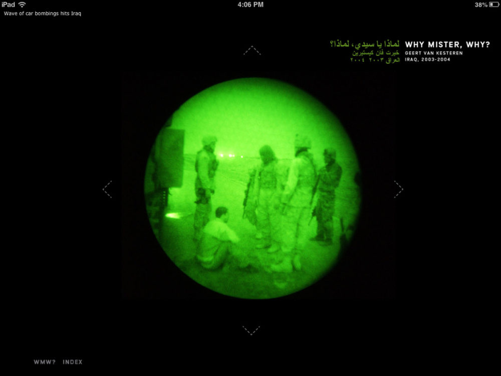
Photography-wise, the iPad with its backlit screen is a very different experience for a lot of images. To give you one very obvious example, I saw some work by Daido Moriyama in the iPad version of the British Journal of Photography, and I was struck by how different I perceived them compared with seeing them in a book. I don’t own that many of Moriyama’s books, but the ones I have are more or less the complete opposite of what I experience on the iPad. Given that most photographers and/or publishers think very carefully about how photographs and/or photobooks are being printed, the fact that iPad apps are all backlit already results in possibly one major change in experience.
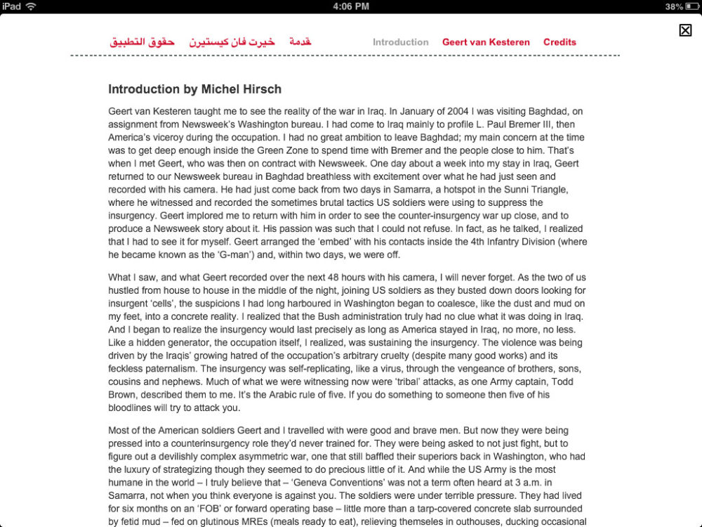
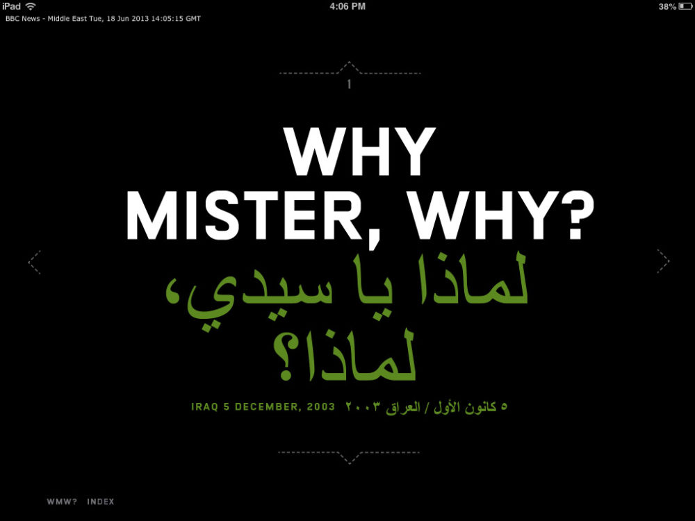
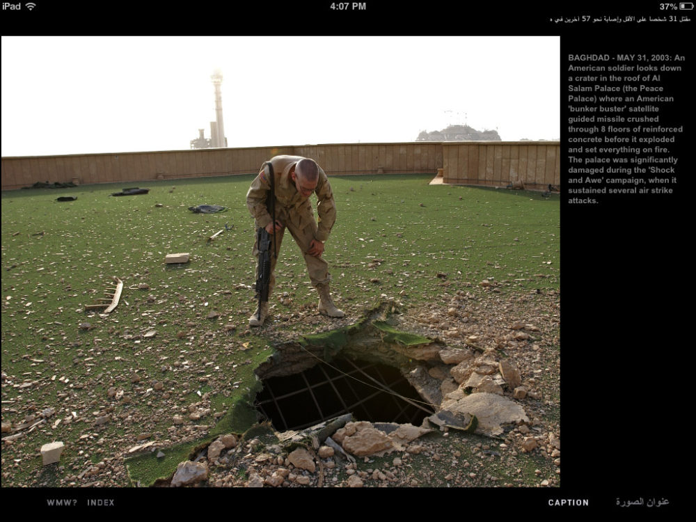
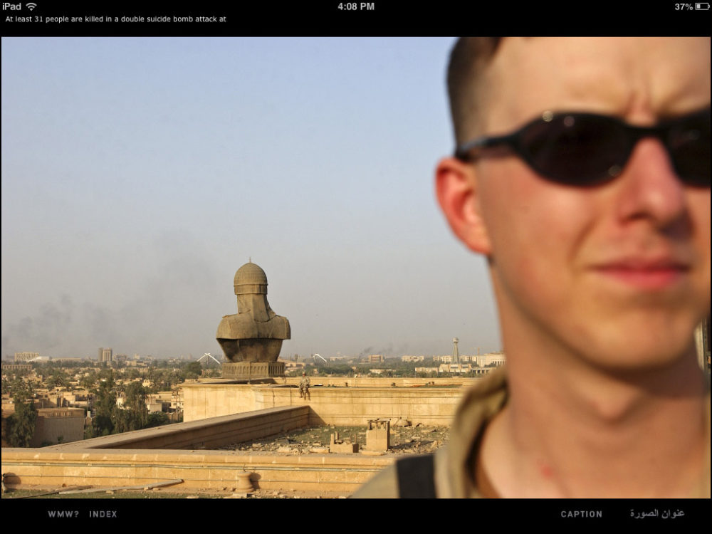
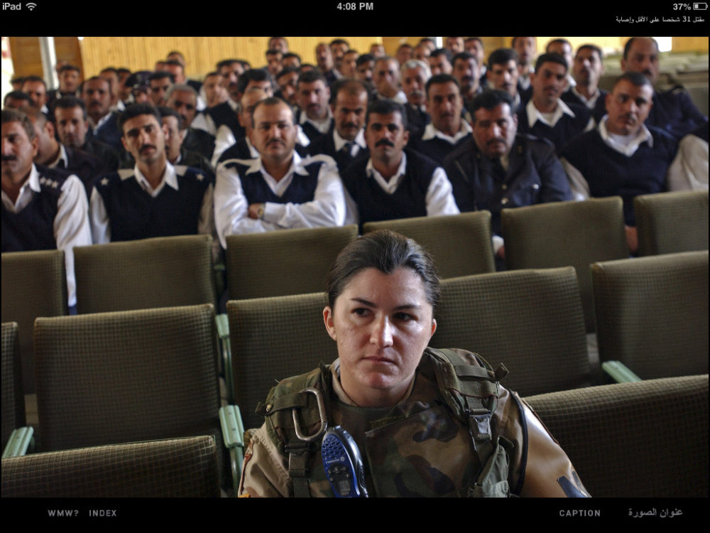
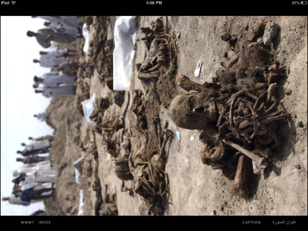
Needless to say, this might not matter for a fair amount of photographs, in particular those that are already mostly seen on computer screens, such as photojournalistic work. This brings me to Why Mister, Why? by Geert van Kesteren. With this book and Baghdad Calling (see my review here), van Kesteren single-handedly not only produced the two most relevant photobooks about the United States’ Iraq war, but he also raised the bar of what the medium photobook could do for photojournalistic work.
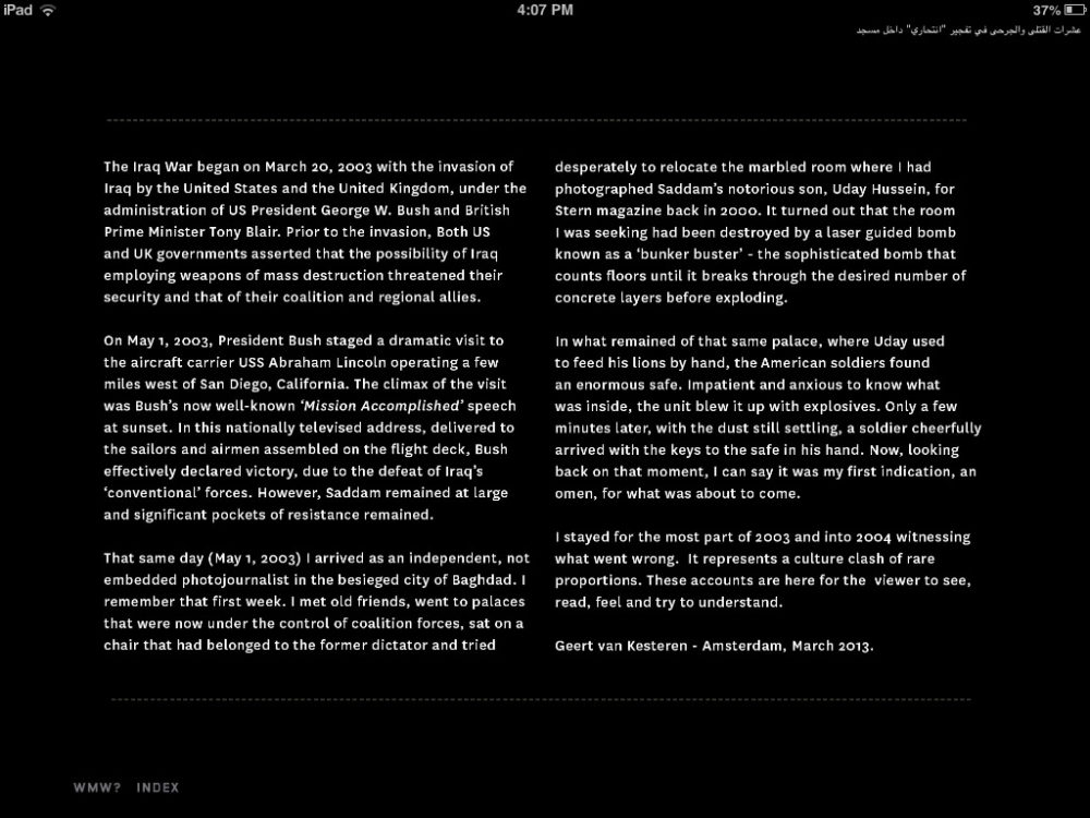
Why Mister, Why? now exists in the form of an app, which adds 166 images to the 237 photographs in the book. The organization of the app follows that of a book, with various details being adapted to the medium tablet computer. Books have pages. An iPad is always just that, a flat shiny thing. The viewer gets from one “page” to the next by swiping to the left or right. Thankfully, whoever developed the app resisted the temptation to add fake pages (Issuu style). An app is not a book, so why pretend there are virtual pages? Swiping left/right from a chapter’s main “page” will bring you to the Arabic/English language introductory essay (the app is fully bilingual), neatly mimicking how Arabic and English are being read from right to left and left to right, respectively (it’s taking care of details like this that seems to set apart Dutch photobook/app designers from the rest).
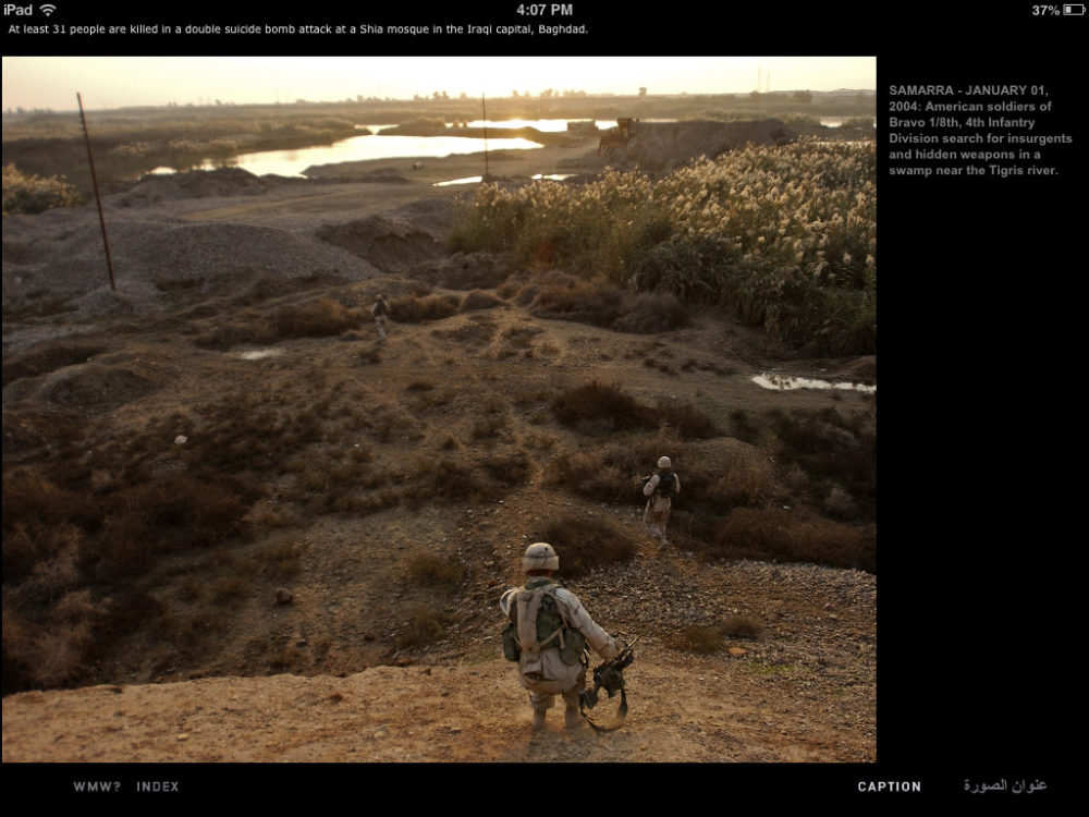
Each page displays a single photograph. For each image, there is a caption that can be accessed by pressing where it says “caption” on the screen. If you look at the gallery of images, you can see the various details I’m referring to – the images are all screenshots from my iPad. In a physical book, you either have a caption, or you don’t. Here, it’s the viewer’s choice to see it or not. In other words, you can decide how you want to engage with the app. The way the app is organized wastes no space for something that people might not want to see right away (you can’t do that with a book). Furthermore, vertical images are displayed just like horizontal ones. To properly see them, you need to turn your iPad. There are relatively few vertical images, so that’s not a big deal at all.
To navigate between chapters, you swipe up or down when you are on the very first page of any chapter. You cannot do that when you’re in the middle of a chapter. Again, this is not only simple and intuitive, it also makes sense: Since each chapter deals with a specific part of the story, you can’t create your own stories. If you’re in the middle of some chapter, and you want to go back to the main index, touch the screen where it says “Index”.
Why Mister, Why? thus is intuitively simple, while at the same time allowing for probably the best experience of the body of work on the iPad. The app brings a second life to the book (which is sold out), while, at the same time, making it available for – hopefully – a much larger audience.
But the app also shows that photojournalism does have a very good electronic future. Photojournalism should not be about reaching audiences first (by trying to be cool or hip) and about possibly having some sort of story second. Instead, it should be about well-produced stories first and then about trying to reach audiences with those stories. In a day and age where some people confuse taking Instagram pictures with photojournalism, Why Mister, Why?, the app, demonstrates what can be done with new media without sacrificing what made the profession in the first place.
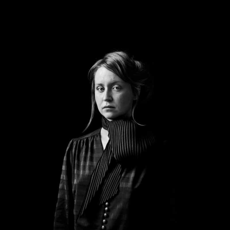
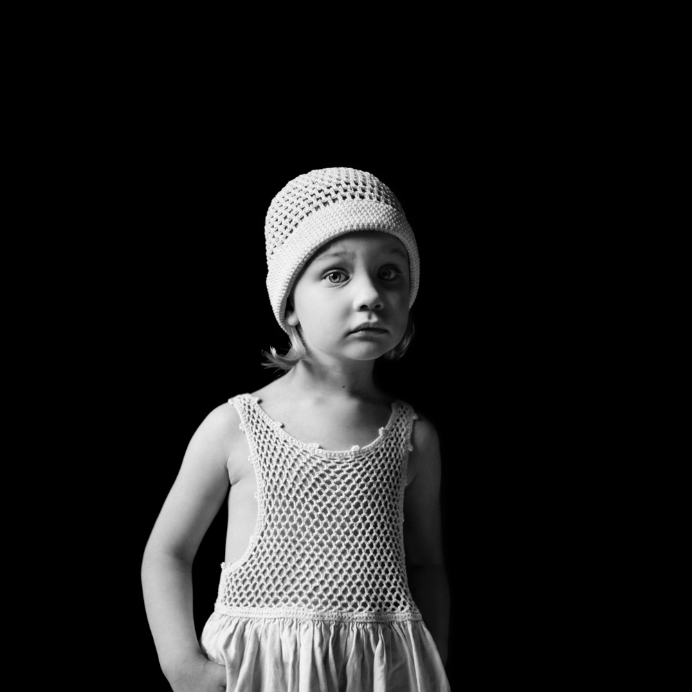
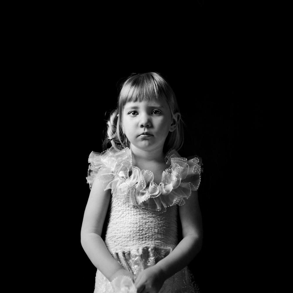
The less information a portrait gives us, the more we start scrutinizing the image. This photography by Nelli Palomäki, Aino at 27, shows us a young woman in the center of a frame, with all reference points around her hidden from view. Richard Avedon used to place his subjects in front of a nondescript white background. Palomäki here uses a black one. Such seemingly simple decisions have consequences. A black background and a white background register as different kinds of empty. A figure stands out against a white background. But this young woman emerges from the background, with parts of her blending back into it.
Such a discussion might appear to concern itself with semantics, but it is anything but. Instead, we are deep into the territory of the psychology of portraits. Photographic portraiture is mostly concerned with the psychology of the image, the experience of encountering someone else’s likeness in photographic form. Talking about the psychology of images might appear to be a strange idea. But think about, say, the often ludicrously Photoshopped photographs on the covers of magazines and the consequences arising from those, and it becomes very obvious that photographs can have very profound psychological impacts on people.
The results of this woman blending into the background are complex. For a start, there is none of the harshness that often characterized Avedon’s photographs. His sitters who often felt like specimen, mercilessly exposed against a white background, with no chance to hide anything. That lack of harshness here is also caused by decisions other than the choice of background colour. The light looks soft, and it comes mostly from one side (the left). The photograph looks carefully lit, but it feels as if the photographer had allowed for things to appear and disappear, for this woman to be able to blend in a little, to not be so exposed to the camera.
Look a little bit more closely, and you see that everything in this photograph looks as if it had been carefully arranged: The hair, the scarf, the clothes… It’s all very neat. Mind you, this finding doesn’t take anything away from the photograph. It merely hints at how carefully this photograph might have been prepared.
The real focus of the portrait clearly is the face. I will admit that I find my eyes darting back and forth between the woman’s eyes and the small part of skin underneath her scarf. The eyes draw me in, because that’s where we get most of our information, that’s where we look when we see someone’s face. I wasn’t consciously aware of the small patch of skin until I realized I was looking because it is so bright. The black background has us look at the brightest parts of the photograph, and that’s the woman’s skin, illuminated from whatever light source there might be on the left-hand side.
And that’s really all the viewer has, this woman emerging from the back. Unless we know her in person we have absolutely no information about her. Instead, we’ll start rummaging through our brains, applying all the various filters and preferences and prejudices… We interpret and like or dislike and judge a little, in all kinds of ways, approaching the likeness of the woman in many ways as if we were in fact standing in front of her. Without us doing any of this, portraits wouldn’t be interesting at all. They’d be merely pictures of people. But they’re not. They’re not, because we cannot disengage from the human face.
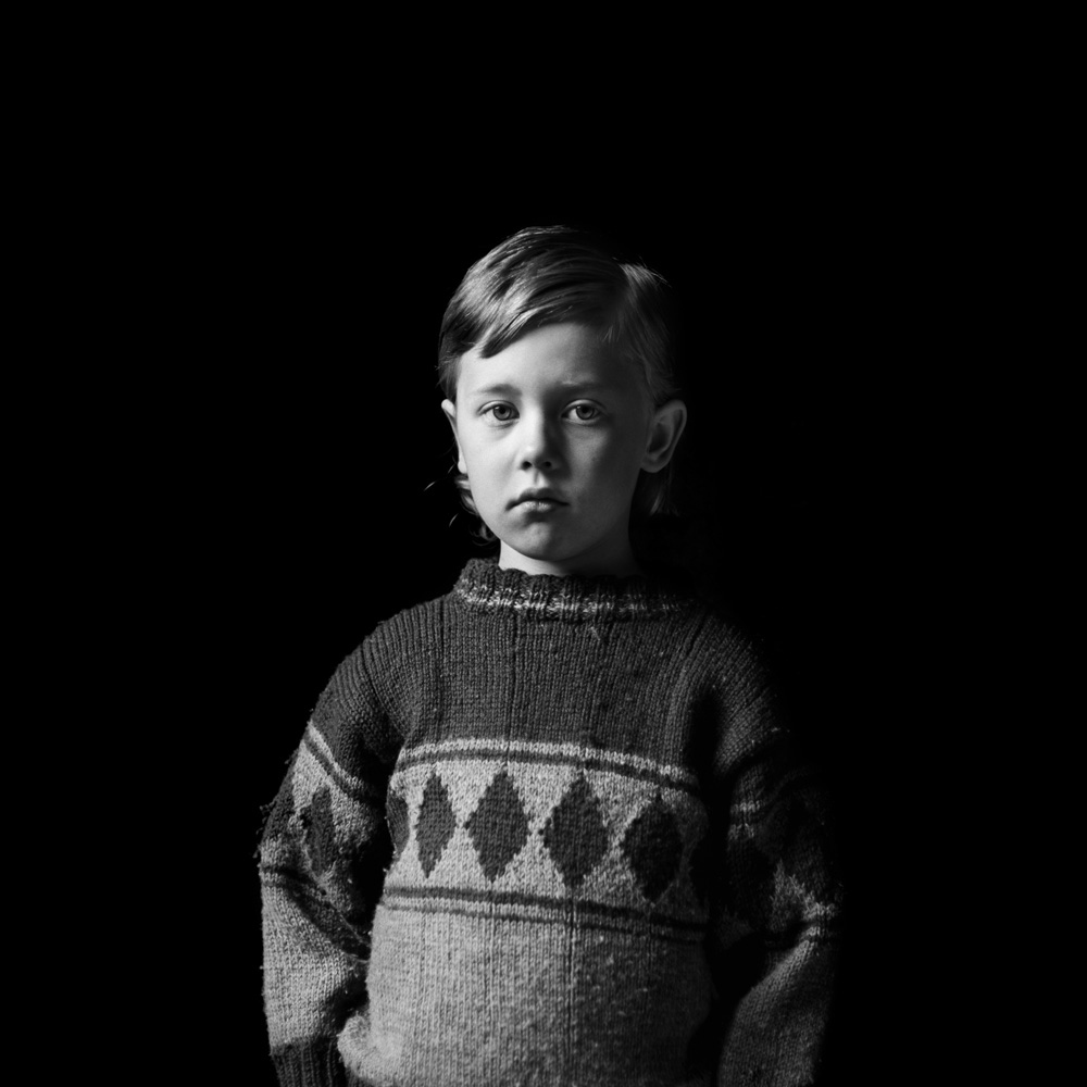
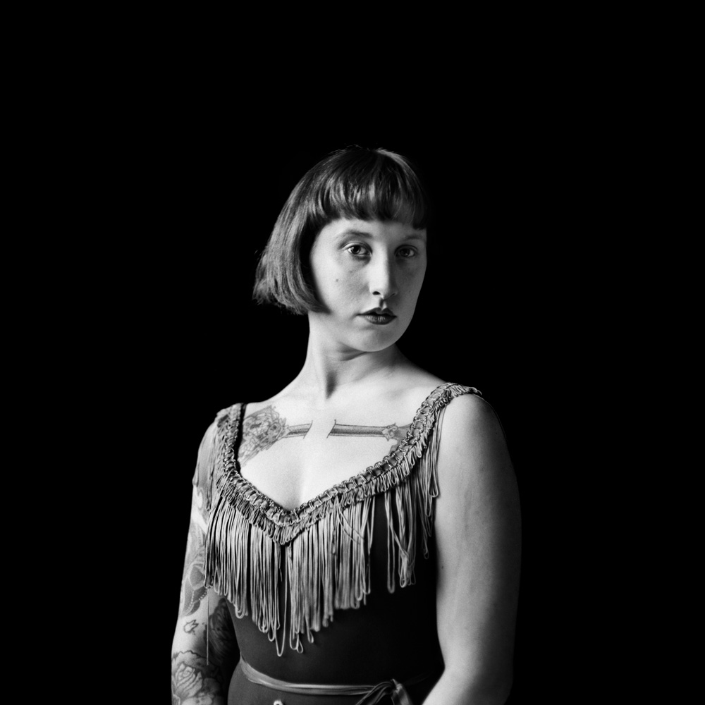
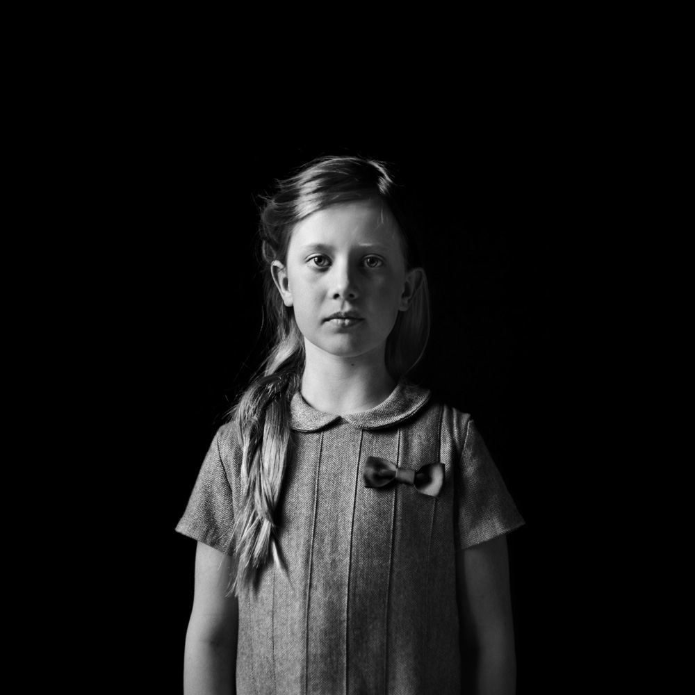
If we now look at more of Palomäki’s portraits against a black background, we get to experience varieties of all of these effects. Yet at the same time we also see how these work for different people, including children. I’s very hard to take good photographs of children, and Palomäki clearly excels at doing it. As always, we have to be careful: We don’t know whether any of these children really are what they appear to be – wise or at least confident beyond their years; but the photographs certainly make for convincing cases.
That’s what good photographs do: They make a convincing case for something. (After all, we want to be seduced.)
All of Palomäki’s subjects are prepared to meet our gaze. We look at them, and it seems they look back, most of them seemingly unruffled (with possibly the exception of Pinja). Of course, it is ridiculous to expect that anyone in a photograph would be ruffled from someone looking at that image years later. But still, that’s not what we feel when we look at photographs. Even though the moment when the picture was taken is long gone, we still feel we are looking at someone right now, in particular if that person is looking at the camera.
Installation View at Gallery TAIK Persons, Berlin, Germany, 2013
Earlier this year, I had the chance to see some of Palomäki’s photographs in person, at a gallery in Berlin. There are no people in the photograph to provide a sense of scale, but you can probably see nevertheless that the photographs in their frames are quite large. Of course, I knew the book very well (see my review here). I had not spent any time wondering about the print sizes. But I remember I walked into the space, saw the big pictures – and was surprised.
Here is where all that talk of the psychology of the photograph inevitably breaks down, because unless you’re standing in front of a photograph hanging on the wall, it doesn’t make too much sense to talk about its impact. Talking about sizes of photographs without seeing them at that size is like talking about the taste of a pudding just based on the recipe (the same is true for photobooks and looking at pdfs on the screen). I can say this, though: I do remember feeling that I wished they were a little bit smaller. I suppose somehow I had had an idea – subconsciously – what the sizes might be, based on looking at the work for a while. And I must have simply projected my ideas onto those pictures, which, after all, are not my photographs.
But that’s what we end up doing: projecting our ideas onto other people’s pictures. This is particularly true if we’re dealing with the likeness of another person. In effect, we engage with portraits almost as if we were engaging with people: We have our opinions and ideas, and we want to be able to apply them.
As a graduate student during the mid to late 1990s, I used to travel to Britain quite a lot to attend meetings of the collaboration of scientists I was a member of (for a while, I was the only German member, which made things interesting and fun). Most of those trips brought me to Durham, a small town in the north of England. I had not followed what was going on in England that closely, but I ended up getting immersed in the country’s recent history quite quickly.
Taking a taxi from the airport to the university would inevitably result in a mini education of some aspect of local history, courtesy of the driver (as a side effect, I had to figure out the local dialect rather quickly). Almost inevitably, the effects of Thatcherism would end up dominating the drivers’ narrations, which often enough would deteriorate into rants about how England’s North had been hit badly, with many jobs gone and widespread unemployment and poverty.
Mind you, not all taxi drivers would talk about Thatcherism. I remember one who insisted giving me a tour of Newcastle on my way to the airport there. He said it wasn’t going to take any longer than the direct route to the airport, and he really wanted to show me how beautiful the city was. I didn’t have the heart to tell him that given it was very early in the morning I was probably way too tired to follow much. He was right; and it was one of the best taxi rides I’ve ever had.
But it seemed Thatcherism and its consequences were all around. I wouldn’t have to do much to hear about it, whether it was at the university or just going to a pub to have a beer (I had acquired a real taste for English bitters), about how jobs were gone, about how greed had taken over, about how the social fabric was being destroyed.
It was just a coincidence that I was in Durham the day Tony Blair was elected. I knew nothing about the man. As it turned out everybody I asked didn’t know much, either. “We’re just glad the Tories are gone,” was the main sentiment. I went to a colleague’s house to watch the election results – I had been promised quite the show, and it was a show indeed. When Blair came on (if I remember this correctly, his constituency was right near Durham) there didn’t to be seem much beyond a smile entirely too wide and fake. As it turned out, that was my last trip to Durham, so I never came back to listen to the taxi drivers talk about Tony Blair. I have an inkling, though, what they might have said.
A fair amount of photography was created around (or as a response to) Thatcherism, large – and very influential – parts of it connected to colour photography and the idea of the documentary. David Moore‘s Pictures From The Real World is a body of work I hadn’t seen before. Moore photographed the series in his home city of Derby, documenting the lives of families in council estates (public housing of the sort constructed in large parts of Europe and now suffering from the same problems everywhere).
The book only has 18 photographs, but there is no fat whatsoever that would have benefited from some trimming. Instead, there’s one killer image after another. It’s quite amazing. When I started looking through the book, I expected things to fall off eventually, but it never did. I don’t know whether there exist other photographs or who made this edit. But if there ever was a case for having a relatively small set of very, very strong images (without any fillers, or maybes, or the photo that doesn’t really fit but that the photographer can’t let go), here it is.
My favourite photograph follows the excellent essay by David Chandler, halfway through the book: It shows a woman slouched in an armchair, staring at a TV set that is switched off, next to a table on top of which remnants of the last meal(s) linger. Turned away from the camera, the woman doesn’t acknowledge its presence. The viewer is left to look, to have a peek into this person’s life.There just is this room, and this woman, and there isn’t much. The world is left outside, beyond the drawn curtains, and the woman appears to have little interest in whatever version of the world the TV might offer her. I was reminded of the way Chauncey Hare photographed his subjects in Interior America (if you don’t know that body of work, you might want to consider buying the amazing Protest Photographs – even though, like many Steidl books, it suffers from a bloated edit).
Highly recommended.
Pictures from the Real World; photographs by David Moore; essay by David Chandler; 32 pages; Dewi Lewis/Here Press; 2013
After the terrorist attacks on September 11th, 2001, most Western governments created stricter laws and mechanism designed to prevent future attacks. The extent to which individual countries pursued this goal varies considerably from country to country. The United States appear to have gone furthest, as the recent revelations of what appears to be a massive domestic surveillance program appear to make obvious (at the time of this writing, the full extent of the program, including many details, is not clear). It seems that for many people the threat of terrorism justifies dramatically curtailing the very rights that have been the very foundations of some of the oldest democracies in the world.
With Guantanamo: If the light goes out, photographer Edmund Clark portrayed the prison that was – and still is – holding hundreds of so-called detainees in a state of legal limbo: Most of the laws that previously were considered to be sacrosanct were simply taken as not applying to these men. As a matter of fact, the suspension of laws has become another aspect of the “war on terror.” In other words, the laws – and rights – might still be perfectly valid, except that they don’t apply for a while.
Clark’s latest body of work deals with so-called Control Orders in Britain, essentially a type of house arrest for someone suspected of potentially terrorist activity. One of the most disturbing aspects of Control Orders is that the evidence is being kept secret from those under such orders. Needless to say, that secrecy prevents those under control order (or their lawyers) from defending themselves. Just like in the case of the Guantanamo Bay detainees, the Kafkaesque repercussions are obvious.
How would one go about photographing something like this? Obviously, the first hurdle comes way before the photography: Permission. Once permission was granted – this included all kinds of stipulations and rules – Clark had to work within the boundaries of what he was allowed to do (find the artist writing about the work here). Consequently, the photographs he took are, on the surface, incredibly mundane: Here’s what looks like some sort of anonymous house, in which someone is living. But if there ever were a case to be made that what matters in photography is what is not in the pictures it would be here.
The resulting book, Control Order House, adds a lot more information to the photographs, in the form of reproductions of legal documents and correspondence between the photographer and the authorities (needless to say, all specific information was blacked out). There also is a diary the detainee kept for three days at Clark’s request.
Taken together with the photographs, the documents in Control Order House might give the viewer/reader an idea what such a life must feel like, a life that is suspended, for reasons that are essentially secret. It is to be hoped that books like this one will make more people look at the repercussions of the national-security states that have been built.
If there is a balance to be struck between liberty and security, how far do we allow that balance to be tilted towards a security that in all likelihood is not perfectly achievable anyway? Are we going to be happy with the government suspending the rights of some people for reasons that are kept secret from them (and, of course, from us as well)? Are we going to be happy losing large parts of our privacy (if not all of it)?
We need to have answers for these questions. To get to those answers, we need to be able to have a debate. Clark’s Control Order House is one of the pieces of information that can help us look at some of things going on, and to then talk about them.
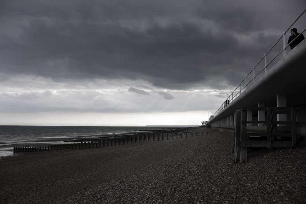
“In many respects,” writes Paul Theroux in the first chapter of The Kingdom by the Sea, “Britain was its coast — nowhere in Britain was more than sixty-fives miles from the sea.” Consequently, Theroux set out to travel along the coast, using mostly slow means of transportation — walking, local trains or buses — and avoiding popular sightseeing destinations (castles and such). The year was 1982, and there was a war happening, far away: Britain was fighting its absurd war with Argentina over a little congregation of rocks, otherwise known as the Falkland Islands.
Not quite thirty years later, between 2009 and 2011, photographer Paul Walsh decided to walk the English South Coast, covering 320 miles and thus producing Isolated Coastline. In a little essay he sent me along with his photographs, he wrote
I was drawn to the quieter moments of my walks and became interested in photographing the single characters who, like me, found themselves drifting alone along the sea’s edge. The English South Coast can also appear to be an incredibly sad and melancholic place. The weather is regularly heavy and the rough sea can make it feel almost apocalyptic. I often found myself walking through dilapidated coastal resorts, disused seaports, run-down towns and along decaying piers.
Having read Theroux’s book, I was very interested in Walsh’s photographs. I did not expect them to illustrate in any way whatever I might remember from The Kingdom by the Sea. Instead, I was curious about seeing how two artists, working with two very different media, would portray the same stretch of land. There exist all kinds of misconceptions as to what photography does or what writing does or how photography can do less than writing (or the other way around). Comparing photography and writing always is a bit like comparing fish&chips and apple pie – there is only so much you can get out of that. Focus on the calories, and you miss the big picture by a mile. Focus on the individual dishes, and it just gets weird. (I’ll leave it up to the reader to decide whether photography is the desert or the junk food)
Both Theroux and Walsh make it clear what matters is what is being triggered in the reader’s or viewer’s mind. Both artists are unapologetic and open about what they set out to do, and how they did it. The Kingdom by the Sea and Isolated Coastline were shaped by the myriad of decisions and choices made by their respective authors. They are both equally truthful, albeit not in a universal sense (there is no such thing as the absolute truth) and also not in a postmodern sense. (the idea of the death of the author is a concept that desperately asks to be re-examined)
Having read a fair amount of travel writing I’m struck by how good travel writing comes possibly closest to emulating how photography works when it’s done well, or how photographers, with all their choices and decisions and preferences, work their way through the world just like travel writers do. Their “products” might differ quite a bit, but it is the mastery of the approach that really matters.
So here we have the English South Coast then, or rather Paul Walsh’s view of it. And if I started writing about what these pictures show in all likelihood, that would not be what they truly show but rather what I see in them. This big mess is what makes photography beautiful. If we just stop looking at all the literalness and, instead, focus on, yes, that big mess, photography can be so much fun!
Consistency of approach is one of the most important aspects for photography. You will only notice it when it’s lacking, when there are gaps, when you somehow notice that something doesn’t seem to work properly. In contrast, when it’s well done you are unlikely to notice it. As a matter of fact, when it’s done well, the consistency of the artist’s approach will contribute to entrancing you, to making whatever you’re looking at work.
There are many different aspects of photography that are part of the consistence of approach, the aesthetic being one of them. Regardless of whatever you do as a photographer concerning the aesthetic, there has to be consistency to how you approach it. It’s often very hard to explain what this means, while it’s very easy to see (or feel) when it’s not working.
I had to think of this aspect of photography when looking through Martin Boyce‘s A Partial Eclipse. I felt that to explain what a consistent approach might mean for a photobook, in the future I’d use this book. It has a definite MACK feel to it – the coarse cloth used for the cover, the photographs occupying a fairly small portion of the pages’ real estate. In addition, the paper choice and printing are quite unique. Each page has a glossy side, upon which the photographs are printed, and a matte grey-green reverse, which is left blank. With a few exceptions, most images face a blank page. In addition, the tonality of the photographs themselves mirrors that of the matte pages. Nothing is – or feels – off; you’d notice that straight away, given the fairly unusual aesthetic.
You’re transported into a strange world, a world you’re familiar with and not familiar with at the same time. All good photography does that – after all, why bother looking at that, which you already know so well? But here, the strangeness of the world somehow becomes apparent, maybe a tad too apparent. I’ve been asking myself whether you could not, in fact, create a body of work or book that was too consistent. I suppose what this might come down to is that while I feel seduced into a strange world, I am being made too aware that I am being seduced. That man behind the curtain is doing a great job, but at the same time I am very much aware of his presence. Mind you, I might just have looked at too many photobooks too carefully, analyzing how they work.
That aside, A Partial Eclipse had me think of Dirk Braeckman‘s work, as well as Alessandro Imbriaco‘s Der Garten. And this is all based on what I feel in these photographs, Boyce’s and Braeckman’s and Imbriaco’s, not on what they (purport to) show. I will admit I tremendously enjoy those bodies of work, because they make me feel things more than they aim to show me. I recently noticed that I’m less and less interested in photography’s literalness, and more and more in artists working with photography despite that literalness.
In the world of photography – that strange, conservative, somewhat autistic islet in the archipelago that is the art world – Boyce, a sculptor who won the 2011 Turner Prize, might not be widely known. This might work as much for as against the book: People might not consider looking at the book, given they are unfamiliar with the name. But when they look, they will come without expectations, thus making it easier for the book to do its magic. Let’s face it, expectations are the pest: You know some earlier body of work, and automatically, you wonder how it compares to something new.
I hope there will be a lot of people who look at A Partial Eclipse. It’s a seductive book of a strange world, a world that exists right next to ours.
A Partial Eclipse; photographs by Martin Boyce; text by Martin Boyce, Raymond MacDonald, David Mackenzie; 60 pages; MACK; 2013
There are our private lives, and there is the outside world. They’re separate. At least that’s how we would like to treat them and deal with them. Yet they are not. Try as we might, some aspects of our private lives are going to get out, and what’s happening in the world might have fairly severe repercussions for our lives.
Family photography has become a staple of contemporary practice, be it in the form of artists photographing how their loved ones live their lives or (possibly) did. Almost inevitably, there is a fair amount of navel gazing involved in family photography, or at least there is the risk that there will be navel gazing, possibly too much. Why, after all, should a stranger care about someone else’s family? The best family photographers have solved this conundrum by turning their families into stand-ins for something larger that connects us all – regardless of how similar our own families might be.
But that still doesn’t get around the navel gazing completely. After all, we could just all be ending up being fascinated by our own navels, tending to all the little personal enjoyment and/or drama in our lives. We might share the same kinds of enjoyments or dramas in our lives, yet experience them separately: An elderly relative might die, a child might be born. But there are also enjoyments or dramas that we share and experience at the same time. We might worry about how to pay the bills, given the economy isn’t doing so well; or we might worry about the future of our children. We might separate families, but many of us are part of the same society or economy. These concerns I usually find absent from family photography. How would one go about this anyway?
With Disquiet, Amani Willett shows us how. The body of work, which has also been released as a truly magnificent book, addresses the changes in the photographer’s private life. In particular, there is the birth of a baby, seen in the context of the times the baby was born into: The later part of the first Obama term, with its crippled economy, severe dysfunction in Washington, the various wars abroad, protest in the form of the Tea Party demonstrations and Occupy Wall Street, and the general feeling of malaise. Much of that is still with us.
I’d be happy to argue that Disquiet is as much a personal body of work as it is a piece of social engagement, social engagement that has been so strangely absent from contemporary photography over the past decade. (Where are all the photography projects dealing with the Great Recession?) Whether or not it has been intended that way doesn’t really matter all that much. What does matter is that here we have an artist who tied family life and its changes to the drama in the wider world, a drama that is guaranteed to have an influence on the family.
In particular in the form of the book, the body of work very powerfully speaks of our times. It acknowledges our frequent inability or unwillingness (it’s hard to tell which one it is) to deal with larger issues, issues that appear to be happening only outside of the four walls of our homes. So it would seem that, yes, you can make a body of work that speaks not only about the events that we share, yet experience separately, but also about the anxieties that we experience separately, while, at the same time, having them form a sort of communal anxiety.
In other words, the separation between windows and mirrors breaks down. The idea that it’s either looking inward or outward is changed so that now there also is the option of being a window and a mirror at the same time. And it becomes clear what is being gained: You can navel gaze as much as you want, but at some stage the world will catch up with you, deal with you in ways that might not necessarily be so enjoyable.
There might not necessarily be the need to ditch your previous life, buy some camera gear and go out to photograph the evils of the world. But the time might be ripe for photographers to come to the realization that a little more engagement with what’s going on outside of the four walls of one’s home essentially also means dealing with aspects of what is going on inside.
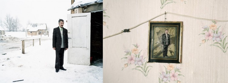
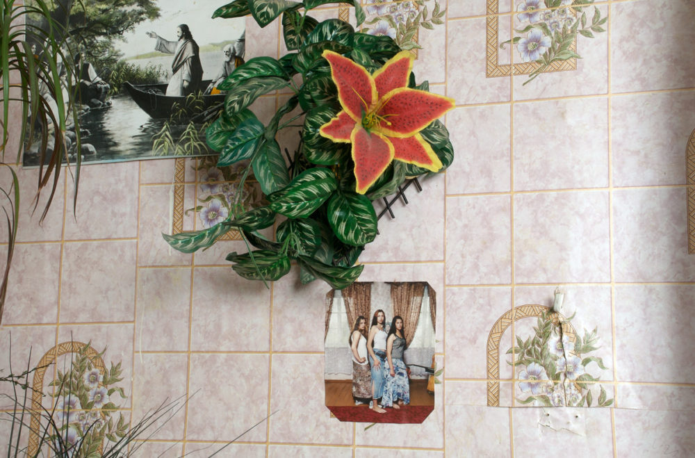
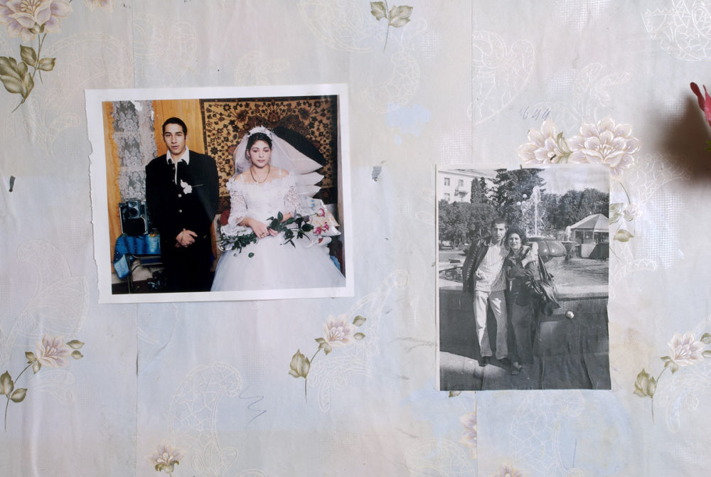
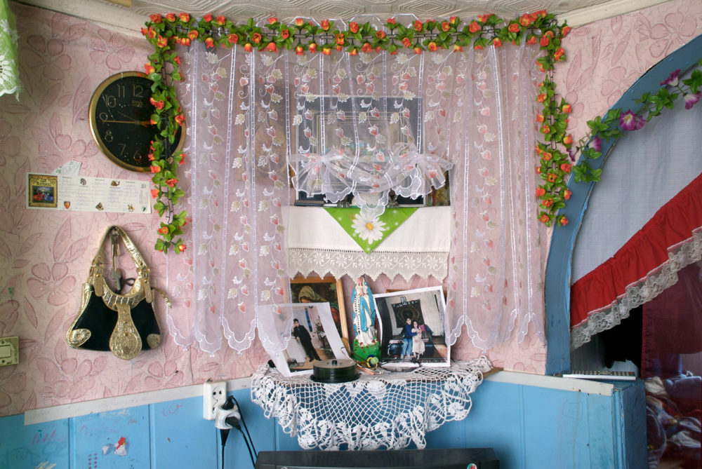
Andrew Miksys‘ Baxt is a portrait of a small community of Roma in Lithuania (see the interview I did with him a few years ago). After photographing his subjects and producing a book, he made sure to hand out prints and copies of his book to those who so graciously had agreed to pose. Photography plays a special role for the Roma, Miksys noted (all quotes from an email the artist sent me):
“Family is one of the most important aspects of life in the Roma community. And the ties between family members and the past is often kept alive through photography. I didn’t really know about this when I first started photographing. But then I began to notice that even the simplest Romani home with very few decorations usually had photographs of family members and ancestors on the walls.”
Coming back to the village later, to organize a music festival of Roma and Lithuanian artists, Miksys decided to re-visit his previous subjects to photograph the family photographs for use in a slideshow during the festival. That is when things got interesting:
“It didn’t take long to realize that I would be re-photographing my own photographs. I found pages torn from my book and hung on walls and other photographs altered in ways I couldn’t even imagine.”
“Leshka (the man standing in the snow) was cut from my photograph and placed on a new background. The frame is broken and there is broken glass stuck to the photograph. Sadly he died shortly after I photographed him and this is a photograph to honor him.”
Another case was equally amazing: “I had given Luiba (the bride) several photographs from her wedding. In her house I found a single photograph stitched together from many other photographs. I’m not sure where the flowers came from.”
Calling his portraiture a collaboration with his subjects, Miksys applies that term to this use of his own photographs as well: “The collaboration went to a whole other level.” It might be safe to say that few, if any, of the regular readers of this – or any other photography related – website would simply tape their portrait to a wall or would ask someone else to Photoshop it for inclusion in a family gallery. But I think there are very powerful statements about photography being made here.
For a start, it’s very obvious that Miksys’ subjects treasure the photographs, even if they don’t treasure the photobook they’re in at all, and they also do not treasure the photographs in the way that the art world does.
Aren’t we dealing with two very different ways of fetishizing photography here? On the one hand, we have people who hang them in very expensive frames in white spaces that looks like fancy hospitals and then ask an insane amount of money for them. (How do we justify having to pay thousands of dollars for a piece of paper again?) On the other hand, we have people who tack or tape the photographs on a wall or happily have someone change them so what they feel matters comes out more strongly.
We could try to think of these Photoshopped photographs in terms of the theoretical frameworks we love to construct around pictures. Isn’t this “outsider appropriation art” here? Then again, what exactly do we gain from doing that? Aren’t we art people the outsiders who treat pictures in ways that certainly must strike most normal people as essentially insane? The vast majority of people who love photography literally cannot afford buying a photograph and are reduced to, at best, looking at them as often bad reproductions in books. How much sense does that make? And why should only the creator of a photograph decide what can be done with it?
What I love about Baxt Revisited is the photographer’s embrace of what is happening here. After all, the use of his photographs by his subjects points at how powerful and meaningful photography can be. It’s hard to forget that especially when one spends too much time online, reading articles about how supposedly photographs don’t matter any longer.
Photographs still matter very much to many people, in ways that are too often forgotten, overlooked or ignored. And this is true not just for Andrew Miksys’ subjects, it is also true for most other people, as different as their use or re-use or engagement with photography might be.


 ever since it came out a few years ago. Plus, they also had copies of
  on sale, which I had been looking for (some of those photographs were at display right there). I had always wanted to ask Joachim whether he would be interested in an interview, and much to my delight he was.

 , published in 1979. Studying the work of Robert Adams, Lewis Baltz, William Eggleston, Frank Gohlke and also John Gossage, Joel Meyerowitz, Nicholas Nixon, and Stephen Shore allowed me to define and refine the criteria of my work. When I attended Michael Schmidt’s Werkstatt für Fotografie in Berlin-Kreuzberg I was able to meet some of the protagonists in person. I also saw exhibitions or discussed the work with other people. At the beginning of the 1980s, this all motivated me very much.