Shinji Otani’s The Country of the Rising Sun

Article main image
Shinji Otani

Most photobooks, at least those carefully considered by their makers, have to be engaged with on their terms – not the viewers’. This is important to remember or realize. After all, catalogues and albums aside, the moment a set of photographs is transformed into a book, the book will start to have a life of its own, in which the individual photographs might become more or less relevant than they were when they existed as framed pieces on the wall, say.

This does not mean that everybody has to appreciate photobooks the same way. If your idea of photographs is to engage with individual pictures, one at a time, many contemporary photobooks might not appeal to you. In particular, those photobooks that include the book itself, its physicality, the way it separates images from each other, those books are probably not going to appeal to you. Do not, however, complain about those books because they do not conform to your ideas the photobook.

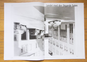
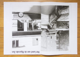
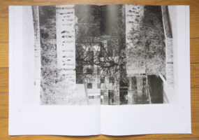
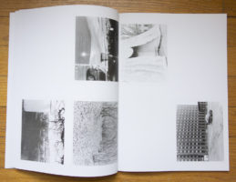
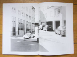
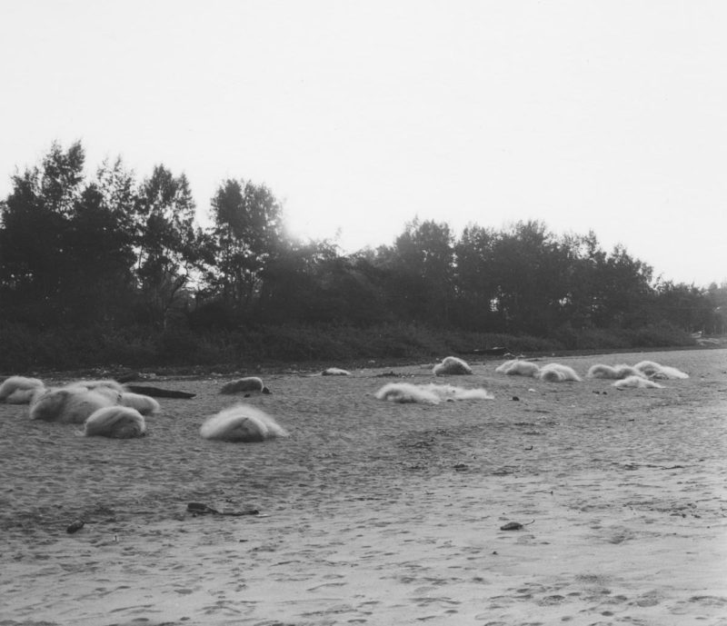
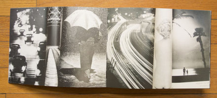
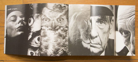
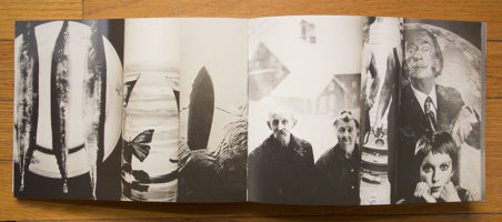
Shinji Otani‘s The Country of the Rising Sun, which won the 2012 Unpublished Dummy Award, was constructed by putting photographs on a wall, photographing the installation, printing the photographs on large pieces of paper, and by then folding and cutting these pieces of paper multiple times to create the folios of the book. This is, after all, how photobooks typically are made when they are commercially printed: The signatures are placed on larger sheets of paper to print a number of pages in one go. The sheets are then folded and trimmed to produce the signatures (note that the actual process is usually quite a bit more involved than my simple description).

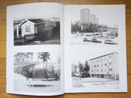
I’m including images of both the dummy and the final book here. The photographs of the dummy use a reduced reproduction of the actual dummy that was part of FOAM Magazine #34, Dummy. The book uses a set of signatures, whereas the dummy included in the magazine is a stapled pamphlet (think of it as a digest of the actual dummy).

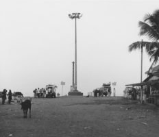
The Country of the Rising Sun is a book that you cannot engage with unless you accept its premise – this brings me back to what I wrote above. Given the photographs in the book come in different orientations (I deliberately did not rotate any of the pictures here), the viewer is asked to work with that.

It would not be too far off to call The Country of the Rising Sun a conceptual photobook. It aims at breaking the preciousness of the individual photographs. What if photographs are broken up, what if they’re placed in combinations that are controlled in ways other than putting them down one after the other?

What if, in other words, we transcended the fetishism of the individual image that underlies pretty much all contemporary debates about photography, regardless of whether it’s talking about auction records for a Gursky or all those billions of photographs on Facebook that, we are told, are all equally precious, relevant, and/or important? What if none of that mattered? (and that’s not even talking about whether any of those claims are actually true)

We need photobooks like The Country of the Rising Sun because they inject some fresh air into the medium. If we allow them to, they will make us think about photographs in ways other than those found on all those oh-so trodden paths.

The Country of the Rising Sun; photographs by Shinji Otani; 64 pages; Lecturis; 2013

1 June 2013: This is a slightly updated version of the original piece, incorporating comments from an email I received from the photographer.

Sibylle Fendt and the inner life of Elke Gärtner

Article main image
Sibylle Fendt

Photographs deals with surfaces, and skin is such a surface. Photographs are unable to show us much, if anything, about a person’s inner, mental life. This is a simple fact that we typically have a hard time accepting. How could photography not show what we can see in real life?

Well, it can’t. For a start, a photograph is a small moment frozen in time. When you’re in front of another person you have a very large number of such small moments available to you, a steady stream of information. We have all learned from very early on how to process such information, even though our abilities to do so might differ, for all kinds of reasons.

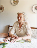
The above photo by Sibylle Fendt has, it seems, a woman interact with us, the viewers. She is looking at us. What can we say, though, about what might be going on in her mind? After all, (so far) we just have this one photograph. No doubt, we can start gathering clues as to what she might be thinking or feeling by looking at her expression, her posture, by what else is going on in the picture (there is a man in the foreground, fixing her clothes – might this tell us something?).

Yet ultimately, we have to admit that we don’t know much, if anything, about this woman’s inner life. The photograph doesn’t tell us enough. As I said, almost no photograph tells us enough. We could even go to an extreme and say that photography is impossible to say anything about people’s inner lives, but that would be a bit extreme. After all, when we see a photograph of a crying person, in all likelihood we can come to some conclusions, as inaccurate as they might be (after all, the person could be crying out of joy or sadness, or the person could be acting).

Once we are given additional information we start applying it to our viewing of photographs. It then becomes very hard (or even impossible) to disentangle what we know from what we see, especially if what we know is what we want to see. As a short aside, I am convinced that this, in part, explains the overly garish aesthetic so frequently used in contemporary photojournalism: Maybe one can make people see by creating the most extreme photographs? Needless to say, a garish aesthetic doesn’t add much other than just that. So the key to photography is to resist that temptation, to understand what photographs can do and what they cannot do, and to then work with that.

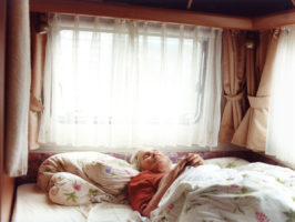
Gärtners Reise by Sibylle Fendt is an extended portrait of two people, Elke and Lothar Gärtner. That’s them, in the photos above. In the summer of 2008, they went on a big camping trip across large parts of Central and Eastern Europe, and Fendt went with them (ultimately spending almost a year with the couple). Germans love their vacations, but in this case there was a specific reason for the trip: Elke Gärtner had been diagnosed with a very aggressive form of dementia, and in all likelihood, this was going to be her last such trip. As a matter of fact, she had already lost her ability to speak.

In these photographs, we see an elderly couple, very much in love and on a trip together. With the additional knowledge we see just that as well: an elderly couple, very much in love and on a trip together. We do see traces of Elke Gärtner’s illness here and there, even though we cannot really be one hundred percent certain. The most obvious case might be the hand-written note.

A moving series of photographs, Gärtners Reise, also available in book form, deftly avoids all the pitfalls presented by the medium’s shortcomings and instead focuses on its strengths. By doing that, Fendt manages to make us look at dementia in different ways, focusing not so much on the affliction, but on the life that is still being had, a life filled with joy and love.

Massimo Sordi’s Changing India

Article main image
Massimo Sordi

We are all fairly familiar with stereotypes that are associated with countries (find a lot of them mapped here). We appear to be way less aware of the the kinds of narratives created by the media, narratives that often are supported by carefully cherry-picked facts and in actuality are little more than, well, stereotypes. For example, the media love to call economically booming countries “tigers,” to first create incredible hype about how well some country is doing and to then – and I’m tempted to say inevitably, since so many of those booms are based on financial bubbles – write about how the former tiger are then forced to deal with reality (click here for an example – note how it’s always “their” bankers who brought the disaster).

India is one of those countries that comes with a lot of those narratives attached. They’re not just economic, of course, there also is the country itself, its dazzling diversity and culture. As a consequence, a lot of photography made around India tends to focus on very few things. In the introduction of Massimo Sordi‘s Changing India, the photographer speaks of the Delhi-Mumbai Industrial Corridor Project, one of those projects intended at developing some major industrial zone. I suppose that’s interesting in some way, but I find it quite a bit less interesting than the photographs themselves.

I think photographically, these images run counter a lot of expectations. And many of them are visually complex in a deceiving manner: At first sight, they appear to be simple. But when the viewer starts to look more carefully, they reveal additional layers. Looking through them, I quickly forgot about the Delhi-Mumbai Industrial Corridor Project, instead finding this very interesting view of India (or at least a part of it) that often had me try to figure out what I was looking at.

I’m left with more questions than answers, which is something I enjoy tremendously. It’s nice to have answers, but all too often there aren’t any easy or obvious answers. And the medium photography is surprisingly well suited to play this game: It pretends to give answers by showing something that was in front of a camera, but really just asks more questions.

Photobook Reviews (Week 21/2013)

Article main image

Most people seem to agree that a photobook is, well, a book, meaning it has pages that are bound and contained in some type of cover. It needn’t be that way, however. Some photobooks deviate from this simple form. Here, I want to introduce three recent publications that each are a little different, in at least one way.

Starting off, there is Martin Soto Climent’s The Equation of Desire (readers living in the US can order it here). In terms of its form, the book comes closest to being a standard photobook. There is one exception: While the pages are bound, there is no cover. Or rather, the cover is what one probably needs to call a spine band – a strip of paper that goes around the spine and edges of the book (the much more common version of this type of cover would be a belly band; one could argue whether it’s really a cover at all). You look at the book by removing that band (which turns out to be a bit of a kerfuffle). Once removed, you can browse through the block of pages.

Aside from the slightly unusual presentation, the content of this book is what sets it apart from most other books. Each spread shows a visual collage: A number of publications were rolled up and placed next to each other in such a way that their visible parts form a (non-permanent) collage (fans of Redheaded Peckerwood might recognize the device from one of that book’s spreads; there, only a single magazine was used).

The resulting collages vary in terms of their complexity. Some are very obvious, essentially amounting to a simple game of pattern or content recognition. Others are less obvious and much more intriguing. In those, the juxtapositions place images against each other that do not simply mirror each other. At 366 spreads, the books feels a tad long – I am a pretty patient person, but so far I’ve mostly spent time on parts of the book. But then again, who says that each photobook should require the viewer to look at everything in one go, from the beginning until the end?

Larry Clark - C/O catalogue, cover

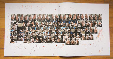
At the occasion of a Larry Clark exhibition at C/O Berlin, the museum produced a catalogue showcasing the work on display. Clark is still hanging out with and photographing teenagers (make of that whatever you want), and the show consisted of a number of large wall collages. To show these collages, C/O created a fairly unusual catalogue. It comes in the form, shape and size of a triple LP (remember those?). Two of the pouches contain folded up posters that allow the viewer to get an idea what the collages might have looked like on the wall. The third pouch contains a booklet with more images, plus some text.

The resulting publication probably comes closest to conveying the impressions one might have gotten when seeing the exhibition. At the same time, the packaging itself is smart and well done, and it clearly stands out – quite literally so – on someone’s bookshelf.

As you can see from the sample spreads, the cover image of the publication is slightly deceiving. I am not sure how much a fan I am of this particular body of work; of course your mileage might vary.

Eva Leitolf, Postcards from Europe 03/13, cover

Speaking of standing out (pardon the somewhat lame segue!) , the final publication I want to talk about today is Eva Leitolf‘s Postcards from Europe 03/13. For a start, at 29,7 x 40 cm (roughly 11 3/4 x 15 3/4 inches), the publication is quite large. On top of that, it’s not bound. Instead, Postcards is a slipcase that holds 20 plates (or, if you want to run with the title, very large postcards). I suppose you could argue that a book is something that needs to be bound. But it’s not easy to see what is being gained from being so strict with the criteria of what constitutes a photobook and what does not.

Obviously, if you have a book whose pages aren’t bound, you can re-arrange them any which way you want. In the case of Postcards, the order of the photographs truly doesn’t matter. Each image shows a glimpse into some aspect of Europe’s borders, borders that have become increasingly more rigid – those inside would like to keep those outside there. With the general idea of Europe currently being severely undermined by what amounts to little more than a combination of political pettiness and economical selfishness (not surprisingly, across the continent, public support for the European Union is plummeting), Leitolf’s work is a timely reminder of some of the important issues Europeans better start dealing with properly.

All of these three books expand the idea or form of the photobook in some way. Crucially, each has its own, very specific reasons for its form, which make perfect sense. Photobooks need not necessarily deviate from their standard form. But in some cases, something different helps showcase the work in ways that cannot be achieved in any other way.

The moment you deviate from a standard book you’re likely to run into all kinds of problems (how do oversized books onto people’s bookshelves, say?). Ultimately, photobook making always is a trade-off between what is needed and what is possible. What is possible isn’t always needed (this is where photobooks can become gimmicky), and what’s needed isn’t always possible (for example, a book with dozens of gatefolds might simply be too expensive to produce).

The three books I discussed here can be found at that lucky intersection, where what was needed became possible – and where the resulting products work very well.

The Equation of Desire; photographs by Martin Soto Climent; 366 pages; Mousse Publishing; 2012

Larry Clark; photographs/collages by Larry Clark; two posters plus a booklet in an LP-style slipcase; C/O Berlin; 2012

Postcards from Europe 03/13; photographs and text by Eva Leitolf; 20 plates in a slipcase; Kehrer; 2013

A ride to Rockaway Beach with Rob Stephenson

Article main image
Rob Stephenson

Just like probably a lot of people who don’t actually live in or near New York City, I’m pretty bad with any part of the city that’s not Manhattan. I know where Brooklyn is, and I have an idea where Queens might be, but that’s about it. I don’t know anything about the different parts of Brooklyn. Given I don’t live there I’ve never had much of an interest in learning more. As a consequence of that, until very recently, when Hurricane Sandy devastated the Rockaway Peninsula and I finally looked it up on a map, I had no idea where to find Rockaway Beach.

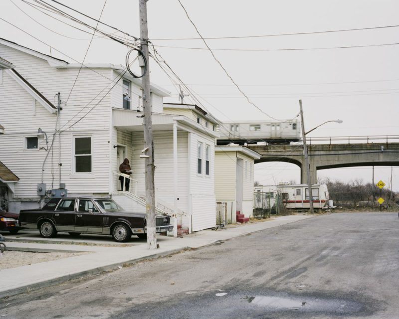
Rob Stephenson‘s There Swept out of the Sea a Song portrays the Rockaways. Still not having been there, I have no way of knowing how accurate that portrayal is. But maybe I should take that back immediately. While the idea of an accurate portrayal of a place is making the rounds more than ever, in reality there cannot be anything such as that. There can only be a person’s portrayal of a place, which usually says quite a few things about it, but which also, and crucially, tends to say even more about its maker.

I believe this is where photography of any given place becomes interesting. After all, what good would a perfect portrayal be, other than saving the viewer the time to go there and experience it for her/himself? What would be the point of that? That would reduce photography to the status of an infographic. Certainly when we’re talking about photography that has artistic ambitions, the last thing the viewer might want to see is an infographic. Phrased differently, if a viewer doesn’t like the portrayal of a specific place, maybe that viewer needs to interrogate her or his own ideas of art, instead of blaming the artist for “misrepresenting” something?

Just like an artist will make photographs in a location that are not necessarily only of that location, the viewer will bring another part, her or his own ideas, to the table, and this is where things get interesting. As much as I dislike these kinds of comparisons, it might be helpful to think of a Venn Diagram, in particular the intersection of two sets. That little red area there, that’s where art gets made, that’s where the art lives.

The little red area, that’s what an artist is sharing with viewers. These photographs of the Rockaways present us with Stephenson’s vision, and they create their own echos inside of us – those massive apartment buildings that we might have seen in major American cities, the beaches, maybe an echo here and there of another photograph we might have come across (photographs don’t exist in a vacuum), the little narratives that might thus be triggered… That’s what makes photography worthwhile looking at.

That’s why photography can be an art form: Not because it shows something that exists in the world, but despite the fact that it does that.

Looking at Dorothea Lange’s Migrant Mother

Article main image

Something appears to have been mixed up here, since the photograph above is not the well-known Migrant Mother photograph by Dorothea Lange. However, it is, unmistakably, the mother from that photograph. What I’m going to do in the following is to try to investigate how portraiture works (at least in part) by using a set of Lange’s photographs, namely the Migrant Mother ones that can be found in the Library of Congress. (For this article, I’m using the scans from the LOC scans, hence the frames and the writing around the image)  There are all kinds of reasons for me to pick these images, the most important ones being that everybody knows the most well-known picture, while only few people have ever seen the other ones. In fact most people don’t even seem to be aware of them. I’m going to ignore all background information about these photographs other than what is available in the LOC, since I want to discuss what can be seen in the photos.

The photograph that everybody is so familiar with is this one:

Dorothea Lange - Migrant agricultural worker's family. Seven children without food. Mother aged thirty-two. Father is a native Californian. Nipomo, California

What do we actually see here? First of all, there obviously is a woman (in the center of the frame) whose gaze does not meet the camera’s lens (and thus the viewer’s eyes). Her face appears worried, there is a bit of a frown in her face, and with her right hand she is holding or possibly slightly pinching the side of her face. Apart from the woman, there are three (yes, three) children visible. Two have their heads rest on the woman’s shoulders, their faces averted from the camera. The third child is a baby whose (sleeping) face is visible at the right edge of the frame, behind that wooden pillar.

For those who like to obsess over Photoshop manipulation “scandals”: The woman is actually holding on to that pillar with her left hand, and the lower right corner of the frame one can faintly see the retouched thumb (to see more images, including a restored one, see this page). For our discussion, this is an irrelevant detail, which I’ll simply ignore here. I’m also not going to touch upon the fact that the image is an iconic photograph. There are repercussions of that, but that’s for another day.

Back to the photograph, while the mother’s pose seems fairly natural, the two larger children’s has always struck me as a bit artificial. Children not familiar with a stranger might show their shyness, but these poses seem maybe a little bit too posed. And posed they are. Lange used a 4×5 view camera for these photographs, a camera that usually requires careful preparation of each photograph. Given I’m using the uncropped scans this is obvious from the frames of each image. But even if one didn’t know that, subconsciously most people I have talked to about this photograph tend to pick up on the posing aspect. Since most portraits are posed there is very little one could infer from the device itself, so beyond noting that I’ve always found the children’s poses a tad contrived I’m not going to add anything else here.

But obviously given we are not dealing with a candid photograph, the subjects were fully aware of the presence of the photographer. In fact, the photographer made them pose – this claim might not convince some people, yet, but once we’ve seen all the other photographs it will be obvious.

Given what we see in the photograph, it seems safe to assume that the children are in fact the woman’s, even though we can’t know for sure. Photographs often contain surprisingly little actual information, yet common sense allows us to come to fairly simple and usually correct conclusions. We know that this photograph is known as Migrant Mother, so assuming that these are in fact not the woman’s children would appear to be quite the stretch.

Here is the full caption of the photograph: “Destitute pea pickers in California. Mother of seven children. Age thirty-two. Nipomo, California” (note that the main page gives “Destitute peapickers in California; a 32 year old mother of seven children. February 1936.”). Knowing the full caption adds a bit of information that is not actually contained in the photograph. Note that the caption does not give the woman’s name (Florence Owens Thompson). For a start, she looks as if she were significantly older than thirty-two. Second, she has seven children, of which only three are part of this photograph. Where are the other ones? We don’t know. But we might start coming up with theories or ideas. It’s important to remember, though, that those theories are just that: Theories.

When looking at photographs, all we have is what is contained inside their frames, plus, possibly, whatever additional information the captions might provide. If we think we know something about a photograph that is not visible in the frame and that is not mentioned in the caption, then it’s not unlikely we have come to a conclusion that is not supported by the photographic facts. When looking at photographs the very first thing is to become aware of what we see – and what we think we see.

Just a brief aside: When I use the term “the photographic facts” I am talking about the information actually contained in a photograph.

Back then to the picture from the very top:
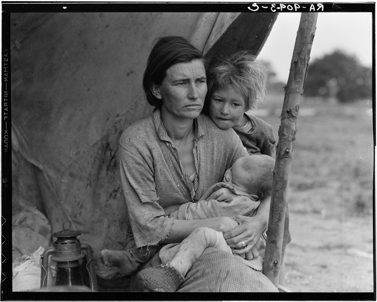
Nipomo, Calif. Mar. 1936. Migrant agricultural worker's family. Seven hungry children. Mother aged 32, the father is a native Californian. Destitute in a pea pickers camp, because of the failure of the early pea crop. These people had just sold their tent in order to buy food. Most of the 2,500 people in this camp were destitute.

It’s the same woman, plus two of her children. One of them, the one on the left in the famous frame, is gone. The baby is still there, and it is more clearly visible now. The other child – we can identify the hair and the rather ragged, coarse clothing – now rests her head on her mother’s shoulder. As before, both mother and child look away from the camera (the baby is sleeping).

This photograph is framed differently. It’s a horizontal framing, not nearly as close as the previous one. Comparing the way these two images were framed is instructive since it tells us something about both photographs. The original photograph is framed very tightly around the mother who provides a visual anchor (note I’m calling it “the original” since I used it to start this discussion; here and in the following I’ll refer to the images in order in which I discuss them in this article). She supports her children, literally (we are led to believe) and pictorially (they rest their heads on her shoulders). In contrast, while she still is at the center of the second frame, everything seems looser. Two thirds of the frame are occupied by very little – on the left a lamp in the foreground plus a tarp in the background, and on the right a post that holds up the tarp plus an out-of-focus background.

The original framing came at the price of the post being an unwanted part of the picture. This might be the reason why Lange retouched the image, to remove the thumb: The photograph was going to be grounded on the mother, and the mother holding on to something would divert from that photographic device. In the wider, horizontal photograph, the environment plays a much larger role now: It is mostly barren, empty, impoverished (mind you, I’m only talking about the environment that is actually visible in the photograph).

Also note how the woman’s left hand is visible in the second frame. She is wearing what might be a wedding band or engagement ring. This is the hand that is not visible in the famous frame. I have no way of knowing whether Lange intended to hint at this or not, but the ring adds a little piece of information about the woman, which, in turn, might trigger additional conclusions. If there is in fact a man in her life – these children must have a father – where is he? The famous frame, with the left hand invisible (remember, the thumb even got retouched out of the frame), omit this fact and makes the photograph center on motherhood alone: The mother as the anchor, providing the strength the children rely on (again literally and in terms of how they’re posed). The second frame, on contrast, could be read as a wife who is supporting her children but who also is waiting for her husband or partner to come back, to bring back food or money or whatever else.

As before, one needs to be careful about the photographic facts and whatever one might want to infer from that. The ring on the woman’s hand is a photographic fact. Everything else is an assumption.

Here’s the caption of the wider shot: “Migrant agricultural worker’s family. Seven hungry children. Mother aged thirty-two. Father is a native Californian. Destitute in pea picker’s camp, Nipomo, California, because of the failure of the early pea crop. These people had just sold their tent in order to buy food. Of the twenty-five hundred people in this camp most of them were destitute”. That is a lot more information than before. As before, this information gets our minds going, yet we need to be very careful with what conclusions are going to be ours, and which ones are actually supported by the photograph.

Let’s keep looking. Here’s another frame:

Dorothea Lange - Migrant agricultural worker's family. Seven children without food. Mother aged thirty-two. Father is a native Californian. Nipomo, California

This third frame is close to the second one in terms of the poses. Very little has changed – the older child is now holding on to the post, and the heads have moved a little, possibly to accommodate the different camera position. This frame was shot vertically, and it reduces the little family to an even smaller part of the image, still in the very center, though. There is what looks like a suitcase or trunk in the foreground, somewhat out of focus, upon which a plate rests. There is the lamp again, as are the tarp, the post, the empty backgrounds. Part of the ground is now contained in the frame, in the lower right corner it is in focus: It looks like sand, some sort of soil.

The third frame differs quite a bit from the first, famous one. While I’m happy to argue that the poses look much more natural, the intense focus on the mother is almost completely gone. While she still occupies the center of the frame, the somewhat active pose of the older child has both of them battle for the viewer’s attention. And the group looks almost lost in these desperately poor circumstances – a tent of sorts held up by a post made from a young tree, a single plate, a suitcase (or trunk) as a table.

We might as well step back even further:
Dorothea Lange - Destitute pea pickers in California. Mother of seven children. Age thirty-two. Nipomo, CA 1936 05

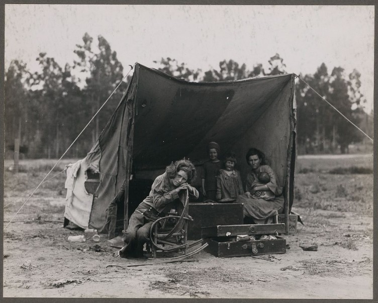
Now this is a very different picture than the “original” Migrant Mother, isn’t it? For a start, the mother is not even in focus/the focal point of the picture. Instead, it’s a child sitting in a rocking chair, in front of a makeshift tent. Inside the tent, we can see the mother (holding the baby), plus two other children, both of them younger than the one in the chair, both probably the children from the other frames.

Interestingly, this is the only frame where the subjects are actually engaging with or at least looking at the camera. Most of the posing efforts seem to have been spent on the child in the rocking chair, while the group in the background (in the tent) essentially just make sure they occupy the correct spot in the frame.

Note how this image is constructed photographically. The opening of the shelter provides a photographic frame. The subjects are all placed inside that frame, the group in the background very obviously so (they are in fact inside the shelter), whereas the rocking chair (plus an open suitcase) have been placed in front of the opening of the shelter. They might have been there when the photographer arrived, we can’t know for sure. But visually, there are two worlds: The one of the family, in the center, photographed inside that frame, and the larger world outside, a fairly uninviting, empty place.

Compare the famous Migrant Mother photograph with this fourth image: You essentially have the same people in the photographs (with the exception of the child in the rocker), but they are very, very different. And all of that from working with the distance between the camera and the subjects (and some careful arranging of the frames at each distance). I have no way of knowing which frame actually came first; I want to assume Lange started further away and then moved in, but it could have been the other way around. From the photographs, it’s essentially impossible to tell (and it frankly doesn’t matter anyway).

There is another photograph:

Dorothea Lange - Destitute pea pickers in California. Mother of seven children. Age thirty-two. Nipomo, CA 1936 04

Photographed at a distance roughly between the second and third frame, it shows the mother in the very center of the frame, breastfeeding her baby. Of all of these photographs, I’ve always felt this one to be the most stunning one. Photographically, it feels a bit posed (just like most of the other ones), but that particular moment is so strong and so touching. The mother’s expression, which looks like weary resignation, creates a strong contrast to what she is doing: Feeding her baby. None of the other children are contained in the frame, this one is focused just on a mother nursing her baby.

The photograph that became the iconic Migrant Mother is the one where the camera is closest to Florence Owens Thompson. Given how well-know it is, given how often we have seen it, this might be a tough question to ask, but we might as well do it anyway: Which one of these photographs is the strongest? Personal preference (plus agenda and biases) might have us pick one over the others, but is it going to be the famous one? Is it even going to be possible to disentangle all we know and feel from these photographs?

If we ignore the fact that one of these frames has become iconic, the variety of the photographs – the way they are composed, their distance to the subjects, etc. – gives us an opportunity to see how portraiture operates, how adding or withholding information can contribute to the way a portrait is perceived, how adding or withholding information makes us see and then feel different things.

Of course, there is nothing fundamentally revealing about any of this – it’s photography, after all, and this is what photography does. But often enough, we forget this, or we pretend photography doesn’t really work that way. When talking about photographs, it’s essential to start out from the facts, from what is contained in the frame, from how things are set up, and to then move to whatever one might infer from that.

I often find that people approach photography the other way around, by bringing their own conclusions to the images, to then try to see how the photograph supports them. I don’t think that’s a good approach. With so many photographs around us now, in all likelihood what is going to happen is that instead of us navigating photographs, we are instead being led. Instead of being active, we end up being passive. That can’t be good. How can one make choices if one doesn’t have the tools at one’s disposal that are needed to make these choices?

Portraiture makes the viewer’s task particularly tricky, because it often seduces us to see things that aren’t actually there. A photograph of another person never is that other person. It always “only” is a photograph, made with specific devices and (usually) intent. To understand how portraiture works, one needs to look at the use of the devices, to possibly infer a little about the intent, and to learn a lot about what we bring to the table when looking at a photograph of another person.

Update (22 May 2013): A reader emailed me to say the photographs were taken with a press camera, not a view camera. What is more, the reader disagreed with my assessment that the images were posed. While part of that discussion comes down to semantics, the main idea of this article is not based on whether or not these images were posed. I’m concerned with what we can infer from the pictures, to be precise from trying to rely only on the photographic facts. Obviously, my assumptions and conclusions might differ from yours.

This article is the first in a series, engaging with portraits to see how they work and what they say.

Photobook Review: Vers l’Orient by Marc Riboud

Article main image

In 1955, Marc Riboud left for what was to become a three-year trip east, vers l’orient, traveling to Turkey, Iran, Afghanistan, Pakistan, India, China, Japan… Thirty years old, Henri Cartier-Bresson became a mentor during that time. “I often found letters from Henri waiting for me at General Delivery in Kabul, in Jaipur, in Madras, in Ahmedabad, or in some Indonesian city whose name I forget.” writes Riboud in the essay that comes with Vers l’Orient, the publication, which makes the photographs from that time available again. Re-looking at the letters decades latter, the recipient finds “Henri again as he was when I met him – infused with that determination to proclaim what he believed to be the right way to photograph, to look at painting, to understand a country, to shun the picturesque, to ‘think’ a story, to ‘organize it in the mind;’ and of course to see – to learn to see – form and beauty.”

Marc Riboud - Khyber Pass, Afghanistan, 1955

Can you imagine traveling the world, to find letters by one of photography’s greatest, addressed to you and delivered in physical form to whatever remote place you might be going to? To go off on that tangent, this is not just a different mode of delivery of information (which, technically, it is). It’s a different mode of time, where a letter might be on its way for a few weeks. It’s also a different mode of engagement, where what matters is not just what’s on view in the most popular galleries, or what’s hot in the most coveted magazines, or what’s on vogue on the most popular blogs or Tumblrs. How many of us take the time to look at painting, or try to understand a different country?

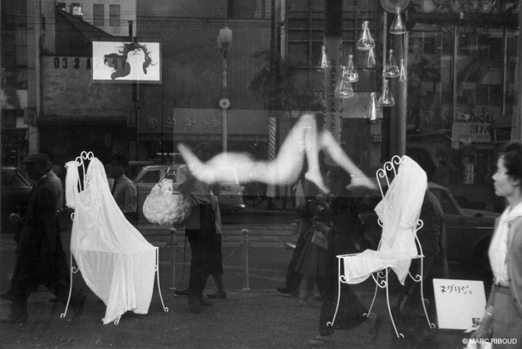
Marc Riboud - Tokyo, 1958

Vers l’Orient comes in the form of five books in a box. By themselves, the individual books are unassuming. Whoever thought of how to present these photographs resisted the temptation to produce yet another massive, glossy book with too many pictures. Instead, at 187 × 200 mm (roughly 7 ¼ x 7 ¾ inches) the books are modestly sized, and with 64 pages they do not allow for an overly loose approach to editing (which has marred so many recent releases of old material from other photographers). The presentation thus thankfully enhances the work very nicely, strengthening a sense of preciousness that can be found in many of Riboud’s photographs.

One could argue about whether or not the books show the photographer’s evolution as an artist. The different countries and subject matters would make this a tricky endeavour. That said, my favourite book by far is the last one, Japan, which is filled with photographic gems, beautifully seen moments, many of which are touching portraits.

Marc Riboud - Japan, 1958

Knowing from Riboud’s essay that Cartier-Bresson sent regular comments about the work he was being sent from the Far East I have been trying to imagine the content. How instructive such a look behind the scenes would be! Maybe some day, we will all be granted a peek. In the meantime, there are Riboud’s photographs to enjoy, in the form of Vers l’Orient, one of the finest (re-)releases of old material I have seen in a while.

Vers l’Orient; photographs and essay by Marc Riboud; 5 hardcover volumes in a box set; 5 × 64 pages; Editions Xavier Barral; 2012

Jens Sundheim & Bernhard Reuss – The Traveller

Article main image
Jens Sundheim and Bernhard Reuss

In the very early 1990s, a simple coffee pot became the first object to be recorded by a webcam. With the coffee pot located too far from the offices of the people interested in its content, two scientists trained a video camera on the pot and fed the resulting image into their computer network. You were then able to check the status of the pot, to see whether there was coffee to be had, from your desk (As someone who has worked in academia and who is familiar with the atrocious drip coffee produced and consumed by scientists, this makes perfect sense to me: You’re really interested in the coffee, too busy to think about how to improve its quality, but not busy enough to worry about technical stuff like that). A little while later, the coffee pot cam made it onto the internet. That was in late 1993.

Almost twenty years later, webcams are ubiquitous, some public and many more inaccessible to the public. People love to refer to the latter as “security cameras,” even though in reality they do not provide much of a security at all – typically, they’re only good at catching things after the fact. In other words, they deter those criminals who are worried about being caught later, while, at the same time, turning us all into potential suspects (an ugly mob is then only a Reddit post away).

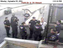
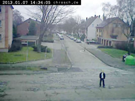
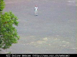
It seems safe to say that most people aren’t particularly interested in being photographed by surveillance cameras. Jens Sundheim, however, is. As der Reisende (the Traveller), Sundheim has put himself into the frames of surveillance cameras that can be accessed online, for Bernhard Reuss to take, well, grab his picture: A often lone man, his hands in his pockets and facing the camera, posing for the camera. Given the real-time transmission of the images, Sundheim needs his collaborator to grab the image from a (remote) computer screen. It wouldn’t be too far off to call Sundheim a photographic performance artist.

Seen as a group, these images become absurd and unsettling at the same time. The presence of the one figure very much aware of the presence of the camera puts the focus of the image on the way it was made – a camera in a public (or private) space recording a steady stream of images that might or might not be stored in some database, to be possibly used for all kinds of purposes later. At the same time, the single repeating figure itself is unsettling – it is as if there was someone who knows more than we do, someone staring back at us, making us viewers feel uncomfortable.

If that discomfort translated into us thinking a little bit more where we are currently moving, in this, to repeat the trite and dangerous phrase, “post 9/11 world” we might actually gain something: Do we really have to sacrifice all that privacy to try to achieve an unachievable sense of security?

Der Reisende is part of a new book I served as the guest editor for. Observed, published by Ivorypress, collects the works of visual artists investigating the use and creation of images that deal with ideas of privacy, surveillance, or observation. As it turns out, things aren’t quite as simple or black and white as one would imagine. With Observed I am hoping to expand an often narrow discussion into something wider. In some form, a lot of  photography involves an act of intrusion into someone’s life. With cameras being ubiquitous in an era where civil liberties are being eroded in the name of security it’s high time for us to start thinking about this aspect of photography.

A New Site

Article main image

With Conscientious approaching the 12th year of its existence, for various reasons the time was ripe for a change. Here it is, with its own dedicated URL: cphmag.com (Conscientious Photography Magazine).

For a start, regular visitors will notice the site looks differently now. The new design uses larger images and a different, much improved layout. The internet is a visual medium more than anything else. As a consequence, from now on photographs will be treated very prominently here.

If you re-size your browser, the page will adapt. If you look at the site on your smartphone it will look just like on the browser on your tablet, laptop or desktop computer. Massive thanks are due to Tim Gasperak for providing his expertise, input and time in making this new site happen.

I don’t want to bore you with technical details, but the underlying machinery is also new. After 11 years and almost 6,000 posts, the old machinery was ready to retire. As you might have noticed over the past few weeks, the old site suffered from a number of increasingly crippling technical problems.

Lest you worry, the old site (accessible under the old URL) will remain what it is — an archive of 11 years of work. The links will remain unchanged, and all of the articles will remain accessible as they are. If you want to access the old site, there is a link at the bottom (“Conscientious Archives 2002-2012”).

If you want to get an idea what this new site is going to be like, you might enjoy seeing examples of older articles reformatted: Riverfront by Curran Hatleberg, A Conversation with CPC 2012 Winner Hye-Ryoung Min, and A Conversation with Christian Patterson.

The most important change to Conscientious is conceptual. In a day and age where there is a flood of one-image posts on Tumblr and of links on Twitter, having any of that here doesn’t make sense any longer. If you are interested in links without any comments, follow my Twitter feed (@jmcolberg). Those active on Tumblr might enjoy following my Tumblr. As for single-image posts here… I think their usefulness has expired.

The flood of images and PR on the internet requires a new approach.

From now on, Conscientious will exclusively focus on long-form content. You might have noticed this transformation already — I started to change my approach to the site months ago. At the end of the week, there will be in-depth photobook reviews. There will be longer articles (such as “Meditations on Photographs”). And the short photographer profiles will be replaced by less frequent longer ones, showcasing someone’s work — critically — in more detail.

Photography is more popular than ever, and I believe it deserves to be treated with respect. I’m sick and tired of seeing photography reduced to the usual “scandals” or “outrages”: OMG, did you hear that photographer manipulated a photograph? Does Instagram destroy photography? Etc.

My attempts to do better might not always be as successful as I’d like it to be (please email to send in feedback), but I’ll try my best. The idea is not to necessarily have the answers; instead it’s about trying to ask the right questions, in as honest a way as possible.

I’m also working on a subscription service; once ready I will announce it here.

So welcome to a new incarnation of this site: Conscientious Photography Magazine.