Merrie Albion

Article main image

Britain’s recent decision to turn its back on Europe — “Brexit” in its official parlance — is mostly an English affair, much like British politics itself. For most outside observers, this decision is utterly baffling and essentially self-defeating. That it was passed with a relatively small majority doesn’t matter much, though. A majority is a majority, and it’s not as if Englad had been known for its enthusiasm towards the rest of Europe anyway. So they might as well leave.

In a larger sense, and this is related to the preceding, the English navel might be the most gazed at in the world. As someone who grew up in post World War 2 Germany, I have always found any country’s patriotism (let alone nationalism) somewhat unhealthy. But England’s always struck me as particularly odd. Of all the countries I’ve visited, it’s the one most firmly and oddly stuck in some form of idealized past that is strikingly at odds with both its own reality and the world at large.

Many other countries share some of the customs that can be found in England. But in all other countries I know an embrace of the crusty and somewhat absurd old is balanced by a usually even stronger embrace of something new, something that might in fact challenge the old. Consequently, in those other countries the struggle inevitably will be over the clash between the old and the new, a process that can be quite ugly and unnerving. England is the only country I know where that clash happens with a mindset so firmly stuck in a idealized version of the past that outsiders mostly end up being baffled about what’s going on. Just look at how “Brexit” is discussed there and in the rest of Europe: it is as if there are two completely distinct realities meeting.

The world of photography offers plenty of examples of the English people’s preoccupation with themselves. Most famously, Martin Parr has made a whole career out of it. But of course there are plenty of other artists. This includes Simon Roberts who has extensively photographed the small island he lives on and who has published a series of book, of which Merrie Albion is but the latest (also see We English or Pierdom).

In its photographic approach, the work relates to John Davies just as much as to the more recent Andreas Gursky (the one before all the digital mumbo jumbo) and Joachim Brohm: the viewer gets to see scenes from across the land from an often (but not always) elevated vantage point, with a view camera offering a plethora of details. Photo geekery aside, this approach tips its hat to classical paintings in which the view over the land and the scene unfolding in its vastness came to stand for a god-like, somewhat disinterested stance: these people here get shot to pieces and suffer a rather miserable death, but in the larger scheme of things…

But we don’t live in a world any longer where such a larger scheme of things holds much sway. A few years ago, we all, each one of us (at least those contributing something online), became TIME magazine‘s person of the year (the only “award” this writer has ever “won”), and that’s where we’re at now — while corporations plunder the land and ourselves, including the very data we happily send them so we can “poke” each other on their sites. This change in focus means that the elevated view now merely serves to show the spectacle of public life.

In Merrie Albion, the one photo that might forcefully illustrate this approach is the photograph of Gordon Brown, the former (hapless) prime minister, campaigning in a location identified as Rochdale. There’s a single TV camera trained on the man, who was as bad running his mouth as the country, which would contribute to help him lose the election (obviously, that’s not in the picture); and the whole scene looks like the lot of nothing that politics has become. I suppose for reasons of political fairness, various other politicians are also depicted campaigning in the book. It’s not clear to me what is being gained by that other than an attempt to be politically fair. I will say that I did enjoy seeing a picture of Captain Beany from the New Millennium Bean Party included.

The pulling back of the curtain that is implied by Roberts’ photographic approach has the altogether effect of making the place, mostly England, look even more miniscule than it already is (and I mean that mostly in a metaphorical sense). There’s a provincial quaintness over vast parts of the scenery that in other countries would be openly admitted. Not here, though. That quaintness makes the few more grandiose buildings either look like they’re out of a theme park (for example the parliament) or out of an amusement park (London’s Olympic stadium, say). And near the very end of this all, the burned out hull of Grenfell Tower looms over a section of what looks like the projects nearby (I suppose the British term for this would be council estate).

So what’s all this then? I think it’s obvious that someone not from England would look at Merrie Albion in a very different way than a native. Where we all could agree is that Roberts uses his tool competently and with care, resulting in many very good photographs. Whatever you want to think about either the state of the country or its politics, though, I end up being drawn to the conclusion that the all-inclusive approach (the often detached observations) somehow doesn’t quite cut to the chase. Or rather, it makes for a curiously disinterested take on a place that invites a lot more judgment.

It’s possible that people from England might find judgment in the pictures. I could maybe see it here or there. But I personally would want more. Why judgement, though, you might ask? Well, if you don’t like that word, then use “opinion” or any other word — anything really that will get you quite a bit closer to the actual state of the place’s politics and to the position it is now finding itself in after a referendum led by a small cabal of xeonophobic knownothings (one of whom is currently the foreign minister) landed the country in a political and cultural isolation that will cost it dearly for decades to come.

If the only people willing to openly and loudly state their preferences are the populist rabble one shouldn’t be surprised about finding yourself in a mess. And to dig yourself out of the mess, you’ll have to be willing to state what you believe in, you’ll have to be willing to offer an alternative to what historically is already known as splendid isolation (in a world moving rapidly towards its opposite pole). It’s up to photographers to decide whether they want to do that or not. Still, I believe that when you’re a photographer, you’re not only that. You’re also a citizen, a member of any number of larger communities, whether they’re familial, cultural, societal, or geographical. Consequently, you will have to fight for what you believe in — or risk getting swept away along with all the other passive people.

Ideas must be fought with other ideas. Bad ideas must be fought with good ideas. While photographs of course are documentations of what existed in front of some camera, they can be a lot more, especially when grouped into a book: they can be propositions for a better future. So as much as I enjoy many of the photographs in Merrie Albion, I just wish its overall message had a lot more bite. Give me something to chew on! If that means getting down from the elevated ladder, to rumble in the trenches, then so be it.

Merrie Albion; photographs by Simon Roberts; texts by various authors; 152 pages; Dewi Lewis; 2017

Rating: Photography 4.0, Book Concept 2.0, Edit 3.0, Production 3.0 – Overall 3.1

(With the above, it’s not sure whether in the ratings the photography or the book should reflect my criticism. I’ve picked the book here, but I could have easily picked the photography.)


Success in Photography

Article main image

Much like writing about photographs teaching has vastly expanded my thinking around pictures. A plethora of problems that I simply had not been aware of have opened up to me. Curiously, it seems that the simplest problems often are the hardest to solve.

If there’s an overlap between criticism, teaching photography, and photographing it’s that without an idea of success any of these activities constitutes a hopeless endeavour. When I use the word “success” I am not concerned with or interested in whether a photographer produces a widely popular body of work and/or book and gets fêted at festivals the world over, not even to mention the exposure offered by click-bait needy websites. I don’t have a problem whatsoever with anyone enjoying this type of success — it’s just that when writing or teaching or photographing I’m simply not interested in it. I can’t be, and neither should be the photographer (or student).

What I’m interested in instead is the simple question of what success means for the photographer, given the body of work in question. What is, in other words, a successful picture? Or maybe what is a good picture and what a bad one? In the most basic and obvious sense, that — and that alone — ought to drive the dreaded process of editing: put all the good pictures on the small pile to the right, and the rest can go into that big garbage bin on the left. Editing usually is one of the hardest tasks faced by photographers, and I now believe this is mostly because despite taking (hopefully) lots of pictures, most photographers never think about success, about what it is that will make a picture good.

I often encounter blank stares when asking this particular question — how do you define success in your work? — so I tend to follow up with an equally simple question that also mostly leads to the very same lack of response: what do you want your pictures to do? It’s not that my goal is to have students stumped — on the contrary! But if a good way to solve a problem is to begin at, well, the beginning, then maybe it’s best to start with the simple questions before turning to the complicated ones.

In a very obvious sense, there is no generalized answer anyone can give me when asked about success. Any generalized answer only tends to be a non-answer or an evasion. For example, someone might tell me they want their pictures to obey the rule of thirds. OK, that seems fair enough. But then it’s equally fair to ask why. Is there a reason? In fact, every possible answer will result in the same question: why? And this is a genuine question: I’m interested in the reasons each criterion that is being presented — not to disprove its validity, but rather to get as close to the criteria to be used as possible.

What this means is that any criterion could possibly be a valid one, provided in the given context — aka the body of work in question — it makes sense. Making sense as in having full validity for the photographer, given her or his ideas and motivations. To what extent a photographer’s criteria are related to what might make sense for other people often requires some hard thinking. On the one hand, even in the arts it’s almost impossible to be sui generis (most people lack the talent and drive for it anyway). On the other hand, it usually is a terrible idea to focus group your art.

When teaching, that — and only that — is what I feel needs to drive my efforts to help a student along, namely that her or his own criteria for her or his work are being met: you light the fire, and my only job is to hold your own feet to the fire you lit. It’s your fire, not mine. This is where criticism and teaching diverge — in criticism it’s my fire and only my fire. Being a critic helps me being a teacher: I know full well that there might be other criteria (mine), so my willingness to indulge students only goes so far. The nice part of the job is to see the fire lit, the challenging part is the holding of the feet to it.

One of the main reasons why I re-started taking my own photographs on a very regular basis a couple of years ago was to subject myself to these very same mechanisms. It’s one thing to “grill” someone over their failure to pick the good pictures out of the pile. It’s quite another to do it for oneself. It’s good to know about how hard it is. But it’s also good to try to find ways to make the job easier. When it’s not my own photographs, I find I have a for me uncanny ability to produce good edits pretty quickly. But for years I struggled with the task of trying to explain how exactly I would do it.

I am now convinced that what I do boils down to reading the work, picking up on what it aims to do, establishing the corresponding criteria, and then selecting pictures based on those. Mind you, when not being the photographer my criteria probably are not one hundred percent in line with hers or his. Another editor might employ different criteria.

The only person for whom the most perfectly served criteria coincide with the criteria is the photographer. S/he ought to be able to get as close as possible t0 identifying and applying them. These criteria will be driven by her or his original motivations and ideas as much as by the work’s. However, it is likely that in the end, the work will drive the process, given that just like in all other forms of creative art (as opposed to craft) the work will overrule its creator.

Especially early on, though, as the creator you will attempt to get close to your ideas and motivations and ask: what’s a good picture here? Why is this good? If this is a good picture and that one is, what does this mean? How can I define the success of these pictures here? What should they do? Why do I think they should do what I’m saying they should do?

This process will have to involve a lot of looking and looking and looking at the work, and it will require a good amount of emotional honesty. The reasons that drive your work might be ones you feel uncomfortable with. If they make you feel uncomfortable you will have to be able to stay in that place and keep digging, keep asking: what does this mean? What’s driving me here?

Whether or not the body of work ultimately gets to enjoy the success that manifests itself in sales or exposure is a very different question. It might, or it might not. There are too many awards and prizes for any of them to make sense any longer, yet people still have their eyes fixed on them. Consequently, there will be many rejections, many shortlists not made, many festivals hawking other people’s wares.

Here then is the final point where having a measure of success based on the work itself offers plenty of solace: maybe the work didn’t get shortlisted, didn’t get shown, didn’t go viral for 15 minutes. But if it sits at the end of a long process of introspection and hard work, and if it conforms to its maker’s deepest ideas of success — isn’t that what really matters?


Book Reviews W16/2018

Article main image

I recently wrote about the exhibition catalog and the limitations of this particular format of photobook (see the article here). I personally rarely, if ever, see the need to add a catalog to my collection unless it offers more than the very basic ingredients of what makes a catalog a catalog. But this is where the ebook comes in. For a while, the idea of the ephotobook was all the rage. The hype over such books has calmed down considerably, as its many limitations have come apparent. These include, for example, a possible dependency on the whims of corporations such as Google or Apple, whether concerning technical aspects or the often grotesquely puritan restrictions concerning content. But the ebook still has a lot to offer, and it’s in the area of the catalog where it might fulfill its potential most easily.

To begin with, a basic catalog is a collection of pictures plus some essays. Basic catalogs don’t offer any of the bells and whistles that make their more extravagantly realized examples so exciting. Turns out the ebook is perfect for basic catalogs as is being aptly demonstrated by the e version of the one made at the occasion of Stephen Shore’s career retrospective at MoMA. Lest you get confused, the book is accessible through either a browser-based interface or a stand-alone app (I’m using one on an iPad mini). In both cases, the navigation is essentially the same — nothing fancy and thus possibly confusing. The user can switch between a view of the physical catalog’s spreads and text and images displayed on their own, with a zoom function for images supported.

If this sounds fairly bare bones, in a sense it is. But it also supports the idea of the catalog perfectly: you get easy and simple access to its information through a set of menu options that make finding something actually a tad less tedious than in the case of a book. Given my concerns about the catalog format per se, Musebooks — the company behind the e version of the catalog — appear to have thought about both what such an entity should be able to do in an electronic form and how to prevent the kinds of problems run into by other ebook makers. If you read magazines on your tablet through an app like Zinio or if you use iBooks (or a non-Apple equivalent), you’ll be familiar with accessing content this way — there’ll merely be another app to install (which worked like a breeze).

I might thus end up adding very conventional catalogs to my collection after all. But they won’t take up any space, and they will exist in that “space” that I use for my professional work. Having a set of electronic catalogs at my disposal actually sounds like a pretty good idea. I’m hoping that these kinds of catalogs won’t follow in the footsteps of many of the other ebook initiatives we have seen in photoland over the past decade. I guess time will tell.

Stephen Shore; images by Stephen Shore; essays by David Campany, Kristen Gaylord, Martino Stierli; 336 pages (as physical book); The Museum of Modern Art/Musebooks; 2017

(not rated)

Those who think they know what to expect when buying a book by Richard Renaldi will have their expectations shattered by I Want Your Love. Widely known for his view-camera portraiture that occasionally expands to landscapes or cityscapes, this new book is one of those Super Labo books that allows its author to move beyond the usual. I personally think such a move is always a good idea. There’s nothing worse than to get stuck in an endless loop of doing what you know well, doing what everybody has come to expect.

In this particular case, the photographer decided to produce a visual autobiography: the book features ample photographs taken by a variety of sources — family photographs, snapshots by friends, the author’s own (non-view camera) ones — plus a selection of pithy and despite (or maybe because) of that very touching personal pieces of text in which Renaldi talks about growing up, discovering his sexuality, entering and leaving relationships. The writing possesses an unassuming effortlessness that those who write much and/or often usually struggle to achieve.

The writing is not just perfect for the photographs it comes with, there also is none of the pretense that makes so much of what artists in general produce about themselves so tedious. The text is conversational without feeling strained or too loose, and it sits very well next to the photographs that describe a life in those ways that a smartly edited assortment of mostly unassuming pictures does: it’s almost as if the reader/viewer is literally sitting with Renaldi, to hear the stories instead of reading them. No mean feat.

Right at the end, there is a reveal of sorts, the motivation behind the production of the book. The final lines of text are “My mother had a long and painful demise, and in many ways I think she left us in that hospital room in suburban Chicago long before she died. As I approach fifty, living an active life as an HIV-positive man, those issues of health and mortality move closer and closer to my center.” The camera can only do so much for you as the maker of photographs. Even as other people, your viewers, might draw considerable gains from your pictures, for you, the maker, they can only briefly — if even that — conceal your larger concerns, or make you forget about them.

Whether or not we will cry out for our loved ones when our time has come — just like Renaldi’s mother did, we won’t know until those moments. But our pictures are little gestures of doing just that, of reaching out to strangers to get something back: their approval, their enjoyment, their love.

Highly recommended.

I Want Your Love, photographs and text by Richard Renaldi; 176 pages; Super Labo; 2018

(not rated)

Anne Morgenstern’s Reinheit

Article main image

For three and a half years, from late 1995 to 1999, I lived in Bavaria, specifically in Munich, its capital. Born and raised in the north of Germany, I had previously spent six years in Bonn, the capital of West Germany (right after I arrived it lost that status). Bonn had been my first exposure to a place governed by Catholicism, which had taken some getting used to. I’m not sure I fully succeeded (or even wanted to) getting used to it when I arrived in Munich, where the Catholicism came without the Rhenish humour and laissez-faire that had made it somewhat bearable in Bonn.

Munich was just hardcore for me, and mostly not in a good way at all. I remember one time near the end of my stay there when I had to travel by plane from Stockholm back to Munich. It was deep winter. I forgot where I switched planes, but at that airport I saw people wearing their winter clothes — puffy coats and jackets that presented a bewildering mosaic of colour. And then I landed in Munich: a sea of grey and the dark green. The place’s relentless conservatism had literally visualized itself through that sea of gloomy colours, of people grumpily walking around, only too willing to stare at anyone who looked even slightly out of place.

Somewhat related: for the longest time, before the advent of the AfD party (essentially a neo-Nazi party repackaged as a populist party) far-right ideas could be found in the Bundestag mostly expressed with a Bavarian accent. Not to be outdone by the AfD, Bavaria’s conservative CSU now openly courts anti-semitic and racist autocrats such as Hungary’s Orban. This is not to say that Bavaria is the only place in Germany that’s quite far to the right, but its tradition is and has always been way to the right of the country’s political center.

Mind you, Munich is great to visit especially if you don’t speak the language and are thus not exposed as much to the often narrow-minded conservatism. But even to visit — I remember one time I went there with someone who had grown up in the US and who was simply horrified to see a homeless person getting picked up by the police for no reasons whatsoever (well, being homeless was the reason). There’s really no good way to explain this away.

That then is my personal background, without which I cannot look at Anne Morgenstern‘s Reinheit. Specifically, while I don’t have the cultural background driving what’s depicted in its pages, I was exposed to it for a period long enough for me to have had my brushes with various of its details. It’s strange, I’ve been away for a long time, but seeing these pictures brought back instant reactions — it was more reactions than memories, because somehow there are a lot more of the former than the latter.

The same is true for another place I ended up disliking with a vengeance after having lived there for years, Pittsburgh, PA. In some ways, what rubbed me the wrong way is essentially the same in these two places. It’s not their being so different from where I grew up. I have lived in and/or visited a fairly large variety of places to be very much aware of the allure of all that, which is different. What makes us different allows us to see what we have in common. But if there’s one thing that absolutely drives me crazy it’s locations where people think that their place or culture is the one that should serve as the benchmark and everywhere else is just sub par.

In both Munich and Pittsburgh, it’s this excluding narrow-minded mindset that ultimately only betrays its own provinciality that had me so happy once I was able to leave. Of course, that’s not in Morgenstern’s pictures — I don’t think anyway. So I’m not sure what exactly it is that triggered my fairly visceral reaction. But that’s good, any book that gets a visceral reaction out of me is a good book.

A mix of portraits, still lifes, and landscapes and split into two parts, Reinheit doesn’t so much describe as it does allude to things. The two parts literally bisect the book — halfway through, every picture suddenly is upside down, forcing the viewer to flip the book around and start from the other end. The two parts each are subdivided into three sections each, with two sections of only portraits (photographed focused on the subjects) sandwiching a larger section that explores a variety of themes. Clearly some thinking went into this. But if my description of the book’s structure sounds maybe a tad too complex for the reader, then, yes, that is in fact the case. Luckily, it doesn’t take too much away from the pictures.

I suppose the way these pictures get at me (not the portraits but mostly the other ones) is through them showing me something that irritates me. The culmination of this irritation is provided by a photograph of a neatly arranged table, on which plates are set, each of them with exactly the same materials, a slice of bread, some butter, a fork, and what looks like a piece of fish (or maybe meat — I can’t tell). With the very Bavarian tablecloth underneath, this pictures just screams of the conformity that is so prevalent — and enforced — in Bavaria, where you either fit in, or, well, you’ll find the police might inspect your backpack while you wait for the subway (true story: a former colleague of mine, who sported longer hair and dressed casually, told me that he had been frisked for drugs by the police dozens of times — not because he had any but simply because to the Bavarian police he looked like a person who would; in case you’re wondering given the homeless story and this one, I got plenty more).

And you got all your symbols in the pictures, the police, those almost absurdly stereotypical Lederhosen, your Christian cross, etc. etc. etc. I don’t know how Morgenstern did it, but this feels like Bavaria. This just oozes conformity, Catholicism, conservatism (code word: “tradition”). There you got your Reinheit — German for literall and metaphorical purity alike, for chastity, cleanliness, for being immaculate.

After Land ohne Mitte, this is the second impressive book by Anne Morgenstern. There’s a new name on the firmament of German photography that you might want to take note of, a new voice that pushes past the Düsseldorf people who, unfortunately, still dominate the conversation around photography from this Central European country so much. Maybe I missed something, but I yet have to see this particular photographer’s work getting some attention outside of her home country. It really is about time.

Reinheit; photographs by Anne Morgenstern; essay by Jonas Lüscher; 160 pages; Fountain Books Berlin; 2017

Rating: Photography 4.0, Book Concept 2.5, Edit 3.0, Production 3.5 – Overall 3.4

The Drake Equation

Article main image

Astronomers are people who produce a lot of results by doing two things. First, they will merely look at what they’re interested in. And second, they will attempt to work with a combination of common sense and very basic assumptions. They have no other choice. Unlike other scientists, they’re unable to physically travel to their objects of study.  Even planetologists have to be content with sending robots to do their jobs.

Thus as an astronomer, you’re mostly spending your time waiting for your data to come in, you’re writing your peer-reviewed papers (possibly fighting some incredibly silly feuds about otherwise completely irrelevant details with that other person specializing in your topic of study), and you’re trying to convince some funding agency to give you more money so you can continue your research (given scientists don’t use interns to do the grunt work, you’ll make sure to have a bunch of Ph.D. students at hand).

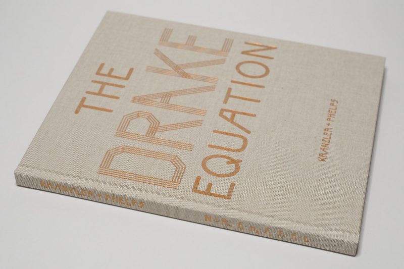
Paul Kranzler and Andrew PhelpsThe Drake Equation ostensibly focuses on the intersection of just that, the speculative and the extremely expensive experiment, in the form of said equation and radio telescopes in a region of the United States, respectively. To the layperson, the Drake Equation looks very much like what you’d expect from the sciences — a bunch of letters stringed together, with various of them only differing in the subscripts attached to them. It’s a real equation, but that doesn’t necessarily mean it’s particularly exact. Turns out that depending on your assumptions you’ll find that the number of other civilizations roughly similar to ours in the Milky Way ranges from none to millions. In other words, it’s astronomy.

If you wanted to find out if there are other civilizations roughly like ours “out there,” all you have to do is to, well, listen (especially given that space travel is currently no option). “Roughly like ours” is part of the equation: you’re interested in civilizations that might not look like us, but that have reached similar (or possibly higher) levels of technology and that are now infesting their galactic neighbourhood with re-runs and/or re-makes of, let’s say, Roseanne, transmitted via electromagnetic radiation. As far as I know, no such transmissions from other civilizations has reached us, yet, so as of now, we’re stuck with ours.

Speaking of Roseanne, the particular location where some of the antennas used for the detection of those transmissions are located, is Trump country (parts of the Virginias). As it happens, radio telescopes (as these antennas are called) are extremely sensitive instruments that you want to place somewhere where there isn’t a lot of human-made background noise going on. Human background noise also is a problem for optical telescopes — there’s such a thing as light pollution. The United States’s National Radio Quiet Zone was established as an area where scientific and military research can be conducted: electronic transmissions of all kinds are strictly limited. People with electromagnetic hypersensitivity also have become attracted to the area (there is no scientific basis for this “illness,” and it’s not recognized by the medical community).

In a nutshell, this particular area would appear to be a possible gold mine for photographers. In my years of teaching, I have been able to observe guest critics’ eyes light up when presented with stories or pitches, and here’s one that sounds like a jackpot. “I mean come on,” I can just hear a certain photographer exclaim, “that’s such a great story!” And it is. What makes the story so interesting, though, isn’t all that stuff around science (another thing I learned is that photographers love scientific ideas — the less they understand, the more attracted they are) or the Trump country aspect (photographers love “real folks”) or the illness that isn’t really an illness (“How would you know, though?”).

It’s the fact that pretty much none of what makes this story interesting can be photographed. That’s why I love the idea: photography can be great when it attempts to work around something that can’t be visualized, when, in other words, the viewer’s imagination is made to contribute to the overall experience. That is also how the work is able to expand beyond its basic parameters, to speak about larger underlying topics.

Who most of the people portrayed in The Drake Equation are is not made clear throughout the book (there’s a short index in the end that identifies a few, though, and the hunters are easy to spot, too). I quite like it that way. It’s simply such a strange mix of people meeting in this remote area, and they come to stand for the forces that are currently pulling apart the country at large: those trusting in facts against those only trusting their own beliefs (however misguided those might be), with other quite pressing issues simply being absent (whether it’s race, struggles over gender, etc. etc.). Out of sight, out of mind? Not so!

This is a pretend world that it completely out of place in the realities of 2018. Yet it struggles mightily to be the “real” world, with its faux adherence to traditions that on their own come with a lot of problems that aren’t widely acknowledged (for example a white working-class culture that has never acknowledged its racism, expressions of which have been littering American history, most recently in Charleston, VA). The more I look at this book, the more political it becomes.

Collaborations between two artists are rare. Given what they have achieved here, I’m hoping there will be more work made by Paul Kranzler and Andrew Phelps. And the publisher, Berlin based Fountain Books, also is establishing itself as quite the force (I will review another one of their recent books over the course of the next weeks). So here’s a book that deserves to be seen widely.

The Drake Equation; photographs by Paul Kranzler and Andrew Phelps; essay by Alard von Kittlitz; 120 pages; Fountain Books Berlin; 2017

Rating: Photography 3.5, Book Concept 3.5, Edit 3.0, Production 4.0 – Overall 3.6