Butterflies

Article main image

Over the course of the past decade, the idea of the narrative-driven book has become one of the main ideas behind photobook making. With time, it has become such a fad, though, that I now encounter more and more photographers who ask me whether they need a narrative to make a book. My response almost inevitably combines a mix of utter shock and sheer delight: no, you don’t. Most photography does very well without a narrative.

While it’s an art form in itself to create a well-made book with a smart narrative, it’s actually just as difficult to make a book that doesn’t have one, for the cases where a narrative would not be in service of the underlying body of work in question. In fact, I’ve now come to find myself drawn to books without a narrative, given that these days narrative-driven books too often end up being exercises in being clever (often with unnecessarily gratuitous graphic-design gimmicks added on top).

Without a clear narrative, which does the job of guiding a viewer/reader though a book and which often (but not always) serves to keep them glued to what they’re looking at, you have to be able to have your audience understand the basic idea — however clear or fuzzy it might be, while preventing them from jumping ship, from, in other words, putting the book aside halfway through.

This can be particularly difficult when the idea or topic is broad and when the audience will have to bring patience to the book. In the context of an image-centered book it’s easy to not be aware of this fact: books require an investment of time and mental energy by their viewers/readers. That investment can be relatively small, or it can be considerable.

I think one of the biggest challenges for many artists is to embrace the idea that a viewer will have to invest time and energy when they look at a book. This is not any different than making a movie that lasts four hours, is complex, and avoids trite Hollywood conventions. As an artist, you’ll have to have the confidence that there will be people who are willing and able to invest the time and energy. Those people are your audience.

Photographed in Japan, Silvia Pogoda‘s Butterflies is a Stimmungsbild — there is no good English translation for this German word that combines Stimmung (mood) with Bild (image, whether abstract or concrete). Through a large variety of imagery — some black and white, some colour; some abstract, some concrete; some close, some far away — the book conveys the mood of something that is hard to define, yet relatively straightforward to experience when leafing though its pages.

Much like any Stimmungsbild, this one doesn’t reveal itself so easily. As a viewer, you can’t look out for it — instead, you will have to experience it. With every exposure to the book — it’s a book that begs for multiple viewings — the feeling becomes stronger and stronger.

In a nutshell, this is how non-narrative photobooks often work: in each of their pictures, they hint at the larger feeling, a feeling that needs to get built up by a viewer who trusts the book enough to be able to give it their full attention.

Thus, with Butterflies a viewer is thrust into a world that on the surface looks Japanese (in particular through the faces of people depicted in some of the photographs), but that feels familiar to what one might have experienced in one’s own life. There is a mix of joy and sadness caused by the impermanence of things, by the fact that every moment, however mundane or beautiful it might be, is not going to last forever.

The book’s makers themselves appear to struggle with what they have on hand: “It is also a story about beauty and its degradation, and the beauty of degradation.” (quoted from the publisher’s page) Unfortunately, words are made to appear throughout the book, starting with the cover. I don’t feel these words do the book much of a service. For me, they come across like sentiments one might find in a fortune cookie.

There is, of course, that perceived need to add words to a visual book — something for people to grab on to. But this temptation must be resisted where it will lead a viewer astray or where it might cheapen their experience. (Alternatively, add some words that don’t help the viewer at all and make them think about something related, but seemingly completely different.) A Stimmungsbild works because of what it does on its own. Trust your viewers to pick up on it, while demanding from your viewers that they will do the work necessary to get there.

As an object, Butterflies is a handsome production with a modest size and a deft choice of paper: the paper allows for just enough details in the printing, while also contributing to a sense of dreaminess (for a lack of a better word). Its weight and tactile qualities contribute much to the overall experience.

Butterflies; photographs and texts by Silvia Pogoda; Wszyscy Jesteśmy Fotografami; 2021

Rating: Photography 3.5, Book Concept 3.0, Edit 2.0, Production 4.0 – Overall 3.3

The Enemy Is Us

Article main image

It’s far too early to summarize what exactly went wrong with the war in Afghanistan (assuming that that’s even a good approach to the issue). However, it’s not too early to note that the media played a huge role in the war. In his newsletter, Judd Legum called out what he termed The media’s systemic failure on Afghanistan. You will want to read the piece.

If you’re curious what the US government really knew about the situation on the ground, read What We Need to Learn: Lessons From Twenty Years of Afghanistan Reconstruction (links to a pdf). This is the 11th report the agency wrote, and you can understand the events of the past weeks a lot more easily.

It’s not clear, yet, whether the end of the war will trigger discussions about the role photography has played to communicate its course or meaning. These kinds of discussions aren’t new, yet they deserve to be re-visited in light of the past twenty years.

In fact, war photography can look back to a history that’s long enough for it to have spawned its own secondary literature. We have basically known that it doesn’t work for quite some time.

The photographers who go out to photograph wars know that the actual experience of being in a war zone cannot be communicated with pictures. The people who look at photographs of war now know very well that war photography also doesn’t do much for or to them. It’s debatable to what extent war photographs have shaped the public discourse.

Some of the finest photojournalists and photographers went to Afghanistan and risked their lives to take pictures, only for us, as viewers essentially knowing barely more about the country, its people, and the war than 20 years ago. I don’t see this as a photography failure because the pictures these men and women brought home never existed in a vacuum. They became embedded in the media whose corporations commissioned them.

“The single biggest mistake that a photographer can make,” Philip Jones Griffiths once said, “is to believe in the profession, to believe in magazines and newspapers. When that happens, you have already failed. One must work first and foremost to satisfy oneself.” (quoted from: Interview with Philip Jones Griffiths, by Geert van Kesteren, Brigitte Lardinois, and Julian Stallabrass, in Memories of Fire: Images of War and The War of Images, ed. Julian Stallabrass, Photoworks, 2013, p. 68)

The main point I will make in the following boils down to this: while the media have largely failed to provide a meaningful picture of the so-called War on Terror (in part because of their own complicity in it), independent efforts by a number of people (photographers, critics, artists) have resulted in a number of books that managed to achieve two things. First, they each advanced the form of the war photobook a lot further. Second, they each embraced a paradigm shift that centered the voices of those taking (or using) the pictures. The second aspect will become more clear in the following.

In parallel to twenty years of war, another reality has emerged that in the West is slowly, yet steadily being accepted by more and more people: Western photojournalists can only speak with authority about their own countries and cultures — unless they embed themselves with local communities for a long time, picking up the language etc.

Such an approach runs counter the dominant parachute-in approach still used by most photojournalists. What’s more, it can’t be the presumed task of a Western photojournalist to speak about other people’s experiences — when those people are fully capable of doing it themselves (there are, after all, non-Western photojournalists, right?).

This fact aligns with the second of my observations of today’s cutting-edge war photobooks: those who take (or use) the pictures are being centered. This takes on a variety of forms.

Maybe the most pronounced aspect is that photojournalists from countries that waged the wars have put their own countries front and center. To some extent, this already happened during the Vietnam War. But it now has become vastly amplified, as visual propaganda is openly critiqued.

War photobooks now contain pictures taken far away from where the bombs are falling: there are pictures of ordinary citizens going about their business, and, of course, soldiers coming home from the war, often heavily physically and mentally scarred, are being shown in the midst of a society that can’t understand what it did to them (it’s worthwhile to note that the latter is a recent addition in the world of photography; the world of literature is filled with examples that are a lot older).

The change was driven by a small number of people who believed in themselves and their mission, working with the likes of The New York Times where necessary but ultimately shaping their own message: war photography’s real goal is not to pretend that violence happening far away can be objectively displayed. Instead, the goal is to dive deeply into the heart of our own involvement in the mayhem.

Here, I want to single out a few books that I feel have each not only pushed the conversation about the war photobook a lot further, but that also have provided unprecedented insight into the past twenty years. Where I reviewed the books on this site in the past, I will link to the article. I should say that I have not re-read these articles. It’s possible that parts of my thinking might have changed or evolved. But I am pretty certain that my main view of the books’ merit hasn’t changed.

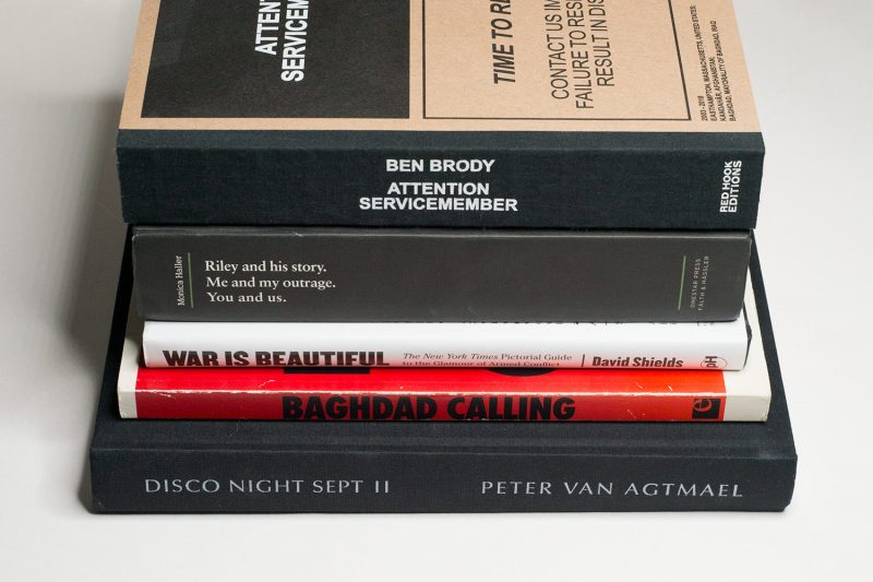
David Shields’ War Is Beautiful is subtitled “The New York Times Pictorial Guide to the Glamour of Armed Conflict” (reviewed here). For the book, Shields selected photographs that had been featured prominently on the front page of the newspaper (that had played a critical role in selling the invasion of Iraq — it later issued an apology of sorts). He then sorted the photographs into a number of categories that were based on larger ideas expressed through them.

In spirit, the book operates along the lines of Roland Barthes’ Mythologies. The argument basically is that the photo editors of the newspaper select photographs to conform with specific ideas that center on their underlying US ideology. Even if I would have organized the material differently, the basic idea is very solid, and it provides considerable insight into the uses of photography on the cover of the most prominent US newspaper.

Shields’ book is important because it is intended to trigger a critical dialogue about the uses of pictures and how these uses often reflect an ideology more than what’s actually on view in them (if you’ve read my book Photography’s Neoliberal Realism you know I’m using a similar approach there). But it indirectly also makes us gaze into what historically has been an area of contention, namely newspaper editors working with pictures in a way that possibly is in conflict with the photographers’ original ideas.

Geert van Kesteren’s Baghdad Calling unfortunately has now become one of those out-of-print rare books (review here). Much like War Is Beautiful, it attacks the conventions of photojournalism. The book features a very large number of photographs taken by Iraqi citizens that had been forced from the country during the worst of the violence there. In addition, their voices are given: the photographs feature descriptions of what’s on view in the photographs.

The book’s brilliance lies in the fact that it’s Iraqis telling their stories through their own pictures. Van Kesteren added a few of his own photographs, depicting the Iraqi refugees in their temporary homes in neighbouring countries. It’s an incredibly effective book that shows the power of photography, especially when it’s used for purposes that we now see on social media.

Monica Haller‘s Riley and his story operates in essentially the same way as Baghdad Calling. Here, though, it is a large selection of photographs taken by a friend of Haller’s who served as a nurse at the infamous Abu Ghraib prison.

At nearly 500 pages, the book features an onslaught of photographs and text, exposing the daily life of any one of the many “foot soldiers” caught in the war’s huge meat grinder. The sheer repetitiveness of the imagery is mind numbing: certain scenes just repeat over and over and over again.

Riley asks much of the viewer/reader. But then, if there is any expectation on their part to understand more about war and what it might mean, I think inevitably, a book will have to expect much. Our understanding cannot be had cheaply, on the go.

Much like Haller’s friend, Ben Brody was a soldier in the US army. Unlike Riley, Ben was an army photographer, though, and he later became a photojournalist to go back to the war zones repeatedly (full disclosure: Ben is a former student and now friend of mine). These facts make his work interesting: he has seen the machinery of war first from within and then from without, a type of knowledge that many photojournalist don’t have.

Attention Servicemember dives deep into many aspects of the wars in Afghanistan and Iraq, some of which a viewer might be familiar with from regular photojournalism, but much which had eluded war photobooks until this one came along (reviewed here). Ben’s writing in the book is one of the most effective pieces of text I’ve ever come across in a war photobook — the book is required reading even just for that.

With the book, Ben blows huge holes into the standard narrative of the so-called War on Terror. It always was a farce more than anything, a farce that unfortunately cost way too many lives that shouldn’t have been lost.

Much like Ben Brody, Peter van Agtmael went to document the war as a very young man. But unlike Ben, he stayed on the outside, becoming a photojournalist.

If any photojournalist has produced the photojournalistic photobook about the wars, it’s Van Agtmael. In fact, there are two books, which are equally brilliant. There’s Disco Night Sept 11 (2014; reviewed here — trigger warning: some people might find the article’s main image — part of the book — upsetting), and there’s Sorry For The War (2021; reviewed here).

Both books feature a lot of photographs from the war zones. In both books, Van Agtmael also describes what people used to call “the home front”: scarred veterans are going home, government officials are trying to sell the war, popular culture arranges itself around an increasingly militarized society. Disco Night is closer in spirit to the classic photojournalistic book. With Sorry, the viewer encounters a photographer and citizen who is in deep despair over the ongoing folly.

I’m not going to argue that any one of these books is more essential than all the other ones. Ideally, a full set would be present in every US household so that people could see the reality of the war they paid for with their tax dollars and possibly voted for (let’s remember that in the Congress there was exactly one person, Representative Barbara Lee, who voted against the war in Afghanistan).

Of course, that idea is elusive and unrealistic. My main point here is not that more people should see these books — they should; but it’s their decision. Instead, here I wanted to stress two facts. First, the war photobook has evolved enormously over the past 20 years. This is due to the efforts of people who either were outsiders or who decided to ditch the conventions of their profession (photojournalism), to try to get closer to an understanding of these wars.

Second, in their own ways, they all realized that looking at their own underlying ideology needed to be part of that endeavour. They also realized that by construction, the standard model of photojournalism is incapable of doing what it pretends to be doing, because of its insistence on its own otherness, its own not being/becoming involved.

I suspect that there will be other books coming out about the wars. But it’s pretty amazing that we already have seen so many excellent war photobooks that cover the US-led wars over the past 20 years.


If you’ve enjoyed this article, you might enjoy my Patreon: in-depth essays about and videos of books that cover my own personal response as much as the books’ individual aspects.

Also, there is a Mailing List. You can sign up here. If you follow the link, you can also see the growing archive. Emails arrive roughly every two weeks or so.

Speak The Wind

Article main image

In the mid- to late-1960s, Eikoh Hosoe and butoh dancer Tatsumi Hijikata visited a farming village in northern Japan, located in the area where they both had been born. “One thing I remembered from my days as a kid in that countryside,” the photographer wrote much later, “was a sinking feeling we sometimes had, as though something terrible would happen if we dared to venture outside after dark. The fields seemed to be full of ghosts and demons–some of them romantic, some of them awful.” Kamaitachi was the name given to the demon (yōkai) that was the manifestation of the sharp winds: it would inflict cuts on people. (Hosoe quoted from the 2009 afterword to the re-release of Kamaitachi [unpaginated]).

In their artistic collaboration, Hijikata turned into a kamaitachi for Hosoe’s camera, rushing through the landscape and inflicting himself on the mostly unsuspecting villagers who, with the exception of children, appear genuinely puzzled by what’s going on. “Later on,” Hosoe wrote, “I felt I probably owed an apology to those people, who must have been surprised when these two young men appeared out of nowhere and inserted themselves into their daily lives and rituals, snatching babies from cribs and shouting over their shoulders, ‘Sorry, we’re just borrowing your baby for a few seconds!'” (ibid.)

Even though Hosoe and Hijikata’s Kamaitachi and Hoda Afshar‘s Speak The Wind visually have nothing in common, I immediately connected with the Japanese artists’ work when I looked at this new book. That human beings are connected to the lands they live in through a more complex relationship than merely the extractive one Western thinking has established throughout the centuries is still widely acknowledged, even as this takes different forms in different locales.

In the West, these types of engagement with Nature itself are usually couched in dismissive or at least somewhat belittling terms. “On the islands in the Strait of Hormuz,” the publisher’s text about the book begins, “off the southern coast of Iran, there is a common belief that the winds can possess a person, bringing illness and disease. The existence of similar convictions in some African countries suggests that the cult may have been brought to Iran from southeast Africa through the Arab slave trade.” However irrational such beliefs might seem to Westerners, describing them as a “cult” seems unfortunate to this writer.

Much like in Kamaitachi, locals appear in Speak The Wind. But the Japanese book’s stark black-and-white expressionism is replaced with a style of photography that is more in line with the medium’s documentary tradition. Furthermore, no added shenanigans are inflicted on the locals by an artist personifying the spirit in question. Instead, their own words and drawings become part of the work itself. For sure, these differences reflect the overall change in sensibility that has happened in photography in the roughly 50 years that separate these two books.

But of course, these differences result in a very different engagement with the two books. Kamaitachi is visually very visceral in the sense that Speak The Wind is mostly not. The former is easier to engage with than the latter, which unfolds much more slowly and delicately. While this in part reflects the fact that the very male in-your-faceness of photography is thankfully on its way out (this is the subjective part of this sentence), it also shows how very similar ideas can be approached in very different ways by different artists.

This is where things get interesting, because the two books not only connect two different cultures far apart on the globe, they also both demonstrate how photography can be art: not by looking like art (which has no substance beyond the showrooms of commercial galleries), but by evoking feelings in viewers who might not have much in common with what they’re made to face.

Speak The Wind depicts a land that looks hostile to human life, with its harsh rocky environment in which ochre tones dominate. There is, however, a surprising beauty to the land that Afshar manages to tease out skillfully with her camera. Time and again, photographs of rocks or sand start to simmer with colour, the range of which extends far beyond what one at first perceives as a desert-like monochrome.

There are many photographs of human figures in the book, some of them portraits, others not. How or why I’m making this distinction will become obvious to anyone looking at the book: with a camera, a person can be made to stand for her or himself, or for the rest of us or their community.

There is no story other than the belief that the land and its wind are home to non-human presences. For a book maker, this is a blessing — no need to worry about a beginning and and end, and a curse — all the more worry about a beginning and an end: how do you even allude to something if that’s all you’ve got to do? Afshar does this very skillfully, by building up the idea in such a way that it reveals itself.

Throughout the book, sections of colour photographs alternate with ones in which the pictures are black and white. In the latter sections, variations of the same scene appear. More often than not, these variations do not conform to the page structure, having two pictures appear next to each other in seemingly random locations.

In addition, parts of the black-and-white sections employ pages that were not trimmed at the top, allowing a viewer to peak into a page. There, the viewer finds text: narrations of dreams, and there are drawings of specters and ogres. Here, they are, the demons perceived by the locals, narrated and depicted by their own hands.

Photography’s real strength is to speak of that which is pointed at outside of its own frames. Speak The Wind forcefully drives this idea home, regardless of whether we want to think of the beliefs of the people depicted therein as a cult or as an expression of a different, I’d argue: deeper, connection with the land they live in, a connection that Western thinking has eradicated in many parts of the world. In light of the enormous number of disasters that have been striking this planet just this month — wildfires in many different parts of the world, floods, earthquakes, many of which are the indirect consequence of our own ravaging of this planet’s resources, re-thinking how we deal with the only world available for us to live in sounds like a good idea to me.

Seen that way, if as viewers we allow ourselves to look beyond what separates the people in this book from us, we might pick up more of what the world around us has to tell us.

Here then, the biggest difference between Kamaitachi and Speak The Wind reveals itself. With its very masculine and now dated looking vitality, in the former two artists forced themselves onto the world. With its delicate and accepting grace, in the latter we find an artist listening to the world. For sure, we can use a lot more of that.

Recommended.

Speak The Wind; photographs by Hoda Afhsar; essay by Michael Taussig; 168 pages; MACK; 2021

Rating: Photography 4.0, Book Concept 4.0, Edit 4.0, Production 4.0 – Overall 4.0

Soft Copy Hard Copy

Article main image

Please note: The author generated this text with the help of GPT-3, OpenAI’s large-scale language-generation model. Please refer to the notes at the end for more details.

The surfaces of any modern city are a hodge podge of mass-produced materials, set against each other without regard for what sits next to what else. This is done this because it’s cheap. The problem is that it doesn’t look good. People don’t know what to make of it. This is why everything has to be branded. In the same way that the modernists thought that a city could be designed by a vision, the thinking now is that a city can be branded. The idea is to create a city that looks like a designed object, but it’s done in a way that’s controlled by the marketplace. New buildings are a lot like new cities: they look good, but they don’t feel good, resulting in a city that looks good, but feels bad.

The modern city is thus defined by its surfaces, by the accumulation of materials on top of them, and by their erosion. These traces of human activities are ubiquitous, and they are familiar. They are thus easy to miss, easy to overlook. But they are not invisible. They can be analyzed, studied, recorded, and, through the reproduction of their forms, re-imagined.

To describe Stephan Keppel‘s Soft Copy Hard Copy as a re-imagination of Amsterdam is apt. There is very little in the book that will remind a viewer who is familiar with the city of what she or he might remember. There is no great canal, no Anne Frank House, no zoo, not even a canal ring. A book is a fantasy, it can be whatever an artist wants it to be. And Keppel’s Amsterdam is a city of the 1960s, with a touch of the 1970s. It’s all surfaces and materials. It’s a city that looks like it’s made of cheap plastic, cheap wood, cheap stones, all of them grimy.

The images depict a built environment made out of materials, components, platforms, and other things that can be found in a hardware store or on the street. Keppel’s book uses photos of buildings as a vehicle to talk about the city and culture that produced them. Soft Copy Hard Copy is about the creation of buildings, their architecture, and construction. It is about neglect, in particular the kind we don’t think of as such: opting for cheap materials, for layering of materials upon materials, for doing the job and just the job.

After all, the marketplace’s cheapness of the materials has resulted in a cheapness of our own ambitions on the job. This is unfortunate, because the motivation for the cheapness of the materials is the perception that quality isn’t worth it. Ultimately, though, the marketplace is just responding to our demands. So why don’t we demand better materials? It’s because we’re under pressure to be cheap. But this causes a big problem. Cheap building materials don’t last. So they’ll need a lot of maintenance before long. And then they’ll need even more maintenance after that. And so on and so on and so on. It thus becomes a feedback loop of cheapness, cheapness on top of other cheapness. It’s a downward spiral, and it’s why buildings today are increasingly more expensive to maintain.

For an artist, the cheapness becomes a fodder, though. Keppel photographed and accumulated the materials, extracting forms and shapes. One might imagine him expressing his ideas as follows: “I think in all my work, the collage is very important. I like to play with different materials, different shapes and forms. It’s about the materiality of things, that you can create something new with old things. And I like that.” (This sentence isn’t an actual quote by the artist; it’s something the AI created. Given the experimental nature of this article, I decided to keep it, while being transparent about how it arose. — JMC)

Furthermore, depictions of materials and patterns become their own materials, as Keppel scans and photographs instruction manuals, books that showcase samples of materials, and his own photographs of surfaces. Much like in his book about New York City, the result has very little to do with the Amsterdam a visitor or even a local might notice. An index at the end reveals the sources of what to a viewer might come across as a random selection of forms and surfaces.

This is a book the viewer needs to let wash over themselves in order to fully appreciate. It’s a book that rewards patience. It’s a book that will make the viewer want to re-examine the places walked past and the things passed by on a daily basis. It’s a book that will get them thinking about the things they see every day. The book could be described as an “exquisite corpse,” a book in which each page is assembled from images contributed by various artists who are given only a few guidelines and no instruction — except that all of those artists hadn’t been told where and how their “work” would be used.

It’s also a book that is likely to confuse many viewers, leading them to ask themselves “why am I looking at this?” And, yes, what is there to see in these grimy surfaces and materials? Sure, we can see things like the marks left by the someone’s hand, but is this really that interesting? From the perspective of an art critic, the answer is yes. But from the perspective of a lay viewer or someone casually interested in photography, it’s not clear. What seems clear is that many people are going to find the experience of looking at these photographs to be a very unpleasant one. And this might be the key to the experience. The images often are visually unpleasant. They’re full of dirt and grime, of neglect and cheapness: the dirt and grime, the neglect and cheapness of our lived environments.

In part, this work is critical in its attempt to challenge our expectations for how photographs are supposed to look, and it challenges us to look at our world in a different way. But at the same time, there’s not much here that’s political, or even all that provocative. Indeed, this work seems almost apolitical in its refusal to engage with its viewers. And yet if this work isn’t political, that doesn’t necessarily mean that it isn’t political. As noted above, one of the central elements of this work is its desire to frustrate and put off its viewers. And this can be seen as political (or at least anti-political) in that it refuses to pander to its audience. It refuses to provide them with easy answers or eye candy. Instead, it provides us with something much more difficult: a deeply frustrating experience that may well leave us feeling like we’ve wasted our time by looking at it.

If we indeed have wasted our time looking at these pictures (which, to make this clear, I don’t think we have), then that means we’re wasting our time looking at our lived environments. Where does this leave us? It is exactly that question that I believe Keppel wants us to deal with. There are no easy answers, but that is the point of the book. If we’re going to be living in these environments, then there needs to be some understanding of what they are. Whether that understanding comes from the designers, the builders, the artists, or the critics is another question. But to not have that question being asked is the problem in the first place. To not have that question being asked is to be ceding the ground to those who will ignore or abuse it.

To finish, I think it’s important to note why I care about this book. I’m a critic and a writer. I care about how people live and how they think about how they live. I’ve been a critic for so long that I’ve had to learn how to be a critic of myself. I care about these things so much that I do them for free. I care about these things so much that I’ve written a book on them and am currently working on another. I care about these things so much that I’ve failed a lot and suffered a lot of rejection as a result. I care about these things so much that even if none of it ever pays off professionally, I’ll keep doing it because it’s important to me and my family and my friends and my colleagues. In short, this book has made me better at what I do and it will continue to do so until it becomes irrelevant or until I’m dead.

Soft Copy Hard Copy; photographs and images by Stephan Keppel; 240 pages with poster; FW:Books; 2021


Production notes: As described in the very beginning, this article was generated in part with GPT-3, OpenAI’s large-scale language-generation model (using the “Da Vinci” engine). “Generative Pre-trained Transformer 3 (GPT-3),” notes Wikipedia, “is an autoregressive language model that uses deep learning to produce human-like text.” In a nutshell, the algorithm gets trained with existing text (written by humans), and it then learns how such text operates, to be able to generate it on its own.

Given that GPT-3 essentially creates “copies” (however loose they are) of other materials, I thought it would be perfect for this particular book. That said, as a reader, you will want to keep the experimental nature of this article in mind.

GPT-3 operates on the basis of prompts. You supply it with (a) sentence(s) (or even just a word, which I didn’t do). And it will then generate text based on that (those) sentence(s). For the most part, I did this in an iterative manner. I would first write a sentence and let the machine generate text. My sole criterion for whether to accept or reject the result was based on whether it made sense in the context of the book. For example, whenever the AI started writing about something very different, that text was rejected (at times, the AI would produce what essentially looked like parts of standard press releases by gallerists or museums).

Once there was text that made sense as a continuation of my prompt, I would edit the text to make its style and voice fit my own, cutting out smaller parts that wouldn’t fit (or that were simply repetitive or superfluous), and at times adding little bits. Depending on how much text I ended up with, I would use the longer text as a prompt in its own right and look for further output. In general, a paragraph or a couple of paragraphs are the typical outcome of any such iteration. The AI would move too far from the book/topic afterwards. I those cases, I started a new paragraph with a new prompt.

I rejected all text that I felt would do a disservice to the discussion of the book or artist in question. Even though the AI attempted to insert first-person narration throughout, I removed all such parts (in part because their logic didn’t make any sense), with one exception that is very easy to spot.

In the end, this article effectively is a montage of iteratively constructed parts of AI-generated text, each one of which was initially prompted by me.

Before I started, I made the decision not to mark which parts of the text were written by me and which parts were generated by the AI. The idea of my editing was solely to make the text legible and not confusing (avoiding abrupt changes in narration, where such changes would simply be confusing). In the final text, about 75% of the text are text produced by GPT-3.

The generation of this article resulted in costs of $0.70 (for the use of the AI engine).

I’m deeply indebted to Nelis Franken for introducing me to GPT-3 and for his many attempts to make me understand the logic behind it. All inaccuracies in terms of the descriptions above are solely caused by the limitations of my own understanding of the machine.

Liberia

Article main image

“As a white, Northern European photographer who had spent almost ten years of his active career in the warzones of this world,” Andreas Herzau writes, “I had a tendency to seek out the problems: casualties of war, mass graves, the damage caused by the fighting, and of course poverty. Under the guise of the well-intentioned humanitarian aim to inform and explain, we photographers travel through countries like Liberia reporting mostly on matters which are already well-known.”  These sentences describe one of the main problems of photojournalism. It is heartening to see it expressed not by a critic or writer, or by someone who found themselves in front of a photojournalist’s lens, but by someone behind the camera.

Some of the photographs Herzau took in the country in 1996 during its civil war are included in Liberia (the book; in the following, the italicized word refers to the book, the regular form to the country). About two thirds into the book, there is a section of pages printed on a different paper stock. These pages show parts of contact sheets that feature a mostly grim selection of pictures of violence and mayhem, with added colourful markings from the later editing stages. These markings form a visual form of violence in itself, such as when there is a stark red cross right over what looks like the face of a dead man in a morgue.

“At the beginning of 2020,” Herzau concludes his introduction to the book, “I traveled through Liberia once again, experimenting with looking at this country in a different way.” The photographer summarizes the pictures he took as an “attempt to counteract the cementing effect of the one-sided documentation of victims.” We might immediately note that while this goal for sure is honourable, it is unlikely to have the same reach as the ongoing “one-sided documentation of victims” that Western news media continue to produce. After all, a photobook is unlikely to reach even remotely as many people as, say, slides shows by the likes of the New York Times. If anywhere we’d need desperately need to see such a counteraction, it is there. Still, it has to start somewhere, doesn’t it?

“Always use the word ‘Africa’ or ‘Darkness’ or ‘Safari’ in your title,” Binyavanga Wainaina begins an essay originally published in Granta that accompanies the book. It’s entitled How to Write About Africa, and it includes a long list of stereotypical depictions of a continent that is home to 1.3 billion people living in over 50 countries, states, and territories, yet that in the West mostly exists as this one word: Africa. It tends to make the news only when disaster strikes (much like how, for example, South America typically only makes the Western news when and where someone acts like a dictator).

As a locale, Africa was pillaged by photography more than once. First, photography played an integral part of colonialism. Then, photojournalists descended on the continent to do what Herzau outlined (they still do). Whether or not these two are actually separate developments is debatable. But I’m going to leave it to others to discuss the topic who can write with more authority on this particular subject matter.

Either way, it seems obvious that if one wants to approach a part of the continent with a camera as a professional photographer from the West, then one needs to proceed with care. There is, after all, yet another pitfall, albeit one that also exists in many other places in the world: the dreaded cliché. Wherever you go, it’s hard to avoid photographing the clichés first.

For example, every year, there is a steady trickle of photobooks being published in Germany that reduce the United States to either a home of cowboys or the home of people at the margins. Obviously, there are cowboys in the US, just like there are plenty of people who have to live at the margins. But when the production of photography around these topics basically just serves to cement fairly superficial stereotypes (as is usually the case with these bodies of work), then that becomes a problem.

After all, stereotypes not only simplify, they also serve to disable crossing a divide that makes them arise in the first place. And stereotypes can be produced or re-produced even with the best of intentions. To be able to truly go beyond stereotypes typically requires a lot of work and time. It requires becoming embedded in another country or with another culture, which inevitably entails learning the language. It’s hard work, and whatever payoffs can be had arrive only after a longer period of time.

If you’re a tourist, you won’t get there. As a tourist, you’re a visitor. You’ll be treated well and with care by your hosts. But those hosts won’t let you see behind the scenes any more than you’d do it if someone came to live with you for a week or two. That’s why tourist photographs always look like, well, tourist photographs: you become fascinated with anything that looks different or exciting. Even when you know that photographing certain things shouldn’t really be done, there’s not any more depth to it.

This then brings me to Liberia. While there are a number of really good pictures in the book, after having looked at it a number of times, I’m not an iota closer to knowing more about the country. Instead, I know what Herzau visually responded to. There is plenty of colourful fabric, there is what I would call the African vernacular (aging hand-painted signs, decorations, and images), there are young people playing on the beach. Make no mistake, Liberia is presented as a nice looking place that looks fun to visit. And thankfully, photojournalistic disaster is absent.

But is this enough?

I’m thinking that with Liberia, Andreas Herzau solved a problem, while failing to address the problem. The problem at hand is that none of the many countries in Africa tend to get the deeper, longer-term engagement by Western photographers that is truly necessary to reveal more of their actual essence. Obviously, whether or not a Western outsider will be able to get close to that essence is for another debate. There is much to be said for photographers from the continent to reveal their own view of their home first.

Still, the problem at hand is pretty common in the world of photography: you arrive with your camera, and despite your best efforts to avoid the obvious problems, despite your best intentions you don’t get much further because you can’t or won’t look deeper. In a place like Africa, which has been on the receiving end of so much colonial violence and exploitation, such an approach can only fall short.

Liberia; photographs and text by Andreas Herzau; essay by Binyavanga Wainaina; 128 pages; Nimbus; 2021


If you’ve enjoyed this article, you might enjoy my Patreon: in-depth essays about and videos of books that cover my own personal response as much as the books’ individual aspects.

Also, there is a Mailing List. You can sign up here. If you follow the link, you can also see the growing archive. Emails arrive roughly every two weeks or so.