

You don’t really have to read the news to find out whether the stock market is tanking or not. You just need to look whether or not there are the usual photographs of distraught looking traders in the news. In much the same fashion, you can tell it’s election season in the US when you see photos of politicians pointing at people, or you see them giving speeches without a tie, their shirt sleeves rolled up. The media love a good cliché photograph. But when we think of the stock market, there is an underlying problem, namely the fact that what’s crashing cannot be photographed. All those transactions now happen inside computers, and many of the entities being traded are completely virtual anyway. A stock might have some value, which you could visualize as the equivalent amount of paper money. But futures or derivatives are entirely different beasts.
In part this might be the reason why so little photography has been done around the causes of the recent Great Recession. It’s easy to photograph empty homes, say, and it’s easy to photograph people who just lost their home, but it’s a bit harder to photograph any of the root causes. How do you photograph, let alone understand, a subprime mortgage? How do you photograph greed? Of course, the fact that it’s difficult doesn’t mean it can’t be done. A brilliant case in point is provided by The Heavens, a photobook centering on tax havens (there’s a website dedicated to it as well). The book was made by photographers Paolo Woods and Gabriele Galimberti, in collaboration with Nicholas Shaxson who wrote an in-depth essay that gives the insight photographs simply cannot produce.
The photographs in The Heavens center mostly on some of the players, plus on what one could think of the symptoms. There are images of very wealthy people, of, let’s say, post-office boxes on the Cayman islands, of buildings built but never occupied, there even is a photograph of an art collector who just bought a painting (reminding the world of art photography that it is not entirely innocent here). For every such image, an accompanying caption provides information of what the viewer is looking at (and why this actually matters). Combined with Shaxson’s essay and a series of smart and engaging infographics, the photographs become part of a larger whole that demonstrates that photography can indeed cover complex topics, topics that don’t lend themselves to easy (or cliché) pictures.
As a book, The Heavens shows how and why documentary photography can still play a vital role, especially once it utilizes all the tricks that can be employed in book form. And we do need to see work like this, for all the reasons that I outlined above — unless, of course, we’d rather not look and know where some of the money is coming from that is being funneled into the art world, where and how corporations hide their money so they don’t have to pay taxes for the services that we would like to enjoy, what kind of shadow world exists in plain view, a shadow world that time and again has severe repercussions for our own lives, whether it’s a crashing stock market, or interest rates going up or down etc.
Rating: Photography 3.5, Book Concept 4, Edit 3, Production 5 – Overall 3.9
The Heavens; photographs by Paolo Woods and Gabriele Galimberti; essay by Nicholas Shaxson; 218 pages; Dewi Lewis; 2015
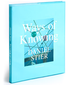
One of photography’s most glaring weaknesses can be its strength at the same time: it’s just so unbelievably straight. There’s this thing or situation, you point your camera at it, press the shutter button, and that’s the picture then, of that thing or situation. Daniel Stier makes good use of this mechanism in Ways of Knowing, a two-part publication that combines images taken in a variety of scientific environments with an assortment of essentially New Formalism-esque still lifes.
As much as I’m infinitely tired of the mostly lame tropes of New Formalism, in the context of this particular book they actually make sense. Where most New Formalism work centers on its own navel, lacking any sense of a world outside of the narrow confines of institutional photography, Stier’s pictures make use of exactly that: they’re being embedded into the context of the human quest to make sense of the world. They thus gain a faux relevance that undermines their pictorial seriousness, much like the deadpan photographs of people strapped into absurd-looking contraptions for the sake of scientific research that are shown in the other part.
Ways of Knowing isn’t as visually subversive as Andreas Meichsner‘s The Beauty of Serious Work. Instead, it’s serious and free of a sense of irony, let alone snark. But the book pulls it off regardless, in part because in this day and age, the serious often cannot run from the absurd. As insightful as the photographed situations in the scientific labs might be for their maker scientists, beyond that room things are just, well, absurd.
Whether it was a good idea to keep these two sets of photographs separate I don’t know. It was an obvious solution, for sure. Things are being made easy for the viewer. But I did find myself looking at the laboratory photographs at an increasing pace, given that seeing one after another after another etc. does get a bit, well, repetitive. So I probably would have preferred a single book, with these photographs intermixed. Of course, I’ve got to review the book I got, not the one I’d want. But I do think the one I’d want would be slightly better.
Rating: Photography 3.5, Book Concept 2, Edit 3, Production 4 – Overall 3.2
Ways of Knowing; photographs by Daniel Stier; essays by Pedro Ferreira and Daniel Jewesbury; 168 pages; Yes; 2015
I noted above how the media love a good cliché photograph. Needless to say, you might disagree. How can news photography possibly be clichéd if the events they depict have never happened before and are unlikely to happen again? This is where we could start talking about form and content, about what a photograph describes in a visual manner and how it does that.
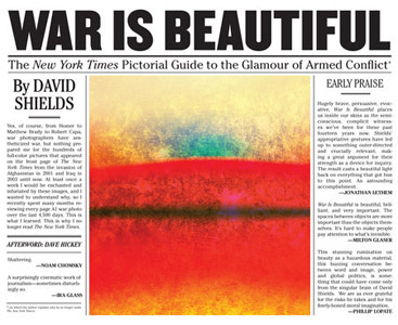
David Shields has just done that job, the job of looking at pictures, specifically war photographs used on the front page of The New York Times, classifying them not according to what they show, but how they do it. The result is War Is Beautiful, whose subtitle The New York Times Pictorial Guide to the Glamour of Armed Conflict gives you an idea of what to expect. I’m sure you wouldn’t necessarily expect to see war portrayed in a glamourous way on the front page of what is widely seen as the United States’ most relevant newspaper. Can there be such a thing, especially given the photographs in question were taken by a wide selection of photojournalism’s finest practitioners? The answer is not only affirmative, it is also deeply troubling, given the consequences.
The photographs in War Is Beautiful all center on the wars in Afghanistan and Iraq (in the latter case, the newspaper played a considerable role in the country’s rush to war). Shields organized them around themes or topics, in part based on what they show, in part based on how they do it. Seen in these categories, the viewer is in for a shock. What at first might look like almost bizarre categories — “Nature” or “Playground” or “Beauty” — quickly make a lot of sense. And organized this way, the selection mechanisms that made these particular photographs front-page worthy indeed is being revealed.
Given we love to ignore the many different invisible hands that handle photographs before we see them in the media, War Is Beautiful shows us what those hands do. They show us what many photographers know, namely that it’s one thing to bring the pictures, but it’s quite another to get them published, especially if what is depicted (or how it is depicted) won’t sit well with those who do the publishing. While the book singles out The New York Times, making it clear how the paper is anything but the disinterested entity it loves to pretend it is, the same exercise could be done for many other news organizations.
Photographs don’t come with meanings, we give them meaning through their use. For us to be better “consumers” of the visual diet we are being served, we need to acquire the skills that Shields displays here. For any visual-literacy class, War Is Beautiful could serve as a textbook. And those not going to school any longer might still want to have a peek.
(not rated)
War Is Beautiful; photographs by various photographers; assembled by David Shields; essay by Dave Hickey; 112 pages; Powerhouse; 2015
Ratings explained here.