4100 Duisburg

Article main image

Roughly halfway through Laurenz Berges4100 Duisburg (available via this site), there’s a photograph of a man sitting at a table in a somewhat overgrown and disheveled looking backyard. Everything in sight is covered with layers of patina: the walls, the table, the chairs — the kind of generic white plastic chairs that are ubiquitous all over the world, even the plants, and the man himself. To say that he looks weary would be an understatement. He looks lost. If he has seen better days, then those are now relics of a very distant past.

Ordinarily, such a photograph would be a real bummer in most books. But here, it actually provides a sense of respite, given a relentless onslaught of images depicting an utterly brutal environment. None of the pictures actually show architectural Brutalism — named after the gratuitous use of raw concrete. But the houses on display were all built with such blatant disregard for human life that it’s very tempting to think of another form of brutalism: the erection of houses or buildings that are little more than containers for human beings — architecture itself giving physical form to an unforgiving, inhumane ideology.

The one thing actual Brutalism and this one have in common is that their surfaces don’t age well. I’m personally not a big fan of raw concrete — it’s a disgusting eyesore as far as I’m concerned. But concrete might be the one building material whose patina makes it look even shittier with time. The same is true for the buildings shown in Berges’ photographs: they all have seen better days, even though that term is relative, of course.

The building shown on page 137 (near the end of the book) might be a good example. Its squat shape makes it look as if it wanted to recede back into the ground. It could have more windows — there’s ample space, but it doesn’t. You just know that its basement — where tenants might store potatoes for use in winter — is perpetually chilly and damp. There’s the obligatory hedge running by and the equally obligatory tree out in front. There must be a list of chores in the main entrance where tenants are told when it is their term to sweep the stairs.

You don’t look forward to coming home to any of the locations shown in the book because of anything other than the fact that home is where your dwelling is. That was the main idea by the city planners who built such places: people were seen as more or less expendable entities, whose utility was exhausted by whatever their jobs might be. Outside of their jobs, they were of no interest to anyone — which, of course, often resulted in very strong communal activities related to the local football (US lingo: soccer) club and to going to the pub.

There was an instant pang of recognition when I saw the book’s title. The number refers to the old West-German zip code (which after reunification was replaced by a five-digit version). Duisburg itself, the city, I have never visited. But I remember hearing of the football team.

Football was — and still is — a big deal in Germany. I was never a fan (in general, I tend to stay away from anything that’s tribal), but it was impossible not to hear a thing here or there. With any of the clubs from the area — in principle it’s one quite large city that happens to be divided into many smaller ones, there would always be talk of the connection to the working class and to the various industries there.

I’m sure Duisburg has its attractions (even though I wouldn’t know what they actually are), but it’s not a location that features very high on the list of touristic targets in Germany. In effect, it could stand in for any of such locations that can be found in many countries in Europe and with some modifications beyond.

If Duisburg has its attractions, for sure Berges didn’t seek them out. Instead, he took his camera to these neglected working-class areas where every building looks like every other building, with the only difference provided by when they were built. He then trained the camera on the patina, the detritus, and unfortunately only very occasionally on people. In these areas, the difference between patina and detritus is often not that clear (art lingo — ugh: liminality), and that makes for good pictures.

That said, there is only so much that can be expressed with a picture of, say, a set of broken buttons that ring people’s doorbells. Unfortunately, in the edit, there are a bit too many of these — I feel as if the book would have been a little stronger with a stricter edit.

This misgiving aside, 4100 Duisburg speaks of how little human beings actually matter to those who have either the means or the power to build such environments. They might be a century removed from the completely unsanitary tenements that workers had to dwell in before. But they’re also a century or two removed from the environments that, one can hope, will provide truly meaningful accommodations for vast parts of society in the future (assuming global warming hasn’t made life on Earth more or less impossible).

I don’t know whether anyone not born into the West Germany that’s depicted in the book will get the same immediate reaction from the book. But I think once a viewer casts aside the impulse to attribute to what’s on view to Berges’ training at the Düsseldorf Academy, the universality of what these pictures talk about will become apparent. Capitalism is cruel, even when it is tempered by the German social-democratic model (which since reunification has been massively eroded).

That’s all right there in these pictures, in every grimy surface, in every bit of shitty patina layered on top of decaying building material. In principle, human beings have all the rights in the world to live a more meaningful and beautiful life, but they’re not getting it — and it really doesn’t matter whether it’s an Alfried Krupp or a Jeff Bezos accumulating the wealth instead.

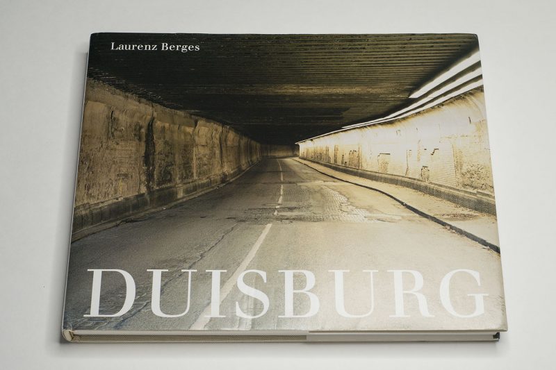
4100 Duisburg, photographs by Laurenz Berges; essays by Heinz Liesbrock, Thomas Weski; 160 pages; Koenig Books; 2020

Rating: Photography 4.0, Book Concept 3.0, Edit 2.0, Production 5.0 – Overall 3.7

Colby Hutson’s Compassion

Article main image

I first came across this photograph in a cropped version. The interface on my smartphone Twitter app merely showed the bottom, the message that someone with hands in gloves was holding. There’s this idea that there are too many photographs online, and they’re all scrolling by — I have never subscribed to it. If the idea were true, I would have just scrolled by, but I didn’t. I read the text, and I then clicked to see the full tweet.

The full tweet showed the photograph in its original version. There was no information about its source or about who was being depicted. Clearly, what I was looking at was some anonymous nurse holding up a sign to communicate with his peers (I thought I could tell it was a male nurse). A quick Google Image search led me to nothing. A day later, I learned of the details of the picture through social media (Twitter and Instagram): the nurse’s name is Colby Hutson, and he is working at Ascension Seton Hays hospital in Central Texas. Here’s a short local-news piece about the picture, and you can hear him speak about his motivation in this piece.

In the world of photography, especially in its news/journalistic corners, there exists the idea that any event ought to have its iconic photograph, the one picture that somehow tells the whole story or that signifies the essence of whatever the story might be. It’s a bit of a naive idea that treats images more like ritualistic entities that have magical powers than the depictions of an aspect of the world that they really are. But it does work for some photographs.

If anything, I thought after looking at this photograph for quite some time (with tears in my eyes), that this ought to be the iconic photograph around the Covid 19 crisis in the United States, a crisis whose magnitude has been greatly acerbated by the federal government’s ineptitude and sheer unwillingness to deal with it properly (there exist ample data already how swift government action in a variety of countries helped contain the pandemic, whether in South Korea, New Zealand, Germany, or elsewhere).

This picture isn’t really the greatest picture in the usual sense of photoland. Any professional photographer with some fancy and very expensive digital camera would have taken a picture that would have photographically dazzled the audience more. But to look at the photograph this way is absolutely the wrong approach. The picture is the greatest picture simply as is.

Its power lies in it being so utilitarian. It shows what it shows: the message (very prominently), the message’s maker (a little less so), and the context it was taken in (undefined, yet clear anyway).

In photoland, news images are so often treated as entities that somehow can’t just tell a message. Instead, they need to be embellished, they need to show their makers’ professional brilliance. I don’t think that’s a very good approach for news photographs, because all too often, the photographs become more about their makers and their intended target audiences than about what they actually pretend to depict.

I stopped writing about the yearly World Press Photo (WPP) winners because there’s only so much joy to be had from being a Don Quixote figure in photoland. But this doesn’t mean that I have changed my mind — actually quite on the contrary. What I’ve noticed is that more and more, WPP winners look like staged-narrative photography — even though that’s absolutely not what they are.

For example, this year’s winning photo (yet again a journalist photographing in Africa in what we could think of as the classical Western tradition) could have been taken out of a project by, say, Stan Douglas. Photographically speaking, it’s a good picture. But as a news photograph, as a photograph attempting to speak of the reality of life in Africa (assuming one can even make such a sweepingly generalizing statement about a whole continent), it’s deeply flawed. In fact, the picture would be problematic in any context, because it cannot be untethered from the long and rather shameful history of how Africa has been depicted.

Of late, WPP have really shaped an expectation of photographic excellence (the craft of it all) — coupled with an approach that while pretending to be dealing with the world mostly looks at it from a very Western-centric angle. Most of the WPP fare has me think that these photographers take pictures with their audience (and possibly careers) in mind first, while the event itself is secondary at best.

All of that is absent from this picture of Colby Hutson. This is “just” a utilitarian picture of a nurse holding a sign. The sign has a simple message: “Just going to hold his hand for a bit, I dont [sic!] think he has long”. That’s it. That’s devastating. It’s even more devastating to see that the message was written on a form designed for patients that can go home. This patient isn’t going to go home.

Roland Barthes spoke of the connection between photography and death. Here, that connection comes with a twist. It’s a photograph of a death foretold.

Photographs can only show surfaces. But while this photograph only does that, it really is a photograph about Hutson’s compassion and empathy. We don’t know anything about the circumstances. But we infer from his written words that there’s a man dying from Covid 19, and in his last moments, he doesn’t have to be alone. He doesn’t have to be alone because Hutson won’t have it. He will be there for this man — who in all likelihood is a stranger.

Given Hutson is wearing full protective gear (PPE), we only know of what kind of person he is through his writing, through his gesture. As a figure in the photograph, he has become anonymous. We cannot see most of his face. We all know that he is not the only nurse working at this time. So the PPE serves to make him a stand in for all nurses (and doctors) who at the risk of their own health take care of some of the sickest people there are right now. The patient is anonymous, too, a “he” — a man whose name we aren’t told.

With that in mind, this photograph isn’t “just” a photograph about the particular situation. Instead, it is a photograph about the situation that is playing out all over the country (and world), where nurses and doctors take care of their patients. That is why this picture for me is the picture around the crisis. Ostensibly showing the reality in a particular hospital, it actually speaks of the humanity that is operating the chronically underfunded health-care system that is attempting to save so many desperately ill patients.

Of late, I have come across the idea that maybe the lack of depiction of the actual reality inside hospitals is to blame for so many people (especially on the right and far right) not taking the pandemic seriously. If only we had the pictures! But we have the pictures, and here is one of the most powerful ones!

What would we gain from seeing pictures of dying patients or the staged-narrative looking WPP fare? Don’t we know from a long history of war (“conflict”) photography that the depiction of the most gruesome circumstances does not necessarily result in the kind of change we want?

I don’t think having more or other pictures would sway those who want to play down the pandemic. If anything, it’s not a lack of information that has them act the way they do. It’s a lack of compassion.

So here is a picture about compassion. This is a picture about what it means to be a human being. And we know it is because the picture’s subject, the nurse, has been given a voice: he wrote those words.

We don’t get to see what he will have done after showing the sign. We might be able to imagine. The actual news-worthy act — a nurse holding a dying patient’s hands in his last moments — is not being depicted. And I don’t think I would need to see of the nurse holding the patient’s hand.

Sometimes, not having a picture is a lot better than having one. I don’t know where the idea came from that we need to see everything. We don’t — even in a news context. I also don’t know where the idea is coming from that it’s the news’ job to explain everything, possible using listicles. Often, it’s enough for us to imagine.

There are some things we need to see, and there are other things that we don’t need to see. Not seeing them doesn’t make them disappear. Instead, our imagination will allow us to deal with them.

And let’s be honest, seeing pictures of dying patients will not convince those who still don’t want to believe the tragedy of the pandemic. Pictures or explanations aren’t a cure for a lack of compassion, for egotism, or for a drive to power that puts power above all else.

As truly humbling as it is to watch the sheer bravery of health-care workers, it’s not the bravery that I most admire. It’s what drives that bravery: a deep sense of empathy and compassion. I don’t know if I could have such bravery (it’s a moot idea to think about anyway, given that I clearly won’t be allowed to work in a hospital, given my absence of any medical training). But I would like to think that I have a good idea of what empathy and compassion mean.

This is the final aspect of the photograph: while only depicting the facts in a most utilitarian way it asks for a reckoning of those whose task it was to help us all deal with this pandemic. In other words, the photograph informs us, but it also asks something from us.

I’m hoping that once this is over, there will be not just some parade for health-care workers. I’m hoping they will get paid and appreciated a lot better. They shouldn’t have to beg for PPE when running towards gravely ill people.

There also will have to be a reckoning for all those who put these health-care workers into the situation they find themselves in. You know who they are: those in power.

The photograph asks us to think about the following: the people in power — did they display a sense of empathy and compassion? Did they seem to care about their duty — in words and deeds?

This photograph is a reminder that we can use their sense of empathy and compassion — or the lack thereof — as a pointer for how to judge them, to be able to make a decision whether or not to vote for them.

Event Horizon

Article main image

We prefer to think of childhood as a time of wonder. But we tend to forget that it also is a time of considerable terror, a terror that parents do their best to mitigate. Everything is new, and it’s not clear whether what is new is a source of enjoyment or something to stay away from. You grow teeth, which causes considerable pain, and then they fall out, only to be replaced by new ones. You get sick all the time. Occasionally, you get an illness that you get just once in your lifetime, but that doesn’t make it any better.

I remember when I was five years old, I broke my arm. Even as an adult, having to deal with a broken bone is enormously painful. But that’s nothing compared with the sheer terror of going to the hospital as a kid, being unable to move your left arm because of the terrible pain. Even at that age you can already tell that while all the adults tell you it’s going to be alright, this is not like a little cut. Those X-ray machines looked like gigantic contraptions, and it certainly didn’t help that when they took the “picture”, they all left the room (if this is nothing to worry about why are they all leaving?).

In some ways, we all share that experience now, with the pandemic causing such a major disruption to our lives: there’s no cure (yet) for this invisible threat. We don’t know how to avoid it, even though we have some ideas that seem to work for most people. In a sense, we’re being reduced to what we all were able to forget: this is what it feels like to be a child and to face something we cannot understand (it doesn’t help that there aren’t any adults who can help us through this).

This is not to say that childhood isn’t also a great time. But to forget all the unpleasant aspects sanitizes a large part of the human experience, and that ultimately only serves to infantilize us as adults. Life can be rough, and often it is. Being able to deal with anything that is or feels threatening is an important aspect of life, and it’s a folly to just brush that aside with Hallmark-card-style cheap sentiments.

With Event Horizon, Stéphanie Roland dives into the world of childhood, to show it to us not as a candy-coloured fantasy but rather as a vaguely threatening world of strangeness. To a large extent, this is achieved by how the artist treats her photographs. They’re all blue and desaturated — a look that is similar to visual effects used in contemporary cinema. The subject matter is mostly mundane, but through the photographic treatment, what is depicted acquires a sense of heightened importance.

For example, there is a photograph of a horse that seen against an otherwise undefined background stands out in a way that has the viewer look at it as if it were something s/he had never seen before. In much the same fashion, most of the other photographs employ what we could think of as a Brechtian Verfremdungseffect (alienation effect). The exceptions are provided by the portraits of young children who despite the colour treatment communicate as portraits — and not as pictures of subjects to viewed anew.

As is the case with other books produced by the publisher, The Eriskay Connection, the design and production play a major role to convey the message. Every image is presented full bleed, a choice that serves to reinforce the viewer’s immersion in the world presented. The book’s edges are coloured black, which along with the cover-design choice serves to transform the book into a somewhat unsettling monolith.

Inside the book, there also are added sections of blue paper that only feature numbers. The first, 2019, coincides with the book’s publication year, and there is a line towards another number on the same page, 2099. Subsequent pages see incremental increases of the numbers used, hinting at the idea of the future and of time passing. The breaks provided by the monochromatic pages help maintaining the overall intensity of the material at hand.

Event Horizon demonstrates how with relatively few very simple means it is possible to construct a book that makes for a very specific and unique experience. This is what I personally expect to see in a photoboook: the confluence of all aspects — pictures, edit, sequence, layout/design, production — that results in the creation of something that simply wouldn’t hold up if just one element were missing.

Event Horizon, photographs by Stéphanie Roland; 96 pages; The Eriskay Connection; 2019

Rating: Photography 3.0, Book Concept 4.0, Edit 3.0, Production 3.5 – Overall 3.4

A Seventh Man

Article main image

“The book consists of images and words”, writes John Berger in A Note to the Reader at the very beginning of A Seventh Man. “Both should be read in their own terms. Only occasionally is an image used to illustrate the text. The photographs, taken over a period of years by Jean Mohr, say things which are beyond the reach of words. The pictures in sequence make a statement: a statement which is equal and comparable to, but different from, that of text.” (my emphasis)

These few sentences succinctly summarize how this photo-text book works, how it is to be approached. They apply equally to many other instances where text is used in photobooks. If you were to make such a book — or maybe collaborate with someone, printing these sentences and hanging them in a prominent spot would do you no harm: these are the pictures, this is the text, this is what they do on their own, and here is how they’re made to dance together.

When we lost John Berger, we lost a man who was able to express complicated things in a simple, concise manner. We also lost a man who was not hiding his convictions. In the Preface of the 2010 reissue of the book, he talks of the “global economic order, known as neoliberalism”, and he clarifies: “or, more accurately, economic fascism.” After all, Berger was a Marxist. If you want to learn more about the man, read Joshua Sperling‘s marvelous A Writer of Our Time: The Life and Work of John Berger.

Right before the Preface, there is a page with a little bit of text. It says: “This book was made by: Sven Blomberg, painter; Richard Hollis, designer; Jean Mohr, photographer; John Berger, writer” (I condensed the text into a single line). Mohr was the main photographer, but Blomberg also contributed photographs and, with Richard Hollis, helped build the book’s visual structure.

Hollis, of course, famously designed Ways of Seeing, but he also wrote a lot about design. If you’re interested, you can’t go wrong with About Graphic Design. Not that this fact should really matter but A Seventh Man was created by a few giants in their respective fields.

When I called the book photo-text above, I maybe should have been clearer. In all likelihood, someone opening it will approach it as a text-photo book. You could merely look at the pictures, and that would give you some idea of what’s going on. But it really is the text that carries the book, despite Berger’s initial implied insistence that text and pictures are equal. Or maybe it’s not implied at all, and I’m reading this into his words.

In his 2010 Preface, Berger points out that many elements of the world as we see it now are absent from the book. It is true, economic migration now looks a lot different than it did in the late 1960s or early 1970s when various Western European countries (including my native West Germany) invited “guest workers” to temporarily migrate north and to work in factories.

Nowadays, economic migration is mostly unwelcome — in Europe as much as in many other parts of the world. What is more, many of those who migrated to Germany (to take this case) stayed there, having children, and forming a community that is still struggling to be fully accepted as being an equal part of contemporary Germany.

The fact that these details have changed shouldn’t get in the way of the overall focus of the book. We could easily surmise that a migrant’s overall motivations and background now are very similar to those a migrant might have experienced almost 50 years ago. Also, as the title page informs us, A Seventh Man is “a book […] about the experiences” of migrant workers. It is, in other words, a form of humanistic Marxism.

Such an approach promises much. It invites the reader/viewer to participate in these experiences, to the extent that that is actually possible. Such a participation could possibly bridge the gap that exists between readers/viewers faced with purely documentary work, where more often than not someone else ends up as a scientific specimen than a fully formed human being on their own (obviously, there is the big possible problem of othering).

However, it’s not entirely clear to me to what extent Berger and Mohr actually succeeded in arriving at their goal. Actually, the onus here is on Berger, because by construction, the photographer cannot depict his subjects’ mental state. The writer, however, attempts to do so, writing about the migrant in an omniscient fashion. There’s the “he”, the archetypical migrant whose motivations are laid out as if the writer had had full access to them.

(Berger acknowledges the omission of the experiences of women in A Note to the Reader: “Among the migrant workers in Europe there are probably two million women. […] To write of their experience adequately would require a book in itself. We hope this will be done. Ours is limited to the experience of the male migrant worker.”)

As much as I appreciate the book, it is these “he” passages that to me feel a tad too paternalistic, however well Berger actually meant. Even if every word in these “he” passages was created from something a migrant might actually have said to Berger (or Mohr), I find the conversion into an omniscient narrator’s description of another person’s motivations troublesome. In the end, while these millions of migrants might share very similar experiences, taking away their individuality and turning them into a generic “he” ultimately serves a purpose that could easily be compared with, let’s say, the way they’re inspected by doctors at the beginning of the book.

Sentences such as “He is not aware of his historical antecedents.” (p. 115) rub me the wrong way. I find myself surprised that someone as astute and political a writer as Berger would not pick up on what he was doing with his words. Even if the migrants had no idea of “historical antecedents” (and, let’s face it, Berger’s Marxist thinking), to phrase it this way only reinforces their overall standing. Other examples are more benign, yet often hardly more endearing.

So A Seventh Man is not without its problems. Still, it’s a book that deserves to be read and viewed and studied by all those who want to use the combination of text and pictures. It’s a book that is overtly political when so many text-photo books now shy away from that.

What is more, migration, whether economic or any other, still is a very big topic, albeit one with a variety of changed circumstances. The book’s basic premise concerns us as much now as it did back when it was published.

A Seventh Man; text by John Berger; photographs by Jean Mohr (and Sven Blomberg); 248 pages; Verso; 2010 (reissue)