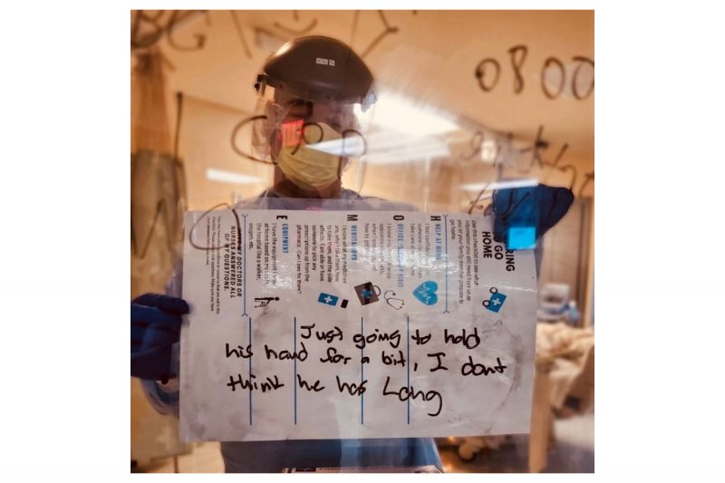
I first came across this photograph in a cropped version. The interface on my smartphone Twitter app merely showed the bottom, the message that someone with hands in gloves was holding. There’s this idea that there are too many photographs online, and they’re all scrolling by — I have never subscribed to it. If the idea were true, I would have just scrolled by, but I didn’t. I read the text, and I then clicked to see the full tweet.
The full tweet showed the photograph in its original version. There was no information about its source or about who was being depicted. Clearly, what I was looking at was some anonymous nurse holding up a sign to communicate with his peers (I thought I could tell it was a male nurse). A quick Google Image search led me to nothing. A day later, I learned of the details of the picture through social media (Twitter and Instagram): the nurse’s name is Colby Hutson, and he is working at Ascension Seton Hays hospital in Central Texas. Here’s a short local-news piece about the picture, and you can hear him speak about his motivation in this piece.
In the world of photography, especially in its news/journalistic corners, there exists the idea that any event ought to have its iconic photograph, the one picture that somehow tells the whole story or that signifies the essence of whatever the story might be. It’s a bit of a naive idea that treats images more like ritualistic entities that have magical powers than the depictions of an aspect of the world that they really are. But it does work for some photographs.
If anything, I thought after looking at this photograph for quite some time (with tears in my eyes), that this ought to be the iconic photograph around the Covid 19 crisis in the United States, a crisis whose magnitude has been greatly acerbated by the federal government’s ineptitude and sheer unwillingness to deal with it properly (there exist ample data already how swift government action in a variety of countries helped contain the pandemic, whether in South Korea, New Zealand, Germany, or elsewhere).
This picture isn’t really the greatest picture in the usual sense of photoland. Any professional photographer with some fancy and very expensive digital camera would have taken a picture that would have photographically dazzled the audience more. But to look at the photograph this way is absolutely the wrong approach. The picture is the greatest picture simply as is.
Its power lies in it being so utilitarian. It shows what it shows: the message (very prominently), the message’s maker (a little less so), and the context it was taken in (undefined, yet clear anyway).
In photoland, news images are so often treated as entities that somehow can’t just tell a message. Instead, they need to be embellished, they need to show their makers’ professional brilliance. I don’t think that’s a very good approach for news photographs, because all too often, the photographs become more about their makers and their intended target audiences than about what they actually pretend to depict.
I stopped writing about the yearly World Press Photo (WPP) winners because there’s only so much joy to be had from being a Don Quixote figure in photoland. But this doesn’t mean that I have changed my mind — actually quite on the contrary. What I’ve noticed is that more and more, WPP winners look like staged-narrative photography — even though that’s absolutely not what they are.
For example, this year’s winning photo (yet again a journalist photographing in Africa in what we could think of as the classical Western tradition) could have been taken out of a project by, say, Stan Douglas. Photographically speaking, it’s a good picture. But as a news photograph, as a photograph attempting to speak of the reality of life in Africa (assuming one can even make such a sweepingly generalizing statement about a whole continent), it’s deeply flawed. In fact, the picture would be problematic in any context, because it cannot be untethered from the long and rather shameful history of how Africa has been depicted.
Of late, WPP have really shaped an expectation of photographic excellence (the craft of it all) — coupled with an approach that while pretending to be dealing with the world mostly looks at it from a very Western-centric angle. Most of the WPP fare has me think that these photographers take pictures with their audience (and possibly careers) in mind first, while the event itself is secondary at best.
All of that is absent from this picture of Colby Hutson. This is “just” a utilitarian picture of a nurse holding a sign. The sign has a simple message: “Just going to hold his hand for a bit, I dont [sic!] think he has long”. That’s it. That’s devastating. It’s even more devastating to see that the message was written on a form designed for patients that can go home. This patient isn’t going to go home.
Roland Barthes spoke of the connection between photography and death. Here, that connection comes with a twist. It’s a photograph of a death foretold.
Photographs can only show surfaces. But while this photograph only does that, it really is a photograph about Hutson’s compassion and empathy. We don’t know anything about the circumstances. But we infer from his written words that there’s a man dying from Covid 19, and in his last moments, he doesn’t have to be alone. He doesn’t have to be alone because Hutson won’t have it. He will be there for this man — who in all likelihood is a stranger.
Given Hutson is wearing full protective gear (PPE), we only know of what kind of person he is through his writing, through his gesture. As a figure in the photograph, he has become anonymous. We cannot see most of his face. We all know that he is not the only nurse working at this time. So the PPE serves to make him a stand in for all nurses (and doctors) who at the risk of their own health take care of some of the sickest people there are right now. The patient is anonymous, too, a “he” — a man whose name we aren’t told.
With that in mind, this photograph isn’t “just” a photograph about the particular situation. Instead, it is a photograph about the situation that is playing out all over the country (and world), where nurses and doctors take care of their patients. That is why this picture for me is the picture around the crisis. Ostensibly showing the reality in a particular hospital, it actually speaks of the humanity that is operating the chronically underfunded health-care system that is attempting to save so many desperately ill patients.
Of late, I have come across the idea that maybe the lack of depiction of the actual reality inside hospitals is to blame for so many people (especially on the right and far right) not taking the pandemic seriously. If only we had the pictures! But we have the pictures, and here is one of the most powerful ones!
What would we gain from seeing pictures of dying patients or the staged-narrative looking WPP fare? Don’t we know from a long history of war (“conflict”) photography that the depiction of the most gruesome circumstances does not necessarily result in the kind of change we want?
I don’t think having more or other pictures would sway those who want to play down the pandemic. If anything, it’s not a lack of information that has them act the way they do. It’s a lack of compassion.
So here is a picture about compassion. This is a picture about what it means to be a human being. And we know it is because the picture’s subject, the nurse, has been given a voice: he wrote those words.
We don’t get to see what he will have done after showing the sign. We might be able to imagine. The actual news-worthy act — a nurse holding a dying patient’s hands in his last moments — is not being depicted. And I don’t think I would need to see of the nurse holding the patient’s hand.
Sometimes, not having a picture is a lot better than having one. I don’t know where the idea came from that we need to see everything. We don’t — even in a news context. I also don’t know where the idea is coming from that it’s the news’ job to explain everything, possible using listicles. Often, it’s enough for us to imagine.
There are some things we need to see, and there are other things that we don’t need to see. Not seeing them doesn’t make them disappear. Instead, our imagination will allow us to deal with them.
And let’s be honest, seeing pictures of dying patients will not convince those who still don’t want to believe the tragedy of the pandemic. Pictures or explanations aren’t a cure for a lack of compassion, for egotism, or for a drive to power that puts power above all else.
As truly humbling as it is to watch the sheer bravery of health-care workers, it’s not the bravery that I most admire. It’s what drives that bravery: a deep sense of empathy and compassion. I don’t know if I could have such bravery (it’s a moot idea to think about anyway, given that I clearly won’t be allowed to work in a hospital, given my absence of any medical training). But I would like to think that I have a good idea of what empathy and compassion mean.
This is the final aspect of the photograph: while only depicting the facts in a most utilitarian way it asks for a reckoning of those whose task it was to help us all deal with this pandemic. In other words, the photograph informs us, but it also asks something from us.
I’m hoping that once this is over, there will be not just some parade for health-care workers. I’m hoping they will get paid and appreciated a lot better. They shouldn’t have to beg for PPE when running towards gravely ill people.
There also will have to be a reckoning for all those who put these health-care workers into the situation they find themselves in. You know who they are: those in power.
The photograph asks us to think about the following: the people in power — did they display a sense of empathy and compassion? Did they seem to care about their duty — in words and deeds?
This photograph is a reminder that we can use their sense of empathy and compassion — or the lack thereof — as a pointer for how to judge them, to be able to make a decision whether or not to vote for them.