Making Sense of the World with Pictures

Article main image

We largely comprehend this world through pictures, whether we’re taking selfies or photographing a very distant celestial body with a satellite that’s rushing past it with a speed of 16.26 km/s (10.10 mi/s). Every photograph is an attempt to make sense of the world, even if only a few are acknowledged as that — those that we all could easily agree as being documents more than anything.

Regardless of whether a photograph is viewed as a document or not, in all likelihood it is the result of some form of extrapolation, of some form or processing. Astronomical images are heavily processed, with the colours seen in them being often added artificially (based on clearly defined astronomical conventions).

A smartphone operates in similar ways. “By default,” Apple notes, “iOS and a device’s image signal processor perform a number of operations on the data from a camera’s image sensor to create a displayable image. These manipulations include dead pixel interpolation, demosaicing, white balance, noise reduction, tone compensation, and sharpening.”

None, of this, I would argue, matters much — after all, our own brains themselves are known to very selectively stitch together what we perceive as reality (please note that with this statement I’m referring to neurological processes and not to what is currently at display on the far-right side of the political spectrum all over the world).

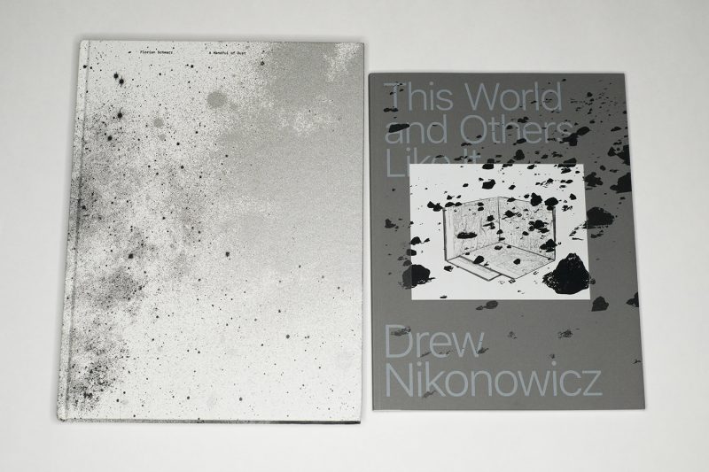
But there is much to be gained from attempting to understand how the process of discerning facts or meanings from pictures — an act of interpretation — plays out. Two recent books use this idea as jump-off points, Drew Nikonowicz‘s This World and Others Like It and Florian Schwarz‘s A Handful of Dust (please note that the latter is not to be confused with David Campany’s book of the same title).

As a brief aside, the books share the same designer, Hans Gremmen (who co-published This World and Others Like It), a fact I only realized after I had decided to review them together.

This being the internet, I should make it clear that these two books are not the same. As I noted, their jump-off point is the same, but they look into the topic using different angles. This World and Others Like It, the more cerebral one, mostly concerns itself with the construction of images and their subsequent inevitable artifice. In contrast, A Handful of Dust plays it more straight, largely ignoring the process of making images and instead tying them to their makers — or consumers — themselves: humans.

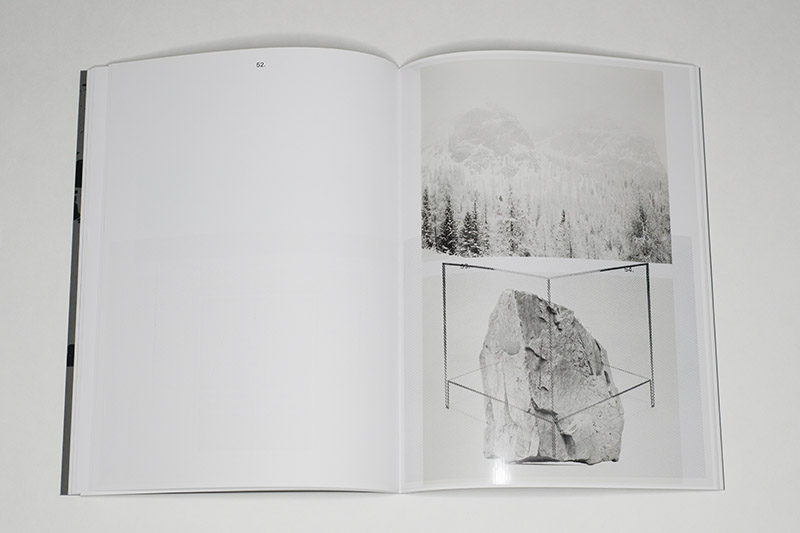
This World and Others Like It starts off with a list of coordinates in time and space — these are, the viewer can infer, the data of the images. But wait, picture 2 is one of the famous 1969 photographs of a man on the moon — how could this have a date of 2014 and a location so close to many other pictures? Well, it’s an image of an image, presumably produced in the artist’s studio: Google Earth shows me the Fine Arts Building of the University of Missouri. And it continues in this vein, with images of images or images made to look like other images or images made to look like they tell you about the process etc. Like I noted above, images are constructs, and the book focuses on that very point.

The work stays right there, at the level of the image — the various degrees of artifice involved in its making and the way we viewers read or interpret it. This is good. The book includes a couple of plastic sheets onto which patterns are printed, further confusing the viewer and adding another tactile element. This is good, too. It is my background — I have a Ph.D. in physics and spent years working in astronomy — that probably has me wanting a bit more, though. I know images are constructed so what else is there?

Over the years, I’ve had the same reaction to what one could call metaphotography. I remember Thomas Ruff once told me something about how astronomers process their images (50% of which was actually factually wrong — I didn’t have the heart to tell him), and I realized that what was completely trivial and obvious to me clearly must be truly fascinating for non-astronomers. My background probably also easily explains why I just can’t get too worked up over image manipulation or construction.

So This World and Others Like It is the kind of book that I’d look at during the day, sitting in my office. It’s very well done. It perfectly caters to my intellect, and I can enjoy it while my reptilian brain is cooking up something else entirely for a later moment.

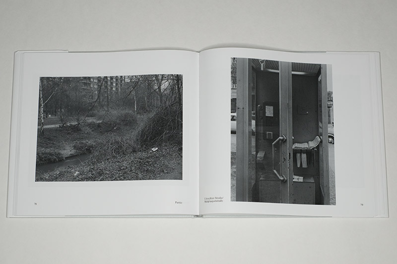
There is some overlap between the two books in what they show — images that look like other images, but all in all despite an abundance of scientific (mostly astronomical) imagery, the main element in A Handful of Dust that disrupts the cerebral game are the many (straight) photographs of people, many of whom at first do not appear to have any obvious connection to the rest of the book. Who are these people? Why are they there? I found myself intensely drawn to them because through this disruption, the artist gets at the larger topic at hand, namely the quest for knowledge, the quest to make sense of it all.

Looking at A Handful of Dust I found myself skipping most of the astronomical content (from the above it might be obvious why). For example, the pictures of the labs with the various contraptions — that’s what I’d see in one of my university jobs if I left my office and walked straight ahead into the lab across the hallway. I found all the other pictures interesting and intriguing, and the design and production of the book truly work together to enhance what is on view. Maybe it’s the book’s size and design that makes this one a lot more immersive than the other one. It speaks to the sheer brilliance of the designer, Hans Gremmen, to have found the perfect solution for these two books.

So if This World and Others Like It is a book for day-time hours, I’d rather look at A Handful of Dust at other times, when my intellect possibly is a bit exhausted, and when I can soak up some of its feelings. (Writing these sentences down made me realize that I have in fact been looking at these books in exactly this fashion.)

It is as if each book existed to remind the viewer of the missing parts that are contained in the other. And when I say “missing” I don’t want to imply a value judgment. Inevitably, as one focuses on one’s work, the process is one of exclusion, of casting aside elements that have no place, that are unnecessary or unneeded. Nikonowicz’s cerebral and at times cold study of images has no place for a more human component, for photographs of people that are maybe only remotely connected to what’s in the pictures. In contrast, Schwarz never approaches his topic too closely, instead weaving in and out while bringing together what at first sight appear to be unconnected elements.

What do we know? What can we know? I suspect we will always use images to try to find out. In their different ways, these two books bring the viewer closer to understanding the role of images in our lives — and their limitations.

A Handful of Dust; images by Florian Schwarz; texts by Boris von Brauchitsch, Martin Dominik, Arnold Stadler; 232 pages; Kerber; 2019

Rating: Photography 4.0, Book Concept 4.0, Edit 3.0, Production 5.0 – Overall 4.1

This World and Others Like It; images by Drew Nikonowicz; text by Paula Kupfer; 102 pages; Yoffy Press/FW:Books; 2019

Rating: Photography 4.0, Book Concept 4.0, Edit 3.0, Production 5.0 – Overall 4.1

Lacuna Park

Article main image

There’s a lot of photography writing that’s all about who can out-quote whom, who can show that their vocabulary is larger than everybody else’s: photographers compete with Megapixels (or film size), writers with words. It’s not that I’m worried about the number of words I know, it’s just that I find those kinds of games tedious. If anything, it’s not the number of words – or quotes – you know that will impress me, it’s your wit, your ability to tell me something new with the least amount of effort: call it style if you will.

Nicholas Muellner got style, in fact plenty of it. I’m convinced he got the words and quotes as well, but he’s a confident enough writer to know that he doesn’t have to compete on those terms. After all, as Ludwig Wittgenstein noted (granted, in a different context): “What can be said at all, can be said clearly; and whereof one cannot speak, thereof one must be silent.”

In the context of art, the second part, the “whereof one cannot speak”, does play a role. Good art writing concerns itself with attempting to do just that, to somehow speak of the unspeakable. But good writers know that when doing so it ought to be done in a clear, simple, elegant manner (not to dive into international art English too much, but it is never elegant — in writing, beauty does matter, too).

A new collection of Muellner’s essays is now available as Lacuna Park: Essays and Other Adventures in Photography. The book ought to find itself on photoland’s required-reading lists. It compiles an assortment of essays written by Muellner over the course of the past decade, some of it done as contributions for other books. The largest piece, The Photograph Commands Indifference, was originally published in 2009 and has been out of print for a while.

I’m feeling intensely self-conscious about my own writing, and the projector in me assumes that other writers find themselves in the same position. Whether or not that is in fact true, this projection usually has me refrain from producing criticism that centers on other people’s writing. This is a bit of a problem since this article will not write itself. I could, of course, produce something using my smartphone’s predicative text, but that would feel like a glib gesture, one that doesn’t do the task at hand justice. So then, let’s try…

At the end of The Photograph Commands Indifference, Muellner sums up some thinking around photographs made by tourists. Following Susan Sontag’s lead, tourist photography has been much maligned. “Contrary to Sontag’s damning readings,” he writes, “the tourist photograph is not always an extension of a consumer economy’s blunt equation of acquisition with success.”

And he continues (buckle up!): “The photograph of the monument can also be read as an expression of our desire to mean something when we are away, ripped from the usual props and contexts of home that obfuscate questions of the existential. […] The photograph, including the acts of making, having and showing it, reasserts and reformulates for the individual the core paradox of the monument, you being here makes meaning.” (emphases in the original, p. 197 in the book) Well, yes! And we could easily extend this idea and take it as that, which drives the now much maligned photography on sites like Instagram.

In an obvious way, The Photograph Commands Indifference and the book’s very first essay, Making Doubles, are bookends. But in a larger sense, I feel that here we have this author’s core concerns expressed, namely the idea that somehow through writing one can come closer to understanding the desires that underlie photography.

That possibly is a losing proposition, but it is one very much worthwhile engaging in regardless. Right at the beginning of Making Doubles, Muellner warns the reader that the “essay has failed,” possibly using criteria for the failure that might be too strict. But that is the writer’s task: to set oneself criteria that are too strict. In other words, you set yourself up for (your own) failure.

As readers, we don’t necessarily have to accept these criteria. The writer’s task is not necessarily the reader’s; and even where it is the writer’s failure could still very successfully show the reader some things she has never before imagined.

I already noted above that there is much in Lacuna Park: Essays and Other Adventures in Photography that is of immense value and that makes this book a most welcome addition to a canon of writing that all too often is a bit on the dry, if not tedious side. For sure I will come back to Muellner’s advertures often.

Lacuna Park: Essays and Other Adventures in Photography; essays by Nicholas Muellner; 208 pages; Self Publish Be Happy; 2019

Making Pictures

Article main image

This is such a boys picture, isn’t it? A photograph of a car — a covered car but a car nonetheless — in an urban environment. I’m not at all into cars, but I liked the scene so much that I took the picture twice, once in 2018 (on the left) and once three weeks ago (on the right).

If you look carefully you’ll see that that some time passed between them. The house in the background was now covered, and the mangled tree had more leaves but was now missing a y-shaped extension at its very top. It’s not clear to me if that covered car had been moved at all. At times, I’m thinking it had — its cover appears to have changed a little bit; but then couldn’t that have been the wind or possibly its owner straightening things?

These are pictures from Tokyo, a city that I had the opportunity to visit twice by now. Each time, I brought my camera, and each time the city resisted being photographed as much as it could. Much like in most Western countries, people, I was told, would be unhappy having their picture taken without their permission. Given I’m not interested in “street photography” that posed no problem.

That left me with the city itself — but what do you photograph in a city that’s so neat, so eager to present only its facade behind which the real Tokyo was happening, a real Tokyo that an outsider simply will not be granted access to?

Last year, I produced a lot of pictures that centered on the city’s very obvious oddness. There were the rotators in the parking garages, there were what feels like an infinite number of orange cones set up to prevent access to what might possibly be remotely dangerous, there were the covered cars in their often minute parking spaces… That was all new and fun, and I made a lot of pictures, some of which I still like. But all in all, it left me wanting more.

What was that “more”, though? Obviously, I didn’t want a repeat performance of last year, so I tried not to photograph covered cars, cones, or garages. I think I got a little bit closer this time, even though every once in a while I did stray from my rule — to arrive at the repeat picture shown above.

The funny thing was that I seemed to remember that I took the picture already, but just in case… And then I did look, and yes, I had taken it already — the same angle, almost the same crop. Lest you think I was performing some kind of magic, to get the picture I had to photograph over a fence, and there was that one convenient spot where I would be able to step on a little barrier which would elevate me just enough…

I like the picture, but I only like it as much because I have it twice now (without planning it), and there is so little difference between what’s in those two frames. If anything, that’s maybe the most Tokyo I’ve ever achieved in pictures. The next time I go back, I could take the same picture again — or maybe it will be drastically different, given a building might have been torn down, replaced by something shiny, clean, and new.

When I started to consciously take photographs with a serious camera again, a large part of my motivation arose from wanting to have these kinds of problems again: what do I photograph, or how do I photograph something? It’s one thing to write about photographs, and it’s quite another to make photographs (writers like me are essentially the barnacles on photoland’s hull, with the ship steadily moving in some direction whether we barnacles want that or not).

In a nutshell, I wanted to have other people’s problems, I wanted to make other people’s mistakes: if I wasn’t struggling with these things, how could I expect other people to work through their struggles?

But photography also is a different kind of seeing, and, frankly, I was a little tired of only seeing the world through other people’s eyes. Some of these people are very good at making me see things, but I was wondering if I would be able to make myself see things that I hadn’t seen before. Turns out I was (I’m working on my first photobook right now), even though it felt that a place like Tokyo existed to expose me to the limits of my abilities.

But it’s at the limits where most of the fun is to be had, isn’t it? Even though in the moment it might not necessarily feel that way. There were many days where I walked around to produce mostly shitty pictures. Tokyo being Tokyo, you never quite know whether turning a corner will produce more such pictures or whether out of the blue something magical will open itself up. I’m not at the stage, yet, where I could say what that “something magical” might be. For sure, it’s not the shrines or temples, though — they’re lovely but just terrible for good pictures.

It’s funny, I started to appreciate photography a lot more when I started writing about it (which had me stop photographing for quite a while). And then I began to appreciate photography even more when I picked up a camera again, to make my own pictures, pictures that I hadn’t made before, pictures that I didn’t know how to make. It’s places like Tokyo that I now appreciate the most, places that make it so hard to find good pictures. That intense and frustrating struggle that so often leads nowhere but that occasionally might offer an unexpected reward: that’s really what I personally want to experience.

Berlin-Wedding (and the rest of West Germany)

Article main image

Over the course of the past year I heard a photographer speak of how a good photograph would conjure up the sensation of smell: the viewer wouldn’t just be able to see what was in front of the camera, s/he would also be able to smell it. Unfortunately, I don’t remember the photographer’s name. I had to think of this idea again when I looked through the newly reissued Berlin-Wedding by Michael Schmidt.

One picture in particular brought me back to the era when the photographs were taken. On page 79, there is an outlier photograph. Where most of the pictures follow along New Topographics-style cityscapes or portraits, here, the viewer is presented with the inside of a telephone booth at the corner of Utrechter Straße and Malplaqetstraße, the door of which is half open (or half closed — your call). West German telephone booths reeked of three things, the coldly lingering smell of cigarettes smoked while engaging in conversation, the nastily brutish smell of the cold metal a user would be surrounded with, and then there were the telephone books that would swivel out of their storage to reveal the numbers that could be called.

Visually, that photograph is out of place in the book. But given the telephone booth’s smell, it might well be regarded as the image that sums everything up: this was the smell of West Germany, the rump country left over after World War 2 that had allied itself with the West and that in 1990 would gobble up the other German rump country to form what is now simply known as Germany, a place where the wounds of that gobbling up are increasingly festering, with unrepentant neo-Nazis reaping the benefits of the still largely West German political class’ tone deafness.

I was born into and grew up in West Germany, in some mostly insignificant shitty city of which there appeared to have been an incredible abundance of. The three Berlin sectors formally governed by the Western Allies were not supposed to be part of West Germany. But the laws weren’t kidding anyone, and neither was the more or less openly professed disinterest by those very Allies. West Berlin was West Germany — it looked like it, it felt like it, and for sure it smelled like it.

For all the talk of Schmidt as the man who was focused on Berlin (well, he was, but mostly in and with Waffenruhe), this most German of all photographers — could there be a more generic name than Michael Schmidt (Michael Smith)? — was most of all a West German photographer with a West German sensibility. If you want to know what that might have been, a West German sensibility, just imagine the mixed smell of cold metal, cigarettes, and cheaply printed publications for mass consumption.

Even just the thought of that smell makes me sick. To imagine that I grew up there. Anyway…

The photograph on page 79 is not a very good picture; but it’s intensely fitting. When I use “good” in “good picture”, I’m referring only to everything beyond it. Photographically, the picture is competent. The lines are straight, and everything is on focus. Beyond that, though, apart from the smell that I sense and that a viewer not originally from West Germany might simply not pick up on, there’s nothing of interest here.

Then again, the West German smell of cold metal, cigarettes, and cheaply printed publications betrayed just that: there’s nothing of interest here. If you wanted to believe the government (which is, of course, what good German citizens were trained to do) there was nothing of interest there when former Nazis pervaded the government and found cushy spots in high places, and there was nothing of interest when I grew up, a time when those old Nazis were mostly (but not completely) gone, having been replaced by their now slightly (but only so slightly) more democratic successors. A prime example of those people was provided by the Bavarian prime minister Franz Josef Strauß, a man I would have a much easier time describing in German, given the German word for swastika (Hakenkreuz) includes the word for (Christian) cross (Kreuz). (They named the airport in Munich after him. Think of that when you fly there.)

Berlin-Wedding essentially describes the West Germany of the mid to late 1970s, the West Germany ruled by übertechnocrat Chancellor Helmut Schmidt, a man who had been an officer during World War 2 (he had, you see, just done his duty) and who then went on to lecture the rest of the world about all the things he had expertise of. Schmidt (Helmut, the Chancellor) should have been the man to destroy his Social Democratic party, but with unfettered global neoliberal capitalism still around 20 years away, all he could do was to lay the foundations, to then watch things fall apart in retirement (where, true to his style, he would continue to lecture everybody else about what he thought was right, now in much reduced form as co-publisher of a widely read German weekly). Helmut Schmidt must have smelled of cigarettes and, lingering I would imagine, of cold steel (Jünger style in spirit), but now I’m digressing.

Berlin-Wedding divides into two parts, the first of which photographically describes the Berlin district with view-camera New Topographics pictures. The second, smaller, part focuses on selected individuals who are depicted in their places of work and in their homes. The latter now looks somewhat more dated than the former, in large part because fashions and interior decorations have changed a lot more by now than Berlin’s built environment in those places not affected too much by gentrification.

In reality there were at least two types of West Berlin (and of West Germany), namely the ones affected by an influx of migrants and those that were not. Due to a shortage of workers, West Germany had openly accepted people from a variety of countries who were called Gastarbeiter (guest workers), and these people and their families tended to settle not uniformly but selectively. Hence, if you go to Berlin today, places like Kreuzberg or Neukölln look a lot different than, say, Wedding.

The same was true for the rest of West Germany. It has become fashionable to conceal a tendency towards intolerance (if not outright racism) behind concerns over political correctness (with the implication that somehow free speech is under assault). Back in the day, that concern expressed as a complaint over the fact that certain parts of some West German cities looked messier to German eyes than others. Still, I took and take the lively atmosphere of Neukölln over the gentrified stifling conformity of Prenzlauer Berg any time, thank you very much.

A few paragraphs ago you probably realized that I’m not a disinterested critic here. But if any work of art is good it’s able to make a viewer feel as if its maker was sticking a long hotly glowing poker into her or him. Art, in other words, ought to hurt, ought to stir us, because otherwise, it’s just entertainment. Schmidt (the photographer) was no entertainer.

This reissue stays very close to the original, published in 1978. I think that’s a good choice because it brings today’s new viewers very close to Schmidt’s intended experience. Curiously, while the book’s form looks and feels a bit dated, the work itself doesn’t. Swap out the old car, advertizing signs, and old clothes, and you get pictures that could have easily been made in many locations in today’s Germany.

Recommended.

Berlin-Wedding; photographs by Michael Schmidt; essays by various authors (original essays only in German; 2019 essay by Thomas Weski in German and English); 120 pages; Koenig Books; 2019