Fünf Finger Föhn Frisur

Article main image

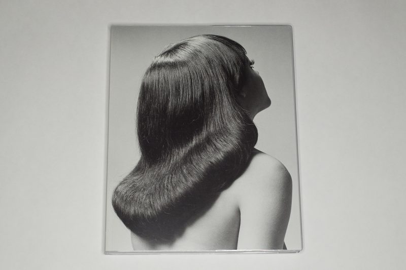
Whoever came up with the title of Fünf Finger Föhn Frisur did a marvelous job, and kudos to the publisher for not translating it. The book’s main essay is reproduced in its original German (Frisurwandel der Öffentlichkeit) and in English (The Structural Transformation of Hair in the Public Sphere) — oh, the beauty of the German language! But who needs text anyway when one can enjoy what look like (and are) promotional photographs made for a Zürich based hair salon from the 1970s until the 1990s?

For better or worse (your choice), Fünf Finger Föhn Frisur is a book about sculpture, more precisely the kinds of sculptures created on the heads of upper-class bourgeois Zürich women that a strong gust of wind outside might have easily transformed into something a little less impressive.

I must have grown up being exposed to similar photographs (no upper class, no Zürich) when I went to the barber, but of course, I didn’t pay any attention to the photographs on display, what with my general dislike of getting my own hair cut. In hindsight, there are at least two regrettable aspects to this fact, namely a) the rather bad hair cut I liked (oh boy!) and b) my missing out on enjoying the photographs I could have taken in instead of ignored.

But that’s how it goes, doesn’t it? We ignore what is all around us, only to later engage in perhaps slightly exaggerated swooning when presented with what we missed out on. There always is the danger that a form of nostalgia is being created that stands in no relation to the actual merits of the things or times in question. The other danger is things or people being exoticized which can easily create a form of othering. So I’m always a bit wary about photobooks that present collections of old pictures. It’s hard to say what the recipe is to avoid these pitfalls — or whether there even can be such a recipe.

As far as I can see, there is no nostalgia here, though, except maybe for the production of these photographs. For sure, nobody is being exoticized here, either. What exactly is going on here? This is where it gets interesting for me. I personally have no interest in hair styles (anyone who has ever met me in person will not be surprised by this statement). Most of what is depicted in the book strikes me as a bit dated, but I’m not 100% sure. Now, if I were interested in hair styles, I’d probably look at the book as that, a collection of them that I might find interesting or revolting or whatever else; but that would be a lot less interesting than what I’m facing here.

When I wrote above that there’s no exoticizing going on, then that’s maybe not entirely correct. For me, much of what I encounter is exotic, but it’s a form of being everyday-exotic: something that is very familiar in some ways, that is thus not being paid much attention to, and that then takes on a very different and fascinating character when it becomes the center of attention. This has me fascinated. Of course, this is something that someone who is paying a lot of attention to hair styles might not experience.

But the paying attention to these pictures throws their artifice into stark contrast. That artifice actually splits into two parts. There is the artifice of the hair styles, which seems to follows its own logic (rather the logic of, say, ease of use or whatever there might be). And there is the artifice of the photography, with its often strange (or maybe I should say strangely exaggerated) poses, the way it often dissolves the figure below the shoulders, and its often just too exaggerated ideas of seduction: the smiles are just a tad too fake, there might be too much of a faux-erotic squint going on — or its opposite, etc. It’s all photographed so well that none of this falls apart. The phoniness is almost believable. Almost. That makes it interesting.

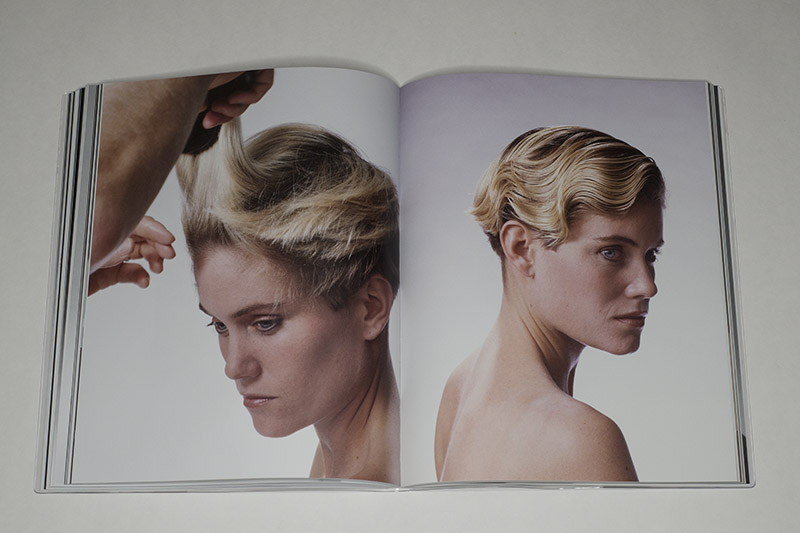
With its inclusion of behind-the-scenes material — invoices, contact sheets, etc. — Fünf Finger Föhn Frisur keeps reminding the viewer of the production, of the artifice involved. What’s more, in various cases different versions of a photograph are included. This way, the book always centers on the photography as much as on the sculpted hair.

Ultimately, the book asks of us to pay closer attention to the photography we see all around us, whatever context it might be embedded in. Ultimately, photography used in advertizing can be just as revealing and interesting as photography in an art museum. Often enough, it’s just as well (or even better) produced. Its ultimate purpose might be different — but why should one type of manipulation be worse than another?

Fünf Finger Föhn Frisur; photographs by Gaechter+Clahsen; essay by Jörg Scheller; Edition Patrick Frey; 2019

(not rated)

American Origami

Article main image

I feel it might be best to cut to the chase right away: America Origami by Andres Gonzalez suffers from the same problem as Mathieu Asselin’s Monsanto: A Photographic Investigation. In both cases, a photographer set out to very ambitiously tackle an important, large topic. In both cases, the respective publisher pulled all the right stops to produce what should be an engaging book. And in both cases, the photography is competent, yet mediocre if not lackluster.

When I write this, I don’t mean to extend that description to the photographers. Someone clearly would have to care a great deal to spend years on exposing the tragic truth behind US mass shootings or an agricultural corporation that’s poisoning the planet. But good photobooks do need good pictures in 99% of all cases. And the 1% of cases — that’s usually where the pictures don’t matter at all (for whatever reason), or the idea of the book is to display crappy pictures.

For all other books you need good pictures. A photobook is a visual medium, and as a maker you will have to sustain a viewer’s attention. That’s what it comes down to.

In the case of America Origami, the very clever binding actually manages to highlight the photography even more (Monsanto is a much more classical production). The book is side stitched, and the pages were then folded, resulting in a triangular spine (see picture above). The publisher describes this as “staplebound reversed gatefold”. This produces for a book that’s very slightly awkward to handle. The viewer can look through the book normally with two hands and no other support. If s/he wants to look at the initially hidden parts, s/he will require some support, whether her or his lap or a table.

Now, whether or not it’s actually worthwhile to engage in the process of unfolding isn’t clear to me. After encountering the umpteenth photograph of a document or letter, I simply stopped looking at the interior. That’s the thing with elaborate constructions like the one used here: the resulting effort to look will actually have to be worth it for the viewer, and I don’t think it is. Seen that way, even the folded binding itself might be questioned.

It gives me no pleasure writing these comments, because as I noted, the topic covered in the book is important and relevant enough. In fact, I probably don’t have to explain why one would need to worry about mass shootings. The reality is that in the time that will pass between me writing this article and me publishing it, in all likelihood there will have been another one: “The total number of deadly mass shootings in the United States in 2019 comes out to an average of one every 13 days.” (source) In every other country I know this fact would be considered as a major problem that needs to be solved as quickly as possible. In the US, thanks to the gun lobby and the Republican Party, there are “thoughts and prayers”.

Now, how does one tackle mass shootings photographically? When they happen, the visual diet has by now been clearly established: there are pictures of police tape, survivors walking out with their hands up (as if they needed to be traumatized even more), relatives and/or friends embracing and crying, make-shift memorials, and politicians giving a press conference. That’s it. None of these photographs obviously have the power to communicate what a mass shooting really means — a problem that war photographers know very well.

How then do you tackle mass shootings after they happened? Gonzalez solved the problem by photographing locations and objects such as letters. In theory, that’s a good idea. But photographing locations runs into the problem that the built environment in the US actually is visually mostly not very interesting at all, whether it’s the malls that look the same everywhere, the houses (ditto), or the public buildings (ditto). So there runs a thread of a sameness through these pictures, which on the one hand communicates that these shootings are just very common. On the other hand, it’s a stale visual diet, which prevents the viewer from engaging more deeply.

If these photographs covered a different topic, maybe their message would be different. But for such a loaded subject, locations such as Littleton, CO (Columbine High School) or Newtown, CT (Sandy Hook Elementary High School), this viewer has felt himself being frustrated about how mute the photographs are. Of course, they are mute because that’s what photographs are: pictures show surfaces, but they can’t portray emotions. Still, if there is any urgency to these pictures, then I’m not made to feel that. And that’s what gets me.

In the book, there are a few attempts to insert the human presence that’s so sorely lacking in most of the photographs (no, pictures of people’s belongings do not introduce that presence). There are short sections with two portraits (in black and white) plus transcripts of longer interviews (there are also speeches by various presidents reproduced). Here then are the human voices. This is good, and it mostly follows ideas used by Svetlana Alexievich in her books (where interviews are condensed into long first-person narratives, with the questions in between removed).

But why are there so few people in the book? Where are the portraits of people? If I have wanted a human presence in a photobook, here I find myself wanting it as much as I possibly can. It’s not even that I need to see people somehow connected to the shootings (that would be very documentary-style thinking). Any of us could become connected to a mass shooting today, tomorrow, or the day after — if we’re unlucky enough to be in the wrong place at the wrong time, when yet another mass shooter — in all likelihood a young, white loner — gets out his arsenal of military-grade guns (not so indirectly courtesy of the gun lobby) to go about his business.

Maybe this all comes down to expectations: what exactly is a photobook about mass shootings to do? What is it supposed to tell us? How can that for which words escape us be shown, be told? I don’t know. What I do know, though, is that a huge topic like mass shootings — the mass murder that has become so common in the US — asks for a bold response, a response that I find lacking in America Origami in every aspect except the book’s form. Crucially, the book’s inventive binding cannot conceal the lack of such boldness in the photographs.

Contemporary photography with its often reduced visual elements and its deadpan aesthetic is good for a large variety of things. But it’s also really bad for a variety of others. Unfortunately, this includes mass shootings.

American Origami; photographs and text (transcribed) by Andres Gonzalez; 384 pages; FW:Books/Light work; 2019

Rating: Photography 1.5, Book Concept 2.5, Edit 2, Production 3 – Overall 2.2

Bath in Brilliant Green

Article main image

In photography, all too often the tristesse of contemporary life is given an expression through equally sour photographs that often are devoid of a direct human presence. I can see the appeal of such photography — for a while, I was drawn to it myself. Might one not describe vast parts of the so-called Düsseldorf School as operating along those lines? Even where there literally are thousands of people in the photographs of Andreas Gursky, the effect is the opposite: it’s as if nobody is there.

I can see the point of such work, but I now view it as one of those many dead ends that the history of photography is filled with, where a photographic approach first turns into style and then into mannerism. Lest you now send me emails with your latest “street photography” – that’s not much better, merely exchanging one mannerism for another, the differences in styles notwithstanding.

Maybe that’s the struggle every photographer has to face: how to arrive at something without having that — whatever it is — exhaust itself as an ultimately empty formula. For a variety of reasons, that’s difficult, because who is happy to abandon what might have been so hard to reach? And who wants to tell their gallerists and/or publishers that more of the same just doesn’t cut it for anything other than paying the bills?

I’ve been itching more and more to see a human presence in photographs, ideally one where I can feel a real connection between the person in front of the camera and the one behind. And when I use the term “real connection” I’m explicitly excluding the macho approach to photography, which, sadly, is still all-too common (older male goes out into the world and sticks his camera plus flash into the faces of the most vulnerable — you know what I’m talking about).

I suppose what this all comes down to is that I want to look at photographs where I can sense that their maker cared about more than their own ego. Obviously, all art is rooted in the artist’s ego; but it doesn’t have to stop there. As an artist, one can — I’d say: one should — move beyond one’s own ego.

The above might read like a strange introduction to Nina Röder‘s Bath in Brilliant Green. But it is what I arrived at, thinking about what was going on the background of the work. There are, after all, plenty of photographs in the book that look like some form of collaboration between a person and the photographer. People are shown engaging with part of the land, often in the nude, or they are seen adorned with materials that stand in stark contrast to the softness of their flesh.

It is that very softness, and its rosiness, that hint at the vulnerability of the human condition that rests at the center of the work. The world is depicted as being what it is, harsh and unforgiving, and we humans have to deal with that, whether literally or figuratively.

I sense loneliness and longing in these photographs. To what extent that read is based on what I bring to these pictures I couldn’t say. In the photographs, the figures are always on their own, and for the most part their faces are being hidden or turned away. They are, in other words, nobodies. But they’re not nobodies in a social sense, they are nobodies as human beings in an environment that is hostile to them being there. This fact points at why we collectively ought to take better care of each other: there is nothing else in this world that could do that for us.

Bath in Brilliant Green mixes landscapes with still lifes with studio photographs and more, and it does that well. For sure, there is that clear thread of feeling going through the work that I spoke of above. It’s edited and designed well. However, for my taste, the book’s printing falls on the lifeless side, with shadow detail sorely lacking. This means that images dominated by dark tones lose a lot of definition, at times resulting in muddy flatness. I think that’s unfortunate.

But all in all, it is the human presence in the work that carries most of its meaning. Working with people in front of the camera is hard. It requires work, dedication, passion, empathy. And obviously the performative style of photography used in the book isn’t the only way to do it. Still, what a difference it makes to see human figures — and not just landscapes devoid of a human presence!

Bath in Brilliant Green; photographs by Nina Röder; texts by Sarah Frost, Nicolas Oxen; 144 pages; Kehrer; 2018

Rating: Photography 4, Book Concept 3, Edit 3, Production 2 – Overall 3.1

Attention Servicemember

Article main image

Eighteen years after a group of terrorists attacked the United States on its own soil, there still are soldiers in Afghanistan, which served as the base of the terror organization, Al-Qaeda. Al-Qaeda has now been defeated — or maybe not, it’s really not that clear. The moment someone suggests withdrawing the soldiers from what looks like an endless war that doesn’t appear to have any goals other than sustaining itself, someone else will claim that Al-Qaeda aren’t defeated and/or they might re-emerge. You can swap out Al-Qaeda and Afghanistan for some other group and country — there is no shortage of locations where the US is maintaining a military presence without, seemingly, making any headway beyond anything that’s purely warfare.

The world of photography has long lost interest in locations such as Afghanistan or Iraq, much like the rest of the country. Meanwhile, Afghan civilians are still being butchered by the dozens, now often remotely through the use of drones: “A U.S. drone strike intended to hit an Islamic State (IS) hideout in Afghanistan killed at least 30 civilians resting after a day’s labor in the fields, officials said on Thursday.” “We are aware of allegations of the death of non-combatants,” some military spokesperson is being quoted, “and are working with local officials to determine the facts.” Yeah, right.

War is a meat grinder, and the meat that’s being ground typically is that of foreigners. But the thousands and thousands of soldiers sent abroad to do the grinding do not come home unaffected. Some lose their lives, others a limb or two, and most — maybe all of them — lose their sanity, suffering from post-traumatic stress disorder (PTSD) for the rest of their lives. I’ve now lived long enough to understand that war is not communicable in any way — you have either experienced it, or — if you’re lucky — you don’t. I’ve also come to understand that there’s a gulf in understanding between those who have experienced war and those who  have not.

One of my grandfathers came home from World War 2 as a psychological wreck. Today, we’d speak of PTSD, back in the day (it took me years to piece this together), he was just being difficult and abusive to those he returned to. And then he left again, to find his final resting place in a pauper’s grave somewhere in the city he was born, having been disavowed by my relatives. As I said, a gulf of understanding — also on my part (how could they?…).

Ben Brody went to war, happily at first. I know this because he wrote about it in his book Attention Servicemember: “I was 22 and thought the Iraq War would be the pivotal moment for my generation, as Vietnam was for my parents’ generation.” Ben, with whom — full disclosure — I worked on some of the pictures in the book when he was my student, wanted to be a photographer; having failed a photojournalism class he signed up as an Army combat photographer. This put him into the middle of things, from which you couldn’t easily extricate yourself (like a photojournalist).

Obviously, you cannot just take any pictures as a combat photographer, or rather your superiors want to see a certain thing (victory). As Ben writes in the book, this approach isn’t entirely different than how photojournalism works, it’s just somewhat different objectives. Having eventually left the military, he went back to photographing, this time as an embedded photojournalist. He ended up photographing in both Iraq and Afghanistan, and there is a very large number if photographs from both locations in the book.

There also are photographs from until after he decided he wasn’t going back any longer, photographs in which he attempts to describe what the world at home looks like to him now: “After long periods in war zones, being shot at and blown up starts to feel normal. When you get home, you feel crazy for awhile, because no one is trying to kill you. That feeling fades quickly, but I still see the tactical geometry of any room I’m in. I also see war at the gas pump, war in the choices that people make who consider themselves peaceful, war in our drug use, war in our economic system, war in our collective anxieties.”

Attention Servicemember brings all of this together, and it might just be the photobook to describe the almost 20 years of continuous US wars in the early 21st Century. A lot of the elements don’t seem to quite fit together, but that’s apparently what war does: it reveals the insanity of the human condition that lies underneath the very thin (and currently thinning) veneer that we mistaken for our culture, for our civilization. It is the text that holds it all together and produces the impressive end result that the book is. Ben’s first-person account of his journey gets the viewer/reader as close as s/he can hope to the reality of war.

Highly recommended.

Attention Servicemember; photographs and text by Ben Brody; 304 pages; Red Hook Editions; 2019

(not rated)