Photography and Fake News

Article main image

At the occasion of Donald Trump’s recent visit to Britain, the tabloid The Sun published an interview, in which Trump had some very undiplomatic (and, as usual, completely ill-informed) comments about “Brexit” to offer, including an open dismissal of the country’s hapless Prime Minister Theresa May. Those comments were a guarantee for a highly contentious press conference — except that they weren’t. When confronted with what he had said and the tabloid had printed, Trump simply claimed that was all “fake news”. Taken at face value, that claim was obviously nonsensical. The tabloid published its audio recordings. What they were unable to grasp, though, was the meaning of Trump’s “fake news” comment.

I found this episode incredibly telling because yet again it revealed the essence of the term “fake news.” Here, the word “fake” does not have the meaning it usually has, the meaning you will find in dictionaries. When something is fake, the fakeness can been established (tested) through traditional, agreed-upon mechanisms that ultimately date back to the age of enlightenment. But that’s not how Trump uses the word: Something is not fake because it can be proven to be fake; something is fake because he says so.

In other words, fakeness is an assertion, an act of faith — reverting back to pre-enlightenment days, to the hallways of most faith-based organizations/religions, or to the power circles of some of the most horrible regimes this planet’s history has to offer (Greg Sargent offered a take on this aspect of Trump in March 2018). On 24 July, 2018, Trump himself provided the clearest version of this idea: “Just remember, what you’re seeing and what you’re reading is not what’s happening.” The Orwellian nature of this statement was immediately noted. But calling something “Orwellian” somehow is a dead end, isn’t it? Republicans aren’t going to stop their president based on the read of a novel, however accurate it might be (for non-Republicans).

Trump and his followers can easily run circles around the media who, of course, believe in the idea of verification. Trump’s evil genius has been to not only make the media go through a seemingly endless number of verifications (which change nothing, whatever the outcome) while moving on to the next nonsense at lightning speed, but to also throw out the rules altogether when speaking to his base (which is the only thing he does). It’s a bit like that famous Peanuts football gag. The media (Charlie Brown) are aiming for veracity (the football), and just before they’re about to hit Trump (Lucy) pulls the thing away: “the very dishonest media,” “fake news.”

Whatever you want to make of this, there is no way that continuing to play the game makes sense for anyone other than Trump. Of course, as the media you want to adhere to the basics of your profession. But you can only do that with people who act in good faith. Trump doesn’t act in good faith, and neither do his followers (I’m defining “good faith” based on the post-enlightenment principles that are the foundation of most modern societies). The media yet have to find a way to deal with this problem. While verification is one of its pillars, the idea that we’re all aiming for the greater good and following the rules is another.

What does this have to do with photography? Quite a lot actually. I think the idea of “fake news” has repercussions for photography. Remember, we’re talking about the situation where something isn’t fake because it’s literally fake but simply because someone says so or a group of people simply refuse to believe in it.

For example, Colin Pantall just wrote an article about the verification of images, their truth value, and repercussions for photographic storytelling, discussing Anastasia Taylor-Lind and the eyeWitness to Atrocity app. Great stuff. “Truth in photography,” he writes, “is not just about indexicality, it’s about how images fit together, how they tie into a sequence, how they work within a particular publication or website, it’s about the ownership of that publication or website. It’s about what came before and what comes after, it’s about the voice, the mode, the narrative structure.” I couldn’t agree more.

In fact, in the world of photography most discussions around “fake news” center on indexicality: is what is shown in the picture an accurate depiction of what was in front of the camera’s lens? In a news context, that is a very important question, and it has led to a variety of discussions, scandals, and problems that I don’t want to discuss in detail here. There typically is at least one such occasion to witness something like this when World Press Photo announce their yearly set of photographs of the year.

In the context of the Trumpian “fake news,” however, those considerations are mostly irrelevant. In that context, truth in photography is not derived from indexicality or from how images fit together. It’s merely and only derived from what you believe in and what you say is true. This might sound crazy, but we now see this mechanism in action all the time (for example, take people who refuse to have their children vaccinated because of some unscientific concerns mixed with general paranoia).

In the world of photography, the problem erupted on the scale that we’re not witnessing literally on Day 1 of the Trump presidency. Then press secretary Sean Spicer said that Washington had witnessed “the largest audience to ever witness an inauguration, period.”  Of course, there were photographs that showed that that wasn’t the case. But those, Spicer said, had been made to make the crowd size look small, and in any case it was “the largest audience to ever witness an inauguration, period.” It was somewhat startling and funny to watch.

Comedians have been making endless fun of this particular case (and many other cases), without realizing that not only can you not shame the shameless, it’s also particularly pointless to try to argue with people who don’t believe in the validity of a sound argument.

In a nutshell, the mechanisms typically used by conspiracy theorists have become mainstream. Here, an often irrational belief cannot be argued about because the goal posts are constantly made to shift, any sound verification that does not yield the desired result only hints at some larger conspiracy, and in any case it’s really all about irrational beliefs. So there is no global warming (there is), UFOs are real (they’re not), vaccines are bad (which is terribly dangerous nonsense), and Trump is a great president who’s good for the country (he isn’t and he’s not).

Of course, there also is some old-school take-the-photograph-out-of-context stuff still going on, plus plenty of outright fakery. Here’s an example from Poland. Poland also has a rabid right-wing government, with its state television assuming the role of the US’ Fox News. As you can see in that Twitter thread, photographs are simply used to make a case, and where they don’t serve that case, it’s, well, the viewers’ or critics’ fault. Pictures, in other words, are only true if those in power say so, and all exposed fakery only shows that those who unmask the truth are actually bending it (truth here is based on ideology or simply on what people choose to believe in).

Whatever you want to make of this development, it’s very obvious that you cannot counter “fake news” only with verification. As I said, that only works if there is an agreed-upon good faith by all parties involved. The Trumps or Kaczyńskis of this world will simply remove the football you’re trying to kick. Remove that foundation of the free press, label the free press “enemies of the people” (a truly frightening development for those who know their history),  and you can do whatever the hell you want.

It seems clear that photographers need to develop ways of dealing with this new reality.

Obviously, the solution cannot be to simply throw everything out of the window and engage in generous photo fakery, in producing actual fake news. However, especially news photographers, photojournalists, photo editors, and journalists working with photographs have to find ways to deal with the fact that a sizeable part of the population deems photographs only true if they show what is desired or what the president deems true — if (and only if) they want to reach those people. I’ll be honest and admit that it’s not clear to me whether this goal makes perfect sense. This is a grave challenge, and I have no easy — of other — solution to offer.

It is not a new challenge, though, because in our daily lives, we use the kinds of mechanisms discussed here all the time. For example, take someone’s portrait and ask them to describe what they see. In all likelihood, they will point out all kinds of problems that objectively are not in the photograph. Seeing things in photographs that aren’t there or ignoring things that are — those are two very basic human mechanisms that I’m sure we all have seen in action multiple times. Advertizing relies heavily on showing us one thing, while actually selling us another.

The big difference now is that when those ideas are cynically exploited at the level of the US presidency (and elsewhere), the very foundations of free societies are in peril.

To begin dealing with the problem, at the very least most discussions around photography have to massively expand. It’s simply not good any longer to only talk about indexicality or Photoshopping. Context often determines a photograph’s meaning or influence a lot more than whether someone cloned away some shoe or whether the colours are a bit wonky. Context gets at the fact that photographs do not exist in the vacuum photoland likes to consider them in. Instead, all photographs fulfill specific functions in specific contexts — and the same picture can change meaning with a changed context.

And then there is the fact that photographs are seen by people, and people aren’t robots. As I said, regardless of what you want to think about people like Sean Spicer, we all engage in bending the truth often quite a bit when photographs of ourselves are involved. So at the very least, even if we don’t accept a claim made about a photograph, we ought to consider to some extent where a claim might be coming from.

This doesn’t necessarily mean that we should accommodate those acting in bad faith, though — something that, unfortunately, is being done way too much especially in US media (hardly a day goes by without some “Trump voter still a believer” piece; also don’t miss this Twitter thread).

So verification is good, and discussions of context etc. are good, but there needs to be more. At a basic level, there will have to be a conversation. In this larger context, that conversation might involve using or talking about pictures. However, photographs will merely play a minor role. Maybe that’s good.

For all the relevance that photographs are being assigned in photoland, the reality is that despite their seeming ubiquity they don’t matter nearly as much as we photolandians would like to believe. I think that realization ought to make its way into photoland — a place where all too often overly grandiose claims are being made about pictures that simply don’t add up to much, if anything (often neither the claims nor the pictures).

Seriously, is a claim about a “photo that changed the course of [add some event here]” really all that different than Spicer’s “the largest audience to ever witness an inauguration, period”?

As especially many photojournalists have found out, their photographs, often taken under the most difficult circumstances and showing the most horrendous events, haven’t changed the world one bit. Or maybe a bit, but wars are still being waged, people still die of hunger, etc. etc. etc.

As I noted, the “fake news” approach to photography takes what we do with pictures all the time to its obscene extreme, resulting in a situation where a picture, no matter what it shows, means something that you want it to show, the actual truth be damned. Seen that way, the approach is a part of photography that we didn’t have to deal with so far. Now we do.

And we better figure it out.

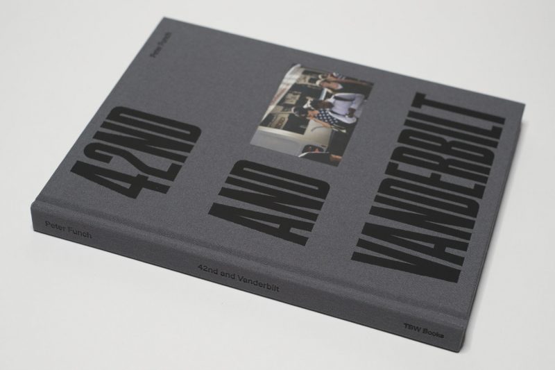
42nd and Vanderbilt (and everywhere)

Article main image

It’s a strange world, isn’t it? On the one hand, we’re fine with being filmed by surveillance cameras all the time, whether by governments or private corporations. On the other hand, we’re usually absolutely not fine with a private individual taking our picture. For me, this is a pretty stunning reversal of the attitude people used to have when I grew up. Then, mass surveillance was one of the worst possible ideas, but few people would complain about some stranger taking a picture of them. I usually don’t belong to people who’ll revert to doe-eyed nostalgia concerning the past. For sure, I would not want to go back to the days I just mentioned. However, I would happily go back to this one particular aspect (just that one, though).

In the world of photography, this reversal has had obvious and often problematic repercussions, especially in the world of street photography. It is probably no secret that I’m not a particular fan of the genre. I feel what little artistic utility it might have had in the past has long exhausted itself. As far as I am concerned any attempt to do street photography today for sure would have to attempt to raise the bar considerably. Of course, that’s true for photography in general, assuming it wants to be art: you will have to ask yourself to what extent and/or how you are raising the bar.

Peter Funch‘s 42nd and Vanderbilt sits at the intersection of Philip-Lorca diCorcia’s Heads, Paul Graham’s The Present, and any classic street photography, let’s say Joel Meyerowitz’s. From diCorcia, it uses the intense focus on a single person even when there are more people in the frame, in other words the way you can use a camera to isolate someone from their surroundings. From Graham, it adopts the idea of multiplicity: two (or more) pictures of the same person in roughly the same location can lead to very different photographic moments. This all brought together and edited smartly resulted in 42nd and Vanderbilt, a selection of street photographs that show the same group of people multiple times.

An index at the book’s end informs us of the precise dates and times when the photographs were taken. For the individual groupings — typically pairs but occasionally three pictures, the resulting intervals fall in the range somewhere between a day up to roughly a month apart. There’s one group in which a pair of pictures was produced within four seconds, and another one where a pair was produced within the same second (there might be more such instances, I didn’t check the whole index). To focus on these times, however, is somewhat besides the point, the reason being that the edit itself does not look as if it had been made with the element of time itself much of a consideration.

Instead, the edit appears to have been made with gestures in mind. For example, if in a pair someone is holding a coffee cup in their right hand, looking down, in that next pictures they will do the same thing. This is interesting. It is interesting because it telegraphs an opinion about those in the pictures. In all likelihood, we would all love to think that we’re unique personalities and that we’re also not entirely predictable. On the other hand, we clearly all have our habits and little ticks. We might pick up that same kind of coffee every morning on our way to work. Most of us also possess a finite wardrobe, meaning that if someone observes us often enough, they will eventually see us wearing the same clothes on different days.

The edit in the book distills these ideas down in such a way that 42nd and Vanderbilt is less about street photography and, instead, about not just surveillance but a particular kind of surveillance, namely one that comes to conclusions. That’s what I meant earlier by “opinion” — someone’s getting at something here. In the afterword, Douglas Coupland mentions the movie Groundhog Day. That’s an interesting reference, albeit one that seems slightly out of place here. After all, in the movie the main character realizes the predicament he is trapped in, and his attempts to escape are shown. But there is no such character here. It’s like a version of the movie Groundhog Day with the main character removed, leaving all the extras behind who do the same stuff day in, day out.

Then again, who says the viewer can’t be the main character? After all, the effect of the book for a lot of viewers clearly must be an eerie realization of how unbelievably tedious life is under late capitalism. OK, so that’s good, albeit not any less obvious than talking about Groundhog Day (Coupland, of course, goes there as well). But in this day and age, one cannot talk about these pictures without taking the photographic aspect itself into consideration. This isn’t 1975 any longer where there aren’t ubiquitous surveillance cameras and where the idea of self-monitoring devices in people’s pockets (that double as telephones) would have been science fiction.

This is where things get interesting, because if Funch is able to record a group of people and then construct something like a critique of late capitalism out of it, what can and will the people do who record us with those other cameras? What do they know? What can they know? What will they infer? What conclusions will they come to — conclusions that might in fact run counter to what we believe in or think is right? In 42nd and Vanderbilt, we find out what is being inferred. With all the other data, though, we usually don’t — unless some whistleblower tells us and then has to live in Russia or in a US prison.

Cameras are tools. The ability to edit a set of photographs to come to a conclusion — that’s a skill. In the hands of fine-art photographers, we’re cool with all of that. We might get offended by someone coming to the wrong conclusion. But what about the wrong hands, the hands of people whose business involves “security” or “business”? Those people largely operate in the dark, and it is that dark that we desperately need to shine some light into. There is a lot more at stake for us than being merely displayed as extras from the movie Groundhog Day.

42nd and Vanderbilt; photographs by Peter Funch; essay by Douglas Coupland; 160 pages; TBW Books; 2017

Rating: Photography 3.5, Book Concept 4.0, Edit 4.0, Production 5.0 – Overall 4.1

Big Brother

Article main image

Photography doesn’t deal well with mental states because by construction, the camera only records surfaces. This basic fact is a particular challenge for those aiming to deal with mental illness using photography. Depictions typically oscillate between the two poles of people either looking catatonic or acting out (often violently). However much such expression of a person’s mental state might indeed be what an outsider witnesses, for sure it does the person in question a severe disservice: you don’t have a mental illness (like you have blond hair or brown eyes), you suffer from it.

In fact, any depiction of a person’s mental state can easily become problematic. People suffer or are made to suffer in many places, and the world of photojournalism, for example, has developed a set of cliche approaches to deal with the various situations. In that world, one’s person’s suffering might not be depicted in the same way as another person’s. Obviously, suffering is always an individual feeling, but that’s not what I’m talking about here. A mother losing her child to violence in all likelihood is going to be overwhelmed with the very same sense of grief regardless whether she’s, let’s say, American or Arab. But (Western) photojournalists won’t depict such mothers in the same fashion. The American mother typically will be given a kind of visual dignity — unlike the Arab mother. This poses a huge problem, and discussions around this particular topic unfortunately are only in its infancy.

You could argue that, well, that’s photojournalism with all its various problems. Why do we have to worry about that when dealing with, for example, a long-term documentary project of a particular person suffering from mental illness? We do have to worry about the idea of the cliche here for the same reason as in the case of photojournalism. It’s easy for me to call types of depictions cliches. But the moment a type of depiction becomes ubiquitous while, at the same time, falling short of necessary nuances, then you’re in cliche territory. And unfortunately, photography projects dealing with mental illness all-too-often fall into this particular trap.

I’m writing this article as someone who is personally familiar with mental illness in the form of depression. I have first-hand knowledge of what it feels like to be at times often extremely depressed. I also have seen various attempts to depict depression — moody looking people, bland pictures with a lot of grey tones (Emo Photo 101). I understand the idea behind such depictions. But I can tell you that such depictions don’t even come close to conveying what happens to you when you’re depressed: you don’t merely live in a grey cartoon world.

This all makes attempting to work on mental illness possibly one of the hardest challenges you could imagine. Given the preceding, the only sensible solution that I can think of can only be to be mindful of the pitfalls and to find ways to work around everything that the camera cannot show. A crucial aspect of such an approach probably should be to give voice to the person who is suffering. In all likelihood, you will never be able to convey what they will be feeling, in particular given that that’s already based on your own understanding. But you will have to live with that. And on top of that, everything should be based on an approach filled with dignity, acceptance, and affection — it’s that approach that’s usually entirely missing from photojournalism.

Louis Quail‘s Big Brother is a new book that approaches the subject mental illness in the form of the photographer’s brother’s schizophrenia. Whatever stigma there might exist around depression, for sure schizophrenia is a topic most people would rather not deal with. Where depressed people are mostly “just sad,” people with schizophrenia are… well, what are they? To be honest, I didn’t know, either — until I finished looking through and reading this book.

In the book, Quail takes a multi-layered approach to describe his brother Justin and their relationship. In addition, there is a third person, the brother’s long-term partner (who also suffers from various afflictions). On top of everything, there’s society in the form of neighbours who don’t — or maybe can’t — understand and who thus create all kinds of problems. And there is the state, a state ruled by a mindset that basically cuts funding for mental health (and health in general), only to thus shift the responsibility for dealing with problems from trained mental-health specialists to the police who obviously aren’t trained to deal with this whatsoever.

Quail introduces all these different characters in some form. The photographs focus on the brother and his partner. The text — there is ample text — speaks of various aspects that either cannot be shown or for which there simply are no photographs. In line with strategies now commonly used in photobooks, there are facsimiles of documents. But, and this is the key aspect here, there also are reproductions of Justin Quail’s poems and artworks (drawings and paintings), including a little booklet at the very end of the book.

Much of the portrait of the brother focuses on his life and not merely on his illness. Justin Quail is an avid bird watcher, and this activity is explored in some depth. He also is just a good guy and brother whose mental illness interferes with what otherwise would simply be an ordinary life. Justin Quail is trying to lead an ordinary life, just like the rest of us, but his illness won’t let him. This is the main insight I took away from this tremendous book.

Most of us even know that defining someone by or through an affliction they have to deal with does them a huge disservice. So we ought to be careful with that. But do we really know why? If I look at all the discussions around the phrase “political correctness,” then both on the right and the left, the idea that it’s just some sort of artifice to stifle people’s freedom of expression appears to be widely spread — even in circles where you’d think people know better (yes, I’m looking at you, photoland).

So Big Brother not only does an amazing job bringing the life and suffering of Justin Quail closer to a general audience, it indirectly also teaches us why we should be careful with how we talk about people, especially people whose afflictions we simply don’t (can’t) comprehend. Lastly, though, the book is testament to deep brotherly love, evidence what dignity, acceptance and affection can lead to — a marvelous achievement.

Highly recommended.

Big Brother; photographs and text by Louis Quail; artworks and poems by Justin Quail; 196 pages; Dewi Lewis; 2018

Rating: Photography 3.0, Book Concept 5.0, Edit 4.0, Production 4.0 – Overall 3.9

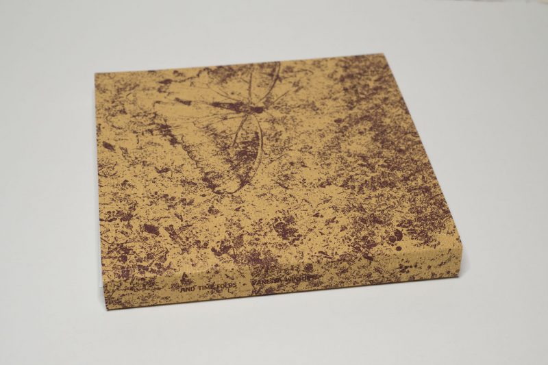
And Time Folds

Article main image

There is a photograph by Vanessa Winship that I could not live with, whose presence in my home would probably challenge me too much on a daily basis. It’s a photograph from she dances on jackson, and it shows a young couple (thankfully, the book has now been reissued; I reviewed the book in 2013).

That they are a boy and a girl or — almost — a man and a woman is barely betrayed by the shapes of their bodies, their hair, or their faces. They’re very young. The passing of time has not yet etched ravines of discontentment into their skins: they’re not quite aware of what the future might hold. They both meet the camera’s mechanical gaze straight on, looking into and beyond its lens, the girl being more self-assured than the boy. Her left eye’s brow is slightly raised, as if to assert some sort of autonomy, some sort of knowing what lies ahead. But they don’t know. We all don’t know — so how would they?

Here is what gets me about this photograph: There are this young couple’s hands. It is partly the hands and what they do with them that has me not wanting to live with the picture. It would be too much.


To begin with, the boy and girl hold hands, her right and his left hand clasping each other, the two young bodies drawn towards each other. The fingers are not interlocking. But they’re holding each other, and they do so tightly. The position and orientation of their bodies stresses this embrace: we two belong together. To affirm that stance, the girl’s left hand rests very lightly on and against the boy’s chest, grasping his t-shirt in the lightest possible way: there’s a fold running down the shirt, and she has that fold running in between her index and middle finger, her thumb asserting just a little pressure. It’s gentle gesture of possessiveness. You are mine. I really like and care about you. In contrast, the boy’s remaining free hand, his right, is left to merely hang next to his body. There’s an animal skin — a fox’s? — wrapped around his wrist, a symbol, possibly an expression, of wildness, a wildness which, however, is more a desire than a reality.

In an obvious sense, this photograph speaks of young love, of two young people having met and now clinging to each other. But there also are elements of doubt and uncertainty in the photograph, which I see as not only concerning the future of their relationship (this too shall pass?) but the future in general. It is that doubt that gets me. I know I have some grasp on the future — less than I’d like, though. But I don’t know if I would want to be exposed to that fact every day. It’s not even that knowing it makes me uncomfortable.  It’s also that I wouldn’t want this discomfort to become part of the daily decorations I am surrounded with.

If I had to describe Winship’s art it would probably center on the idea outlined above: it’s very gently outlining some very hard truths. she dances on jackson has none of the machismo that run through so many America road-trip projects, Robert Frank’s The Americans being the most obvious example. There is nothing particularly wrong with the machismo per se; Frank’s work clearly derives its power from it. At the same time, it is that very machismo that is partly responsible for making The Americans a dead end for this particular photographer, a dead end from which he never managed to extricate himself (the other part being provided by his biography).

As a countermodel of The Americans, she dances on jackson offers a different perspective of what the American road trip could be, a somewhat amorphous and very powerful sense of dread and sadness. It might be just a tad too convenient to conclude that Winship’s biography informed this result, with her father’s ill health hanging over the trip. Ultimately, she had to return home, cutting short her trip, to be with him when he died just a few days after her return. When I first saw the book, I sensed something might have been afoot, but I didn’t know. Still, the book did and does feel very Winshipian, and what that means — Winshipian — can now be seen in the catalog that accompanies a retrospective at Barbican Art Gallery (obviously, it can also be seen in the show by those able to visit), And Time Folds.

The book reveals Winship’s particular sensitivity, that very gentle outlining of hard truths I spoke of earlier, just as much as her not standing still as an artist. In fact, the different projects are actually quite varied, with a range of approaches, some bordering on photojournalism while others are incredibly still. Yet these different photographic approaches notwithstanding, there is the photographer’s sensitivity that keeps shining through. More often than not she seems to be drawn to those who still have their future ahead of them, as if to show her audience that the very same is true for all of us. Of course, this is a trite statement, but its triteness doesn’t mean it’s any less true: from tomorrow — or maybe even from now on — I can be a better, a different person.

Set against this very basic and simple idea are depictions of what surrounds us, the often harsh landscapes and dilapidated hellscapes we call our cities. Those are “easy” to photograph. But it is the adding of the very different human element that brings forth this particular photographer’s voice, a voice that, as I noted above, differs from the still so prevalent machismo in the world of photography.

Over the past years, it has become overabundantly obvious that the range of voices we are being able to view have to expand beyond the usual Western white males. I’ve said this before, and I will do so again here: there is something to be gained from doing that for all of us. We need more voices that speak of the human condition beyond the often angry white male’s. We need to be able to see what can be gained from being able to listen — especially now that our larger cultural and societal fabric has become so torn as a consequence of the aggressive, angry white male exploiting and degrading our democracies.

Thus, And Time Folds is a timely book not just for a history of photography that begs to be more inclusive. It also is a book that shows us a different approach to describing some of the world’s biggest problems. These problems are being caused by people. There is much to gain from looking at and engaging with them.

Highly recommended.

And Time Folds; photographs by Vanessa Winship; essay by David Chandler; 256 pages; MACK; 2018

(not rated)

Human

Article main image

Leave it to Gábor Arion Kudász to photograph the relevance of the humble brick and make it interesting. After all, how or why should anyone care about bricks? Conceptually, though, this object isn’t only one of the oldest and most important human artifacts, it specifically has ties to both the human scale itself and to the homes many people live in. Those considerations would have less inventive artists produce a dreadfully tedious and boring project. But the Hungarian photographer is sufficiently steeped in a humanistic tradition to be fully aware of this pitfall and to circumvent it by considering the truly human aspect: bricks are still produced involving a lot of hard manual labour, and everybody has aspirations of having or possibly owning their own home.

I have been following this project ever since Kudász showed me the first pictures while I was on a visit to Budapest. Later, he was one of the winners of the Portfolio Competition that was run on this site for a decade. To find out more about the artist’s background, thinking, and project there’s an interview I did with him in early 2017. And now, there’s Human, the book, that’s a bit harder to locate online than it should be (at the time of this writing, there appear to be copies available here, here, and possibly here — you might have to email the latter; please don’t email me, I only know Google search results).

You could take Human as a perfect example of how to give a project its right and proper shape in the form of a book. It uses all the bells and whistles available without ever going overboard. My only minor complaint would be the artist’s insistence in mimicking the printing in old technical manuals — I don’t think this fully supports the work (and if you’re unfamiliar with such manuals, you won’t pick up on it). But that’s really just a minor gripe. Everything else is simply stunningly beautiful.

The book takes the viewer through the aforementioned ideas without ever feeling or looking didactic (which would have been that huge pitfall here). There’s a surprising variety of photographs, which allows for the inclusion of images that simply on their own would fall flat. And there is that human aspect of the work that’s so important, the grimy and brutal hand work, the aspirations of a home… I didn’t think the book would allow me to discover a lot more in the work (which I had seen, in all kinds of variations, many times). But it did.

Printed in a relatively small edition, unfortunately the book is almost sold out. I’m usually not too eager to review books that are sold out (or very close to it). As much as I like to give credit where credit is due, I also feel queasy about a photobook market that all-too-often is interested in the commodity more than the enjoyment it can provide. But when I last met him, Kudasz confided in me that he was considering a second edition. So this article isn’t merely a review. It’s also a plea to the artist to produce that second edition as quickly as possible. Rayon Vert and Human are by far the best photobooks I have seen in a long while, and it would be a shame if one (or both) were not available for a larger audience.

Highly recommended.

Human; photographs by Gábor Arion Kudász; 78 pages; self-published; 2018

Rating: Photography 5.0, Book Concept 5.0, Edit 5.0, Production 5.0 – Overall 5.0