The Forms and Functions of Photobooks (1)

Article main image

In March 2017 I published an article in which I looked at photobooks specifically under the angle of their physicality. A book in an object, and its very properties cannot be approached without considering its content. More precisely, a viewer/reader will pick up on these various properties (size, weight, choices of materials, type of binding, etc.). Thus book makers are well advised to pay careful attention to them. In the context of creating a photobook from start to finish, in Understanding Photobooks I discuss these various aspects in a lot more detail, using a series of examples.

This is the first in a series of articles, in which I I want to look at production choices, in particular how a book is bound, by using more than one book for any given type of binding. Anyone owning a copy of Understanding Photobooks might view these articles as providing more study material. But I’m hoping these articles will not just supplement my book, they will also provide deeper insight into photobooks on their own, regardless of whether you have read my book or not.

To begin with, for me there is something deeply satisfying about handling a well made book. You would imagine that books per se don’t have much, if any, character. After all, they’re just a bunch of pages held together by a cover (case). But it really goes beyond that. Given we have to touch photobooks when we look at them, we feel how that handle. We feel how they react to us turning their pages. We feel how easy or difficult the handling is.

For me, the key is not to get an incredibly fancy and/or elaborate photobook into my hands. Instead, I derive deep pleasure from photobooks where the form of the object and its intended function work together. That could be a fancy photobook, or it could be some very basic, cheaply printed book. In other words, the point that I want to make here and in the following articles is simply to point out what happens when everything comes together well. I have not been involved in the making of any of these books, so my discussions are going to be based on what I see as working.

I want to begin the series by discussing the accordion book. These books are also referred to as leporello or concertina books. To make a very basic accordion book, all you have to do is to fold a long piece of paper into smaller sections, and you got your book. The devil, of course, is in the details, since you’ll need to fold the paper carefully, so your book won’t be irregular or even start twisting. Folding a long piece of paper is one option of making an accordion. Usually, these types of books are produced from shorter sections that are taped or glued together.

If you do this at home — and you might as well make a quick accordion right now from a piece of paper, you’ll notice a few things. First of all, the resulting book has two sides. That’s really interesting, because all other types of books I can think of only have one side. Second, an accordion doesn’t have a spine. Consequently, the risk of the material tearing is much higher than for other books. So if you want to make an accordion book, you’ll have to use a heavier paper stock (aka thicker paper).

Now, if you look at your accordion, there are the two sides, so you have a front cover and a back (however you decide which page is front and back). If you think of attaching covers to the front and back, you can do that (remember there is no spine). But you’ll immediately run into a little bit of trouble, because the absence of a spine makes the whole construction a bit flimsy. In particular, you can skew the front against the back fairly easily. Also, the whole contraption is a bit of a mess to store. For storage, you need to add something to your accordion — that, ideally, will also provide you with a space onto which you print your book’s title etc.  So an accordion needs a case, something that holds it.

In terms of how accordions operate, again unlike any other type of binding I know, you can either look at the book just like any other “regular” book by turning the pages, or you can unfold larger sections of it. If you have a table (or floor) that’s long enough, you could potentially unfold the whole thing.

There really are two types of considerations here, production issues and handling issues. You need to solve the production issues so your resulting book functions well and doesn’t get destroyed easily. In contrast, everything related to the handling should work hand in hand with the photographs (and text) contained in the book. Let’s look at some examples.

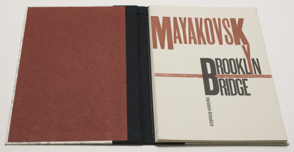
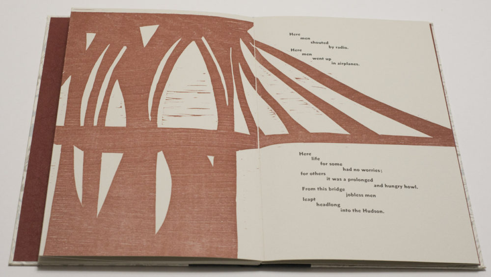
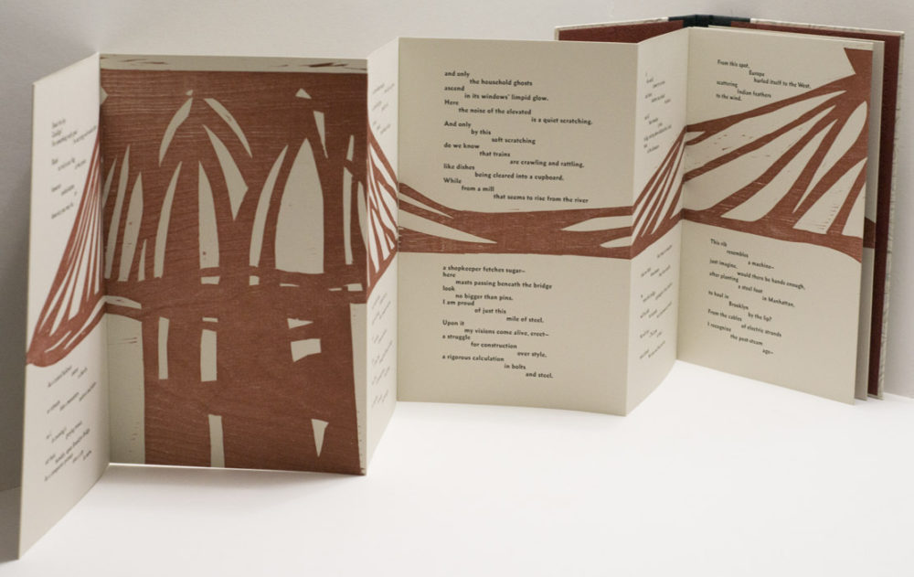
The most beautiful accordion book I own is not a photobook. Instead, it’s a book containing a poem by Vladimir Mayakovsky entitled Brooklyn Bridge. The book was completely handmade in an edition of 75 by imprimerie dromadaire in 1985. Throughout the book, the poem is printed around a woodcut of the bridge. As you look through the book, you get to see sections. Alternatively, you can unfold the book to see the whole bridge. The back of the accordion is left blank. So Brooklyn Bridge shows a first obvious application of the accordion: a very wide image is being broken up into smaller sections, and unfolding the accordion will show the whole. Fully unfolded, the accordion is 70″ (178cm) long (or wide).

Note that the accordion in Brooklyn Bridge is contained in a “regular” case. It’s connected only in the back, Swiss binding style. Folded, the book stores like any other book, and you couldn’t really tell from the spine in your book shelf that there’s an accordion inside.

The vast majority of photographs do not have such extreme aspect ratios, asking to be broken up into smaller sections. In fact, photobooks tend to consist of a larger number of pictures, which are shown in a particular sequence for any number of reasons. These reasons can be incredibly complex, in particular if they’re driven by ideas of narrative, or they can be quite simple (remember, simple isn’t bad — simplistic is). For example, a sequence could replicate a journey in space, where the order in which the photographs are shown represents being on that journey (note that the journey might or might not be fictional). If you printed such a journey on an accordion, the viewer could “follow” along — or, if s/he decides to do so, unfold sections of the journey to see them together.

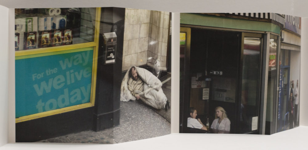
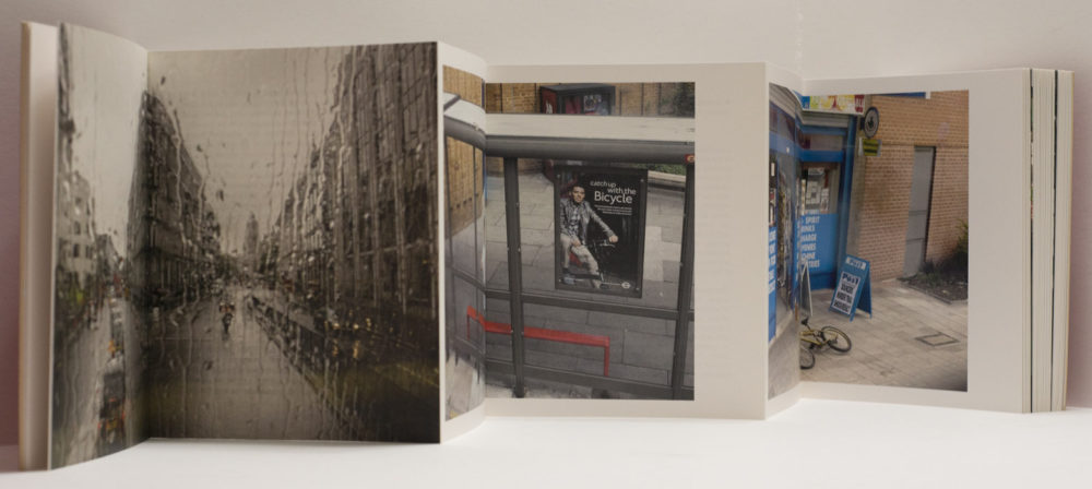
This is the basic approach adopted by George Georgiou‘s Last Stop. Photographed through the windows of buses in London, the idea of the journey becomes quite obvious. In reality, there could have been quite a few separate journeys, with the presentation in the book being a fictional trip — I don’t live in London, so I have no idea. But it also doesn’t matter so much whether the presented journey is real in a documentary sense or in a metaphorical sense. Either way, the accordion is a good way to represent such a journey. As you move through the book, you move through the urban landscape, and the sights and especially figures speak of the various aspects of contemporary London.

In Last Stop, the accordion clearly has a front and back. After the cover page, there is a title page, and the last few pages on the other side at the back contain an essay. In this particular case, it’s important to establish this kind of viewing of the book, because the pictures move from the city’s center outwards. If, in contrast, the photographs had all been taken on some ring road, then maybe the beginning and ending aspects would be different (in which case it would be a different book).

For the most part, Last Stop shows its photographs across the spreads that a viewer gets by holding the accordion and flipping through it like a “regular” book. But there are sections where photographs cross from one such spread to the next. Remember, it’s an accordion, and you could unfold larger sections, reconnecting the separate sections of these photographs. But of course, you also want to cut the pictures in half in such a way that the two parts work on their own (and with what is next to them).

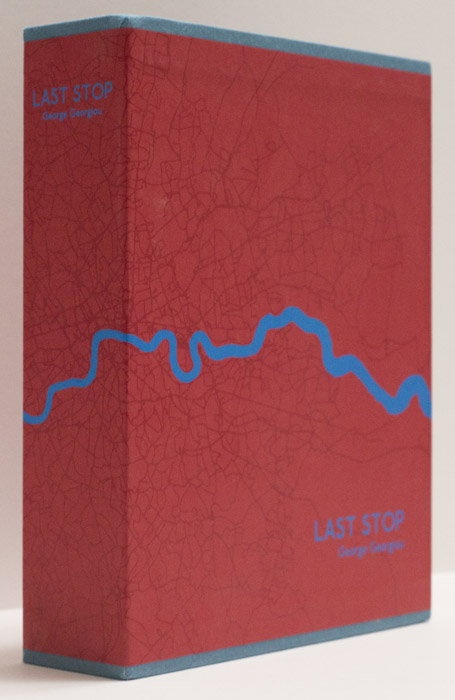
Given Last Stop utilizes both the accordion’s front and back, it can’t use the Swiss binding style case that Brooklyn Bridge used. That would restrict the viewer too much: s/he will have to be able to handle both sides equally easily and well. For storage, the accordion is housed in a sturdy slip case, the covers of which replicate the accordion’s. That’s a nifty and practical solution for an accordion book.

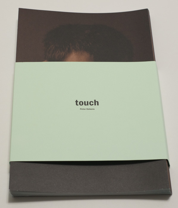
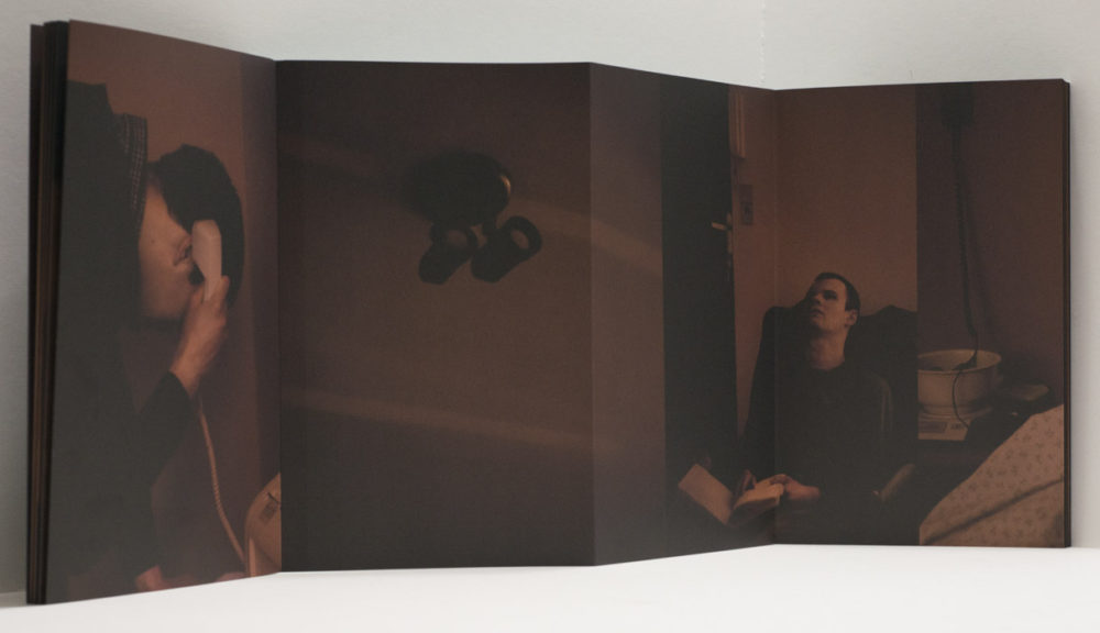
In terms of its production, Touch by Peter Dekens is almost the complete opposite of Last Stop. While the latter’s slip case is muscular, the former’s accordion is held together only by a simple belly band that also doubles as the title page and the colophon. Photographed in a blind man’s apartment with only dim available light, the book makes for a somewhat disorienting experience, thus replicating what the photographer himself must have experienced in a space that he, unlike his subject, could navigate without much ease.

It’s not always obvious where one picture end and another one begins, a conscious lack of an obvious structure that only an accordion could provide. Only an accordion allows the viewer to unfold larger sections to possibly help her or him understand the visual flow better. Only one side of the structure is used, the other one is left blank.

I suspect that viewers might be torn about the difference in the way the two accordions in Last Stop and Touch are “housed.” Last Stop clearly is very solid, whereas Touch is anything but. I do like these different solutions, because to put Touch into a sturdy case or box would take away the aspect of fragility and uncertainty communicated by the pictures. In contrast, Last Stop requires to its more conventional slip case, given in terms of the navigation through the book there is a clear structure.

In Understanding Photobooks I discuss another accordion book with yet another logic and construction, Sjoerd Knibbeler’s Paper Planes. There, the aspect of folding becomes important, connecting paper planes with the structure of an accordion.

So the accordion is a very interesting structure for a photobook that comes with a set of what on the one hand are restrictions, but on the other hand are opportunities to break up the restrictions provided by any type of binding that uses a spine (in other words one fixed axis around which actual pages operate). I feel the accordion is underused, but — and this is a big but — you can’t use it just for the sake of it, given how it requires more efforts from its viewers. Wherever you might want your viewer to see more than two pages, for whatever reasons, you’ll be in business with an accordion.

You can even break the “rules” as Anne Carson’s Nox demonstrates (this also is not a photobook): the accordion is printed on thin paper, making it incredibly fragile and delicate. It’s contained in a clam-shell case, which once opened provides the support for the accordion. The accordion’s fragility is fully in service of the writing it carries — again, if you use an accordion it has to make sense, and like in almost any kind of binding, you can push the boundaries in such a way that the structure itself carries part of your message.

Consequently, for any kind of binding, especially one that’s less run of the mill, the most important question should always be: how does this binding support the overall idea of the book? In the following articles, I will look at other types of binding. There also is an in-depth discussion of binding choices — and a lot more — in Understanding Photobooks.

This article is the first in a series of five. You can find the other parts here: part 1, part 2, part 3, part 4, part 5

The Great Nadar

Article main image

I just finished Adam Begley‘s The Great Nadar: The Man Behind the Camera. I can’t remember the last time when reading a photographer’s biography was so much fun. Even when well written, such biographies tend to be rather dry affairs, because the flamboyant, the irrational, the people who just refuse to grow up tend to prefer activities other than taking people’s pictures. As originally did Gaspard-Félix Tournachon, who first set out to become a writer, then became a rather accomplished caricaturist, then opened a photography studio, then got obsessed with ballooning… Or maybe it was ballooning first and then photography — such details would not have mattered much, if at all, to a man who seemed to have been possessed with an overabundance of ideas and energy, a true human dynamo, an Energizer Bunny before there existed such a thing (actually, batteries existed, but they weren’t very good — you’ll find out about that in the book, too). 

I find it very hard to relate to people who lived in times so different than our own. I’m intensely fascinated by some historical figures. But there’s always this abyss of time, this abyss of everything I am taking for granted in all likelihood being somewhat or completely different many years ago. What had me enjoy this biography so much was the fact that this unknowable stranger, who happened to take some of the most amazing portraits in the history of photography, had such an insatiable appetite to realize ideas that even at the time must have sounded outright crazy to many people. Nadar, as Tournachon ended up calling himself (how and why the book explains), reminded me of the kinds of characters you can find in Tom Waits’ lyrics. However, while Waits’ characters mostly end up being somewhat tragic losers, Nadar showed that it doesn’t hurt to be crazy, as long as you make what seems crazy a reality. Goal post shifted: who says this can’t be done? Who says this is nuts?

Seen this way, the photographs on the cover of The Great Nadar are a truly brilliant choice. Here are nine self portraits of the man (the original set has 12, you can see the remaining three on the back, albeit cut off), taken from different angles, as if he sat in a rotating chair, with Eadweard Muybridge operating the camera, except that Muybridge’s serial photographs came later (btw, Rebecca Solnit’s River of Shadows: Eadweard Muybridge and the Technological Wild West is a great read, too, even though Muybridge’s life was mostly a lot less entertaining). But there’s one other crucial difference, because in one of the frames, you can see Nadar smiling (you can see it in the top image). I just want to believe that he was just trying very hard not to laugh. What a completely silly idea to take these portraits in rotation! What purpose would this serve in 1865 (or so), just a little over 25 years after photography had been introduced to the public? Well, obviously, Nadar’s: simply doing it for the fun of it, to see what the outcome might look like. That one frame gives it away: the fun of it. I’ve looked at these pictures so many times now, and it still gives me so much pleasure seeing this man enjoying himself.

Maybe Nadar was helped by the fact that there was no photographic tradition. There was a very, very short history, vast parts of it French. But if you were interested in photography in the mid to late 1800s the world was your oyster. I have a hard time believing someone like Nadar would have viewed the presence of a longer tradition as an impediment. He simply was too focused on his ideas to let others get in the way. This was, after all, a man who built a gigantic balloon to raise money for his pet aviation projects (which involved impractical helicopter models), a balloon carrying a two-story wicker house that, we are told, came with a wine cellar (of course!).

The world doesn’t feel like anyone’s photographic oyster any longer (or any kind of oyster really, unless you’re a member of the 1%). Reading The Great Nadar reminded me of that. It also reminded me of the fact that large parts of photoland seem to be so devoid of simple, silly fun, of laughter, of taking yourself not too seriously. In a sense, photoland has a lot in common with rock ‘n’ roll: most of its biggest stars, however accomplished they are as artists, aren’t necessarily well known for being lighthearted and funny. There is a seriousness (and usually literalness) to photography that often makes me feel like I desperately need to look at something else (ask yourself: how many truly funny photography projects can you think of?).

If I have one complaint about The Great Nadar it’s that it was over too soon. I would have enjoyed reading about Nadar for another 100, 200 pages. Many of his acquaintances and friends, people he photographed, were some of the most well known writers, composers, artists of his time. I would have enjoyed reading more about them and their relationships. That said, thankfully, the book never makes this celebrity aspect its sole focal point (it would have been so tempting to do so).

One thing Begley makes clear is that for all the fun and silly exuberance Nadar was considerably more than just a man with too many ideas. He was a human being like the rest of us, just a little more gifted, and just as flawed as we all are. I don’t know if I would sue my brother over a trademark I established (I have a brother but no trademark). I also don’t know if I would shelter the equivalent of a political refugee from certain death and then risk my life going to the authorities, telling them to pardon him. I would like to think I wouldn’t (sue), and I would (shelter), but I have no way of knowing.

Biographies can be great ways of learning about the choices other people made and of everything that resulted from those. Gaspard-Félix Tournachon, the man known as Nadar, had too many ideas and too much energy, so he just decided to realize as many of them as possible. In a world where there are so many options now, where we individually are given so many choices, having to fend for ourselves, someone like Nadar might come as an interesting role model: if you think you need to build that gigantic balloon to fund your helicopter research you might as well do it.

Life’s too short to waste any time, and there are too many other, equally interesting ideas just around the corner. If you want, you can be a writer, caricaturist, photographer, balloonist, and family man at the same time. And you can have a lot of fun while doing all of that.

Photobook Phenomenon

Article main image

We have reached peak photobook, which right now looks like a rather broad summit. The photobook as a way to use and disseminate photographs has become a widely acknowledged tool, a fact that for me certainly outweighs the various inevitable excesses.

Curiously, while there is a lot of talk about photobooks, I’m not sure someone who does not know a lot already will have an easy time getting some first impressions. Most of the materials I can think of seem to have been made for those in the know, in other words for people who are familiar with photobooks. If you were to pick up, say, The Photobook: A History, Vol. 1 I don’t think you would necessarily understand photobooks per se better (I know I didn’t when I looked at it for the very first time). My own Understanding Photobooks will teach you about how to make a photobook (after all, that’s what it was designed for). But if you are someone who just wants to get a deeper understanding without a lot of technical input it might be a bit much (maybe this would be similar to trying to understand Italian cuisine by reading a cookbook). 

So there is need for something simpler, something that covers more basic aspects: what does this type of book actually do? Ideally, the photobook would be looked at from various angles. This is where Photobook Phenomenon enters, a box set of eight booklets that each studies photobooks using one particular angle. It’s authored by Lesley Martin, Markus Schaden, Martin Parr, Horacio Fernandez, Ryuichi Kaneko, Gerry Badger, Erik Kessels, and a few others.

Producing this set is a good idea. It will help someone who is unfamiliar with the world of the photobook look at the various aspects that tend to dominate every photoboook festival (seeing the same topics and usual suspects at every festival at times makes me think of a traveling circus). Consequently, if you’re already in the know, Photobook Phenomenon might be of somewhat limited utility for you. But I think that’s more than OK. As I said above, there already is a lot of material for experts out there.

So what do you actually get in this set? Booklet 1 contains texts by Moritz Neumüller and Lesley Martin, with both authors giving broader introductions. I’m hoping that Martin’s contribution might eventually blossom into something larger, its own book: the idea of a photobook taxonomy provides a very different angle for approaching the topic. What types of books are there, and what do they do?

I’m a bit baffled by booklet 2, a “reading” of William Klein’s Life Is Good & Good For You In New York by Markus Schaden and Frederic Lezmi. It looks cool, with its various phrases attempting to mimic Klein’s hectic book. But unless you are very familiar with that book, looking through this booklet is more like stumbling across a complete stranger’s Twitter feed. Maybe this works a lot better in the exhibition space it was designed for.

In a sense, Martin Parr and Erik Kessels produced the same booklet, the difference being the angle: hey, look at these “best”/wacky photobooks I collected (theirs are numbers 3 and 7). I think Kessels ultimately does a somewhat more convincing job, because here you understand, OK, these are just really weird books. How or why Parr’s books are the “best” isn’t explained — maybe it’s good for newcomers to realize that parts of the photobook world love a “because I say so” approach.

Horacio Fernandez’s looking at the library as a museum in booklet 4 is one of the highlights of the set, as is Ryuichi Kaneko’s very basic introduction to Japanese photobooks (booklet 5). I feel they manage to reach newcomers as much as those who already know about photobooks. In particular Fernandez’s essay casts a very wide net, and it’s deeply researched.

Of course, with these different writers present, the reader will also end up being drawn to the ones closest to what s/he prefers (as might be the case here — maybe I’m just not cool enough for the Schaden/Lezmi extravaganza).

In booklet 6, Gerry Badger looks at propaganda versus protest books. I have no idea what someone not very familiar with photobooks would make of this contribution. My guess would be that of all of the booklets, this might be the one that’s really made mostly for experts.

Lastly, the booklet entitled Contemporary Practices by Irene de Mendoza and Moritz Neumüller looks at a small number of contemporary books and has their authors talk about them and their practice. I feel this is a great addition to the overall set, because in many discussions of photobooks, this approach tends to be ignored.

There is one more aspect of Photobook Phenomenon that deserves to be mentioned. If you get yourself a copy, it’s not going to break the bank, and once it arrives in the mail, it won’t break your back, either. With the physical sizes and associated prices of many survey books having gone through the roof lately, something aimed at a larger audience ought to simply be more accessible in every aspect.

Especially on the American side of the Atlantic some people would probably prefer a more conventional single-volume book instead of this set. But I’m not sure such a book would have the same impact. This set is so well thought out and designed and produced — it just stands out. It’s engaging. It conveys some of the exciting energy that is driving parts of the photobook world.

An introduction to that world ought to communicate this particular aspect as well: we might disagree about what we like, what to look at, what’s important, what’s good and what’s bad — but the world of the photobook is filled with people who are genuinely excited about what they’re doing.

Recommended.

(French: Photobook Phenomenon)

Generation Wealth

Article main image

Whether I can do Lauren Greenfield‘s Generation Wealth any justice I’m not sure. Its scope is vast, and in these 504 pages it literally tackles it by casting as wide a net as possible. For me, looking and reading through the book has been an utterly exhausting experience; and that’s not a bad thing.

To be clear, what exhausts me is not so much the sheer amount of pictures and text, it’s the spiritual emptiness that sits at the very center of so many of these very aspects presented here. I don’t even consider myself religious. But to encounter such emptiness, such a focus on only one’s own personal gain — that has me exhausted every time I look at the book. So the following paragraphs are more like fragments that somehow hold together (I hope), without necessarily operating in a strict flow.

This is the Age of Trump. The Republican Party has not been subjected to a hostile takeover, as some have claimed. The only hostile aspect of the B-list real-estate developer/celebrity’s takeover was merely not rising through the party’s ranks. In every other aspect, the man himself embodies everything the Republican Party has been promoting for years, albeit in as crude — and open — a fashion as possible. Where people like Paul Ryan pretend they’re interested in the larger good (which they clearly are not), Trump does away with such phony theater. Trump is the Republican Party’s id, and that id is also the driving force behind most of what’s on view in this book.

But it’s too easy to pretend what Generation Wealth shows has anything to do only with one political party. You can find, for example, former Democratic presidential candidate John Kerry in the book. The internet tells me the man’s net worth is a little less than $200m. The privilege is bipartisan. And it goes beyond the US. We have a word for that, globalization. There are many pictures from outside the US in the book, showcasing capitalism and wealth in other countries, whether they’re China, Russia, or wherever else.

It’s too easy to pretend that we photolandians don’t have anything to do with this. For example, on pages 434 and 435 there is a picture of Ilona, “a photographer and former model originally from Latvia” (as the caption informs us). She is seen “in the mezzanine library of her home, which so far contains only copies of a self-published book of her fashion photographs” (ditto). The young woman also graces the cover of the book with her custom-made “I’m a Luxury” sweater.

So yeah, there is some irony in the fact that a book about wealth itself is a luxury object, with gold as the dominant colour on the cover. To pretend, though, that art or the kind of documentary work presented here is not a luxury would be delusional. It is. That fact doesn’t necessarily reduce its larger societal value, but if, and only if, that very fact is being acknowledged. If anything to honestly arrive at that realization is what I feel is still missing in photoland: nobody needs any of these pictures to survive. Nobody.

This doesn’t mean that there isn’t a value in what we do. But that value is not tied to money, even if it is so tempting to talk about the price of things.

Of course, you can get Generation Wealth through your friendly online retailer — see, I’m even providing the link for you. The money will then go to fill the coffers of a US oligarch, even though we have gentler words for these kinds of people here.

We’re all members of a society that has adopted the system laid out in full glory here. As these members we can’t necessarily escape that easily. On page 405, a man named Jeff is depicted camping out during Occupy Wall Street. He’s wearing “a $250 Gucci baseball cap he purchased during the boom years” (again, that’s quoting the caption). A few pages later, there’s a picture that among other people includes Eugenia Kuyda (Russia) who “launched Bribr, a website and app that collects anonymous reports of bribes users have been forced to pay corrupt officials” (ditto). Commodify your dissent. Maybe in these tech crazy years, instead of “commodify” we have another term for that now. .

As I already said, there is a very wide net cast in the book. Here are just some of the chapter titles: “I Shop Therefore I am,” “Sexual Capital,” “Old Money,” “Dream Home,” “Bling Dynasty and New Oligarchy.” In her foreword, the photographer lays out her goal, and it’s important to be aware of this: “The title of the project and many of the pictures could mislead the reader to think that this is a work about the 1 percent […]. It is not. The work is about the aspiration for wealth and how that has become a driving force […] for individuals from all classes of society.” (my emphasis)

In other words: We are the 99 percent — but we want to belong to the 1 percent. The book tries hard to have us arrive at that realization.

Lauren Greenfield devoted over two decades of her life working on all these different angles presented here. And now it’s all here for us to see and to come to our own conclusions. Whatever these conclusions will be, we can’t say any longer that we didn’t know — or didn’t think about it.

Required reading for the Age of Trump (and beyond).

Generation Wealth; photographs by Lauren Greenfield; text by Lauren Greenfield, Juliet Schor, Trudy Wilner Stack; 504 pages; Phaidon; 2017

Rating: Photography 3.0, Book Concept 4.0, Edit 3.0, Production 4.0 – Overall 3.5

The Genius of Gordon Parks

Article main image

If you wanted to study the history of photography, picking up Photography: The Whole Story would not be a bad idea. It’s an engaging book whose purchase won’t break your bank. It also is a pleasure to read, given it’s free of dry or academic writing. There only is one problem. It’s not the medium’s whole story. How could any book be that? Just to give you an example, if you go to the index and look for “Parks,” you will find Rosa (two instances), but you won’t find Gordon. Meanwhile, the book discusses material auch as one of Juergen Teller’s “Marc Jacobs Spring/Summer Campaign” (I kid you not). Not to single out this particular book. While doing some late spring cleaning, I came across a copy of one of those more academic history-of-photography books frequently used for undergraduate teaching, and that one had no Parks whatsoever. How can this be?

Of course, the presence of some “Marc Jacobs Spring/Summer Campaign” campaign and absence of a photographer like Gordon Parks might tell us something. Depending on where you’re coming from, your conclusions might differ. But whatever your conclusions might be, written history inevitably falls short of what it might or could or should be. And we all will have to be aware of that, even if we might not be aware of all of the omissions. That said, if you start out from the assumption that the history of photography omits many women and especially people of colour that’s a solid start.

I came to photography not through the system, but as an outsider, learning and finding out on my own. Originally, I was mostly driven by my own curiosity. Now, given that I teach photography and write about it, I’m also driven by my desire to expand my thinking and knowledge as much as I can. Even though I now am more than aware of how the history of the medium is being talked about and presented, I still often marvel at what things or people are stressed. To this date, I can’t fully wrap my head around, for example, the Walker-Evans cult (which I will admit I find a bit creepy, too). I mean, I get the man’s importance. But what I don’t get is how there are few, if any, truly critical appreciations of his achievements.

Speaking of cults, there apparently is a movie about Robert Frank. Which I haven’t seen. Instead, I have spent a lot of time with the Parks that isn’t included in Photography: The Whole Story, Gordon, in particular with Collected Works — Study Edition. Obviously, for any of the more detailed thinking around Gordon Parks’ work, John Edwin Mason‘s writing is a very good starting point. I won’t be able to offer that. I’m coming to Parks, or to phrase it more accurately: to this wide an exposure of the work through these Steidl books, and I suspect there will be many others for whom this is also the case.

This past year, I saw two major exhibitions of Parks’ work in Europe, one at C/O Berlin, the other one at Warsaw’s Zachęta National Gallery of Art (which, btw, is an amazing place to visit, if your travels take you to Poland). The two exhibitions both provided an overview of the artist’s career, and they both were unafraid to dive deeply into the various political aspects. For example, at Zachęta, ample space was given to Parks’ photographs of Black Muslims. With a extremist right-wing rabidly anti-Muslim government in power in Poland, discussing this particular work clearly was a political statement by the museum. Obviously, in Trump’s America, you could stage the same show for the same reasons.

For me, career retrospectives really only are relevant if they acknowledge our times as well (your mileage might vary). This is also how I approach history: what good is history if you don’t use it to think about the times you live in? (ditto) In an obvious way, Gordon Parks’ work could have been photographed yesterday, because many of the topics are just as relevant now as they were back then. This infuriates me, because I feel it shouldn’t be this way. There should have been so much progress that 2017 should not in many ways look like 1967. That’s not the case. In fact, it almost feels these days as if the opposite were the case. For example, there are people in the White House right now who have openly adopted a slogan used by 1940s US Nazi sympathizers. So if Parks somehow came back from the dead, he would find many of the very basic themes of his work still here, still unresolved.

In the most basic sense, Collected Works — Study Edition is that, a study edition. There are five books, which for the most part are organized chronologically, in particular where they are dealing with assignments or projects. Some of the work spans larger time periods (such as the fashion pictures, which I personally couldn’t care less about — not because of Parks, but the topic). The fifth book contains spreads from LIFE magazine. The latter is immediately important, given that for example the aforementioned pictures from Black Muslims can be seen in two different ways. They are shown without text and presented in catalog form, and you will see them another time with added text laid out for LIFE. LIFE’s model of telling stories with pictures is not widely used any longer — I often wonder why photobook makers don’t look at what this particular magazine did.

What’s positively striking about Gordon Parks is the extent of his vision. I have the feeling that this extensive catalog will provide quite a few surprises for those unfamiliar with the lesser known work. Knowing not very much of his biography and thus relying only on the pictures has me feel that while Parks was a very hard worker, that work wasn’t “just” taking a lot of photographs. It also entailed looking at photographs, looking at what and how others were photographing, looking at how what he felt could be brought to the pictures.

As a result, at times I got the impression I was looking at two different photographers when passing from one project to the next in the same book, let’s say from Segregation in the South (1956) to Crime (1957; just as an aside, here I’m using the project titles as given in the books). In a most obvious sense, given the circumstances you couldn’t photograph the latter like the former. Technique aside, though, you probably would also want to change up your approach, based on your subject matter. But the seeming ease with which Parks adapted to the different circumstances still is striking to me. And the more you look, the more connections emerge.

Given there are so many projects and photographs, it’s probably inevitable that there also are pictures that aren’t necessarily all that good. They’re always competent. But some topics didn’t seem to suit Parks as well as others. I think especially throughout the earlier years you can trace how photographers in general approached subject matters, a fact that appears to have influenced Parks. Maybe this is because he worked with and for editors, maybe because he was so aware of the tradition. So some topics seem filled out with good pictures (let’s say the 1940s New England photographs). Others, in contrast, he truly made his own, and it is some of those that are more widely known.

What this would point at is that there always is a picture to be made (that fact that has been bemoaned in certain mostly academic circles, especially now that cameras are in everybody’s pockets). But it takes more than the presence of a camera to make a great picture.

If there’s anything to take away from Gordon Parks’ Collected Works — Study Edition it is the intense hunger for pictures that would tell a story, that would make people relate or engage. This makes him almost the anti-model of so many other photographers who don’t care about anything other than good pictures on their own. Not that there’s anything wrong with that, even though good or elegant or smart pictures really are engaging only for so long.

At the end of the day, nothing matters if as a photographer you don’t engage beyond your camera, if you don’t get out of your mind, if you don’t move beyond your ideas or preconceptions. This is why, for example, Alec Soth‘s Sleeping by the Mississippi worked so well: Of course, there was a road trip, but it wasn’t about that. The camera merely was a conduit for a larger experience channeled through this particular photographer, and that experience in turn imprinted itself in the pictures. You see this exact mechanism at work in Collected Works — Study Edition, albeit on a much larger scale, carried out over the course of decades.

The reading I have arrived at is that the genius of Gordon Parks was contained in his burning desire for pictures, which was coupled with the fact that he believed in something, namely the simple idea that everybody deserves to live a fulfilled life, whatever the circumstances. I shouldn’t have to write this, but I don’t feel that sentiment is a given any longer (maybe it never was). Parks wanted to make pictures that would have consequences, pictures that imprinted a sense of urgency in their viewers.

I’m taking two main lessons from this extended catalog. First, given the quality of Gordon Parks’ work, his exclusion from history books is in dire need of getting fixed. The second lesson is that photographs only matter if you want them to. As these books show, there is no guarantee they always will. Bite into it, though, and more often than not they will matter.

Everybody can make competent pictures, assuming they spend enough time with their cameras. A competent picture shouldn’t be used as the bar for anything (unless you’re teaching Photo 101). The bar should be higher, and it should be at the height that Parks put it for himself: make pictures that matter. Make pictures that convey a deep sense of urgency, where when someone looks at them even fifty years later they’ll be moved deeply. If you got someone to think that way, now or much later, then — and only then — you’re in business. Gordon Parks can show you the way.

One final, somewhat unrelated comment. Given you’re getting five massive books with over 1,000 pages in total, the price of this set is pretty amazing.

Gordon Parks: Collected Works. Study Edition; photographs by Gordon Parks; various authors; 1084 pages (in five books); Steidl; 2017

(not rated)