This Is Not My Book

Article main image

I recently reviewed Magnum Photobook, the catalogue raisonné of photobooks produced by the agency’s members. The book had me baffled, given its overall lack of insight. In conclusion, I wrote that as far as such books are concerned “I’d like to see more in terms of depth, a depth that a simple survey just can’t offer.” Ask, and it will be given to you: on my recent trip to Berlin, I found This Is Not My Book by Erik van der Weijde. In many ways, this book is the polar opposite of the Magnum one, which is where things get tremendously interesting.

The only thing these two books have in common is that they’re both catalogue raisonnés. In almost every other respect, they differ. To begin with, while This Is Not My Book does contain all of Van der Weijde’s photobooks, they are presented in such a way that connections between them become apparent, with spreads from different books intermingling in a set of categories (such as “Germany” or “Animals”). This is a smart idea, given it provides insight into the books’ connective tissue, into the artist’s thinking. Consequently, the reader/viewer is spared the tedium of having to look at one book after the other, instead being able to visually understand more about them — the pages that present the spreads are entirely devoid of text. In addition, selected photographs from various projects are reproduced throughout the book, again without additional text.

All of this, no doubt, is likely to frustrate the accountants of the photobook world. But This Is Not My Book clearly is not made for them. Instead, it’s made for people who might not be overly familiar with this particular artist’s output, while, at the same time, providing ample material for aficionados as well. In addition to the books, essays Van der Weijde produced for his website are presented, including his publishing manifesto or a short piece that discusses the similarities between prostitution and art-book publishing.

Beyond Van der Weijde’s own writing, there are two insightful essays by Jan Wenzel about sequencing and double-page spreads. Having just spent quite a bit of time on trying to discuss these issues in writing (see my Understanding Photobooks), I very much appreciate this author’s different approaches. And then there are four conversations between Van der Weijde and Wenzel/Anne König (two each, to be precise), which discuss various aspects of the artist’s approach to photography and photobook publishing.

Together with Markus Dressen, König and Wenzel are the masterminds behind Leipzig based Spector Books, one of the most cutting-edge photobook publishers not just in Germany but worldwide. Especially those dismayed by the conservatism that runs through large parts of certainly the Anglo-American photobook world might want to pay more attention to what this publisher has been producing.

This particular book alone provides a great case in point how relatively small design decisions can have a huge impact. For example, all the text was typeset in orange, resulting in the text almost jumping off the pages. In addition, the book spreads are shown against orange, yellow, green, and blue pages so that in the absence of explanatory text the colours help guide the viewer. Without even knowing what the book would be all about, when I flipped through its pages for the first time, its visual impact sold it to me. It’s elegant and playful at the same time.

Thus, in all aspects This Is Not My Book is the kind of catalogue raisonné that demonstrates not only that such books needn’t be bone-dry boring affairs. In addition it shows that it is possible to provide further insight beyond mere listings (and displays) of the photobooks in question. Anyone looking through the book will gain a lot of further insight into the photographic thinking behind Erik van der Weijde’s books. But s/he will also learn a lot more about photobook publishing in general, whether it concerns basic problems such as how to sequence photographs, what two photographs do when presented next to each other in a single spread, or how the various decisions for materials and production might result in successful books. This is no mean feat.

Very highly recommended.


Photobook Reviews: W21/2017

Article main image

Gerry Johansson is the kind of photographer who could go for a stroll in my fairly small and not necessarily terribly appealing backyard and come back with at least one incredible photograph, maybe even more. His approach is one of quiet contemplation, as, I think, is obvious from his photographs. They’re like little gems that are found and shaped at the same time. In some ways, they’re incredibly calculated and carefully composed, yet they feel free and full of life (even where depicting locations that really aren’t).

Johansson gives equal consideration to the presentation of his photographs. In a day and age where print sizes easily approach and often surpass the scales of posters, his prints are, well, small. They don’t require larger scales. They’re pristine, well crafted, they’re intensely beautiful. The artist also has been producing photobooks, and most – but not all – of those are relatively modest affairs, too. So you more or less know what to expect, even though each new arrival is a complete revelation.

In its form, Ravenna provides another break from the tradition of Johansson’s books. The book (if we want to call it that) is housed in a large sheet of paper onto which the essay, title, colophon, etc. have been printed, and which has been folded four times (the design is supremely elegant, yet slightly at odds with the spirit of the photographs). The book itself is an unbound signature, 12 folios in total. Featuring Johansson’s square photographs, the book is a bit larger than the cloth bound objects the photographer became known for. What is more, the photographs are quite a bit larger as well. In addition, there are different sizes, there are pairings.

As before, I find myself in awe of the pictures. There are three sections whose titles are simply the first three letters of the alphabet. The largest section, the middle one, features the kinds of anonymous industrial landscapes Johansson appears to be drawn to. The shorter sections are more lyrical in tone, all in all, for me, there is a feeling of melancholy in these pictures, even in the ones that obviously were taken in bright sunlight. All is well and quite beautiful, I feel I’m being told, but there’s also a hint of sadness.

Form and function of a photobook ought to be in sync, and they’re not quite that here. They’re both beautiful in their separate ways, but this might not be the best form for these photographs. Am I nitpicking? I’m not sure. Am I just being conservative? I think not: all too often photobooks are too conservative (and boring), and they would have benefited from the treatment provided here. It just has to fit, though.

Regardless, Ravenna still is a gem.

Ravenna; photographs by Gerry Johansson; text by Silvia Loddo; 48 pages; Osservatorio Fotografico; 2016

Rating: Photography 4.5, Book Concept 3.5, Edit 3.0, Production 4.0 – Overall 3.9

Superficial Images by Peter Tillessen is the kind of book that makes me regret having come up with my photobook ratings. The ratings are good and useful for the large number of books they easily apply for. But a book like this one tends to have me struggle. So what’s going on here?

To begin with, Superficial Images made me laugh. It wasn’t the desperate laughter over a book being so bad that it was almost comical. No, the book is simply funny. Now, with a German critic writing about a German photographer’s book you might have some comments concerning the idea of comedy. Outside of their home country, Germans are known for being good at a lot of things, humour not necessarily being part of those. For example, I once went through an exhibition of Hans-Peter Feldmann‘s work with students, and the only two people laughing were the (German) curator giving the tour and myself. Well, so it goes.

The idea of deadpan, for example, can be extremely funny to Germans, and here we are right in business concerning Superficial Images. The photographs in the book all look like they were taken with a point-and-shoot camera (with the film then processed in the “wrong” manner), and most of them aren’t very spectacular at all. But it is exactly that, their not-being-spectacular, that makes them immensely entertaining, especially given how they’re being combined with captions. The captions are either straight descriptions of what’s on view, or they’re completely made up nonsense (or maybe occasionally both). Because most of these photographs really aren’t very interesting pictures, the resulting effect is initially just baffling – until you decide to be in on the joke. It’s deadpan comedy, which, I’m pretty sure, won’t be very funny for those who struggle with the idea of deadpan in the first place.

Superficial Images was photographed on trips to the most nondescript places – even New York City is made to look just awful, and great fun is then being tickled out of exactly that. Beyond the comedy, there’s something intensely liberating about the book. It’s not just that it pokes fun at the pompous seriousness of so much of fine-art photography. It also uses photography in exactly the kinds of way we (in photoland) often wouldn’t even consider. There are a lot of pictures to be found all around us, and even the shitty ones might tell us something – if, and only if – we approach them with a different mindset. And let’s not forget that there already exists a canon of photography that ignores photoland’s insistence on the brilliant picture, instead finding the sublime in lousy pictures: think Ed Ruscha, Peter Piller, Hans-Peter Feldmann, and many more.

Superficial Images; photographs by Peter Tillessen; texts by Joerg Bader, Ian Jeffrey, Jan Wenzel; 300 pages; Spector Books; 2016

Rating: Photography 3.5, Book Concept 4.5, Edit 3.0, Production 4.0 – Overall 3.8

Michał Łuczak & Filip Springer‘s 11.41 is a collaborative effort by two rising stars of Poland’s cultural scene, one a photographer, the other one a writer. Dealing with the 1988 earthquake in Armenia, which then was part of the Soviet Union, the photographs and text are being presented separately to complement each other. Two sections of pictures bookend the essay, but things are being kept apart by the same card stock that also provides the book’s overall cover. It’s a nifty and simple way to keep things apart; yet it might also be a bit heavy handed.

You can’t photograph the past or people’s memories, you can only photograph what’s left. And even if what’s in the pictures speaks of the past in some ways, it can also allude to the future. How this works becomes clear in the two photography sections. The first showcases Łuczak’s colour work from around Spitak, the location of the earthquake. With the exception of one picture showing hands holding some religious cloth, people are absent from these pictures. Instead, there are their traces, many of them fresh enough to indicate they might be just outside of the frame. Photographing people’s traces is one of the most common strategies employed in contemporary photography. The older I get, the more impatient I become, though: if it’s about humans, I want to see their faces!

There are faces in the second section of photographs, the one that concludes the book, but they’re illustrations. In particular, this section presents images on gravestones, images of people who perished. These are good, in the way that one can put such a label on these images, but I wouldn’t have needed to see them. Of course, they’re idealizations of whomever they depict; what these photographic fragments tell me beyond the obvious I’m not sure, though.

Sandwiched between these sections lies the essay by Springer who traveled to the region. Writing and photography always operate on very different planes. Comparing what photographs can (and can’t) do and what writing can (and can’t) do is instructive. The essay is poignant and insightful, and it brings to life the photographs from the preceding section as much as they, in turn, illuminate what otherwise would have been left to the reader’s imagination.

I’m a big fan of photography and writing coming together the way they do here. As much as I enjoy looking at photographs, I love reading. So this is a good book, shedding some light on what now has become merely a faint memory (if even that) for those who were alive in 1988, watching the trickle of news coming in from the still rather hermetically sealed Soviet Union. And it is a reminder that while there is no end to the flurry of wars and disasters that appears to be just flooding us right now, yesterday’s survivors or victims are still tending to their wounds.

11.41; photographs by Michał Łuczak; text by Filip Springer; 196 pages; Filip Springer; 2016

Rating: Photography 3.5, Book Concept 3.0, Edit 3.0, Production 3.5 – Overall 3.3

Werkstatt für Photographie 1976-1986

Article main image

Forty years later, it would almost seem to be unbelievable that one of the most important changes in photography in (then West-)Germany would result from an adult-education institution in (then West-)Berlin offering what would become groundbreaking classes (in Germany, a Volkshochschule — which literally translates as “people’s university” — can be found in most cities and town. A Volkshochschule typically offers all kinds of classes, from languages to crafts to hobbies etc.). At this current point in time, the influence of the Düsseldorf School at the art academy there is well established. Those more familiar with the history of German photography might know about Essen under Otto Steinert being the dominant school before that. How would a Volkshochschule‘s program run by someone who wasn’t even trained as a photographer — Michael Schmidt — fit into all of this?

A new catalog produced at the occasion of three exhibitions running in parallel provides a first, much needed access to what might be one of the biggest topics concerning the history of German photography for the next few years: Werkstatt für Photographie 1976-1986. The three exhibitions ran at Museum Folkwang in Essen, C/O Berlin, and Sprengel Museum, Hannover under the guidance of Florian Ebner, Felix Hoffmann/Thomas Weski, and Inka Schube, respectively. These four curators also provided the main essays in the catalog.

You might wonder whether the stress on the importance of the Werkstatt might not be unnecessary hyperbole, given that in all likelihood you have never even heard of it before.  A simple list of photographers who at some stage were part of the courses might help address this concern. There are Joachim Brohm, Andreas Gursky, Eva Maria Ocherbauer, Joachim Schmid, Thomas Weski, and Petra Wittmar, plus a large number of others (more about them later). Schmidt (Michael — note the Joachim one is lacking a “t” at the end of his name) invited a number of British and American photographers to either give workshops and/or show their work in Berlin, often making it the very first time for a German exhibition. Those included people like Robert Adams, Lewis Baltz, Larry Clark, William Eggleston, Larry Fink, Robert Frank, Lee Friedlander, John Gossage, Paul Graham, or Stephen Shore. On top of all of that, there also were occasional contacts and meetups with photographers in East Germany, however difficult those were to arrange.

What makes the history of the Werkstatt so interesting, however, are not necessarily the lists of names provided in the preceding paragraph. Instead, there are all those photographers you might never heard of, some of whom produced work that is in serious need of re-discovery. In addition, Schmidt’s Werkstatt wasn’t just a stomping ground for what were to become famous names in the history. It also radically altered the approach to thinking about and teaching photography in Germany, bringing a lot more subjective approach to the medium, in particular concerning its documentary branch. At the risk of being a little simplistic, you can see this change in thinking in Schmidt’s own work, if you compare his early Berlin photographs (here’s an example) with something like Waffenruhe (example). That’s the same Berlin, but it looks and feels a lot different.

Werkstatt für Photographie 1976-1986 is organized into four sections, A Different Landscape, A Different Portrait, A Different Body, and A Different Picture. In each section, photographs from visitors are mixed with work by teachers and/or students. At times, as can possibly be expected, a German photographer might emulate the model of an American visitor, such as when, to give an example, Wolfgang Eilmes channeled his inner Larry Clark and photographed youth/drug culture in Berlin, Tulsa style. But often enough, the imitator brought a completely new dimension to work made by a famous US photographer.

My probably biggest revelation was seeing Christa Mayer’s photographs from a psychiatric ward (Mayer worked professionally as a clinical psychologist and psychotherapist at a psychiatric clinic in Berlin). Square pictures that are clearly in tradition of Diane Arbus, Mayer’s photographs are some of the very best portraits I have seen in a long while, completely eclipsing Arbus’. Where Arbus essentially gawked at her subjects in ways that I increasingly feel are unhealthy and, frankly, tasteless, Mayer’s are infused with a deep understanding of our shared humanity — essentially everything that  is completely absent from Arbus’ gawking grotesqueries. Seeing one of Mayer’s photographs brought tears to my eyes — there are less than a handful of photographs that, so far, managed to do that.

Christa Mayer is not the only photographer whose work I had never seen, despite it being so strong. There are so many others in this catalog, people like Uschi Blume, Gabriele and Helmut Nothhelfer, or Wilmar Koenig, to name just a few. As reluctant as I am to ask for more archival work to get published in photobooks, making this work available — instead of that previously unseen forgettable body of work by one of the usual suspects — sounds like a pretty great idea to me. Werkstatt für Photographie 1976-1986 is a great start, it’s the kind of catalog that I wish had even more pictures.

The book’s essays provide much needed insight into the history of the Werkstatt and the larger situation around it. Just like in the case of the pictures, I wish there was even more text. But as such, there already is so much to learn, so much to discover. In particular Thomas Weski’s essay dives deeply into the history of the Werkstatt. Given Weski was actually present in some of the courses (he is depicted in various of the photographs, but he also provided some himself), his knowledge and insight is based on first-hand knowledge (on top of what must have been a lot of work later). Weski now heads the Archiv Michael Schmidt in Berlin.

The conditions under which the Werkstatt happened are long gone. Berlin is happily reunited, and photography is again being taught under the more regular circumstances of art academies, universities, or dedicated private schools. It’s fascinating to imagine another Werkstatt somewhere in Germany, a place where photography would be studied and made in ways challenging the status quo, while being open to the medium’s many possibilities. It’s hard, very hard, to imagine it could happen. We’re lucky to have been given a view into one of the most fruitful episodes in recent German photography, those ten years when a handful of mostly Berlin-based photographers would shake up their medium.


Richard Mosse’s Incoming

Article main image

Much has been written about Richard Mosse‘s Incoming. It exists in the form of an elaborate video production and as a book. I have not seen the video, so I’m in no position to have an opinion about it. I do own the book, though, which is going to be the basis of this essay. If anything in the following is in conflict with what possibly derives from the video, then you will have to take this into account, please: I have not seen the video.

Let’s maybe talk about Bertolt Brecht‘s Verfremdungseffekt first. Translated as either distancing effect, alienation effect, or estrangement effect, in a nutshell the idea is for the familiar to appear as unfamiliar. Brecht’s idea was rooted in his desire to have theater as a place with social use, a place where viewers would not identify with characters on stage, but rather would critically engage with what was presented. He wanted the play to be seen as a representation of reality and not as reality itself.

It’s straightforward to apply this idea to photography: after all, photographs are a representation of reality, but not reality itself. Photography’s struggle with this basic confusion is ongoing. Much like in the case of Brechtian theater, thinking about the Verfremdungseffekt might help: if what is being presented visually is so alien as to break the link between reality and its representation (which in photography theory/criticism is discussed as indexicality), then we ought to be in business.

Or maybe not. After all, photography’s viewers are amazingly resistant to the Verfremdungseffekt. For example, the world doesn’t look at all like in those high-contrast black and white photojournalist pictures with their crooked horizon lines. Yet we view those pictures as depictions of reality, in part because we are used to seeing it presented this way. So Verfremdung doesn’t only have to do with what something is made to look like, whether or not, in other words, it looks like the world in front of our eyes. It also, and maybe even more importantly has to do with what we are used to seeing and with what we expect to see.

In 1990, a coalition of countries assembled by George Bush the Elder attacked Iraq, which had previously invaded and occupied Kuwait. One of the side notes of that war was the media’s obsession with video footage directly (and happily) supplied by the US military. Brand-new visuals became available, showing the war seen through the eyes of the murderous machinery itself, images and videos displaying strange colours and aesthetics.

Based on what I wrote above, you would imagine that Brecht’s Verfremdungseffekt would have kicked right in, making viewers question what was being offered. However, the exact opposite happened: instead of triggering critical thinking, what was termed the video-game war became a huge network hit. Not only was critical thinking not triggered, it was actually bypassed. People just loved their glorious war (and the technological prowess of their military). The US military (and other armed forces around the world) made sure to make a note.

A little later, German artist Thomas Ruff decided he was going to use similar cameras as the military had at their disposal. Instead of producing imagery of war, though, he was going to train the cameras on Düsseldorf (and other cities). Entitled Nacht (Night), the resulting photographs are everything the military’s are not. They’re devoid of any sense of drama. You might even say they’re boring. But they are also uncanny, because they transform Ruff’s neighbourhood into a place of (possible) war.

So the Verfremdung in the uses of night vision was not in the military’s (which was new and awesome in the awful way televised violence is), but in the artist’s (which was not new, but which played with expectations previously established by the military). Of course, roughly 25 years later, we now are so familiar with night-vision imagery that neither seems particularly striking any longer. But of course, the US military still supplies such imagery because it still does its job. Journalists such as Brian Williams will gush over it in ways that are beyond embarrassing (the situation is hardly better in other countries).

There is an interesting lesson here. I’m no expert on theater or Brecht, and there might be ample writing about how and when and where the Verfremdungseffekt works. Based on the examples I just discussed and based on a variety of other examples I can think of (which I won’t go into here for reasons of space), I’m tempted to think that in photography, you only get Verfremdung the second time around, when an audience is already sufficiently familiar with a visual presentation. When they see it for the first time, though, you’re more likely to encounter awe, as something unfamiliar visually overwhelms its viewers and — possibly — short-circuits the very critical facilities you might profess you’re interested in. There’s nothing, yet, that can get verfremded: your viewers’ expectations aren’t formed — even though they might have very firmly formed ideas of whatever it is that is being presented.

I cannot approach Richard Mosse’s Incoming and his previous Infra without these considerations in mind. I have ample reasons to believe that based on the reactions these works encountered, the very discussions this artist wanted to create did not happen. Instead, people spent endless time reading meaning into the two types of aesthetics themselves. If you apply early 21st Century art-world thinking, none of that really is a problem, given there was that “critical acclaim” (which, let’s face it, in light of what I just wrote really wasn’t that critical at all), and there was a Deutsche Börse Prize. I’m imagining, though, that if I were the artist I would be a tad frustrated, given I would really prefer to talk about something other than the damn colours of the pictures (or movies). Of course, I’m not the artist, so I won’t carry this completely futile Gedankenexperiment any further.

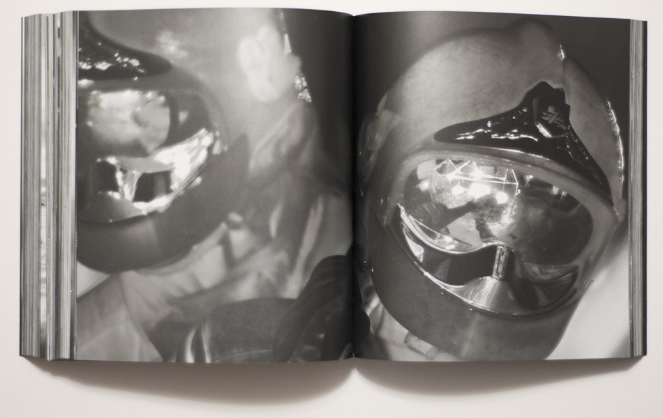
I don’t want to let the artist completely off the hook here, though. It’s not really just a reception problem. After all, the kinds of technologies used for Incoming and Infra are not only awesome for viewers, they also are for their users. In particular the camera used for Incoming, some military camera that supposedly is classified as a weapon — how can you not become a bit too enarmoured with its power? Isn’t this one of today’s conundrums in general that so much of the advanced technology we are given to handle is created in part with that in mind, to make us feel in awe in their presence? So that, to carry the thought further, the kind of critical resistance that Brecht had in mind is in fact futile?

Awesome cameras per se don’t make awesome work, though. It’s true, often enough they make work that initially is awesome. But for art to be art, it needs to unfold over longer periods of time than whatever span covers being in awe of something previously unseen. This comment really is not specific to the work discussed here only; it applies to all of photography. As an artist, you will have to grapple with it, even if you then arrive at the position adopted by Thomas Ruff, one of relentless experimentation, where the overall sum of all the work is a lot more impressive than some of the parts, which seen alone might not be that interesting at all.

It’s this problem that came to my mind, when I first heard of Incoming, and when I then first saw some images: OK, this looks cool, but what does it add up to? Well, I got the book, so let’s see.

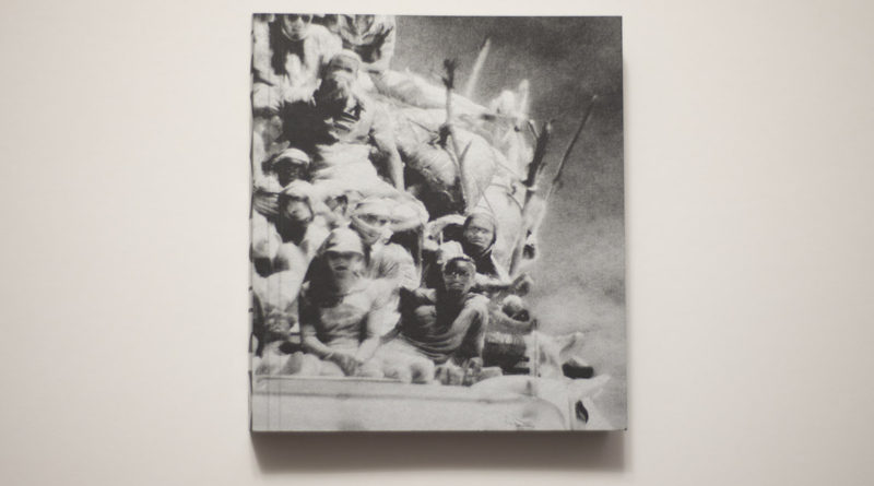
The first aspect of the book that struck me was its physical form. It is compact: it’s small and surprisingly heavy. In fact, it’s like a little black brick, with silvery information on the cover. Its spine is fully taken up by the word “incoming,” and the front and back shows parts of the same image, somewhat ghostly looking people crammed on top of what might be a truck. On the back, the artist’s name is listed. Hmm, OK then. I’ll admit this first impression had me a bit wary, in the way that first impressions often tend to work.

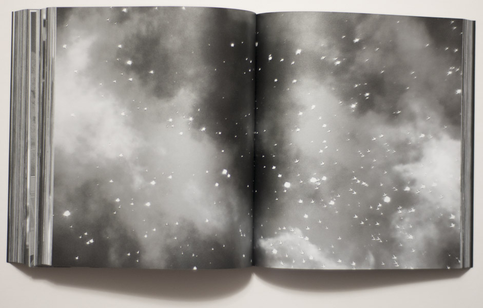
Inside, everything is silvery. It looks like a metallic ink on black paper, a paper that feels a bit slick to the touch. I suspect the intent might have been to replicate the idea of a screen, maybe with the idea of bringing the aspect of the backlit images from the videos to the book.

To be completely honest, I ended up having to force myself to make my way all the way through the book, literally thinking I couldn’t possibly write about it without having seen the whole thing. The first attempts to look at the book ended in me giving up after a little while. It’s not that I have no patience, but the book has 576 pages (with “280 tritone plates,” as the publisher’s website informs its visitors).

Anything north of, let’s say, 200 pages always is going to be a real challenge for a viewer unless you manage to keep her or him interested or, even better, unless you manage to get her or him so hooked that they don’t even realize how time passes as page after page after page is being turned. For me, that really wasn’t happening here. Maybe I’ve looked at too many books. But the first time around already, I thought something like “Oh, I get what they’re trying to do here.” Incoming, the book, is made to work like a video (maybe the video? Remember, I haven’t seen it), with clearly defined sections in which smaller aspects are being explored over and over again, their variations leading to some (usually very minor) idea.

The thing with books is, though, that they’re not videos. While I get the overall idea, if it’s being repeated in this relentless a fashion, the end result is not some deep immersion but rather a sense of tedium, that same tedium that prevented me from getting farther than around 50 or maybe 80 pictures at any given time until I forced myself all the way through. That tedium also arises from the fact that every picture is being treated in exactly the same fashion, namely full bleed across the gutter.

Now, you might suggest that I, as one of those internet types, simply suffer from attention-deficit disorder. I’m not sure that’s it, though. For example, the other day, I watched Andrej Takovsky’s Stalker. There’s not necessarily much happening in that movie. Some of the panning shots are so slow that you could paint a wall and watch it dry before they’re over. Still, I was absolutely mesmerized. If you condensed Stalker into a book, Incoming style, I’m fairly certain that would not work.

Photographs and video work in very different ways. Photographs are stopped time, videos are not. The reason why photography and video are each so interesting is even though strictly speaking one is based on the other, they’re not the same thing at all. Photography is exciting because of all the things you can’t do in video and vice versa.

That aside, the main question I had asked myself before I got to looking at the book and writing this article was: is this telling me anything new? To be clear, I didn’t mean this in the most literal fashion. I would have been happy if the book literally told me something new. But any new perspective, anything resulting from being put in front of some Verfremdung would have equally worked. (I’m writing this as someone who has followed the refugee/migrant crisis washing over Europe fairly closely — to the extent that it’s possible for someone not living there.)

In Europe, refugees/migrants are hard to miss. For sure, they’re on everybody’s minds to an extent that apart from the desperate people in search of a new or temporary home, they’ve also become Europe’s ubiquitous ciphers. In Italy, I saw a man, in all likelihood having come from Africa, walking on the highway. In Berlin, I went by shelters set up for refugees/migrants. In Warsaw, where there are no refugees/migrants from places in Africa, Syria, or Afghanistan (but plenty of them from Ukraine), I saw signs near hipster coffee shops that said “Refugees Welcome Here” (while the right-wing government made it very clear that wasn’t the case).

In an obvious way, refugees/migrants make for a good subject for artists. But it’s not very obvious at all what exactly the point of such art might be, and how this could be done. To cut to the chase, Incoming doesn’t get much beyond being an artful description of the crisis. It’s visually compelling in the way I already discussed above. But that same compellingness inserts itself too forcefully in between the viewer and what is being presented.

Crucially, I cannot get around the fact that the refugees/migrants who are at the work’s center end up being turned from one cipher into another, as the anonymized, visually distorted ghosts they are presented here. In other words, conceptually, we, as viewers from the very countries that now “have to deal” with the crisis…

Just one quick aside: what crisis are we actually talking about here when we call it a crisis? Ours? Our being overwhelmed with having to feed the desperate while living in a situation of overabundance? Or theirs? Their leaving their homes so as not to be torn to pieces by bombs or not to live “underprivileged” lives in abject poverty, deprived of most of the things we easily take for granted?

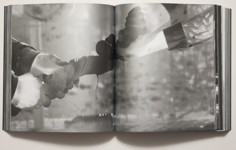
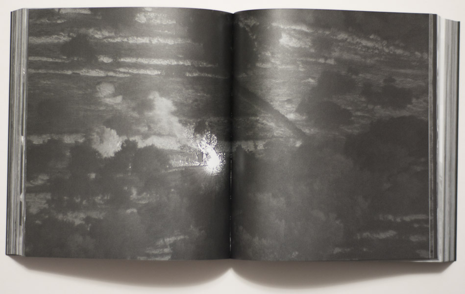
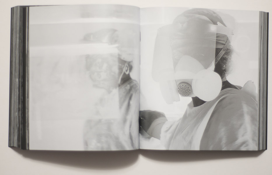
Anyway, we, as viewers from the very countries that now “have to deal” with the crisis are not moved from one sphere into another. Instead, it’s merely the means of technology changing with which these people are being viewed by us. Instead of being anonymous blurry faces in YouTube videos or equally anonymous participants in our photojournalists’ games or equally anonymous masses in TV reports (usually, they’re shown as masses, aren’t they?), Incoming treats the refugees/migrants as anonymous silvery/ghostly specters haunting its pages. The barriers of mediated artifice between “us” and “them” aren’t broken. There’s merely another one presented, one that we haven’t seen before, one that might tempt us to be in awe of the aesthetic.

To put this another way, if as an artist you adopt a visual strategy usually employed by a very specific professional (non-artistic) group, you will have to be very careful. You will have to either go all in, completely adopting that group’s strategies, amplifying it to an extent that the result becomes unbearable to watch. Or you will have to have things crack, so that through that crack a shift can happen in the viewers’ minds, a shift that indicates your own stance. For all good art that uses such adoption techniques, it’s usually the cracking that does the trick. But of course, the amplification method also works. But something has to shift. Somehow, what is being presented cannot be the same as what that aforementioned professional group would be producing.

It is that shift that I’m missing here. I don’t feel I am made to look past the aesthetic of these pictures. At the same time, the aesthetic is not being used in a way that would make me see it as jarring, as possibly inappropriate or very much appropriate. At the same time, the work’s stylization feels too self-conscious and too much in deference of the technology.

There is, in other words, nothing at stake here, and by “here” I mean the people involved in the world of this book (and video). Of course, there is a lot at stake for those depicted. Unfortunately we, in this other — art — world, are excluded from that. This has me think that Incoming is a piece of art for a secluded group of people. We can all nod, make the sounds we expect each other to make, and nothing will change.


A Second Look: Sophie Calle’s Suite vénitienne

Article main image

For a world of photography that professes to be interested in diversity and in exploring the role text can play for and with pictures, there were surprisingly little discussions of Sophie Calle’s work up until recently. Recognition of her achievements is now arriving, though. Calle won the Hasselblad Award in 2010, and at the time of this writing she is on the shortlist of the 2017 Deutsche Börse Prize. Still… I can’t help but feel that having a little less of the usual suspects (Walker Evans, Robert Frank, et al.) and more of those equally strong voices, such as Calle’s, would help breathe life into our ideas of what photography is and does.

Of late, I have spent a lot of time with books made by this artist, the most recently published one being And so Forth. There have been various reissues and (re-)compilations of older books, some of which I bought. And so Forth is such a compilation of material, but it was all new to me. However, the most recent book I bought is older, dating from 1988 (in its English language incarnation), Suite Vénitienne/Please Follow Me.

For reasons that aren’t entirely clear to me, I ended up hunting for the original 1988 paperback instead of the 2015 reissue. It might have been just the pleasure of the hunt. Copies can be had on US eBay for around $130 or more. But I have a strict $100 spending limit for a(ny) photobook. I lost a bid on a signed copy a few weeks ago when it sold for $75. But not that much later, there was an unsigned copy listed for $29.99, and nobody else bid on it. So it was mine.

There is a world between And so Forth and Suite Vénitienne. It’s not just the difference in time, and really, I’m comparing apples and oranges, or rather a big basket of apples with a single orange. Not knowing how big Suite Vénitienne would be, when it arrived, I was surprised how small it is. Somehow, I had thought it would be bigger. I don’t know why. And so Forth is a veritable brick of a book, whose edges are reinforced with metal linings no less. You could hit someone over the head with the book (please don’t!) and do some serious damage. If you attempted to slap anyone with Suite Vénitienne (again, don’t!) I suspect all that would happen is possibly some laughter.

I wrote elsewhere about how the form of a book matters. Suite Vénitienne feels light in the best possible way, even though the work itself doesn’t. This is not to say that the work is grave. It’s not. But it’s conceptual in the way that all of Sophie Calle’s work is conceptual, while being light and infused with deep humanity at the same time. It is, in other words, a far cry of, let’s say, the overblown heavy-handedness that runs through the work of Taryn Simon, to name another conceptual photographer. Calle manages to bring a smile to my face even where she makes me cry. In contrast, I find Simon’s work exasperating and, to be honest, mostly boring.

Maybe if we all thought of Sophie Calle when discussing conceptual photography, that field would find a lot more dedicated followers. As far as I can tell conceptual photography has the reputation of being made for people who laugh on command. I know, that’s really not a fair statement. But let’s face it, that’s what it feels like, doesn’t it? And then comes Sophie Calle, and you realize how a completely conceptual approach, a strange set of rules that might or might not seem to be overly restricting can result in the world unfolding in all its glory in front of you. It’s quite amazing.

“For months,” writes Calle, “I followed strangers on the street. […] I photographed them without their knowledge, took note of their movements, then finally lost sight of them and forgot them.” Reading this in 2017, one can’t help but think that this is a bit strange, if not dodgy. But then, the issues of surveillance and privacy, of getting to know what is supposed to be unknowable, lie at the heart of this artist’s work. “At the end of January 1980,” Calle continues, “on the streets of Paris, I followed a man whom I lost sight of a few minutes later in the crowd. That very evening, quite by chance, he was introduced to me at an opening. During the course of our conversation, he told me he was planning an imminent trip to Venice…” Of course, Calle would have to follow him. In fact, the sheer logic of that act makes this all very Sophie Calle: in her world, the only obvious step is to follow the man to see what he’s doing in Venice. That’s the book, Suite Vénitienne.

The photographs in the book aren’t its important aspects. They’re not necessarily the greatest photographs. Approaching the work with the idea of great photos in mind would miss its point. In Venice, Calle shadowed her person of interest, whom she indeed managed to track down. A lot of the pictures were taken while she followed him (and his wife) through the streets. They’re surveillance photographs, with Calle acting as a private detective of sorts (this included a disguise in the form of a blond wig).

The pictures come with text, ample text, and it really is here where the artist shines. The writing is brilliant. It’s poignant and moving, it’s clever while hinting at its maker’s various vulnerabilities. It frames the photographs and makes them a lot more interesting than they actually are.

In/with Suite Vénitienne manages to turn a viewer/reader who originally might have recoiled at the very premise of following someone and photographing him not only into a willing accomplice, she makes her/him into a co-conspirator. The viewer/reader can’t help but root for Calle, who somehow morphs from being an artist into a woman on a conquest for a man.

This is what lies at the core of why this particular artist, as conceptual as most of her work might be, manages to elevate the work out of dry conceptualism (the one with laughter on command) into something entirely different. The conceptualism — the at time strange or droll rules — aims at the most human of our desires and dreams. Even seemingly irrelevant details are made to acquire stinging meaning. For example, her disguise, the blond wig, takes on its own role: “I go back to my pensione. On the way I take off my wig. I meet the man who had followed me as a blond. He doesn’t pay any attention.” (p. 20)

For Sophie Calle it is exactly this switch that creates part of her work’s poignancy, where seemingly mundane or irrelevant details are not just given some minor role. Instead, they are made to reveal something about the artist’s own vulnerability: here, it’s not just about following some man any longer, it’s also about the flip side, about desiring and being desirable, about the various things that are tied to it.

In Calle’s work, the combination of text and photographs operates along the best lines of visual storytelling there is in the world of photography — if, and this might be up for debate in certain quarters, it can be easily seen as being part of that world (I’d argue it can). Text and photographs complement each other. The text might work without the images, but the other way around you’d lose everything.

The photographs, while usually not in that realm of amazing pictures, still add not only just enough, in fact they kind of are amazing pictures because they’re so banal. They don’t draw attention to the effort needed to make them. They’re documents more than anything. They’re deadpan, but they’re poignant at the same time. And they’re being brought to life through the text.

As a photographer thinking about text plus photographs, you’d be well advised to spend a lot of time with Sophie Calle. It will take some will power to look beyond the charm and strength of this artist’s work. It all looks so effortless, too. I’m sure it’s not — or maybe Calle is one of those people for whom the most amazing things just come easily. Either way, there are millions of ways of telling stories with photographs and text. Here’s an example where both are given more or less the same weight, elevating each other with charm, wit, elegance, and always a hint of the sadness about the frailty of human life.