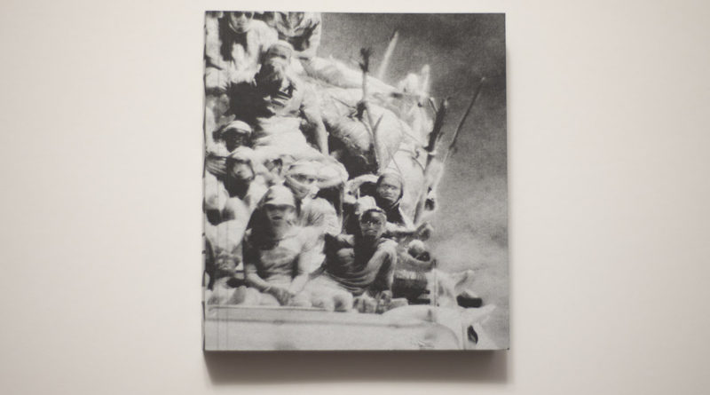
Much has been written about Richard Mosse‘s Incoming. It exists in the form of an elaborate video production and as a book. I have not seen the video, so I’m in no position to have an opinion about it. I do own the book, though, which is going to be the basis of this essay. If anything in the following is in conflict with what possibly derives from the video, then you will have to take this into account, please: I have not seen the video.
Let’s maybe talk about Bertolt Brecht‘s Verfremdungseffekt first. Translated as either distancing effect, alienation effect, or estrangement effect, in a nutshell the idea is for the familiar to appear as unfamiliar. Brecht’s idea was rooted in his desire to have theater as a place with social use, a place where viewers would not identify with characters on stage, but rather would critically engage with what was presented. He wanted the play to be seen as a representation of reality and not as reality itself.
It’s straightforward to apply this idea to photography: after all, photographs are a representation of reality, but not reality itself. Photography’s struggle with this basic confusion is ongoing. Much like in the case of Brechtian theater, thinking about the Verfremdungseffekt might help: if what is being presented visually is so alien as to break the link between reality and its representation (which in photography theory/criticism is discussed as indexicality), then we ought to be in business.
Or maybe not. After all, photography’s viewers are amazingly resistant to the Verfremdungseffekt. For example, the world doesn’t look at all like in those high-contrast black and white photojournalist pictures with their crooked horizon lines. Yet we view those pictures as depictions of reality, in part because we are used to seeing it presented this way. So Verfremdung doesn’t only have to do with what something is made to look like, whether or not, in other words, it looks like the world in front of our eyes. It also, and maybe even more importantly has to do with what we are used to seeing and with what we expect to see.
In 1990, a coalition of countries assembled by George Bush the Elder attacked Iraq, which had previously invaded and occupied Kuwait. One of the side notes of that war was the media’s obsession with video footage directly (and happily) supplied by the US military. Brand-new visuals became available, showing the war seen through the eyes of the murderous machinery itself, images and videos displaying strange colours and aesthetics.
Based on what I wrote above, you would imagine that Brecht’s Verfremdungseffekt would have kicked right in, making viewers question what was being offered. However, the exact opposite happened: instead of triggering critical thinking, what was termed the video-game war became a huge network hit. Not only was critical thinking not triggered, it was actually bypassed. People just loved their glorious war (and the technological prowess of their military). The US military (and other armed forces around the world) made sure to make a note.
A little later, German artist Thomas Ruff decided he was going to use similar cameras as the military had at their disposal. Instead of producing imagery of war, though, he was going to train the cameras on Düsseldorf (and other cities). Entitled Nacht (Night), the resulting photographs are everything the military’s are not. They’re devoid of any sense of drama. You might even say they’re boring. But they are also uncanny, because they transform Ruff’s neighbourhood into a place of (possible) war.
So the Verfremdung in the uses of night vision was not in the military’s (which was new and awesome in the awful way televised violence is), but in the artist’s (which was not new, but which played with expectations previously established by the military). Of course, roughly 25 years later, we now are so familiar with night-vision imagery that neither seems particularly striking any longer. But of course, the US military still supplies such imagery because it still does its job. Journalists such as Brian Williams will gush over it in ways that are beyond embarrassing (the situation is hardly better in other countries).


There is an interesting lesson here. I’m no expert on theater or Brecht, and there might be ample writing about how and when and where the Verfremdungseffekt works. Based on the examples I just discussed and based on a variety of other examples I can think of (which I won’t go into here for reasons of space), I’m tempted to think that in photography, you only get Verfremdung the second time around, when an audience is already sufficiently familiar with a visual presentation. When they see it for the first time, though, you’re more likely to encounter awe, as something unfamiliar visually overwhelms its viewers and — possibly — short-circuits the very critical facilities you might profess you’re interested in. There’s nothing, yet, that can get verfremded: your viewers’ expectations aren’t formed — even though they might have very firmly formed ideas of whatever it is that is being presented.
I cannot approach Richard Mosse’s Incoming and his previous Infra without these considerations in mind. I have ample reasons to believe that based on the reactions these works encountered, the very discussions this artist wanted to create did not happen. Instead, people spent endless time reading meaning into the two types of aesthetics themselves. If you apply early 21st Century art-world thinking, none of that really is a problem, given there was that “critical acclaim” (which, let’s face it, in light of what I just wrote really wasn’t that critical at all), and there was a Deutsche Börse Prize. I’m imagining, though, that if I were the artist I would be a tad frustrated, given I would really prefer to talk about something other than the damn colours of the pictures (or movies). Of course, I’m not the artist, so I won’t carry this completely futile Gedankenexperiment any further.
I don’t want to let the artist completely off the hook here, though. It’s not really just a reception problem. After all, the kinds of technologies used for Incoming and Infra are not only awesome for viewers, they also are for their users. In particular the camera used for Incoming, some military camera that supposedly is classified as a weapon — how can you not become a bit too enarmoured with its power? Isn’t this one of today’s conundrums in general that so much of the advanced technology we are given to handle is created in part with that in mind, to make us feel in awe in their presence? So that, to carry the thought further, the kind of critical resistance that Brecht had in mind is in fact futile?
Awesome cameras per se don’t make awesome work, though. It’s true, often enough they make work that initially is awesome. But for art to be art, it needs to unfold over longer periods of time than whatever span covers being in awe of something previously unseen. This comment really is not specific to the work discussed here only; it applies to all of photography. As an artist, you will have to grapple with it, even if you then arrive at the position adopted by Thomas Ruff, one of relentless experimentation, where the overall sum of all the work is a lot more impressive than some of the parts, which seen alone might not be that interesting at all.
It’s this problem that came to my mind, when I first heard of Incoming, and when I then first saw some images: OK, this looks cool, but what does it add up to? Well, I got the book, so let’s see.
The first aspect of the book that struck me was its physical form. It is compact: it’s small and surprisingly heavy. In fact, it’s like a little black brick, with silvery information on the cover. Its spine is fully taken up by the word “incoming,” and the front and back shows parts of the same image, somewhat ghostly looking people crammed on top of what might be a truck. On the back, the artist’s name is listed. Hmm, OK then. I’ll admit this first impression had me a bit wary, in the way that first impressions often tend to work.
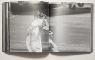
Inside, everything is silvery. It looks like a metallic ink on black paper, a paper that feels a bit slick to the touch. I suspect the intent might have been to replicate the idea of a screen, maybe with the idea of bringing the aspect of the backlit images from the videos to the book.
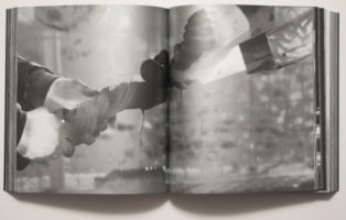
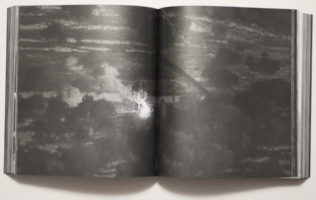
To be completely honest, I ended up having to force myself to make my way all the way through the book, literally thinking I couldn’t possibly write about it without having seen the whole thing. The first attempts to look at the book ended in me giving up after a little while. It’s not that I have no patience, but the book has 576 pages (with “280 tritone plates,” as the publisher’s website informs its visitors).
Anything north of, let’s say, 200 pages always is going to be a real challenge for a viewer unless you manage to keep her or him interested or, even better, unless you manage to get her or him so hooked that they don’t even realize how time passes as page after page after page is being turned. For me, that really wasn’t happening here. Maybe I’ve looked at too many books. But the first time around already, I thought something like “Oh, I get what they’re trying to do here.” Incoming, the book, is made to work like a video (maybe the video? Remember, I haven’t seen it), with clearly defined sections in which smaller aspects are being explored over and over again, their variations leading to some (usually very minor) idea.
The thing with books is, though, that they’re not videos. While I get the overall idea, if it’s being repeated in this relentless a fashion, the end result is not some deep immersion but rather a sense of tedium, that same tedium that prevented me from getting farther than around 50 or maybe 80 pictures at any given time until I forced myself all the way through. That tedium also arises from the fact that every picture is being treated in exactly the same fashion, namely full bleed across the gutter.
Now, you might suggest that I, as one of those internet types, simply suffer from attention-deficit disorder. I’m not sure that’s it, though. For example, the other day, I watched Andrej Takovsky’s Stalker. There’s not necessarily much happening in that movie. Some of the panning shots are so slow that you could paint a wall and watch it dry before they’re over. Still, I was absolutely mesmerized. If you condensed Stalker into a book, Incoming style, I’m fairly certain that would not work.
Photographs and video work in very different ways. Photographs are stopped time, videos are not. The reason why photography and video are each so interesting is even though strictly speaking one is based on the other, they’re not the same thing at all. Photography is exciting because of all the things you can’t do in video and vice versa.
That aside, the main question I had asked myself before I got to looking at the book and writing this article was: is this telling me anything new? To be clear, I didn’t mean this in the most literal fashion. I would have been happy if the book literally told me something new. But any new perspective, anything resulting from being put in front of some Verfremdung would have equally worked. (I’m writing this as someone who has followed the refugee/migrant crisis washing over Europe fairly closely — to the extent that it’s possible for someone not living there.)
In Europe, refugees/migrants are hard to miss. For sure, they’re on everybody’s minds to an extent that apart from the desperate people in search of a new or temporary home, they’ve also become Europe’s ubiquitous ciphers. In Italy, I saw a man, in all likelihood having come from Africa, walking on the highway. In Berlin, I went by shelters set up for refugees/migrants. In Warsaw, where there are no refugees/migrants from places in Africa, Syria, or Afghanistan (but plenty of them from Ukraine), I saw signs near hipster coffee shops that said “Refugees Welcome Here” (while the right-wing government made it very clear that wasn’t the case).
In an obvious way, refugees/migrants make for a good subject for artists. But it’s not very obvious at all what exactly the point of such art might be, and how this could be done. To cut to the chase, Incoming doesn’t get much beyond being an artful description of the crisis. It’s visually compelling in the way I already discussed above. But that same compellingness inserts itself too forcefully in between the viewer and what is being presented.
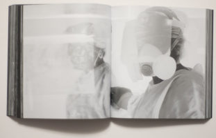
Crucially, I cannot get around the fact that the refugees/migrants who are at the work’s center end up being turned from one cipher into another, as the anonymized, visually distorted ghosts they are presented here. In other words, conceptually, we, as viewers from the very countries that now “have to deal” with the crisis…
Just one quick aside: what crisis are we actually talking about here when we call it a crisis? Ours? Our being overwhelmed with having to feed the desperate while living in a situation of overabundance? Or theirs? Their leaving their homes so as not to be torn to pieces by bombs or not to live “underprivileged” lives in abject poverty, deprived of most of the things we easily take for granted?
Anyway, we, as viewers from the very countries that now “have to deal” with the crisis are not moved from one sphere into another. Instead, it’s merely the means of technology changing with which these people are being viewed by us. Instead of being anonymous blurry faces in YouTube videos or equally anonymous participants in our photojournalists’ games or equally anonymous masses in TV reports (usually, they’re shown as masses, aren’t they?), Incoming treats the refugees/migrants as anonymous silvery/ghostly specters haunting its pages. The barriers of mediated artifice between “us” and “them” aren’t broken. There’s merely another one presented, one that we haven’t seen before, one that might tempt us to be in awe of the aesthetic.
To put this another way, if as an artist you adopt a visual strategy usually employed by a very specific professional (non-artistic) group, you will have to be very careful. You will have to either go all in, completely adopting that group’s strategies, amplifying it to an extent that the result becomes unbearable to watch. Or you will have to have things crack, so that through that crack a shift can happen in the viewers’ minds, a shift that indicates your own stance. For all good art that uses such adoption techniques, it’s usually the cracking that does the trick. But of course, the amplification method also works. But something has to shift. Somehow, what is being presented cannot be the same as what that aforementioned professional group would be producing.
It is that shift that I’m missing here. I don’t feel I am made to look past the aesthetic of these pictures. At the same time, the aesthetic is not being used in a way that would make me see it as jarring, as possibly inappropriate or very much appropriate. At the same time, the work’s stylization feels too self-conscious and too much in deference of the technology.
There is, in other words, nothing at stake here, and by “here” I mean the people involved in the world of this book (and video). Of course, there is a lot at stake for those depicted. Unfortunately we, in this other — art — world, are excluded from that. This has me think that Incoming is a piece of art for a secluded group of people. We can all nod, make the sounds we expect each other to make, and nothing will change.
