Barbara Bosworth’s Heavens

Article main image

These days, it’s hard to come up with something that unites us in our fractured, ever more decaying societies that are slowly eaten up by a mix of corporate greed, political cynicism, and internal rot. The only things that still stand above the fray are celestial bodies, most of them too far away for us to be able to despoil them as well. Stars, planets, and moons continue to shine their light on us, however pathetic a scene we produce down here, and we revere them for the beauty of their spectacle, for their astronomical sublime.

The night sky never fails to produce a sense of recurring beauty that even the greatest pieces of art have a hard time mustering. For example, the moon is always the same moon, always showing us the same side. It’s so familiar, yet it’s also so amazing to see in its many variations, which rage from the slight, tender sickle to the glaringly bright full moon that will illuminate an otherwise dark night oh-so brilliantly.

Given most celestial objects are too far away for us to visit, the history of astronomy is almost synonymous with a very particular history of photography, and, if we go back a little further in time, with people making art by sketching or drawing. We study these objects almost exclusively through the light they send us (where said light extends into domains invisible to the human eye). And if we are not among those who academically study them, we appreciate them in much the same way, through what their light has to offer.

I’ve mostly stayed away from looking at artistic attempts to deal with astronomy because of my background. I studied physics with a focus on astronomy. I spent years writing a Ph.D. thesis on (theoretical) astrophysics and then a few more years attempting to carve out a career in the field before aborting it. What has had me stay away from artists approaching astronomy is not so much that by training I know a lot about the topic, though. Instead, it is that artists often attempt to be or act like astronomers, and that simply doesn’t work for me. I once had Thomas Ruff explain to me what he thought astronomers weren’t getting about images, and I ended up thinking “If you only knew…”.

What can happen when an artist approaches the stars with a true artistic sensibility is demonstrated by Barbara Bosworth‘s The Heavens. To be honest, as much as I appreciate the fact that she produced the images with an 8×10 camera and the various technical contraptions needed to be able to make them, that’s not what has me interested. Instead, it’s the fact that their staggering beauty derives from the fact that they were made so a viewer can feel them, instead of merely see them.

In a strictly astronomical sense (which is also adopted by the sprawling community of astrophotography), many of the pictures are flawed. They’re not quite crisp enough, or they might be a little bit uneven or blurry. But that is exactly why they’re so great: they perfectly express the experience of someone who knows full well how to make a beautiful photograph, someone who knows how to let the experience of feeling a landscape drive that process.

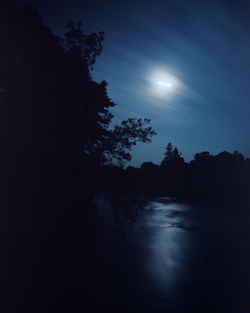
In one of my favourite photographs (on page 27 in the book), the frame is taken up by a sea of darkness. The sky really only occupies roughly the image’s upper third, allowing the viewer to see that Bosworth pointed her camera at a group of trees, which can be made out against the sky. There is what must be a full moon, brightly illuminated, but somehow also losing its struggle to provide light. What might have been a relatively bright light is turned into something altogether different through the tool of photography. A few clouds are visible above the moon, and a handful of other specks of light might be some of the brightest planets or stars.

A confident astrophotographer with their expensive tools would have turned the scene into the well-known image of a sky filled with stars and a moon whose details would have stood out sharply. But that’s not what I am led to think Bosworth was after. Instead, she wants to convey the sheer wonder of being in the presence of such a moon under an almost spotless sky at night when we all feel the presence of something much larger, a world of which we are only small and irrelevant parts.

This idea permeates through the book, with its countless photographs of stars, the sun, and the moon. It is that astronomical sublime that re-emerges time and time again, either with its specks of light against seas of darkness, with its delineations of landscape, or with what almost are portraits, images of the sun and moon that surprise and delight the viewer through the fact that these two are granted a character (I don’t know how else to describe it).

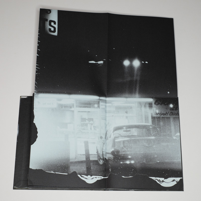
In addition to these photographs, The Heavens features reproductions of three booklets made by the artist, each with a different theme (“The Moon”, “The Heavens”, “The Sun”). Using a different paper stock and page size, these booklets break up the flow of photograph in a pleasing way. Yet in an otherwise large and somewhat imposing book, they also remind the viewer through their materials of the visual delicacy of most of the photographs. In addition, an appendix offers more visual material.

If art is about interrupting the certainty of our thoughts, then this book succeeds brilliantly. With Barbara Bosworth’s camera not attempting to reproduce the sky faithfully but instead conveying the sense of wonder we all feel, there is much to be enjoyed here. A lavish production, The Heavens begs for its inclusion in the collection of anyone eager to appreciate what the photobook can do.

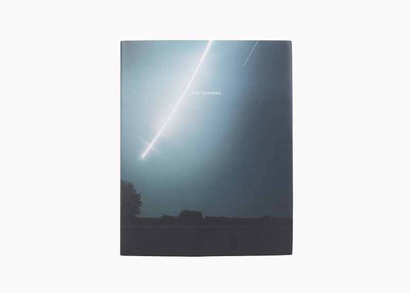
The Heavens; photographs by Barbara Bosworth; text by by Margot Anne Kelley, Joanne Lukitsh, and Owen Gingerich; 200 pages; Radius; 2018

Rating: Photography 5.0, Book Concept 4.0, Edit 4.0, Production 5.0 – Overall 4.6

(If you enjoyed this review, please consider visiting my Fundraiser. Reader support helps sustain this site. Thank you!)

Michael Lange’s Neo-Provoke

Article main image

However ambitious the members of Japan’s Provoke movement might have been, it was inevitable that it would run head on into a dead end. That dead end might have found its form in Daido Moriyama‘s 1972 Bye Bye Photography: where to go thence? Of course, as Moriyama demonstrated, you can make a career of shooting the same high-contrast pictures for another few decades. But that doesn’t necessarily mean it’s going to get you anywhere in an artistic sense.

In general, as a photographer you’ll run into a comparable problem any time your pictures’ form takes on a very dominant role. Unless you’re interested in formal aspects only (a very valid approach), you’ll find yourself struggling to have your content getting noticed. This is because in many cases, form becomes or maybe rather shapes content aggressively. This is true for Provoke (and its various offshoots, such as, let’s say, all those Scandinavian photographers employing the same tools), it’s true for classic photojournalism (with its variety of tiresome conventions such as high-contrast black and white, crooked horizon lines, etc.),  it’s true for the toy-camera crowd, for people using old Polaroid film… The list goes on and on.

Consequently, you will have to be careful with your photographic materials — lest they overpower you and your ideas. This conundrum certainly applies for Michael Lange‘s LA Drive By — both for the photographs themselves and for the form of the book. Let’s begin with the pictures. As the book’s title indicates, they were photographed in Los Angeles, from inside a moving car. As a location, the city, whose form negates what Europeans would think of as the essence of urbanity, is unthinkable without a car. You have to drive around to get anything done, and of course you can turn this fact into your photographic strategy.

It’s hardly a very original strategy, but it’s important to keep in mind that not every photographic strategy has to be original at all. There’s much to say for following the trodden paths to see what the world has to offer you. On top of photographing from a car, Lange also used photographic materials that would leave their own traces (from the looks of it, some Polaroid materials). So now you got those two strategies, the driving plus the Polaroids, on top of something that is fairly familiar from the history of photography, resulting in a project that is difficult to do well.

Lange pulled it off. I’ll admit that I’m not in the least bit interested in Los Angeles or in cars, let alone in driving around for a long time. But I’m interested in these pictures. I’m still a bit undecided to what extent this is because of the photographs’ form. I didn’t mentioned Provoke for nothing earlier. There is a very strong neo-Provokian sense running through the book, with — for me anyway — clear references of Moriyama’s stray dogs or Yutaka Takanashi’s Towards the City, not to mention the occasional other Japanese photographer from around that time (think Shomei Tomatsu, who wasn’t a member of Provoke). That works for me. It does feel familiar, but it doesn’t feel so familiar that I don’t enjoy engaging with the images.

LA Drive By was designed by Sybren Kuiper. If you think you know what that means, then, yes, you’re absolutely right. On top of various gatefolds, here you even get posters. There possibly is a different term for what you call it when you fold a poster into a book. But at various locations in the book, what looks like a simple spread will unfold twice to yield an image that’s four times the size of a regular spread.

I swear, while I’m writing this I can hear eyeballs rolling in the more conservative parts of photobookland: isn’t this overdesigned? While your mileage might vary, I don’t think it is — even though it’s really, really close. But it works. The unfolding is worth it. There’s one image in particular that had me excited, where after opening up the poster I was presented with the underbelly of a commercial jetliner flying overhead (this image had me think of Tomatsu). In fact, without having seen these photographs on the walls of a gallery, I’m tempted to think that this form, the book, is the one I’d want to look at.

In part, this is because the movement through the book mirrors the movement of the car (this might sound simplistic and superficial, but I don’t think it is either). But it’s not clear if any of the photographs in the book are good enough to warrant being shown on a wall. I know this is a sentence that’s easy to misunderstand. The pictures are good. But I think they only work together, in this particular form, where everything comes together. It’s the book that’s the piece of art, not any single picture (of course, this type of thinking is common in Japanese photography). I think once you put these pictures on the wall, they lose whatever grit they have here and become decorative (I’m sure the artist’s gallerists will disagree with me).

LA Drive By is a very good example of a book where its ingredients come together to deliver a very good book. As I hinted at, half of photoland is going to hate the book because it strays so far from their beloved gallery-show-on-paper format. Honestly, you’ll never be able to make a book that makes everybody happy. But seriously, put these photographs into that oh-so conservative format and, boy, would you have a terrible book. So this really works, and it works very well. Oh, and the production of this book is perfect. Anything short of perfect would have been a disaster for this complex production.

LA Drive By; photographs by Michael Lange; essay by Andreas Kilb; 194 pages (20 fold-out pages); self-published; 2018

Rating: Photography 3.0, Book Concept 4.5, Edit 3.0, Production 5.0 – Overall 3.9

(If you enjoyed this review, please consider visiting my Fundraiser. Reader support helps sustain this site. Thank you!)

Cristina de Middel’s Perfect Man

Article main image

I often think that the world of photography could use a little Dada. For the most part, it is relatively conservative, staid, and literal. Photographers go out into the world with their little machines, and they bring back truthful pictures that are intended to enlighten and/or delight the viewer.

Discussions frequently center about to what extent the idea of truth depends on the photographer’s choices once the pictures are in their little boxes (whether as bytes or as undeveloped film), how to “properly” display something, or how terrible all the non-experts are with their desire to have fun with their own cameras. This is not to say that there’s no merit to this approach, but you’ll have to admit its utility ultimately is limited. And, frankly, it’s boring.

Dada, in the words of the site the link will direct you to, is “often satirical and nonsensical in nature.” At a surface level, that’s certainly true, but it also misses the point. Or rather, it misdirects a reader who might raise an eyebrow coming across “satirical” and who will then just stop short once s/he arrives at “nonsensical in nature.” Don’t things have to make sense? What’s the point of doing something that seems to make no sense?

Then again, what reactions are left to you in a world that itself is, well, Dada, a world that is so obscene in a very straight way that no reaction in kind will lead anywhere, certainly not to any deeper insight? That’s the position the original Dada was coming from. “While the guns rumbled in the distance,” Hans Arp is being quoted if you follow the link, “we sang, painted, made collages and wrote poems with all our might.” In the face of the obscenity of war aren’t such activities obscene? Well, sure. But what exactly would not be obscene?

In the British sitcom The It Crowd, one of the running jokes is that the two main characters, Roy and Moss, when answering their phone will immediately ask “Have you tried switching it off and on again?” That often works for computers. But it doesn’t work for societies, cultures, or smaller aspects of societies and cultures, such as the world of photography. You cannot solve its problems or challenges by switching it off and on again.

But you could embrace a Dada approach, something that is satirical and maybe so “nonsensical in nature” at first that a viewer’s autopilot will simply be forced to switch off old thoughts and deeply ingrained mechanisms for how to react and then switch back on to possibly — even just for a short moment — be open to something different.

For me, that’s the key to Dada: once you’re prepared to have it switch off and on your brain you might be able to see the world in a different way — however briefly. During that moment, the satirical parts of Dada will be thrown into sharp relief. It’s not that they will somehow be less satirical. Instead, it’s the complete opposite: their satirical bite will get vastly enhanced. And then you are presented with a choice: do I got back to the world I am so familiar with, ignore what I just saw, and proclaim I’m just confused about the nonsense — or do I take what I just saw at face value and let it guide me to new values?

In other words, Dada is a means to an end. It resists being seen that way very strongly, in part because to acknowledge it would in part self-defeat the whole underlying idea. To acknowledge it would pull Dada back into the world it proclaims to escape from (seen that way, Dada has much in common with a sulking teenager, who cares so much about the world that s/he pretends s/he couldn’t care less). Still, though, you can’t view Dada without its ultimate goal, the higher truth it’s attempting to get at.

It might be tempting to think that I came up with my Dada reference for Cristina de Middel‘s The Perfect Man because of the prominence of Charlie Chaplin in the book. For a start, Chaplin (the character) wasn’t Dada. More importantly, though, in the book, the idea of Charlie Chaplin, here in the form of Indian men acting as impersonators (hang in there, this will all make sense shortly), is a Dadesque misdirection of sorts, and that’s where it gets interesting. After all, what the book really is concerned with is the role of both masculinity in India and the visual depiction of the country itself.

In other words, the book sits at the nexus of two huge topics that in one form or another for a few years have been plaguing the world of photography (or rather those of its members who have been paying attention to the various problems contained in the medium’s history). How would you go about making work that deals with this nexus? You could (the conservative approach) go to India and make earnest photographs around Indian men, trying to be very aware of the role of “the other” there (whether in the form of People of India or, more recently, around National Geographic-style photography done there). That approach could work, but of course, it’s fraught with danger.

Alternatively, and this is what de Middel does here, you could keep all that in your head as the background, and you could then, Dada style, make work around the topic that is so outlandish that a viewer will be thrown off balance, to approach the subject matter anew, freed from having to consider the various pitfalls (at least initially; also note that given the world of photography is so incredibly conservative, to produce something outlandish is a lot easier than in, say, painting).

So the viewer gets to see a bunch of photographs of Indian men attempting to look like Charlie Chaplin first, and the other photographs initially don’t necessarily register quite as much. The relevance of those photographs will become clearer later once the viewer is sufficiently ill-prepared to deal with what is being thrown at her or him, in other words, once s/he has lowered her or his defenses enough, given there’s the expectation of a book about Charlie Chaplin.

But it’s not about Charlie Chaplin, because the book proceeds to talk about ideas of masculinity in India: the jobs men might have and the expectations they have to deal with, given their culture. Borrowing ideas from Chaplin’s Modern Times, Indian men are shown at work, engaging in a variety of ways with the various machines near or around them. So the men now aren’t impersonating Chaplin through dress or masks any longer, they become Chaplinesque characters in their own world. This is a deft move by the artist, given that now the viewer is moved into the territory where s/he has to consider to what extent we all are products of the circumstances we find ourselves in and to what extent we are responsible ourselves.

In the final section, the book moves out of this realm completely, having sufficiently disarmed the viewer, to describe with a few pithy pieces of text the other side of this masculinity, namely the role of women in India and the frequent and widely accepted abuse directed at them. Here, there is no more Charlie Chaplin. Instead, the pictures all center on aspects of masculinity.

As can be expected for this particular artist, the book makes use of the various bells and whistles available for contemporary photobook makers. The various choices made are carefully considered — for example, the colour blue that is used widely refers both to blue-collar work and to a blue-skinned Indian deity associated with masculinity. The overall effect is one of playfulness, which adds to the initially disarming character of the book.

On the surface, this is no book for the vast überconservative block that forms the heart of photography. There is a lack of (surface) seriousness here, but the book also doesn’t pull a Martin Parr where you know immediately where you’re at. Instead, what might come across as just some sort of silly superficial joke becomes very serious, to, as I noted above, discuss topics that are in dire need of being explored more deeply. And the book does this very well.

The Perfect Man; photographs, text, and drawings by Cristina de Middel; 176 pages;La Fabrica; 2018

Rating: Photography 3.0, Book Concept 4.0, Edit 3.0, Production 4.5 – Overall 3.6

(If you enjoyed this review, please consider visiting my Fundraiser. Reader support helps sustain this site. Thank you!)

The Precious-Picture Complex

Article main image

The vast majority of photography revolves around the unary mode: each person, thing, event has to be represented by exactly one picture. In other words, as a photographer you go out to photograph a person, thing, or event, and before the world sees what you saw you spend time in your studio to reduce everything down to that one picture that… Well, what? What exactly does the one picture do?

In light of the world’s complexities, reducing something down to one picture is a gross oversimplification that, however, is not without its merits as the history of photography demonstrates. This history also contains examples of photographers straying from the single-image idea, starting with, let’s say, Eadweard Muybridge and then moving through the ages here and there in a variety of ways up until, Paul Graham‘s A Shimmer of Possibility or Sandi Haber Fifield‘s After the Threshold.

Even these latter two artists cannot fully move away from the idea of the single image, as their presentations make clear. For example, Graham’s Shimmer vignettes each are hung in an exhibition as clusters of carefully and individually framed photographs. In contrast, the vignettes in Threshold revolve around very specific and equally carefully selected images. These artists thus expand the idea of the single unique picture without being able to fully untether themselves from it.

In a different way, graphic designer Yoshihisa Tanaka and the sculptor Ryuta Iida (who form the duo Nerhol) attempt to circumvent photography’s single-image limitations. Using a large number of individual portraits of a person, taken over the course of a few minutes, they produce what many people would probably describe as a sculpture that, however, when presented ends up as an individual single photo again (find their process described here).

In yet other ways, artists such as Barbara Probst or Andrzej Steinbach have been exploring photography’s seemingly inherent focus on that one picture. To this end, Probst constructs often very elaborate multi-panel installations, where each individual picture shows the exact same situation, albeit from a different angle and possibly with different means. Where Graham dissolves a short moment into a burst of individual images, Probst does the same for the idea of the vantage point. Still, the end result yet again is a group of carefully framed prints.

It is Steinbach who gets close to what I’m after here. Seemingly doing away with the idea of editing, he presents photographs of, let’s say, a single person none of which on its own appears to have any more relevance than any of the others (the artist has employed his technique also with smaller groups of people). A viewer very familiar with photography’s standard approach for dealing with pictures will inevitably get confused when s/he is presented two photographs that appear to have been taken in rapid succession: should there not be a choice made, picking one picture over the other? What does it mean to look at two, especially when they’re so similar?

This is where things get interesting. It’s still photography, yet it subverts our expectations — and that’s what I’m after here. Who says there cannot be new things done in photography? New, I should add, not for the sake of its newness — that would quickly become tedious — but rather to explore what photography can do when you do away with some of its (at times fairly arbitrary) restrictions.

After all, would photography have moved so quickly towards the single image after its invention if painting or print making had never been around? It’s a nonsensical question, given that one of the reasons why photography was invented was exactly to circumvent the limitations created by the maker’s hands in painting or print making. So photographers treated their images like paintings (producing a single image) and prints (employing ways to mass-produce said single image into a set of identical copies, whether in ink or otherwise).

One might imagine that once roll-film negatives was made available, artists would have embraced the fact that they could, in fact usually did, produce variants of the same picture. Those variants were what artists worked with, when they inspected their contact sheets. That embrace never happeend.

As far as I know, even people as willing to push the boundaries as László Moholy-Nagy did not expand beyond the single-picture approach. Moholy-Nagy’s 60 Fotos is filled with daring ways to explore photography — some so visually exciting that they manage to inspire my students to this day. But in the straight photographs, it’s the single picture that matters (in some of the montages, picture fragments might appear multiple times). Maybe it was the presence of movie making that got in the way. After all, what are movies other than collections of very large numbers of picture variants that, however, the viewer gets to see one after the other?

It is interesting to note that Muybridge at times strayed from — or maybe went beyond — what he is known for. I own a copy of the third edition of his The Human Figure in Motion (which carries the great subtitle An Electro-Photographic Investigation of Consecutive Phases of Muscular Action), printed in 1907. After 172 pages of the multi-panel displays that he is so well known for, there is a second section in the book, Miscellaneous Phases of the Human Figure in Motion. In that section, parts of the panels shown earlier are enlarged, with small groups and occasionally a single photograph. This section does not quite get into A Shimmer of Possibility territory, but at times, the rigid scientific approach of the multi-panel presentations is broken up enough to hint at the actual power of the photographer’s work.

I usually refer to photographers’ usual insistence on picking a single image, the single image, as the Precious-Picture Complex. As I noted, there is a validity to this approach: the moment you reduce a complex situation, event, or person to a single photograph all kinds of things can happen. Those can be good or bad.

For example, we are so used to knowing of what we call iconic photographs that we don’t question them any longer. In fact, parts of photoland debate which one of the pictures around some event is likely to become the iconic image, the one image that gets to stand for how the event is perceived. This approach is understandable, especially in light of what I discussed above. But it also runs the risk of simplifying things too much, of creating too simplistic an idea around something or someone who is a lot more complex than one single photograph could possibly convey.

So the simplification is not even just the selection of a single picture. It also is our own taking that single picture at face value, tossing aside what we know photography is and does: a highly selective process that always simplifies whatever is in front of a camera lens.

As I already mentioned, it doesn’t have to be this way. Steinbach’s approach might strike some as being overly arty (I don’t think it is), but even going back to some of the history of photography will unearth examples of photographers pushing beyond the Precious Picture. The above is just one spread from David Douglas Duncan‘s 1969 Self-Portrait: U.S.A., a book that for a variety of reasons deserves a lot more attention than it actually gets (given that the book hasn’t been written up by the makers of any of those photobook meta books you can get a copy for around $10 online).

In that spread you have 15 tightly cropped photographs of then presidential candidate (and later presidential crook) Richard Nixon at a press conference. In fact, there is a little section in the book that covers that press conference, and each spread works with these multi-panel layouts. The result is effective and impressive: no single photograph would have been able to describe this (and, let’s face it, many other) politicians’ mastery at manipulating an audience as well as embracing this multitude of photographs — all taken within a relatively short time span.

So the single photograph, the Precious Picture, has its uses. But especially given the times we live in, where photographs are used and misused so frequently that our first instinct is to check first whether a photograph is real or in the proper context before reacting — in such a time, maybe moving away from the insistence of the single photograph can help revert some of the erosion of trust in this particular medium.

Seen that way, we’ve almost brought photography’s crisis of credibility upon ourselves, by unnecessarily reducing it to its simplest incarnation, an incarnation that’s filled with problems and that is almost begging to be abused. But we can also help solve the crisis. This might mean that we have to abandon some of the ideas we hold so dearly when it comes to photography, in particular our insistence that everything — every situation or person — has to be represented by a single picture and only by a single picture.