Photobook Reviews (Week 35/2014)

Article main image

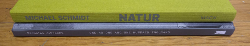
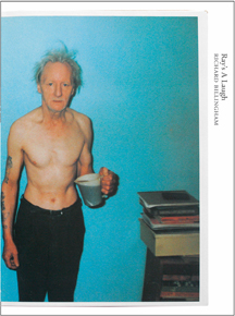
I’m not sure what to make of the selection of books for the most recent Errata Editions books. But then, it’s probably just like which books made it into the Parr/Badger tomes (and which not): to a large extent, it might just be based on personal preferences. That said, I was very excited about the inclusion of Richard Billingham’s Ray’s a Laugh. Most photobooks have much more to offer than the usually handful of images that are widely known, and Ray’s a Laugh is a particularly good example.

If you’re unfamiliar with Errata Editions here is what these “books on books” are. Each volume is dedicated to a single photobook that (usually) is out of print, here Ray’s a Laugh. The photobook in question is fully reproduced in the form of photographs of a collector’s copy (this one is Jeffrey Ladd’s). The Errata Editions books are all the same size, meaning that if the aspect ratios of the photobook in question is very different, things can get a bit iffy. In this particular case, most spreads contain a single spread from the original book. But there are also a few cases of two spreads being shown, one on the left, one on the right page. In addition to the reproduction of the original book, there is a longer essay by a specialist (here Charlotte Cotton), putting the work in perspective, a short essay by Ladd (the mastermind behind the series) with details of the original book, plus a short bio of the photographer.

As someone teaching photography, in particular the history of the photobook and how photobooks work, many of these Errata Editions books are very useful. They make photobooks accessible that otherwise would be unavailable (in this case, the university I’m teaching at has a copy of the original in its library, though). All the various details I outlined above make these books very good research material. But that also is one of the weaknesses of the series: the books never become more than that, given the uniformity of the production and form. So as a collector, I’m still going to be looking for an actual copy of Ray’s a Laugh.

What all of this means is the following: if you buy a copy of Ray’s a Laugh, expecting to get the experience you’re get from looking at the original book, that’s not going to happen. That’s an unrealistic expectation – not a shortcoming of the concept behind the Errata Editions books. If you can look beyond the restriction in form, Ray’s a Laugh has a lot to offer (incl. such goodies as a few reproductions of proof prints or of the original maquette). In particular, if (like me) you don’t have the roughly $300 that a used copy of the original might cost, you’ll get access to a brilliant photobook, however indirectly.

Considerable parts of the history of photography are filled with male photographers taking pictures of mostly younger women, in all states of dress or – usually – undress. This does fit in with the Western history of art in general (see, for example, Kenneth Clark’s The Nude: A Study in Ideal Form), which in itself, however, does not diminish the various aspects of how and why it’s also quite problematic (I attempted to discuss one of them in this piece). Things get even more problematic once you add the portrayal of women in the media, a portrayal that uses and relies on (often heavily retouched) photography to push a very particular image of what a beautiful female body is supposed to look like.

How and why this is extremely problematic is spelled out beautifully in interviews with the women who were photographed by Jodi Bieber for Real Beauty (the book is listed on the German Amazon site, but not on the US one). All of them were photographed in their underwear in (what look like) their own homes, and they each were given the opportunity to talk about their bodies and how they deal with the expectations they run into. And the photographs taken by Bieber belie those very expectations. If the heavily Photoshopped photographs of women on the covers of magazines essentially showcase the beauty of androids, Bieber’s photographs show what real beauty looks like. And the beauty here is included in each and every aspect of the work, including in the very gesture of making it.

We can’t run away from the history of photography. We can’t cherry pick the parts we like and pretend all the nasty ones didn’t (or don’t) exist. It is up to us to learn and know about the many problems photography can create, and we need to confront them. Luckily, as a medium photography can be its own corrective, and Real Beauty makes a very strong case for that. While writing or scientific studies can educate us why contemporary beauty ideals are so problematic, photographs can show us the feeble foundations those ideals rest on.

It is very important that photography itself can be its own corrective: it shows us that it’s not the medium that is flawed. Instead, it’s our uses of it, or – more often – our acceptance of these uses. After all, silence implies consent.

Real Beauty; photographs by Jodi Bieber; essays by Stephan Mann and Steffen Fischer, Jodi Bieber, Ferial Haffajee, Mieke Bal, Pumla Dineo Gqola, Michket Krifa, Lauren Beukes; incl. interviews with the subjects; 107 pages; Pagina; 2014

Rating: Photography 4, Book Concept 3, Edit 3, Production 4 – Overall 3.6

)

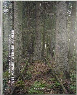
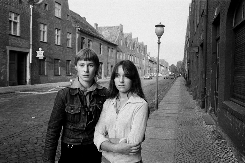
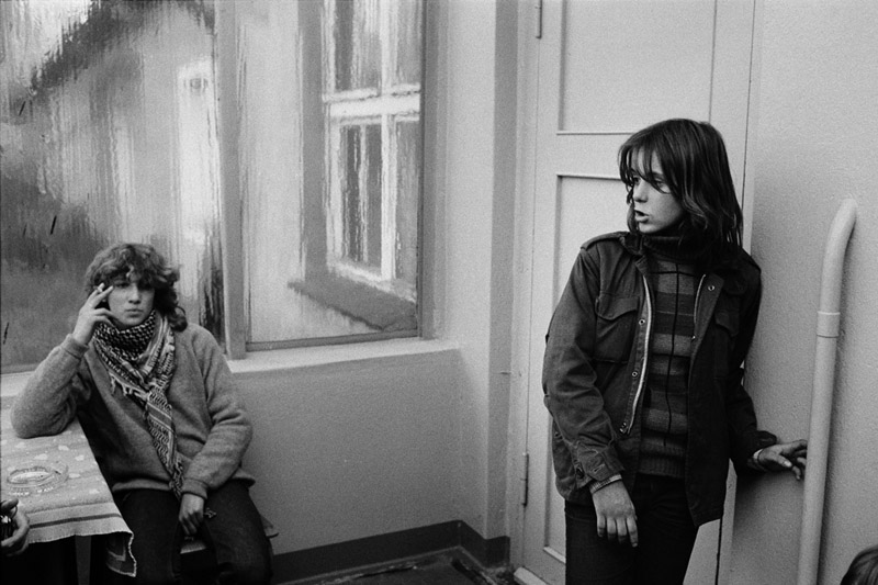
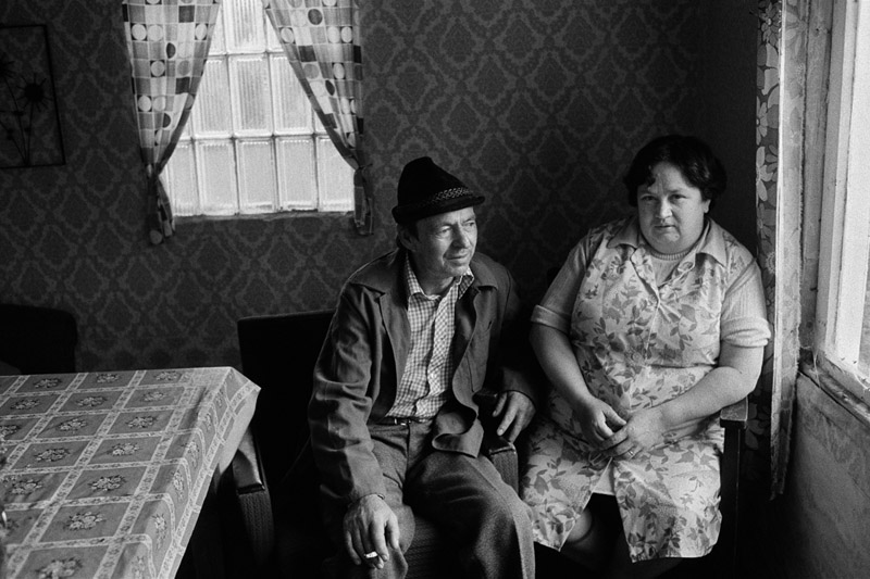
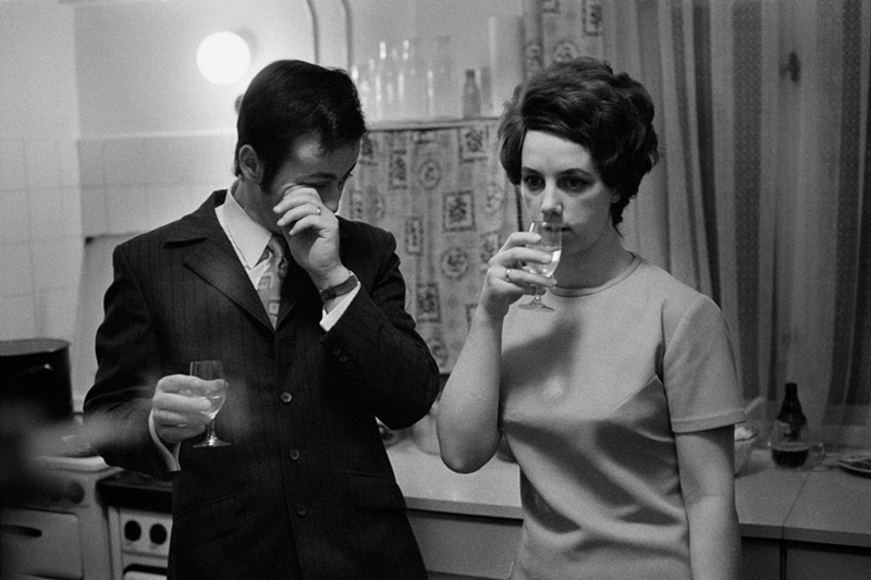
Earlier this year, Hamburg’s Deichtorhallen staged a major retrospective of the work of Ute Mahler and Werner Mahler. A married couple, the two only started working together as photographers a few years ago. Up until then, they photographically went their own ways – with separate projects and commissions. With their East German background, the Mahlers’ work reflects a very specific and still often overlooked part of German photographic history. But it would not do the quality of the photographs any justice to confine it to this particular niche. Much of their photography centers on the human condition (see my recently published piece discussing Ute Mahler’s Zusammenleben), looking at what it is that we do to each other and how we go about our lives.

Neither Ute Mahler nor Werner Mahler has ever shied away from incredibly challenging projects. In 1975, Werner Mahler photographed the inside of a coal mine and its miners hard at work. Because of the intense heat, most workers did their job in the nude (except for boots to protect their feet) – it’s hard to imagine what photographing under such conditions must have been like. In 1993, Ute Mahler photographed a German neonazi, his family and friends.

And then of course, Werner Mahler went to the Berlin Wall the night it was opened, November 9th, 1989. A picture shows groups of men standing on top. It’s a somewhat blurry photograph – light was low for sure, but it’s hard to imagine the photographer’s hands not shaking just a little bit from excitement. Another photograph prominently features a man in a jubilant pose right in front of the Brandenburg Gate. There must have been a flash, the man is lit against the mostly dark background. It’s a moving photograph, a photograph that deserves to find its way into the canon of work done around German reunification.

All of these photographs are included in the catalog from the retrospective, Ute Mahler and Werner Mahler (Kehrer 2014). Unfortunately, its designer went a bit overboard. But that does not take away from the fact that the book deserves to be seen beyond Germany. Never wavering in their firm belief in what makes us all human, Ute and Werner Mahler have been compiling an utterly impressive collection of photographs. They’re still working, their latest body of work – a meditation on the very quiet moments in life – opens us yet another new chapter for them. With so much superficial, flashy and ultimately forgettable photography now being bandied around, these two photographers demonstrate what can be gained from fulfilling the medium’s real promise.

(no ratings for Ray’s a Laugh and Ute and Werner Mahler since the two books aren’t monographs)

Ute Mahler – Zusammenleben

Article main image
Ute Mahler

What do we do with – or to – each other when we live together with someone? Living with other people entails a flurry of things that we are all familiar with, even though large parts of our experiences might not have risen to the level of consciousness. What we feel and see: do those we live together with feel and see the same? How do we navigate this seemingly endless territory? Over the course of a decade and a half, Ute Mahler photographed people in her immediate surroundings to find out.

What can photographs tell us about living together with other people? In a brief afterword to Zusammenleben (German for “living together”), a book that collects many of the pictures, Mahler writes “I was spurred on by the question of how familiar people were with each other, as well as how alien they could become. Today, I think I probably wanted to take pictures where you could see love.”

Isn’t that interesting how forty years after the very first picture was taken the photographer’s mind has shifted from thinking about pictures showing people living together to pictures showing love? For a start, photographs have a much easier time depicting two (or more) people living together than showing love. Photography deals with surfaces – much like we do as well. We cannot know for sure what is going on in another person’s head, unless we are being told (and even that might not be the full or actual truth).

But Mahler’s statement is informed not just by having photographed all these people, not just by having studied the resulting pictures very carefully (the artist is one of the most astute reader of photographs I have ever come across), it is also informed by having lived a life of her own, a life that includes her husband Werner (also a well-known photographer) and their son, Paul. There is a picture of Werner and Paul in the book, a very small image showing Werner in bed, with a baby lying on his naked chest, photographed from above (in the bottom right corner of the frame, the photographer’s foot is visible).

Photography and life are inseparable. If you are a photographer, you need to live with your pictures just like you want to live with other people: take them very seriously and listen to what they tell you. But photographs aren’t like other people in the sense they reflect back to you, as the photographer, how you see the world. They encompass your decisions about very particular moments in time. So they tell you at least as much about the world in front of your camera, as about what went into the decision to press the shutter button at very specific moments in time.

You might have pressed the shutter button multiple times, resulting in multiple pictures around the same subject. Your task is then to pick the one that “works,” the one that is better than all the others. Better in a photographic sense, of course, because other people will have no access to your feelings, thinking, or intentions. So suddenly, the pictures become independent entities, partly detached from you, because the best frame might not be the one you would want to pick. But you’ve got to be honest with your pictures…

As a result, what we think we intend to do with our pictures and what they end up doing might be two entirely different things. Or they might overlap in curious ways, with one – “the question of how familiar people were with each other” really just standing in for another – “pictures where you could see love.” 

Seen that way, photographs behave like mirrors, except that they don’t necessarily reflect back what we think we know about ourselves.

Can we see love in the picture above this paragraph? We can certainly try detecting it. But isn’t the woman leaning away from the man (her husband?)? Isn’t he looking out of the window, while she is looking at the camera? Are they mentally in the same space in the way that they physically are? And even if we were to conclude that these two don’t necessarily look like there is love between them – how would we know what might have been the truth the moment the picture was taken?

Much like life, photography is an exercise in futility. Photographs can’t show us some of the most important things in life, yet we keep being engaged with it anyway. In part, this is because somehow what went into the making of photographs can be felt by the viewers. More than once, I had the opportunity to watch Mahler engage with students and their photographs, and this seemingly so German woman inevitably would start talking about what she was feeling in the pictures.

How about these two? Isn’t it interesting how you can feel something in this picture? You can approach the photograph formally and study its composition, you can study its visual content, but you can also feel something here. To be able to make photographs that convey feelings is an immense gift, but of course in part it is rooted in being able to be susceptible to what other people might feel. Photographers’ empathy (or lack thereof) is a topic that is rarely discussed.

We don’t talk about feeling in photography much, don’t we? Maybe Zusammenleben can teach us what can be gained from approaching photography in this way? I want to think so.

Needless to say, my reading of these photographs might be biased, given I know Ute Mahler quite well.

But there’s a good title for a book yet to be written: The Empathetic Photographer. There’d certainly be a chapter about Ute Mahler in it.

Zusammenleben; photographs by Ute Mahler; essay by Sybille Berg; texts in German/English/French; 144 pages; Hatje Cantz; 2014

Review: Pandora’s Camera by Joan Fontcuberta

Article main image

Joan Fontcuberta is a bit of an unusual photographic artist. His approach is rooted in conceptualism. But unlike most conceptual photographic artists who all-too-often produce work that mostly speaks to their own circles (plus to museum curators), Fontcuberta applies his thinking to what we see around us, the photography that we might engage with on a daily basis. Often, there is a fair amount of humour mixed in, humour not intended to mock, but to make us enjoy having been taken for the fools we are believing in photography. A recent publication by MACK entitled The Photography of Nature & The Nature of Photography provides a wonderful overview of the Fontcuberta universe (find my review of the book here; note that there also is an electronic version of the book).

The frequent noises by many theorists notwithstanding, not only do we firmly believe in photography, we also cling to a lot of strange thoughts about the medium. This is a fertile breeding ground for articles about the medium’s crisis and/or shortcomings. It’s also where Fontcuberta walks around, picking up little things to turn into visual wonders. And it works. I have shown students examples of his work – let’s say the fossilized mermaids, with the immediate result usually being an incredulous “is this for real?” before the realization sets in that, oh yes, we’re in class, so it can’t be (or can it?).

With Pandora’s Camera Fontcuberta now reveals the thinking behind his work. A collection of essays about photography, the book is a most welcome addition to the growing canon of writing about the medium in English (the original Spanish language version was published in 2010). You wouldn’t necessarily know it from the titles of the individual essays, but the book addresses many of the topics that have frequently been discussed over the past few years.

The Mystery of the Missing Nipple, for example, talks both about the Photoshopping of celebrities and digital manipulations in photojournalism. And Fontcuberta is not afraid to pull any punches. Addressing the use of manipulated pictures in a news context (this includes strategically cropped), he writes “The hypocrisy in all this is that editors rend their garments and wave codes of ethics in the air when these things are done by photographers, but are perfectly happy to permit and justify them when they coincide with the institutional or corporate interests of their papers.” (p. 140)

Most people are probably familiar with a lot of the various hot topics and/or scandals we have been dealing with in photography over the past few years. Fontcuberta’s contributions to these are refreshing in that they work with the medium we have, not the one we think we have or want. But Pandora’s Camera contains a lot more. Various essays deal with topics I have not seen discussed much before. Just to give one example, Eugenics Without Borders chronicles how historically, photography was used to categorize people, with attempts to infer their characters (incl. their possible criminal intent) from their features, and it connects these historical examples with contemporary work around identity and the role of the portrait.

As a writer, Fontcuberta is quite the raconteur, adding considerable charm and lightness to his essays without ever losing sight of the points that he needs to make. I Knew the Spice Girls does indeed mention the singers (talking about his daughter, Fontcuberta notes “just think: she survived her premature birth only to turn into a fan of the Spice Girls!” [p. 57f.]), but it uses a digital template of theirs, found in a London photobooth, to discuss the possible changes in photography brought about by the change from analog technology to the digital one, arriving at “There are photographers who enthuse about digital technology because it means their work no longer depends on luck, but we can turn this argument around: the unconscious that the Surrealists valued in the gaze of the camera is neutralised by too much control and rationality. […] only time and experience will reveal the collateral damage and let us see what we have lost.” (p. 63)

There appear to be two major strands of thinking around photography. One has completely bought into the talking points coming out of Silicon Valley, hyping the (supposed) promises of digital technologies and “social media.” The other, opposing one laments all that is already lost and attempts to cling to whatever is still with us that might get lost soon enough. Thankfully, Fontcuberta is open to listening to both sides, taking what appears to be valuable and putting it to the test. Pandora’s Camera does not uncritically embrace all that is new, yet at the same time it acknowledges the expansion and enrichment the medium photography has experienced over the past few years.

This approach mirrors the artist’s work with photographs: take everything at face value, and then let’s see where this gets us. At the end of the day, photography tells us more about ourselves than we imagine. Thinking and/or writing about photography has less to do with the medium and its inherent properties and more with trying to understand our own reactions to it. For anyone seriously interested in photography, Pandora’s Camera is required reading.


On Process (Further Down the Rabbit Hole)

Article main image

Last year, I wrote an article entitled On Process. I’ve long been struggling with how process is treated and discussed in the world of photography. Committing my own thinking to the electronic screen seemed like a good way to address some of my frustrations. The article’s core is centered on the following: “For me, process alone almost never makes a good or interesting photograph. Process is not enough. […] A good photograph is a good photograph in such a way that the process itself might be an integral part of it, but it’s not the focal point. In other words, the moment you can almost separate out the image from the process […] you’re in trouble: Suddenly, the process itself becomes part of what is being evaluated.” Being the author of these words, I still know very well where I was coming from. But I also feel there is too much of the baby dangling dangerously over the edge of the bathtub now that I got rid off the bathwater.

Some of the original impetus behind my article is unchanged. Usually, nothing irritates me more than some photographs being presented starting out with a description of their process. Having been exposed to such PR for years now, I’ve come to the conclusion that most of the work showcased that way is, well, not very interesting.

Mind you, there often is that element of visual attractiveness, which is coupled with pictures looking rather different than your run-of-the-mill straight photography. This holds in equal part for tintypes and for images on Instagram – to pick two very different processes (however in these two cases something interesting is happening: a digital version of a tintype usually looks much less interesting than the actual object, and most Instagram images don’t survive being printed on paper very well at all).

Still… At the end of the day, it should be about the pictures. It’s one thing to take a camera and make tintypes. It’s quite another thing to take a camera and make tintypes that aren’t just lousy pictures in the form of tintypes (of course, the same is true for Instagram or any other process). So I look at the pictures first – are they any good? – and then at the process.

But, and this is important, there is very process-centric work that not only is extremely interesting, but that also focuses heavily, if not exclusively, on the process itself. Over the past few months, I have been looking at – and enjoying – quite a bit of it. Before looking at examples, this leaves me with this following curious position: process doesn’t matter, except where it does. Needless to say, that’s not a very useful statement, in particular for someone who wants to write critically about photography. How can this be improved?

When teaching photography, there will be the inevitable point where I will ask a student to what end they’re doing whatever it is they’re engaged with. This is not quite the same as asking what is at stake (for either the photographer or the viewers – I ask that a lot as well). Instead, I want to learn whether the decision to do something actually makes sense. I don’t necessarily need to agree with the decision, but I want to find out whether the student has an actual reason beyond, let’s say, “it looks cool.”

I want to bring that approach to thinking about process, because I think it can help me clarify my approach: in a body of work whose process is very prominent to what end is the process being used? This splits thinking about process into two branches. First, there is work that is very clearly about process itself. Second, there is work whose focus lies elsewhere but for which process plays a prominent role. An example of the former would be Marco Breuer‘s work. Richard Mosse‘s The Enclave is an example for the latter.

Before proceeding, I need to point out a few things. My approach constitutes a simple model intended to help me guide my thinking and not more than that. I really would not want the model to be used as the basis for yet another discussion for the question “what is a photograph?”. That stopped being a fruitful question to approach photography sometime in the 1980s (or even earlier). What is more, there is quite a bit of work that falls clearly smack in between the two branches, making things more complicated. For example, in Michael Wesely‘s work the process and its focus – the passing of time – fuse. Such work serves as a reminder that ultimately, all photography is process centric – we just only talk about cases where process strikes us as dominant.

With Breuer’s work in mind, it becomes clear why my earlier statement that “process alone almost never makes a good or interesting photograph” is problematic. OK, there is that qualifier “almost never,” but I don’t want to argue on that basis. There is indeed photography that is very process centric and that is very good and/or interesting. Process can be enough, more than enough actually. To separate out process from the work in such cases can easily become problematic, and it’s not clear what is actually gained from doing that.

But abstract, very process-centric work has never really been a problem for me anyway. The frustration I have been talking about earlier has instead resulted from work such as Richard Mosse’s. Please keep in mind that I’m using Mosse as an example. One of the artists whose work I’ve spent a lot time looking at lately is Daisuke Yokota, and I intend to write about it in a separate piece.

But Mosse’s Enclave can serve as a perfect example of work that has truly ruffled my feathers. Or more accurately not necessarily the work, but rather the way it was sold and discussed. Photographed in Congo, using some infrared film, the work presents us with… yeah, with what? Here’s what the publisher of his book wrote. Photographing “in eastern Democratic Republic of Congo, a region in which a long-standing power vacuum has resulted in a horrifying cycle of violence, a Hobbesian ‘state of war,’ so brutal and complex that it defies communication” (this alone would require a thorough dissection) The Enclave is the culmination of Mosse’s recent efforts to radically rethink traditional representations of conflict photography, drawing on artistic and documentary strategies in equal measure. […] With both still- and 16 mm-cameras, Mosse uses a discontinued military surveillance film, which registers an invisible spectrum of infrared light. The resulting surreal palette describes these isolated, jungle war zones and the soldiers that inhabit them in disorienting psychedelic hues of scarlet, lavender, cobalt, and puce. […] Mosse has captured a landscape that is deceptively seductive, alluring. Ultimately, however, the resulting images and film map the otherwise invisible edges of violence, chaos, and incommunicable horror.” (source)

I don’t think so.

When I first saw the statement I thought “Oh, that’s cool, this is trying to make me rethink ‘conflict.'” Given I knew next to nothing about the conflict in question, I bought and read Dancing in the Glory of Monsters: The Collapse of the Congo and the Great War of Africa by Jason Stearns. This is probably not what art and/or photography critics do when they’re being presented with work. But I thought that in order to be able to have an educated opinion about the work I needed to know more about the background story.

Having read that book, I liked The Enclave even less.

Let’s take the publisher’s statement at face value (why wouldn’t we?). If these images are documentary in any loose sense of the word, are they doing what they are said to be doing? I think the answer to that is a resounding no. No, they are not. They show us a, let’s face it, fairly romantic view of a region in Africa that has seen enormous amounts of suffering, the romanticism a bit disturbed by the bubble-gum pink. Because that’s what it is: these images ultimately are quite romantic.

I don’t think the various statements surrounding the work were questioned much, given that everybody was talking about the process (a noteworthy exception, a piece by Lewis Bush, can be found here).

Seriously, we’re dealing with one of the most horrific conflicts in Africa in recent years, and all we can talk about is the infrared film? What’s wrong with us art-photo people?

As much as traditional representations of “conflict photography” are problematic, showing us these pictures hardly can be the solution, can it? Rethinking representations of conflict is fine. But I want to think that whatever the solution might be, it should still talk about the conflict.

Speaking of the “incommunicable horror” mentioned in the publisher’s blurb, the reason why that Marlon Brando scene in Apocalypse Now works so well is because it’s at the very end of the movie. At that stage, the movie has attempted to show us the “incommunicable horror” of war in all kinds of ways (many of which we are familiar with from “conflict photography”), and it’s very clear, that some things simply cannot be shown or told. Cue Brando. Exeunt.

Not to dwell on The Enclave too much, but it’s a good example to explain where my frustration with process is coming from. There are various other such bodies of work, all of them touted mostly because of their process, and none of them holding up too well to actual scrutiny.

I suppose part of what I’m trying to say here is that some things are maybe a tad too important to just use them as a playing field for process, as a playing field for an art-photography scene that appears to have become a bit too bored with itself. Some things are so important that even when they’re used as a playing field for process, the ultimate questions can’t be about said process, and the work better hold up to proper, rigourous scrutiny.

This extends to all of those bodies of work where process is dominant. Regardless of how important your topic might be (in whatever grander or smaller scheme of things), if you use some funky process, at the end of the day, the images matter. Process might – if and only if it’s about process.

I’m aware that you could consider large parts of what I wrote above as my own personal preferences. I realize that. I am not particularly interested in, say, New Formalism photography simply because I’m not overly interested in investigating photography that way, especially given that so much of the work is so one-dimensional. To a large extent, that’s my personal preference. I prefer photography that looks at the world.

But whatever you enjoy in photography I do think that it’s very important to judge photographs based on their artistic merit, based on what they are said or pretend to be doing. For some work – Breuer’s, say – artistic merit is strongly tied to process. For a lot of other work in which process features prominently, the process merely is the vehicle to reach a different destination. And in such cases we need to ask: is that destination being reached, regardless of however cool the vehicle might look?

Photobook Reviews (Week 33/2014)

Article main image

After I received Nicholas Albrecht‘s One, No One, and One Hundred Thousand, I looked through it. Then I looked again, and again, and I liked what I saw. Still, I had no clue what this was actually supposed to tell me (thankfully, I didn’t discover the blurb on the book’s back until much later – do yourself a favour: don’t read it). When teaching photography, the question “what is this about?” usually arises, one of those inevitable constants. It’s a great and necessary question in many cases, as much as it is pretty dreadful as well.

Why does everything always have to be about something?

I smell a flower, and I enjoy that – what the hell is that supposed to be about?

(If any of my current and/or future students read this: don’t even think about using what I’m writing here as an excuse for not being able to talk about your own work.)

But photographs aren’t flowers, they’re photographs. They can act like flowers in their own specific ways, causing chemical reactions in our heads that we treat as if they were connected to something in the external world, and that might or might not be the case. Who is to say?

That is, to repeat myself yet again, the beauty of photography: it’s often not quite clear to what extent what we think or feel when we see a photograph comes from what’s actually in the picture. There is all this other stuff we carry with us, which, inevitably, will have us see photographs in our own – unique – ways; and you can’t have photography without that.

There can’t be photography if you think it’s about projecting something onto a blank slate. This is a big problem for photography, of course, one of the most technical, geeky, and seemingly overtly descriptive forms of art.

In this particular case, the back of the book gives you some information concerning the “about.” I don’t think it was a very good idea to print that on the back. I suppose when you want to sell a book that’s oblique you need to give people pointers. But still… The back story and the little explanation simply don’t matter. Ultimately, these pictures work very well on their own, creating a world that is more than just a little bit unsettling.

One, No One, and One Hundred Thousand; photographs by Nicholas Albrecht; text by John Marlovitz; 84 pages; Schilt; 2014

Rating: Photography 4, Book Concept 3.5, Edit 3, Production 2.5 – Overall 3.4

Just a few days after being awarded the Prix Pictet photography prize, Michael Schmidt died in a Berlin hospital following a long battle with illness. At around the same time, Natur was being published, a book that he had been working on while being sick. There remains much to be said about this particular artist. I believe a reassessment of his work is overdue to understand his artistic accomplishments more fully and deeply – moving away from the Waffenruhe centric focus, towards a wider understanding of how this artist made everything he touched truly his own, while opening up new ways of seeing. This new, most recent book can help us understand Schmidt’s legacy.

The photographs in Natur were taken between 1987 and 1997 and edited and compiled this year. As the title indicates, they deal with nature, or maybe more properly with our own understanding or ideas of nature. Most of Schmidt’s work was done in his version of black and white, as is the case here, a seemingly vast stretch of grey tones, with black and white being mostly absent. A Michael Schmidt photograph always looks and feels like one in part because of that. It’s almost as if the image had a weight itself, a weight not necessarily related to feelings of being heavy or light, but instead to having a presence.

If you go to Berlin, you can still find spots that look like Schmidt might have photographed there. But while it’s somewhat straightforward to see those spots, it’s impossible to conjure the weight and presence that an actual photograph by this artist would produce. This is, after all, why we look at photographs: not to see what we can see, but to feel the photographer’s presence, to experience the photographer assert her/himself in the scene, onto the scene.

Natur easily references work done by other artists, and it contains echos of Schmidt’s earlier work (how could it not?). It also showcases some of the visual strategies Schmidt employed, which include repetition and/or just very slightly modified vantage points. But descriptions are hardly able to bring the experience of looking through the book any closer.

Instead, imagine sitting on a bench somewhere, and you hear a curious little and somewhat peculiar tune, a tune which after a while you can’t get out of your head any longer. You’re not quite sure why it appeals to you so much, but you don’t want it to stop.

Natur; photographs by Michael Schmidt; 104 pages; MACK; 2014

Rating: Photography 4.5, Book Concept 4, Edit 3, Production 4 – Overall 4.0

The fight over photographs

Article main image

Having just spent the better part of the past two weeks teaching, I’m still catching up with what has been going on in the world of photography. An article by Michael Shaw, an extremely smart and well-researched take-down of a tweet by David Frum, former speech writer for George W. Bush and now Senior Editor at The Atlantic, might have been the highlight of that period of time. If you’re not familiar with the story, read Shaw’s piece to be able to make sense of the following.

You might wonder why it’s worthwhile to dwell on what appears to be just one of the many scandals or pseudo-scandals around photography. But I think both Frum’s original accusation and the way Shaw reacted to it point us to two very important aspects of photography on the web.

There doesn’t appear to be anything noteworthy about the accusation that a photograph might be doctored and/or staged. We’ve seen many such discussions before. But think about what is actually happening here. We are all used to the fact that photographs might be doctored, when in fact the number of such images produced by respected visual journalists is very, very small.

The very accusation itself, however valid it might be, has in effect now come to serve a role on its own: if you’re unable to defend the indefensible (like the bombing of a hospital) you might as well attack the resulting photographs. Somewhere, the doubt has got to stick in your audience’s minds, and photographs so neatly provide the sticky surface.

This is, after all, the game we’re now engaged in, a game photographs have become an integral part of: flood the internet with images around major events, and question any photograph that appears to not support your own position. Who is to say who is right or wrong, especially given how fast everything is moving now?

Essentially, you can create your own reality – a concept we can be sure Frum, George W. Bush’s former speech writer, is very familiar with. All you need are images that support your point of view, and everything else is just doctored. If there’s a problem, simply attack photographs that appear to contradict your position by attaching doubt to them, a doubt easily available these days.

Frum’s game would have worked very well, if Shaw hadn’t called it the way he did. The internet might be flooded with photographs, many of them from unconfirmed/unconfirmable sources. But these very images can serve as a research tool to effectively do the due diligence. To see how this can work, see Shaw’s article. Frum apologized here.

If you want to find out about an image, the tools to do so are now at essentially everybody’s disposal. So not only are we flooded with images, some of which might be fake or at least dubious – at the very same time, we can now also use all of these images (and videos) to possibly find out what actually happened.

For example, I’ve been following the “crisis” in eastern Ukraine – created and sustained by Russia – using a website The Interpreter. With so much information and counter-information online, it’s hard to tell what’s actually going on. Time and again, The Interpreter have done the research, geolocating images and/or videos (find various examples here).

The Interpreter have used videos shot by people on the scenes (often multiple ones, produced from slightly different locations), photographs, images culled from sites like Panoramio/Google Street View, and the input from people who either are familiar with the scene or who appear to have the time and willingness to do this kind of painstaking research. Each of the elements on its own might be too unreliable to yield much insight. Taken together, however, they overlap in ways that create very specific and clear conclusions. This is remarkable.

So the flood of images online and our inclination to at least initially not believe anything we see cuts both ways: you can use it to cast doubt on photographs that contradict your position (regardless of whether there is any merit to it), but you can also investigate videos and images in ways that previously was much, much harder. Given that the research inevitably takes a lot longer than accusing someone of staging a picture, the David Frums of the world are at an advantage. But as long as we have the Michael Shaws there is hope, a lot of it actually.

Jim Goldberg: Rich and Poor

Article main image

I first came across prints from Jim Goldberg‘s Rich and Poor at Pier 24, the photography ego-seum in San Francisco. Of course, there is something ironic about seeing photographs that center on a society’s wealth disparity and its effects in a huge space that was financed by a very wealthy investment banker. This doesn’t mean I want to single out Andy Pilara and/or the space he created for and around his massive collection of photographs. After all, to a fairly large extent the world of art photography is built on, well, exactly this: very wealthy people buying pieces of paper, onto (or into) which photographs have been fixed, for a lot of money. And even if we were to ignore the world of galleries and collectors, to expand our view – the contemporary art photography scene essentially is based on a luxury position. Nobody needs photographs to survive. You need housing and food, but you don’t need photographs (or paintings or sculpture or ballet etc.).

I don’t mean to denigrate what artists do. Beyond the very basic needs everybody has, art does serve very important purposes. That said, I find it extremely important to keep in mind that even though these purposes are important, we’re still dealing with a luxury here. The moment you lose touch of this basic fact you might be in trouble. It’s a bit like worrying too much about “First World problems.” This term itself is problematic, because it pretends that problems people might suffer from in the Second or Third World are absent from the First. But the reality is they’re not. There are a lot of people in the First World that have Third World problems.

And this brings us back to Rich and Poor. The book’s idea is incredibly simple. Much like all incredibly simple ideas, its realization took many years (1977-85). The photographs were taken in San Francisco, a city that has recently been undergoing massive changes, given the influx of enormous amounts of tech money, resulting in all kinds of extremely ugly effects. Much like the island of Manhattan, San Francisco has become a place where it has become very hard, if not impossible, to live if you’re not making quite a bit of money. Add to that the recent discussions in the United States about the general wealth disparity – whether it’s in the form of talk of the 1% or in terms of Thomas Picketty’s Capital in the Twenty-First Century, and it would seem that Rich and Poor is being reissued at just about the right time.

Elsewhere on this site, I wrote about Jim Goldberg and the Struggle of Photographic Storytelling, which can serve as a companion piece for this one. Rich and Poor relies on a simple strategy: having photographed his various subjects, Goldberg returned to them and had them write comments/captions on the prints. Here’s one: “Now I see a way out to a decent future. I’m tired of this shit, Drugs and pimping and all that stuff. Maybe now I have the courage to do something — anything. I don’t know, we will see. Jim Thanks. [signed:] Harold Graham (P.S.) I love you” (in these transcriptions, I try to be as close to the original spelling and grammar as possible) Or: “My Face Shows the intensity of a pained women I’ve been mugged and beaten. I didn’t ask for this mess. This makes me look like a Bum – I AM not. I am a fantastic Dorothy, A popular personality The nicest person in the hotel [signed:] Dorothy R 3-16-83” Or: “I Like TO BE ATTRACTIVE AND Distant. I Love The games, intrigue, AND MYSTERY OF being A WOMAN. TRUE Feminity is A great deal OF Power. I AM VERY Vain — I WISH I WAS THINNER. [signed:] Shannon” Or: “This picture does not reflect my personality. I am not an empty person. I have a lot of feelings and stand up for what I think. [signed:] OJ”

So there are all these photographs and comments by poor people and rich people, and on the surface, it would appear that we all share the same aspirations. And we do. The only difference being that some people’s insecurities and problems are, well, First World insecurities and problems, whereas other people have to worry about Third World problems – such as: how to get by? – while living in the same First World. Well, no, while we might share the physical space, the actual spaces we live in are quite different. This reissue of book comes with an accordion booklet, which shows, Ed Ruscha style, two strips of road, one for the rich, one for the poor.

“My Friend Jim the cameraman came and show me a mirror of my self” a man named Charles Johnson added to his picture. He is not the only one to mention the photographer, someone who would look out for all these people, whether rich or poor, to go back and bring back a photograph. To engage. Photography works best (or maybe most fully) when it engages, when the photographer possesses a large degree of empathy. It is, after all, easy to go out into the world, make some pictures, print them and then to sell them to the select few who have the money to be able to afford them. But I don’t think you can do that so easily if the amount of empathy you bring to your work is as large as Jim Goldberg’s. It’s a struggle – not just a photographic one, but also (mostly) one as a human being. And we better become aware of that struggle, because if we don’t, these photographs – along with their text – will become merely just another artifact in some ego-seum or one of the many books in our collections.

Rich and Poor (2014 reissue); photographs by Jim Goldberg; 222 pages plus accordion booklet; Steidl; 2014

Rating: Photography 3, Book Concept 5, Edit 3, Production 5 – Overall 4.0