Trends in photography come and go, and usually I’m not sad to see them go. Trends are the pest. They don’t actually reflect what is going on so much as what is currently being traded most highly in the attention economy. Have some big prints behind plexiglass by German artists, gawk at snapshots run through vintage filters on people’s cell phones, look at all these cool photographs from the past… This is not to say that there isn’t anything worthwhile looking at when something is trendy – there usually is at least something. But trends are the big simplifier, and once they’re gone, they leave behind a tainted wasteland: Something or somebody that was trendy in the recent past cannot possibly be interesting any longer.
So trends are essentially unfair. They usually decouple and disregard merit, and they do not treat the people en vogue or not en vogue any longer kindly (as an aside, they’re even more unfair to those who don’t happen to follow the criteria: You’re a German photographer, say, who does not use big colour prints and plexi? Tough luck, pal!). A few years ago, photography from China was all the rage in art photography, opening up an exciting visual world – albeit temporarily. Now, things have changed a bit, and artists from China have mostly disappeared from Western photography magazines or websites again.
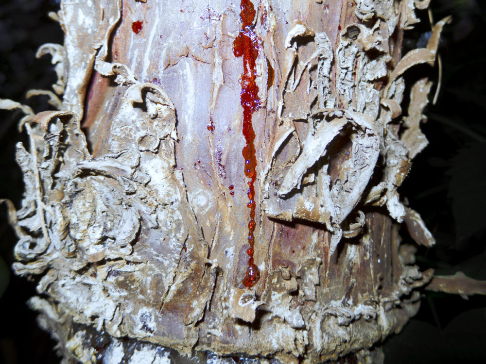
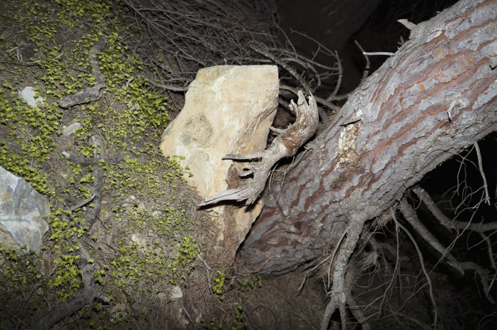
This leaves Muge (Huang Rong) at a disadvantage, making him one of contemporary photography’s more underrated talents. He got some exposure for his series Going Home. But one would miss quite few in his work to reduce him to Going Home. As a matter of fact, Ash might appear to provide a fairly large contrast. In his statement for the series, Muge writes he hopes that “Ash won’t only lay eyes on the world of representation.” This is, essentially, photography that is not about what is in the pictures – something the medium, or rather its perception, has been struggling with for a long time.
Thankfully, the series has now been released in book form. With the exception of a folded sheet of paper, the book consists of loose pages, held together by a hardcover shell – a collection of single images that, nevertheless, are unified by the artist’s vision and by the feelings they evoke in the viewer. The idea of the spiritual is nothing new in photography, and I’ll leave it up to the reader to decide whether or not Ash could be compared to, let’s say, some of Minor White’s work.
The history of photography aside, there appear to be quite a few young artists coming out of Asia whose photography centers more on what you cannot see in the pictures. As another example, Daisku Yokota comes to my mind (but please, don’t take that as me thinking of a new trend!). Now that the digital revolution – quite ironically – has brought our thinking so firmly back to what is in the frame, looking elsewhere might be a good way to experience something different, to learn something about what else photography can do. Muge’s Ash certainly provides a good starting point.
Ash; photographs by Muge; 41 photo reproductions and text; Zen Foto Gallery; 2013
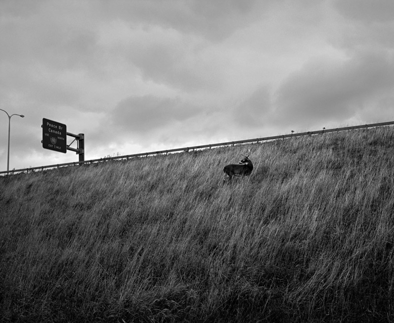
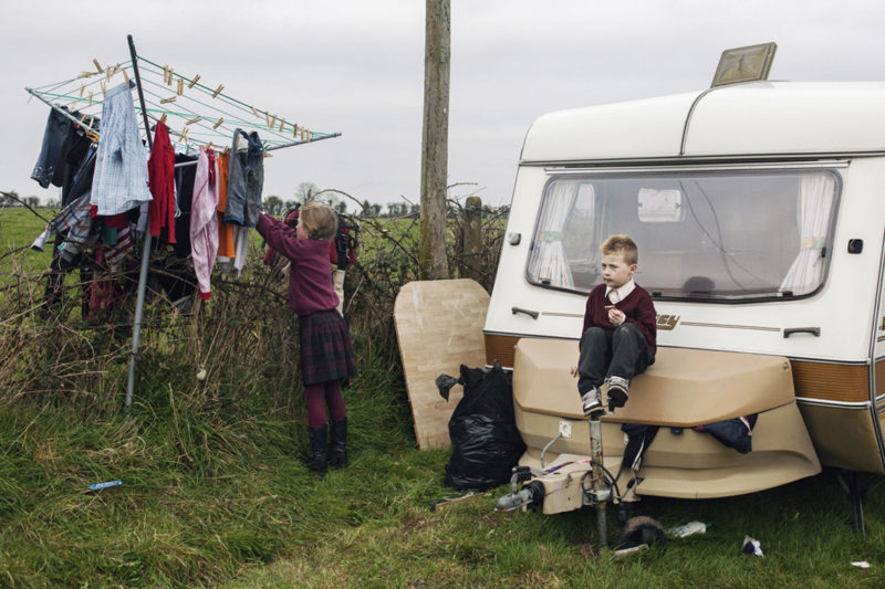
A young girl and boy go about their business here, or rather their businesses since they’re clearly different: The young girl is busy with the laundry, while the young boy is eating what looks like a chocolate bar. The telephone/electricity pole in the very center of the frame neatly divides the two realms. These two act like a stereotypical and old-fashioned husband and wife, but given their ages this cannot be. So something is a bit amiss.
Closer inspection of the scene reveals more things that aren’t quite what we’d expect them to be. The cloth hanger is propped up next to a fence, in fact it is in part supported by the fence. The young boy is sitting on the front box of a camper, various clothes are partly sticking out of that box. There are a black garbage bag (which might or might not contain garbage, we have noway of knowing) and a wooden board next to the camper. What is more, there are various items on the ground, some of them clearly trash.
Lastly, the girl and boy are both dressed nicely and neatly, the few spots of dirt on the boy’s knees really talk more of his age – and the kind of activities boys that age tend to go about – than about anything else. These two could be camping somewhere, but why are they dressed this way? And why is the young girl doing the laundry? What’s going on here?
These photograph are part of Birte Kaufmann‘s The Travellers, you can find a lot more information about the project here. The moment you’re given information about a photograph, your reading of that photograph inevitably changes: You try to create a match between what you’re told and what you see. This mechanism has repercussions for how photographs work – or actually can work – once there is a caption, once there is some text next to or underneath it.
As an aside, it’s interesting how few people question information about photographs, while questioning the photographs quite a bit – shouldn’t it really be the other way around? I’ve had people email me things about pictures that couldn’t literally be true given what you see in the photographs, yet people were more insistent in the written or spoken word than what the pictures showed. We humans are very weird creatures.
Coming back to The Travellers, Kaufmann is an emphatic observer of a group of people not widely known. At some stage, I will have to come back to the idea of empathy and photography; for now, I’ll just say that you cannot be a very good photographer if there is no empathy, if there isn’t even the slightest hint of recognition – that person there, that could be me, if this and that were different, or if I were to peel away a lot of the stuff that defines me in a somewhat superficial sense.
Our differences define us less than all those things we have in common; Kaufmann’s The Travellers reminds us that it is photography, not writing, that has the ultimate power to make this clear.
Review: Occupy São Paulo by Carlos Cazalis
Carlos Cazalis‘ book Occupy São Paulo is a claustrophobic affair. It is crammed with pictures. As if there were not enough pages, they flow over from one page to the next, and they even come on top of each other. If you like your photobooks quaint and/or conservative, this one’s not for you. Presenting this photographs this way seems to be an appropriate choice dealing with a city like São Paulo, a so-called megacity, with its more than twenty million inhabitants.
The challenges faced by megacities are daunting, as are the prospects of somehow having to make a living, of somehow finding a place to sleep for many of their inhabitants. These megacities attract a large variety of people, the very rich as much as the very poor, which results in a frankly obscene disparity in the quality of life, depending on whether you’re very rich or very poor.
We needn’t travel very far to see this effect: New York City has many of them on display. Given we are so used to seeing it, it’s hard to realize what we’re dealing with. Looking at a place like São Paulo might thus make it easier to understand the problem. The resulting problem, however, is that the problems might appear to be different – whereas the underlying root causes are very similar.
That said, there are clear differences between cities like New York City and São Paulo. A recent article by Suketu Mehta in the New York Review of Books presents a rather sobering view of the situation of Brazilian cities and the many, many problems posed by their favelas. To get ready for next year’s soccer world cup (the huge costs of which have led to very massive protests), the government has essentially been invading the favelas with its military, to flush out what other powers tend to operate there (violent gangs and/or corrupt militias). Mehta’s article contains a lot more details than I can possibly outline here.
Photography is bad at depicting abstract concepts, in particular in contexts that require illustration more than illumination (think of the news, for example – just look at the battle over who is framing the situation in Detroit “properly” with pictures that is currently going on). The problem here in part is that abstract concepts are not necessarily very clear by themselves. We all know what the term “love” means, for example, but we’d have a very hard time explaining it succinctly, without missing various aspects. The same is true for “bankruptcy,” for example. Add to that the fact that we all want to see particular things (whatever we think is important), and photography finds itself in a tough spot when it comes to abstract concepts.
Needless to say, you can use photography for what it does well, namely for showing things that are visible and alluding to, hinting at things that are not. Occupy São Paulo does just that, and it does it well. It’s not an impartial book, but why would it be? How could it be? Instead, it offers an impassioned view of a huge city and some of its inhabitants. Looking at the book makes for an intense experience. I want to assume for many people living in São Paulo is just as intense.
Occupy São Paulo; photographs and text by Carlos Cazalis; 112 pages; Kehrer; 2013
A Conversation with Adam Broomberg & Oliver Chanarin
Adam Broomberg and Oliver Chanarin are the winners of the 2013 Deutsche Börse Photography Prize. Often tackling overtly political subjects in a variety of ways has been their mode of work for a long time now, and I’ve always wanted to speak to them about the various projects, about what motivated and guided them, and about how they viewed the state of photography in general.
Jörg Colberg: For a lot of photographers, their work seems to be ending once the photograph is taken (or post-processed). With you I’ve always had the impression that the making of pictures was maybe less important than their placement: to see what they would do. Or to see whether they had the intended effect. Or to make people look at photographs in new ways so that they would become more aware of what photography actually does. I don’t know whether you would agree with this, and I’m also curious how you arrived at this mode of work that you’ve been using for a while now.
Adam Broomberg & Oliver Chanarin: Its started with a growing doubt we both had every time we made a picture. There is a hidden promise built into the act of making a photograph, particularly with portraiture. A hint of salvation, as if the camera can act as a portal to a better place. This would obviously be more pronounced in places like prisons, conflict zones or psychiatric hospitals but even on the street we were bewildered when people agreed. At about the time this doubt started creeping in we both read a remarkable book by Janet Malcolm called “The Journalist and the Murderer,” where she wonders incredulously why anyone would reveal so much to a journalist, in her experience often more than she felt they would reveal to a shrink. We began to feel the same about images. Why would anyone agree to being photographed without a full understanding of the potential political, cultural and economic currency of the images. That eco-system, the moral, political and financial world that images work in began to interest us more than the individual images. So our work began to look at revealing the mechanisms at work around image making, distribution and consumption. Its hard to do this if you’re just making pictures which for the most part leaves you at the bottom of this powerful food chain.
Adam Broomberg and Oliver Chanarin, The Day Nobody Died III, June 10, 2008, The Day Nobody Died, 2008, Detail, Unique c-type 76.2x600cm
JC: In 2008, you went to Afghanistan, “embedded” with the British army, to make pictures (The Day That Nobody Died). You went with a roll of unexposed photo paper, unrolled parts of it on different days and exposed them for a period of time. This was a conceptual way to look into the process of embedding, of having the army transport you and your box of film, of making pictures in a war zone. This all makes perfect sense, at least as long as you’re familiar with all of these mechanisms (and with the idea of conceptual photography). Most of the consumers of the news, however, might not have the background needed to make these connections. They might simply be baffled. I’m wondering how you navigate around that risk, the risk that people outside of the art world simply don’t have enough exposure to this fairly sophisticated thinking about photography to get what’s going on?
B&C: Interviews like these, teaching and speaking in public is very much part of our work and we try and explain everything about our motivations, our working methods and our mistakes. In the project you mentioned we wanted it to raise questions. It was at the height of the insurgency in Afghanistan, and the embedding process was in full swing. When we began investigating the embedding process it bewildered us, and revealing its working underpinned the project. To truncate its history, the US and UK realised that the public would demand access to photojournalists after the first Gulf War in the 90’s, where no photographers were allowed into the conflict zone, and we all sat behind televisions watching so called “smart bombs” exploding randomly (often brought to us by cameras mounted on the noses of these intelligent weapons). At the same time the US administration had noticed that during the Falklands war – where boats taking troops alongside a limited amount of photojournalists to the frontline took three weeks – led to a different depiction of the war. The journalists had developed an affinity with the troops and this led to a more traditional , ‘heroic’ depiction of their actions. So they invented the embedding system, which on the surface promises the photographer unprecedented access to the frontline (but less apparent was the access it granted the defense ministries to the photographer’s movement and material). It was a deal with the devil. In order to get embedded we signed a form effectively banning us from taking any images that showed evidence of conflict (no dead bodies, no wounded bodied, non evidence of enemy fire… the list is endless). So our only option was to make a performative act of resistance. To go there we lied and said we were photojournalists and signed their embedding form, and once there never made any pictures. To get back to your question, the controversy it raised helped us ask these questions in public. But less cynically the “images” we brought back (6 meter, abstract swathes of colour all made at moments when a traditional photojournalist would make a picture) are in a sense real witnesses. Those documents, that piece of paper was actually there in the place. Its relation to the event is more clear than a traditional photograph. It ears the scratches, the effects of the light, the heat, the environment on its surface.
JC: Important events such as wars or disasters need to be witnessed and documented or reported. How can this work, though, in a world where the news and media in general have become so heavily commercialized and where, I think as a consequence, the general trust in images in the news has been diminished?
B&C: The civilian journalist, anyone armed with a mobile phone is now a potential witness. Did you know that Associated Press now have more people scouring social media then they have professional photographers in the field looking for ‘evidence’? The playing field is now wide open, and hopefully with more and more people feeling the need to blow the whistle the more we’ll know about the dark workings of the state.
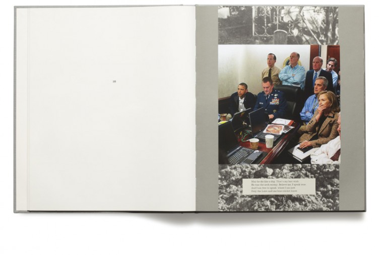
Plate 21, War Primer 2, Adam Broomberg and Oliver Chanarin, MACK, 2011 5th April 2010, 10:44 EST WikiLeaks has released a video depicting the indiscriminate slaying of over a dozen people in the Iraqi suburb of New Baghdad – including two Reuters news staff. Since the time of the attack Reuters has been trying to obtain the video through the Freedom of Information Act, without success. Two young children involved in the rescue were also seriously wounded. http://www.youtube.com/watch?v=is9sxRfU-ik&feature=player_embedded
JC: For various of your recent projects, including War Primer 2 (for which you received the 2013 Deutsche Börse Photography Prize – Congratulations!) and your new book The Holy Bible, you used archival photographs. Can you talk about your general interest in archival images?
B&C: We have always collected images, but archives are strange beasts that work in unique ways. Our project People in Trouble Laughing Pushed to The Ground is a good example. The Belfast Exposed Archive occupies a small room on the first floor at 23 Donegal Street and contains over 14,000 black-and-white contact sheets, documenting the Troubles in Northern Ireland. These are photographs taken by professional photo-journalists and ‘civilian’ photographers, chronicling protests, funerals and acts of terrorism as well as the more ordinary stuff of life: drinking tea; kissing girls; watching trains. The marks on the surface of the contact strips – across the image itself – allude to the presence of many visitors. These include successive archivists, who have ordered, catalogued and re-catalogued this jumble of images. For many years the archive was also made available to members of the public, and sometimes they would deface their own image with a marker pen, ink or scissors. So, in addition to the marks made by generations of archivists, photo editors, legal aides and activists, the traces of these very personal obliterations are also visible. They are the gestures of those who wished to remain anonymous.
JC: War Primer 2 is an update of Brecht’s 1955 War Primer. How did you come across Brecht’s book, and what had you produce a new version? In what way has our understanding – and possibly use – of photography changed between 1955 and now?
B&C: We first read an essay about it by David Evans and then got the original book which loitered around our studio for years… It slowly built in momentum the project. We began as Brecht did, cutting out images from broadsheets but soon realised (and following his dictum to not “follow the good old things but the bad new ones”) that if Brecht was alive he would be trawling the internet, not sitting in the British library. The book is really about how photographic strategies (particularly in documenting war) have changed in just 50 years. Now everyone has a camera, from drones, to grandmothers, and each offers another political view of the same event. We wanted to analyse this new playing field.
pp.42-43, Holy Bible, Adam Broomberg and Oliver Chanarin, MACK & the AMC 2013
JC: The Holy Bible had you create a variant of sorts of War Primer, where you added photographs from the Archive of Modern Conflict to a Bible. How did this come about? And why did you work with with material from the Archive of Modern Conflict? Why not your own pictures?
B&C: Three reasons. The first is we were in conversation with Adi Ophir, a radical philosopher who has dedicated some time to studying the Old and New Testament. His thesis “Divine Violence” argues that God reveals himself primarily through catastrophe, through violence. He sees the Bible as a parable for the growth of the modern state and the blurring between God and State leading to us blindly and naively accepting the radical punishment the State is able to meter out. So with this reading in mind an archive that deals with conflict and its history seemed appropriate. The photographic project has always been drawn to scenes of catastrophe and violence, so using photographed and specifically mining an archive of images of conflict from the beginning of the medium to its most recent incarnations seemed apt.
JC: Given that there are so many photographs in the Archive of Modern Conflict how did you go about selecting images? The task at hand seems incredibly hard, both in terms of sifting through all those images, but also in terms of making choices for specific parts of the bible? Did you pick photographs first and then match them up with passages from the bible, or did you approach the archive broadly knowing what kinds of images to look for?
B&C: Each archive is unique and its important to understand its remit or lack of one. The Archive of Modern Conflict that we collaborated with is interesting because its history of conflict is almost an unofficial one. It has a large collection, for example of private Nazi soldiers albums showing intimate moments between the soldiers and their loves, men being playful together – none of this is the narrative we have been allowed to see. So although we were looking for images of conflict to illustrate this violent text, we weren’t looking for the official version, for those images around which our collective memory has coagulated.
Plate 10, War Primer 2, Adam Broomberg and Oliver Chanarin, MACK, 2011 President Barack Obama and Vice President Joe Biden, Secretary of Defense Robert Gate, Secretary of State Hillary Clinton along with members of the national security team, as they receive an update on the mission against Osama bin Laden in the Situation Room of the White House, May 1, 2011 http://www.floatline.com/floatline/2008/05/nice-asp.html
JC: You frequently hear or read the claim that there are too many photographs in the world. Millions are being made and added to Facebook alone every day. How can we navigate a world in which so many images are so easily available (unlike in the not-so-distant past where only photographs that were physically accessible were truly visible)? How can we make smart choices what to look at, what to ignore, what to trust, what to mistrust?
B&C: Yup, something like 375 billion images have already been made this year. I recently told someone about a recurring nightmare I have where all of those images materialise, and we drown in a tsunami that starts inside Happy Snaps. The important thing is to realise that even though so many are made, they are still so carefully controlled, by newspapers, by news agencies, by the state. We see very little of what’s really going on unless we look hard.
JC: One final question. Do you think that photographers have a responsibility that goes beyond artistic (or photographic) concerns? Maybe a responsibility to not only be aware of how photographs are being used, but to also make talking about or dealing with the use more of their practice? There is the politics in the images, and there is the politics around the dissemination of images. Compared with the past, have photographers become too apolitical in both respects?
Love and War is the title of a song by Tamar Braxton. It’s also the name of a branding and advertising agency based in New York City. There is a TV series from the early 1990s called Love and War. John and Stasi Eldredge wrote a book, using that title (Love and War: Find Your Way to Something Beautiful in Your Marriage). Now there is photographer Guillaume Simoneau‘s Love & War. Love and war, could there be any grander themes? Take away love and war from the history of art, and what would be left?
You’re sweeping with a big, big brush when you aim to address the big, big themes. And why wouldn’t you? But there’s the risk to get (sorry!) swept away, and there are all the cliches lurking around the various corners.
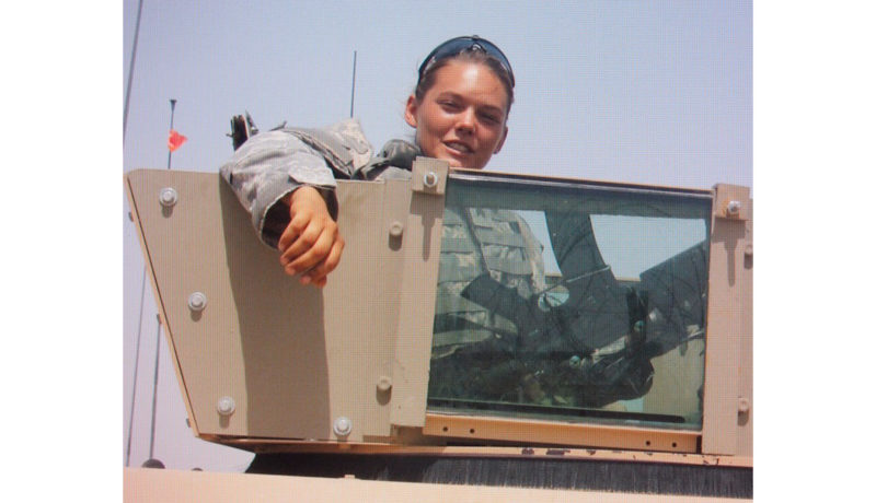
Love & War contains a large number of portraits of a young woman, Caroline Annandale. The photographer, we are told in the beginning essay, met Annandale at the Maine Photographic Workshops in 2000, and they fell in love. Most of the portraits are from around 2008. In these eight years, Annandale enlisted in the US military, and she spent time in Iraq. She also married another man (this we learn from a print-out of an email to the photographer, a photograph of which is included in the book). What happened to that man – or the marriage – we don’t know. How and why Simoneau and Annandale reconnected we also aren’t told, not that it matters.
There then are love and war, intertwined in obvious and non-obvious ways. And there are the kinds of complications life throws at you when you’re dealing with love (which I have, just like, I assume, everybody else), and when you’re dealing with war (which I have not). But somehow, things might be a tad too simple here. For a start, love involves two people, and somehow the book pretends there’s really only one, the woman, with the other one, the man, hovering in the background, reduced to, we are led to believe, taking pictures. And that in itself would be a great story, because that can be the reality of love, seen from the perspective of that man. As a matter of fact, it is the reality of love here, seen from the perspective of that man, the photographer.
You actually don’t have to throw in war for this to be a potentially heart-breaking story (pardon the cliche). Now, of course, Annandale did go to war. Omitting this would seem, well, weird. We see the transformation of a young woman into a slightly older, yet infinitely tougher looking woman. War will do this to people. However, you don’t actually go to war to experience such changes. People undergo rapid changes in a few years due to all kinds of circumstances.
What I’m trying to get at here is that the book essentially has two major strands, both of which feel somewhat unresolved. Given how much I enjoy seeing many of the photographs, I feel that that’s too bad. There is such huge potential to deal with all the complicated things that might happen when you fall in love with someone somewhere, and then that person gets married, and you reconnect, and the person has changed so much. There also is such huge potential to deal with just these few years in which a young woman, shown to be mostly carefree, decides to go to war and watches her comrades blown to pieces (there is some text by Annandale at the end of the book that talks about exactly that). Throw these two things together, and there might be a lot of loose ends.
But, and this is a big, big but: Photobooks are not made to satisfy the audience’s demands. Photobooks are not like TV shows or internet articles, where it matters that the ratings are good, that things go viral. What I want a photobook to be or tell me essentially is irrelevant, because I am not the maker. Seeing someone react to a different photobook (which I like very much) the other day had me think about this. It’s so tempting for an audience to expect that an artist does something for them. But that’s really not the idea, and the medium internet (which is, let’s face it, focused on the idea that merit scales with the number of “likes”) ends up reinforcing the wrong idea.
In other words, if I feel like there might be too many loose ends here, then, well, that might just be my problem. A photobook does not have to be like a Hollywood movie where you can expect your happy ending before you leave the movie theater. Life in general usually doesn’t work that way (otherwise, there’d be a lot less books and movies about love!), and photobooks don’t, either. Instead, life can be full of loose ends that you end up trying to connect, even though they just won’t connect.
Ultimately, this is what Love & War shows, or tries to show. There is only so much you can do with photography, actually with any medium. You’re better off coming to terms with your medium’s limitations, instead of trying to make it do things it just can’t do. And you might end up being better off realizing that life doesn’t always make the kind of sense you’d love it to make, especially not when love, or war, or love and war are involved.
Love and War; photographs by Guillaume Simoneau; essays by Caroline Annandale, Lisa J. Sutcliffe; 80 pages; Dewi Lewis; 2013
“Every landscape can be decomposed in an infinite number of minor ones,” writes Petros Koublis about his Minor Landscapes. It didn’t occur to me to look at these photographs as landscapes, the title of the series notwithstanding. Of course, many of them are, in a somewhat obvious sense. What drew me to this work was the fact that it presented me with a fairly unique view of this world that I had not seen before. Not seen before in terms of the artistic vision behind this work.
There is something very interesting going on in these photographs. Looking through them, I experienced what I call “the wait-a-minute effect”: You look and look and don’t think too much about it, and at some stage you mutter “wait a minute” and go back to re-look (if you don’t like the term “wait-a-minute effect” maybe you’ll prefer “the what-was-that? effect”). There’s something there to somehow catch your attention. I realize that’s not a very elegant way to describe these photographs’ impact, but it seems to get quite close to the experience of looking at them.
A photograph can’t be too obviously interesting or flashy to lead to the wait-a-minute effect. That’s why most editorial photography looks very stale a few years later: It’s just so obvious. It looks good next to some article about why soy milk is good for you or about some soon-to-be-forgotten actor in some ever-sooner-to-be-forgotten movie, and there’s absolutely nothing wrong with that. But that’s not what I’m interested in when I look at photographs.
I like photographs that have a depth, a subversive depth to be more precise. Photographs where something doesn’t feel right, or where something doesn’t look like what it seems to be, albeit in a way that doesn’t become obvious straight away. It would be way too simple to say (actually: claim) that that’s what art photography does, because a lot of art photography doesn’t.
A lot of art photography is what I call “art editorial.” It’s essentially editorial photography, except there is no story to support other than the one in the photographs, the one carefully defined by the photographer. Just like in the case of editorial photography, there’s nothing wrong with art-editorial photography. It’s just not terribly interesting in the long run.
Koublis’ photographs, in contrast, have none of that. Instead, they deal with mystique, often in ways that at first sight makes it seem there isn’t much going on. But there is. It’s a topsy-turvy world where things are not what they seem to be (with images thrown in where things are in fact what they seem to be for good measure). Photography always means looking. It means looking when you take photographs, and it means looking when engaging with photographs. Petros Koublis makes us look, and then look again.
Photobook Reviews (Week 28/2013)
The Republic of Burundi is a small African country. What little I knew about it I remembered from reading a book about the war in Congo (Dancing in the Glory of Monsters: The Collapse of the Congo and the Great War of Africa). As is – or should be – widely know, photography has not treated the continent of Africa well at all. Corrections of this sad fact have been long overdue. And they have been trickling in. But for every step forward, there is another one back, with one stereotype simply being replaced by another ones. It’s hard to get underneath the surface when you fly in to take some quick pictures.
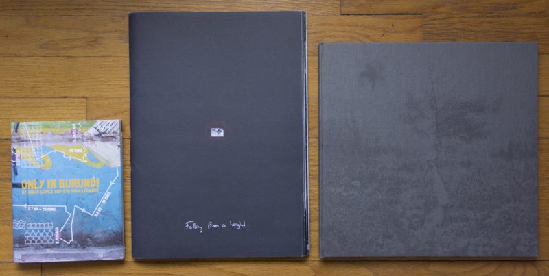
Thankfully, there now is Only in Burundi by Anaïs López, a photographer, and Eva Smallegange, a writer (you can see a preview of the book’s dummy here; unlike the dummy the book is not spiral-bound). The book works along the lines of the Sochi Project publications, combining photography with very engaging and informative text, presented in a very attractive (well designed) package. At the risk of repeating myself, the future of documentary photobooks is currently being shaped by the work of all the various Dutch photographers, writers, and designers who show how such storytelling can work.
Only in Burundi uses a man named Koky to provide a read thread. Koky is not only a well-connected man, but also a bit of a social wizard: One of those people who combine charm with just the right amount of persuasiveness to get things done, no matter where or what. Koky managed to give the photographer and writer access to people impossible to reach otherwise. But he’s not just some fixer; he is a conduit to a society that simply has different rules, rules that aren’t obvious or easy to navigate for people flying in from Europe. As a consequence, López and Smallegange change from being complete outsiders to being accepted guests, with a lot of access. A world has been opened up, and as viewers and readers we get to experiences glimpses of it.
Staying in Holland, at least in terms of photobook making, brings me to Martijn Berk‘s Falling from a Height. The book is, to use its maker’s words, an “honest story of my obsession for a 20-year-old boy.” One might wonder how or to what extent photography might ever be honest. This book might serve as a way to investigate this question. There are more than 4,000 photographs inside (I didn’t count them to confirm the number the artist gives), most of them presented as vast grids of images, in essence large contact sheets. These are all the photos shot during that obsession, so there literally is nothing hidden. It’s all right there.
Needless to say, looking at 4,000 photographs would induce a tedium in most people probably only matched by having to read a telephone book from front to back. But the book is smart enough not to just show digital contact sheets. Designer Syb divided the images into two groups. Using two different types of paper, there are large photographs on glossy paper, and there are text plus contact sheets (with varying numbers of images) on a matte, rather heavy paper, almost like a card stock. If you look through the book, this seems like an incredibly obvious way to present the work in a smart manner – and that’s great design: It’s simple and obvious, and only very few people can do it well.
So there is an obsession alright, a story (or non-story – it’s more like being in a certain state, isn’t it?) told with over 4,000 photographs. I have the feeling that those of my students who see the book will now refuse to aim for tighter, more coherent edits. But the lesson to be learned here is not that numbers matter. It’s that if you do it well, even more than 4,000 photographs can be a tight and coherent edit (just like 30 or 40 can already be too many pictures).
Adam Panczuk‘s Karczeby, with text by Kazimierz Kusznierow, combines his two series Karczeby and Actors. It’s probably safe to say that the people depicted in these photographs lead very different lives than the readers of this website. They’re farmers in the east of Poland, working the land, living with and from the land. According to the photographer’s website, the “word Karczeb was also used to describe what remains after a tree is cut down – a trunk with roots, which remains stuck in the ground. This also applied to people.” This kind of attachment to the land has disappeared from many (most?) places in the Western World, where people often move freely and easily for a job, to go to school, to join a loved one.
But there is more, since the part of the tree below ground level also goes back into the earth once the tree has been cut down – much like people, who, after all, are buried after death and who then become passive members of the cycle of life. We’ve come to disassociate ourselves from this basic fact quite a bit. The land, the soil – they’re alien to us. Food appears in supermarkets, coming from who-knows-where (which, often, might means very far away). And when we die we don’t die, we just “pass” or “pass on.” Needless to say, no euphemism will take anything away from the very basic fact that we all will die some day, and that’s it. The people depicted in Panczuk’s don’t appear to suffer from any of these hang-ups we have developed. You live, you work the land, and when you die, you go back to the land.
In between, you enjoy life, and that enjoyment can take the simplest forms. It’s hard to imagine someone sitting at an airport with their iPhone, say, might even consider putting up a backdrop in the form of some cloth that’s actually too small as theater. But in actuality, theater is made not by the presence of a stage, it’s made by the production (this becomes obvious once we look at what’s going on in our parliaments). It’s maybe too easy and tempting to attribute a happier life to Panczuk’s subjects. It’s a simpler life, for sure. And it might be more grounded in the very basic facts of human life. But happiness is always relative.
Karczeby might thus serve to remind us that a different life is possible, whatever we decide to make of this fact. And just like Panczuk’s photographs the text written by Kazimierz Kusznierow opens another window, to give us a different angle from which to look at things.
Photography’s Existential Dread
If you have followed discussions of photography on the web over the past few years, it’s not unlikely that you might have come to the conclusion that the medium is experiencing a crisis. Here is just one example of someone characterizing photography:
Everything is being tried, but nothing seems to dispel the malaise that hangs over the contemporary photography or the uneasiness, lack of confidence, alienation, and dislocation that afflict the contemporary photographer.
That appears to sum things up fairly well, doesn’t it? That’s Janet Malcolm, writing in 1976. I found the sentence in the very last paragraph of an essay entitled Diana and Nikon (originally published in New Yorker Magazine, you can also find it in Diana and Nikon: Essays on the Aesthetic of Photography, my source).
Let’s forget about photography for a second. Let’s focus on the fact that a statement from an article about photography written in 1976 sounds as if it was lifted from one of the many articles published about the medium today. What’s going on here? It would be tempting to dismiss Malcolm’s statements, just like all the other ones, claiming that essentially, people have always complained about this. Apart from the fact that that’s not necessarily true, it also refuses to address the problem.
The malaise in large parts of the world of photography is very real. The question is: why has it lasted so long? What is going on here? It might tell us something that Malcolm wrote her essay a couple of years after digital photography was invented, decades removed from the point in time where digital cameras, in whatever form, would find their ways into the lives of photographers (professionals and non-professionals alike). The malaise has nothing to do with the digital world.
Instead, it has a lot to do with our general ideas what photography should do and its inability to live up to those ideas. Let me give you an example to try to make this a bit clearer. It’s a common and widely accepted claim that “we’re all photographers now” (here is just one example). But when a newspaper fires all their photographers everybody is suddenly upset. Something doesn’t compute here. We’re either all photographers, or we’re not. If we are all photographers, then obviously a newspaper doesn’t need to employ photographers given that everybody else (the cleaning staff, the other reporters, the receptionists, etc.) can do the job just as well.
I think it’s fairly obvious that firing the photographers was a bad idea, because the cleaning staff, the other reporters, the receptionists, etc. will not be able to do the job the photographers were doing (the newspaper will soon find out; I don’t expect it to last). Which means that we are not all photographers. Or maybe more accurately, we might all have cameras, and we all might be using them all the time, but that doesn’t mean that what we’re doing with them is the same thing, regardless of whether it’s Thomas Ruff, Alec Soth, Sally Mann, some photojournalist in Afghanistan, a local news reporter down the street, your grandmother, your parents, yourself, or whoever else.
This brings me back to Malcolm’s essay, which was written in response to John Szarkowski’s The Photographer’s Eye and to Jonathan Green’s The Snap-Shot, to, essentially, the introduction of so-called vernacular photography into the sacred hallways of high-brow photography (or whatever you want to call it). It would seem that the world of high-brow photography has never fulled recovered from this and is stuck in a perpetual state of malaise, resulting in, to re-quote Malcolm’s words, “the uneasiness, lack of confidence, alienation, and dislocation that afflict the contemporary photographer”.
It would seem that there are two ways to solve the problem so many photographers appear to be having right now: We can either go back to the world where there were photographers and amateurs, the latter strictly separate. It’s probably fairly obvious why that isn’t a very good idea. The alternative to that would be to start looking at photography does and how despite the dictum that “we’re all photographers now” in reality means that we’re engaged in very different things.
Whenever I have the opportunity I like talking to non-photoland people about photography. Not surprisingly, pretty much everybody I talked to takes photographs, usually with their cell phone. Just as an aside, one of the best photo presentations I’ve had in a while was courtesy of the twelve-year old daughter of a (photographer) friend of mine, who was happy to show me all the photos from a recent trip on her cell phone. People usually love talking about their photographs, and they love telling you what is in those pictures (even if most of that is not apparent to a stranger at all – we’re certainly all photographers in the sense of believing there are things in the pictures someone else simply can’t see, given her or his lack of background knowledge).
At the same time, I yet have to meet someone outside of photoland who believes her or his photographs are in any way comparable to the photos taken by professionals. As it turns out, from my admittedly hardly representative “research,” most non-professional photographers have a better understanding of the differences in meaning, use, and even quality between their pictures and those of professionals than many professionals themselves!
Maybe it’s time to stop all the hand wringing now, and to go back to making pictures, and to exploring what the medium photography has to offer. We’re all photographers now. Fine. Whatever. Plus, we’re really not. Now might be a good time to stop pretending that we are all the same kinds of photographer, realizing that making distinctions does not mean that one is better or more valuable or more desirable than the other. Add context to the debate, and things get even more interesting.
And maybe the problem with art photography is that it has lost all ideas of context, of what it can or should do. The days of John Szarkowski, of someone being willing and able to engage with the medium, of someone being willing and able to take the medium and to try to figure out what it does, and to then communicate this to a wider audience… Those days appear to be over. Make no mistake, I don’t yearn for just one person to be that person. But there is no reason why it just needs to be one. Who says it can only be one?
It’s a shame that as far as photography is concerned our expectations have become so vastly diminished. We’re all photographers now – that’s really just scraping the very bottom of the barrel as far as the medium is concerned. Given that photography is more popular than ever, it’s almost shocking to me that such an opportunity is essentially being squandered. It’s time to end the existential dread that has been hanging over large parts of the photographic community for too long now.
For example, I could make an excellent case for including Richard Avedon‘s Nothing Personal, a book that breaks with the ideas that a) you need to do a road trip to produce a book about the country, and b) you somehow disqualify from being part of such a list just because you happen to make a lot of money as a fashion photographer. Avedon’s book certainly is as punchy as Frank’s, albeit in a very different way. One could also add books such as Dorothea Lange’s An American Exodus: A Record of Human Erosion, making the case for work that is less interested in the vast picture and more in looking at how the country’s people are doing.
At the risk of painting with a somewhat broad and simplified brush, with the exception of Lange’s none of the books in the list above is particularly concerned with the people who happen to be where the photographs were taken (here and in the following, I’m going to focus on books made in the 20th century). The people are mostly reduced to characters that happen to be of good use for a picture. For example, in Frank’s book, the only image that makes you feel the photographer cares about his subjects is the one of his own family in the car. And that’s fine. But still, it leaves me wanting. What is the country without its people?
What’s more, as much as I appreciate the books I listed above (some of them more than others obviously), none of them gives me the feeling that when getting out of the car, the photographer would actually shut off the engine (I’m speaking metaphorically here). You can hear the sound of the engine in the pictures, the desire to make the picture and to then move on, because, after all, that’s the idea of the road trip. But still… With the engine running, will you hear any of the sounds drowned out by that mechanic noise? Will you be able to fully take in the atmosphere? Artists project their ideas onto the canvas that is the country, but wouldn’t it also hurt to sometimes just listen?
The very first thing I noticed about Vanessa Winship‘s new She Dances on Jackson was that it is a book filled with pictures that feel like someone was listening, in fact listening very carefully and closely. Someone listening not just to the loud cheers in the football stadiums or the ubiquitous roar of the traffic or the endless chatter on cell phones, but also to those silent moments in that cacophony of noise, to the quiet lament that has been hanging over the country for the past ten years.
What happened to the American Dream?
The US are a country rich in symbols, and many of them found their way into the book. But they have all been transformed. A landscape might contain a road, but instead of stretching away from the camera into a seeming infinite distance, here is stretches from one nowhere to the left to another nowhere on the right. Or Evans’ signage meets Shore’s view of the city, to only fall apart into an apathetic scene, drained of life, exhausted. The infrastructure is shown crumbling, as are most of the buildings. If there are any effort to be made to preserve or re-make something – those are largely absent from the book.
In this rather desolate land we encounter people. Winship is a magnificent portrait photographer. In She Dances on Jackson she continues working with young people, creating a stunning number of utterly arresting photographs. A little more than halfway into the book, we encounter one of the key portraits in the book, a young couple. The young man (still more a boy than a man really) and woman are holding hands, and her left hand rests on his chest, with a crease of his t-shirt in between the index and middle finger. The young man appears quite a bit more fragile than his girlfriend, who seems to put a claim on him. Even though their eyes meet the viewer’s it is hard to guess what might be going on in their minds; it’s tempting to see worry, a bit of uncertainty and a hint of defiance (isn’t that the signature of youth, that you still defy the world?).
This hints at what makes the portraits so strong and this book so convincing. It would have been tempting to produce a sad-sack tour of the troubled land, with jobs gone and people struggling to get by. But there always is that hope or that defiance that you have when you’re young. You don’t really know what is going to happen, but it’s going to be alright. You’ll make do, one way or the other.
Of course, She Dances on Jackson is Winship’s idea of America just like, say, The Americans was Frank’s. One isn’t necessarily better than the other. What makes She Dances on Jackson stand out, though, is its sensibility, the fact that the photographer’s empathy was given such amazing expression in the photographs. Such a book was long overdue, and I’m tremendously excited it now exists. She Dances on Jackson is an absolute masterpiece.
She Dances on Jackson; photographs and short text by Vanessa Winship; MACK; 2013
How do you go about visualizing something that already happened, something that thus is completely inaccessible: the past? The past stays with us in the form of memories, and there is history. The former constitute our own history, and while we might not be too aware of it, our memories are a carefully edited version of whatever might have happened, including, possibly, things that actually never happened at all. History itself is not that different. It is designed to rest on facts, but those facts might in fact not hold up to further scrutiny (history gets revised frequently), and in any case, facts are being selected and interpreted.
Of course, that’s what photographers do: To select and focus on things. You would imagine photography would thus be ideal to tell history. But it’s not. Photography’s own seeming literalness gets in the way. If we could all just finally accept that photographs present a truth, but not the truth, if we could all just understand that what is not shown in a photograph might be just as important as what is shown, the medium’s power would increase considerably. In the meantime, photographers will have to make do with what they got, or rather: with how people deal with what they got.
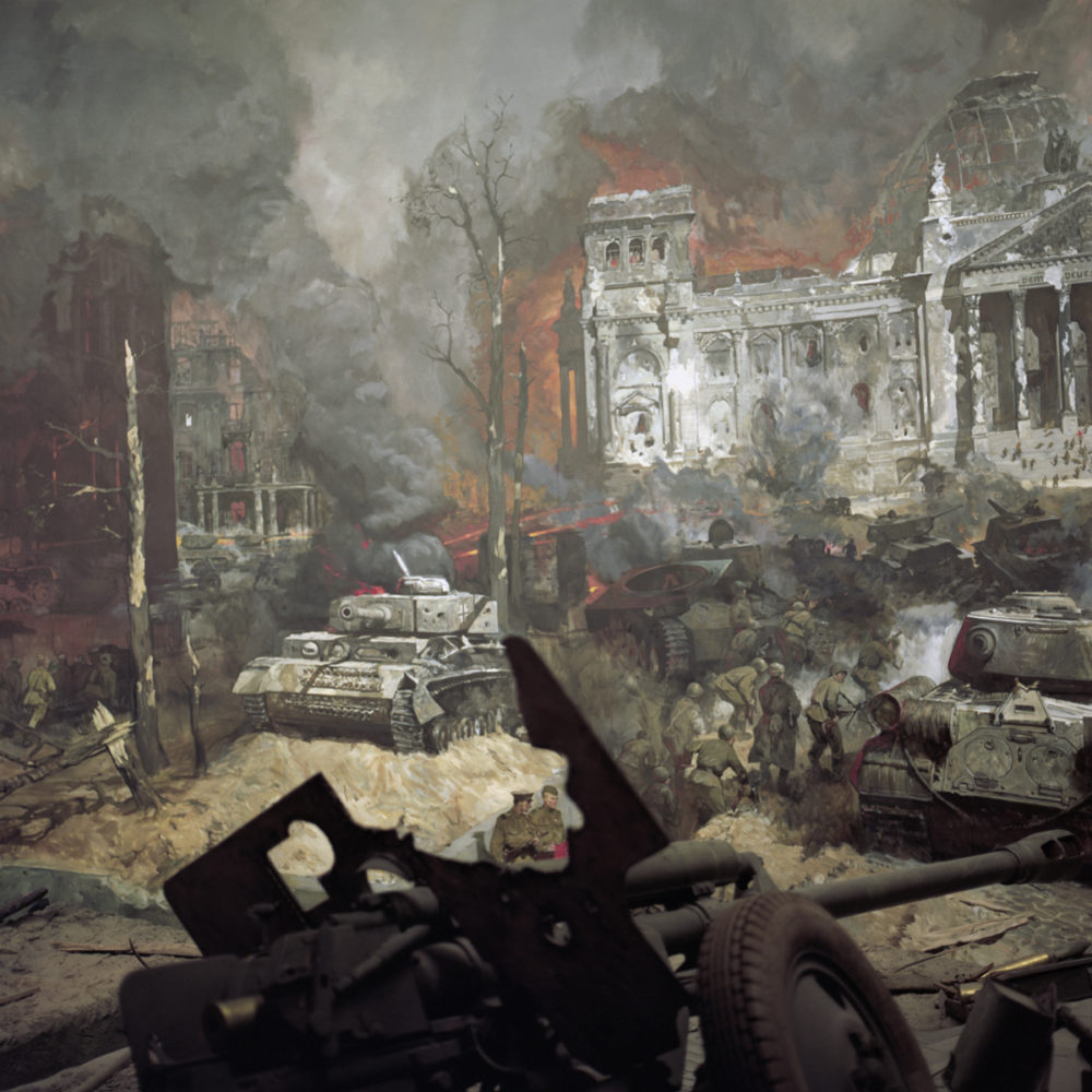
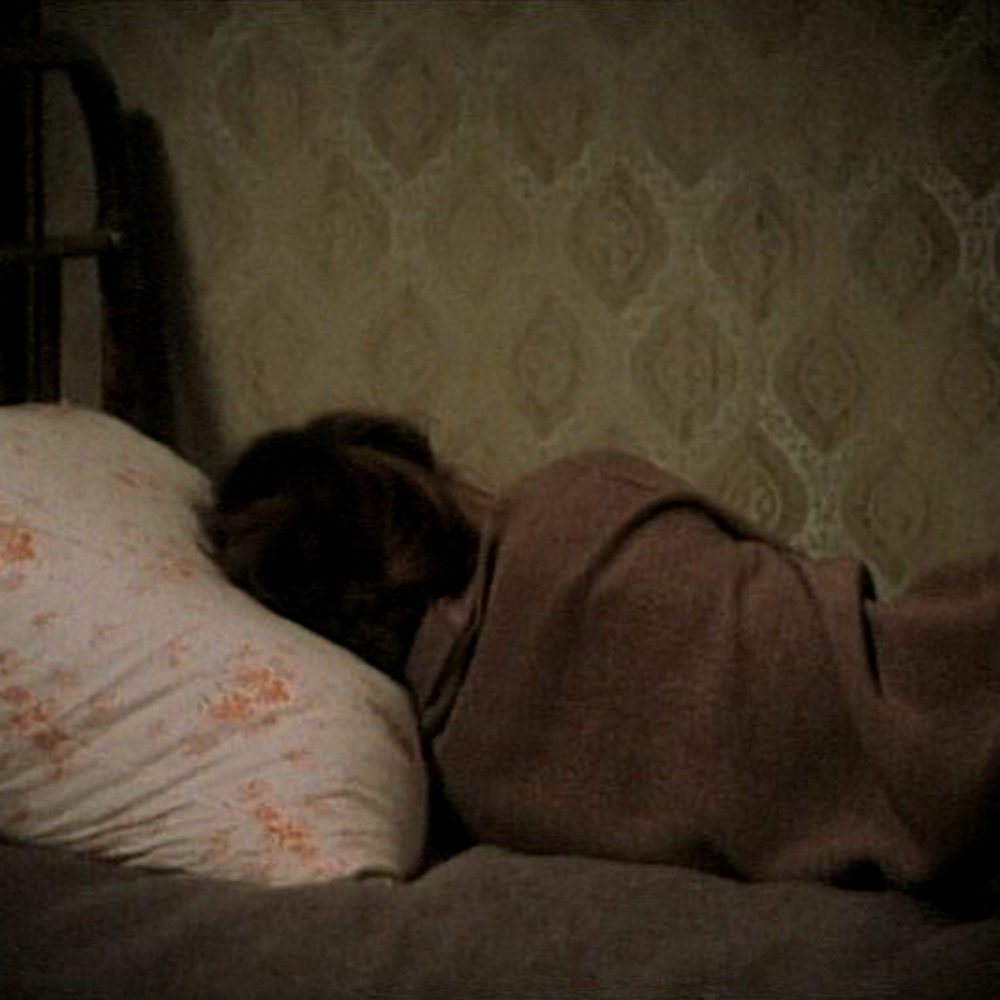
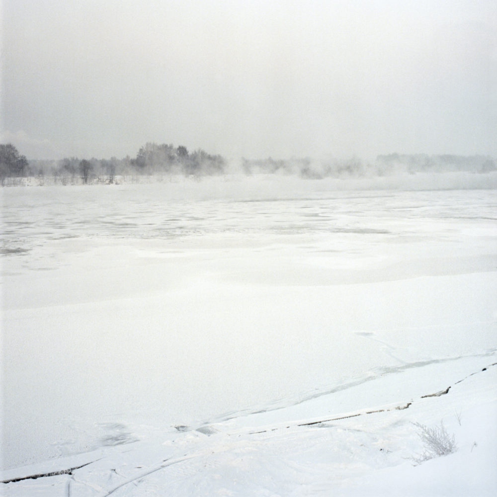
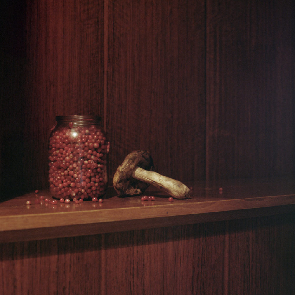
After a long period of mostly silence about their own country’s past, German photographers have (finally!) started exploring it. Ulrike Schmitz‘s Museum of your Memories is another addition to the steadily growing number of such projects. The project deals with the lives of her grandparents, which after World War 2 had to move to the Soviet Union to work there. As specialists in aircraft engineering, their skills were desired by the Soviets, and they had to stay in Russia until 1954 in Podberesye, a town north of Moscow.
To build the story, Schmitz uses her own photographs and fill stills from Soviet movies. The inclusion of appropriated imagery has lately become fashionable in photography; and often, I can’t escape the feeling that artists are trying to get away with something, are trying to do something they feel they can’t do with their own images. But it doesn’t really work that way anyway, so we needn’t worry about any of this. If photographs just can’t show certain things then of course that applies to any kind of photograph, including a film still.
In other words, using film stills (or other appropriated material) really only muddies the water. Which is exactly what you need to do if you want to tell a story. As an artist, you just have to somehow break that literalness of the medium photography, that willingness of its viewers to believe everything they see. To tell a good story you have to spin a convincing yarn, meaning: you have to be able to somehow seduce your audience to see things that aren’t there. Appropriated imagery is a good tool for that, since it makes people believe there are suddenly multiple authors (there aren’t), and usually people will infer something from the different aesthetic. (the aesthetic of a photograph determines to a much larger extent how people will perceive it than many photographers realize – this is why using Instagram for photojournalism is such a terrible idea)
In Museum of your Memories the viewer seemingly moves between the presence and the (inaccessible) past: This is what this could have looked like. A fiction, created from another fiction (is your water muddy enough, yet?). It is a convincing fiction, though, in particular since it has the viewer imagine things. Break photography’s literalness, and people have to fill in the gaps, which they will happily do. (that’s the most difficult lesson to learn for photographers: You do not have to give every bit of information, because your viewers don’t need to know everything)
When telling a story with photographs, the idea is not to tell the actual, completely convincing story. Photography simply can’t do that. What it can do, however, is to tell a story that has enough holes in it for us to believe it, a story that lacks enough specificity to be believable – just like life, which, after all, usually is one somewhat messy, not so obvious affair. And this is why (and how) Museum of your Memories succeeds in doing what it is intended to do, bringing a story back to life.


 , you could jump to
  , continue with
  , move on to
  or maybe
  , and you’d arrive more or less today. You could replace one or the other, even though, I’m sure, few people would want to replace either Evans’ or Frank’s books. You could add work here and there easily, filling in gaps left by me taking rather big steps.
 , making the case for work that is less interested in the vast picture and more in looking at how the country’s people are doing.