Publishers are the largely unsung heroes of the world of photobook making. Without them, there would be almost no books: it would be up to photographers to self-publish.
While there is much to be said for self-publishing, it comes with considerable drawbacks, the main one being that photographers are notoriously bad at arriving at the solutions that serve their own work well.
I personally do not blame photographers for not knowing of the various pitfalls of publishing a book: how would they know? It’s simply unrealistic to be an expert in the kinds of things that a good publisher will know how to take care of (this typically means working with the right people).
The above entails the many aspects of production, of actually creating a book, a physical object, out of files that exist on a computer somewhere. Production aspects determine whether a book is able to communicate its designated goal –but not in the way photographers typically think about them. Good printing is not necessarily the equivalent of using the most ink and/or printers in Verona, and good design opens yet another can of worms.
Beyond production, though, there is a publisher’s vision or maybe you want to call it their sensibility, and that’s where things get even more interesting and important. A publisher might use the best printing available (see disclaimer above) and yet arrive at books that have almost no character (think Steidl).
If I think about the various photobook publishers out in the world, the ones that immediately come to my mind are those whose voices I can immediately imagine. Their books have a unified character (I like thinking of books using that word), but the character does not necessarily force itself on the individual books.
The one metaphor I can think of for what I have in mind is a family with children. In a nurturing family, the parents go out of their way to allow their children to be the people they need to be while shaping them in a fashion that gives them all the support they need to exist in the larger world.
Being able to work with a good publisher is a gift in many different ways, and it really is too bad that so many of the discussions around the role of publishers is marred by often simplistic ideas (it’s even worse that for some publishers, those simplistic ideas actually apply).
A good publisher will inevitably shape the book they produce from a photographer’s work in such a fashion that it sits comfortably in the company of all of the other books made so far.
If you approach your artistic life as if it were a zero-sum game, as if attention given to someone else takes away attention from you, then, yes, that poses a problem. But having one’s work shaped by someone who has a distinct vision of what they’re after — namely giving the work at hand its ideal expression as a book — is an enormous privilege. While the publisher’s hand does indeed shine through in the final book, the work itself still is and quite forcefully remains the photographer’s.
It’s straightforward to make the case that many photobooks ended up being widely praised to a fairly large extent because a publisher did what they felt they needed to do to elevate the work in question.
A good approach to looking at photobooks is to consider whether the book itself, and the many different ways it came together, elevates the photography. But you need to be mindful of your own ignorance when doing so.
For example, I don’t know all that much about graphic design. But I have my preferences. It would be foolish for me to judge a book’s design based on what I know or want. What I can ask, though, is whether the design choices (to the extent that I can see them) elevate the book — or whether they elevate the person who came up with them. I personally prefer the former (as always your mileage might vary).
Graphic design actually is an interesting topic because unless you’re a trained professional, you have no real understanding of how to create it well. However, you can still see bad design. If you don’t believe me, design something, and then have a trained professional fix what you made up. If you thought that what you made looked good, you’ll be in for a huge surprise (the worst part of this exercise is the usually relatively minor changes the professional will make that will still make everything look so much better).
If you don’t know about types of paper, you can still rely on your finger tips to experience what paper does: you can feel it. A piece of paper might not bend quite as well as you might want, or it might be too slippery. Again, do you feel that the paper choices elevate the book if your finger stumble over them?
With books made by the best publishers, the above combine to questions of taste. You might not enjoy the design used, or you might prefer a different paper. But when you are looking through a book made by one of those very good publishers, you notice the unity of the vision that brought it together. Even if the book does not speak to you, you are still able to admire it (if you think about it, that’s the essential experience of art).
By now, Hans Gremmen has made more than 400 books, many of them with/for his own imprint FW:Books. The publishing imprint is easily one of the very few whose new publications are always look forward to. Whatever I might have to say about the books — over the years I wrote a lot of praise and some rare negative criticism, every one of them elevates the work it carries.
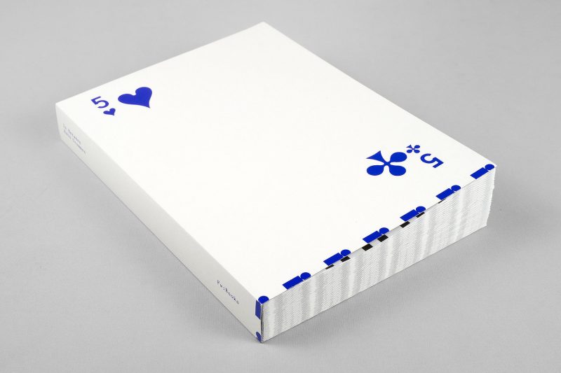
To celebrate the past 25 years, Hans has put together “notes, sketches, photos, printed matter, screenshots, ephemera, and other breadcrumbs” and created In Between (subtitled An Incomplete Index).
“Making a book,” he writes (somewhere near the end of the book in the index), “is freezing a moment in time, creating a document which will always be around.”
Of course, the freezing of a moment in time is done particularly well when the frozen moment continues to speak to us now, the denizens of what previously was thought of as the future. By its own nature, there are many moments from across the two and a half decades of bookmaking and design in In Between, and in their own ways they visually convey what I attempted to outline with all of the preceding.
That publisher’s sensibility I spoke of above — it is on view within the pages of this book. It derives from two main and separate components, an enormous, unmatched visual intelligence and the kind of playfulness that most of us leave behind as we age out of being children.
If you love the lives of pictures and printed materials (chances are that if you are into photobooks you do), then this is a book you have been waiting for without knowing that you did.
If anything, In Between showcases what the world looks like to someone who takes enormous pleasure in organizing the visuals around himself into a coherent set of bound pages.
As I noted above, you get all of that in any of the FW:Books books. But it’s marvelous to experience it with its own pleasure in mind. And there is more, a lot more than the books: there are coins, for example (no really, actual coins), or stamps.
Now onto the next 25 years!
Highly recommended.
In Between, An Incomplete Index (2001-2026); photography/artwork by Hans Gremmen; 280 pages; FW:Books; 2026
If you enjoyed this article, please consider subscribing to my Patreon. There, you will find exclusive articles, videos, and audio guides about the world of the photobook and more. For those curious, there now is the possibility of a trial membership for seven days.
Much like journalism, photography criticism involves a huge investment of time and resources. When you become a subscriber, you not only get access to more of my work. You will also help me produce it (including the free content on this site).
There also is a Mailing List, which I use to send out supplementary materials — anything that has me inspired or that somehow seemed worth noting. Some of it is serious, some is not. You can sign up for free here.
Thank you for your support!