In March 2017 I published an article in which I looked at photobooks specifically under the angle of their physicality. A book in an object, and its very properties cannot be approached without considering its content. More precisely, a viewer/reader will pick up on these various properties (size, weight, choices of materials, type of binding, etc.). Thus book makers are well advised to pay careful attention to them. In the context of creating a photobook from start to finish, in Understanding Photobooks I discuss these various aspects in a lot more detail, using a series of examples.
This is the first in a series of articles, in which I I want to look at production choices, in particular how a book is bound, by using more than one book for any given type of binding. Anyone owning a copy of Understanding Photobooks might view these articles as providing more study material. But I’m hoping these articles will not just supplement my book, they will also provide deeper insight into photobooks on their own, regardless of whether you have read my book or not.
To begin with, for me there is something deeply satisfying about handling a well made book. You would imagine that books per se don’t have much, if any, character. After all, they’re just a bunch of pages held together by a cover (case). But it really goes beyond that. Given we have to touch photobooks when we look at them, we feel how that handle. We feel how they react to us turning their pages. We feel how easy or difficult the handling is.
For me, the key is not to get an incredibly fancy and/or elaborate photobook into my hands. Instead, I derive deep pleasure from photobooks where the form of the object and its intended function work together. That could be a fancy photobook, or it could be some very basic, cheaply printed book. In other words, the point that I want to make here and in the following articles is simply to point out what happens when everything comes together well. I have not been involved in the making of any of these books, so my discussions are going to be based on what I see as working.
I want to begin the series by discussing the accordion book. These books are also referred to as leporello or concertina books. To make a very basic accordion book, all you have to do is to fold a long piece of paper into smaller sections, and you got your book. The devil, of course, is in the details, since you’ll need to fold the paper carefully, so your book won’t be irregular or even start twisting. Folding a long piece of paper is one option of making an accordion. Usually, these types of books are produced from shorter sections that are taped or glued together.
If you do this at home — and you might as well make a quick accordion right now from a piece of paper, you’ll notice a few things. First of all, the resulting book has two sides. That’s really interesting, because all other types of books I can think of only have one side. Second, an accordion doesn’t have a spine. Consequently, the risk of the material tearing is much higher than for other books. So if you want to make an accordion book, you’ll have to use a heavier paper stock (aka thicker paper).
Now, if you look at your accordion, there are the two sides, so you have a front cover and a back (however you decide which page is front and back). If you think of attaching covers to the front and back, you can do that (remember there is no spine). But you’ll immediately run into a little bit of trouble, because the absence of a spine makes the whole construction a bit flimsy. In particular, you can skew the front against the back fairly easily. Also, the whole contraption is a bit of a mess to store. For storage, you need to add something to your accordion — that, ideally, will also provide you with a space onto which you print your book’s title etc. So an accordion needs a case, something that holds it.
In terms of how accordions operate, again unlike any other type of binding I know, you can either look at the book just like any other “regular” book by turning the pages, or you can unfold larger sections of it. If you have a table (or floor) that’s long enough, you could potentially unfold the whole thing.
There really are two types of considerations here, production issues and handling issues. You need to solve the production issues so your resulting book functions well and doesn’t get destroyed easily. In contrast, everything related to the handling should work hand in hand with the photographs (and text) contained in the book. Let’s look at some examples.
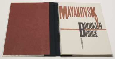
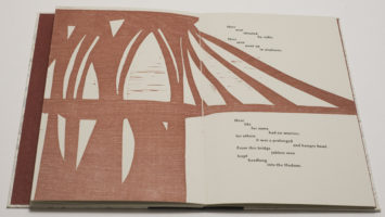

The most beautiful accordion book I own is not a photobook. Instead, it’s a book containing a poem by Vladimir Mayakovsky entitled Brooklyn Bridge. The book was completely handmade in an edition of 75 by imprimerie dromadaire in 1985. Throughout the book, the poem is printed around a woodcut of the bridge. As you look through the book, you get to see sections. Alternatively, you can unfold the book to see the whole bridge. The back of the accordion is left blank. So Brooklyn Bridge shows a first obvious application of the accordion: a very wide image is being broken up into smaller sections, and unfolding the accordion will show the whole. Fully unfolded, the accordion is 70″ (178cm) long (or wide).
Note that the accordion in Brooklyn Bridge is contained in a “regular” case. It’s connected only in the back, Swiss binding style. Folded, the book stores like any other book, and you couldn’t really tell from the spine in your book shelf that there’s an accordion inside.
The vast majority of photographs do not have such extreme aspect ratios, asking to be broken up into smaller sections. In fact, photobooks tend to consist of a larger number of pictures, which are shown in a particular sequence for any number of reasons. These reasons can be incredibly complex, in particular if they’re driven by ideas of narrative, or they can be quite simple (remember, simple isn’t bad — simplistic is). For example, a sequence could replicate a journey in space, where the order in which the photographs are shown represents being on that journey (note that the journey might or might not be fictional). If you printed such a journey on an accordion, the viewer could “follow” along — or, if s/he decides to do so, unfold sections of the journey to see them together.
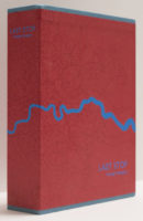
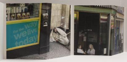
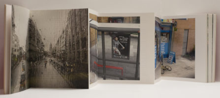
This is the basic approach adopted by George Georgiou‘s Last Stop. Photographed through the windows of buses in London, the idea of the journey becomes quite obvious. In reality, there could have been quite a few separate journeys, with the presentation in the book being a fictional trip — I don’t live in London, so I have no idea. But it also doesn’t matter so much whether the presented journey is real in a documentary sense or in a metaphorical sense. Either way, the accordion is a good way to represent such a journey. As you move through the book, you move through the urban landscape, and the sights and especially figures speak of the various aspects of contemporary London.
In Last Stop, the accordion clearly has a front and back. After the cover page, there is a title page, and the last few pages on the other side at the back contain an essay. In this particular case, it’s important to establish this kind of viewing of the book, because the pictures move from the city’s center outwards. If, in contrast, the photographs had all been taken on some ring road, then maybe the beginning and ending aspects would be different (in which case it would be a different book).
For the most part, Last Stop shows its photographs across the spreads that a viewer gets by holding the accordion and flipping through it like a “regular” book. But there are sections where photographs cross from one such spread to the next. Remember, it’s an accordion, and you could unfold larger sections, reconnecting the separate sections of these photographs. But of course, you also want to cut the pictures in half in such a way that the two parts work on their own (and with what is next to them).
Given Last Stop utilizes both the accordion’s front and back, it can’t use the Swiss binding style case that Brooklyn Bridge used. That would restrict the viewer too much: s/he will have to be able to handle both sides equally easily and well. For storage, the accordion is housed in a sturdy slip case, the covers of which replicate the accordion’s. That’s a nifty and practical solution for an accordion book.
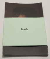
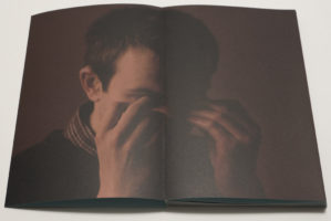
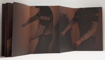
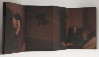
In terms of its production, Touch by Peter Dekens is almost the complete opposite of Last Stop. While the latter’s slip case is muscular, the former’s accordion is held together only by a simple belly band that also doubles as the title page and the colophon. Photographed in a blind man’s apartment with only dim available light, the book makes for a somewhat disorienting experience, thus replicating what the photographer himself must have experienced in a space that he, unlike his subject, could navigate without much ease.
It’s not always obvious where one picture end and another one begins, a conscious lack of an obvious structure that only an accordion could provide. Only an accordion allows the viewer to unfold larger sections to possibly help her or him understand the visual flow better. Only one side of the structure is used, the other one is left blank.
I suspect that viewers might be torn about the difference in the way the two accordions in Last Stop and Touch are “housed.” Last Stop clearly is very solid, whereas Touch is anything but. I do like these different solutions, because to put Touch into a sturdy case or box would take away the aspect of fragility and uncertainty communicated by the pictures. In contrast, Last Stop requires to its more conventional slip case, given in terms of the navigation through the book there is a clear structure.
In Understanding Photobooks I discuss another accordion book with yet another logic and construction, Sjoerd Knibbeler’s Paper Planes. There, the aspect of folding becomes important, connecting paper planes with the structure of an accordion.
So the accordion is a very interesting structure for a photobook that comes with a set of what on the one hand are restrictions, but on the other hand are opportunities to break up the restrictions provided by any type of binding that uses a spine (in other words one fixed axis around which actual pages operate). I feel the accordion is underused, but — and this is a big but — you can’t use it just for the sake of it, given how it requires more efforts from its viewers. Wherever you might want your viewer to see more than two pages, for whatever reasons, you’ll be in business with an accordion.
You can even break the “rules” as Anne Carson’s Nox demonstrates (this also is not a photobook): the accordion is printed on thin paper, making it incredibly fragile and delicate. It’s contained in a clam-shell case, which once opened provides the support for the accordion. The accordion’s fragility is fully in service of the writing it carries — again, if you use an accordion it has to make sense, and like in almost any kind of binding, you can push the boundaries in such a way that the structure itself carries part of your message.
Consequently, for any kind of binding, especially one that’s less run of the mill, the most important question should always be: how does this binding support the overall idea of the book? In the following articles, I will look at other types of binding. There also is an in-depth discussion of binding choices — and a lot more — in Understanding Photobooks.
This article is the first in a series of five. You can find the other parts here: part 1, part 2, part 3, part 4, part 5
