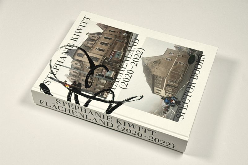
The really infuriating aspect of Stephanie Kiwitt’s Flächenland (2020-2022) is that it contains a really good photobook that’s hidden inside a pretty bad one. Here’s the thing: The challenge of photobook making is not to become too enarmored with one’s own cleverness. You have to trim away any signs of it so that the end result, the book, sings. Flächenland does not sing. Instead, it groans like a fatally wounded monstrous creature.
Flächenland is, as you might have guessed, a German word. It’s a term to describe German states that are not merely cities (such as Berlin, Hamburg, or Bremen). The state in question is called Sachsen-Anhalt. You might have never heard of this particular state, and, honestly, nobody, except possibly the locals, would blame you for it. Sachsen-Anhalt is roughly the size of the US state I live in (Massachusetts) or about the size of Slovenia.
The state lies in what used to be East Germany before the so-called reunification, meaning that in comparison to states in the west, it has one additional historical layer. But the idea of layers is somewhat misleading because unlike onions, countries tend to show all of their layers at the same time (even as some might be more prominent than others). You don’t have to peel one away to come across another.
At its core, the photographs in Flächenland concern themselves with these layers through their depiction of the built environment in Sachsen-Anhalt. It’s the type of photography that has a rich tradition, whether in Germany or elsewhere. It’s also the type of photography that’s easy to do but very hard to do well: anyone can take a photograph of a house, but few people — including Kiwitt — can do it at a level that the result is more than merely an exercise in form.
(I should probably add that I personally have an affinity for photography along the lines of Kiwitt’s work, even though I personally insist on the presence of the human form in my own work.)
The many small towns in Sachsen-Anhalt lend themselves to being surveyed in Kiwitt’s fashion because of the many traces of history ingrained in its buildings. Looking through the book, I was immediately familiar with a lot of what these buildings communicate.
As I noted, it’s difficult to do the work well, and I find it hard to describe how or why the good photographs in Flächenland are so good. That line between competent photography of the built environment and excellent photography of it is hard to cross and just as hard to define.
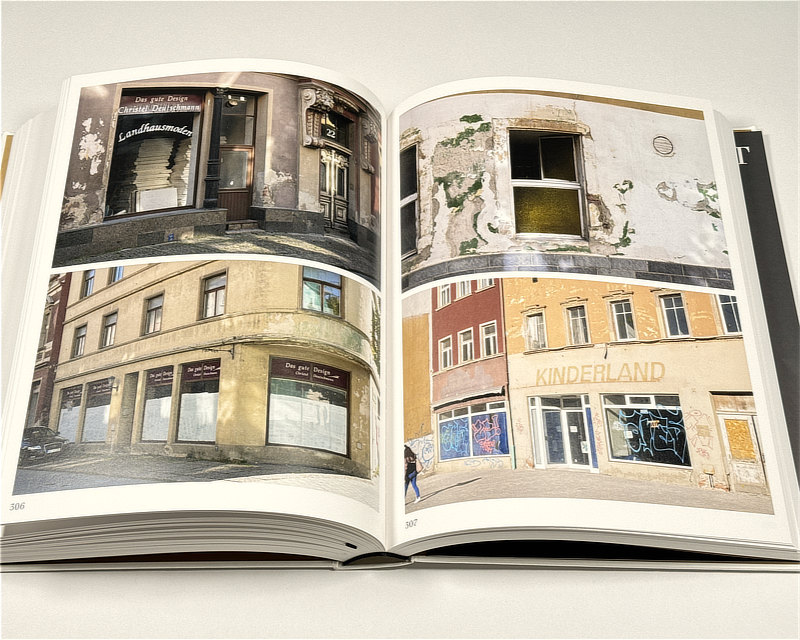
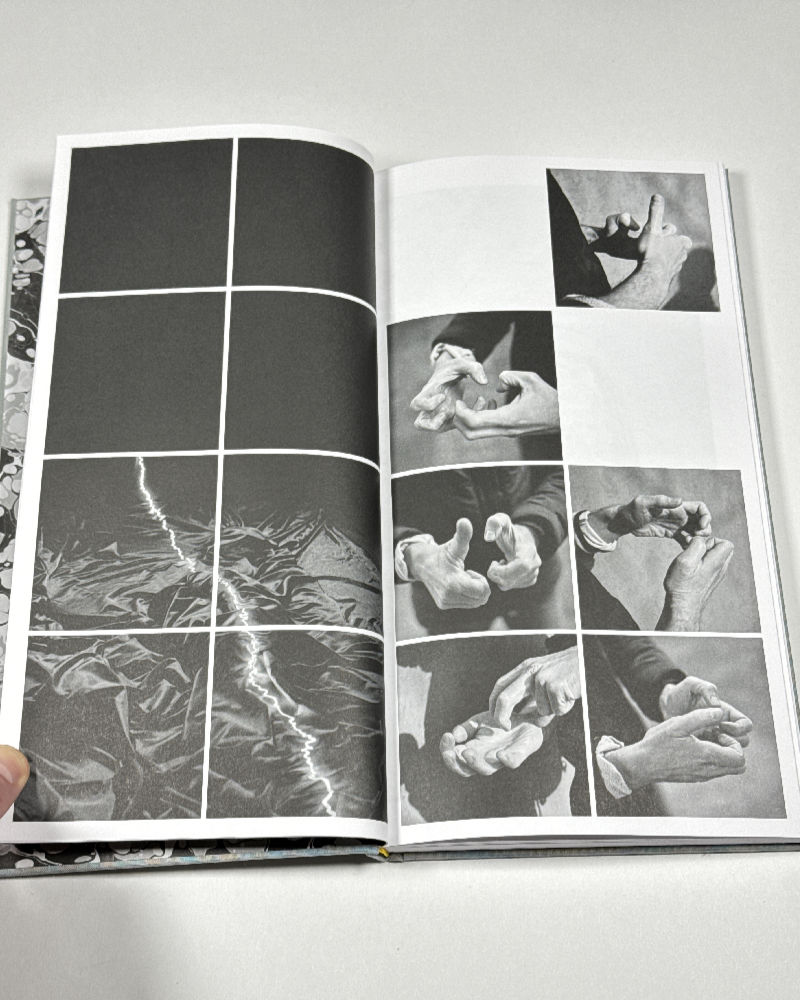
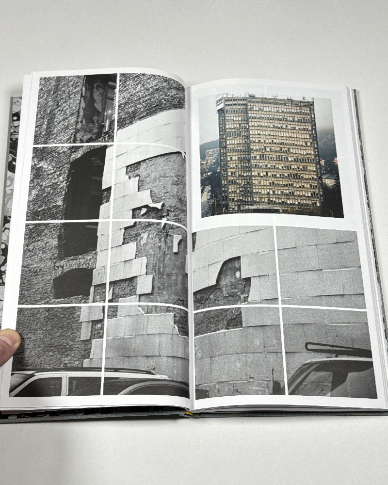
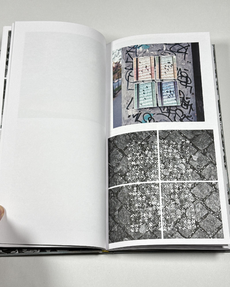
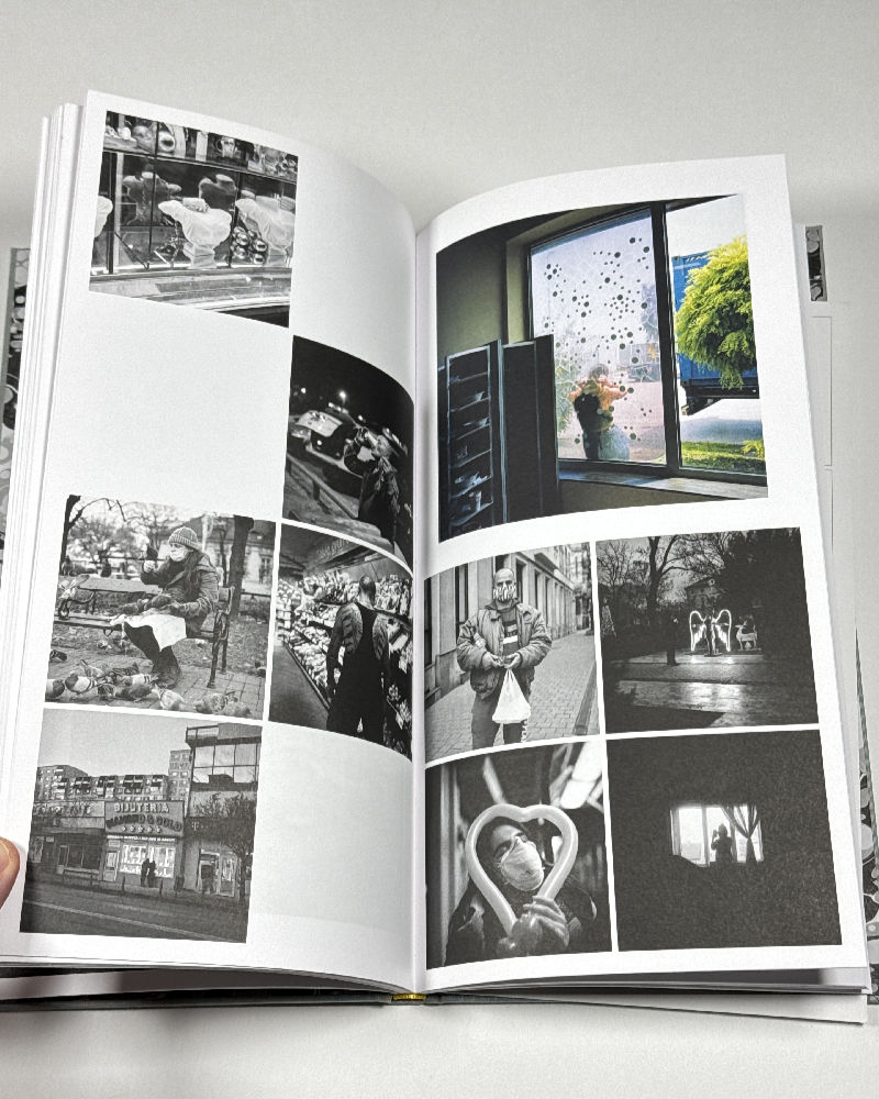
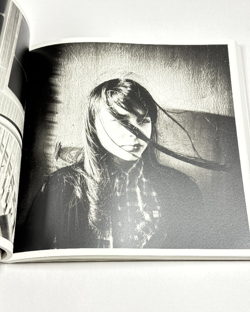
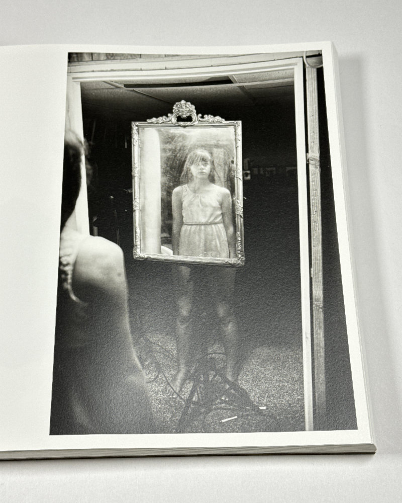
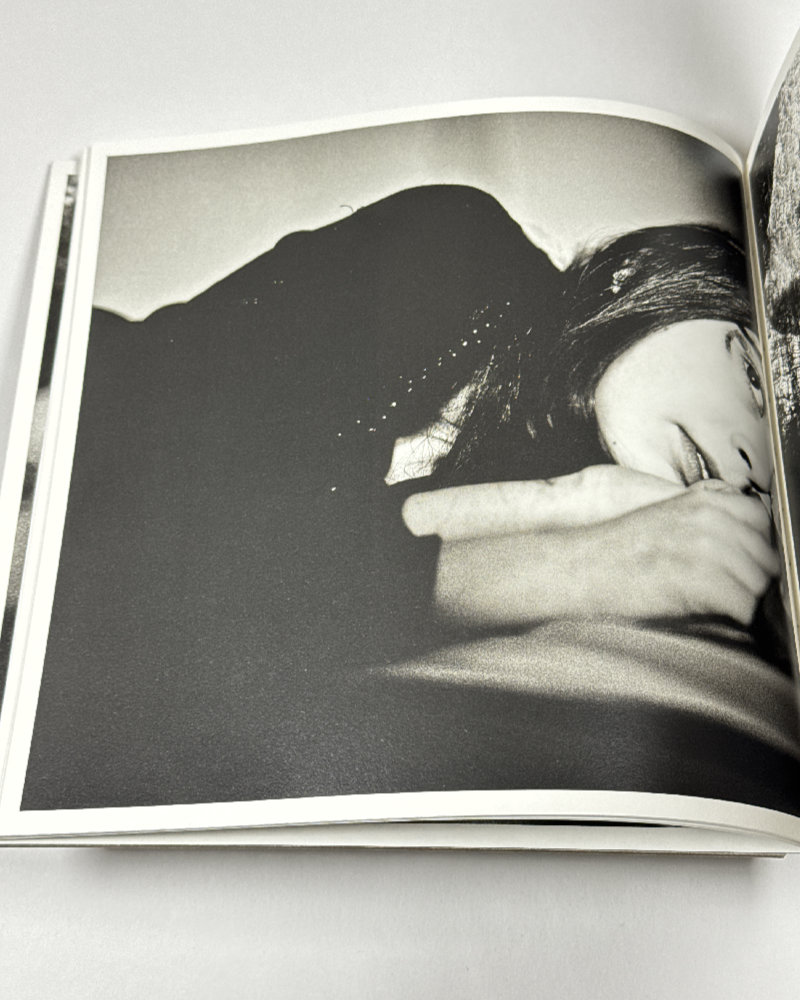
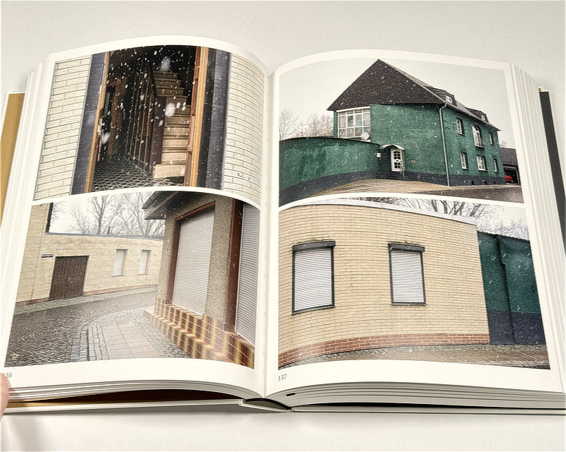
The book is filled with photographs of houses and streets, with any number of details thrown in. It’s photography in colour, but there is an enormous sense of grey drabness over everything on view. Where people appear in photographs, they do so accidentally.
The bulk of the book consists of spreads of four photographs in a grid of two on the left page and two on the right one. Typically (but not always), the photographs in a single spread are closely related, such as when four photographs might show variations of the same scene (produced by the camera moving around a space).
If the above sounds very didactic, then, yes, that’s already the first problem. Second, it’s not immediately clear how as a viewer you are supposed to read the grid. Do you go from top left to right and then from bottom left to right (as I have been doing), or do you go from top left to bottom and then from top right to bottom? Either way, this doesn’t solve the problem of the didacticism.
It’s a didacticism that’s entirely photographic. Which, I suppose, is fine if you’re into that kind of thing. Paul Graham famously engaged with it in almost all of his later work.
But the choice of a focus on the photographic causes the aforementioned burying of really fantastic photographs in a sea of mediocrity. I think that that’s a steep price to pay for a concept that simply is too clever by half.
In addition, given the book’s insistence to keep the different times (locations) when (where) the photographs were taken apart, whatever additional connections could have been made between them remain unused. Instead, there’s a long list of the names of cities and towns and hamlets at the beginning, and then the book proceeds to show you.
I’m writing these words the day before the 2025 federal elections in Germany. The far-right AfD party polls at around 20%, meaning one out of every five Germans will vote for a Nazi party. Obviously, people all over the world now vote for Nazi parties; but in Germany things hit differently (I shouldn’t have to explain why that is the case).
Furthermore, Sachsen-Anhalt is one of the hot spots of German contemporary fascism. The latest poll there has the AfD at 31%, just a single point behind the nominally conservative CDU party that over the past couple of years has been veering to the right, embracing many AfD talking points.
I’ve been following a lot of discussions online about Germany’s current politics and its sharp turn to the right. There appears to be a clear divide, with Germans living abroad (and non-Germans) being a lot more critical of what they’re observing than the Germans themselves.
Frankly, much like many outside observers, I am aghast at the general complacency with which Germans deal with the Nazi threat in their own midst.
I’m not necessarily of the opinion that photographers or artists have to feel compelled to make work around the political situation. Still, if you make a book about Sachsen-Anhalt, I simply fail to understand how you would embrace turning things into a photographic exercise while you drive through what increasingly are becoming no-go areas for larger parts of the population.
The thing is that with a much better edit it would have been very easy to work out some of that dreadful political atmosphere that is now making many Germans, especially those whose names are not Schmidt or Müller, question whether they really have a home in Germany. In addition, that book would also have more successfully looked a the layers of history in this particular German state.
Obviously, I can only talk about the book at hand, not the one that could have been. Still, what a missed opportunity!
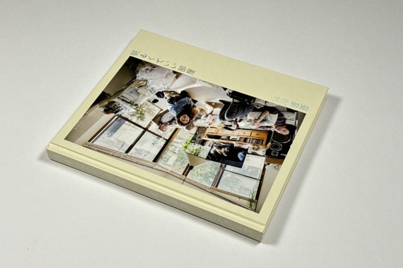
Flächenland; photographs by Stephanie Kiwitt; texts by Jonathan Everts, Daniel Herrmann; 448 + 16 pages; Spector Books; 2023
If you enjoyed this article, please consider subscribing to my Patreon. There, you will find exclusive articles, videos, and audio guides about the world of the photobook and more. For those curious, there now is the possibility of a trial membership for seven days.
Much like journalism, photography criticism involves a huge investment of time and resources. When you become a subscriber, you not only get access to more of my work. You will also help me produce it (including the free content on this site).
Thank you for your support!