The Forms and Functions of Photobooks (5)

Article main image

In this series on the forms and functions of photobooks, I have so far discussed four types of binding: how they function, their advantages and disadvantages, and how they can be used to support the underlying photographic material’s intent or message. To conclude this series, I thought I would move away from binding and focus on an aspect of photobooks that of late appears to have commanded more attention than binding: the use of different types and/or sizes of paper.

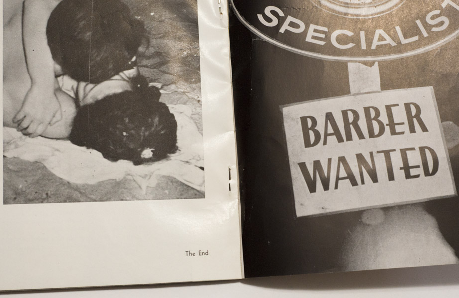
Especially after the run-away success of Christian Patterson’s Redheaded Peckerwood, which included facsimile-style reproductions of archival materials, photographers started to pay attention to the fact that the pages in a book needn’t necessarily all have the same size. Of course, Peckerwood wasn’t the first photobook to employ this trick. Especially in the Netherlands, photobook designers have been working with different papers and/or different sizes for quite some time.

Conceptually, the use of different paper stocks and/or of different page sizes can be a very simple way to organize information in a tactile and/or visual sense. If handling some pages feels different than other pages, an attentive reader will pick up on this: these pages here look and/or feel different than those, so there must be a difference in what they’re talking about. In other words, the book’s very materials can contribute to communicating its intent in a very specific manner, if, of course, this is done properly. This isn’t quite the same as what was done in Peckerwood, where the sizes supported the idea of the facsimile. Still, the choices made support the underlying message, and that’s what you want for a photobook.

If as a photobook maker you want to work with the idea of different papers stocks and especially different page sizes you need to be careful. Unless you produce your books by hand, in which case the added work doesn’t matter all that much, in the case of books being made by machines you need to consider costs. There might be added costs, especially if hand work is required.

That’s probably the very first thing you need to consider: given the choices made, can this book be mass produced easily, or will costs simply explode? Especially if you work with a publisher this topic is likely to arise. Experienced photobook designers know how their design choices relate to production, which, however, usually is not the case at all for inexperienced ones.

So the very first question you need to ask yourself is: is what I’m thinking I should have feasible? Can it be made, and can costs be kept under control? The second, equally important question is: does this actually make sense? What purpose do these different types of paper and/or page sizes serve?

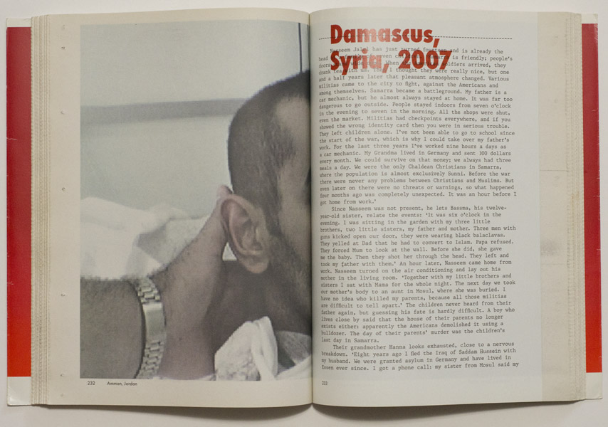
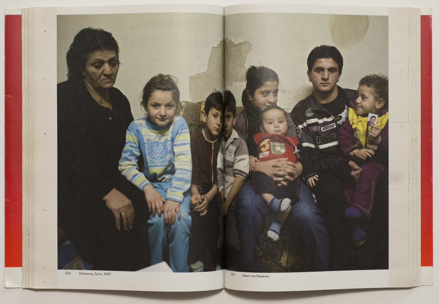
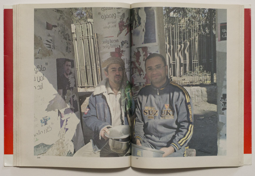
As in the previous articles, I’d like to look at a few example cases here. The first book is Geert van Kesteren’s Baghdad Calling. Published in 2008, the book broke new ground in terms of what a photojournalistic photobook could do. Van Kesteren visited Iraqi refugees living in Jordan, Syria, and Jordan and described their lives in exile. At the same time, he collected their cellphone photographs, which showed life in Iraq, a life that at that time was almost impossible to document for photojournalists, given how dangerous the situation there was. So there are two types of photographic materials in the book, Van Kesteren’s pictures and the citizen-journalist-style pictures by the refugees.

Given what I have been discussing above, it might seem obvious how to present the material, and this is indeed how it was done. Van Kesteren’s and the refugees’ photographs are printed on two different types of paper, namely for the former the kind of paper one would find in magazines such as, say, Time, and for the letter newsprint. In addition, the newsprint pages are 2cm (a bit over 3/4 of an inch) wider than the other ones. The design (treatment of the typeface) is uniform throughout the book. For most of the photographs, the difference between the photojournalist’s and the citizen journalists’ images is clear: the cellphone photographs clearly betray their origins through copious amounts of image artifacts, whether it’s blurriness, pixelation, or wonky colours. The paper choices reinforce the differences. At the same time, they also reference the typical life span of the pictures. Whereas Van Kesteren’s photographs might at best live for as long as a regular news magazine would be around, the refugees’ photographs are not unlike the ones we all take with our phones on a regular basis: to be looked at the same day and then mostly forgotten.

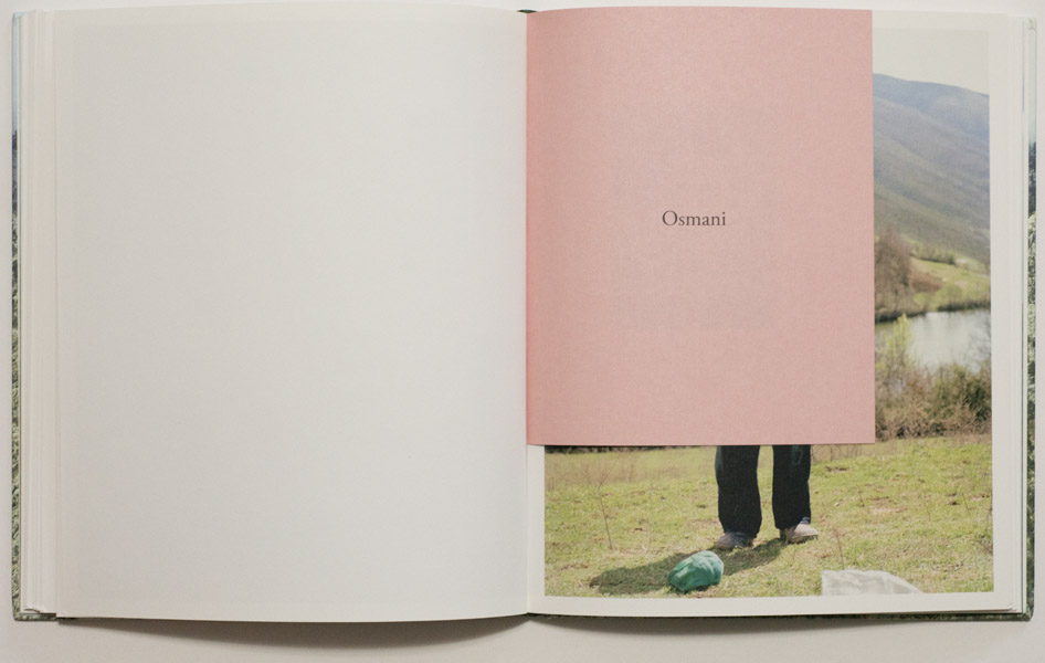
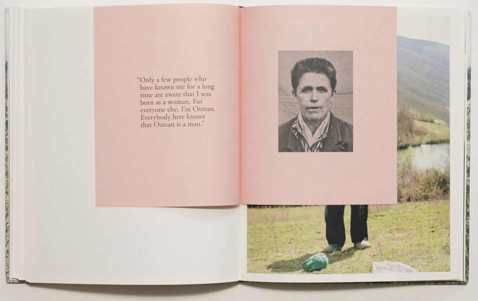
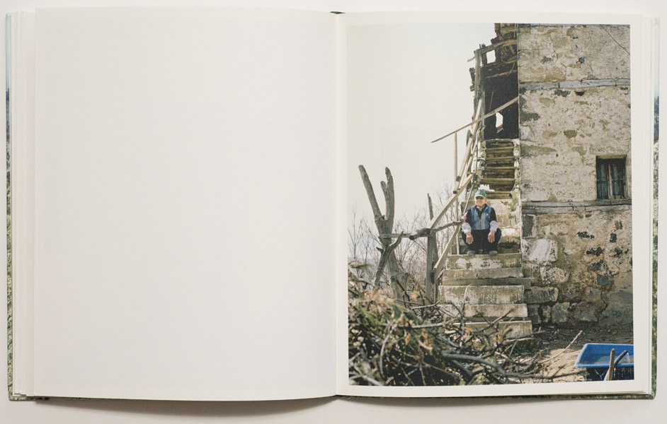
Even though it’s very different work, a similar device to organize photographs was used for Pepa Hristova’s Sworn Virgins. A book about a group of Northern Albanian women who out of tradition decided to live their lives as men, the photographer’s images here live side by side with archival photographs. While in the case of Baghdad Calling the vernacular material was given precedence over the professionals’, in this particular case, it is the other way around. The archival photographs, along with short texts, merely provide the basic context for Hristova’s pictures. Consequently, the archival materials and text are featured on small inserts, using a rose coloured thin paper stock that feels quite cheap compared with the paper Hristova’s photographs are printed on. Thus, in addition to the differences between the pictures, there also is a hierarchy being communicated: Hristova’s photographs are clearly the ones that carry the message.

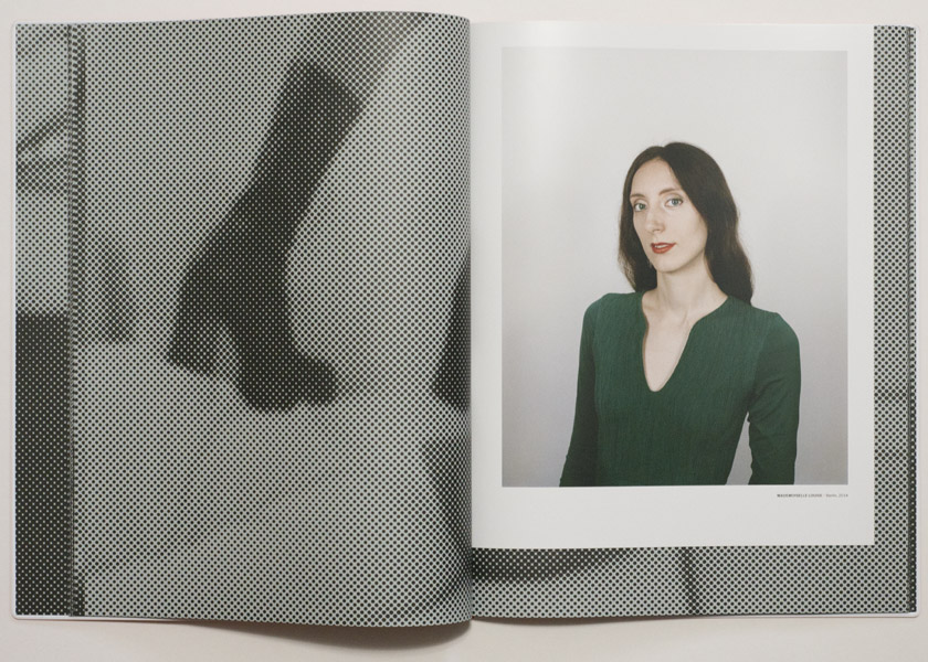
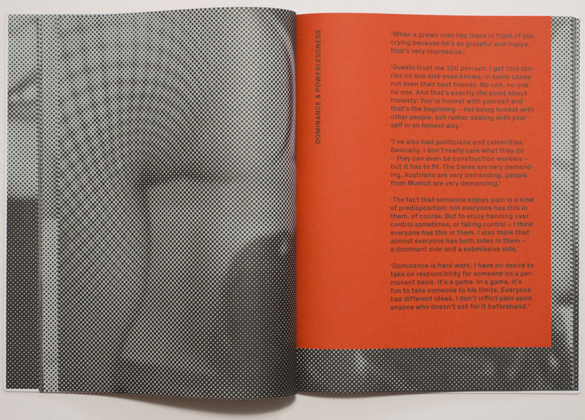
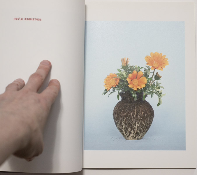
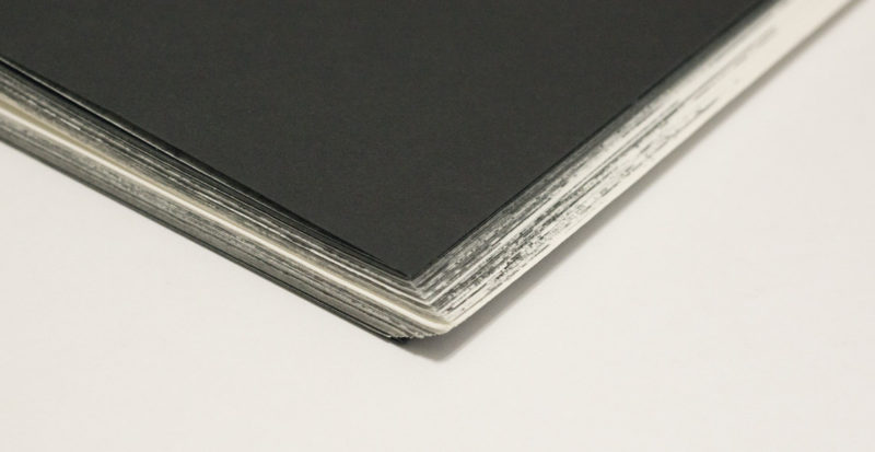
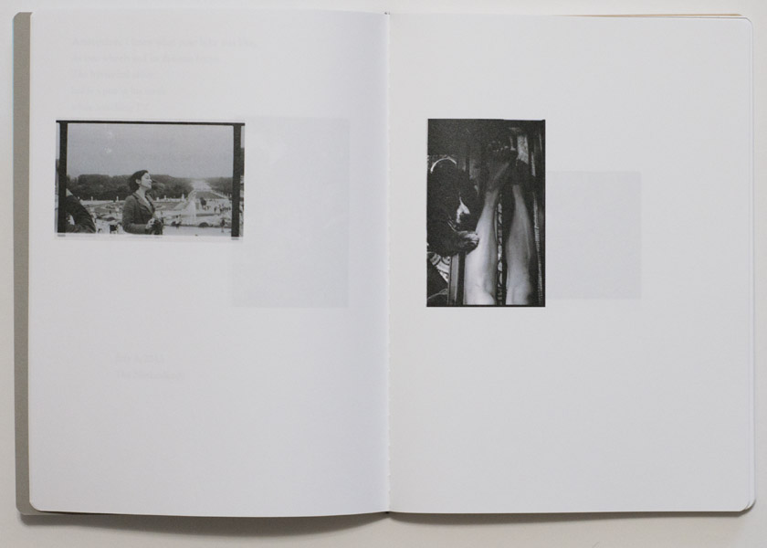
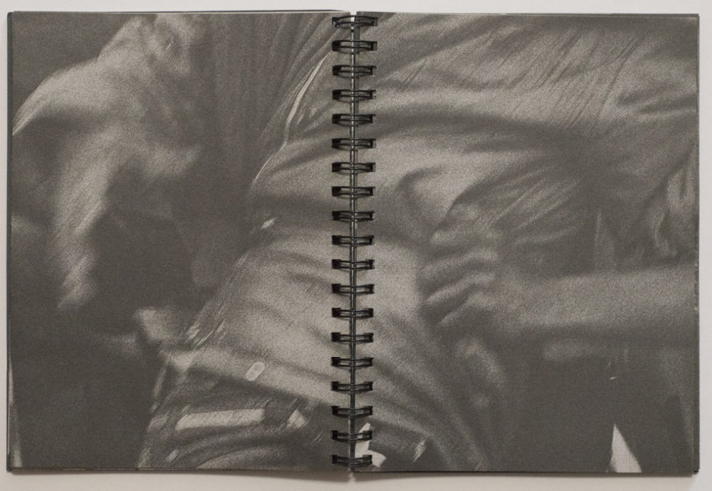
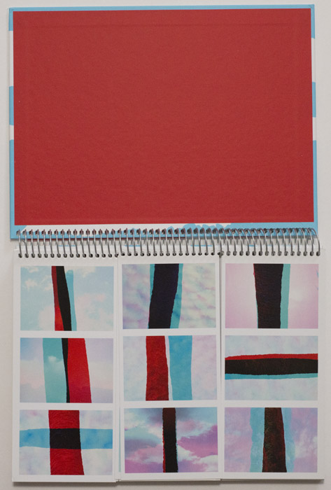
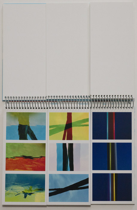
In terms of sizing, Max Eicke’s Dominas operates in just the inverse way than Sworn Virgins. While the paper stock the pictures are printed on feels like it’s of higher quality (it’s a slightly heavier white paper), the pages are actually smaller than the whole book. There are three different sections. As already noted, there are, first, the pages containing the photographs. There then are pages that contain text in the form of quotes from the women portrayed in the pictures. These pages have the same size as the picture ones, but it’s a different paper stock (see pictures). It’s red, and it feels like an office-paper stock. These two types of pages are then embedded in larger pages, which large rasterized segments of found pornographic images, printed in black and white.

The structure itself is simple. There’s no title page, so the first raster spread is identical with what ordinarily would be the end paper. There then is another raster-only spread. After that, there is a text page inserted. Into the next two raster-spreads, there are picture pages inserted (one each). Then one text page, followed by two picture pages, etc. until the end. Consequently, those who don’t read the text will experience a book focusing mostly on the photographs. Sworn Virgins doesn’t follow quite as strict a pattern, but the smaller pages there clearly separate the different chapters. In Dominas, there are no chapters.

As I hope to have made clear, apart from supporting facsimile reproductions of archival materials (Peckerwood style), different paper stocks and/or page sizes can be great tools to help organize content in a photobook. For this to make sense, there needs to be a variety of content being present. In the examples above, differences in the photographs arose through their sources. Obviously, there are other ways to separate out different types of images, but using paper stocks and/or page sizes provides a way that doesn’t require any further explanation: an attentive viewer will simply pick up on it. Other types of content that can be separated out are text and images, even though here, it’s not necessarily so clear per se why one would need to point out a difference. That said, though, printing text on the same relatively heavy paper stock as the photographs often feels a little bit over the top, so picking thinner paper is not a bad idea.

One needs to keep production issues and costs in mind. Wherever hand work becomes involved, production costs tend to explode. You probably want to stay away from that — even if you have the means to make such a book, the sale price would have to reflect the production costs, resulting in a pretty expensive book (unless you would want to absorb the added costs). A smart and experienced photobook designer will be able to come up with a design/production that will adhere to the budget. So as always, but especially when thinking about anything that involves a non-standard book format, with different paper types and/or sizes, speak with an expert to get help!

This article is the fifth in a series of five. You can find the other parts here: part 1, part 2, part 3, part 4, part 5

The Forms and Functions of Photobooks (4)

Article main image

Last week, I wrote about the easiest way to make a book: fold a piece of paper in half to arrive at a very simple book. Add a few more of such folded sheets to make a pamphlet-style book. But why would one have to fold the paper? After all, you could simply stack a few sheets of paper, somehow hold them in place, and you’d have a book as well. An obvious idea for holding the pages together would be to use a hole punch, and to insert them into a binder. Lest you think I’m being a bit flippant here, this is the model used for Lee Friedlander’s The American Monument.

If you don’t like the idea of the binder (which references the way very old photo albums used to operate), you could also run some staples through the stack of paper. The staples would clearly hold everything together. And again, I’m not being flippant here. I own a 1945 abridged softcover version of Weegee’s Naked City that was produced this way. Its cover, a just very slightly heavier paper stock, wraps around the stapled stack of paper (see pictures).

Mechanical solutions such as these two options do their jobs, but aesthetically they’re not overly attractive. Of course, you could say the same about the spiral. But there’s another option to bind books using the same principle, which has a long tradition in Asia: stab binding. In a nutshell, instead of a hole punch and a pre-made binder, you make a series of smaller holes through the pages, and the book is held together with binder’s thread. Just like in the case of the spiral, the binding itself becomes very prominent. But instead of a metal/plastic spiral/coil, here you see the thread, which not only holds the book together but also adds a sense of ornamentation.

Unlike in the case of the spiral, stab binding introduces a limitation to the book. You can’t really place the binding holes too close to the edges of the paper — otherwise, the structure would become unstable: opening the book would produce too much of a stress on the material. Consequently, you lose a part of each page to the binding. When you open the book, a small part of each page is simply invisible — it disappears in the gutter. Thus, if you want to use images that cross the gutter you have to plan very carefully how to do it.

What is more, unlike the spiral-bound book, a stab bound book will never lie flat. In fact, you usually need to use both hands to even look at such books because the binding adds an element of stiffness to the book. You can get around the stiffness by using very thin paper. But printing photographs on very thin paper is not very simple, unless you employ the kind of trick commonly used in Asian books: pouch pages. A pouch page essentially is a folded piece of paper. Unlike in the case of the pamphlet where the folding creates a set of pages, here the folding merely hides the parts of your page where an image shines through to the other side. Now, a folded piece of thin paper (one side of which you’d print on) still can be more flexible than a thicker paper that would allow double-sided printing (this idea might come in handy if you want to make such books using an inkjet printer in your studio).

The stab binding example I discuss in Understanding Photobooks is Daisuke Yokota’s Linger. Of all the books this photographer has made (I’ll admit I’ve lost track), I think it’s still by far his best. Another example is provided by Kosuke Okahara’s Vanishing existence (to be precise, the regular edition, there also are two other editions). This particular book is maybe an even better example of stab binding. Unlike Linger, Vanishing existence uses pouch pages. The paper is not very thin, so the whole book requires both hands (for the picture, I made do with one to be able to operate my camera, but it was quite awkward).

The book’s spreads contain smaller pictures, usually in pairs, but there are also pictures across the gutter. Such careful attention to detail was placed here that those picture can be enjoyed fully: details might get very close to the gutter, but they don’t disappear in it. In addition, text was printed across the part of each sheet of paper where it would be creased, which produces an intensely beautiful detail. With a focus on leprosy villages in China, the book very clearly is situated in Asia, and its form and content come together perfectly. It’s a real treasure of a book.

OK, so these two books clearly have a strong connection to Asia, easily justifying the binding. What else could you use this binding for? There is one other aspect of the binding that I have ignored so far. With stab binding, you can also mix different types of paper. If you wanted to, you could stack any combination of papers. Given the binding involves hand work anyway, mixing papers doesn’t necessarily make it more complex.

This brings me to Diana Scherer’s Nurture Studies. For the project, the artist grew flowers from seeds in a set of vases. Once fully grown, the vases were removed, leaving the soil and roots which would still carry the vases’ outlines. The plants were then photographed on monochromatic backdrops. The book contains these photographs. For each photograph, there is date given, which is printed on a vellum-style paper. With its very reduced aesthetic, Nurture Studies clearly references classic books on Japanese flower arrangements. And this reference is clearly reinforced through the binding. Added bonus: the binders thread on the outside also references the tangles of roots in the soil.

So all of these books are very specific in their intent, and that intent is made to work with the binding (as it should be). In a sense, stab binding is a great way to make books that are even just aesthetically intensely pleasing. Of all the binding types I can think of stab binding is the one that commands most attention on its own. However, the books discussed here do clearly reference a very particular tradition, which in combination with the hand-made factor doesn’t really work for a lot of photography (I couldn’t imagine, say, a Becher water tower book done this way). Like any type of binding, stab binding is just waiting for its right application.

This article is the fourth in a series of five. You can find the other parts here: part 1, part 2, part 3, part 4, part 5

The Forms and Functions of Photobooks (3)

Article main image

The simplest way to make a book is to take a piece of paper, to fold it in half, and voilà, there’s your book! It might not be the most exciting book with its four pages, of which two are the book’s front and back. But still, it’s a very basic book. If you want your book to have more pages, you can add them by folding more pieces of paper and inserting them. If you don’t want the book to so easily fall apart, run two or three staples through the “spine,” and you’re all set. Of course, you know this publication format, since it is commonly used for magazines. But you could easily employ it for your photobook, because it’s very simple, and it can be very cheap to produce. As an added bonus, it will produce a book that lies perfectly flat when opened.

In Understanding Photobooks I discuss Donald Weber‘s Interrogations as an example of such a book (pamphlet). In that particular case, the format was driven by the idea of arriving at something that would be similar to a basic police report. The very same idea was also used for Valerio Spada‘s Gomorrah Girl, at least the earlier self-published version. The later trade release then had the publisher put a hard case around the book, which completely ruined the original idea. 

Police-report ideas aside, what else can you do with the pamphlet? If you’ve seen Interrogations you’ll probably remember vividly how it was pretty think, but somehow they “forgot” to trim the fore-edge (that’s where you open the pamphlet — this document might come in handy if you aren’t familiar with book-binding terms). Well, they did not forget, they just decided not to trim the excess, resulting in the pages jutting out. When you buy a magazine, you won’t see this. But pamphlet-style magazines usually are thinner (they use a lighter paper stock), and they don’t have as many pages. They are trimmed at the fore-edge, though.

An untrimmed fore-edge in a relatively thick pamphlet gives the resulting object a somewhat sculptural feel. A very good example of how this can be used perfectly is provided by Nicoló DegiorgisPeak. Each photograph shows a mountain in the Dolomites, with the picture centered on its peak (this might not surprise you, given the book’s title). If you look at the book there is a peak of paper jutting out its side (see top image). The book is loosely bound with a rubber band, so you could easily take it apart, and two halves of different mountains would then form new, artificial peaks. Lastly, the photographs are sequences in such a way that they go from very dark (night) to very bright (full day light) to very dark again. These decisions make the book the most perfect realization of the source material I could think of. All the choices are simple, they’re relatively cheap to produce, and the object itself just feels right. That’s what you want for your book.

One of the nice properties of the pamphlet book is that in theory, you can stack as many different types or styles or weights of paper as you want. This type of mixing is a lot harder with other types of binding. Now, the downside of this fact is that you’ll have to pay careful attention to how you’re doing this. Let’s say you think early on in your book you need two pages of a very different paper. So you’ll add it. What this means, though, is that given it’s a pamphlet book, there will also be two of those pages very late in the book. That’s the thing with pamphlet books, every added sheet of paper means four additional pages. Consequently, while mixing different papers is great, you’ll have to plan the content of your book in such a way that everything works out. Unlike in the case of a perfect-bound book, say, you can’t just add two pages somewhere. You’ll always add four, and the two pairs come at the same relative position in the book (two pages in means another pair two pages before the end etc.).

A very good example of the mixing I just discussed is provided by Peter Dekens(un)expected. A book about a region in Europe with a very high suicide rate, the book comprises two types of photographic materials. There are fairly bleak black-and-white cityscapes devoid of human presence. And there are colour photographs, which are done in a documentary style and which center on people left behind (there also are reproductions of archival materials). In the book, these two types of material are made to interweave, with the cityscapes printed big. The other photographs (plus some text) are added as separate smaller sections, which are also printed on smaller pages. It’s a very simple and basic way to separate out the material, while giving the book an, again, simple and basic structure: the “smaller” more personal stories are literally embedded in a “larger” somewhat grim and depressing cityscape. This book really is a prime example of how to employ the idea of mixing paper types and styles very successfully.

Just as an aside, note that with the exception of Degiorgis’ book, all the examples here were produced by Dutch designers. Make of that what you will.

You have to be careful, though, not to possibly go overboard with what you’re doing. For me, Kate Nolan‘s Neither goes that one step too far.  What I really like about the book is how the cover is actually smaller than the content pages. After all, there is no law that decrees otherwise, is there? In the front, these first pages are facsimile reproduction of journal entries written by young women living in Kaliningrad (the Russian enclave just north of Poland, which before WW2 was part of East Prussia). In the back, there are quotes from Russian women who were resettled there (after the German population had been driven out). Open the book, and you’ll find full-bleed (square) photographs, underneath of which there are short segments of a larger quote. These segments have been cut from the rest of the page. You can leaf through these two sections independently, combining different pictures with different quotes. I get that idea in principle, but I don’t know what it adds to the whole book. Plus, the way the pages are cut makes turning the smaller sections a bit iffy. So I wish that aspect of the book had been done differently. To me, this feel gimmicky. The rest works very well.

Most pamphlet-style books I know mostly stay within the very basic parameters, usually avoiding any gimmicks or any of the possibilities discussed above. In particular, smaller self-published books often employ this kind of format, either stapled or machine-sewn. When done well, even a very basic production can look very nice and accomplished. The last example I want to discuss is a book that combines the very basic format while stepping beyond it at the same time: Alexey Nikishin‘s the journals. One of the very obvious reference for pamphlet-style note books are plain notebooks you can buy (for example, Moleskine’s Cahier Journals, which come in different sizes). As is obvious from the title, the journals is modeled after such cahier-style notebooks. In this particular case, though, three books are affixed to each other (the back of the first one is glued to the front of the second one etc.), resulting in a single object. Alternatively, one could have housed the set in a slip case, which would have inflated costs, though. As an added bonus of this particular construction, the whole set is pretty solid: while it looks like three notebooks, the overall object isn’t as flexible as a single one would have been.

So the pamphlet-style photobook offers quite a few perks, especially if as a photographer you’re interested in self-publishing. Done well, it results in a very clean book that will lie flat — unlike perfect-bound books, which also use very cheap binding. I think I’ve made it clear that the binding should work with the content as well if possible. Some bodies of work might just ask for a pamphlet-style production, simply because it works so well conceptually, or it might be the easiest and cheapest way to have the book do what it’s supposed to be doing.

However, one always needs to keep one aspect in mind. A pamphlet-style book is unlikely to have a “previous book” cachet — this might be why Twin Palms decided to house Gomorrah Girl in a hard case: now it looks like a “real” book. Unfortunately, this completely destroys the idea behind the original book. What collection of police files comes in a previous case? It doesn’t make sense. In contrast, the slipcase for Interrogations literally is the cheapest possible (and fully functional) case you could think of, hitting both targets easily: it maintains the illusion of someone just holding this police file together, while not telegraphing “I’m precious.” That’s how you do this. As always: form has to follow function. And function better not include “impress collectors looking for precious books,” because once you’re doing that, you’re screwing it up.

This article is the third in a series of five. You can find the other parts here: part 1, part 2, part 3, part 4, part 5

The Forms and Functions of Photobooks (2)

Article main image

I want to continue my discussion of unusual binding choices by looking at the spiral. Spiral (or coil) binding a photobook might sound like a very strange approach: whatever you do, it tends to look cheap. Then again, for example Brassaï’s 1933 Nuits de Paris was bound this way, so it can’t be all that bad. But yes, spiral binding looks cheap, and you’ll have to work your way around that fact — or make good use of it.

If you’ve read Understanding Photobooks you will know that I consider producing physical dummies as one of the most important parts when making a photobook. Enters the spiral, or rather a cheap spiral-bound notebook: your first dummy could simply be such a notebook with prints pasted in with removable double-sided tape. Cost issues aside, you can add plenty of extra pictures to such a notebook without it bulging. What is more, you can tear out pages easily and even re-add such pages at different locations. None of that might be aesthetically too pleasing, but at the very early stages of editing and sequencing a photobook, the idea really shouldn’t be to make something pretty. You want to make something that works in a convenient and simple manner.

The spiral also provides a good and again cheap way to make a more advanced dummy. Let’s say you printed all the pages on your inkjet printer. Getting them bound can be a bit of a kerfuffle, unless you know how to bind books yourself. But you could also simply print out all the pages and take them to your local copy shop. They will be able to spiral bind the pages to produce your dummy, and it will cost you very little. That’s great. You might not want your final book to be spiral bound, but your dummy will look and feel very much like a real book.

What’s more, if you want to use different paper stocks in your book, the spiral is perfect again. You can stack as many different types of pages as you want, in as wacky and order as you like, and you’ll get your book. In fact, any type of binding that operates along the line of the spiral will do that for you. But especially if you printed your dummy on the typically heavier inkjet paper, the spiral looks like the perfect match. Producing a perfect bound book (which is also very cheap) would severely limit the overall ease with which you could look at your book. In the most extreme case (which I’ve seen) you’ll have a hard time opening your dummy.

Now, those heavier inkjet paper stocks also fulfill one of those crucial criteria for a spiral-bound book. Just like in the case of the accordion book, the binging puts a physical strain on the pages. For your notebook dummy maybe you’re glad that you can rip out pages easily. But you don’t want that for your advanced dummy or your actual photobook. So when using spiral binding, you have to very carefully think about the type of paper(s) used: if it’s too thin (light), the risk of tearing will increase a lot.

There are two other aspects of the spiral that you will also want to take into consideration before committing to it. A spiral-bound book has no spine you can print on. All you get is the metal or plastic spiral. If you want a printed spine, you’ll have to produce a solution (which is possible). If you don’t care, that’s OK, too: you won’t be able to read the photographer and title of the book once it’s filed on a book shelf. But how many spiral-bound photobooks are there? So maybe that’s OK.

Second, the presence of the spiral creates quite a drastic gutter. The most likely way any spread will appear is its two parts (pages) not touching. This depends a bit on the size of your spiral. You could pick a slim spiral (which will limit your overall page count), so a very attentive viewer could make sure the pages touch. I’ve tried doing that, and it’s a major kerfuffle: honestly, nobody is going to bother doing that. So in a spread, there likely is a small gap between the two pages.

If you want to work across the gutter, especially with photographs, you really need to think very carefully about it. With plenty of people already complaining about pictures going across Smyth-sewn gutters, you’re going to limit the appeal of your book. But you will never be able to produce a book that makes everybody happy, so maybe this is not such a big deal. I personally don’t care much about the problem at hand here: for me the spiral cutting through a picture adds an element of disruption that can work very well.

One last comment about this type of binding. Strictly speaking, I’m a bit sloppy with the use of “spiral” here. If you wanted to be very precise, you’d have to talk of spiral/coil binding and double-loop-wire binding. The technical differences are explained here. But they’re simple to tell apart. In a nutshell, for spiral/coil you’ll see a single spiral holding the book together, and the material could be either plastic or metal. As the name indicates, the double-loop wire uses metal, and there are two loops going through each of the holes (see top image). The double loop looks a little bit nicer (I think), but it comes at the expense of the book being a tad less flexible. In addition, it allows for pages to possibly escape, something that’s impossible for the single spiral (unless the page gets torn out).

In Understanding Photobooks I discuss Irina Rozovsky‘s Island on My Mind as an example of a spiral-bound book. I’m going to look at a others here. Felipe Abreu‘s APROX 50 300 000 is a very good example of using a spiral to amplify the roughness of the binding. There is a strong sense of violence going through its images, all of them appropriated news images centering on the migrant/refugee crisis.

Through its construction, spiral-bound books tend to be a bit flexible, but this flexibility here is kept in check through the use of quite heavy and coarse-looking card stock for the covers. That cover is particularly important, given that the pages themselves are quite thin newsprint-style pouch pages. I mentioned above that the use of thin paper poses a risk, given that it might tear easily. The doubling up resulting from the pouch pages helps against that as does the double spiral (which distributes the forces on the insides of the binding holes onto two spots). At the same time, the size of the double spiral in combination with the overall number of pages by construction forces pairs of pages to be very close to each other (see pictures). The way this ends up happening is quite nifty, in particular since often, photographs cross the gutter.

So these choices come together very well here. The book remains quite tight, with the spiral binding clearly escaping from the terrain of precious photobook that would be very much at odds with the subject matter. You could contrast this with House of Coates by Brad Zellar and Alec Soth. The book combines Zellar’s writing with Soth’s photographs, taken with disposable cameras.

What I find interesting is how the form of the book tries to have it both ways: it intends to look and feel less like your run-of-the-mill precious photobook, but at the same time it also doesn’t run away from that completely. While APROX 50 300 000 clearly wants to look and feel rough, Coates’ roughness is more along the lines of a pair of new jeans that come like they’ve already been worn for ages. For example, the book uses a wrap-around cover, so when it’s closed it features a spiral along with a front, back, and spine. The cover material feels coarse to the touch, but it also provides ample support.

So House of Coates basically is a well made not-so-precious photobook, which I think it fine. But I’m not necessarily convinced it couldn’t have been more simply a standard perfect-bound softcover. That issue aside, it is a very good example of how you can use the spiral to get as close to your average photobook as possible, while adding hints of a lack of preciousness.

Shifting gears a little bit, there is one other very good reason for using spiral binding: when you literally want to break/cut up the pages. The maybe most obvious example for this type of book might be the kind of children’s book where the young viewer can assemble parts of separate wholes into something new, let’s say a face from a separate mouth, nose, and face. In a fairly obvious sense, this type of book isn’t really an option for 99.99 percent of all photography. But I actually do own such a book, and it doesn’t even use faces: Alejandro Marote‘s B.

What it’s about I have no idea. Honestly, I’d be much obliged if someone could translate the photographer’s ideas into plain English for me: “I head towards a place in which the two main coastal plains, the vertical line formed by the palm tree and the horizontal line of the sea, are in charge of preserving a constant geometric pulse. The Cross that is born from this encounter unveils the secrets hidden in the change of states that matter itself undergoes, thus opening a door through which we can travel from a solid reality towards the frontiers of liquid abstraction.” When I want to travel “towards the frontiers of liquid abstraction” I usually grab a bottle of Żubrówka.

Joking aside, though, in the book, the grid of nine (three by three) images can be reconfigured more or less any which way by turning the page segments individually, creating a large variety of abstract patterns. I’m tempted to think that this might actually be the most interesting application of this type of book (your mileage might vary). Allowing this level of interactivity makes for a very distinctive experience for the viewer. And it is quite a unique way to work with the New-Formalism-style source material.

Had I been involved in the making of the book, I personally probably would have gravitated towards using film pages that allow for layering. But that’s really a very obvious, and possibly too easy, solution. This particular solution here certainly is unique and engaging and it has an element of playfulness to it, especially given the materials — bright and colourful, but also (in part out of sheer necessity) a bit oversized, thus clearly evoking children’s books.

So much like the accordion (see part 1), the spiral has its uses. Unlike the accordion, a spiral probably needs to be adopted more for the aesthetic it comes with than the function it offers — unless you want to make a book like B. Whatever you want to make of the spiral as the end form for your book, it’s a great tool for making especially early dummies. As the final form for a book, I quite like the spiral, but I feel that it’s a lot easier to make a bad spiral-bound book than an accordion, say. You really want to think it through before you commit to it.

But then, you’ll have to think through your book regardless of the production choices. Maybe what makes these more unusual binding types so interesting is that as a viewer you notice them so much more. They amplify the book in certain ways, so your choices better work.

This article is the second in a series of five. You can find the other parts here: part 1, part 2, part 3, part 4, part 5