What do we talk about when we talk about photography?

Article main image

A two-part essay about Susan Sontag (part 1, part 2) by Darren Campion had me think about my problem with On Photography. I’m not even sure that Sontag really writes about photography. It’s true, in the most obvious sense the various essays discuss photography. But once you start digesting Sontag’s conclusions (and ignore all the various contradictions and shortcomings), photography emerges as little more than a piñata for this particular writer: Sontag’s beef is not so much with photography, it’s with our culture. My problem here is not so much Sontag’s critique of our culture. Instead, it is the projection of what to me read like pretty clearly pre-determined conclusions onto photography. You don’t learn all that much by doing it, and you end up with some pretty strange ideas of your piñata.

I mean what is photography anyway? What do we talk about when we talk about photography? When photojournalists talk about photography, do they talk about the exact same entity as advertizing photographers? When people who post on Instagram talk about photography, do they talk about the same entity as museum curators? When I talk about photography (as I do here), do you, the reader, have the same entity in your head? I’m not sure. I’m pretty sure that Sontag’s idea of photography is very different than mine. It’s true, all photography focuses on photographs. But there isn’t even agreement concerning what exactly a photograph is, let alone what they do or how they do it.

For me, it is exactly that fact, namely that photographs can mean so many different things that makes this interesting. But to do full justice to what photography is, or how it operates, or rather how we operate it, we need to always not only acknowledge the contexts we’re dealing with but also our own expectations. If we don’t do that, then we’ll run into the kinds of common problems, namely that our arguments make little sense for other people (while there’s ample nodding in whatever little bubble we operate in).

If, for example, photojournalists discuss the types of manipulations that should be allowed for photographs, those arguments might make perfect sense in that particular context. But for an advertizing photographer, not allowing the gratuitous use of Photoshop must sound like a pretty absurd approach: who would advertize a product with shitty looking pictures? And what’s with all the strange high-contrast black and white and the crooked horizons in photojournalism? You can’t manipulate your pictures, but you can do that? This is not to say that one approach is necessarily better than the other. It’s not. Each approach works perfectly well within its own context — even though each approach might also be subject to often necessary discussions, in particular since contexts and expectations can be fluid.

As an aside, please note that context here means two aspects at the same time. There is, first, the larger context a photograph is being used in (for example the news). And second, there is the particular specific context (let’s say the discussion about healthcare or whatever else). Both types of context come with their own set of expectations, but the former usually — but not always — are more important than the latter.

Consequently, when we talk about photography we usually talk about photography given a specific context. And we need to acknowledge that, because not doing that easily lands us in trouble. Thing is, in “real life” we appear to be quite flexible and adept at dealing with photography. Just to give one example, a little while ago I was in the check-out line of a supermarket, and there was a mother with her relatively young child right behind me. The boy pointed at one of the magazines in the impulse-buy racks. I didn’t hear what he said. But I heard very clearly how his mother told him that he shouldn’t necessarily believe the covers of the magazines, given the people on them were Photoshoped to look attractive. What do you know, a visual-literacy lesson at the supermarket check-out.

The importance of context (and attached expectations) becomes easily obvious once you’re exposed to a photograph in such a way that the context isn’t clear, or when you encounter a photograph that seems to violate what you expect from a particular context. Benetton’s use of a photograph of David Kirby is a good example of a photograph taken out of one context and put into another. Another example would be Luc Delahaye’s dead Taliban soldier. If photographs really were the kinds of absolute entities as which they are often described, taking a picture out of one context and bringing it into another one would not to matter. But that’s not how this works. The larger the differences between two contexts (and their associated expectations), the more a viewer might be rattled.

In fact, photographs are no absolute entities. Typically, we associate a context with every photograph (or at least attempt to), based on form and context. A grainy black and white picture with a crooked horizon line looks like a photojournalistic picture, because we don’t see such pictures in advertizing. We have certain expectations of what pictures look like, given a context, and we’ll apply them (btw, this doesn’t mean such expectations cannot be changed): this picture looks like it’s out of this particular context, so I’m going to assume it is.

I taught a class on visual literacy a few years ago, which consisted of showing students photographs without any additional information (other than the broader context, such as “news”). The students’ task was to describe the pictures and to tell me what they meant (or might mean). The most exciting examples were photographs where students literally had no idea what they were looking at. One example I clearly remember was a colour photograph from the day Pearl Harbor was attacked. Not a single student was able to determine what it showed. The consensus was that it would be a photograph showing an oil spill somewhere: a lot of water, some very thick smoke near a naval structure, and a colour photograph.

The key to visual literacy — and the goal of the class — is to interrogate these kinds of mechanisms, where we attach contexts and meanings to pictures, based on what they show and how they show it. The more you can do that, the more you can understand the world of images that surround you.

Coming back to the larger question, I don’t know what photographs are in a more absolute sense. They tend to be these incredibly malleable entities that we attach all kinds of expectations to, given a context, and that we then project our ideas onto. That’s what makes photography so great, so lively: there are so many different contexts, so many different expectations and ideas.

Consequently, when we look at photographs we don’t necessarily look at absolute entities that tell us about the world. Instead, when we look at a photograph we know someone is pointing at something (that might or might not be in the picture), and the connection that we can make by participating, the experience of sharing a moment — that is photography. That experience can be very specific — such as when your doctor shows you a broken bone on an X-ray photograph, and it can be incredibly vague — such as when you stand in front of a large abstract picture.

Project your own ideologies onto photographs at your own risk. In all likelihood, you’re going to miss at least some aspects of what this pretty amazing medium can do.
Photobook Reviews W25/2017

Article main image

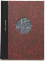
If, as I pointed out last week, there are plenty of photobooks that don’t have — and need — a narrative, there are all those that do. Narrative-driven books currently are all the rage, to the point of the idea of “narrative” almost having become a bit of a fad. But this development shouldn’t get into the way of us enjoying those books that work particularly well, such as Laia Abril‘s Lobismuller.

One of the “problems” with narrative-driven books is that they tempt the reviewer to give it all away, to, in other words, talk about the story, thus (possibly) marring the possible viewers’ experience. In addition, by construction there is a literalness to photography that often extends (or actually is being extended) to our discourse around the medium, a literalness that, frankly, I’m at war with. So I’ll try to refrain from that here. Just briefly, the book centers on a Spanish serial killer who lived in the mid-1800s. There are many additional details that vastly complicate this basic story and that reveal themselves beautifully through the book.

Usually, good photography (or photobooks) is (are) good not because they’re literal, but even though they’re literal. At least, that’s what I enjoy about photography, when it’s used well: as a viewer, you rub against everything that “despite” the photographer’s best intentions is incommunicable. I’m using quotes around “despite,” because when you make a photobook, you need to be very aware of this aspect — if not, at times, make sure that you’re not ruining this very fact, in particular if you’re making a narrative-driven book. You have to resist to provide too much information, to, in other words, place the bread crumbs the viewer is supposed to follow too narrowly together.

In Lobismuller, Abril and frequent collaborator Ramon Pez employ their considerable skills, using the by now well-established tools available for the makers of narrative-driven books, such as a variety of source materials and layouts, production choices (different paper types and sizes), plus the addition of text in various places. I realize my description might make their work seem formulaic, but I don’t mean it that way. After all, if you produce your usual gallery-show-on-paper, that’s no less formulaic than adding facsimile document inserts in books.

The main question really should not be whether any of the choices used to make a (any!) photobook are new or overused or whatever else the criticism might be, but rather whether they work, whether, in other words, they help the photobook (but not viewer’s ideology) in question. Approached from that angle, the many choices that went into the making of this particular book work very well. Even though there is a main narrative, Abril and Pez actually present more like a weave of narratives, where more cerebral strands mix with decidedly emotional ones. In particular, the full-bleed section starting roughly after the middle of the book works tremendously well.

Anyone interested in narrative-driven photobooks is well advised to pay close attention to the books made by Laia Abril and Ramon Pez. Lobismuller provides a very good entry point to their thinking. And anyone else is in for a visual treat, with the book showcasing some of the things you can do with pictures and text in photobook form.

Lobismuller; images and text by Laia Abril; 192 pages; RM; 2017

Rating: Photography 3.5, Book Concept 5.0, Edit 3.0, Production 4.0 – Overall 3.9

“I believe,” I wrote in March this year, “that an exploration of ‘the social and political landscape of the United States’ is essentially useless if it systematically excludes the most dominant group, the group whose economic and political power shapes the country.” I still believe that. An investigation of the wealthy, of the incredibly privileged, of those unlikely to suffer from any of the rather basic problems 99% of the US population have to deal with all the time — such an investigation must be part of the world of photography attempting to tackle the state of the world we’re living in.

Sage Sohier‘s Witness to Beauty is, well, that: a look at privilege, privilege in more than one way. First and foremost, though, it’s an extended portrait of the photographer’s mother, a former model who at some stage was photographed by the likes of Richard Avedon, Irving Penn, or Philippe Halsman, a woman whose face was featured on the covers of magazines such as LIFE (January 26, 1948) or CHARM (December 1947; CHARM billed itself as “The Magazine for the Business Girl”). The book makes all of that abundantly clear, laying out photograph after photograph before the title page, a flurry of pictures taken by famous photographers plus an ample amount of family photographs, one more celebratory than the other. 

This ought to have been a bold decision to make by Sohier: after all, the viewers would see all the photographs by Avedon et al. first. But it works, because there really can’t be a competition here, given those photographs were the distant past, whereas the other ones, Sohier’s, show the more immediate past and present. In addition, the former clearly inform the latter in this indirect way. I have no way of knowing this given my life’s circumstances are so very different. But whatever I imagine what growing up as this woman’s daughter must have been like, it can’t have been easy (it is not for nothing that the photographer’s essay in the very back is entitled “In Beauty’s Shadow”).

While Sohier makes her mother the central figure of her work, she also includes a cast of other characters, most prominently her sister and herself. Photographs always are a fiction. So who knows who contributed how much to what I’m picking up. But the mother and her display of regal beauty come across as a bit insincere, as if the facade were just about to crack, as if someone knows how to act very well but can’t help but overact just a tad. The roles of the photographer and her sister also differ, with the former displayed as being in on the spectacle — unlike the latter. My read, of course, is based solely on the pictures, on not personally knowing any of the portrayed. But my read also makes this book intriguing, given that too perfect a picture (pardon the pun) would easily make the whole affair very trite.

And then there also is the privilege, the almost complete absence of any of the more fundamental problems that so many other people have to deal with. This also makes this book intriguing to me, because it irritates me a bit. Through the various devices I discussed earlier, as a viewer I’m being given some sort of access to this world. This is not just in the way that photographs always deceive into showing more than they do. In addition, I feel I’m being held at more than just an arm’s length here. So I don’t know what to make of this world that ultimately I have no access to, other than the one I’m being granted (yes, that would be the word) here.

Witness to Beauty; images and text by Sage Sohier; text by Marvin Heiferman; 108 pages; Kehrer; 2016

Rating: Photography 3.5, Book Concept 3.5, Edit 3.0, Production 4.0 – Overall 3.6

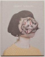
There’s a small industry of artists who will take photographs and physically manipulate them, whether by embroidering, punching holes into them to shine lights through, or whatever else. Alma Haser is one of these artists. Her Cosmic Surgery essentially is based on an iterative process that starts out with a portraits, taken by Haser, and that then moves through an origami-style stage, to eventually end with a photograph of the slightly sculpturesque contraption produced this way. As someone who enjoys when photography is being taken a step further I enjoy the idea. That said, in almost all of these kinds of approaches, a grouping of such pictures for me ends up as being a lot less than just a single one.

How do you make a photobook out of these pictures? A simple catalog, gallery-show-on-paper style, would probably be dreadfully boring (your mileage might vary). That can’t be it. Obviously, you’d want to make a book that incorporates the very process with which the photographs were made. I’m using “obviously” here probably in part because I have already seen the book, plus I’d love to think I would have come up with the same idea (whether that would have indeed been the case I’ll — possibly thankfully — never find out). So you’d want to make a book with pop-up components, given that these incorporate the basic idea. In theory, that’s a great idea, in practice, it vastly complicates the production of the book, because the pop-up components can’t be added by machines. They require hand work.

And so it was done: there is a book. The folks at Stanley James Press collaborated with Haser on the making/production of the book. The design and production choices adopted for the book are simply brilliant, arriving at what I think is the best possible realization of a photobook out of the source material. The design itself is elegant, simple, and a bit playful, while neatly avoiding doing too much, which would have turned the whole thing into something a bit too cute (or maybe twee). The production also wasn’t overdone: there aren’t a dozen pop-ups in the book — that would possibly not only have been too costly, it would ruin the whole idea through needless repetition.

So It’s really the perfect book for this body of work, a huge surprise for me when I received it in the mail.

Cosmic Surgery; photographs by Alma Haser; text by Piers Bizony; Alma Haser; 2016

Rating: Photography 3.0, Book Concept 5.0, Edit 3.0, Production 5.0 – Overall 3.7

Photobook Reviews W24/2017

Article main image

Hardly anyone speaks of the catalog that much any longer. Instead, everybody wants to make a photobook that has a “narrative.” I can see the appeal of narrative-driven books. But the reality is that for many photographic bodies of work, such a narrative either doesn’t exist at all, or the resulting book can only be a somewhat glorified catalog. In other words, even though the photobook as a narrative-driven entity has become so popular, there is absolutely nothing wrong with catalogs. Trying to force a narrative on a body of work that doesn’t any is a recipe for disaster.

Maybe the problem people have with catalogs is that usually they tend to be so dry, overblown, and academic. Many catalogs I own are just that, somewhat grandiose affairs that open with one or two introductions by very important people (who have seriously nothing to say about, well, anything, not even to mention the photographs), there then are two or three often broderline unreadable academic essays by specialists (half of the page count might be taken up by footnotes), and finally there are the plates. I can see the value of such catalogs. I own a few of them. I rarely look at them. They seem made for an audience that consists of the peers of those people whose essays are included. That’s totally fine, of course, but it’s, let’s face it, pretty much useless for anybody else.

It needn’t be so. On and off I have reviewed catalogs that broke the aforementioned mold. But they’re rare, because many of the institutions that produce catalogs prefer them the way it has always been. Another one of these rare examples is now provided by Spring Tide, made at the occasion of an exhibition at the Nederlands Fotomuseum that was curated by Willem van Zoetendaal (who also is the catalog’s publisher). Van Zoetendaal dove into the museum’s collection and picked 250 photographs, showing them uncropped and printed from the negatives.

For anyone outside of the Netherlands, Spring Tide will make for an unexpected treat for a variety of reasons. To begin with, it’s not a large hardcover book of the type discussed before. Instead, it’s a relatively unassuming, intimate feeling softcover (that — added bonus — comes at a very reasonable price). As an object, it’s an engaging book — it almost seduces the viewer into believing it was made just for her or him (which it was, except it was also made for all those other people who own it…). The production is absolutely gorgeous, employing pouch pages (the publisher’s refers to these “Sempuyu-style” binding; I’ve also heard people call them “Japanese binding” or “Asian binding,” even though those two terms for me are too broad).

The print quality is absolutely stunning. In terms of printing, Steidl usually is being seen as the gold standard. But I’ll take Van Zoetendaal’s over Steidl’s (or anyone else’s) any day: instead of using heavy, overly contrasty layers of ink, Van Zoetendaal manages to print his books in such a way that the photographs become incredibly delicate, revealing all their details where needed. I realize this is a bit of a superficial comment, but there is a vintage feel to the way these photographs are printed — vintage in the best possible way: not some pseudo-nostalgic gimmick, but this delicacy that I don’t see very often at all any longer in the world of photobook printing.

What is more, the book demonstrates what Dutch photobook design can do for a catalog, here mostly the use and placement of the type (which aptly handles showing two languages, Dutch and English, on the same pages without confusing the reader). The text — a short essay by Van Zoentendaal and biographies of the photographers — is placed in the back, so you can enjoy the photographs first.

And then there are the pictures. Boy, the pictures! I’m not Dutch, so I wasn’t familiar with roughly half of the artists. There are none of the currently well-known Dutch photographers, with the exception of Ed van der Elsken. I think this might make for a bit of a disadvantage for the catalog outside of the Netherlands. From what I can tell, these days people will rather look at something they’re already familiar with than get exposed to something new (I notice this in the reception of my writing: any article about someone well known gets shared a lot more than something about someone not so famous. To be honest, this is maybe the hardest struggle I’m facing as a writer these days). But the flip side, of course, is that there is a sense of discovery offered by Spring Tide that seeing yet another book of, say, someone who made colour photography popular simply can’t offer.

I could probably write a lot more about this book, but I think by now it’s clear how much I enjoy it. So maybe I’ll add just this: if you only buy one photobook this year, make sure it’s Spring Tide.

Spring Tide; photographs by various photographers; text by Willem van Zoetendaal; 104 pages; Willem van Zoetendaal; 2017

(not rated)

If you wanted to teach how to make a photobook, Max Eicke‘s Dominas could serve as a good example. A photobook, after all, gives its source material a best possible form (“a,” not necessarily “the” — but that might be for a later day). To do that, it will have to combine all its elements in the best possible way: edit and sequence, design, production (materials and binding). You’re shooting yourself in the foot if you neglect one (or even two) of these elements at the expense of the other(s). For example, design is often seen as merely an afterthought, the stated fear or opinion being that it must not get in the way of the pictures. In principle, that’s true, but reality is a bit more complex. After all, the end result of all efforts is the photobook, and the book is not merely a container for pictures (unless you’re making a catalog). The book is the piece of art, and the pictures are part of that — an important part, but for sure not the only part.

When you being making a photobook, it all starts out from the pictures, of course. You then need to move on to the question what the book should do, should achieve. Once that is established, you probably need to ask to what extent the photographs in question can do the lifting, in other words what kind of support they need from both design and materials. This step too often gets neglected. The reason why it is so important is at times, the pictures might simply not have enough muscle. A widely held belief in photoland is that if the pictures somehow aren’t “good enough” (which isn’t the same thing at all as having not enough muscle, but let’s entertain that notion), then you can’t make a good photobook. And that’s not true at all. If you wanted to be really orthodox about this (which vast parts of the Anglo-Saxon photobook world are), you’d basically approach each photobook like a slightly glorified catalog. That’s great for a lot of bodies of work, but it limits what you can do with photobooks (plus, it results in a lot of terribly boring books).

I don’t think the photographs in Dominas can do much lifting on their own. They’re competent portraits, that’s true. But for me, they seem to rely way too much on the subjects being interesting or exciting per se, which they’re clearly not (your mileage might vary). Photographed in a studio against a grey background, the pictures hover in this strange middle ground of not being quite deadpan enough to make you uncomfortable, but they also lack a sense of the photographer’s opinion. They’re photographs of dominas. They’re good. But they don’t tell you anything you don’t already know.

It’s the design and production that activate the book. The book’s cover is a reddish plastic, the kind of cheap plastic designed to be functional (this instantly anchors this particular part of the production in the pictures). There are two page sizes, and as far as I can tell there are two types of paper. The portraits are printed on a luster paper, the rest is printed on matte paper. There’s ample text, sourced from interviews with the subjects, which is printed on the matte paper (using the same red background colour as the cover), trimmed to the size of the photographs’ pages. The text and picture pages are inserted in pages showing black and white rasterized image fragments of sourced/found photographs.

As a consequence of these choices and decisions, Dominas works quite well. Whatever you want to say about its use of design and production (I can hear the sound of eye balls rolling in the photobook cloisters), there’s no denying that the book has an impact that a lot more conservative presentation of the source material would have failed to provide. What is more, I’m willing to wager that in a physical book shop, people will be drawn to the book simply because it’s eye catching.

Dominas; photographs and text by Max Eicke; 96 pages; Kehrer; 2016

Rating: Photography 1.5, Book Concept 5.0, Edit 3.0, Production 4.5 – Overall 3.4

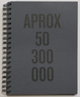
Visually at first obtuse, Felipe Abreu‘s APROX  50.300.000 creates an atmosphere in which violence, state power, and desperation mix. As a viewer, you can’t help but feel that those who are shown as caught up in this atmosphere are not only to pity, they’re also ultimately just pawns in a larger game. They’re outcasts. They are, as the text at the end of the book informs us, migrants.

The book is the complete opposite of the slick and overproduced Incoming. Curiously, at their cores, both books are very contemporary in their approaches, given they both rely on technology to produce their respective imagery. In the case of APROX. 50.300.000, the viewer is presented with cropped fragments of images found through Google: Abreu used the search term “migrant crisis,” which resulted in the number of search results that gave the book its title.

The book’s overall impact switched a little once I had been told what it was about. Well, emotionally it didn’t — with each repeated viewing, the book still has me arrive at the same agitated state. Intellectually it did, though. I’m tempted to think that the book really is not so much about the migrants as it is about the superstructures in whose web those migrants are caught, the superstructures we all are parts of. Crucially, it is here where Abreu’s book manages to get at the viewer in ways that Mosse’s spectacle doesn’t: In the latter case, the question in whose name any of this is being done never arises. The surface is never punctured. The visual spectacle operates for itself, dazzling the viewer. In APROX. 50.300.000, however, the viewer is taken right there, below the surface of those images, below the surface of the spectacle that the media themselves have made out of the migrant crisis.

The migrants and refugees are pawns not just in any game, they’re pawns in our game, in the world we have co-created, the world run by anonymous megacorporations while politicians have become mere administrators of those corporations’ wishes (c.f. Zygmunt Bauman’s Liquid Modernity). While the fight against this situation is now carried out in a variety of ways, with some idea of possible success being visible in some countries (but not in others), migrants keep coming, keep drowning, keep getting interned in heartless camps, keep getting beat up by the police, keep getting denied access and sent back to the places of their original misery. This ought to give us pause. Does it, though?

With an edition of 300 and made in Brazil, APROX. 50.300.000 is facing an uphill struggle attempting to reach the larger parts of photoland in Europe or the US with their ubiquitous fairs and festivals and “best of” lists. But who knows? Maybe enough copies of this book will make their ways into the hands of photobook lovers outside of Brazil — I sure hope so. And then maybe they’ll re-print it if, as I’m hoping, it will sell out, because it’s a book that deserves to be seen more widely.

APROX 50.300.000; images and text by Felipe Abreu; text by Ana Luisa Lima; 84 pages; Vibrant; 2017

Rating: Photography 3.0, Book Concept 4.0, Edit 3.0, Production 4.0 – Overall 3.5

Do we really need competitions, awards, and prizes?

Article main image

For a while, I have wanted to write about a topic that seems pressing, at least to me, and that is being talked about a lot, especially once you meet photographers or critics for a drink: competitions, awards, and prizes. In the following, please bear with me, I’m going to try to string together a few strands.

To begin with, I’m amazed to see how many photographers are able to use the words “award winning” in front of their profession. Are there that many awards?

In addition, out of the three major photography prizes, the Hasselblad Award, the Deutsche Börse Photography Prize, and the Prix Pictet, two are bankrolled by organizations that don’t necessarily do as much good as their photographic philanthropy might want the public to believe. For me, it makes perfect sense for a camera maker to hand out a prize. But a company behind a stock market, or a bank? Aren’t those people co-responsible for, let’s say, the 2008 market crash that destroyed so many people’s livelihoods? Is that the kind of sponsorship the world of photography ought to be seeking?

Then there are those various issues and/or scandals that keep popping up, many of which are directly linked to some competition or prize. For example, World Press Photo (WPP) have been bravely battling with the topic of how to deal with image manipulation. The actual issue at hand aside (which, for me, isn’t quite so well-defined, but that’s a different topic), the task is to at least in theory check the thousands and thousands of submissions. In fact, any competition that is flooded with submissions is likely to face the same conundrum: how can you even do justice to all those pictures? Obviously, you can’t look at every picture for more than a second, maybe less, because there just isn’t enough time. As far as I can tell, WPP are doing a great job making sure their winners are water tight. But of course, something might fall through the cracks, or someone on the internet is unhappy about something, and then there’s the next “scandal.” So competitions with thousands of entries not only have to identify the “best” (however that might be defined), they also have to do all the various other checks along the way: manipulation, ethics… That’s crazy.

Beyond that, there is the question of how or why a single photo should somehow represent the world of press photography for any given year, especially given the sheer flood of submissions, the sheer number of photographs we all see every day. Does picking one photograph out of thousands still make sense to say something about, well, anything really? Even beyond news photography, I’m just not so sure any longer.

What is more, there appear to be ample ethical issues that often pop up. As far as I can tell, the latest case is a photographer who not only Photoshoped someone else’s picture into one of his (!) but also photographed an underage “sex worker” getting raped — to then submit those pictures to a competition, which, in turn, used it for promotional purposes (see this Petapixel article plus this Photo Fundamentalist follow-up). Beyond the direct questions of ethics concerning the photographs, what boggled my mind was that said photographer was so keen on getting an award for his pictures. Not to single him out, because he was just doing what apparently a large number of photographers are engaged in: sending their work to competitions, which usually involves paying some “fee,” to get an award.

I mean I get that when, let’s say, you grow a particularly big and/or nice vegetable in your garden or allotment, or when you own a particularly good-looking dog or cat, you might enter it in some competition, hoping to get some recognition. But to see this same principle applied in the world of photography, especially when the pictures at hand show something that’s gruesome — that just feels a little bit weird to me.

I used to run my own competition on this site. I had it set up in ways to counter what I saw (and still see) as wrong in the world of competitions. To begin with, it was free to enter. In addition, the guest jurors had to judge the pictures without knowing the photographers’ names, to create an equal playing field. Late last year, I decided to have the 2016 edition be the last. The whole idea of competitions had just started to feel wrong to me.

Of course, seen purely from a business point of view running a competition for free was a dumb idea. I could have made some serious money every year, charging some “submission fee.” That is, after all, what competitions do. And that is what has irked me about competitions for a long time: many of them are really just barely disguised ways to fleece photographers (not all, of course, but many). For me, there’s just too much that’s wrong with that, in particular since it creates an unequal playing field, where photographers who can’t afford to play the game simply lose out.

So seriously, what do we need competitions, awards, or prizes for? It seems to me that there simply are too many problems, regardless of how you look at it. I’m sure it’s nice to win something (I wouldn’t know, given I’m award free), and as I said, for vegetables or show dogs, I get the idea. But for photographs?

Especially in this day and age where there are so many photographs around — so many of them genuinely good — what’s the point of (metaphorically speaking) putting a ribbon on a small number? What’s the point, I should ask, besides either filling the coffers through submission “fees” or, in the case of those major prizes, polishing the image of some rather unseemly organization in two out of the three cases?

What’s the value of competitions or awards if there are so many of them? If so many photographers are “award winning,” if so many photobooks are on some usually not-so-short shortlist, what distinction is supposed to be communicated here?

One final point. There’s ample evidence that the use of Facebook makes people unhappy: “people who gave up Facebook for a week reported higher levels of satisfaction than those who continued to use the social network.” So if you’re on Facebook (I’m not) and you’re not one of those people winning something — does seeing all those announcements of prizes and awards etc. make you any happier? I’m not sure.

(French: A-t-on vraiment besoin de concours et de prix?)