
Hardly anyone speaks of the catalog that much any longer. Instead, everybody wants to make a photobook that has a “narrative.” I can see the appeal of narrative-driven books. But the reality is that for many photographic bodies of work, such a narrative either doesn’t exist at all, or the resulting book can only be a somewhat glorified catalog. In other words, even though the photobook as a narrative-driven entity has become so popular, there is absolutely nothing wrong with catalogs. Trying to force a narrative on a body of work that doesn’t any is a recipe for disaster.
Maybe the problem people have with catalogs is that usually they tend to be so dry, overblown, and academic. Many catalogs I own are just that, somewhat grandiose affairs that open with one or two introductions by very important people (who have seriously nothing to say about, well, anything, not even to mention the photographs), there then are two or three often broderline unreadable academic essays by specialists (half of the page count might be taken up by footnotes), and finally there are the plates. I can see the value of such catalogs. I own a few of them. I rarely look at them. They seem made for an audience that consists of the peers of those people whose essays are included. That’s totally fine, of course, but it’s, let’s face it, pretty much useless for anybody else.
It needn’t be so. On and off I have reviewed catalogs that broke the aforementioned mold. But they’re rare, because many of the institutions that produce catalogs prefer them the way it has always been. Another one of these rare examples is now provided by Spring Tide, made at the occasion of an exhibition at the Nederlands Fotomuseum that was curated by Willem van Zoetendaal (who also is the catalog’s publisher). Van Zoetendaal dove into the museum’s collection and picked 250 photographs, showing them uncropped and printed from the negatives.
For anyone outside of the Netherlands, Spring Tide will make for an unexpected treat for a variety of reasons. To begin with, it’s not a large hardcover book of the type discussed before. Instead, it’s a relatively unassuming, intimate feeling softcover (that — added bonus — comes at a very reasonable price). As an object, it’s an engaging book — it almost seduces the viewer into believing it was made just for her or him (which it was, except it was also made for all those other people who own it…). The production is absolutely gorgeous, employing pouch pages (the publisher’s refers to these “Sempuyu-style” binding; I’ve also heard people call them “Japanese binding” or “Asian binding,” even though those two terms for me are too broad).
The print quality is absolutely stunning. In terms of printing, Steidl usually is being seen as the gold standard. But I’ll take Van Zoetendaal’s over Steidl’s (or anyone else’s) any day: instead of using heavy, overly contrasty layers of ink, Van Zoetendaal manages to print his books in such a way that the photographs become incredibly delicate, revealing all their details where needed. I realize this is a bit of a superficial comment, but there is a vintage feel to the way these photographs are printed — vintage in the best possible way: not some pseudo-nostalgic gimmick, but this delicacy that I don’t see very often at all any longer in the world of photobook printing.
What is more, the book demonstrates what Dutch photobook design can do for a catalog, here mostly the use and placement of the type (which aptly handles showing two languages, Dutch and English, on the same pages without confusing the reader). The text — a short essay by Van Zoentendaal and biographies of the photographers — is placed in the back, so you can enjoy the photographs first.
And then there are the pictures. Boy, the pictures! I’m not Dutch, so I wasn’t familiar with roughly half of the artists. There are none of the currently well-known Dutch photographers, with the exception of Ed van der Elsken. I think this might make for a bit of a disadvantage for the catalog outside of the Netherlands. From what I can tell, these days people will rather look at something they’re already familiar with than get exposed to something new (I notice this in the reception of my writing: any article about someone well known gets shared a lot more than something about someone not so famous. To be honest, this is maybe the hardest struggle I’m facing as a writer these days). But the flip side, of course, is that there is a sense of discovery offered by Spring Tide that seeing yet another book of, say, someone who made colour photography popular simply can’t offer.
I could probably write a lot more about this book, but I think by now it’s clear how much I enjoy it. So maybe I’ll add just this: if you only buy one photobook this year, make sure it’s Spring Tide.
Spring Tide; photographs by various photographers; text by Willem van Zoetendaal; 104 pages; Willem van Zoetendaal; 2017
(not rated)
If you wanted to teach how to make a photobook, Max Eicke‘s Dominas could serve as a good example. A photobook, after all, gives its source material a best possible form (“a,” not necessarily “the” — but that might be for a later day). To do that, it will have to combine all its elements in the best possible way: edit and sequence, design, production (materials and binding). You’re shooting yourself in the foot if you neglect one (or even two) of these elements at the expense of the other(s). For example, design is often seen as merely an afterthought, the stated fear or opinion being that it must not get in the way of the pictures. In principle, that’s true, but reality is a bit more complex. After all, the end result of all efforts is the photobook, and the book is not merely a container for pictures (unless you’re making a catalog). The book is the piece of art, and the pictures are part of that — an important part, but for sure not the only part.
When you being making a photobook, it all starts out from the pictures, of course. You then need to move on to the question what the book should do, should achieve. Once that is established, you probably need to ask to what extent the photographs in question can do the lifting, in other words what kind of support they need from both design and materials. This step too often gets neglected. The reason why it is so important is at times, the pictures might simply not have enough muscle. A widely held belief in photoland is that if the pictures somehow aren’t “good enough” (which isn’t the same thing at all as having not enough muscle, but let’s entertain that notion), then you can’t make a good photobook. And that’s not true at all. If you wanted to be really orthodox about this (which vast parts of the Anglo-Saxon photobook world are), you’d basically approach each photobook like a slightly glorified catalog. That’s great for a lot of bodies of work, but it limits what you can do with photobooks (plus, it results in a lot of terribly boring books).
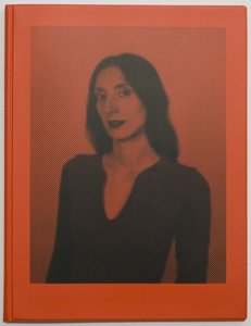
I don’t think the photographs in Dominas can do much lifting on their own. They’re competent portraits, that’s true. But for me, they seem to rely way too much on the subjects being interesting or exciting per se, which they’re clearly not (your mileage might vary). Photographed in a studio against a grey background, the pictures hover in this strange middle ground of not being quite deadpan enough to make you uncomfortable, but they also lack a sense of the photographer’s opinion. They’re photographs of dominas. They’re good. But they don’t tell you anything you don’t already know.
It’s the design and production that activate the book. The book’s cover is a reddish plastic, the kind of cheap plastic designed to be functional (this instantly anchors this particular part of the production in the pictures). There are two page sizes, and as far as I can tell there are two types of paper. The portraits are printed on a luster paper, the rest is printed on matte paper. There’s ample text, sourced from interviews with the subjects, which is printed on the matte paper (using the same red background colour as the cover), trimmed to the size of the photographs’ pages. The text and picture pages are inserted in pages showing black and white rasterized image fragments of sourced/found photographs.
As a consequence of these choices and decisions, Dominas works quite well. Whatever you want to say about its use of design and production (I can hear the sound of eye balls rolling in the photobook cloisters), there’s no denying that the book has an impact that a lot more conservative presentation of the source material would have failed to provide. What is more, I’m willing to wager that in a physical book shop, people will be drawn to the book simply because it’s eye catching.
Dominas; photographs and text by Max Eicke; 96 pages; Kehrer; 2016
Rating: Photography 1.5, Book Concept 5.0, Edit 3.0, Production 4.5 – Overall 3.4
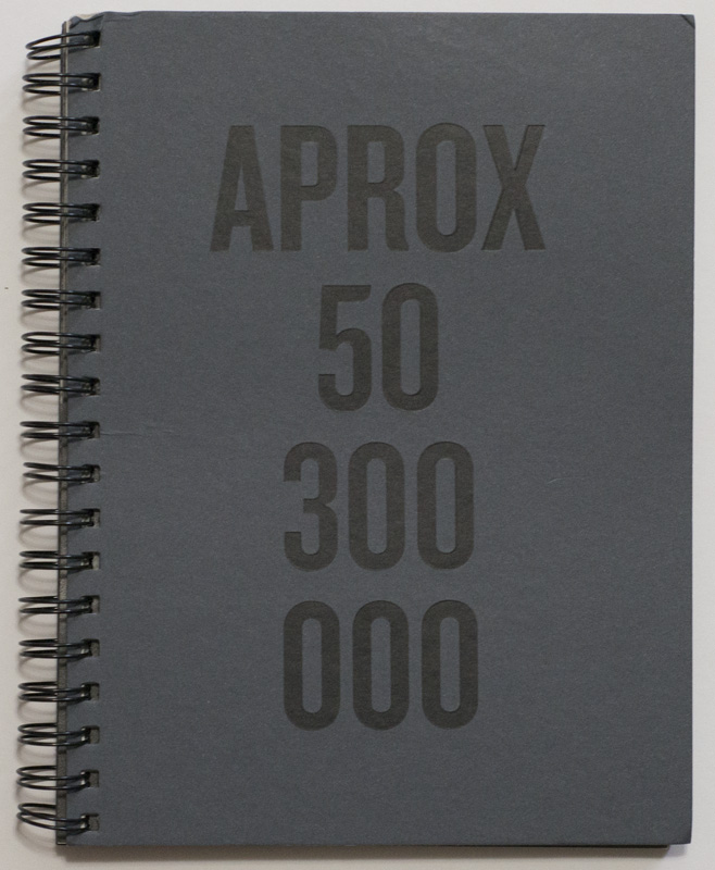
Visually at first obtuse, Felipe Abreu‘s APROX 50.300.000 creates an atmosphere in which violence, state power, and desperation mix. As a viewer, you can’t help but feel that those who are shown as caught up in this atmosphere are not only to pity, they’re also ultimately just pawns in a larger game. They’re outcasts. They are, as the text at the end of the book informs us, migrants.
The book is the complete opposite of the slick and overproduced Incoming. Curiously, at their cores, both books are very contemporary in their approaches, given they both rely on technology to produce their respective imagery. In the case of APROX. 50.300.000, the viewer is presented with cropped fragments of images found through Google: Abreu used the search term “migrant crisis,” which resulted in the number of search results that gave the book its title.
The book’s overall impact switched a little once I had been told what it was about. Well, emotionally it didn’t — with each repeated viewing, the book still has me arrive at the same agitated state. Intellectually it did, though. I’m tempted to think that the book really is not so much about the migrants as it is about the superstructures in whose web those migrants are caught, the superstructures we all are parts of. Crucially, it is here where Abreu’s book manages to get at the viewer in ways that Mosse’s spectacle doesn’t: In the latter case, the question in whose name any of this is being done never arises. The surface is never punctured. The visual spectacle operates for itself, dazzling the viewer. In APROX. 50.300.000, however, the viewer is taken right there, below the surface of those images, below the surface of the spectacle that the media themselves have made out of the migrant crisis.
The migrants and refugees are pawns not just in any game, they’re pawns in our game, in the world we have co-created, the world run by anonymous megacorporations while politicians have become mere administrators of those corporations’ wishes (c.f. Zygmunt Bauman’s Liquid Modernity). While the fight against this situation is now carried out in a variety of ways, with some idea of possible success being visible in some countries (but not in others), migrants keep coming, keep drowning, keep getting interned in heartless camps, keep getting beat up by the police, keep getting denied access and sent back to the places of their original misery. This ought to give us pause. Does it, though?
With an edition of 300 and made in Brazil, APROX. 50.300.000 is facing an uphill struggle attempting to reach the larger parts of photoland in Europe or the US with their ubiquitous fairs and festivals and “best of” lists. But who knows? Maybe enough copies of this book will make their ways into the hands of photobook lovers outside of Brazil — I sure hope so. And then maybe they’ll re-print it if, as I’m hoping, it will sell out, because it’s a book that deserves to be seen more widely.
APROX 50.300.000; images and text by Felipe Abreu; text by Ana Luisa Lima; 84 pages; Vibrant; 2017
Rating: Photography 3.0, Book Concept 4.0, Edit 3.0, Production 4.0 – Overall 3.5
Ratings explained here.