Photobook Reviews (Week 17/2016)

Article main image

Later this week, I’m going to travel to Berlin for work. I will be there for a little over three weeks. As has been the case over the past few years, I won’t have much time for all things online. But the articles for this site are prepared and ready for publication. There will be two, and they’re so long that I cut them up into two pieces each. I’m quite excited about them; in fact, they could have both been even longer. Ultimately, I think I need to find a different form for very long pieces — regardless of what is being said about “long-form” art writing online, a medium that at least to some degree makes us all develop attention-deficit disorder might simply not be the right forum. Onto photobooks…

There was something in the water in the Netherlands in the 1950s (and there still is, albeit in slightly diluted form). Photographers Ed van der Elsken and Johan van der Keuken would publish Love on the Left Bank and Wij zijn 17, respectively. It’s likely you will be familiar with the former, given the book has been — rightly — praised and discussed over the past decade. It’s equally likely you might now know of the important contributions by designer Jurriaan Schrofer, so treat yourself to this biography to find out. Without Schrofer, the history of the Dutch photobook would have simply looked a lot different.

While Schrofer’s contributions still need to be acknowledged a lot more, the same is true for Van der Keuken’s. Much like Love on the Left Bank, Wij zijn 17 is the kind of book that simply should finds it place in the library of anyone who is halfway serious about photobooks. The very good news is that it now can find its way into those libraries, given that it has been reissued in its original form.

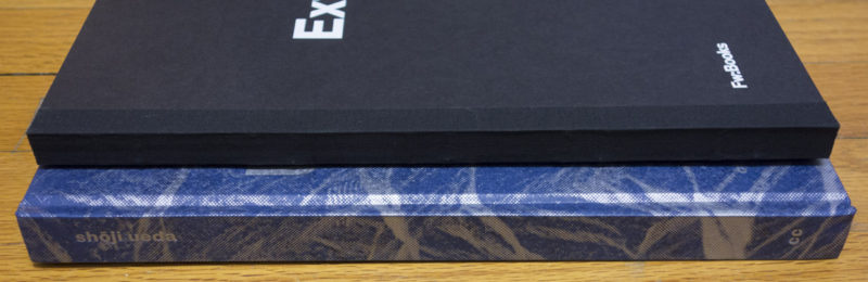
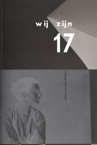
In fact, the book simply states that what you are getting is the sixth edition, and that is basically the case. I do own a copy of the fourth printing (there’s no date in the book indicating when that edition was produced), and the differences between what essentially was the original and what is the latest edition are very minor. Crucially, the essay is now available in an English and Japanese translation, the colophon includes a lot more information, and there is a belly band. Other than that, the size was preserved, as was the production (a softcover), and the printing is as close to the original as possible (see top image).

Of course, you don’t want to treat yourself to a copy of Wij zijn 17 because somehow, it’s an important book (which it is), but because it’s a book that is filled with amazing photographs, taken by a very young photographer. The title translates as “we are 17.” The portraits in the book show this then young generation of Dutch people ten years after the end of World War 2, with all the changes that the late 1950s and especially the 1960s would bring just ahead. But if you’re so inclined you can safely ignore that whole background — why wouldn’t you? — and enjoy the pictures.

These days, hardly a day goes by without some young photographer being hyped — our culture has somehow become obsessed with valuing youthful immaturity, as long as it is expressed in what to the rest of us looks like playful youth (watching and seeing all those jeans commercials for decades must have rotten away some of our critical faculties). We should be so lucky to have a Johan van der Keuken, though. What makes Wij zijn 17 so amazing is that the photographs easily bridge the gap that we have come to accept as unbridgeable: the photographs both are artistically incredibly mature, while carrying the lightest, most youthful touch. They’re tender, they’re loving, they’re appreciative of what the world might have to offer, and they’re devoid of cynicism.

Very highly recommended.

Wij zijn 17; photographs by Johan van der Keuken; essay by S. Carmiggelt, 64 pages; Foci Press & Van Zoetendaal; 2015

Rating: Photography 5.0, Book Concept 4.0, Edit 4.0, Production 4.0 – Overall 4.4

If you’ve never heard of Johan van der Keuken’s Les Copains before, you’ll be forgiven. It’s a companion book to Wij zij 17. I admit that when I learned about the original idea, I was very nervous: why would there have to be a book with the uncropped versions of some of the other book’s pictures, with other outtakes added? This sound awfully like those jazz re-releases, where they give you five other versions of some track, three of them possibly aborted or “false starts.”

I needn’t have worried, though, because Van der Keuken’s archive has been in very good hands in terms of the books produced from it: gallerist, designer, and publisher Willem van Zoetendaal. Van Zoetendaal is deeply aware of the photobook’s history and of what it takes to make a good book.

None of the pictures in Les Copains feels like it should have better not seen the light of day. It is a companion book in the very best sense of that word, allowing further insight into both the photographer’s vision and into how he then transformed some of the photographs for inclusion in Wij zijn 17. That’s right, Van der Keuken designed his book. I always tell photographers not to design their own books, given that 95% of all photographers have no idea what good design looks like. Van der Keuken was one of the 5% who knew how to translate his vision into something aesthetically pleasing.

Les Copains doesn’t feel that that different than the other book. What I wrote about Wij zijn 17 easily applies here as well, as far as the photography is concerned. You probably don’t want to get it if you don’t have the original book. If you like that one, for sure you’ll want this one as well.

Les Copains; photographs by Johan van der Keuken; essay by Willem van Zoetendaal, 64 pages; Foci Press & Van Zoetendaal; 2015

Rating: Photography 5.0, Book Concept 4.0, Edit 4.0, Production 4.0 – Overall 4.4

I love everything about Martin Parr‘s Real Food. Everything — except the pictures. I’ve spent a long time thinking about what it is that bothers me so much when I think of most of this photographer’s current work. And I think there are two aspects. First, the pictures are visual snark, and in a day and age where there’s no shortage of snark I’m really tired of that. Snark might have its uses, possibly even its value. But that value isn’t lasting. Snark is for the moment, and it hardly ever survives being critically examined. Second, and that’s not in these pictures but I’m bringing it to them, they’re essentially the easiest and least interesting aspect of Parr’s marvelous early work.

So these pictures don’t tell me anything I don’t already know. They just do it with a bit more disdain than I might muster — if people want to eat that junk, that’s not my problem. But they also aren’t even that interesting, given how many pictures of food we’re bombarded with already. Regardless of whether it’s food photographs on Instagram, photographs used in supermarket flyers, photographs used by restaurants to lure tourists in — those kinds of pictures, if you pay careful attention to them, do what Parr’s do, except they don’t add any snark.

I think that if that’s your territory then you either have to simply take those pictures, literally taking them (think Useful Photography), or you have to bring something else to pictures of food that’s a bit more than a ring flash and gaudy colours. Because you’ll have to make me look at something that I wouldn’t see, even if I paid as much attention as possible.

I’m sure the book is going to sell well because it’s easy. They’ll have it at Urban Outfitters. People will probably look at it once, snicker a little and then put it away, never to revisit it. And I shouldn’t even think about it that much, because nothing indicates it’s intended to do that, make people think. It’s a piece of entertainment, like any of those mass-produced pop songs you might hear on the radio. It might even do photography a favour, because someone might get encouraged to look at other photobooks, and s/he might then discover the good stuff. Nothing wrong with any of that.

Still… It’s not that I don’t like entertainment. I just prefer it a bit smarter. Actually a lot.

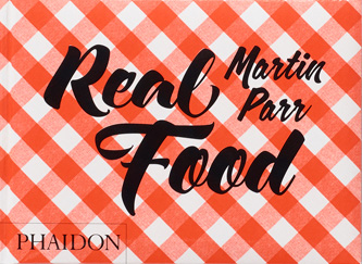
Real Food; photographs by Martin Parr; essay by Fergus Henderson, 208 pages; Phaidon; 2016

Rating: Photography 1.0, Book Concept 3.0, Edit 2.0, Production 4.0 – Overall 2.4

Why does it always have to be about something?

Article main image

Every day, I’m being bombarded with a flurry of pedestrian pictures, grouped in projects that are “about” this or that. These days, photographs always have to be “about” something. Pictures can never be merely pictures.

Make no mistake, a group of pictures will have to add up to something. A group of random pictures that doesn’t add up to anything is just that, a group of random pictures. And I’m not more interested in that than in the pedestrian projects. But still, if pictures add up to something that doesn’t necessarily amount to some aboutness right away. The history of photography is filled with practitioners operating along the line of groups of single pictures.

So what’s going on here?

I am perfectly aware that present and/or future students of mine might want to use my words against me (such attempts happen all the time). But if you can’t tell me what your pictures add up to, you’re not going to get very far.

Having got this out of the way, there probably is a plethora of reasons for photography’s aboutness problem. For a start, it’s the medium itself. It is this machine (or machinery, if you add all the processing/post-processing) that records what is out there in the world. On the simplest, most basic level, that is about something, namely about what is being depicted. Not that there’s anything wrong with that. But that’s not quite the level I’m interested in.

Aiming for the somewhat higher level is tough, where you can consistently take photographs that, if taken out of the sea of mediocrity, move more people than your friends and family. After all, how do you do that? What are you interested in? Why is this picture stronger than that picture? Those are very difficult questions. A very useful crutch is to ask, well, what the pictures are about when they’re being put together. As a teaching tool, aboutness is great – much like training wheels on a bicycle.

Most photographers are usually very good at deflecting blame for problems. Apart from schools (with MFA programs being the most popular scape goats usually), it’s surely the curators’ fault that projects have to be “about” something! And of course the critics’! And the bloggers’! And the gallerists! And the collectors’! Anybody really who is not a photographer, but who somehow has some form of importance in the world of photography (how real or imagined that importance might actually be).

I think you can see where I’m going with this, because you have probably seen it expressed here or there in an article online: If we could only go back to the good-old days of Garry Winogrand, where the solitary (mostly male) photographer prowled the world, collecting his pictures, then all those ills that ruin photography these days will simply disappear. Well, we can’t go back, and that’s a very good thing. If you still want to follow that model, then great! Enjoy! You will still have to operate under the obligation that your pictures will have to add up to something, even if they’re not “about” something.

But placing the blame with photography’s satellite fish does not miss the point entirely. Of course, there’s an irony here: the medium that tried so hard to be taken as seriously as all the other arts now complains about, well, everything that goes with that. Maybe photographers should have considered this a bit earlier.

Polemics aside, aboutness does make everybody’s job easier, not just the teachers’. For example, a new generation of photography curators has emerged, with many of its members having no actual photography background whatsoever. Instead, they were trained as art historians and/or doing curatorial studies. It’s no surprise to me that those kinds of curators often struggle with understanding photography. Speaking “about” something clearly helps them (especially if it’s packaged in gratuitous amounts of pretentious art speak).

At the other end of the spectrum maybe sit those who don’t have much exposure to the medium. Handed a book filled with pictures, they will still expect them to be “about” something. This is simply because there is that very valid and useful expectation that an authored book containing, well, anything really (words, pictures, words plus pictures, …) tends to be “about” something. Seen that way, aboutness essentially ties in with our human desire for the world to make sense, for the world not to be just some random, possibly threatening collection of stuff.

Aboutness itself clearly is not necessarily bad.

As I noted above, often enough it is, though. For example, there are so many photography projects about very valid concerns, social or otherwise. I couldn’t be more sympathetic concerning fights for more social justice, say. But still, if presented to me in the form of photographs, mediocre pictures simply won’t do, even if the cause in question is dear to me.

What I’m seeing is a flood of forgettable projects with mediocre photographs that were clearly fleshed out to be “about” that one (usually easy and simple) thing, easy to comprehend, easy to digest. Based on what I hear from friends and other critics I don’t think I’m the only person having that impression.

So I suppose my main problem with pictures “about” something is not the general principle. It’s the fact that all too often, the photographs end up being bad, simply because their makers stop when they’re about whatever it is they’re supposed to be about. That’s really not how this should work, though. You don’t use training wheels on a bicycle to learn how to ride with training wheels. You use them so you can ditch them as quickly as you can.

In other words, if a group of stellar pictures are “about” something, that’s very different than a group of mediocre pictures that are only being held together by aboutness. And the latter is something you see a lot. In fact, we – collectively – make it too easy for photographers to get away with that, in part because we have become too comfortable looking for photography that confirms our belief system, instead of challenging it.

Honestly, I know what I believe in, and I’m even convinced that I’m right. But still, I’d rather have an artist challenge me, because I also know that I might be wrong. And I’ve lived long enough to have learned that I would now disagree with my younger self about quite a few things. Exposing myself to art is one of the ways I try to grow, to learn something, to possibly become a better person.

But show me a project with mediocre pictures about something, and I’m not interested. If it’s about something I already agree with, what’s the point? My ego is not so brittle that I need pictures to confirm what I believe in. And if it’s about something I disagree with, then how can I be expected to engage with them, given that the pictures don’t make me to do that? Who wants to look at mediocre pictures? Life’s too short.

So what this all comes down to is not so much the idea of pictures being about something or not. I’m really more interested in photographs being given the starring role, and not any of the mumbo jumbo surrounding it, their aboutness being maybe the most prominent aspects. I want to get the task to unpack what might be going on, instead of having it handed to me.

Make me want to look at your pictures! Make me hungry for them! Make me want to discover what they might be about – rather than trying to use aboutness as a tool to hold a bunch of mediocre stuff together.

And let’s also accept work more openly again that is not playing along the lines of standard aboutness. It really doesn’t always have to be a project. As long as a group of pictures add up to something, without necessarily being about this or that right away – that’s great.

Photobook Reviews (Week 15/2016)

Article main image

For a while it looked as if the ephotobook was going to have quite a bit of a future, and then that idea abruptly disappeared. I don’t know whether this is simply me not paying enough attention, or whether photographers have realized that squeezing a unique photobook into what is a very limited format might not work so easily.

But there is an ephotobook version of Léonie Hampton‘s marvelous In the Shadow of Things now. If any book might lend itself to getting explored on tablets, it’s this one. Focusing on the photographer’s mother’s struggle with obsessive-compulsive disorder (OCD), the book contains a large (main) part that only shows photographs and a smaller, quite dense section with text, transcripts of conversations (which I’ll admit I’ve never read). In terms of e’ing the book what to do with the pictures of course is the main challenge. The books’ text is more obvious.

Ignoring the app’s “how to use” section, there are five main elements. There’s a “Prologue,” which, as can be expected, offers an introduction to the characters and a brief explanation of OCD. There’s “Things,” an interactive and fairly massive gallery of photographs and short video clips. “Slideshow” is just that, non-interactively going through the book’s photographs (produced on the occasion of a museum show a few years back, and it’s not identical with the book). A section called “Voices” offers a large number of audio recordings to listen to, all of them conversations or characters talking (this is the substitute of what in the book is the section of transcripts). Lastly, “Sketches” is another non-interactive slideshow of sorts that mixes still frames with short video clips – some people might view it as more like an animation itself.

Viewers will inevitably quibble about whether or not the Slideshow section shouldn’t be interactive (I’d prefer it, but then I might as well look at the original book). They might also quibble over how the audio files were presented. I’m not particularly interested in any of that, since I’ll take the app as a valuable complement, but not replacement of the book itself. I’m not sure whether this will make the app’s designers/makers happy or not. Conceivably, the app could stand on its own. But it’s hard for me to gauge this, given I have spent so much time with the book itself, so my eyes are anything but fresh.

But as a complement, the app adds a lot. It increases the experience of the book, without fully replacing it (something, I think, ephotobooks simply will never be able to do). And maybe that’s where the whole idea of the “e” version of photobooks might actually blossom a bit more, not as replacements or necessarily stand-alone products, but as very engaging complements that deepen a viewer’s engagement.

This the might point at the future of the ephotobook, or actually the lack thereof. For anything truly deep, anything that requires a thorough investment on the viewer’s parts, physical books are where its at. Tablets might simply not be the right vehicle, given everything else we do on them is either quick (checking your Twitter feed or email) or lacking any sort of deeper, meaningful engagement (playing games or watching cat videos or movies).

(not rated)

There are all kinds of ideas floating around concerning the Dutch photobook. A sentiment I often run into, in particular in the United States, is that Dutch photobooks are essentially overdesigned. Of course, compared with the mostly rather stale diet of photobook design in the US, Dutch photobooks inevitably appear to contain a rather large design component. But overdesigned they usually are not, exceptions as always proving the rule.

Why or how this matters is demonstrated by Raimond Wouda‘s Ext.-Int. It would have been tempting to produce one of those dreadfully boring gallery shows on paper – blank page, picture page, blank page, picture page, etc., plus obligatory boring essay, plus list of plates. But a book’s design and production ought to enhance its pictures, even when they don’t necessarily need any help. So what I’m talking about here are not bells and whistles so people don’t notice how bad the pictures are. Instead, design and production are tools to enhance the viewer’s experience. And that’s just what is being done so well in the Netherlands (and increasingly elsewhere, too).

Ext.-Int. pushes the idea of enhancing the experience by including a connection to the Layar app. Using Layar (which you’ll download for your smart phone or tablet computer – it works on both my iPhone and iPad mini) essentially links content in the book – pictures – with other material. In this particular case, Layar identifies movies whose sets were photographed, and it picks the clips that correspond to the particular scene in the picture. This might actually prove to be a more interesting way to add an “e” component to a photobook than attempting to convert the whole thing.

In terms of the content, there are photographs of Dutch language movie sets and locations in the book, plus portraits of background extras. The sets and locations are often photographed from a larger distance, offering a view of the artifice of this particular medium. But then, who’s talking? Photography of course comes with its own artifice. The comparison of the photographs with what the scenes ended up looking like in the final movies often is staggering, despite the fact that it is quite expected. We all know how much extra trickery gets added by production studios, but still… Using Layar to reveal the game adds a lot for the viewer (of course, it’s only a matter of time until someone does this for a porn-set photobook…).

Wouda deftly uses his camera, in that he doesn’t rely on offering the same kind of view of the movie sets. Instead, he weaves in and out, showing details and larger views. As I already noted there are portraits of background actors. With the design and production smartly enhancing the overall experience, this is probably the best solution for this book I can think of. In particular, given that movie sets in principle lend themselves to being photographed, it seems the photographer thought carefully about how things can be revealed by focusing on the different types of artifice – or lack thereof: the background actors clearly all look a bit awkward.

Ext.-Int.; photographs by Raimond Wouda; 160 pages; Fw:Books; 2015

Rating: Photography 3.5, Book Concept 4.0, Edit 3.0, Production 4.0 – Overall 3.7

There is no shortage of interest in books by Japanese photographers, and rightly so: the country has a rich photographic tradition, large parts of it woefully unknown and/or unexplored in the West. Of course, there are the usual suspects (Araki, Moriyama, …) who produce photobooks at astonishing rates. Let’s be honest, most of these books might as well not exist. The rare, occasional gem notwithstanding, nobody really needs yet another Araki or Moriyama book with work that basically looks like all the other stuff (the same is true for any other usual photoland suspect as well). And there is something irksome to me about the fact that those books are easy to come by outside of Japan – I have a hard time accepting the market, and not merit, as the arbiter of what to look at (market and actual artistic merit are at best loosely correlated).

So the fact that Shōji Ueda (the book) exists, featuring photographs by Shōji Ueda (the photographer) is to be applauded for more reasons than just one. For a start, as I noted we have much to gain from seeing something other than the corpse of Provoke being dragged out yet again, or seeing yet another collection of young naked women in bondage (let’s here ignore the question what we have gained from seeing those in the first place). More importantly, Shōji Ueda’s photographs deserve to be seen more widely, given they reveal an exquisite eye for making of good pictures.

The book is a compilation of the late photographer’s work, mixing colour and b/w photographs. In fact, many of the colour photographs – playful, yet simple still lifes – are interspersed throughout the first, larger part of the book, oriented sideways (both of which, no doubt, likely to exasperate purists). After an essay by Toshiyuki Horie, there is a shorter second part, in which all photographs are in colour, again shown sideways.

While I enjoy looking at the colour work, it is the b/w ones that interest me a lot more, and amongst those the square photographs stand out for me. There isn’t much you can do with the square, and I know quite a few photography teachers who tend to implore students to pick “a more interesting format” (that’s a quote from memory, and it’s accurate in spirit, maybe not necessarily in the exact wording). I couldn’t disagree more: I don’t care at all what format you pick, as long as you’re able to fill it well (disclaimer: as a photographer, I have mostly focused on square photographs, so I’m clearly biased in that sense).

There are elements of both lightness and melancholy in Shōji Ueda’s, a combination that serves the photographs well. That’s a difficult line to walk, given that the pendulum swinging either too much towards lightness or melancholy would instantly produce either fluff or dread, respectively. Staying on that line is tough, but it’s well worth trying: It creates a tension the viewer can’t help but pick up on, a tension that is sure to stir something inside her or him.

Recommended.

Shōji Ueda; photographs by Shōji Ueda; essay by Toshiyuki Horie, 188 pages; Chose Commune; 2015

(not rated)

About Criticism

Article main image

Criticism has to be based on its own inherent set of criteria, which – ideally – are coherent and make sense, at least for as long as it takes to engage in it: as a critic, you might be bit smarter (or dumber) than a year before. A year down the line, you’ll be a different person again. Your criticism needs to be based on where you are right here, right now, and this all ought to be based both on (inevitably) where you’re coming from, and on the larger history and context of whatever it is you’re subjecting to criticism.

Let’s say, you focus on photography. This medium’s history and context are specific. The history might change, might get re-written or modified, and you could (probably: should) be cognizant of that and engage in doing it yourself en passant. Much like art itself, good criticism cannot exist in a vacuum, in a state of ignorance of what already exists (a medium’s history), and of how what existed and what exists now relates to each other, given those who create(d) and those who engage (a medium’s context). “Those who engage” is not necessarily a very pretty phrase, but it seems a lot more appealing to me than, say, “consumers” (for obvious reasons) or “viewers” (which is just way too passive).

Unfortunately, context is severely marred by conventions of all kinds. What I’m somewhat loosely calling conventions is in fact a collection of happen- and circumstances, which include, but certainly are not limited to, what is generally expected of critics and artists, and how the arts are embedded in the larger culture and/or society. Even though we probably wouldn’t see it that way, the conventions also include what is expected of those who engage. More precisely: what those who engage expect from each other concerning said engagement. After all, to some extent our engagement with the arts is shaped by what we ought to do, by what we think we are expected to do. It is, after all, the age of so-called social media, which have forcefully shoehorned our engagement with pretty much anything, given, say, the next Twitter controversy is merely 140 characters away. This is where criticism can get iffy.

In an ideal world, criticism would simply ignore this aspect of art. In principle, no critic should pay attention to what is expected of either her or him, or of those who engage. As before, this mirrors the position the arts should exist in: you shouldn’t make art based on what is expected of you (however much for example your gallerist tells you that more pictures like those that sold well would be so nice).

For both artists and critics that’s a lot easier to demand than to actually do. For example, in general, it requires a lot more courage and stamina to produce pieces of art (or criticism) that brush against the grain, that do not confirm what we profess to believe in in public (what we believe in when we’re honest with ourselves might be an entirely different matter). Brushing against the grain runs the risk of challenging what we profess to believe in. If anything that’s a challenge we are becoming less and less good at dealing with. With the rise of xenophobia and Islamophobia in vast parts of the West, and with historical injustices such as sexism, racism, etc. still being such huge problems that’s exactly the kind of engagement we really need, though. Often enough, there is something at stake in the arts beyond auction prices or sales.

If anything ought to be able to bridge the kinds of gaps our body politic can’t cross, it’s the arts (I’m using the term “body politic” slightly loosely here, meaning our society as much as our culture, both of which, of course, are thoroughly infused with politics). And good criticism should be cognizant of exactly this, because it is here where often good (challenging) art is to be found. It is also here where art and criticism separate. While good criticism shares many characteristics of what it takes to be a good artist, given it is a reaction to something, criticism is much less likely to take on our larger societal or cultural conditions on its own. If it does, it will have to be based on something else: criticism is a reaction.

As that reaction, though, and this brings me back to what I started to explore in the penultimate paragraph, it ought to be a reaction to what it criticizes, and not to any of the widely accepted criteria for how to engage (however much or little they are acknowledged or possibly prescribed openly). What is expected from a critic should really only be what is required to produce good criticism, but not what produces an outcome that is in line with what we could call our general ideology. It should be a critic’s role to firmly investigate whether a piece of art does what it pretends to do, for example. That can be a nasty and tedious job, but somebody will have to do it. After all, even where it is critical in that negative sense, good criticism elevates: it might tear down some piece of art, but it helps everybody see more clearly.

One final aspect. The criteria for how to evaluate a body of work should be the critic’s and certainly not those of the artist whose work is subjected to scrutiny. I’m increasingly noticing this in cases where photographers very aggressively attempt to make sure their work is viewed in that one way they want. This puts everybody into a straight jacket. That’s not how art can – actually should – operate. It might fine for an artist to attempt to steer the discussion into some direction. But it has to be equally fine for those who engage and for critics to go into a completely different direction. Critics need to have the guts to reject narrow paths of interpretation, and they should call out bullshit where they encounter it.

Ultimately, much like it’s not an artist’s job to make us feel good about ourselves, it’s not a critic’s, either. Of course, that’s where criticism tends to get into trouble. It might point out that what a large number of people might enjoy is actually complete crap, given certain criteria. Reactions to that kind of criticism do not tend to be kind. A critic will simply have to live with being called all kinds of things – much like an artist.