
For a while it looked as if the ephotobook was going to have quite a bit of a future, and then that idea abruptly disappeared. I don’t know whether this is simply me not paying enough attention, or whether photographers have realized that squeezing a unique photobook into what is a very limited format might not work so easily.
But there is an ephotobook version of Léonie Hampton‘s marvelous In the Shadow of Things now. If any book might lend itself to getting explored on tablets, it’s this one. Focusing on the photographer’s mother’s struggle with obsessive-compulsive disorder (OCD), the book contains a large (main) part that only shows photographs and a smaller, quite dense section with text, transcripts of conversations (which I’ll admit I’ve never read). In terms of e’ing the book what to do with the pictures of course is the main challenge. The books’ text is more obvious.
Ignoring the app’s “how to use” section, there are five main elements. There’s a “Prologue,” which, as can be expected, offers an introduction to the characters and a brief explanation of OCD. There’s “Things,” an interactive and fairly massive gallery of photographs and short video clips. “Slideshow” is just that, non-interactively going through the book’s photographs (produced on the occasion of a museum show a few years back, and it’s not identical with the book). A section called “Voices” offers a large number of audio recordings to listen to, all of them conversations or characters talking (this is the substitute of what in the book is the section of transcripts). Lastly, “Sketches” is another non-interactive slideshow of sorts that mixes still frames with short video clips – some people might view it as more like an animation itself.
Viewers will inevitably quibble about whether or not the Slideshow section shouldn’t be interactive (I’d prefer it, but then I might as well look at the original book). They might also quibble over how the audio files were presented. I’m not particularly interested in any of that, since I’ll take the app as a valuable complement, but not replacement of the book itself. I’m not sure whether this will make the app’s designers/makers happy or not. Conceivably, the app could stand on its own. But it’s hard for me to gauge this, given I have spent so much time with the book itself, so my eyes are anything but fresh.
But as a complement, the app adds a lot. It increases the experience of the book, without fully replacing it (something, I think, ephotobooks simply will never be able to do). And maybe that’s where the whole idea of the “e” version of photobooks might actually blossom a bit more, not as replacements or necessarily stand-alone products, but as very engaging complements that deepen a viewer’s engagement.
This the might point at the future of the ephotobook, or actually the lack thereof. For anything truly deep, anything that requires a thorough investment on the viewer’s parts, physical books are where its at. Tablets might simply not be the right vehicle, given everything else we do on them is either quick (checking your Twitter feed or email) or lacking any sort of deeper, meaningful engagement (playing games or watching cat videos or movies).
(not rated)
There are all kinds of ideas floating around concerning the Dutch photobook. A sentiment I often run into, in particular in the United States, is that Dutch photobooks are essentially overdesigned. Of course, compared with the mostly rather stale diet of photobook design in the US, Dutch photobooks inevitably appear to contain a rather large design component. But overdesigned they usually are not, exceptions as always proving the rule.
Why or how this matters is demonstrated by Raimond Wouda‘s Ext.-Int. It would have been tempting to produce one of those dreadfully boring gallery shows on paper – blank page, picture page, blank page, picture page, etc., plus obligatory boring essay, plus list of plates. But a book’s design and production ought to enhance its pictures, even when they don’t necessarily need any help. So what I’m talking about here are not bells and whistles so people don’t notice how bad the pictures are. Instead, design and production are tools to enhance the viewer’s experience. And that’s just what is being done so well in the Netherlands (and increasingly elsewhere, too).
Ext.-Int. pushes the idea of enhancing the experience by including a connection to the Layar app. Using Layar (which you’ll download for your smart phone or tablet computer – it works on both my iPhone and iPad mini) essentially links content in the book – pictures – with other material. In this particular case, Layar identifies movies whose sets were photographed, and it picks the clips that correspond to the particular scene in the picture. This might actually prove to be a more interesting way to add an “e” component to a photobook than attempting to convert the whole thing.
In terms of the content, there are photographs of Dutch language movie sets and locations in the book, plus portraits of background extras. The sets and locations are often photographed from a larger distance, offering a view of the artifice of this particular medium. But then, who’s talking? Photography of course comes with its own artifice. The comparison of the photographs with what the scenes ended up looking like in the final movies often is staggering, despite the fact that it is quite expected. We all know how much extra trickery gets added by production studios, but still… Using Layar to reveal the game adds a lot for the viewer (of course, it’s only a matter of time until someone does this for a porn-set photobook…).
Wouda deftly uses his camera, in that he doesn’t rely on offering the same kind of view of the movie sets. Instead, he weaves in and out, showing details and larger views. As I already noted there are portraits of background actors. With the design and production smartly enhancing the overall experience, this is probably the best solution for this book I can think of. In particular, given that movie sets in principle lend themselves to being photographed, it seems the photographer thought carefully about how things can be revealed by focusing on the different types of artifice – or lack thereof: the background actors clearly all look a bit awkward.
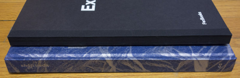
Ext.-Int.; photographs by Raimond Wouda; 160 pages; Fw:Books; 2015
Rating: Photography 3.5, Book Concept 4.0, Edit 3.0, Production 4.0 – Overall 3.7

There is no shortage of interest in books by Japanese photographers, and rightly so: the country has a rich photographic tradition, large parts of it woefully unknown and/or unexplored in the West. Of course, there are the usual suspects (Araki, Moriyama, …) who produce photobooks at astonishing rates. Let’s be honest, most of these books might as well not exist. The rare, occasional gem notwithstanding, nobody really needs yet another Araki or Moriyama book with work that basically looks like all the other stuff (the same is true for any other usual photoland suspect as well). And there is something irksome to me about the fact that those books are easy to come by outside of Japan – I have a hard time accepting the market, and not merit, as the arbiter of what to look at (market and actual artistic merit are at best loosely correlated).
So the fact that Shōji Ueda (the book) exists, featuring photographs by Shōji Ueda (the photographer) is to be applauded for more reasons than just one. For a start, as I noted we have much to gain from seeing something other than the corpse of Provoke being dragged out yet again, or seeing yet another collection of young naked women in bondage (let’s here ignore the question what we have gained from seeing those in the first place). More importantly, Shōji Ueda’s photographs deserve to be seen more widely, given they reveal an exquisite eye for making of good pictures.
The book is a compilation of the late photographer’s work, mixing colour and b/w photographs. In fact, many of the colour photographs – playful, yet simple still lifes – are interspersed throughout the first, larger part of the book, oriented sideways (both of which, no doubt, likely to exasperate purists). After an essay by Toshiyuki Horie, there is a shorter second part, in which all photographs are in colour, again shown sideways.
While I enjoy looking at the colour work, it is the b/w ones that interest me a lot more, and amongst those the square photographs stand out for me. There isn’t much you can do with the square, and I know quite a few photography teachers who tend to implore students to pick “a more interesting format” (that’s a quote from memory, and it’s accurate in spirit, maybe not necessarily in the exact wording). I couldn’t disagree more: I don’t care at all what format you pick, as long as you’re able to fill it well (disclaimer: as a photographer, I have mostly focused on square photographs, so I’m clearly biased in that sense).
There are elements of both lightness and melancholy in Shōji Ueda’s, a combination that serves the photographs well. That’s a difficult line to walk, given that the pendulum swinging either too much towards lightness or melancholy would instantly produce either fluff or dread, respectively. Staying on that line is tough, but it’s well worth trying: It creates a tension the viewer can’t help but pick up on, a tension that is sure to stir something inside her or him.
Recommended.
Shōji Ueda; photographs by Shōji Ueda; essay by Toshiyuki Horie, 188 pages; Chose Commune; 2015
(not rated)
Ratings explained here.