Photobook Reviews (W13/2016)

Article main image

One of the possibly greatest tragedies of the so-called Arab Spring was that in the West, a grand narrative was immediately created around it. The uprisings in various Arab countries were seen not as what they might have been, but as essentially a validation of Western ideology. Make no mistake, there might have been a copious amount of overlap. But at times, it almost felt as if the fighting was not so much about local goals, such as overthrowing a hated ruler (who might have enjoyed the support of the same West for a long time – think Hosni Mubarak), but about Western values.

History wasn’t kind enough to play along. Of all the countries involved, only Tunisia underwent reforms and became a better place. Everywhere else, things didn’t play out so well. Egypt ultimately went back to the same situation it was in before (with its military ruler now again propped up by the West, Arab Spring ideas be damned), Libya might or might not become a failed state (if it hasn’t done so already), Syria lies in ruins, …

Photography was heavily involved in the Arab Spring, as photojournalists descended upon the latest theater of civil war to document the uprisings and locals documented events with their smart phones. Of course, some photographs played a much bigger role than others. Aliaa Elmahdy might now be forgotten (in the West), but her nude self portrait played a much larger for events in Egypt than any of the photographs made by professionals sent there to document what was going on. This observation is not intended to diminish the contribution by all the various photojournalists. But in the world of photography, we often tend to be too narrow in our views. All too often, we inflate our own importance a bit too much.

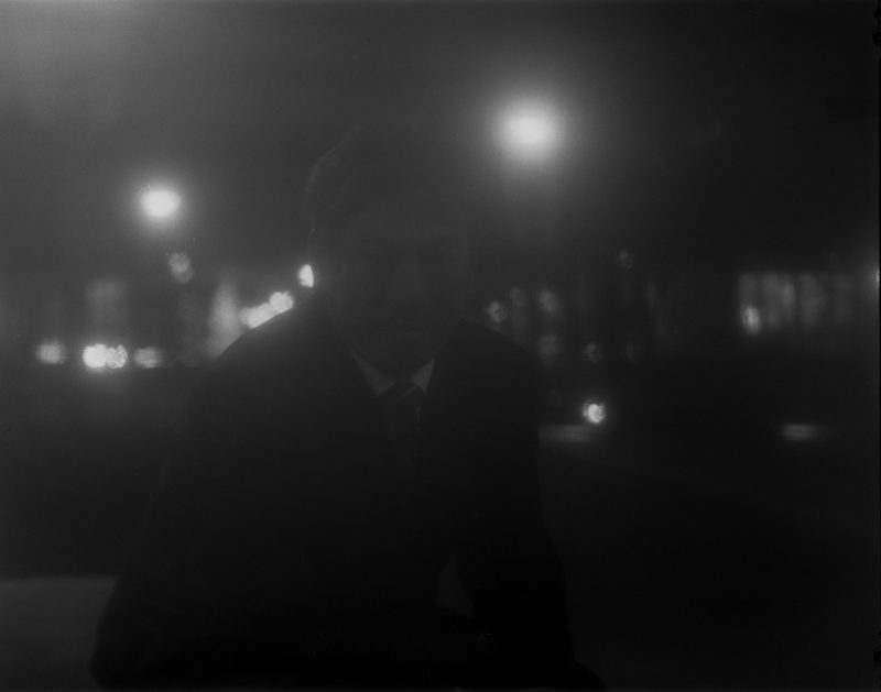
If you went around the Arab Spring, like Moises Saman did, you now have precious little to show for it in terms of that “bigger picture,” because not much adds up to something. That pre-created narrative, the spring, has evaporated, to leave behind mostly rubble and bleak misery.

If you forget the bigger picture, you’re going to be on to something, though. In that part of the world of photography that I operate in, you make the pictures first and then you think about what you got, what they might tell you. That is, of course, the complete opposite of how large parts of photojournalism operate, where, as I noted above, the pictures often are made to support the story you got sent out for.

Discordia, Saman’s book containing his photographs from the Arab Spring, is billed as “a personal memory of the nearly four years he spent living and working as a photojournalist in the Middle East during the Arab Spring from 2011 to 2014.” Of course, the book is that. But it’s actually — and thankfully — a lot more, and that’s where it gets interesting for its viewers. This is not to say that personal memories somehow aren’t valid or possibly interesting. But in this particular context I feel the story ought to remain with what is being photographed and not who is operating the camera.

The book intermixes photographs taken in many different locations, at different points in time, to ultimately make us face one of the biggest problems we can encounter in life: search as you might, there just isn’t a happy ending, even just a resolution of sorts. The violence and destruction appear to exist for their own sake. And in the midst of all of that are people whose aspirations and dreams aren’t so different than ours. Unlike us, they just happened to be born in the wrong place at the wrong time, witnessing or taking part in or being subjected to the destruction wrought in the name of whatever it might be that drives war.

War means misery, and Saman presents us with plenty of that, without that way out that the simple narratives we cling to demand. The world simply is too complex to accept our longing for simplicity, for that perfect happy ending. And it’s also too complex to allow itself to be described in simple terms with pictures.

Discordia gets at that. There is no resolution. Even pictures we might be tempted to think of as “iconic” won’t reveal much (in reality, iconic pictures only reveal the ideology at play when we term them “iconic”). There is simply the stepping in, at some point in time, and the leaving again later, and the photographic shards picked up along the way speak of chaos.

We’d be better off avoiding the simplistic narratives we tend to come up with to describe the world. The world’s a mess. That’s life. We will be better off accepting that pictures might be able to describe those simplistic narratives well, but that there is little to be gained from doing that, given that the next event then will refuse to adhere to the scheme we’ve set up.

We can (possibly we should) try to make sense of what is happening, but that can’t be done based on what we want. It should be based on what is. Photographs are great to show us what is, and when they’re being put together smartly, as in Discordia, they can show us what we have to face (as an aside, I don’t think the collages add anything to the book — that’s the one thing I could have easily done without).

Photographs can also show us that the veneer of what we call civilization is thin, with ugly realities raging right underneath. The dirty, ugly, violent mess depicted by Moises Saman really is just an uprising – or an election going horribly wrong – away.

Highly recommended.

Discordia; photographs by Moises Saman; collages by Daria Birang; 200 pages; self-published; 2016

Rating: Photography 3.0, Book Concept 4.0, Edit 3.0, Production 4.5 – Overall 3.6

After I had grown old enough to be a curious teenager with a fairly good bullshit meter, I realized that real answers to the questions I had about my country’s past often were hard to come by. I now know that the oft-repeated mantra that “ordinary Germans” had not known about what was done either in their name was complete bullshit. I wish I had a time machine to take Nicholas Stargardt’s The German War and shove it into the faces of all those people who lied to me about their country’s – and, I’m now sure, their own – past.

I have not yet been able to shake the sense of betrayal that built up in me ever since I just could not believe what was both widely accepted and what at the same time obviously could not be the actual truth. In fact, I might end up taking considerable amounts of bitterness about being lied to so widely and freely and shamefully to my own grave.

Regardless, we now know a lot more about the German past, about the involvement of ordinary citizens and soldiers during World War 2 in the many, many atrocities committed. At the same time, over the past twenty five years the consequences of the war for the Germans has also received considerable attention. I already wrote elsewhere that engaging in an arithmetic of death or suffering has long ceased to make sense. It doesn’t make sense on the level of the individual (taking all air out of debates about the death penalty), and it doesn’t make sense on the level of hundreds, thousands, millions.

I suppose if part of the being lied to three decades ago hadn’t often included focusing so much on German suffering I’d have a slightly easier time accepting it than I actually do. But I’m working on acceptance.

Claudia Heinermann‘s Wolfskinder focuses on part of the consequences of World War 2 that at least in Germany had never really left the public debates. As Soviet troops swept across Eastern Europe to at least initially liberate countries occupied by the Nazi Germany, ethnic Germans started a trek towards the West, which ultimately resulted in vast parts of Eastern or Central Europe being freed of Germans (reversing centuries of tradition etc.). Where Germans were not expelled by newly liberated states, they left on their own, leaving behind what had been their homes. In the chaos, families were separated, and many young children ended up being on their own, trying to get by.

This, of course, is a situation that is only too familiar from stories now emerging about refugees escaping to Europe today. Just the other day, I read about a ten-year old Afghan child being reunited with the rest of his family. Plus ça change, it’s depressing. Anyway, those German children ended up being termed Wolfskinder, wolf children, given often they ended up living in the woods, much like feral animals. Many of them eventually found a home, often enough not their original home, but a home, and a home certainly was better than none.

Wolfskinder tells the stories of a number of them. The book combines photographs by Claudia Heinermann with text by Sonya Winterberg. That text is integral to how the book operates, given that each previous wolf child is given the opportunity to talk about her or his particular story. Heinermann provided the visual background in the form of portraits, environmental photographs, plenty of pictures of the woods, and there are reproduction of archival materials, whether photographs, letters, documents, or whatever else. So the book neatly follows the contemporary path of documentary photography, giving ample insight into the lives of a fairly large number of people.

It’s a hefty book, not just in terms of what it throws at the viewer/reader. It also literally is a heavy, and big, with 404 pages. I can’t help but feel Wolfskinder could have been more condensed, without losing any of its punch. What it might have lost, and I’m guessing this is what stood in the way of doing that, was giving each and every previous wolf child exactly the same amount of attention. But still, given the overall structure is one of chapters, each done in exactly the same way, roughly halfway through the book there is very little discovery left for the viewer/reader. Everything is spelled out and presented, even though ultimately much can only be imagined. I feel this ultimately takes away some of the impetus the book could have had.

Wolfskinder; photographs by Claudia Heinermann; text by Sonya Winterberg; 404 pages; self-published; 2015

Rating: Photography 3.0, Book Concept 2, Edit 3, Production 4.0 – Overall 3.0

A Renewed Case for Blogging

Article main image

A recent article about planned changes to how Instagram is going to operate made me think about photography online, and about blogs. I’m not sure people will agree, but it seems to me that the boom-and-bust culture that Silicon Valley has created is becoming more and more of a detriment to photography on the net. New sites and/or tools are constantly being introduced as being “game changers” that everybody has to follow lest they want to be left behind (or whatever other overblown marketing speak is being used). These sites/tools are then “updated” regularly, to eventually lose every ounce of what might have made them good in the first place. Then cue the usual articles about how the very site/tool that just a few months ago was so indispensable is “over,” but there is that new site/tool that everybody ought to be looking at. And then go back to the beginning of the cycle.

If that sounds too negative to you, just take Flickr. I was never a big Flickerite, but I know a lot of people that were (and possibly still are) and that were aghast when the site was bought and essentially ruined by Yahoo (a company for which the writing also is on the wall). In the time span of roughly ten years (which isn’t really that much time in the grander scheme of things), the online world has changed massively, and photographers have been trying to keep up with it. Like some sort of traveling circus, photographers have moved from one site to the next to the next to, say, discuss photography or share work.

I honestly don’t know how a serious photographer can justify investing yet more time into yet another online tool after the previous ones have all fizzled out. Given I’m in my late forties, I also have an increasingly hard time seeing why I should sign up for some tool that looks like it’s clearly made for teenagers (for example Snapchat), made and coded by people who aren’t much older (and who are also predominantly white and male). In 2010, Zadie Smith wrote a great piece about Facebook that focuses on some of these aspects — if you haven’t read it, yet, now might be a good time.

Ten years ago, blogging was all the rage. I’m very happy to have been part of what happened back then, to a large extent because experiencing (and being part of) the general excitement that existed among the bloggers was just great. Back then, my main concern was that once corporations would make people move from individual blogs to centrally controlled sites a lot of that excitement would disappear, in part because things would become a lot more homogeneous. That’s exactly what happened once Facebook took over.

In a sense, when I started working on my own blog, most photographers maintained what you could see as their own proto-Instagrams. To write about other people’s pictures or share links was an aberration. Instead, many people posted their own work, one picture at a time. Of course, there weren’t “filters” in the sense of adding something to pictures after the fact. People still used a lot of actual film cameras, often plastic ones that would in camera create the strange kind of effects you now slap on with a “filter”. As a viewer, you would not simply scroll from one picture to the next, or from one photographer to the next, but there was a lot to be said for that. It was a lot harder to merely consume pictures. And individual photographers wouldn’t just be some name with a picture in an environment where everything looked the same.

Another aspect I was concerned about was that ten years ago — much like today — individual bloggers would give their sites their own unique IDs, which is something that would just be incompatible with what a corporation would want. Again, that’s exactly what happened on Facebook. You might be on Facebook (I’m not), but I’ve never heard of someone being known for their profile there.

The enforced uniformity on corporate sites plus the often random seeming changes there (which clearly make sense for the companies) essentially are the complete opposite of what made and makes blogging great. For a while, I was very accepting of the fact that blogging might simply have crested. In fact, blogging itself was embedded in a clearly overhyped boom-and-bust cycle, so even thinking about it seemed like the kind of navel gazing I am not too fond of.

But unlike any of those other sites or tools that came before or after blogging (Livejournal, Myspace, Flickr, Facebook, Instagram, etc. etc. etc.) maintaining one’s own blog is essentially the only one that functioned just as well then as it does now (the underlying machinery is a lot more advanced now, but the general principle and organization have hardly changed). In that article I linked to above, Eric Kim is quoted as saying that “I wish I spent more time blogging.”

The last thing I’d want this piece to be is some sort of “told you so.” Instead, as someone who has been heavily involved in blogging about photography, I thought it would be worthwhile pointing out that we simply have a choice: we can run after the latest fads and buy into the latest tech bullshit coming out of Silicon Valley. Or we don’t. And thinking about blogging really is not just pining for the good old days. I think by now we have seen enough things to assess what is useful for photography and what just adds noise (and funnels more cash into corporate coffers).

Make no mistake, there are still quite a few blogs out there. Some of them are older, some are newer additions since we had that dreadful discussion about whether or not blogging was over. I spend a lot of time each week looking through these blogs, and they cover a wide ground, whether it’s intelligently reviewing exhibitions, discussing photography very academically or in a way that is enjoyable and smart, digging into the bowels of photojournalism and/or documentary photography, or whatever else. I do think I’d enjoy seeing more blogs like those, and I’d also enjoy photographers going back to creating their own sites, to make them their own instead of being just some other name on some boring looking corporate website.

In the end, what this piece is really all about is not which site to use or which tool is cool. I’m on Instagram, and I’m enjoying it while it lasts. In my relatively short time there, they already changed the site many times. Having spent time in the industry fifteen years ago, I can just imagine the gears going in the heads of the software engineers and business people about how to “improve” the experience. In reality most people seem to enjoy the site not necessarily because it’s the most ideal IT site but because of what the maybe non-ideal software does, what kinds of things it throws at you that you could have never thought of. Do I want to only see my “friends'” stuff (whatever the company might think the word “friend” means)? Hell no! I want to see the crazy shit that’s coming out of left field. But maybe your mileage varies, and you crave soulless uniformity.

The key for all of this is who is in the driver’s seat. If you’re happy with being a passenger and with having to change vehicles usually the moment you’ve become a bit comfortable, then stick with Silicon Valley’s boom-and-bust cycle. If that’s not what you want, going back to blogging is likely to give you a lot more agency. If you want to change your blog it’s you doing it, not some people who decide for you that starting tomorrow you will just see things differently, sorted now by what makes best sense for advertizers or shareholders.

And honestly, it just bothers the crap out of me that at the end of what is supposed to be a creative endeavour (let’s pretend all photography is art), it’s then shared and discussed using tools that are anything but creative. Tools made to enrich a small number of corporate CEO’s, tools that serve advertizers. Doesn’t this send the message that at the end of the day, this world of photography is only about that? About the bottom line? About success, here meaning being talked about for that short time period when a link gets clicked on? About generating Twitter “controversies” where five people will for ten minute talk about some “issue” in a thread that’s unintelligible for someone not involved? About “branding” and all that other corporate crap? Where photography is more about how to hustle, about how to sell your pictures and get the clicks than about making them? Is that what we want?

I don’t know about you, but it’s certainly not what I want.


Mayumi Suzuki and the Tsunami’s Aftermath

Article main image
Mayumi Suzuki

On Friday, 11 March 2011, a very powerful earthquake off the coast of Japan caused a massive tsunami, which resulted in widespread destruction and the largest nuclear disaster since the 1986 meltdown in Chernobyl. According to a 2015 report, almost 16,000 people were killed, with a little over 2,500 still missing, and over 200,000 people having lost their homes, either temporarily or permanently. Among those who lost their lives were the parents of photographer Mayumi Suzuki, who had owned a small photography business in the town of Onagawa. The house Suzuki had been born in, the house out of which her father operated his studio, was destroyed completely.

Ever since, Suzuki has been visiting what is left of her old home town, to witness its reemergence, and to document her generation’s rebuilding. Onagawa had been hit by tsunamis before, and yet again, it is up to its survivors to rebuild.

Of course, photography has played a crucial role in dealing with the tsunami, to the point of it already becoming a major exhibition. Much of that work has centered on the immediate consequences, on apocalyptic landscapes and on survivors. There also has been a focus on the many photographs found after the tsunami.

In contrast, Suzuki’s photography really is about the future, about showing people preparing for what they hope is a better future for their children, rebuilding homes and businesses out of ruins.

There is, however, another aspect. In the ruins of her father’s photography shop, Suzuki found his darkroom equipment, including a view-camera lens that somehow had survived the tsunami, albeit in somewhat bad shape. The photographer decided to use this lens, previously owned and used by her father, without cleaning it. For these pictures, Suzuki decided, she was going to use b/w film — the rest of the work is in colour.

After years and years of people using so-called toy cameras, we’re fairly accustomed to seeing blurry photographs. But the photographs Suzuki made with her father’s old lens transcend what in the wake of apps such as Instagram we now have come to think of as “filters.” These photographs convey a sense of menace, of unease and dread. They’re haunting photographs. I am a little bit reminded of Thomas Ruff‘s night-time images, which are equally foreboding.

There have been and always will be discussions centering on what photographs can do, or possibly should do. I’m a bit of a minimalist, knowing full well of both the medium’s and our own mental restrictions, a combination that has so far successfully conspired to prevent us from learning lessons offered to us through pictures. What is more, I’m also more interested in the act of photography not as that activity that happens to get to the pictures, but rather as one of the essential aspects of the medium itself. Much like when we whistle in the shower it’s not so much about the music per se as about the expression of a feeling, it is the gestures of photography that contribute much to whatever pictures do.

To record pictures through a blurry lens left over from a perished loved one’s business is such a powerful gesture. It speaks of a deep mourning, and a desire to connect with what is being rebuilt in part through the eyes of those who cannot see any longer. And to have everything focus on the future then is an attempt to defeat photography: to make photos if not of the future, but for the future, photographs that attempt to speak of what was as much as of what is and will be, photographs that don’t merely look back. This is, after all, what it means to mourn, where the final stage means acceptance and looking forward (while never forgetting what was).

(full disclosure: In 2014/15, I worked with Mayumi Suzuki as part of the Onward mentorship program)

Photobook Reviews (W10/2016)

Article main image

I probably like the idea behind Kickstarter better than how many people use the site. I love the idea of crowd-funding, but what I wrote in 2012 still also applies: don’t treat your (possible) patrons as if they were merely cash cows. At some stage, I thought it would be interesting to see how Kickstarter campaigns actually work out for photography. Given the company makes it so hard to do this kind of research I never started it (I can’t escape the impression that transparency isn’t high on their list of corporate priorities).

Tim Greyhavens has now done the work, and you can find the results here. There are a few interesting results. To begin with, almost 30% of photography campaigns get funded. In terms of photobooks, Greyhavens assembled some statistics for the top 100 campaigns, which you might want to look at carefully. You probably want to keep in mind that most photobook campaigns require fairly large amounts of money — making a book is expensive.

Given photobooks currently are so popular, for all the right and plenty of the wrong reasons, the inevitable backlash has ensued. I’ll admit that I am at best marginally interested in discussions of whether or not the photobook market is healthy or a cult, or whether we talk too much about books… For me, the book simply is a fantastic vehicle to get access to photographs that I otherwise wouldn’t be able to see, regardless of whether it is a collection of pictures or a piece of art in its own right. So onto some reviews.

To make a photobook, you need pictures. If you have really good pictures, that helps! I often think that this simple fact gets a bit too much pushed into the background these days. Sure, you can add all kinds of bells and whistles to your book, have some great concept, or maybe the binding is super wonky. There can be a limited edition of 73, each one comes with a different cover, and the price increases by a factor of pi for every seventh book sold. You get the idea. Unfortunately, we’ve seen it all.

But at the end of the day, what will determine whether your book is going to have any lasting power – beyond the yearly “best of” lists – is whether it contains great photographs. If it doesn’t, once the novelty of whatever gimmick you picked to sex up your book wears off nobody will want to look at it again (btw, the same is true for any other fad in photography – remember how Google Street View was all the rage a few years ago?).

This is why Chris Killip‘s In Flagrante Two succeeds so easily: you turn the pages, and the good pictures just keep coming. There are less than a handful of photographs I would not miss in the book. The rest are just brilliant (I don’t say this lightly). You can seriously open the book at random, and it’s very likely there’s going to be a great picture to look at. I can’t think of too many books where that’s the case.

In Flagrante Two is a reissue of the first version, which has been out of print for a while. Various changes were made, pushing the book towards possibly its most conservative form possible. I personally have not seen the earlier version, so I have no opinion about whether or not the new form serves the body of work better or not (I’ll say this, though: I have no problem with pictures crossing a book’s gutter). Possibly the book could have been a tad smaller, but your mileage might vary.

All these reissue aspects aside, the fact that these photographs are now easily available again is hugely encouraging. They deserve to be studied carefully by those who have not seen them, yet. These pictures can tell us a thing or two. They can tell us about a photographer being aware of and informed by his medium’s tradition. They can tell us about what is to be gained from what we could call a humanist approach to photography. They can tell us about how the old game of “form and content,” when applied to photographs like these, not reduces them in some sort of exercise, but elevates them even further.

And these photographs might tell us something about our times, where we’d have to exchange the locations and politicians, but the neglect caused by an economical ideology run amok would be just the same. That connection, of course, we’d have to make. With these photographs, Killip is making us see, hoping to make us care. If we don’t start caring, who will? The blowhards yelling at us from our TV sets or computers for sure won’t.

In Flagrante Two; photographs by Chris Killip; 110 pages; Steidl; 2016

Rating: Photography 5.0, Book Concept 3.0, Edit 3.0, Production 4.0 – Overall 4.0

I’m not sure I can discuss Zoë Croggon‘s Arc without adding both Katrien de Blauwer and John Stezaker to the mix. After all, these three artists are in part or fully engaged in adding two fragments of photographs together in what might constitute the most basic form of collage (or montage). Croggon’s collages sit somewhere between De Blauwer’s and Stezaker’s. They lack the emotional punch of the former artist’s work, while they’re not as cerebral as the latter’s.

I’m a big admirer of collage when it’s well done. But doing it well is a challenge: it’s so easy to either produce an exercise in graphic design or something that looks like it’s out of a scrap book. Exercises in graphic design might in fact be quite interesting, as long as they don’t stay that. I’m thinking of László Moholy-Nagy‘s montages, which, in part, informed part of what later became known as graphic design, but which also artistically transcend their underlying geometry. Groggon’s pieces for the most part never quite get there. Where they are good, they possess wit. Where they are less successful, they speak more of the underlying desire to visually fit things together, with much less wit.

I don’t think the production of the book does Croggon’s work much justice. It’s not a bad book per se, but it just feels as if the sizes of the reproductions were varied for the sake of, well, providing variation for a potentially bored viewer. Variation for the sake of variation rarely is a good idea, though. What is more, the collages work well when they can be seen easily, on a single page. Where they are made to cross the gutter, things get too unwieldy too easily, especially since the varying degrees with which the printing of the source material is visible confuses their relevance. In fact, the smallest reproductions work the best for me.

This all leaves me wanting slightly more. I want to be tickled a bit more by the images, and I’d really enjoy an object “book” more that had a little bit more character.

Arc; collages by Zoë Croggon; 80 pages; Perimeter Editions; 2015

(not rated)

Martin Parr is one of the few photographers who managed to establish himself as a multi-layered brand. There is Martin Parr, the photobook expert, and of course, there’s Martin Parr, the photographer. Much could be said about the latter, especially when compared with Paul Graham. While Graham over time decided to lift the bar to be crossed, I’m not so sure I’d say that about Parr. I think The Last Resort is marvelous, but many of the later offerings merely rehash that work, albeit in a form that is a lot less interesting. That aside, my all-time favourite body of work is Parr’s Autoportrait anyway, now re-released in an expanded form.

The body of work sits somewhere at the intersection of Parr, the photographer, and Parr, the astute observer of how photographs can be used and then are used, especially in that vast context outside of the very narrow confines of the so-called art world (Parr, the photobook expert, has looked into that as well). A lot of photography made for all those not-so-important contexts is so tacky that it’s just amazing. You will just have to lower your defenses if you’re coming from inside the art world.

Autoportrait shows portraits Parr had made in photo studios or booths around the world, essentially wherever someone would take your picture for you, for whatever reason (money, of course, being the obvious such reason). While this is already a pretty great idea, Parr also is maybe the best possible subject, given he can so easily act as that every-man stand in. A lot of photographers I know would be much too self conscious (have you ever tried taking a picture of a photographer?). Not Parr. He offers his straight face (which somehow makes him look a bit befuddled), and whatever “magic” the photographers then want to apply he’ll let them go for it.

What really turns Autoportrait into a real winner is that all of those photographs would have never been made had there not been demand for them. Parr truly is every man (or woman), and he shows us to what lengths people will go to create attractive looking portraits in their studios (“attractive looking” here obviously is debatable). This is photography! In fact, Autoportrait says more, a lot more, about our human condition and how we deal with photographs than large sections of the required readings we discuss with such seriousness in the world of art photography.

No, really, photography mostly is gloriously tacky. And the best thing is that we wouldn’t want it any other way.

Autoportrait; photographs of Martin Parr; 144 pages; Dewi Lewis; 2016

Rating: Photography 5.0, Book Concept 3.0, Edit 3.0, Production 3.0 – Overall 3.7