I probably like the idea behind Kickstarter better than how many people use the site. I love the idea of crowd-funding, but what I wrote in 2012 still also applies: don’t treat your (possible) patrons as if they were merely cash cows. At some stage, I thought it would be interesting to see how Kickstarter campaigns actually work out for photography. Given the company makes it so hard to do this kind of research I never started it (I can’t escape the impression that transparency isn’t high on their list of corporate priorities).
Tim Greyhavens has now done the work, and you can find the results here. There are a few interesting results. To begin with, almost 30% of photography campaigns get funded. In terms of photobooks, Greyhavens assembled some statistics for the top 100 campaigns, which you might want to look at carefully. You probably want to keep in mind that most photobook campaigns require fairly large amounts of money — making a book is expensive.
Given photobooks currently are so popular, for all the right and plenty of the wrong reasons, the inevitable backlash has ensued. I’ll admit that I am at best marginally interested in discussions of whether or not the photobook market is healthy or a cult, or whether we talk too much about books… For me, the book simply is a fantastic vehicle to get access to photographs that I otherwise wouldn’t be able to see, regardless of whether it is a collection of pictures or a piece of art in its own right. So onto some reviews.
To make a photobook, you need pictures. If you have really good pictures, that helps! I often think that this simple fact gets a bit too much pushed into the background these days. Sure, you can add all kinds of bells and whistles to your book, have some great concept, or maybe the binding is super wonky. There can be a limited edition of 73, each one comes with a different cover, and the price increases by a factor of pi for every seventh book sold. You get the idea. Unfortunately, we’ve seen it all.
But at the end of the day, what will determine whether your book is going to have any lasting power – beyond the yearly “best of” lists – is whether it contains great photographs. If it doesn’t, once the novelty of whatever gimmick you picked to sex up your book wears off nobody will want to look at it again (btw, the same is true for any other fad in photography – remember how Google Street View was all the rage a few years ago?).
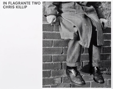
This is why Chris Killip‘s In Flagrante Two succeeds so easily: you turn the pages, and the good pictures just keep coming. There are less than a handful of photographs I would not miss in the book. The rest are just brilliant (I don’t say this lightly). You can seriously open the book at random, and it’s very likely there’s going to be a great picture to look at. I can’t think of too many books where that’s the case.
In Flagrante Two is a reissue of the first version, which has been out of print for a while. Various changes were made, pushing the book towards possibly its most conservative form possible. I personally have not seen the earlier version, so I have no opinion about whether or not the new form serves the body of work better or not (I’ll say this, though: I have no problem with pictures crossing a book’s gutter). Possibly the book could have been a tad smaller, but your mileage might vary.
All these reissue aspects aside, the fact that these photographs are now easily available again is hugely encouraging. They deserve to be studied carefully by those who have not seen them, yet. These pictures can tell us a thing or two. They can tell us about a photographer being aware of and informed by his medium’s tradition. They can tell us about what is to be gained from what we could call a humanist approach to photography. They can tell us about how the old game of “form and content,” when applied to photographs like these, not reduces them in some sort of exercise, but elevates them even further.
And these photographs might tell us something about our times, where we’d have to exchange the locations and politicians, but the neglect caused by an economical ideology run amok would be just the same. That connection, of course, we’d have to make. With these photographs, Killip is making us see, hoping to make us care. If we don’t start caring, who will? The blowhards yelling at us from our TV sets or computers for sure won’t.
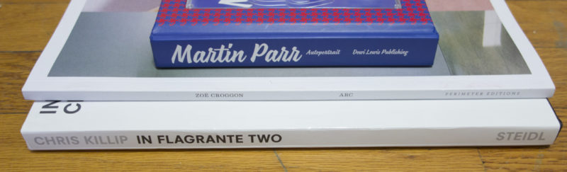
In Flagrante Two; photographs by Chris Killip; 110 pages; Steidl; 2016
Rating: Photography 5.0, Book Concept 3.0, Edit 3.0, Production 4.0 – Overall 4.0
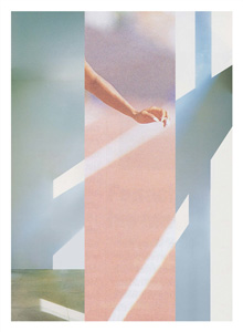
I’m not sure I can discuss Zoë Croggon‘s Arc without adding both Katrien de Blauwer and John Stezaker to the mix. After all, these three artists are in part or fully engaged in adding two fragments of photographs together in what might constitute the most basic form of collage (or montage). Croggon’s collages sit somewhere between De Blauwer’s and Stezaker’s. They lack the emotional punch of the former artist’s work, while they’re not as cerebral as the latter’s.
I’m a big admirer of collage when it’s well done. But doing it well is a challenge: it’s so easy to either produce an exercise in graphic design or something that looks like it’s out of a scrap book. Exercises in graphic design might in fact be quite interesting, as long as they don’t stay that. I’m thinking of László Moholy-Nagy‘s montages, which, in part, informed part of what later became known as graphic design, but which also artistically transcend their underlying geometry. Groggon’s pieces for the most part never quite get there. Where they are good, they possess wit. Where they are less successful, they speak more of the underlying desire to visually fit things together, with much less wit.
I don’t think the production of the book does Croggon’s work much justice. It’s not a bad book per se, but it just feels as if the sizes of the reproductions were varied for the sake of, well, providing variation for a potentially bored viewer. Variation for the sake of variation rarely is a good idea, though. What is more, the collages work well when they can be seen easily, on a single page. Where they are made to cross the gutter, things get too unwieldy too easily, especially since the varying degrees with which the printing of the source material is visible confuses their relevance. In fact, the smallest reproductions work the best for me.
This all leaves me wanting slightly more. I want to be tickled a bit more by the images, and I’d really enjoy an object “book” more that had a little bit more character.
Arc; collages by Zoë Croggon; 80 pages; Perimeter Editions; 2015
(not rated)
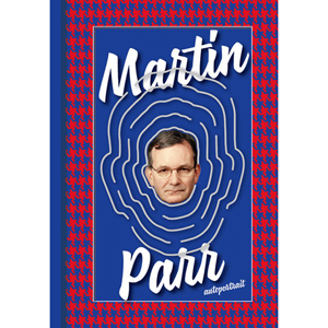
Martin Parr is one of the few photographers who managed to establish himself as a multi-layered brand. There is Martin Parr, the photobook expert, and of course, there’s Martin Parr, the photographer. Much could be said about the latter, especially when compared with Paul Graham. While Graham over time decided to lift the bar to be crossed, I’m not so sure I’d say that about Parr. I think The Last Resort is marvelous, but many of the later offerings merely rehash that work, albeit in a form that is a lot less interesting. That aside, my all-time favourite body of work is Parr’s Autoportrait anyway, now re-released in an expanded form.
The body of work sits somewhere at the intersection of Parr, the photographer, and Parr, the astute observer of how photographs can be used and then are used, especially in that vast context outside of the very narrow confines of the so-called art world (Parr, the photobook expert, has looked into that as well). A lot of photography made for all those not-so-important contexts is so tacky that it’s just amazing. You will just have to lower your defenses if you’re coming from inside the art world.
Autoportrait shows portraits Parr had made in photo studios or booths around the world, essentially wherever someone would take your picture for you, for whatever reason (money, of course, being the obvious such reason). While this is already a pretty great idea, Parr also is maybe the best possible subject, given he can so easily act as that every-man stand in. A lot of photographers I know would be much too self conscious (have you ever tried taking a picture of a photographer?). Not Parr. He offers his straight face (which somehow makes him look a bit befuddled), and whatever “magic” the photographers then want to apply he’ll let them go for it.
What really turns Autoportrait into a real winner is that all of those photographs would have never been made had there not been demand for them. Parr truly is every man (or woman), and he shows us to what lengths people will go to create attractive looking portraits in their studios (“attractive looking” here obviously is debatable). This is photography! In fact, Autoportrait says more, a lot more, about our human condition and how we deal with photographs than large sections of the required readings we discuss with such seriousness in the world of art photography.
No, really, photography mostly is gloriously tacky. And the best thing is that we wouldn’t want it any other way.
Autoportrait; photographs of Martin Parr; 144 pages; Dewi Lewis; 2016
Rating: Photography 5.0, Book Concept 3.0, Edit 3.0, Production 3.0 – Overall 3.7
Ratings explained here.