Unseen 2015

Article main image

I had become deeply suspicious of the world of galleries when the economy was made to crash by reckless banks, dragging everything, including the world of selling photography, into the abyss, at least for a while. The idea that what was being shown in galleries represented the best of photography (however you would want to define that) I had long abandoned. But the crash and subsequent change in what was shown made it very clear to me that if there is a correlation between commerce and quality, it’s loose, at best.

In a sense, that is totally fine, because if rich people (I think galleries prefer to talk of “collectors”) have different ideas of what they want to hang over their couches than this writer, that’s just the way it is. However distorted the system might be, via galleries those same people pump considerable amounts of money into the world of photography, propping up the good along with the bad.

By extension, I am deeply, deeply suspicious of art fairs, even though they really just represent the system of selling photography in its most blatant and honest form. If you are a gallery going to some art fair, you really offer what you are fairly certain you can sell. So fairs are a great gauge what is going on in “the market.” Up until three years ago, I had been to a small number of fairs, finding them all equally insufferable for exactly that reason, though. Turns out I just don’t care about what people buy.

Three years ago, I got invited to Amsterdam’s Unseen for the first time. Unseen combines a photography festival with a fair. The fair bills itself as focusing on “new photography,” which could really mean anything. But “new” here (mostly) means “new to the market.” Thus when you visit the fair, you’re not going to see the same of stuff you see everywhere else.

I spend a lot of time looking at photography, but going to Unseen is like going to some Wunderkammer, with copious amounts of real treasures to be found. What do you know, here’s a photo fair I really enjoy going to.

I remember last year, I was blown away by Augustin Rebetez (whose work I had known, having interviewed him for FOAM Magazine the year before). This year, there were, for example, Anna Cabrera and Angel Albarrán whose installation I just couldn’t photograph adequately for it to look even halfway decent in a picture (there is a lesson here, which I keep re-learning: the web is great, but the reality is that what a book or exhibition install will look like in real life often is completely different). The same applied for Marleen Sleeuwits, whose work I also had known quite well, but who somehow had made that quantum leap that can make art so exciting.

By construction, the Unseen fair offers a large number of very new work, and this means a lot of New Formalism. I’ve heard this as a criticism of sorts — “how does this represent photography?” But that’s really a bit unfair, given that no fair represents photography anyway, and Unseen is quite open about its mission to show new work. Now those who really dislike New Formalism will just have to wait around five years or so for the fad to be over (hopefully less). But it does represent photography, at least right now, in much the same fashion that the Düsseldorf school stuff did before or whatever was hot before that. That said, I won’t disagree with a curator from outside of the Western world (who shall remain nameless) who observed that there were “a lot of pictures of stones.”

Whatever misgivings one might have about what’s hot right now, seeing it installed in person is a good test to determine its photographic strength in another form. I’ll admit that most of New Formalism falls completely flat in a frame on a wall (pardon the pun), essentially making it eye candy for (rich)  intellectuals. In a side nook of the main exhibition hall, though, Wandering Bears (Luke Norman and Nik Adam) offered an install of their work, a collaboration with Charlie Engman, demonstrating how such photography can — or probably should — be shown. I thought that was highly successful.

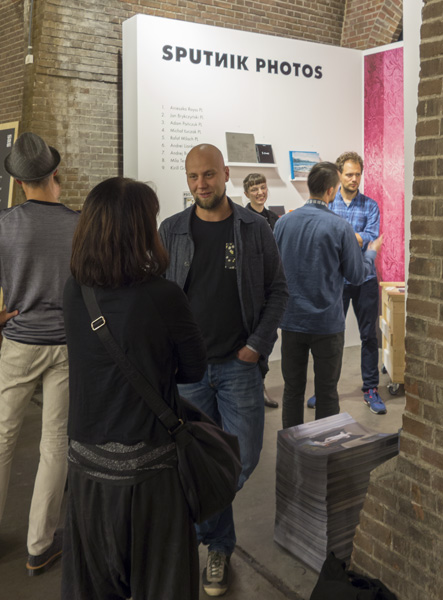
Another nook had the Polish collective Sputnik Photos, who presented an overview of their work in the form of the various books they have made (you can find reviews of some in this site’s archives). The Sputniks for sure are photographers to watch, given the diversity and strength of their work, the topics they cover, and the fact that they’re highly cognizant of the medium photobook.

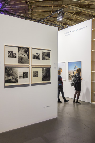
Of course, there also were established artists represented at the fair, of which I truly enjoyed new work by Raymond Meeks, Gregory Halpern, Awoiska van der Molen, or Mayumi Hosokura, to name a few. Peter Puklus had been put in charge of the Unseen campaign, and that was truly enjoyable as well (he also gave what might have been the best artist talk I have ever heard).

Along with the fair, Unseen also included outdoor exhibitions, a photobook market, and an actual festival with presentations, talks, and panel discussions. Out front, Erik Kessels presented The Embarrassment Show, which was literally that, photographs made by students at Lausanne’s ECAL with the idea of focusing on something embarrassing in mind.

The book market tore just a minor hole into my budget, with Makoto Azuma and Shunsuke Shiioki’s Encyclopedia of Flowers II easily being my favourite find, a visceral overabundance of colourful beauty. If this book won’t make you gasp, you might want to make you check whether you still have a pulse. Other than the flowers book and a couple others, there were a lot of books, of course, but none that I really needed (except for that marvelous Sophie Calle book, for which they asked 200 Euros, though, because they had stamped English translations into it. As a rule, I don’t spend more than 100 Dollars or Euros for a book).

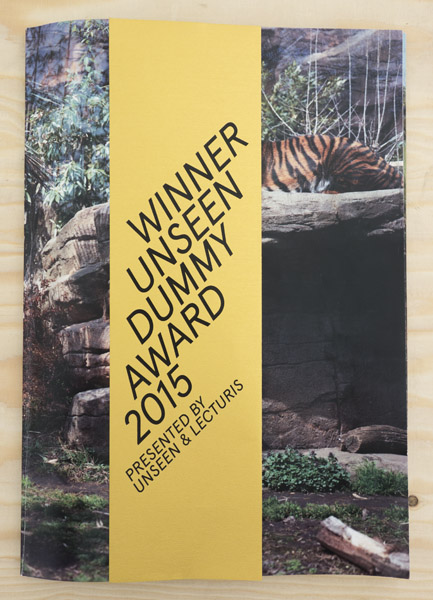
Yoshinori Masuda won the Dummy Award this year with Tiger 2. I’m not sure whether I agree with the jury’s assessment that it’s “certain to be an instant classic.”

As is the case every year, FOAM presented their selection of Talents, with both huge on-site photographs and short interviews with the photographers who were present. In addition, the photographs had been distributed across the festival’s neighbourhood, so you could see them in restaurants and shop windows. While art photography already seems to be a lot more embedded into and accepted by the larger Dutch society than the US one, I really enjoyed seeing the added step of taking the work outside of a very art-specific background.

I always tell my students that there is no law that governs that an artist can show work only in galleries, museums, or in books (that are then sold in what essentially is a closed system), so far with little luck, though. But just like Zoe Strauss demonstrated that you can exhibit your work outside of the narrow confines of photoland, I hope this idea will catch on a little more. FOAM showed part of the way.

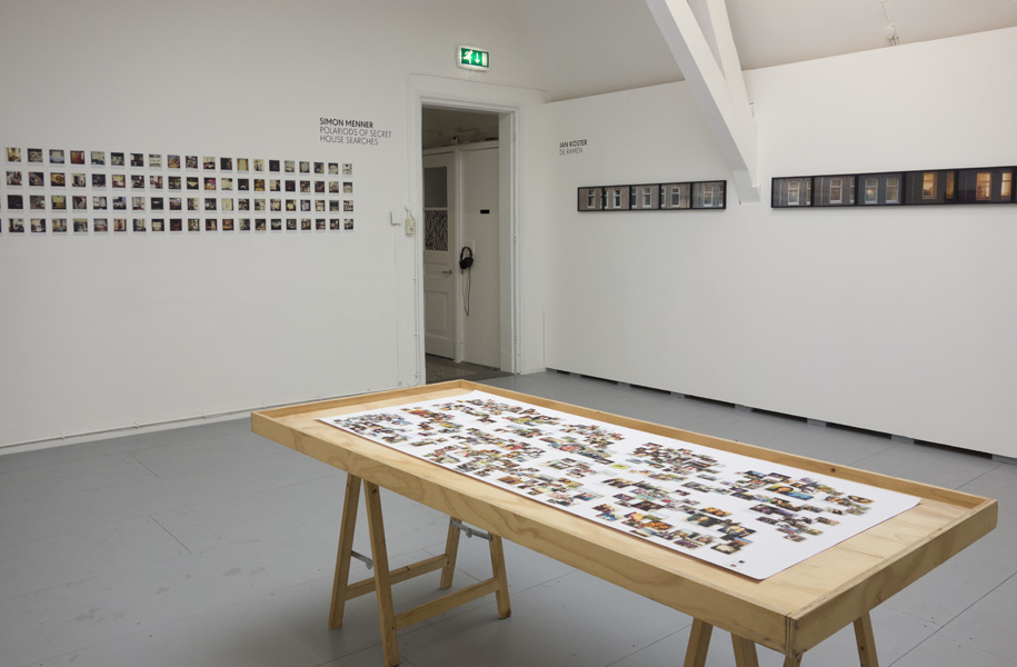
After Unseen I went to Utrecht to stay there for a couple of days, and I used the opportunity to visit Fotodok, which had (No) Privacy on view, a mix of obvious and not so obvious work on the topics of surveillance and privacy (I can’t find an English version of the page). One of the highlights was Milan Rijnders‘ project on the amount of information you can easily find on Facebook about people, using simply an email address of someone to unearth information and photographs of that person’s family and friends (can’t find that online, either).

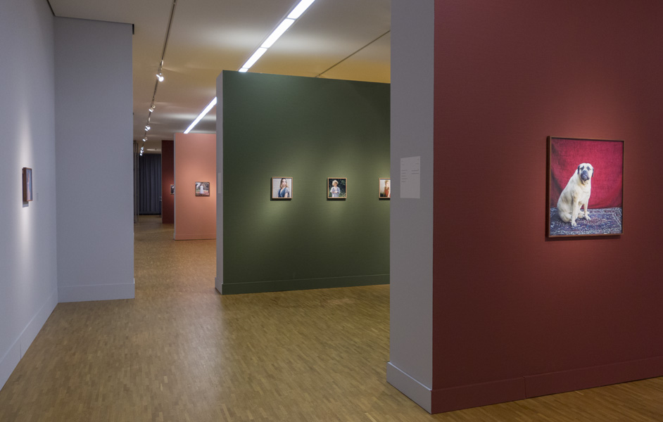
The last (photo) leg of my trip consisted of going to The Hague, to see my friend Hellen van Meene‘s mid-career retrospective at the photo museum. Given we’re friends, my assessment is obviously biased. But this is a highly successful exhibition, with an amazing degree of artistic coherence, given the time span over which the photographs were taken. Those who can’t make it to The Hague might enjoy the book, a brilliant overview of this photographer’s vision.

Conscientious Portfolio Competition 2015

Article main image
Emine Gozde Sevim

I’m excited to announce this year’s incarnation of the Conscientious Portfolio Competition. The winners will have their work featured on this site, in the form of an extended conversation.

The Conscientious Portfolio Competition (CPC) is free to enter. It always has been, it always will be. There are no costs involved for you other than the time it takes to decide about and send in your work.

CPC is aimed at emerging photographers. Photographers not represented by a gallery will get preferential treatment. Needless to say, the quality of the work itself plays the most important role.

There are two guest judges joining me this year to determine the winners, Melissa Catanese and Stanley Wolukau-Wanambwa:

Melissa Catanese lives in Pittsburgh and is founder of Spaces Corners, an artist-run photobook shop and project space. She most recently exhibited in Secondhand at Pier 24 Photography in San Francisco. In 2014, Catanese programmed The Sandbox: At Play With The Photobook at the Carnegie Museum of Art and exhibited in The Photographer’s Playspace at the Aperture Foundation in New York. She has been editing from a vast collection of over 20,000 photographs belonging to collector Peter J. Cohen for some years, and in 2012 she authored the celebrated photobook Dive Dark Dream Slow.

Stanley Wolukau-Wanambwa is a photographer, writer and editor of the The Great Leap Sideways. He has contributed essays to monographs and catalogues raisonnés by Vanessa Winship, George Georgiou and Paul Graham. His photographic work is concerned with questions of patriarchy, race, history, violence and identity, and his research is focused on contemporary photography, in particular on forms of realism, the role of the archive and its relationship to memory.

CPC happens in two stages. The first stage – where we are now – is the submission stage. Photographers are asked to send in their application via email in the following form:
name
email address
website URL (a proper website; no blogs, no Flickr/Tumblr/Instagram accounts)
name of the portfolio/body of work (please do not forget this part – surprisingly often, photographers forget to mention which project they’re submitting)
Send your email to review at jmcolberg.com (you’ll have to replace the “at” with @ and remove the spaces for this to work, of course), subject line “CPC 2015”. One submission per photographer. Please do not submit images or pdfs directly by appending them to the email.

The deadline in 31 October 2015, 11:59pm ET.

If you need a statement for your work, it should be on the website. Your website should have a bio/CV, of course. If you don’t have a website, you will not be able to enter the competition. This might strike you as unfair, but every serious photographer should have her/his own dedicated website.

From the pool of submissions, 25 candidates will be picked for the second round. The photographers in this pool will receive an email, and they will have to send in ten jpeg images, in a uniform format (size etc.).

This is where Melissa and Stanley will come in. They will each pick their personal favourite from the pool of 25. I will pick one, too. Here’s the twist: There will be three or two winners, or maybe just one, if a photographer is picked more than once.

Having a second round is based on the idea of making everything as equal as possible. With uniform file sizes, fancy websites won’t be able to beat out simple ones. With a special naming convention for the jpegs (which will hide the full names), the winner(s) will be solely chosen based on the quality of the work.

The winners of the competition will have their work featured on this website, in the form of an extended conversation.

Good luck!

Photobook Reviews (W37/2015)

Article main image

Daisuke Yokota easily is the currently “hottest” Japanese photographer in the West. There are two main problems for a wider audience, though. First, he has been publishing way too many photobooks over the past two or three years alone, essentially considerably diluting the impact of his photographic vision. And second, as far as I can tell, all of those books, most of them produced in relatively small edition sizes, are sold out. Whenever I talk to someone and point out Yokota’s work, inevitably there’ll be a follow-up email along the lines of “Which book should I get? There are so many!”, followed then by “Never mind! They’re all sold out and beyond my price range.”

I’m not a believer in the idea of churning out a ton of books with photographs for any given artist. I am utterly unconvinced that it is possible to maintain a consistently high level of quality for all of those books. OK, maybe you can do large numbers of books with photographs that are, well, not that good in the first place, and you can hope to kill criticism by inundating people with volume. But with Yokota that doesn’t work for me. For a start, he’s much too good an artist, so he doesn’t need to hide a lack of quality with volume. But his work also is heavily process based, and that makes putting a book together not as straight forward as it might seem.

Vertigo was released last year by Japan based publisher Newfave. I have been keeping it in my “to review” pile in part because it is an utterly engaging book with considerable depth that I simply needed to come back to frequently. A carefully edited selection of Yokota’s black-and-white work, the book creates a tight and somewhat disturbing trip down some mental rabbit hole, in which menace and uncertainty are balanced with ideas of beauty and bliss (some of it, possibly, sexual). The consistent use of a full-bleed layout vastly helps bringing the viewer into the world, and a couple of gatefolds help expand the idea of a world other than our own (or at least the one most people would experience with their senses).

As a starting point into this fascinating photographer’s world, Vertigo is an ideal, yet also tough, choice: this book essentially is the best you can get out of this kind of work, but it also demands a lot from its viewers (while making the process itself disappear).

Vertigo; photographs Daisuke Yokota; 96 pages; Newfave; 2014

Rating: Photography 4, Book Concept 5, Edit 4, Production 5 – Overall 4.5

Another book that got stuck somewhere near the bottom of one of my “still to review” piles is Lard Buurman‘s Africa Junctions. It’s the kind of book that is certain to push a few very obvious and unrelated buttons. For a start, the photographs in the book are composites, produced from a larger number of source images. The more conservative wing of photoland is likely to have a big problem with that. But given this is 2015, I think we can safely and easily move beyond such concerns: that train has long left the station.

Closely related to the construction is the question whether or not the resulting photographs are documentary in any sense of the word, a discussion that also doesn’t really help the viewer to engage with what this work does. We could approach the “is this documentary photography?” question just like the “is this art?” one: let’s just simply say it is, and instead ask “what does this do?”, leading us to “what is the merit of this work?” I know that’s not going to be agreeable for the orthodox wing, but so be it.

Lastly, a white European photographing in Africa is not going to be able to get around the history of such photography done there. It’s tempting to quickly dismiss this work for that reason alone. But that also doesn’t seem like a very good idea, at least to me.

Having got these concerns out of the way, Africa Junctions actually is concerned with a much narrower idea that the whole continent, namely to visually study a selection of cities (15 of them, if my counting isn’t off) across its full length and width. In the resulting 80 photographs, public spaces are explored in the sense of that word: the construction of the photographs allows the photographer to fill the locations in such a way that the space itself and the way people move through it become more visible.

For sure, this is not a photographic depiction of Africa we are familiar with.  The images that are mostly obviously constructed — like the one on the cover — don’t quite work for me as well as those where things aren’t so obvious. In a sense, Buurman’s work combines aspects of photographers like Andreas Gursky and Philip-Lorca diCorcia. Where Gursky aims for the largest possible view, making us take in vast vistas, Buurman focuses on a more manageable aspect: we are invited to look and discover details. Where diCorcia carefully constructs a specific narrative, Buurman uses the construction merely as a way to amplify the location’s structure.

And for sure, this is not a book showing Africa, just like Robert Frank’s The Americans doesn’t show America: it’s Buurman’s view of a large selection of public municipal places across the continent of Africa. As such, it has much to offer for a viewer, while — inevitably — exposing itself to criticism here and there.

Africa Junctions; photographs by Lard Buurman; Foreword by N’Goné Fall, Texts by Chris Abani, Chris Keulemans, Alexander Opper; 216 pages; Hatje Cantz; 2014

Rating: Photography 3.5, Book Concept 4, Edit 3, Production 4 – Overall 3.7

Photobook Reviews (W36/2015)

Article main image

Because it shows what is, or rather was, photography doesn’t lend itself easily to talk about could be or might have been. All the discussions about the impact of digital technologies on the medium notwithstanding, there is a literalness to it that at times makes looking at a lot of photography hard to stomach. This looks like this, and that looks like that, and this here was there, and look at that — that’s all fine. But it needn’t be this way. Photography can do more, as long as you allow it to do just that.

A good case in point is provided by Mariela Sancari‘s Moisés, “a typology of portraits of men in their 70´s, the age of my father if he were alive today” (to quote the artist’s description of the book). I will admit that coming across the description and some of the pictures I initially was not particularly interested in the book. How many more family projects do I have to see? I’m not sure, but the number might be quite small. That said, if an artist manages to show me something I have not seen before, widening my view of not only this part of photography but essentially the world, then I am quite interested.

I am convinced that the reason why Moisés, the book, works so well and powerfully is because it is a very smartly designed book, in which the form and construction vastly elevate the photographs, creating an experience for the viewer that will make her or him feel the desire that was driving its creation. In a nutshell, the book comprises of two interleaving sections. The viewer alternatively opens a page on the left and then on the right, to reveal more and more. There is a somewhat frustrated obsessiveness of looking at a group of elderly men, which the viewer is made to be a part of. Consequently, she or he is being put into the same situation as the artist, wondering what the man not pictured might look like and, by extension, what a person he might be.

While many photobooks are essentially treated like maybe slightly fancy containers for pictures, Moisés demonstrates the power of this particular way to use photographs: with a simple, yet very strongly executed concept and construction, the book takes the viewer out of the world of literalness that so much photography never manages to leave. An impressive achievement.

Moisés; photographs by Mariela Sancari; 2×32 pages; La Fabrica; 2015

Rating: Photography 3, Book Concept 5, Edit 4, Production 5 – Overall 4.2

Just to get this out of the way, Dodo by Adam Broomberg and Oliver Chanarin might be the smelliest photobook I own. I think if I had to locate it in my library in the dark I easily could.

Silliness aside, whatever you want to make of this prolific photographic duo, at this stage into their careers it is completely obvious that anything they do, they do incredibly well. Conceptual photography actually is one of the most difficult types of photography. It is the medium on steroids: photography itself is easy, but it is very hard to do it well. Conceptual photography is even easier (in principle, you don’t even need good photographs, provided you got a concept that will work with bad ones), but it’s incredibly hard to not only do it well, but to do it in such a way that once you’ve seen it all you want to go back and look again.

As far as I am concerned, the work by Adam Broomberg and Oliver Chanarin sets the gold standard of conceptual photography. There is no artist who can do it better, while, at the same time infusing their work with equal amounts of sheer wit, combined with a very well-defined political consciousness (Christopher Williams fans might disagree — feel free to convince me there’s even remotely as much wit and politics in his work). That’s probably my main problem with a lot of conceptual photography, where being clever is seen as the end, and not as a means to a completely different end. OK, I get it, you’re clever, and I am clever, too, because I get it, but that’s really not remotely enough for me.

So anyway, Dodo then, a book that I ultimately might see as a contemporary Don Quixote style tale. The book is so smart that describing it would require a lot of words, which I feel would actually take away from the enjoyment to be had with it. At its core sit the ideas of futility and folly, and how those two, when combined (as they inevitably get in times of war), tend to create what is best described as a clusterfuck. In a multi-layered approach, the book combines aspects of Joseph Heller’s Catch-22, a Catch-22 movie, archeology at one of the movies sites, and the sole still existing egg of the long extinct dodo bird. Make of that whatever you will, but just like in the case of Moisés you will have to see the book, because pictures online or descriptions (like the one above) just fall flat.

Dodo; photographs and text by Adam Broomberg and Oliver Chanarin; 160 pages; RM; 2014

Rating: Photography 3, Book Concept 5, Edit 4, Production 5 – Overall 4.2

When browsing, I tend to look at photobooks starting with the back. But when I look at them, of course I start from the front. I never browsed for Matthew ConnorsFire in Cairo. So I didn’t realize until after I reached what I thought was its end that it’s a book requiring for it to be looked at like I browse, starting from what would ordinarily be its back. But this mistake (or maybe it’s not a mistake) made for an interesting experience, as photographs that alluded to a vague threat became ever more descriptive, to finally reveal the faces of some of those who had participated in whatever we now call the events in Cairo: the revolution overthrowing a military dictatorship, and the subsequent counter-revolution overthrowing democracy, bringing back, well, essentially the same-old military dictatorship.

I suppose it just wasn’t the democracy people wanted, as if you could cherry-pick your democracy.

However many images we have seen by now coming out of Egypt, Fire in Cairo is unlikely to satisfy the photojournalistic or documentary-photography crowd, and that can only be a good thing. Large parts of photojournalism have run themselves into a dead end, obsessing endlessly over image manipulation while churning out a never-ending stream of cheaply manipulative (where not outright exploitative) imagery that has long been failing to have the impact it used to have. If the underlying topics weren’t so gut wrenching and heart breaking, we could label parts of today’s photojournalism camp, a visual outrage machinery that, in all fairness, might just show in pictures what large parts of our culture have become (to a considerable extent thanks to the internet).

Fire in Cairo has very little of that. Instead, the majority of the photographs are formally abstracted, or they are simple portraits. Somehow stuck between these poles, the viewer finds her or himself struggling to understand what is going on, ultimately realizing that — possibly — there is no such enlightenment to be had, certainly not a simple one. Given that portraiture has the power to convince us that something truly matters, the inclusion of the large set of portraits is a smart choice. What is more, most portraits come in pairs, with slight variations between the picture on the left and right reminding us that even a photograph of a person doesn’t tell us as much as we would like.

I’m not sure Fire in Cairo isn’t concerned with itself more than with the events in Cairo, and, again, I don’t mean this as a criticism. For a start, photojournalism certainly is. But that aside, we all have to make sense of what happened and what now appears to be re-frozen again. There are different things at stake for those living there and everybody else, that’s for sure. But the book certainly is a product aimed at people who are part of a very specialized audience. As members of that audience we need to understand better what photographs do and how they can tell stories, so that when something happens we have an easier time understanding what’s going on. Seen that way, this is an ambitious book, and I think it succeeds brilliantly in doing what it does.

Fire in Cairo; photographs and text by Matthew Connors; 160 pages; SPBH; 2015

Rating: Photography 3.5, Book Concept 4, Edit 4, Production 5 – Overall 4.1