Review: Emile Hyperion Dubuisson’s Far

Article main image
Emile Hyperion Dubuisson

In Emmanuel Carrère’s My Life as a Russian Novel: A Memoir, the narrator chronicles how he destroys a relationship with a woman through a series of rather ill-advised decisions. One of them involves traveling to a town in Russia repeatedly, first to try to find traces of Andras Tamas and later to produce a documentary about something, where it’s never quite clear what that something is (the narrator makes it clear he doesn’t quite know). The relationship is one of the threads running through the book, there are more. I ended up enjoying the events – or rather non-events – in Russia the most, in part because I have a weakness for travel writing when it’s done well (many of the other parts of the book, especially near the end, are a bit too gratuitously self-indulgent for me).

The idea of going somewhere without a real purpose or with the flimsiest of purposes appeals to me because a lot of what will happen results from chance and not from planning (it is probably for that reason that I’m a lousy tourist – I just can’t go somewhere with the plan to see something very specific and enjoy the process). The drawback, of course, is that if you don’t plan anything you don’t know whether something is going to happen. It might, and it might not.  You just have to be open to the gifts such trips might hold in store for you, whatever those gifts might be (unexpected opportunities and/or discoveries, however mundane).

Some time in the early 1990s, Emile Hyperion Dubuisson traveled to Siberia to work on a documentary. Finding themselves in an actual polar vortex (gift #1), the crew didn’t get much filming done (gift #2), so Dubuisson walked around with a camera and took photographs. Back in Moscow, processing the film turned into a bit of a nightmare (gift #3), and for a while he thought the negatives were ruined.

Now, you will realize that what I labeled as gifts aren’t really gifts in the standard sense, and they’re not independent. But that’s photography for you. There are gifts everywhere, and you “just” need to be able to spot them, accept them, work with them. And it’s not even always clear right away whether you’re dealing with a gift or not. Often, you need to have a good look at what you got after the fact, back home, maybe years later. (Just as an aside, that’s why digital cameras are such a pest: they often turn photographers into such lousy recipients for gifts.)

This is what Dubuisson did with his photographs from Siberia, eventually producing Far, which is now available in book form. Given the project’s history, the fact that it ties in nicely with The New Pictorialism is a coincidence. But there is a lesson to be learned from looking through Far. For any choice of aesthetic to work, the photographs have to offer more than just that. Fake Polaroids made with some app are not good pictures per se, regardless of the appeal of their aesthetic. In much the same way, Far wouldn’t work if the photographs’ appeal only resulted from the fact that the film was badly developed. You could, in fact, imagine these pictures to work just as well without the aesthetic.

Of course, that’s a somewhat dangerous statement to make, and I’m sure a lot of photographers will object to it. But at the end of the day, it’s about the pictures. I’ll say it again: A cool aesthetic will not give you good pictures. It will only give you pictures with a cool aesthetic (for more on this, see the article about process that I wrote about a year ago).

Far, the book, successfully assembles the photographs and turns them into an attractive package, which – crucially – does not fall into the trap of trying to be too insistent on exploiting the aesthetic. In other words, the book treats the photographs as photographs in their own right, with a somewhat subdued, possibly slightly conservative and careful design. And it works very, very well. Its a very engaging and attractive book, with many very good photographs, a book whose overall experience transcends the work itself. And that’s what good photobooks do.

Far; photographs by Emile Hyperion Dubuisson; essay by Boris Mikhailov; 96 pages; ADAD Books, 2013

Rating: Photography 3.5, Book Concept 4, Edit 3, Production 4 – Overall 3.7

The New Pictorialism

Article main image
JM Colberg

“During the 1890s,” writes Naomi Rosenblum in A World History of Photography, “serious amateurs as well as professionals deplored the ‘fatal facility’ that made possible millions upon millions of camera images of little artistic merit. In seeking to distinguish their own work from this mass of utilitarian photographs, Pictorialists articulated a dual role for the medium in which images would provide an unnuanced record on the one hand, and, on the other, provoke thought and feeling.” (p. 297) Change a few phrases and the date, and you arrive at what could describe the frequent misgivings voice about photography today. There are too many pictures, we are told; and what good are all those photographs of food for anyway?

What interests me here is not the complaint about the “millions upon millions” (now billions upon billions) of images. It seems this complaint is simply part of photography itself. Instead, I want to focus on the Pictorialists’ solution: If there are too many photographs that look too much like something produced by a mechanical device, then we ought to be making something else, something that looks more like art. Looking back, Pictorialism probably strikes us more as incredibly dated than as very artful, especially given that any photograph can be art as long as someone says so.

But still, the Pictorialist impulse, to treat photographs in such a way that they look like art, and not merely like photographs, is still with us. Consider the way the widely popular photography site Instagram treats photographs. Once you’ve taken a picture, you can manipulate it in all kinds of ways, most prominently by picking one of the various filters for it. In similar ways, Oggl (no, really, that’s the name), previously Hipstamatic, centers on applying very specific filters to your image. Oggl even separates things into types of “film” and “lenses.” You want to take a picture that looks like it was taken with a Kodak Instamatic camera? Just pick your “film” and “lens” (pay for those first, of course), and you’re all set!

There is something utterly amazing about this. What we’re witnessing is the following: photography has developed to such an extent that some of the most popular applications of cutting-edge technology is to make things look like what you would get before said technology existed. The very technologies that made film cameras obsolete are now being used to produce photographs that look like film cameras.

People who have never ever had to deal with trying to get a decent picture out of a Polaroid camera, say, now make pictures that look like, well, as if they were made in such a way. And whereas in the not-so-distant past the various technical problems you’d run into with such cameras were a general nuisance, now the (fake) imperfections are what people are after!

Being one of those people using such procedures – I’ll happily admit that I am a frequent user of Hipstamatic, currently making mostly faux wetplate pictures (they’re called “tintypes,” but they don’t really look like tintypes to me) – I see absolutely nothing wrong with such apps being so popular. I don’t think they degrade photography in any kind of way. On the contrary, if such apps contribute to making photography more popular than ever before that’s perfect.

The popularity of creating photographs that look as if they were made in the past fascinates me: This essentially is a form of Pictorialism, an attempt to make pictures that look like art. Needless to say, just because a photograph might have filters applied to it doesn’t necessarily make it a good picture.

In much the same way, I also approach large parts of the photography that I tend to call New Formalism. If you’re curious about such photography, issue #5 of Conveyor Magazine features quite a few artists engaged in this currently so popular type of work. This is a form of Pictorialism as well. Just to make this clear, I don’t mean this as a criticism.

Of course, when I use the term Pictorialism here, I’m misusing it. In the history of photography, Pictorialism stands for a very specific form of photography (and I’m very aware of that). What interests me here is the impetus behind the original Pictorialism, less its particular aesthetic.

Movements in photography come and go. We’re now solidly post-Düsseldorf-School, post-staged-narrative, post-Sternfeld-School, so something had to force its way center stage. It’s not hard to see the New Formalism work as a reaction against all of these three so popular movements in photography: Here is photography, solidly centered on investigating itself, rather than looking out into the world.

The good news for those who are not so interested in these exercises is that inevitably it will spawn another movement in the opposite reaction (Hey, who knows, maybe at some stage there’ll be a new Social Documentary movement? Our world could use some artists eager to engage in a serious subjective way).

But these developments tell us something about the medium photography. It is, and it will forever be, this strange medium, still so poorly understood, struggling with the conflict between taking something from the world with a machine (of sorts) and imposing the human will and desires upon that. The New Pictorialism expresses this struggle, and our collective unease and fascination with it.

Philip-Lorca diCorcia: Hustlers

Article main image
Philip-Lorca diCorcia: Hustlers

Given we decided to construct a culture around sex, money, and violence, we might as well live with the consequences. When these consequences are presented in the most glaring and frightening ways, David Lynch’s movies are often used as references. But their artifice does not revolve around something that flew in from outer space. Instead, they’re a somewhat uninhibited, hard look at the realities, our realities, the very realities we usually rather not look at. In other words, those movies are really just very stylized approximations of the struggle, dread, ennui, and occasional horror of contemporary life.

But movies have a hard time being taken for more than fiction, because they’re movies. There’s just too much involved, and they usually can’t help themselves with the soundtracks. You know you’re being manipulated, even if that manipulation has you look at the smoldering ruins of your own culture. There is too much artifice for things to really hit home. In contrast, photography provides more immediate access, because it deals with pictures, which we know are taken from the world in much simpler ways (even when they’re not). The psychology of the individual picture is very different.

One of the photographers who has most successfully and pressingly made work around what we’re facing is Philip-Lorca diCorcia. Whether it’s sex, money, and violence, or the dread of contemporary life, diCorcia has assembled an incredibly impressive career of photography focusing on those themes. I can’t help but think that his work hasn’t been quite as appreciated as it could have been, given his association with the flood of staged-narrative work coming out of Yale. And then there’s Gregory Crewdson.

However, whereas in Gregory Crewdson’s work the anxiety and/or ennui of the American condition always ends up being just a tad too stylized, reminding the viewer of the artifice and thus providing a way out, an opening to deal or rationalize, diCorcia has managed to keep this impulse (which also is a desire to dazzle, to amaze) under control. It’s very unlikely the viewer will find her or himself oohing and aahing over the production of diCorcia’s photographs, because s/he is made to realize that there is in fact more going on than the making of a photograph.

Crewdson’s work clearly conforms to the staged narrative, where it’s clear that things are being staged, and there’s a narrative (however apparent and pop psychology at times it might be). In contrast, diCorcia, while going about the same game, manages to make the viewer look past the staging; and whatever narrative there might be, it matters so much less than the feelings evoked. Crewdson makes people very conscious of the intended (scripted) feelings created by the photographs; diCorcia makes people very conscious of feeling that clearly, something is really fucked up.

Crewdson, just like Andreas Gursky, eventually pushed his artifice to the ultimate extreme, where in the end there was only artifice left. There isn’t much left to admire in his last massive Hollywood-style productions other than the very production itself, and the artist might have realized as much, going off to Italy to photograph cinema sets. In much the same way, Gursky pushed his God-like views of contemporary life further and further out, until he presented us with images of oceans, photographed from outer space, a pointless artifice that had me cringe when I saw it in person (the same exhibition also featured Photography 101 style images of oil on water). It would seem that the lesson here is that if you push your artifice further and further, there’s no escaping the dead end.

I’m tempted to think that one of the reasons why diCorcia did not fall into this trap is because a vast impetus of his work is provided by a massive amount of indignation. Just like artifice, indignation doesn’t make for good art. It’s the combination, the balance between those two, that determines whether the outcome will stand the test of time. What’s truly amazing about diCorcia is the number of superb bodies of work produced by this one artist, each showing an artist at the top of the game (not his game, the game: the game of contemporary photography), whether it’s A Storybook Life, Hustlers, Streetwork, Heads, or the most recent East of Eden. (For those who want a very good overview of his work, there is Philip-Lorca diCorcia, published at the occasion of a retrospective in Europe.)

Hustlers has now been released as a photobook, in a rather massive version. Just to get this out of the way, I’m not a fan of the size (something like 17.5 by 13 inches) or layout of the book (roughly 75% of the real estate on every spread is unused). Thing is you don’t need such an overly grandiose book to present this body of work.

There are a few things that come up when these photographs are discussed. There is, for example, the fact that diCorcia spent money given to him by the US government, a National Endowment for the Arts fellowship, to pay these hustlers, sticking it to Congress and their “general standards of decency.” This might have been the case, but fortunately, the pictures ended up being much better than that gesture – a gesture that I can wrap my head around, even though it’s really not much more than a tit-for-tat on Congress’ level of discourse.

The photographs, however, transcend that level, and they speak very powerfully of the consequences of all those years of Congress making rules, mostly in favour of corporations, in favour of making a quick buck, no matter the cost: If a quick buck can be made by large businesses, then some of the humans discarded to the growing margins of a society ruled by greed will have to make their quick buck this way, selling their bodies, and thus not following the “general standards of decency.”

In other words, it might be obscene to take taxpayer money and to give it to prostitutes. But it’s even more obscene to create a dog-eat-dog society and to then complain about those in the dirt going about whatever desperate business is left to them just so that they can get by. And that’s in the pictures. That’s what makes Hustlers such a powerful body of photography, such an indictment of the larger culture that spawned it. It’s all about the sex and the money and the violence. It’s all right there, sex and money in obvious ways, and the violence in the form of the larger sphere that creates the boundary conditions within which for some people there is only one way to survive.

The pictures obviously aren’t documentary. I don’t think they’re even really about the people in the pictures, the fact that their names, origins, and prices are given notwithstanding. That information is a red herring. The photographs are a fiction, much like the David Lynch movies I mentioned in the beginning, a fiction that very powerfully speaks of the society and culture it was made in, made from, and it also speaks of the artist himself, his general feelings about all of this, and his way of showing us what mess we’ve got ourselves into.

Seen this way, there’s an arc from Hustlers to East of Eden, and it might not be a coincidence that these bodies of work were shown at the same time in different places. The earlier body of work, Hustlers, has a tighter focus, at least on a surface level. Visually, East of Eden casts a wider net, with its landscapes and hotel interiors, with its small and big figures. I want to think that this new project is slightly more ambitious, and the viewer will have to be equally ambitious when viewing the work, trying to connect what needs to be connected. Hustlers, in contrast, makes the viewer’s job a little easier, as a result of which the general feeling is going to be created more immediately. Needless to say, one is not better than the other.

But however you want to look at it, Hustlers is a real classic, a landmark achievement by an American photographer having a hard look at some of the consequences of his culture. You might have to buy a bigger book shelf, but if you’re interested in contemporary photography, Hustlers is a must buy.

Hustlers; photographs by Philip-Lorca di Corcia; 160 pages; Steidl; 2013

Rating: Photography 5, Book Concept 2, Edit 4, Production 5 – Overall 4.1

Review: Beautiful by Loredana Nemes

Article main image
Loredana Nemes

At age 14, Loredana Nemes was forced to leave her home, a Romanian town called Sibiu, to settle in Germany. It’s one thing to leave your home town to go to college, having just graduated from high school. But it’s quite another having to leave your home town, to find yourself on the other side of a large political divide.

Is it really, though? On the surface, of course circumstances are very different when you leave knowing you can go back compared with when you have to leave not knowing whether you will ever be able to go back. And there is you leaving knowing you never want to go back.

However, beyond all those different circumstances lies the notion of the very first home, which often enough is the idealized home, idealized as the best possible possible home any child could want to have (or the worst possible home – some people derive their comfort from the negative idealization). Once you’ve grown up, how accessible is that home? Does trying to access that home differ depending on the way you left? Or is what differs merely the kind of drive you display, trying to go back (or avoiding to go back by all means necessary)?

Nemes’ Beautiful, photographed over the course of a little more than ten years, is a meditation on this topic. And the word “topic” really isn’t the right choice here, because the book is not about a topic, it’s not even “about” something in any kind of overly abstract sense.

Beautiful is unashamedly sentimental (and I don’t mean this as a criticism), while at the same time facing what the changed times (and circumstances) have brought. Crucially, the photographs are combined with short texts, written by the photographer. These texts stand in place for all that which is unphotographable. Describing them that way might not do them much justice, but you might get a better idea of how they function.

The books’ design plays a significant role as well, with a variety of image sizes, pairings, full-bleed images versus ones with space around them etc. The design certainly enhances the overall experience of the photographs and text, establishing or amplifying their feelings.

Beautiful is not the kind of book I could imagine making about my home town. I don’t have any feelings of sentimentality for a place that I was glad to leave, a place that since then, from all I’ve heard, has changed a lot and not for the better. It’s probably fair to say that I’m not the most sentimental person. This book talks to me about something I am not overly familiar with. And I like that.

There is comfort in being told what you already know: It essentially tells you that you are right after all (even if you’re not). But there also is a strange kind of comfort in being told what you don’t know. You’re challenged, it is true, but you’re also being made aware that there are other ways to see the world, that, provided you’re a little open, there is space to grow.

So Beautiful is indeed beautiful, if you allow the photographs (and text) to work their way (not your way). We will never be able to go back to our childhood homes, however much or little we idealize them; but there still is so much to be gained from trying to go back anyway.

Beautiful; photographs and text by Loredana Nemes; 136 pages; Hatje Cantz; 2013

Rating: Photography 3, Book Concept 4, Edit 3, Production 4 – Overall 3.5

A Conversation with Josh Quigley

Article main image
Josh Quigley

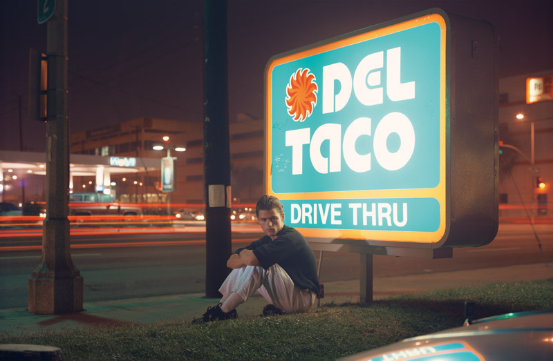
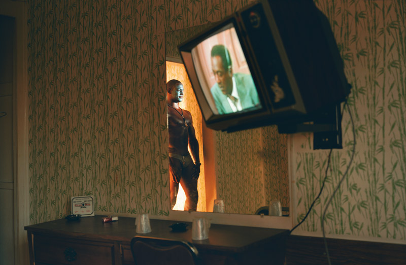
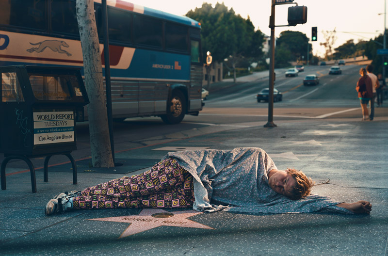
Josh Quigley is one of the winners of the 2013 Conscientious Portfolio Competition. Explaining why I had picked his submission, I wrote: “Behind the cookie-cutter facades of their anonymous homes, people go about their private businesses in all kinds of ways, and it’s hard to see what’s wrong with that. Except, of course, that large parts are kept hidden away, possibly only hinted at with carefully constructed euphemisms, for reasons that aren’t entirely obvious (beyond cultural fiats that deserve to be questioned rather severely). People procreate to have babies, or they do everything that’s involved in the act of procreation except for having that baby. Josh Quigley depicts all that in a way that makes the overly beautiful facades looking a tad freakish, while what’s going on behind is given all the attention it really deserves. There’s no ogling, there’s no sensationalism, there’s just a celebration of the human condition, in all its different forms.” Over the past weeks, I spoke with the artist about his ideas behind the work.

Jörg Colberg: “A Shameless Longing” has evolved over the years to include a large variety of photographs, including very personal ones, self-portraits and portraits of your wife and children. Can you talk a little bit about the evolution about the project, how it came about and how you approach it?

Josh Quigley: The project really started forming legs while at the Minneapolis College of Art and Design. But when I think back on it, I was already making work that would prepare me for “A Shameless Longing”. Before graduate school, I was working as a geotech for an exploration company living in Michigan’s Upper Peninsula. It was here that I started photographing some of the town of Marquette’s unique and eclectic individuals. I was already lighting and staging the photos but in more of a “Rolling Stone” cover shoot way, turning everyday people into celebrities. It was a lot of fun, and it’s where I learned to work with people and how to light a photograph.

In graduate school I learned how to combine these elements and add narrative to the image. Staged photography was king at the time, and it was so inspiring to see work that was being produced for the medium by, Gregory Crewdson, Philip Lorca-diCorcia, Bill Henson, Simen Johan and Jeff Wall. I had to be careful not to fall in love with the process more than the resulting photographs (I have many pretty failures). At first, I just photographed whoever would let me and see what would happen. I had to make a lot of pictures before I knew what I was doing and what exactly I had. I was photographing my family, friends, people from Craigslist, modeling websites, whoever would bite.

I was fortunate in that I was limited by my resources and had to make work by standards that others might have considered “scrappy,” but that’s what allowed the work to remain believable, and not become overly “produced.” After graduate school is when everything “clicked.” I was able to really focus on the project that I wanted to make, and I spent the last 4 years doing just that. Having finished the bulk of the work I now have been working on book mock-ups and tighter edits of the project.

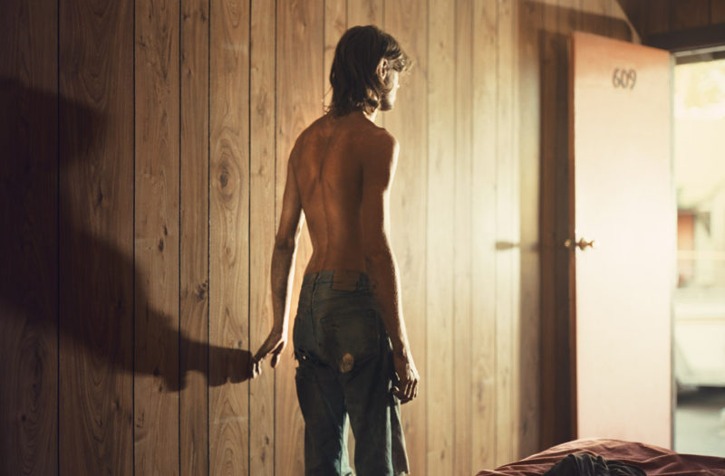
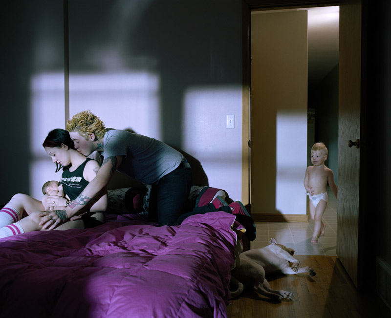
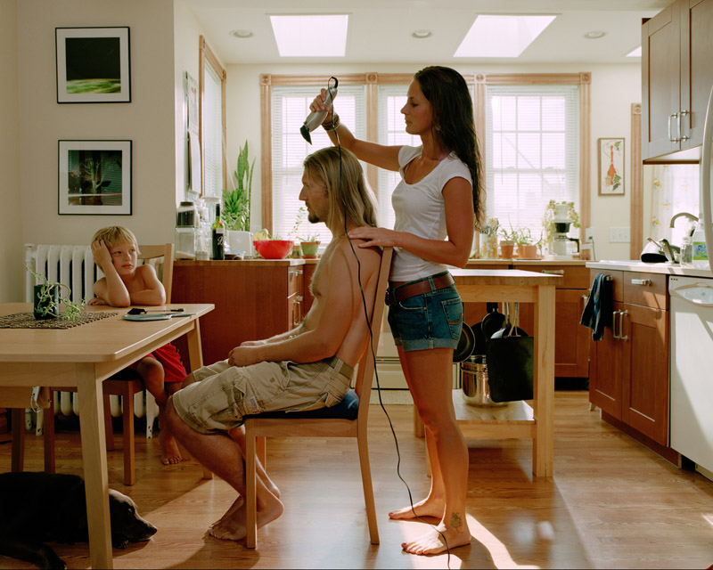
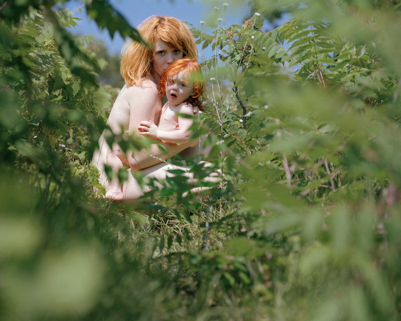
From the beginning of the project I had cast a very wide net. So after seeing what I had caught, I started to shape the project by carefully editing it down into what it is now. I have been told that the project should be two projects–one with my family, and one with the strangers–but I feel as though they are complementary to each other. The family pictures are personal and intimate as they should be. These are people that I am close to and have access to in a way that no one else does. I wanted this work to reflect this privilege of intimacy.

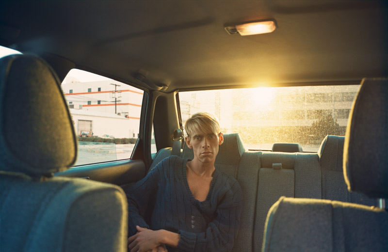
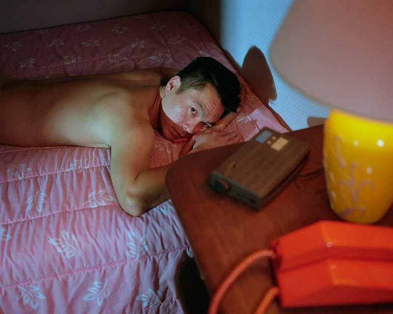
The strangers, on the other hand, are less intimate. Although they are very revealing and sometimes overtly sexual, they remain more anonymous in their actions, and they don’t have enough picture presence to develop more of an overall narrative. This is why it was important for me to create portraits that could act as standalone images, images that can be self contained in their narrative and that don’t necessarily need other images to support them – reminiscent of classical painting and the photography of Jeff Wall.

JC: Given you have spent quite some time on the project, have you worked with some sort of “master plan” once you knew what you wanted? How do you know what else you need, how will you know that you’re going to be done?

JQ: I wish I had some sort of “master plan” when I started this project. But no, “A Shameless Longing” is a series of evolutions and adaptations made over the years. Because of the nature of this project it could go on forever, focusing on my family as they change, and grow older, while also bringing in new people to the fray. At this point in the project, I would say I am 95% done with only a few key pictures of my immediate family to be made this spring/summer. The way I chronicled time in my project is through the aging of my two boys. When the project started Joseph was 6, and now he is 14. For Desmond, we see the time before birth until he is 3 years old. I am looking for a middle ground between the two boys where it could appear as the life of just one boy, the same but different, a strange overlap in time where the project comes full circle.

JC: Inevitably, viewers will want to know who the people in the pictures are, how much is set up or real etc. How do you approach this? To what extent does it matter that people get this knowledge (and why)?

JQ: I hope that it does not matter who the people are, for the initial viewing at least. Like a film, you don’t know how the story is going to unfold until you have watched it. I wanted the work to start out anonymous and become more focused as the viewer realizes the narrative thread that turns out to be my family. Part of the allure is that it is both personal and anonymous, which parallels life. There are those you know and are close to, and there are those you don’t know at all. This juxtaposition does not make them, or you, any more or less important. It is just a very small part of life.

Every picture is set up in a manner that is similar to neo-realist films. I am using the technology and the means to tell a story that is based in the real world with non-professional actors and models. I create a scene where I point the camera in a particular direction, I light that area, and vaguely stage the action (if possible) and let happen what’s going to happen.

Much like the film director shooting the scene of a movie, when I yell “Action” I can never be sure what to expect. I am still surprised by the moments that can be captured. That is what photography does so well, capturing brief moments in time, freezing them so we can look closer, studying them as though we too, have become removed from time.

In general I think people look at photographs and accept them as truth (advertising aside). That is why photography is always getting into trouble for its trustworthiness, but it is also what makes photography so powerful still.

I think my work walks a fine line between what is real and what is staged, therefore asking interesting questions about what it means to make documentary work today and the overall validity of a photograph. After all is said and done, I hope the work speaks to the audience and stirs up emotions within the individual viewer. They don’t have to like the work, but I hope that the work leaves a lasting impression.

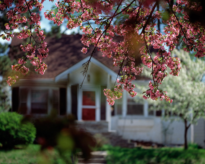
JC: The project also contains a fairly large number of beautiful, almost too beautiful photographs of anonymous houses and landscapes. I’m curious about how those came about and how you see them function in the context of this work.

JQ: I knew I had to make pictures that connected the people to the landscape, but it wasn’t until the fall of 2010 that I made my first successful images. I spent the following winter coming up with a list of ideas for how I wanted these photos to look, which resulted in a set of rules or guidelines that I would try to abide by.

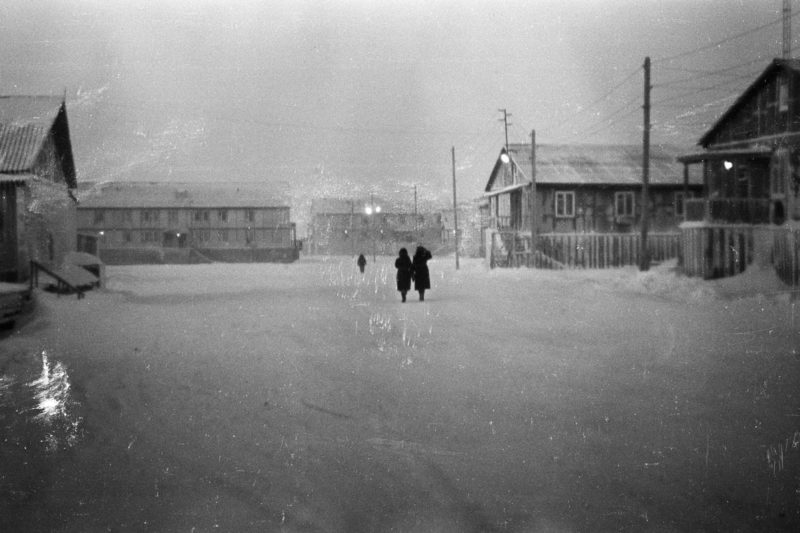
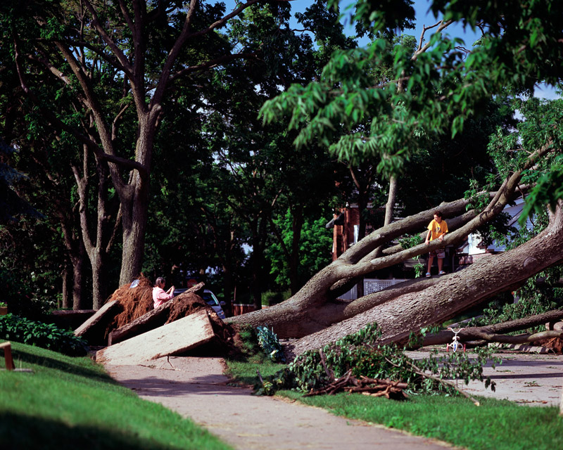
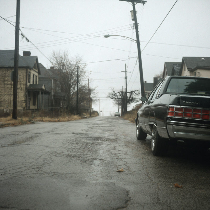
First rule–All pictures had to be taken during the middle of the day, during the summer when the days were long and there was plenty of greenery and foliage on the trees. Also, this is supposedly the ugliest time of day to shoot according to most landscape photographers, as everything becomes top lit with very severe shadows. Since this project was shot in Minnesota where there is snow on the ground for half of the year, I wanted to make sure it could look as hot and bright as possible.

Second–I was going to shoot all the pictures using Fuji Velvia slide film, the number one film for shooting beautifully colored (some may say oversaturated) landscapes.

Third–All pictures were going to be shot with a telephoto lens with very shallow depth of field to really push the voyeuristic look to the max. I wanted a forced perspective that would directly contrast against the interiors’ exaggerated use of three-dimensional space. The idea was that the interiors would represent the vast internal space of the human psyche, and the exteriors would be this flat, unexplored space where people are inhibited from expressing themselves.

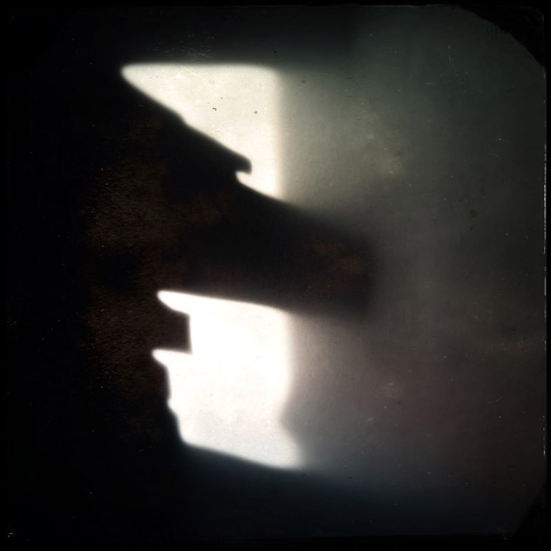
Fourth–There would be no people (preferably). I wanted to create incredibly beautiful images that were full of light but also shadow and darkness, reminiscent of film noir and horror films, but also like children’s fairy tales with just a little bit of Thomas Kinkade thrown in. These would be the habitats, the nests, the homes as they were found in the natural world.

I set out to photograph them like a nature photographer, always from afar, zooming in on a small piece while always being conscious of the third-person perspective used so effectively in the horror movies from my childhood. My intention was not for me to be the voyeur, but to create a perspective that becomes the viewer’s entrance to the work. It’s not neutral, it’s purposefully directed.

This was also about the time that Aperture re-released Robert Adams seminal “Summer Nights Walking,” which was incredibly influential to me, as I am sure it has been for many photographers throughout the years . This book was important to me not just for the pictures but for how I imagined Robert Adams making the work, wondering the streets at night, a camera and a tripod, finding beauty on the fringes of a city, looking for that intersection between the natural world and man’s increasingly dominant domain over the land. I found myself fantasizing about making similar images, but I knew I wanted to do it under the harsh light of day.

Also quite important was the fact that I was going to be a stay at home parent with our son Desmond. So I had to find a way to work that wasn’t as demanding as the portraits were to produce. Desmond spent all of his naps that first summer either being pushed in a stroller or in his car seat, while I walked or drove, looking for locations and dwellings to photograph. When I did come across a scene that interested me, I would first use my digital point-and-shoot wrapped around my neck (that made me look like a dorky dad ) and shoot a few test pictures to see how a picture might look shot on film. If it was interesting, I parked the car or put the brake on the stroller, and pulled out my Mamiya RZ67 and took a few pictures before drawing too much attention to myself. The RZ67 was not inconspicuous in the least, and it made me feel as though I was pointing a bazooka at someones house.

Needless to say, some people wondered what I was up to. It’s funny, but even with all the pictures of nude people in my work I always felt the most uncomfortable, nervous, and even guilty, while I was photographing people’s homes during the middle of the day and always from a public vantage. I guess I felt as though the house was the most vulnerable and couldn’t speak for itself.

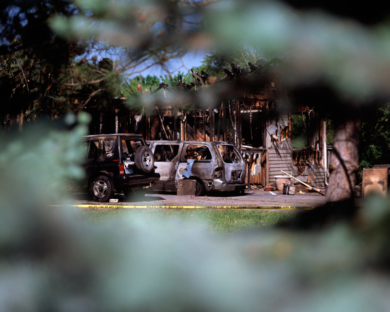
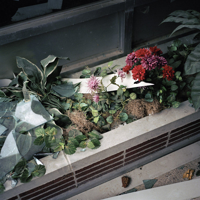
It’s not just the homes that are important to my landscapes, but it’s also about the trees and plants that surround the homes. These trees in many cases have been in their location longer than the homes, and they represent an element of time and a link to the natural world. The homes are being obliterated by the lens, by fire or they are being taken over by nature and shadow. There is an element of danger, law of the jungle, combined with animal instincts, survival of the fittest and survival of the species. The house is also used as a symbol for the body, fragile and at mercy to its environment.

JC: With many photographs depicting sex or its “aftermath” (someone having a baby etc.) I’m wondering how you navigate this area. Given the times and culture we live in artists get typecast so easily. Is this a worry for you?

JQ: To be typecast I think I would have to only make work of one subject or another. At least for me the work represents a vast exploration of the themes and emotions that are possible within the domestic life. This is also one of the reasons that I spent so much time focusing on bringing in the landscape to the project. Not only does it provide a setting for my story, but it also gives some of the more intimate pictures some breathing room, a place for the viewer to be able to rest before moving on.

I have shown some of this work before, and I felt that the work was often reduced to the most “sexual” or “sensational” pictures, which saddened me and made me pull back and reevaluate how I wanted the work to be received as a whole.

It was important for me to incorporate as many facets of sexuality as possible. Not just sex itself, but how sexuality shapes us today and how we incorporate what it means to be feminine and masculine. I wanted to play with sexuality throughout the project so that the viewer has a chance to address their own ideas of sexuality.

Today, we are bombarded by violence in the media, on the TV, in movies, video games. Sex, if shown, is always over-sensationalized to be titillating or bearing guilt. Hence the title “A Shameless Longing” which means to bear no guilt, to have no shame, like an animal, to be natural. It’s also a play on words in that today “shameless” has also come to mean a person who has no shame, i.e. someone who is willing to do anything for fame and money.

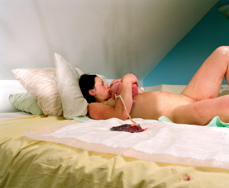
It would be difficult to have a project about sexuality and not incorporate birth and its implications to the overall narrative. As a photographer I totally lucked out knowing that my wife Susan and I were planning on having a home-birth with our son Desmond. I was given an opportunity to show birth in a home environment and what that could look like, and how to some it might seem incredibly grotesque. Contrary to what society views as normal, birth isn’t that complicated. It’s something incredibly personal but natural and something that can be done in your own personal space. Again, it’s accepting what the body does naturally and trusting those ingrained primitive instincts.

My only real worry is that people will not see the work the way I intend for it to be seen. I want the work to be able to reach as many different types of people, not just the ”in the know” art world, and to impact people equally. I imagine a large dark space (like a theater), where there is a film that has been chopped up into its many parts, each illuminated, floating in the darkness. The viewer enters this world that I have created, suspending any disbelief and feeling their way through it. This is how I have imagined the showing of “A Shameless Longing.”

Review: An Atlas of War and Tourism in the Caucasus by the Sochi Project

Article main image
The Sochi Project

The Sochi Winter Olympics are upon us. Depending on where you’re coming from, there are all kinds of problems with these Olympics, such as (in random order) unfinished facilities that inconvenience journalists, a massive amount of corruption leading up to the Olympics, the general political climate in Russia, or the fact that Sochi is a short car ride from the tinderbox known as the Caucasus. In reality, these problems are all interrelated. Their individual relevance might vary. The fact that your tap water in Sochi is yellow might have something to do with corruption (if people in West Virginia can’t drink their water for days, what does that tell us?). And Putin’s rise to fame and glory is tied to some, but not all, of the various wars that have erupted near Sochi over the past decades (enjoy this gallery of his athletic achievements if you haven’t seen it already).

But it’s not unlikely that any of these topics might be part of the news while the Games are ongoing, and it is likely they will be quickly forgotten afterwards. Or at least that would be the case if photographer Rob Hornstra and writer Arnold van Bruggen (The Sochi Project) had not spent the past few years in the region, documenting many of its often bewildering aspects. Regular visitors of this site will be familiar with this work – in the book review archives, for example, most of the various Sochi Project publications can be found.

What if you’re not so familiar with The Sochi Project? What if you are looking for a broader overview of the work? In that case, An Atlas of War and Tourism in the Caucasus might appeal to you. In a nutshell, the book provides a full overview of years of work, touching upon each of the individual aspects of the project that previously were covered in much more detail in book form.

If you already own each of these earlier books, the book is unlikely to provide you with a lot of new insight, other than making it obvious how things tie together (there also is a “making of” section, with a lot of previously unseen footage and text around the duo’s travels in the Caucasus). If you’re unfamiliar with The Sochi Project, here’s your chance to see what they have been doing, to see why holding the Winter Olympics in a place like Sochi is such a tremendously bad idea.

Just like any of the previous Sochi Project publications, An Atlas of War and Tourism in the Caucasus combines photography with writing and very smart design to create an attractive package. The material is not always easy to digest (after all these years, I still can’t distinguish between all the different ethnic groups, even though I’ve read all the earlier books). The book doesn’t shy away from diving into what is complicated, and the design truly helps enhancing the material (this includes the treatment of the type, the paper choices, etc.). It follows The Sochi Project’s well known paths, using the same design team, a very smart choice. Thankfully, Aperture, a rather conservative publisher with a tendency to produce mostly very safe books, shied away from interfering.

As an object, An Atlas of War and Tourism in the Caucasus finds itself in an unusual spot. With its lavish production and relatively high price point, the book’s audience will include those who have enough disposable income available. What this will do for the book is hard to predict. The retail price is entirely appropriate, given the size and production value. But it is still $80 (the Amazon price is lower, of course), and that puts the book more into a territory that is beyond what people might want to (or can) spend on a photobook. In other words, less might have been a bit more.

But then again, the book is such a wonderful object, containing content that will remain relevant for many years. If anything, An Atlas of War and Tourism in the Caucasus demonstrates what the medium photobook is capable of, when it is used by people like Rob Hornstra and Arnold van Bruggen: An in-depth exploration of something large parts of the media have started to discover only maybe four weeks ago. Documentary storytelling using photographs and text is very much alive and well; and even a topic as complex as the Caucasus – tied in with the larger history of Tsarist Russia, the Soviet Union, and now Russia – can be given the attention it deserves without relying on oversimplifications.

In many ways, An Atlas of War and Tourism in the Caucasus is The Sochi Project’s crowning achievement (even though if my house caught on fire I’d save The Secret History of Khava Gaisanova first); and it deserves to be seen – and admired – widely.

Highly recommended.

An Atlas of War and Tourism in the Caucasus; photography by Rob Hornstra; writing by Arnold van Bruggen; 412 pages; Aperture; 2013

Rating: Photography 4, Book Concept 4, Edit 4, Production 5 – Overall 4.3

A few thoughts on Dan Wetmore’s Heartland

Article main image
Dan Wetmore

Heartland really is just the working title of the project, Dan Wetmore told me. Well, OK. I’ll admit I like Heartland.  English is my second language, and I’ve never been able to shake the various mental images I associate with the word Heartland. It strikes me as this strangely irrational word, somewhere along the lines of the German word Heimat (even though it means something somewhat different). What unites Heimat and Heartland is that they’re both in principle fairly innocent words based on diffuse feelings that often are used by people with a somewhat dubious agenda. And that agenda then sticks, whether you want it to or not.

I don’t live in what Americans consider the Heartland. I live where – supposedly – everything that is so central to the Heartland’s core values is being ignored. Where I live that’s not the real America, at least for many of those living in the Heartland (especially those with that agenda). As someone who wasn’t born here, I can see where that idea is coming from. But once you remove the agenda, it literally makes no sense any longer. Needless to say, that’s probably in part because I’m German, and we Germans love taking things at face value.

Heartland seems to center on what’s real. What’s the real America? Well, I can tell you what the real America is. Take an atlas, open it where it says “North America,” and that vast stretch of land between where it says “Canada” and “Mexico” – that’s the real America.

It might be better to say that Heartland centers on what is genuine. As in the case of the word Heimat, that brings us a little closer to what we’re dealing with. The word “genuine” invokes more feelings, more irrationality, than the word “real” (even though there are enough occasions where one can mean the other).  Maybe we need to be even more precise and say that the word Heartland centers on what people want to be genuine. Given that people can rarely agree on what they want, and given people can have very different ideas what’s genuine, this seems pretty apt.

Needless to say, defining a word in such a way that it means different things to different people is usually not a good idea. But there you got your Heartland. Or Heimat.

So Heartland – just like Heimat – has more in common with a myth than with an actual place, the kind of underlying myth without which you can’t have a nation. You can’t have a nation if there is no core idea of what the nation is centered on, even if in reality there might be no place where that idea is perfectly realized. What makes so many countries so interesting is exactly the fact that the core myth is a bit hollow. That little (or maybe not so little) void there – that’s what creates so much life! Go to a country where the core myth is solid, and get ready for a very strange, a very stifling experience!

As an artist, you have no obligation to the truth (writing this, I cherry-picked ideas around Heartland, didn’t I?). Photographers often have a very hard time dealing with that. Is not what is in front of the camera the truth? Well, yes and no. In some – rare – cases more yes than no. But usually more no than yes. And regardless, the truth is what you want it to be, even if what you do is to make pictures with some sort of machine.

I like how this all comes together in Heartland, Wetmore’s project (remember, this is just a working title). I don’t know whether Heartland shows the Heartland. And I don’t even care. What I really care about is to see what someone makes of this idea, what kind of truth – not the truth, just a truth – is being presented to me. Heartland alludes to the various ideas around the word itself, just as it presents a view of what Wetmore takes it to be. It’s specific in a particular sense, just as it is a bit vague. There are pointers to the things we expect to see, and there are photographs that undermine our ideas.

At the end of the day, I don’t know whether I’m any closer to understanding what Heartland might be. But I’m much closer to realizing what the feelings around Heartland for this one particular person are; and from the one I can then hope to get to the many.