Review: Almost by Guy Archard

Article main image
Guy Archard

I never envy the people who have to write the press texts for exhibitions or books. Take, for example, Guy Archard‘s Almost. What can you possibly write about that? Here’s what the publisher came up with. The book is, we’re told, “an enigmatic exploration of beauty and decay both in the physical and metaphysical form. Abstracted images take the viewer on a poetic meander through relationships with loved ones past and present, accompanied by pondering day-dream fixations on everyday objects.” Umm, OK.

But I don’t want to make fun of this, because there is some photography that is difficult to write about, especially when you need a quick blurb so someone might develop the urge to buy a book, and Archard’s photography falls into that realm. With some photography being so difficult to write about, there also is photography that doesn’t really work so well online. To be honest, if I had found the photographs or pictures of the book online somewhere I am not sure I would have bought the book. Instead, I came across the book at the Unseen book market, perusing the various stands for the umpteenth time.

I had been stung with photobook-related excess-weight luggage fees at the airport before, so my plan that day was to look, but not to buy. That didn’t work out so well. I first bought a book that currently only exists in the form of two copies (this required considerable finagling on my part, something which I am usually not the biggest fan of), and then I came across Almost. I picked it up from the table – its unassuming cover had me ignore the book previously, I started leafing through it – backwards, as I always do when browsing, and I realized I needed to buy this book.

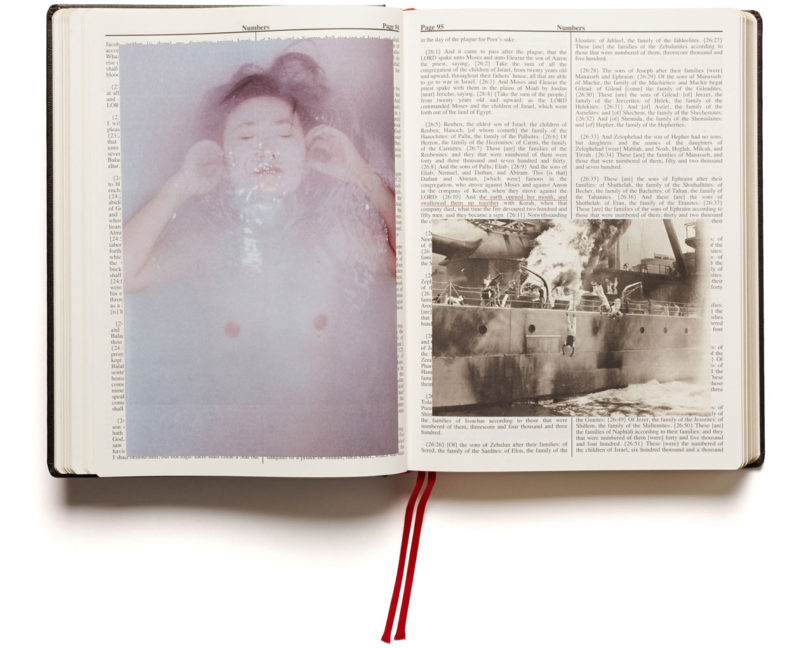
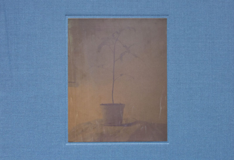
Even if one is dealing with photobooks on a daily basis, it’s often easy to forget that they’re not just collections of pictures. And they’re not albums, either. Instead, they are – or at least should be – carefully considered objects, in which the quality of the photographs and their edit and sequence, live in harmony with the overall layout/design, and the production (the type of paper and cover etc). If you don’t believe me, go, take your favourite photobook, cut out the pictures (and just the pictures), reshuffle them on a table, and see whether you still have the same thing.

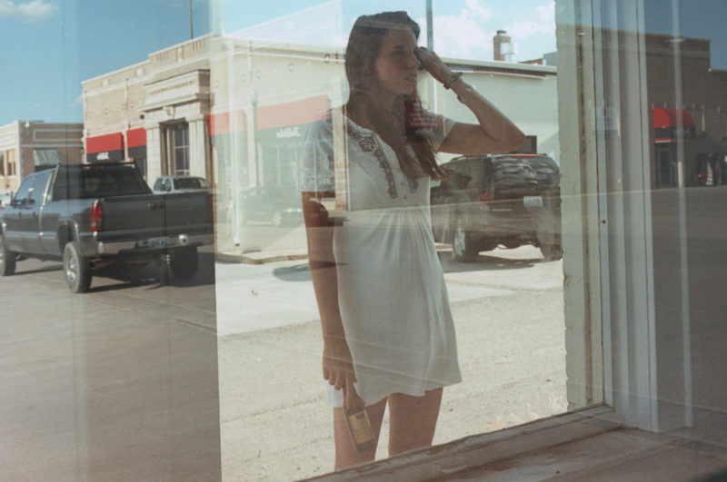
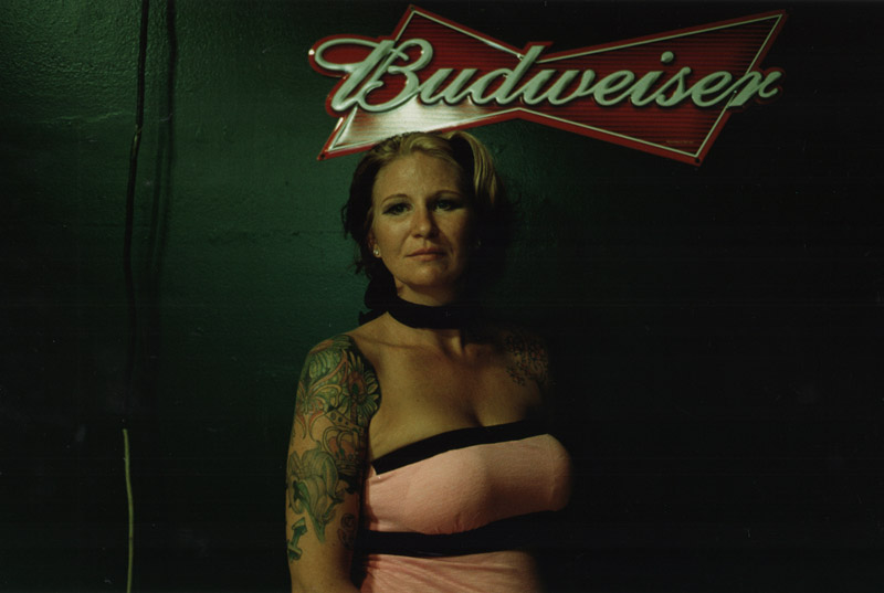
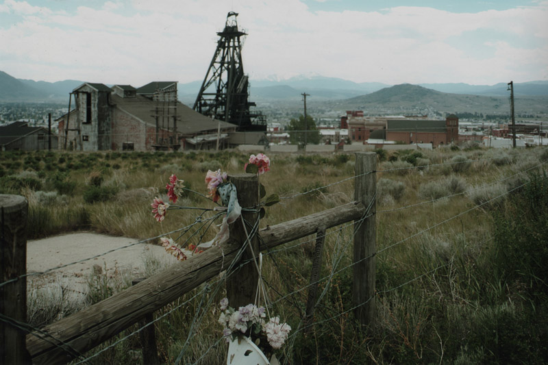
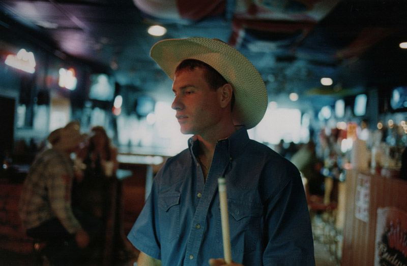
The relative weight of the different factors involved in a photobook can vary considerably, though. You don’t necessarily need great photographs if you have a strong concept, and if all the rest is very convincing. A lot of the images in Almost aren’t great pictures. Some are, but others fall way short. But this doesn’t matter for the book, because as the sum of a carefully considered whole they all are elevated into something bigger, where “bigger” doesn’t quite feel like the right word. There’s nothing big in any sense of the word about the book.

Instead, imagine yourself perfectly at ease and relaxed, watching a piece of light fabric sway in the breeze of a warm, pleasant, sunny day. That is the feeling created (or should I say “transported”?) by Almost. That’s why you’re not going to get this on the web: It would be like watching a video of such fabric swaying as opposed to experiencing the same thing. Here we then have one of those things too easily forgotten, too conveniently ignored by those who mistaken a mostly digital life style, glued to iThis or iThat, for a life fully lived: There is quite a bit more out there. But for you to experience it, you need to shut the damn things off first and be open to that which consists of more than just zeros and ones.

Almost; photographs by Guy Archard and Graham Archard; 48 pages; Bemojake; 2013

Reminder: Conscientious Portfolio Competition 2013

Article main image
Hye-Ryoung Min

The deadline for this year’s Conscientious Portfolio Competition is approaching rapidly. If you have thought about submitting work, yet have not done so, now is the time!

The Conscientious Portfolio Competition is free to enter. There are no costs involved for you other than the time it takes to decide about and send in your work. There are two guest judges joining me to determine the winner(s), Alice Rose George and Ann-Christin Bertrand.

The competition happens in two stages. The first stage – where we are now – is the submission stage. Photographers are asked to send in their application via email in the following form:
name
email address
website URL (a proper website: no Flickr, no blogs/Tumblrs)
name of the portfolio/body of work (please do not forget this part – surprisingly often, photographers forget to mention which project they’re submitting)
Send your email to review at jmcolberg.com (you’ll have to replace the “at” with @ and remove the spaces for this to work, of course), subject line “CPC 2013”. One submission per photographer. Please do not submit images or pdfs directly by appending them to the email.

The deadline in 31 October 2013, 11:59pm ET.

From the pool of submissions, 25 candidates will be picked for the second round. The photographers in this pool will receive an email, and they will have to send in ten jpeg images, in a uniform format (size etc.).

This is where Alice and Ann-Christin will come in. They will each pick their personal favourite from the pool of 25. I will pick one, too. Here’s the twist: There will be three or two winners, or maybe just one, if a photographer is picked more than once.

Having a second round is based on the idea of making everything as equal as possible. With uniform file sizes, fancy websites won’t be able to beat out simple ones. With a special naming convention for the jpegs (which will hide the full names), the winner will be solely chosen based on the quality of the work.

The winner(s) of the competition will have their work featured on this website, in the form of an extended conversation.

Good luck!

Review: Color by John Rohrbach

Article main image

Sometimes, you just got to wonder what the history of fine-art photography would look like if its practitioners and theorists were just a tad less dogmatic and more open to what the non-art part of photography had and still has to offer. It is understandable that art photographers in the late 19th Century wanted to have something that looked like art, so they came up with pictorialism (you can still find this very same sentiment behind a lot of the toy-camera movement today). But then that’s a curious idea of what art is about, isn’t it? And it does seem to speak much more of a deep-seated lack of confidence in one’s own abilities, if one feels the need to set yourself apart from something else that’s “too commercial” or whatever other criteria were and still are being used. Oh, the horrors of advertizing photography!

Where pictorialism didn’t really cause any other harm than, possibly, viewers feeling there was a bit too much photo syrup involved, at other times art photography’s obstinance in the face of perceived threats from the unwashed masses and their photography has led to less than what could have been. The history of colour photography provides a prime example. For the longest time, large parts of the art world rejected colour photography for reasons that, frankly, are too inane to repeat here. Finally, in 1976, MoMA, then the widely accepted arbiter of art photography, embraced colour photography in the form of William Eggleston, while still noting, in the press release, that the “new generation” Eggleston belonged to, were different than the photographers before them “whose color work has either been formless or too pretty”: “In their work the role of color is more than simply descriptive or decorative”.

There have been many attempts to set the record straight over the past few years, looking at and/or discovering many of those artists whose work was deemed “formless or too pretty” by John Szarkowski et al. John Rohrbach’s Color, the catalog of an exhibition at the Amon Carter Museum of American Art, provides a deep study of the evolution of colour photography in the United States. Those tempted to gripe about the omission of non-US work might find solace in the fact that seeing the breadth and quality of colour photography in the United States alone makes its omission from the art-photography canon for such a long time look foolish enough. In addition, focusing on the US offers a focus that adds depth. In contrast, aiming for completeness in a global survey could have easily diluted the scope (and this ignores the various other challenges such an approach might have produced).

In four major chapters, the book explores the development of color photography from the earliest days until today (there’s another short chapter that focuses entirely on its technical aspects – certainly a must read for anyone seriously interested in photography). Each chapter comes with a large number of example images, both smaller ones next to the text itself and a block of larger plates. The reproduction quality of the photographs in the book is very, very good, resulting in quite a few of discoveries and re-discoveries of photographers. Rohrbach goes into considerable detail discussing photographer’s reactions to or theories of colour photography.

Its photohistorical aspects aside, I think Color can serve two additional purposes. First, as I already mentioned there are discoveries and re-discoveries to be made (I’m tempted to think some re-assessments of famous work might also be a good idea). But there also is a lesson here. In the arts, sticking to dogma and rigid ideas hardly ever makes a lot of sense, certainly not in the long term.

We might find it easy to shake our heads about the dismissal of colour photography in the past. But isn’t there just as much misguided dogma today? How about the idea that there’s a flood of photographs, which, as some artists claim, makes one wonder why to take photographs at all? Isn’t that just the same idea that brought us pictorialism or a rejection of colour – the idea that somehow, artists must fight against what dilutes their oh-so precious endeavour? What if we all just stopped worrying about dogmas and started making pictures, and, crucially, appreciating all pictures? Maybe then nobody will have to write a book like Color in thirty or forty years, making future reviewers wonder what we were possibly be thinking when we worried ourselves sick over “too many pictures.”

Color: American Photography Transformed; written by John Rohrbach, with an essay by Sylvie Penichon; 344 pages; University of Texas Press; 2013

The Sochi Project and the Future of Storytelling

Article main image

Over the past few years, I’ve written extensively about The Sochi Project, a multi-year effort by photographer Rob Hornstra and writer Arnold van Bruggen to report on the area around the city chosen for the 2014 Winter Olympics, the Caucasus, easily one of the most volatile and violent regions on this planet. Gearing up for the Olympics, Hornstra and Van Bruggen finished their work, working on the final book, which is due to be released in November 2013 (it might be time to give a shout-out to Jeroen Kummer and Arthur Herrman, who behind the scenes have shaped the visuals of The Sochi Project). In parallel, Russian authorities refused to grant the duo further journalistic visa, a move hardly surprising for those who are familiar with Russia under the autocratic leadership of  Vladimir Putin. There is indeed much to be hidden around the 2014 Winter Olympics (see, for example, this article).

The Sochi Project is often referred to as using slow journalism. Having made countless trips to Sochi and the Caucasus over the course of years, Hornstra and Van Bruggen have assembled material of impressive depth about the region and the many, many problems plaguing it. But there is another aspect of their work that is often overlooked and that deserves a lot more attention: The Sochi Project have embraced a large variety of ways to disseminate and/or present their work. There are the photobooks, many (most?) of them I reviewed on this site. These books themselves separate into the more journalistic ones – heavy on text and background, and the more arty or playful ones, where photographs dominate.

The Secret History of Khava Gaisanova, easily one of the very best photobooks published in 2013 (see my review here), and Sochi Singers (reviewed here) present very different aspects of Sochi and the region around it. They are aimed at somewhat different audiences. There is considerable overlap of those audiences. Yet at the same time, someone more interested in more documentary types of photography might become curious about a more art-focused approach (or vice versa).

In much the same fashion, the photographs are exhibited in different ways. There are the framed glossy prints, sold by a gallery or exhibited in museum shows. But Hornstra and Van Bruggen developed exhibitions of different sizes for museums, allowing for smaller and larger spaces, and smaller and larger budgets. On top of that, there is an exhibition that comes in the form of newsprint that can simply be pasted on walls (plus, there are billboards, see this one, for example).

Some people might find it hard to believe that newsprint pasted on a wall would even be a serious form of showing work. But it is. Prepared properly, the photographs look great (I’ve seen an example). And crucially, this approach to showing the work of a few years opens up a lot of opportunities. Your little town in the middle of (seemingly) nowhere might not have a fancy or even a simple art museum or gallery. But I’m sure there’ll be a wall somewhere, and you don’t need much of  a budget, either (the newsprint posters are available as a set for 35 Euros).

Having approached the end of their project, The Sochi Project have completely revamped their website. The new version tells large parts of the story, using a state-of-the-art multimedia heavy approach: There are large images and small ones, images from the books and outtakes produced with cheap digital cameras, plus vernacular photographs. There are videos, some to click on, others running automatically. There even are links to electronic versions of the publications. And there is text, a lot of text, which presents the various aspects of the project.

There is much talk about the future of (photo)journalism and about how photographs can be used to tell stories. The Sochi Project’s approach (which, btw, also included a crowdfunding component before this became all the rage) might not suit every project in every aspect. But the large variety of approaches used by Hornstra and van Bruggen demonstrates what can be done, and what is to be gained if it’s done well.

Not every part of The Sochi Project might be everybody’s cup of tea. But that’s besides the point. The idea clearly is not to make everybody 100% happy. Instead, the idea is to reach as large a number of people as possible, in other words offering so much that many people will find something that might get them interested.

If it is a photographer’s challenge to present work cohesively and convincingly on the wall, on paper, and on the web, The Sochi Project have clearly demonstrated a landmark way of doing it – and all that embracing, but not pandering to the various technological fads of our times.

Photobook Reviews (Week 42/2013)

Article main image

Process has been making a tremendous comeback in photography. After photographers spent years trying to eliminate all the imperfections processes can entail, rejecting chance, and fighting a loss of control, the arrival of digital photography appears to have made it clear to many practitioners what you lose when you can have it all (technically speaking). Imperfections, embracing chance, living with limited amounts of control – they have a lot to offer for those willing to work with them. It would seem that the medium’s soul doesn’t translate so well into only zeros and ones.

Bryan Graf is one of the many photographers that have been making process an integral part of their work. Take Wildlife Analysis, which relies on considerable darkroom trickery to achieve its effect. The eponymous book containing the work embraces the elements of chance: “Each book, individually printed and assembled at the Conveyor studio, mirrors the meandering tone of the series in its construction. Each image […] has been scanned and, using variable algorithms, arranged into unique sequences.” (quoted from the publisher’s description) This, we are told, “suggests new interpretations in each edition and allows the intimate and unpredictable nature of the series and its subject matter to glisten in its new form.”

I don’t know whether I buy that 100%. But the publisher’s PR aside, the presentation of this often semi-abstract, if not outright abstract photography in Wildlife Analysis works very well. The key to heavily process-based work for me is always whether the work presents something other than the process. It does. The book offers an immerse experience, where it’s not quite clear what is going on. Many of the photographs appear to dissolve on the pages, right in front of one’s eyes; and the variation of whatever is done in the darkroom is wide enough to make the pictures the center of the work, not the process.

Grey Matters by Schilt Publishing is a new series of books, actually booklets. Each booklet features the work of a young photographer, with the final result selling for $20 (or the equivalent in Euros). Life After Zog and other stories by Chiara Tocci presents the photographer’s project, done in Albania from which in the early 1990s refuges had set out to look for a better home in Italy.

You might imagine (especially if you’re a photobook snob) that presenting work in booklet form – “a grey carton cahier cover with banderole” – would not do the pictures any justice. But you’d be wrong. The booklet works very well, and it forces the viewer’s attention onto the pictures, not the production of the object in hand. In a day and age when the photobook fetishism really is out of control, bringing photobooks back to what matters (the pictures) and, at the same time, making the work of young photographers more widely available are two worthwhile goals. Life After Zog and other stories provides a good example of how this can be done.

Lastly, edited by Melissa Catanese & Ed Panar, Notes from the Foundry contains work by photographers Gregory Halpern, Darin Mickey, Corine Vermuelen, Andrew Borowiec, David La Spina, Suzanna Zak, Daniel Shea, Susan Lipper, Andrew Moore, John Lehr, Nicholas Gottlund, Jacob Koestler, Ross Mantle, Zoe Strauss, Sean Stewart, and Todd Hido. Catanese and Panar did an excellent job bringing photographs from so many different artists, to create something that does not feel like a collection of disparate elements.

Instead, a portrait of the American heartland emerges, a region hit, where not ravaged, by economic uncertainties and deindustralization, yet not giving up, going on with life. Notes from the Foundry, initially somewhat unassuming because of its size and production, quickly emerges as a little treasure; and it shows what is to be gained from bringing different voice together that are telling similar stories, albeit in different ways.


Stephanie Steinkopf’s Manhattan

Article main image
Stephanie Steinkopf

In this day of iThis and iThat, we’re all kings or queens of our own domains, as much – or as little – as we might actually feel like one. This man, with his paper crown, sitting in front of a cheap plastic table on top of which there appears to be only alcohol, makes for a sad king; and he seems aware of it. This man lives in Manhattan. Manhattan here lies somewhere in Eastern Germany, in a small village around an hour’s drive from Berlin. There are two apartment blocks in the village, one shuttered; they are called Manhattan. Many parts of Eastern Germany have been hit pretty hard by reunification. iThis and iThat arrived, but jobs didn’t. Neither did the prosperity promised by former Chancellor Helmut Kohl, whose “blooming landscapes” metaphor famously has become a bitter joke for still living in areas that often share much with the American rust belt, say.

Stephanie Steinkopf spent quite a bit of time with the people in those 12 apartments still inhabited (judging from a picture of the blocks, I’m guessing there are around four or five vacant apartments for every one still in use). She knows the region well – this is where she grew up. The resulting body of work (Manhattan—Straße der Jugend) portrays those left behind when East Germany’s socialism was replaced by West Germany’s capitalism.

Of course, ideologies are simple and easy – that is why they’re ideologies in the first place. Even some of the basic facts of the systems ruled by ideologies are simple and easy. The problem usually is that those facts cannot be reconciled, even compared. East Germany offered a job and a home for everybody, and it was a hideous dictatorship. Germany offers a job for many and a home for almost everybody, and it is a stable democracy. How do you juggle these different worlds, though, when you’re one of those who had a job doesn’t have one any longer, when you grow up without a job and without much hope, hearing from your parents that it used to be different?

What makes this all so complex is that it’s so easy to just produce simple value judgments. Of course, a free democracy is vastly preferable over a dictatorship. But then, having a job is preferable over having none. And of course if you have a job, it’s easy to talk about those who don’t have one. But the reality is that some things just can’t be compared. We might be better off accepting the contradictions, instead of outright pretending we can ignore them – that then might be a good opportunity to work towards resolving them, or at least fixing what needs to be fixed, in whatever incremental ways that seem to fall so short of representing the sweeping, grandiose ideas of the ideologies.

Steinkopf is one of those socially concerned photographers who these days make one wonder whether they have come from a different, earlier time. Full of convictions and earnestness, she cannot and will not just accept “the realities” (it would be too simple to take her convictions and earnestness as something stereotypically German). Instead, she sets out with her camera to document what she feels has to be documented, because even if things might be good for many, perhaps most people, it could still be better – a lot better for some, possibly many, maybe even possibly most.

People’s belief that photography can change the world has always struck me as naive and misguided. Photographs don’t change the world. People looking at photographs and then deciding to do something have a chance to change the world, though. That little extra step makes all the difference.

What this means is that photographers still need to go out to take all those pictures. But the onus is not on the pictures, and it’s not on the photographers. It’s on us, each and every one of us, regardless of whether we take pictures or merely look at pictures. We get so see photographs like those in Manhattan, and we then make decisions about what to do (there’s a book, btw – the first two self-published editions are sold out, alas; maybe a publisher will now step in?).

As a photographer, you can thus only hope for the best. You release your pictures into the world, just like you’d throw a stone into a lake: Hoping that the ripples will move out farther and farther without just dissipating.

Petra Wittmar’s Medebach

Article main image

For Petra Wittmar‘s Medebach, the publisher uses the subtitle “a documentation of German reality,” mentioning “the apparent dreariness, despite its orderliness” of the place (which happens to be the photographer’s home town), all of it photographed “from a perspective that is as dauntless as it is distanced.” Brace yourselves, people! Before getting any deeper into this, I might as well get this out of the way first: If you look at photography to get first and foremost entertained, to get a quick and easy thrill, then it’s incredibly unlikely that Medebach is your cup of tea. It’s incredibly likely you will find these photographs “boring.”

We might as well ask what this really means: What is boring photography? I do think that there is such a thing. But it’s not tied to the visual drama in the pictures. In other words, I vehemently reject the correlation between a lack of visual drama and something being boring. Phrased alternatively, photographs with a lot of visual drama can still be incredibly boring, while the most minimalist pictures can contain large amounts of wonder (however you want to define that “wonder”).

If you look through the photographs of Medebach on Wittmar’s website, you might get an idea of what I’m talking about. Medebach seems like the kind of place very few people would want to live, let alone photograph in, a place that indeed looks perfectly dreary, if not outright dreadful. The photographer’s approach to her hometown conforms to what most non-Germans typically think of as “German photography”: Carefully organized and seemingly distanced from its subject matter, using muted colours. Everything looks really neat and really clean, even when there’s snow on the ground.

It is exactly this combination of dreariness, neatness, and the photographer’s seeming unwillingness to inject any kind of visual drama into the mix that makes Medebach work the way it does. The photographs’ compositions are carefully considered, allowing the viewer to study the images carefully, looking for traces of what might be going on here. There are no people in any of the photographs. What could the people living there be possibly up to? Keep looking, and find yourself getting more and more antsy: What’s going on here? How can people live this way?

After some careful inspection, you will find traces of individuality, little efforts to pretty up the bleak surroundings – a cut-out sign showing someone BBQing in the window of a (shuttered) butcher shop, say. But those little injections of something not quite so bleak only end up achieving the opposite effect, making Medebach even more dreadful: There just isn’t enough of them, and in any case, they only reinforce the general feeling of dreariness.

Given that so many of us live in places that have a Medebach feel to them – isn’t America’s Suburbia an even more extreme form of Medebach? – why would we want to look at pictures of them, when all we’d have to do is to look out of the window? For a start, we usually tend to not engage with the places we live in all that deeply. We do not look outside of the bubbles of our homes (in which we’re keeping ourselves entertained by TV or the internet). Furthermore, Wittmar’s Medebach is a piece of fiction, just like every body of photographs. The “real” Medebach must have people living in it, people that actually can be encountered in the streets, and I’m sure there are periods of sunshine as well.

If you don’t like the term “fiction,” then maybe the term “amplification” might be acceptable. As a photographic artist, you pluck certain notes from the world, and you then let those notes work together, to create your own sound. If Alec Soth is the photography equivalent of Neil Young (as I suggested last year), then for Petra Wittmar I’d pick Boards of Canada (listen to an example here). Just like music, photography needs to be engaged with, with the viewer accepting its terms at least for a little while. Medebach unfolds itself slowly at first; but once it does, it projects tremendous power.

Medebach; photographs by Petra Wittmar; incl. a conversation with Gabriele Conrath-Scholl; 144 pages; Hatje Cantz; 2013

Tim Richmond in the American West

Article main image
Tim Richmond

After Richard Avedon published In The American West, John Szarkowski declared “Avedon’s West is not the West as I know it.” (for more details about this body of work’s reception see Avedon at Work: In the American West) It was as if the famous curator had completely forgotten some of his own most essential lessons of photography, finding himself completely under the spell of the West. The West is a place that works well as a big canvas onto which to project one’s own ideas, just as it is a reflection of our own perceptions.

Needless to say, what makes Avedon’s work so good is exactly that it’s Avedon’s West and nobody else’s. The mythical West is a horribly trite place. The West as created or re-created by someone with a vision, however, usually is anything but. And the real West… Well, there is no such thing. The place is so loaded with myths and stereotypes and ideas and ideology that, geographically huge as it may be, there is no real West. There only is what you decide to make of it.

Tim Richmond‘s American West – depicted in Last Best Hiding Place – can be placed anywhere onto the continuum that has the myth at one end and the artist’s unique vision at the other end. It’s a place filled with characters and locations that manage to be specific and completely generic at the same time, with a rough, somewhat hurt, tenderness underneath. I can’t help but think that the photographer is very much aware of what he is taking pictures of, given there appears to be a balancing act at play: Every stereotype is depicted, to be subverted right away or elsewhere. There are cowboys, sure, but they have baby faces underneath their stubble.

Richmond’s West ends up throwing stereotypes and preconceived ideas back at us, reminding us that what we’d like to think of as real is really of our own choosing. What we find is what we’re looking for. Here, photography comes full circle, because it is always at least that: A quest for that, which we already know. And as long as we’re not deluding ourselves into thinking there’s more, we’re in good shape.

I’ve written many times that photography really only excels when it’s being done with its own limitations in mind. These limitations arise from the technical nature of the medium in more ways than one. The properties of the camera have as much to do with it as the fact that a photographer is pointing the camera into some direction, at something in the world.

A long time ago, photographers were able to point their cameras at the world, a world not weighed down by preconceived ideas and earlier photographs. Now, when you point your camera at the world, you’re really pointing it more at all those images in our minds than at the world itself.

The secret then is to make this work, to produce photographs that can still stand on their own, while acknowledging all the ones that came before them. Tim Richmond‘s Last Best Hiding Place does just that, and it does it well.

Adam Broomberg & Oliver Chanarin: Holy Bible

Article main image
Adam Broomberg & Oliver Chanarin

Adam Broomberg and Oliver Chanarin are everywhere these days. Having just won the prestigious Deutsche Börse Photography Prize, they’re also included in MoMA’s 2013 New Photography, and Holy Bible finds itself on the 2013 Paris Photo–Aperture Foundation PhotoBook Awards Shortlist. In a day and age where even the relatively small world of art photography has become very highly fragmented, this has got to mean something. I’d be very happy to argue that whatever you might think of these artists’ approach to photography and photobook-making, what they’re doing, they’re doing very, very well.

Without wanting to spend too much time on this point, it might be worthwhile to realize that when assessing artistic merit there is quite a bit to be gained from not being overly guided by one’s own preferences. Having said that, I have been following Broomberg and Chanarin for quite a while now, and I am always looking forward to a new body of work. I am very much interested in the use of photographs, and I am interested in investigating the political power images have or how power is created when images are being used. What distinguishes Broomberg and Chanarin from many (if not most) other artists working in this vein is the high quality of their output, regardless of whether that quality then translates into artistic merit (which is, of course, entirely subjective – unless we wait one hundred years, in which case we could take what is still being looked at as that, which has the highest merit).

It might seem weird to preface a photobook review the way I just did. But I do think it’s important for me to state where I’m actually coming from. What is more, we have come to embrace the idea that an artist should be measured by previous bodies of work – an approach that creates all kinds of problems (unless an artist wants to literally repeat what s/he has been doing ad infinitum, the art world’s surprisingly popular version of Nietzsche’s concept of the eternal recurrence of the same). If an artist’s later project is not the same as some earlier one, then we should judge it on its own artistic merits and not on whether it looks like the previous – or a very famous earlier – one.

Holy Bible follows in the foot steps of War Primer 2, which had resulted in the Deutsche Börse nomination and eventual win (see my interview with the artists to learn more about their ideas). I’ll admit I wasn’t quite sure what to make of the idea. It sounded just a tad too simple. You take the Bible and put pictures inside? My worries were cast aside very quickly once the actual book arrived. It does indeed look and feel (and even smell) like a Bible. All details are perfect, including the rounded edges, the two bookmark strings, etc. Inside, you get the Bible, with photographs/images selected from the Archive of Modern Conflict superimposed. As you can see in the image at the top, in addition certain, usually short, passages of the text are underlined, thus creating an anchor between text and images. There is no simple on-to-one correspondence between image(s) and text – occasionally, one image is referred to by more than one text fragment. Some spreads have one image, some two, and there even is a short set of pages (in Leviticus) with marked text but without images. It was this passage that fully convinced me of what the artists are doing here.

It’s very tempting to dismiss Holy Bible as, well, an overly provocative piece of art. In much the same fashion, it’s equally tempting to focus on the large number of violent images in the book. But those images refer to the text – so if you find the images too violent, does that say something about the artists matching images to text? What is more, Holy Bible is not merely filled with violent images. Instead, there are references to family and the relationship between the sexes, say, and to a large variety of cultural issues.

On top of that, there are many photographs of magicians (or circus acts) linked to “it came to pass.” Those images are just amazing, given how they subversive they are in their utter ridiculous playfulness. In fact, the magicians are much more subversive than the violent images linked to violent text. Here we have Broomberg and Chanarin asking whether power, religious or political, isn’t essentially just an act of trickery, a trickery that requires considerable skill and, crucially, the audience’s willingness to ignore the knowledge that it’s just trickery, not real magic.

Highly recommended.

Holy Bible; image selections by Adam Broomberg & Oliver Chanarin; essay by Adi Ophir; 768 pages; MACK; 2013