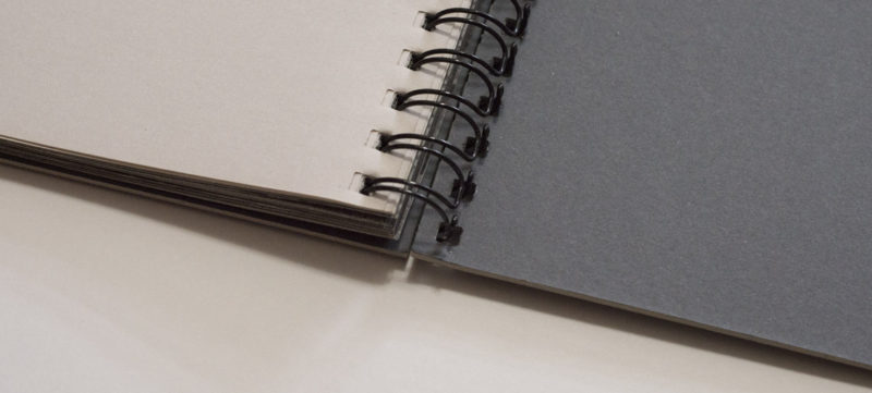
I want to continue my discussion of unusual binding choices by looking at the spiral. Spiral (or coil) binding a photobook might sound like a very strange approach: whatever you do, it tends to look cheap. Then again, for example Brassaï’s 1933 Nuits de Paris was bound this way, so it can’t be all that bad. But yes, spiral binding looks cheap, and you’ll have to work your way around that fact — or make good use of it.
If you’ve read Understanding Photobooks you will know that I consider producing physical dummies as one of the most important parts when making a photobook. Enters the spiral, or rather a cheap spiral-bound notebook: your first dummy could simply be such a notebook with prints pasted in with removable double-sided tape. Cost issues aside, you can add plenty of extra pictures to such a notebook without it bulging. What is more, you can tear out pages easily and even re-add such pages at different locations. None of that might be aesthetically too pleasing, but at the very early stages of editing and sequencing a photobook, the idea really shouldn’t be to make something pretty. You want to make something that works in a convenient and simple manner.
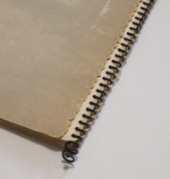

The spiral also provides a good and again cheap way to make a more advanced dummy. Let’s say you printed all the pages on your inkjet printer. Getting them bound can be a bit of a kerfuffle, unless you know how to bind books yourself. But you could also simply print out all the pages and take them to your local copy shop. They will be able to spiral bind the pages to produce your dummy, and it will cost you very little. That’s great. You might not want your final book to be spiral bound, but your dummy will look and feel very much like a real book.
What’s more, if you want to use different paper stocks in your book, the spiral is perfect again. You can stack as many different types of pages as you want, in as wacky and order as you like, and you’ll get your book. In fact, any type of binding that operates along the line of the spiral will do that for you. But especially if you printed your dummy on the typically heavier inkjet paper, the spiral looks like the perfect match. Producing a perfect bound book (which is also very cheap) would severely limit the overall ease with which you could look at your book. In the most extreme case (which I’ve seen) you’ll have a hard time opening your dummy.
Now, those heavier inkjet paper stocks also fulfill one of those crucial criteria for a spiral-bound book. Just like in the case of the accordion book, the binging puts a physical strain on the pages. For your notebook dummy maybe you’re glad that you can rip out pages easily. But you don’t want that for your advanced dummy or your actual photobook. So when using spiral binding, you have to very carefully think about the type of paper(s) used: if it’s too thin (light), the risk of tearing will increase a lot.
There are two other aspects of the spiral that you will also want to take into consideration before committing to it. A spiral-bound book has no spine you can print on. All you get is the metal or plastic spiral. If you want a printed spine, you’ll have to produce a solution (which is possible). If you don’t care, that’s OK, too: you won’t be able to read the photographer and title of the book once it’s filed on a book shelf. But how many spiral-bound photobooks are there? So maybe that’s OK.
Second, the presence of the spiral creates quite a drastic gutter. The most likely way any spread will appear is its two parts (pages) not touching. This depends a bit on the size of your spiral. You could pick a slim spiral (which will limit your overall page count), so a very attentive viewer could make sure the pages touch. I’ve tried doing that, and it’s a major kerfuffle: honestly, nobody is going to bother doing that. So in a spread, there likely is a small gap between the two pages.
If you want to work across the gutter, especially with photographs, you really need to think very carefully about it. With plenty of people already complaining about pictures going across Smyth-sewn gutters, you’re going to limit the appeal of your book. But you will never be able to produce a book that makes everybody happy, so maybe this is not such a big deal. I personally don’t care much about the problem at hand here: for me the spiral cutting through a picture adds an element of disruption that can work very well.
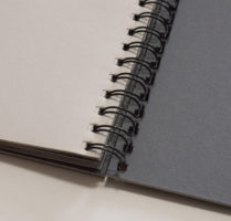
One last comment about this type of binding. Strictly speaking, I’m a bit sloppy with the use of “spiral” here. If you wanted to be very precise, you’d have to talk of spiral/coil binding and double-loop-wire binding. The technical differences are explained here. But they’re simple to tell apart. In a nutshell, for spiral/coil you’ll see a single spiral holding the book together, and the material could be either plastic or metal. As the name indicates, the double-loop wire uses metal, and there are two loops going through each of the holes (see top image). The double loop looks a little bit nicer (I think), but it comes at the expense of the book being a tad less flexible. In addition, it allows for pages to possibly escape, something that’s impossible for the single spiral (unless the page gets torn out).
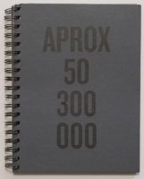
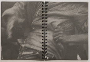
In Understanding Photobooks I discuss Irina Rozovsky‘s Island on My Mind as an example of a spiral-bound book. I’m going to look at a others here. Felipe Abreu‘s APROX 50 300 000 is a very good example of using a spiral to amplify the roughness of the binding. There is a strong sense of violence going through its images, all of them appropriated news images centering on the migrant/refugee crisis.
Through its construction, spiral-bound books tend to be a bit flexible, but this flexibility here is kept in check through the use of quite heavy and coarse-looking card stock for the covers. That cover is particularly important, given that the pages themselves are quite thin newsprint-style pouch pages. I mentioned above that the use of thin paper poses a risk, given that it might tear easily. The doubling up resulting from the pouch pages helps against that as does the double spiral (which distributes the forces on the insides of the binding holes onto two spots). At the same time, the size of the double spiral in combination with the overall number of pages by construction forces pairs of pages to be very close to each other (see pictures). The way this ends up happening is quite nifty, in particular since often, photographs cross the gutter.

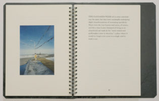

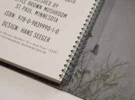
So these choices come together very well here. The book remains quite tight, with the spiral binding clearly escaping from the terrain of precious photobook that would be very much at odds with the subject matter. You could contrast this with House of Coates by Brad Zellar and Alec Soth. The book combines Zellar’s writing with Soth’s photographs, taken with disposable cameras.
What I find interesting is how the form of the book tries to have it both ways: it intends to look and feel less like your run-of-the-mill precious photobook, but at the same time it also doesn’t run away from that completely. While APROX 50 300 000 clearly wants to look and feel rough, Coates’ roughness is more along the lines of a pair of new jeans that come like they’ve already been worn for ages. For example, the book uses a wrap-around cover, so when it’s closed it features a spiral along with a front, back, and spine. The cover material feels coarse to the touch, but it also provides ample support.
So House of Coates basically is a well made not-so-precious photobook, which I think it fine. But I’m not necessarily convinced it couldn’t have been more simply a standard perfect-bound softcover. That issue aside, it is a very good example of how you can use the spiral to get as close to your average photobook as possible, while adding hints of a lack of preciousness.
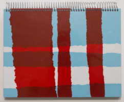
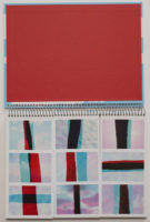
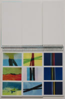
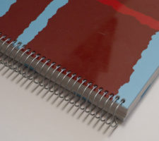
Shifting gears a little bit, there is one other very good reason for using spiral binding: when you literally want to break/cut up the pages. The maybe most obvious example for this type of book might be the kind of children’s book where the young viewer can assemble parts of separate wholes into something new, let’s say a face from a separate mouth, nose, and face. In a fairly obvious sense, this type of book isn’t really an option for 99.99 percent of all photography. But I actually do own such a book, and it doesn’t even use faces: Alejandro Marote‘s B.
What it’s about I have no idea. Honestly, I’d be much obliged if someone could translate the photographer’s ideas into plain English for me: “I head towards a place in which the two main coastal plains, the vertical line formed by the palm tree and the horizontal line of the sea, are in charge of preserving a constant geometric pulse. The Cross that is born from this encounter unveils the secrets hidden in the change of states that matter itself undergoes, thus opening a door through which we can travel from a solid reality towards the frontiers of liquid abstraction.” When I want to travel “towards the frontiers of liquid abstraction” I usually grab a bottle of Żubrówka.
Joking aside, though, in the book, the grid of nine (three by three) images can be reconfigured more or less any which way by turning the page segments individually, creating a large variety of abstract patterns. I’m tempted to think that this might actually be the most interesting application of this type of book (your mileage might vary). Allowing this level of interactivity makes for a very distinctive experience for the viewer. And it is quite a unique way to work with the New-Formalism-style source material.
Had I been involved in the making of the book, I personally probably would have gravitated towards using film pages that allow for layering. But that’s really a very obvious, and possibly too easy, solution. This particular solution here certainly is unique and engaging and it has an element of playfulness to it, especially given the materials — bright and colourful, but also (in part out of sheer necessity) a bit oversized, thus clearly evoking children’s books.
So much like the accordion (see part 1), the spiral has its uses. Unlike the accordion, a spiral probably needs to be adopted more for the aesthetic it comes with than the function it offers — unless you want to make a book like B. Whatever you want to make of the spiral as the end form for your book, it’s a great tool for making especially early dummies. As the final form for a book, I quite like the spiral, but I feel that it’s a lot easier to make a bad spiral-bound book than an accordion, say. You really want to think it through before you commit to it.
But then, you’ll have to think through your book regardless of the production choices. Maybe what makes these more unusual binding types so interesting is that as a viewer you notice them so much more. They amplify the book in certain ways, so your choices better work.
This article is the second in a series of five. You can find the other parts here: part 1, part 2, part 3, part 4, part 5
