Knowing I would write this article about collage today, I asked myself yesterday whether I had any criteria to assess what constitutes good or bad collage — or maybe successful and unsuccessful collage. I realized I didn’t. Forcing myself to come up with something, I thought of this: good collage constitutes good art, whereas bad collage is more like scrapbooking. Not that there’s anything wrong with scrapbooking, it’s just not art — it’s more like a craft. And there’s nothing wrong with craft per se, except that I’m interested in art, and while craft can be art, art does not necessarily need craft: shoddily made art can still be great, whereas shoddily made craft is just bad.
Regardless, the above isn’t taking me any closer to what constitutes good collage other than making it obvious that given I’m interested in art, criteria used there might be of value here. The making aspect thus should only play a minor (if any) role in determining what’s good or bad collage. But now that I’ve already alienated the craft crowd I might as well do the same with another one and say that collage ought to be more than merely very old-school graphic design. Not that there’s anything wrong with graphic design, either (I’ll spare you going into that rabbit hole).

But I think that’s good: I personally want collage to be neither just crafty (even though it could be) and not just designy (even though my gut feeling says that good collage shouldn’t be designy at all — I’ll have to think more about that). That might not help you, the reader, to determine what good collage and bad collage are. At the very least, though, you might have some idea where I’m coming from.
Without abandoning the above completely, I think one of the reasons why collage plays such a small role in the visual arts it’s because it is being associated with a craft (and to a lesser degree with graphic design) in people’s heads. This is too bad, especially given that some of the greatest artists in the 20th Century produced amazing collages — just think of Hannah Höch, who, I believe, still isn’t get the recognition she deserves (not that I’m not interested in separating collage and montage).

There are worlds between Höch and contemporary collage makers, though, and by that I mostly mean the vastly changed visual/cultural environments. This is not to say that Höch found herself in a better — or worse — spot than we do today. For sure, the explosion of the world of visuals during the Weimar Republic cannot be compared to what we are witnessing today. Or rather, we might compare that earlier explosion with, let’s say, the one caused by the internet today. But it’s not the pictures that make the collages, it’s the artist who are perceptive to what is being presented to them. Consequently, it’s the being embedded in a culture that shapes an artist and not the source material available.
Much like in the case of all good art, in collage it is the artist’s sensibility that makes the work — not the scissors, not the glue (much like how good photography can be made with any camera). With this focus, the one on an artist’s sensibility, I do see parallels between Höch’s work and Katrien de Blauwer‘s. I have been following de Blauwer’s work for a few years now (I conducted an interview with the artist in 2015).

Quite unlike Höch’s, her approach is reductive. Just to make this very clear, I do not mean to imply a negative-value statement by using that word. Instead, I mean reductive in a strictly descriptive sense. Where Höch would assemble smaller elements with the larger whole in mind, de Blauwer’s basic elements already contain the very core of that larger whole. The end goal of these two artists, however, is very similar, namely to arrive at pieces that poignantly speak of their respective larger concerns, many of which revolve around assigned gender roles.
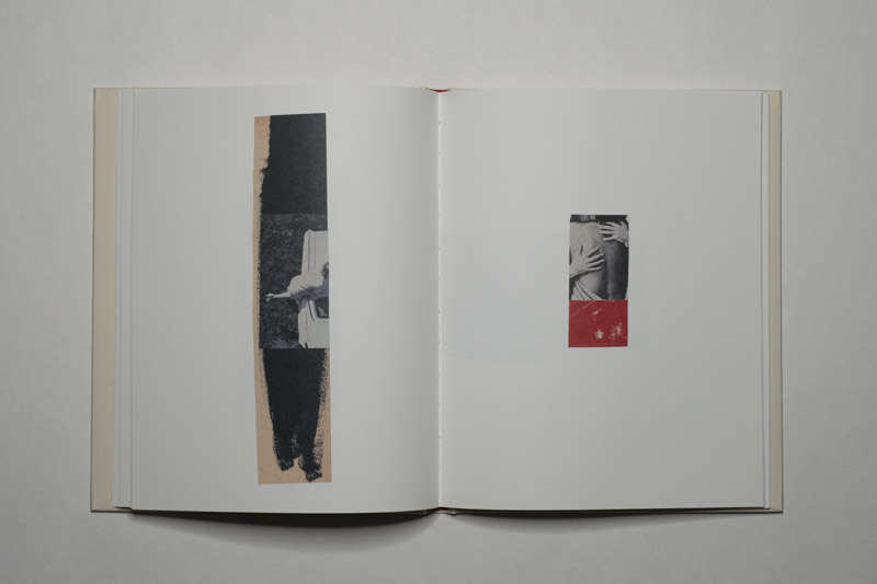
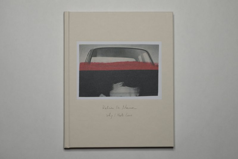
Why I Hate Cars, a new book by de Blauwer, collects a series of new pieces, which unlike in the case of the older work now contain added paint (to be more precise paint and/or crayons). Anyone familiar with the artist’s work will not be surprised to learn that these additions are rather minimal — parts might be very slightly overpainted, with the image still visible, or simple lines might be added. These new collages very much operate like the older ones, in other words, with the added/new elements feeling completely natural.

Much like the older work, these new pieces again center on men and women, specifically on the roles assigned to women by men. It’s a world of desire, where the desire is narrowed down to one possible avenue, in which women are passive objects of male desire and possibly mere trophies (much like cars). The reductive fragmentation I discussed above serves to amplify this aspect, allowing de Blauwer to arrive at phantastically visceral pieces, each of which dissects the male-gaze oriented visual world that still dominates so much of our culture. That the artist’s source materials all come from vintage magazines simply does not even matter.
So here then is collage at its best, collage that deserves to be seen widely, collage that has much to say about photography (from which it collects its source materials) as well.
Highly recommended.
Why I Hate Cars; collages by Katrien de Blauwer; 72 pages; Libraryman; 2019
