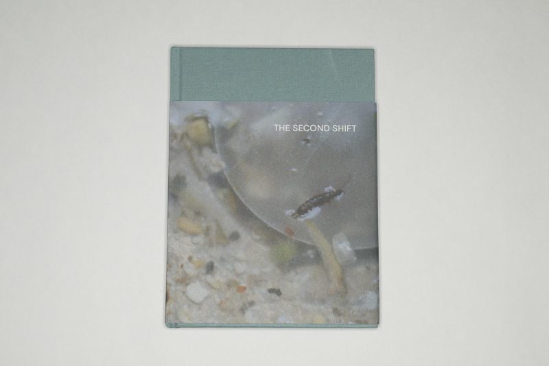
“The Second Shift is the term given to the hidden shift of housework and childcare primarily carried out by women on top of their paid employment.” This is the first sentence of a short text right at the beginning of Clare Gallagher‘s The Second Shift. The text continues: “It is physical, mental and emotional labour which demands effort, skill and time but is unpaid, unaccounted for, unequally distributed and largely unrecognised.” Here, there’s a pivot towards photography, with an implication of what an attentive viewer might pick up on: a deep injustice, a feeling of what it might feel like to be at the receiving end of this deep injustice.
More photography in the next paragraph: “Hidden in plain sight and veiled from familiarity and insignificance, the second shift is largely absent from photographs of home and family.” With many of the famous and all-too-often discussed examples of family photography made by men, this might not come as a surprise (my take here is US-centric, given I’ve been teaching entirely in this context so far; realistically, I do not expect the situation elsewhere to be much better, if better at all). And then there’s the sentence: the project “is a call for resistance to the capitalist, patriarchal and aesthetic systems” that ignore this type of work.
This is a timely book.

You cannot photograph an injustice, you can only make photographs and convey the sense of injustice. The same basic fact is true for any other abstract concept such as, say, love — anything really that exists in our minds and is communicated using words for which there are no physical embodiments.
It’s a coincidence that I’m writing these words on Martin Luther King Jr Day, a day that like no other in theory should serve as a reminder of what can be gained from personal and political integrity and a sense of justice, more abstract concepts that these times make a mockery of: in Anglo-Saxon politics, integrity is in very, very short supply, as is justice.
Again: this is a timely book.
Looking through The Second Shift, I was struck by its somber tone. I hadn’t expected to run into it, and I’m sure my reaction was based on having seen a lot of other family photography before. Family, after all, is something joyful even when it is not: it’s supposed to be presented as such, and even the most celebrated examples obey that rule. There might be conflicts, but they are presented within strictly defined and, we might add, previously agreed-upon parameters so that a viewer might feel somewhat uncomfortable — but not too much. Even seemingly harsh work such as Richard Billingham’s Ray’s a Laugh follows conventions: we know how and where to file the pictures (alcoholic father? check! poverty? check!).

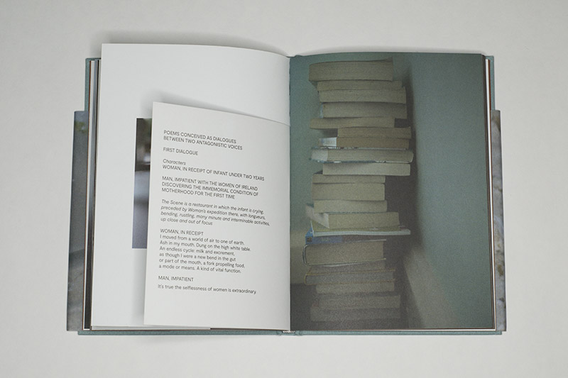
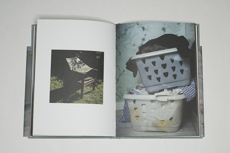
It is this get-out-of-jail card for the viewer that’s missing here, this way of allowing her or him to ultimately disassociate from what is on view. I don’t know if as a viewer you’re going to remember individual pictures as much as the overall experience of looking through the book (which is, after all, what a good photobook should do). You might remember piles of things depicted here or there, whether books or laundry, there’s plenty of detritus lying around, waiting to be picked up by someone (now who might that be?). And there are pictures of children, but even when they’re depicted at their most playful, that feeling comes with ther one of dread: oh boy, there will be some more mess that has to be sorted out (now who might do that?).
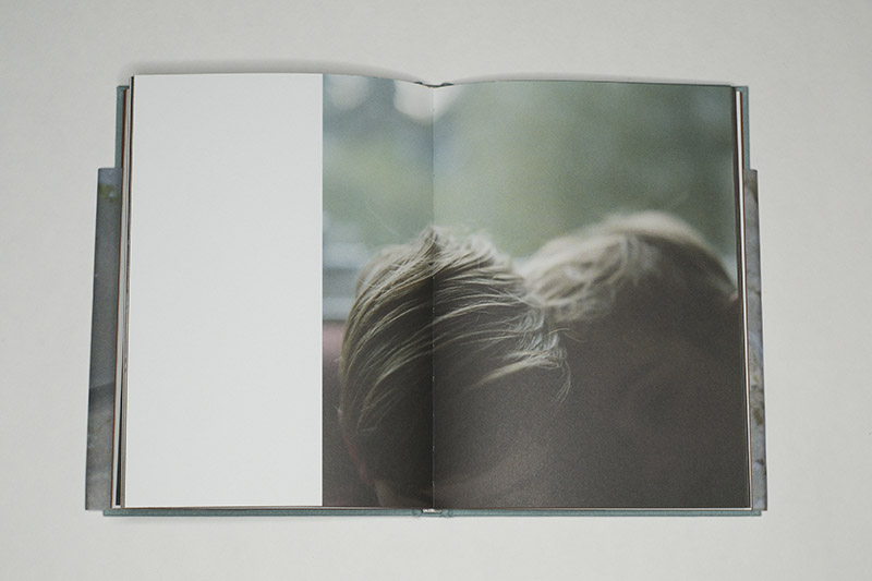
Interestingly, the photographs all strike me as tender. One could have gone about this idea using a flash, but then we’d be in an entirely different visual universe. Instead, these pictures here are observed (but not necessarily elaborately made, which, yet again, would have resulted in a different visual universe). I’d like to think that I can tell how their maker cares as much about what was in front of her camera’s lens (in particular the children) as she dreaded all the inevitable, mind-numbing work associated with it, with all of it. (Full disclosure: I don’t have any children, so I have no first-hand knowledge of any that.)

Smart design and production choices help transport the book’s overall feeling. Many of the photographs are reproduced full bleed (without any borders around them), making the overall experience very immersive for the viewer. At times, a photograph might be shown with a border; in that case, it’s relatively small on the page, which results in it feeling precious (even when what’s on display is merely a stil life of vegetable shavings). With the exception of the colophon, all text is reproduced on smaller pages (there also are a few pictures on such pages), which makes for neat breaks for the viewer. What’s more, what the text might be talking about always ends up peeking in: a viewer can always see fragments of pictures along with the text.
Now, whether or not the book will indeed do what it set out to do — that’s ultimately up to its viewers. Do we want to treat it like Martin Luther King Jr Day, where, let’s face it, most of us merely pay lip service to the ideas Dr King stood for? Or do we want something better? And if we want something better, what could that better look like? Given that the book focuses on home and on the second shift, a viewer might as well start there. After all, larger change will only arrive if it first occurs at a personal level.
The Second Shift; photographs by Clare Gallagher; poem by Leontia Flynn; 64 pages; self published; 2019
Rating: Photography 3, Book Concept 4, Edit 3, Production 4.5 – Overall 3.6
Ratings explained here.
