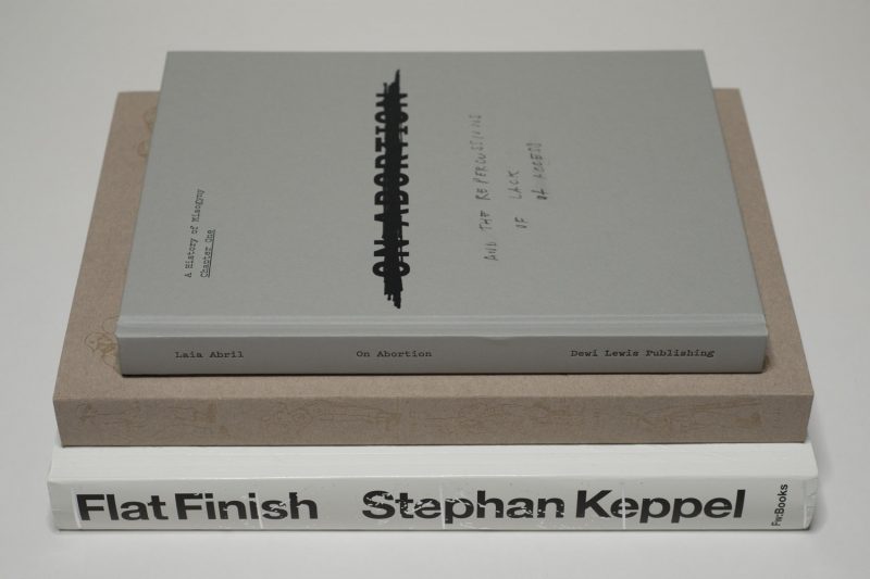
One of the main challenges in the world of photobooks is that there is no such single entity called “photobook.” Instead, there is a fairly large conglomerate of different types of books that all rely on photography to varying degrees. Take Laia Abril‘s On Abortion. Probably the best way to describe the book would be to place it into the larger context of research-based journalism. Having previously produced The Epilogue, this photographer has demonstrated the power of such books, establishing herself at the forefront of its makers.
I’m writing this review as on social media debates are raging over World Press Photo (WPP) and the many problems swirling around picking one news photograph as the best one for some year. Actually, this year, they changed things and presented a shortlist of six pictures, emulating the Oscars and other awards (thus prolonging WPP Outrage Season on social media). Of the many of the problems the identity of photojournalism is one: what does it do? What does it not do? What does it show? What does it not show?
From what I can tell, for many people its shortcomings are a focus on a (sensationalist) “what?” instead of “why?” Whether this particular problem is at all solvable in the context of photojournalism I don’t know. My hunch is: no, it isn’t. The sensationalism and Western myopia for sure should be tackled, though.
Back to On Abortion. The book does exactly what many of the critics of photojournalism demand of that profession. Abril dives deeply into the subject abortion and, in particular, what happens when access to it is restricted (as is the case in countries such as Poland, for example). No words are being minced: the book is presented as the first chapter of “A History of Misogyny.” And the case is being made very clearly and forcefully why prohibiting or limiting access to abortion is enormously harmful for women. So here is a book that deals with the “why”.
The book does this by relying on the full arsenal of tools available. There is a variety of photographic materials, some taken by Abril, some appropriated from a large variety of backgrounds. There is ample text, varying in length and type between a very documentary approach (with pieces of text very tightly tied to particular photographs in a section), captions, and slightly longer texts without any pictures. The book contains a set of distinct sections that use different approaches to shed light on aspects of abortion. And lastly, in terms of the book production, just the right amount of “trickery” is being used, such as different types of paper and shorter pages that when turned reveal something hidden.
On Abortion is about as good as it can get, and I hope that more photographers will start working along this line of photobooks. With a world of photojournalism mired in what looks like a morass of problems (gender, diversity, Western-centric views, various photography problems), from which it is unable to extricate itself, another world is possible. And that is what Abril presents with On Abortion: she establishes the new gold standard of the research-based photographic book.
Highly recommended.
On Abortion; photographs and text by Laia Abril (with contributions by Rebecca Gomperts and Christian Fiala); 196 pages; Dewi Lewis; 2018
Rating: Photography 3.0, Book Concept 5.0, Edit 4.0, Production 5.0 – Overall 4.2

Possibly my first discovery in the United States was the fact that its cities all are Potemkin villages: there might be a grandiose facade in front, but right behind there usually is something derelict. Actually, Donald Trump’s hair is a very good stand-in for what I’m talking about here: it’s designed to look grandiose, but it betrays its owner’s desperate attempt to literally and especially metaphorically cover up the many flaws barely hidden underneath. In addition, it must be the “not my job” attitude that results in things getting barely patched over: someone gets tasked with, let’s say, painting over a spot, so that spot, and only that spot, will get painted over, however ridiculous the result might look. Doing more would already be beyond the assigned task.
If you’re used to such an environment you will not notice. You will have become eyeblind to it — just like when you get exposed to an odious smell, with time you will become noseblind as you simply stop smelling it (while it’s still there). (I’m aware of the fact that the word “blind” means not being able to see, but what I mean by “eyeblind” is not seeing while physically being perfectly capable of doing so.) If you’re not used to it, you will simply be bewildered.
I suppose Stephan Keppel found himself in such a bewildered state, and he made a book out of it: Flat Finish. It’s a curious book. At first sight, it doesn’t look like a New York photobook. Instead, you might be tempted to mistaken it for a catalog of strangely assembled samples of building materials. But it also says “New York” right on the very first page, plus you’ll find ample visual clues such as a section with pictures of the top of the Empire State Building.
Where books about New York City tend to focus on its people, its city life, or possibly its attractions, Flat Finish literally just looks at the city’s many surfaces. This is not a pretty sight as you’re made to look at things that you’d prefer you would have become eyeblind to already. The strangest thing is that with time, the book becomes oddly compelling. You don’t become eyeblind. Instead, you’re made to develop a sense of heightened awareness that lets you look past the neglect, the lack of care, the notmyjobisms.
It’s a bit like listening to music that requires a bit of time from an audience or maybe an abandonment of preconceived ideas of what sounds good. I recently developed an appreciation of black metal, especially the more esoteric kinds. I think I had a similar experience with this book: you can only enjoy it if you accept its terms. While that’s true for most good photobooks, this one’s especially tricky. I suspect that many viewers might simply lack the patience or interest to invest their time. But as I always tell my students, you want to make books for reasonably attentive viewers. Flat Finish for sure takes this approach to its logical conclusion.
Flat Finish; images by Stephan Keppel; 400 pages; Fw:Books; 2017
Rating: I don’t know how to rate the photography in this book. So no rating.

Humans have been inflicting vast changes on the land they have been living on (and from) for a very long time. The land thus bears traces of humanity’s past endeavours, some of which are obvious, some of which become only visible when they are being pointed out. For example, when I visited Masada in the Judaean Desert around 25 years ago, a siege ramp built by Roman engineers in the year 73 was still clearly visible. While I had seen other changes to the land, this one in particular struck me: it’s sole purpose had been the destruction of human beings, and it must have used a huge amount of labour to build.
A few years ago, I came across Donovan Webster’s Aftermath: The Remnants of War, a book that describes the impact of warfare on the land. The book discusses examples of the most destructive of all human activities and how they affected the land in ways still visible. Examples include World War I battlefields in France and the World War 2 battlefields around Volgograd (previously Stalingrad). The land might as well remind us of our human foolishness by making us face its scars and modifications. But not all of these scars are necessarily clearly visible — or even easily approachable.
Donald Weber‘s War Sand is the most recent photobook dealing with this particular subject matter. Where Peter Hebeisen‘s 20th Century European Battlefields only adopts conventions of painting, showing the larger landscape (albeit obviously without its battling participants), Weber expands this view by literally looking at microscopic traces of war. The book focuses on the sites of the 1944 D-Day invasion in Northern France, without which Paris would probably been liberated by the Soviet troops that at the time were overrunning the German troops whose power they had broken.
A little more than halfway through the book, a chapter entitled Microarcheology discusses minute traces of war materials that can be found in the sand, tiny grains of nickel or steel, produced during the fighting itself and then subjected to decades of further erosion through the combined effects of sand and sea water acting upon them (apparently, some of these little grains are bone fragments). Think of it as a variant of sea glass. “Shrapnel grains,” the text says, “range from very fine to coarse sand size (0.06 to 1mm), and all display a remarkable variety of shapes and roundness, just like snowflakes.” (p. 209)
For me, this particular section of War Sand is where Weber is able to offer something not just genuinely new but also something that expands the viewer’s possible experience beyond what has been covered in the literature quite a bit: if you were to walk these beaches of Northern France, you would probably literally walking on the minute traces of bones and steel, deposited in 1944. I don’t know why, but that idea haunts me in ways that, for example, the seascapes taken by Weber don’t.
And it’s strange, because while I feel there simply is too much somewhat repetitive information in the other sections (do I really have to know all that weather information or which commander was active on each section of the beaches?), here I can’t read enough. I’m no microarcheologist, so there clearly is the attraction of that. But it’s also that of all the things that strike terror into my heart it’s the idea of human beings pulverizing each other, of grinding each other into the dust (or here sand). What’s wrong with us as a species?
Seeing the many pictures of the beaches has me think of the kind of awe that the invasion might instill in people, an awe that ultimately ends up celebrating more destruction. These little grains don’t do that. They can’t. Instead, they speak of the repercussions of the destruction, of people losing their lives for the right or wrong reasons.
Again: What’s wrong with us as a species?
War Sand; photographs by Donald Weber; text by Larry Frolick, Kevin Robbie and Donald Weber; 372 pages; self-published; 2018
Rating: Photography 3.0, Book Concept 4.0, Edit 1.5, Production 4.0 – Overall 3.3
Ratings explained here.
