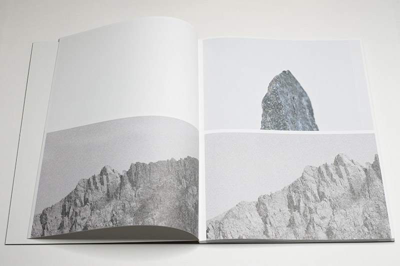
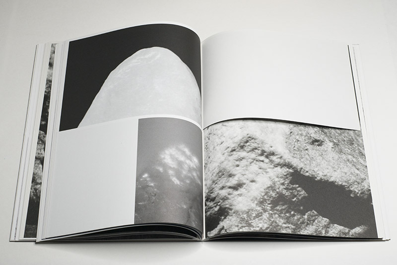
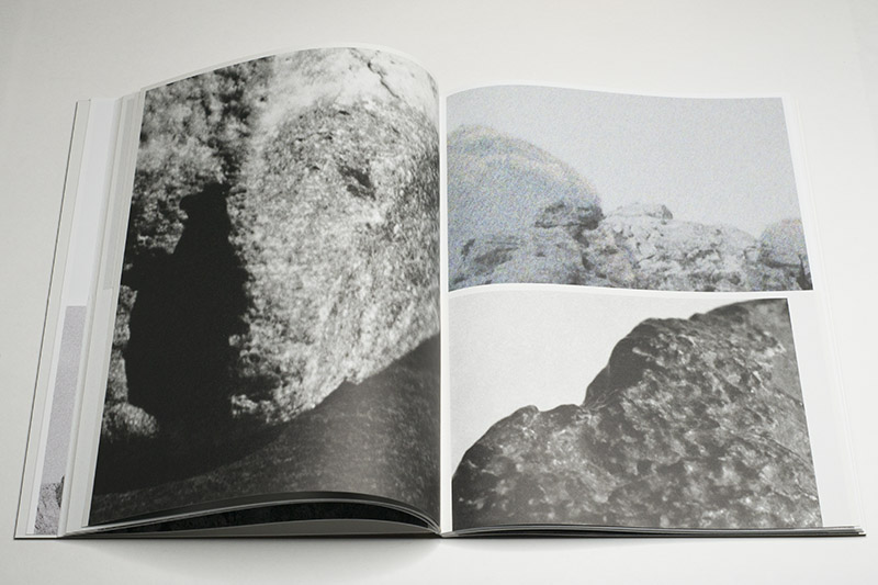
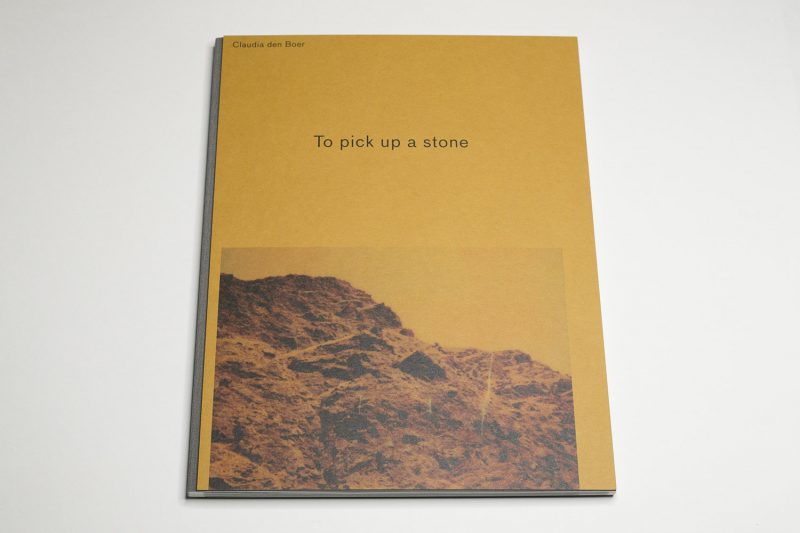
As I leafed through Claudia den Boer‘s To pick up a stone, I found myself double checking whether I had in fact turned a page or missed one. It is a combination of two separate facts that led me to this: first, the low humidity in my home, which has been caused by having to run heating for the winter, as a consequence of which my hands’ skin has become dry; second, the variety of paper stocks used for this book, combined with the occasional trimming of half a page at the top or bottom, which leaves behind a smaller page.
As viewers or readers, we often do not think much of a book’s tactility, of its literal surface qualities that respond to our touch. But photobooks are visual media and they’re also objects. As objects they communicate through the various ways they respond when being held, when they’re being handled. Good photobook makers will be aware of this aspect of their craft: it doesn’t only matter what a book looks like, what it feels like is just as important.

From there, it’s but a small leap to Den Boer’s subject matter, stones. If I asked you to describe your experience with stones, their weight probably would be the first thing that comes to mind (in the UK, “stone” is still used as a unit of weight). Afterwards, there might be what they look like or what it feels like to touch them. Who hasn’t experienced finding a neatly polished stone in or near a body of water, to marvel over its shape and the smoothness of its surface? Who hasn’t picked up a stone in an unusual landscape, to marvel at how suddenly, there is the very landscape — or rather a small part of it — right in one’s own hands?
Paper is an organic material — however processed it is, it’s made from trees. Consequently, much like the fingers with which I am handling the book, a book’s pages will age (whether more or less gracefully than myself remains to be seen). Stones, in contrast, are inorganic, and they take a lot longer to change with age. I’d like to think that instinctively, we know about this. There is no connection with another person when we pick up a stone: it’s merely a small part of the otherwise uncaring universe in our hands. I can put it on my bookshelf, and someone else might pick it up only as the stone it is — and not like the book from my library (regardless of how many other libraries it might exist in).
Consequently, to make a book about stones is a lot harder than making a book about trees: in some form, the trees are in a viewer’s hands, whereas the stones simply aren’t (unless you make a very old-fashioned book in stone-tablet form — it shudders me to think of the person who comes up with that idea: this might be a very hard sell at a photobook fair even with the most hardcore photobook hipsters being present). But you can take the idea of tactility, present in both stones and trees, and bring them to the book. This is what was done here.

The book presents photographs of individual stones and of landscapes in which they might have been found. Photographically, the line between the two at times becomes blurry. A landscape filled with stones essentially is nothing more than a collection of stones. But to view it that way misses the aspect of scale: in our daily lives, there is a huge difference between being in a landscape and being in front of a single stone. This is because our own bodies provide an element of scale (and presence).
In a photograph, the absence of markers of scale (trees, human figures, etc.) can result in uncertainty over what one is actually looking at. As a consequence, if in real life there never is any confusion over whether one is dealing with a landscape or a stone taken from it, in a photograph that distinction can disappear. The book plays with the consequences of this, at times making it impossible to figure out what exactly one is looking at, or more accurately: the scale of what’s on view.
In addition, there exists a variety of photographic artefacts throughout the book. Some images very clearly betray a digital source. Others might be the result of a different process: some look as if they were taken with Polaroid-style materials, some look as if they had been run through a photocopier, etc. This makes the book center as much on what photography itself actually does as on the stones/landscapes themselves. In the book, this fact is driven home by the choice of different paper stocks (I mentioned this already).

Given I’m merely describing to you what’s going on in the book, it might come across as cerebral (which in part it is — not that that’s a bad thing per se) and tedious — the kind of photobook you expect to come out of the Netherlands where design and production play such big roles (to the point of them at times becoming self serving and thus gimmicky). But the book isn’t tedious at all. In fact, without any of the production choices it would be tedious. Here, though, the visual engagement provided by the photographs is supplanted by the tactile delight of moving through the book.
One final comment: in a day and age where so many photographers work on impossibly complex narrative-driven photobooks, I’m being asked more and more often whether this has become the norm. As To pick up a stone demonstrates it has not. A good photobook (or photo project) is not defined by the presence of narrative any more than through its sheer complexity. Here, there is a very simple idea behind the book (remember the difference between simple and simplistic), which is executed very well.
The key to any book is not how snazzy or clever or complicated it is — it’s simply how well it is done within the parameters set by its own materials. Seen that way, To pick up a stone might as well serve as a study case for photographers (and, hint hint, publishers — I’m so tired of all those Tupperware container books!) for how to make an engaging photobook that forcefully and elegantly communicates the idea of the work.
To pick up a stone; photographs by Claudia den Boer; 120 pages; The Eriskay Connection; 2020
Rating: Photography 3.0, Book Concept 5.0, Edit 3.0, Production 5.0 – Overall 4.0
Ratings explained here.
