Most people seem to agree that a photobook is, well, a book, meaning it has pages that are bound and contained in some type of cover. It needn’t be that way, however. Some photobooks deviate from this simple form. Here, I want to introduce three recent publications that each are a little different, in at least one way.
Starting off, there is Martin Soto Climent’s The Equation of Desire (readers living in the US can order it here). In terms of its form, the book comes closest to being a standard photobook. There is one exception: While the pages are bound, there is no cover. Or rather, the cover is what one probably needs to call a spine band – a strip of paper that goes around the spine and edges of the book (the much more common version of this type of cover would be a belly band; one could argue whether it’s really a cover at all). You look at the book by removing that band (which turns out to be a bit of a kerfuffle). Once removed, you can browse through the block of pages.

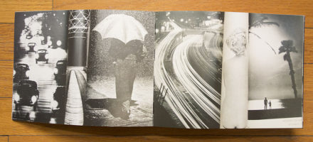
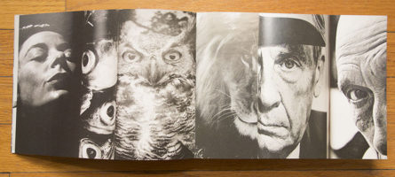
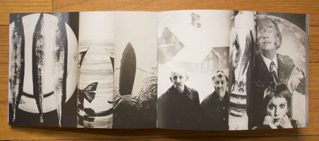


Aside from the slightly unusual presentation, the content of this book is what sets it apart from most other books. Each spread shows a visual collage: A number of publications were rolled up and placed next to each other in such a way that their visible parts form a (non-permanent) collage (fans of Redheaded Peckerwood might recognize the device from one of that book’s spreads; there, only a single magazine was used).
The resulting collages vary in terms of their complexity. Some are very obvious, essentially amounting to a simple game of pattern or content recognition. Others are less obvious and much more intriguing. In those, the juxtapositions place images against each other that do not simply mirror each other. At 366 spreads, the books feels a tad long – I am a pretty patient person, but so far I’ve mostly spent time on parts of the book. But then again, who says that each photobook should require the viewer to look at everything in one go, from the beginning until the end?

At the occasion of a Larry Clark exhibition at C/O Berlin, the museum produced a catalogue showcasing the work on display. Clark is still hanging out with and photographing teenagers (make of that whatever you want), and the show consisted of a number of large wall collages. To show these collages, C/O created a fairly unusual catalogue. It comes in the form, shape and size of a triple LP (remember those?). Two of the pouches contain folded up posters that allow the viewer to get an idea what the collages might have looked like on the wall. The third pouch contains a booklet with more images, plus some text.
The resulting publication probably comes closest to conveying the impressions one might have gotten when seeing the exhibition. At the same time, the packaging itself is smart and well done, and it clearly stands out – quite literally so – on someone’s bookshelf.

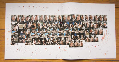

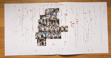
As you can see from the sample spreads, the cover image of the publication is slightly deceiving. I am not sure how much a fan I am of this particular body of work; of course your mileage might vary.
Speaking of standing out (pardon the somewhat lame segue!) , the final publication I want to talk about today is Eva Leitolf‘s Postcards from Europe 03/13. For a start, at 29,7 x 40 cm (roughly 11 3/4 x 15 3/4 inches), the publication is quite large. On top of that, it’s not bound. Instead, Postcards is a slipcase that holds 20 plates (or, if you want to run with the title, very large postcards). I suppose you could argue that a book is something that needs to be bound. But it’s not easy to see what is being gained from being so strict with the criteria of what constitutes a photobook and what does not.




Obviously, if you have a book whose pages aren’t bound, you can re-arrange them any which way you want. In the case of Postcards, the order of the photographs truly doesn’t matter. Each image shows a glimpse into some aspect of Europe’s borders, borders that have become increasingly more rigid – those inside would like to keep those outside there. With the general idea of Europe currently being severely undermined by what amounts to little more than a combination of political pettiness and economical selfishness (not surprisingly, across the continent, public support for the European Union is plummeting), Leitolf’s work is a timely reminder of some of the important issues Europeans better start dealing with properly.
All of these three books expand the idea or form of the photobook in some way. Crucially, each has its own, very specific reasons for its form, which make perfect sense. Photobooks need not necessarily deviate from their standard form. But in some cases, something different helps showcase the work in ways that cannot be achieved in any other way.
The moment you deviate from a standard book you’re likely to run into all kinds of problems (how do oversized books onto people’s bookshelves, say?). Ultimately, photobook making always is a trade-off between what is needed and what is possible. What is possible isn’t always needed (this is where photobooks can become gimmicky), and what’s needed isn’t always possible (for example, a book with dozens of gatefolds might simply be too expensive to produce).
The three books I discussed here can be found at that lucky intersection, where what was needed became possible – and where the resulting products work very well.
The Equation of Desire; photographs by Martin Soto Climent; 366 pages; Mousse Publishing; 2012
Larry Clark; photographs/collages by Larry Clark; two posters plus a booklet in an LP-style slipcase; C/O Berlin; 2012
Postcards from Europe 03/13; photographs and text by Eva Leitolf; 20 plates in a slipcase; Kehrer; 2013
Ratings explained here.

