Of all the things that surround me right now, the photobooks stand out. Much like the desk I’m sitting at, or the computer I’m writing this on, or the chair I’m sitting on, they are mass produced. But unlike those items, they have a sense of personality, well some of them, the good ones, anyway.
When speaking about books, one of the first aspects I tend to mention is that they’re physical objects. This is almost too obvious an observation to make. But it’s not obvious enough for many photographers (or publishers). Physical objects have qualities that appeal to all of our senses, however conscious we are of this. It is easy to be amused by — or make fun of — photobook experts who will obsess over the printing, the type of paper, the binding, even the smell of a book. However, all of these aspects come together to create a book’s personality — or lack thereof. So it’s not just the pictures and their edit that make a book. It’s also not whether or not a book is designed well, whether it’s produced nicely. It’s whether or not the whole package, down to the seemingly most irrelevant detail, works to create something unique (however mass produced it might be).
Taschen provides a good case in point. Somehow, this publisher manages to produce quite a few good books, all of which for me lack any sense of personality. They’re profoundly unattractive objects. And Taschen get away with that. Much like the makers of the admittedly rather shitty desk I’m working at, they know their business. They seem to be quite successful selling really quite awful looking books containing often very nice material. Good for them. I even own a small number of their books. I rarely look at them, because they’re so profoundly unattractive. They’re like Tupperware containers filled with goodies.
Consequently, unless as a publisher you want to become the IKEA of photobooks, you will have to do better. If you’re a photographer making a book, even with a publisher, you have a stake in that game as well. In fact, more often than not the whole chain of events starts with the photographer: there is a body of work, and there is the idea of making a book. For most photographers it does not really mentally move much beyond the pictures, though. Most photographers approach photobooks as if they really were merely containers.
It is true, in the most basic sense, a photobook is a container for photographs. But that doesn’t mean that making one should be approached like, say, making jam. If you’re making jam, you put your energy into the jam, which you’ll then put into whatever containers are at hand. Maybe you’ll spend a little bit of time on the labels. That works great for jam, because the containers are really just that, necessary receptacles that play no role for the actual enjoyment of what they contain.
That’s really not the case for photobooks. The book itself is the thing to be enjoyed, however important (or not) the photographs themselves might be. Unfortunately, modern technologies have been enabling the Tupperware container approach. Why bother thinking about a book, when you can just grab some template? Why deal with messy physical dummies, when you can look at a pdf on a computer screen?
In Understanding Photobooks I outlined the many realities behind photobook making. In the book, I argue that it matters that you take each and every aspect of a photobook into consideration. But there is one aspect that I’m relying on in the book that deserves to be stressed a bit more. In the first chapter, I ask readers to take a book from their shelf and to pay attention to all those details that otherwise often go unnoticed, in particular production and design choices: the object itself. You have to have an understanding of that, the object, if you want to make one.
You would imagine that photographers spend enough time with photobooks to get to that understanding. I am not convinced any longer that that’s the case. What I’m seeing is that knowledge is broad, but not deep. A lot of people seem to know every book that has just been published, what’s “hot” right now (this effect is especially pronounced in places like New York City). There are so many photobooks out now — and so many photobook fairs — that hardly anyone appears to spend time with individual books any longer. It all seems to revolve around sheer numbers.
In fact, one of the most frequent question I get asked is how many photobooks I own. I actually don’t know, since so many are so forgettable, and I don’t care about the actual number. One of the least frequent questions is whether I have seen a great book recently. I really believe that this reflects the idea that photobooks are just these containers that are essentially all alike, maybe with some very minor differences. Note that this situation is a little bit better in parts of Europe where the tradition of photobook making is a lot more tied in with both a larger book culture and a lot more refined ideas of design.
It’s partly for this reason that in Understanding Photobooks I look at a number of photobooks in detail, outlining not just how they provide solutions to the challenges discussed in the various chapters, but also to talk about them as the genuinely exciting objects they are. That’s such an important aspect of photobooks, not just that they have great pictures, but that as objects they’re great. That’s really the main reason why I keep looking at photobooks, regardless of how many there are, because I want to live with such great objects, with books that have a personality.
So I went to look through my pile of unreviewed books, and I thought I’d present some with this aspect in mind first, whether or not as objects they’re attractive.


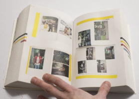
In light of the preceding, Victor Sira‘s Bookdummies is a very good book to look at for more reasons than one. To begin with, as the title indicates, the book collects a very large number of book dummies made by this artist. These dummies often refer to each other, with one being an improved, or changed, variant of an earlier one. For Sira, the end goal doesn’t necessarily appear to be the final, perfect book. Instead, he seems to be a lot more interested in the process of making dummy after dummy, aiming to distill the essence emanating from a set of pictures.
When speaking about photobooks, I usually avoid voicing this idea that there might not be that one perfect form or realization, that a body of work might in fact translate into more than one realization as a photobook. Please note that I’m using the word “might” here, because this clearly can’t be a generalized statement. But this idea might still help photographers working on a book, because instead of finding the perfect book (which can easily become an utterly frustrating endeavour) aiming for maybe a form of a book that works really well can be liberating (I’ve witnessed this very struggle at times when teaching).
Looking at pictures of dummies in Sira’s book obviously is not the same as being able to see the actual objects. This is the usual conundrum faced by the makers of books about photobooks. The usual solution is to provide pictures of open books, usually with drop shadows (for what it’s worth, I personally prefer actual drop shadows over fake ones). But that only offers so much. In this particular case, though, the materiality of Bookdummies itself brings me closer to the dummies’. It’s almost like I’m being tricked into thinking these dummies are right in front of me. I know that’s not the case, but it works.
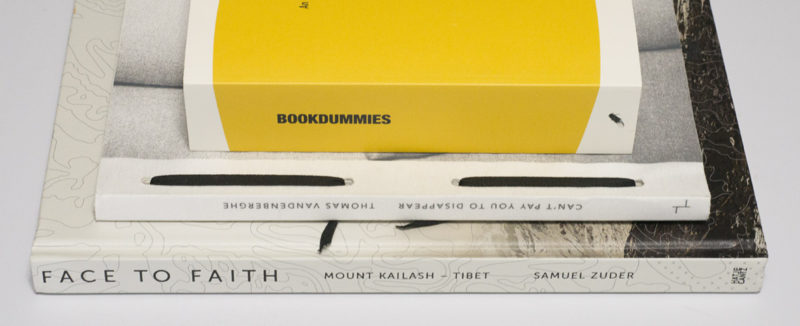
Bookdummies is an object that just asks to be held and looked at. It has personality. Maybe a good way to describe it would be to say that it feels considered. Obviously, all of those various books on photobooks are considered. Yet most of them lack this particular one’s sense of personality. This one is a little brick of a book, that is lighter than one would imagine. The book is relatively small, so it’s easy to hold in one hand, while one looks through it with the other. The design is minimal in the best possible way. The production comprises what I usually call pouch pages, a type of binding that has a long tradition in Asian book making: each page is a piece of paper folded onto itself (a more widely known example would be Rinko Kawauchi‘s Illuminance).


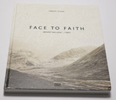
In contrast, Samuel Zuder‘s Face to Faith is a very different kind of book. It’s almost a coffee-table book. I’m using the term “coffee-table book” on purpose because, frankly, there is exists so much needless snobbery in photoland circles about it, in particular about the fact that coffee-table books are made for people whose engagement with photography doesn’t quite measure up to whatever photoland thinks it should be. In other words, it’s photobooks for ordinary folks. This particular book could be such a book. It clearly has a large cross-over appeal if it isn’t in fact made more for regular folks than the kinds of people who hang out at art-book fairs.
Face to Faith contains photographs taken in Tibet. I’ll be honest and admit that when I heard that my interest vanished immediately. That’s not because I’m not interested in Tibet. But the country has been covered so much with so many awful visual cliches that I really don’t need to see any more pictures of prayer flags and rugged people. It’s like seeing a book about the US, and all you get are cowboys and Disneyland. This particular book, however, works very hard trying to do a lot better — and reaching people like me. To begin with, the usual cliche pictures are absent. Instead, there are two groups of photographs, rather majestic looking landscapes and portraits.
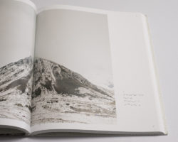
The book’s focus is Mount Kailash, which is sacred in the traditions of, say, Buddhism or Hinduism. The mountain is approached from various sides, and it appears frequently, but not always, in the landscapes (a strategy familiar to those who know Katsushika Hokusai‘s Thirty-Six Views of Mount Fuji). The portraits show pilgrims. The photographs were all taken with a 4×5 view camera, which results in a sense of stillness that is at odds — and thus reinforces — the ruggedness of what is being depicted.
But Face to Faith works hard against what makes most coffee-table and art-fair/photoland books so bad. Design and production come together to create a sense of personality, a sense of a highly considered and well crafted object. I’m no design expert, so my description of the design as being conservative, yet contemporary in a very German sense might not be overly useful. But still, the design looks and feels a lot more interesting and engaging than what you’d see in comparable US books (think Radius).
While I feel there are probably too many pictures in the book, diluting the overall effect, many of the landscapes are very good, with echoes of Walter Niedermayr, say. Occasional gatefolds offer additional vistas. The portraits are more mixed, but the good ones are really, really good, making me want to look at them for a long time. All of this is brought together very strongly in the book and through its form, proving that there need not be that firm separation between art-fair/photoland books and photobooks for those who aren’t part of the clique.
As we’ve seen so far, a book’s mass production and personality (or lack thereof) are not necessarily correlated. With the right attention to detail, a mass produced book can indeed have a lot of personality. Mass production so far has meant the use of machines. But you can mass produce a book by hand — it just takes a lot longer, often resulting in vastly higher costs. A maker’s hands almost automatically guarantee more than a whiff of personality, because because hand binding a book rarely results in something that looks and feels machine-mass produced. The binding is either a lot better and elaborate, or it’s quite a but less good. Interestingly, both cases can enhance a book quite a bit.


A friend of mine is a master hand book binder, and whenever I show him hand made books, he tends to prefer the ones that aren’t so perfect. I suppose as someone whose books are beyond perfect, I can see where that appear might be coming from. But it really is the obvious presence of a maker’s hands that add considerable personality to a book. A good example is provided by Thomas Vandenberghe‘s Can’t Pay You to Disappear, published by Akina (who seemed to be taking a break, but are now back to publishing). In the book’s back it says “Handcrafted by Alex in 200 copies,” and it does indeed look that way.
Part of me has problems with books that come in such small editions, even though another part is very much in sync with them. In the case of books that aren’t fully machine made, an edition of 200 looks perfectly reasonable. After all, someone has to actually put 200 of these books together. If you’ve ever made a book dummy by hand, however well it turned out, you know how time consuming the process is.
But in the case of Can’t Pay You to Disappear, there is a connection to what is inside, the photographs. Vandenberghe is not only another photographer who I’d file under the “New Male Gaze” category. Similar to artists like Daisuke Yokota, he is also deeply committed to the photographic print as a unique outcome of the analogue photographic process, with the kinds of considerations that drive editions of prints thrown out of the window. Instead of aiming for a number of identical looking prints that follow the demands of a gallery-oriented marketplace, he is happy with variation, with imperfections, with each print looking a little different. With such an approach to photographs, the production of the book itself makes perfect sense.
The photographs in the book, many (possibly most) of them pictures of a young woman, are in fact reproductions of physical prints, either shown on their own or as collages or groups. With added text, the book tells the story of a relationship. I’ll be honest and say that I’m not entirely sold on the text — it feels a bit too obvious to me, and I’m also not a big fan of the final quarter of the book, in which increasing repetition of individual images just comes across as trying a bit too hard, where no such effort would actually have been necessary. But those quibbles aside, Can’t Pay You to Disappear is a tremendously engaging book, which for sure would not have worked nearly as well without the hand-production aspects. The intimacy the hand-made object manages to allude to would be entirely absent.
In each of the three cases I discussed here, the photobook itself looks and feels very considered, whether it was mass produced or hand made. Specifically, the object itself, the way it handles and feels, contributes to each of these three books being more than, well, one of the many forgettable Tupperware style photobooks being made these days. The object “book” truly matters. The object itself determines to a large extent what we take away from it. It’s not just the pictures, possibly with some clever text and some cool design added, that makes the books. It’s the whole package. So when making a photobook, a photographer would be well advised to spend some time thinking about this: how can I give my book a bit of personality? While there is no single obvious solution to the answer, finding one and them implementing it is so important, especially given there are so many books being made these days.
