A sense of quiet runs through Caroline Kist‘s book It’s that you’re here. A softcover that despite its relatively large size feels delicate, in page after page after page the viewer comes across scenes of stillness, a stillness that is not only caused by photography’s inherent nature of capturing a small fixed moment in time forever.
Photography is a way of paying attention to something or someone, and it is exactly that aspect that makes it interesting. You can do so for any number of reasons. The one reason I personally enjoy the most is when it is done out of a sense of uncalculated generosity, when, in other words, a photographer pours their love for their subject matter into the work.
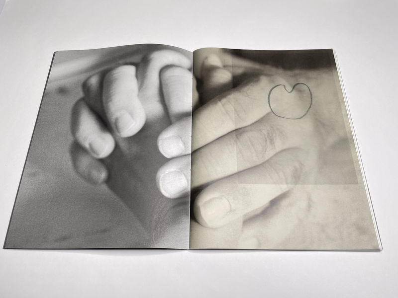
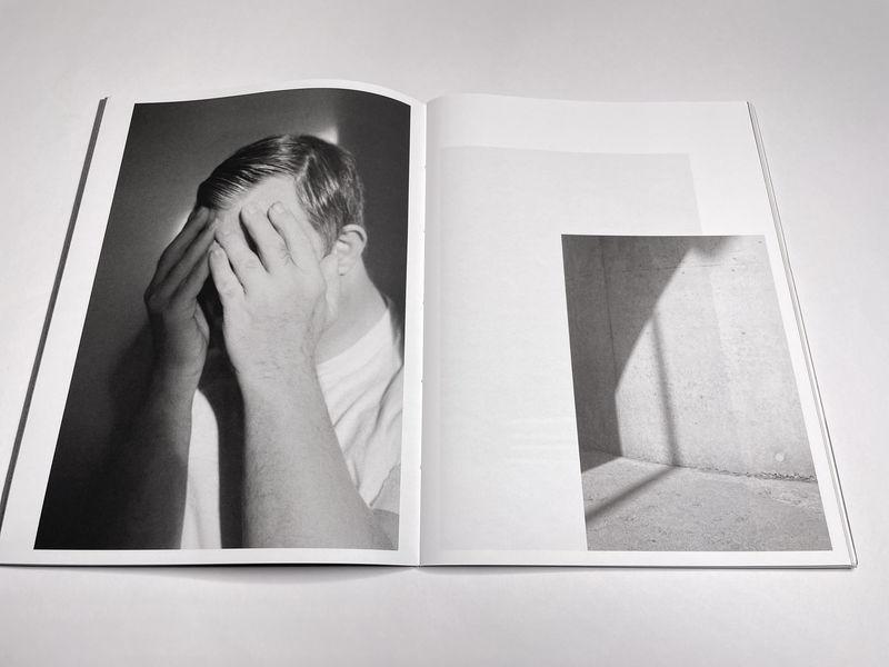
Here, the subject (ugly word, I know) is a man named Reinoud (the book is dedicated to him). Reinoud has Down Syndrome, “a genetic condition where a person is born with an extra chromosome” (source). Initially, viewers get to see only small parts of his body — his hands, the back of his neck. But more and more details are filled in. At the same time, there are details from around the house and, one must assume, the direct neighbourhood.
The book paints a portrait of Reinoud and, indirectly, of the photographer herself. Even as we will never know how the photographs were made, their stillness and special care hints at the relationship between the people in front of and behind the camera. In effect, the viewer is invited to enter that very personal, close space between these two people and experience some of the emotions between them. There is enormous tenderness, and there is enormous care.

That care is reflected in the production of the book. Book production becomes especially relevant when the themes in the work center on intimacy, tenderness, care. It is especially important to realize that the value in “production value” does not necessarily mean an extremely expensive production. An expensive production translates into an expensive book, which by its own nature negates ideas of intimacy or tenderness (there’s nothing tender about money).
Instead, a book about a loving relationship between two siblings should communicate that it was conceived and made with care. For example, the fragility inherent in most familial relationships, especially in one where one person has Down Syndrome, should be something a viewer experiences when handling the book.
A hardcover book, which by construction is rigid, does not communicate fragility quite as well as a softcover. In much the same fashion, if the book had simply been stapled — instead of being sewn together with a couple of threads — it would also send a different signal to the viewer.
An added detail in the book is the inclusion of four sheets of vellum paper, which create added engagement for a viewer: parts of photographer superimpose upon another and create visual echoes. The use of vellum paper is always a risky choice: if you don’t do it well, it quickly becomes a gimmick. But here it works very well.

If I had to talk about one problem with the book, it’s one that is more common than it should be: the book’s title and the photographer’s name are nowhere to be found on the cover. A viewer should not have to open a book to find out such basic details.
If you imagine the book on a table alongside a number of other books, It’s that you’re here simply have a hard time competing for a possible viewer’s attention: are they going to pick the grey cover with the rather non-descript small picture on the cover? What might this be about? Who made it?
Book makers have to be extremely mindful of such details. As objects, books communicate on such basic levels, and it’s a big mistake to try to fight this (or simply ignore it). This doesn’t mean that you book cover should be splashy (even though at photobook fairs, that absolutely helps selling books). But it should make a viewer want to pick it up — whether out of curiosity, attraction, or whatever else.
One of the defining features of It’s that you’re here is that it truly unfolds only after a few repeated viewings. Each time a viewer revisits the book, there are new details to be discovered, and the overall impression the book leaves fills out more.
There’s much to be said for such photobooks, in particular given that this is something typically associated with some types of music — as opposed to movies or literature, which are the most commonly referenced arts forms when it comes to photobooks.

With all that said, Caroline Kist‘s book is a really good example of what only a photobook can do. It communicates care and tenderness. In perhaps the most indirect fashion, it creates a small community of viewers all of whom have been invited to witness the deep love between a brother with Down Syndrome and his sister.
Recommended.
It’s that you’re here; photographs by Caroline Kist; 36 pages; self-published; 2024
If you enjoyed this article, please consider subscribing to my Patreon. There, you will find exclusive articles, videos, and audio guides about the world of the photobook and more. For those curious, there now is the possibility of a trial membership for seven days.
Much like journalism, photography criticism involves a huge investment of time and resources. When you become a subscriber, you not only get access to more of my work. You will also help me produce it (including the free content on this site).
Thank you for your support!
