Lots of photographers don’t trust their pictures. They don’t think or feel that what in the broadest sense is contained in their pictures will communicate itself to their viewers. Even worse, there could be something communicated that s/he either didn’t think of or, even worse, something that s/he does not want to be communicated. For a large variety of contexts, these are valid concerns. For example, if you photograph a car for use in advertizing that car better look fantastic and not like the jalopy it might actually be. In the context of art, however, such concerns become hugely problematic , because art doesn’t operate along such lines of thinking. Art lives from the fact that while it communicates something potentially very powerful, one might be hard pressed to describe with a few simple words what that “something” is.
As a consequence of these concerns a lot of photography that purports to be art ends up being not quite that. Instead, it ends up as the the kind of art where you look, and the first (and only) thing that comes to mind is “Oh, I get it.” There’s nothing particularly wrong with this type of art – it has its uses. But it’s not very good art. At worst, it becomes agitprop. Without giving examples I do believe that quite a bit of particularly topic-based art these days is little more than that, tedious agitprop.
As a brief aside, it’s difficult to talk or write about this problem simply because as a culture we are increasingly moving into a corner where dissent is seen as an admission that the dissenter is outing her or himself as being on the wrong side of history. Let’s say there’s a piece of art about a topic we all care so much about. We then all also have to praise it in the ways we have started to deem appropriate. To do otherwise would not mean that we would talk about art, no, we would out ourselves as actually not agreeing with the topic itself. To be perfectly honest, especially in the United States the way art is discussed has started to remind me of how discussions were had in Stalinist countries, where you either toed the party line, or your not toeing the party line meant that you were part of the problem, that you were to be shunned. This development worries me deeply.
Needless to say, the problem with didactic art isn’t necessarily that it supports neo-Stalinist tendencies – even though in a situation like the one we’re finding ourselves in it can become problematic. The problem with didactic art first and foremost is that it’s bad art. At the very core of art lies an ability to reach people in somewhat specific, but also very vague ways, ways that might be hard to put into words.
By construction, photography struggles with being art the most. I believe this is because of two reasons. First, photography’s artifice is apparent only to insiders. You don’t have to be a painter to be able to see what an artist did in a painting, even though of course you might not understand technical details. But when you are confronted with a photograph, that’s a lot harder to do that. The second reason is that it’s so tempting to think that what a photograph is about is exactly what is being depicted. Obviously, that doesn’t necessarily have to be the case. But my use of that word “obviously” gives away what I am, a photography insider. It’s really not that obvious for others (and even for many photographers themselves).
This second reason is where photography can easily become didactic. Didactic photography starts out with insisting that what is inside the frame is it, is everything there needs to be considered, that, in other words, anything outside of the frame is to be discarded. This isn’t necessarily a problem if you want your photography to be didactic. For example, Bernd and Hilla Becher‘s entire oevre is essentially didactic. What makes their work so great, though, is that insistence on didacticism, offering a topic that will never, ever offer you the “Oh, I get it” result: most people would not stop in front of anonymous industrial sculptures and marvel at their shapes. In fact, you would have never even considered any of the constructions photographed by the Bechers as anonymous sculptures had they not done exactly that to show you. So didactic art isn’t bad per se, but it still has to somehow subvert the viewer’s expectations. It has to move her or him in unexpected ways. Most didactic photography does not do that, which is why I find it so unbelievably tedious. Oh, I get it. Next!
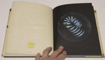
On a surface level, Mandy Barker‘s Beyond Drifting is didactic, at least in its book form. After all, the book is made to look like a late 19th Century science book. In fact, the attention to detail employed for production is impressive. Take off the dust jacket, and the book’s hard case really looks and feels like an old book. There is a fake library note added to the end papers, and it comes dog eared. The pages’ corners are rounded etc.


The production plays a necessary role of the overall illusion. As it will turn out, while the book pretends to be didactic in a specific way, it actually is not. The illusion is that you, the viewer, are faced with a late 19th Century book showing an assortment of microscopic sea organisms. These organisms are presented in round photographs, for the most part lacking the kind of technical details one would expect to see in 21st Century photographs. The images also reference what one might be familiar with from science programs, where a view through a microscope might offer a round image with blackness around it.
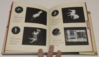
If that were indeed the idea behind Beyond Drifting, to show microscopic sea organisms in an old-timey way, it would be the kind of didactic book that would hardly warrant a second look. But it’s not. There is a smaller section in the back, entitled “Plates,” with a red sticker covering it (with the “concealed hazard” warning printed on top, the sticker somewhat breaks the illusions before the viewer has a chance to see). In that section, Barker reveals what the images really are, namely pictures of mostly plastic trash picked up on a beach. As it turns out, with a little photo trickery, you can make plastic trash look like plankton.
So the book’s reveal is the kicker, and quite a kicker it is. Barker is hardly the first artist to have focused on the insane amount of plastic trash polluting the oceans. Almost all of those other examples I can think of employed exactly the kind of pointing didacticism that ultimately makes the work so toothless: “Here, isn’t this bad?” We can all nod solemnly and go on consuming plastic, producing more trash (if the plastic-trash problem has not got you worried, how about this very recent article: Tests show billions of people globally are drinking water contaminated by plastic particles). But because Beyond Drifting manages to get the viewer so interested in the beauty of marine creatures, only to then unmask those beautiful creatures as ugly trash, it won’t get the viewer nodding: s/he has become too invested in what s/he was looking at.
And that’s really one of the problems of didactic photography: it’s hard to get your viewer invested, whether it’s to engage with the work in the first place or whether it’s to create the kind of emotional hook that all good art requires. Without an emotional hook, photographs will ultimately fall into oblivion, regardless of how many times they were shared on social media at some point in time. The next viral sensation is always just around the corner.
Let’s face it, almost everything is interesting in some ways. What’s more, there is a huge number of pressing problems we all know we should deal with. Didacticism is the worst possible way to get people interested beyond the surface level of “Oh, isn’t this terrible?” To get deeper, you need to get people hooked. Beyond Drifting can serve as a excellent example for how this can be done.
Beyond Drifting; photographs by Mandy Barker; 104 pages; Overlapse; 2017
Rating: Photography 4.0, Book Concept 4.0, Edit 3.0, Production 5.0 – Overall 4.1
Ratings explained here.
