Last week, I wrote that I don’t look at photobooks to see photographs. I look at photobooks to encounter life. Of course, that’s not the entire story, because I also look at photobooks for the simple reason that I love books in general.
If I had to summarize what exactly I’m looking for, I would probably say that I’m am looking for photobooks with character. In the past, I used Tupperware containers as a metaphor for photobooks without character.
It would be a grave mistake to confuse a photobook’s character with its production value. There are a lot of publishers who produce high-production value photobooks that have no character whatsoever. Every book looks and feels like every other of their books, using the same drab design, the same production etc.
It would be a different mistake to equate character with flashiness. If in real life you walk around with a red nose and a bunch of bells and whistles, you’ll be taken for a clown. You could apply similar thinking to photobooks: character arises not from how many bells and whistles you add to your book. It arises from all choices made being solely in service of the book itself (the book, not the photographs: unless it’s a catalogue, a photobook is more than merely a collection of photographs).

The best photobook publishers manage to produce books with a lot of character, and that character is both a reflection of the publisher and the work that is contained in the books. This makes for a tricky balance because a publisher’s contribution should not drown out the work, while the production of the work needs to neatly fit in with the publisher’s catalogue.
Of course, character can mean many different things. But at its core sits the publisher’s dedication to their medium, combined with their willingness to push boundaries where they can and need to be pushed.
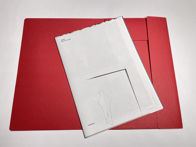
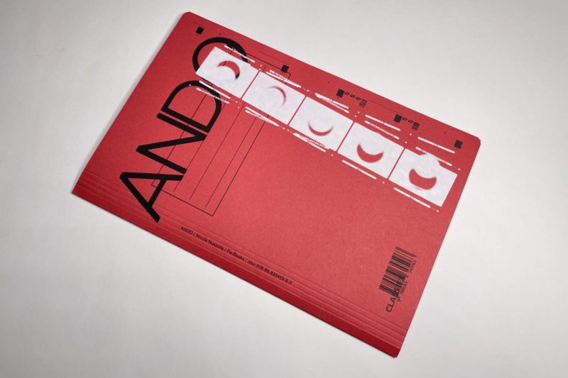
If you look at Nicola Nunziata — Ando, you’ll encounter a combination of all of the above. To begin with, the book doesn’t even look like a real book. It would be easy to mistaken it for a file folder (there are five different colours for the cover available).
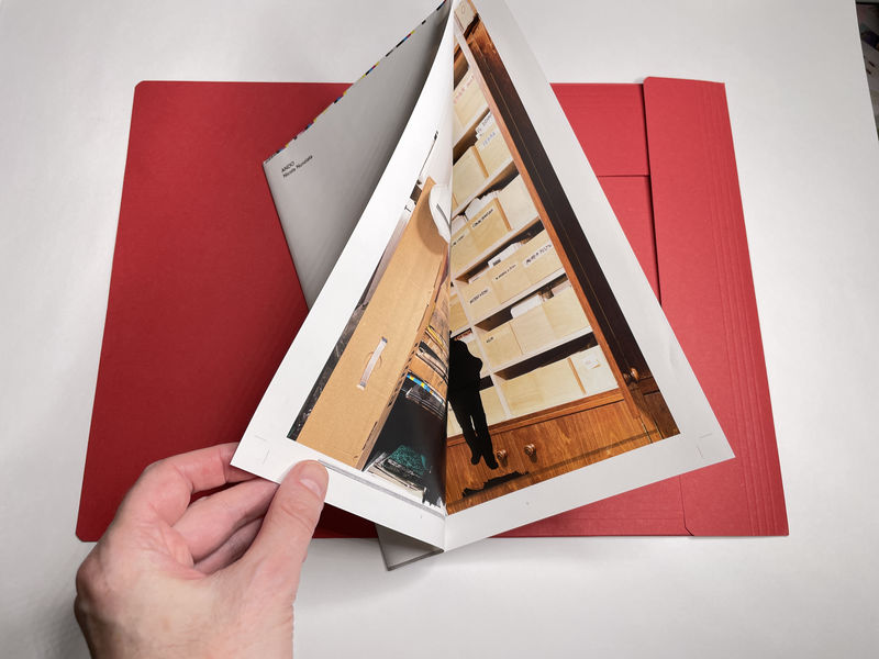
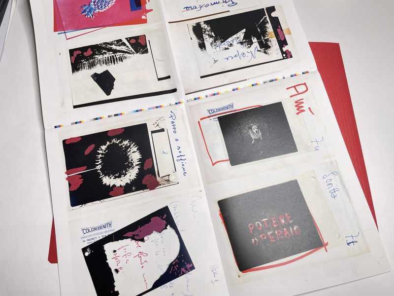
Once you open the folder, you’ll encounter the “file”: a collection of six folded sheets of paper. There are five that have been folded twice and that are made to look as if they were the sheets you’d get from a printing press: they are stacked, there are crop marks, and at the top you can see CMYK patterns that might be used to ensure proper print quality.

Of course, the sheets could have arisen from larger sheets that were cut down to this smaller size. Whether or not that was the case does not matter. What does matter is that as a viewer, you’re made to feel as if you were encountering printed materials that have not gone through all steps of book production, yet.
If you look carefully, you’ll see page numbers on the sheets. If you open the first sheet, you’ll notice that due to the folding, there are two pages hidden inside. You’ll be going from 1 to 2 to 3 to 4, as you might expect. But the following sheet continues with 9.
As it turns out, the missing page numbers can be found on that first sheet. They continue there, meaning that if you insisted on looking at the book following the order dictated by page numbers — maybe because you’re a good German and you’ve been taught to always follow orders, you’d have to disassemble the stack of folded paper.
Lest you worry too much, there are small notes on the sheets that will help you re-assemble to object back to its original state.
On the various pages, you encounter what you could best describe as a visual inventory of places, objects, and printed materials that center on Ando Gilardi, an Italian photographer and photography researcher.

Nicola Nunziata — Ando follows a tradition established be artists such as, for example, Christian Boltanski. In the 1970s, Boltanski exhibited all possessions of a number of people, and there are books as well — visual catalogues. Boltanski is one of the underappreciated artists in the world of photography, especially given that his insight into what photography can and cannot do still is very relevant today (read The Possible Life of Christian Boltanski to find out more!).
But the book also follows its publisher’s own tradition. In 2009, Hans Gremmen (the mastermind behind FW:Books) and Jaap Scheren got together to produce a book called Fake Flowers In Full Colour. In a very playful and smart fashion, the book centers on how colour photographs are printed today, using colour separations, with CMYK serving as the baseline (you can add all kinds of extra colours if you want).
Bring together any one of Boltanski’s inventories (stripped of its idea of completeness), throw in some of the ideas used in Fake Flowers, and you have Ando. It certainly does not matter whether you know Boltanski’s work or the Gremmen/Scheren book.
That’s key to making a good photobook as well: even if ideas are related to earlier ones, you want to avoid making books for your clever in-crowd (that’s not only tedious, it also severely limits the size of your potential audience).
Thus, the publication will appeal to photobook geeks who will appreciate the production value and sheer cleverness of its concept, and it will appeal to anyone who is looking for an engaging and visually delightful publication.
And everybody gets challenged in an equal fashion, because, after all, what’s the deal with all those unbound pages? How do you even look at this? Is there a right way? Or is that for you to figure out?

All of that can be had for € 18,35 (however much that might be in your local currency, should your country not use Euros). Which only proves that it is possible to produce incredibly engaging and smart photobooks without asking your audience to fork over a lot of money.
Recommended.
Ando; photographs by Nicola Nunziata; essays by Francesco Zanot and Elena and Patrizia Piccini; 44 pages; FW:Books; 2024
If you enjoyed this article, please consider subscribing to my Patreon. There, you will find exclusive articles, videos, and audio guides about the world of the photobook and more. For those curious, there now is the possibility of a trial membership for seven days.
Much like journalism, photography criticism involves a huge investment of time and resources. When you become a subscriber, you not only get access to more of my work. You will also help me produce it (including the free content on this site).
Thank you for your support!
