Photobook Reviews (W8/2021)

Article main image

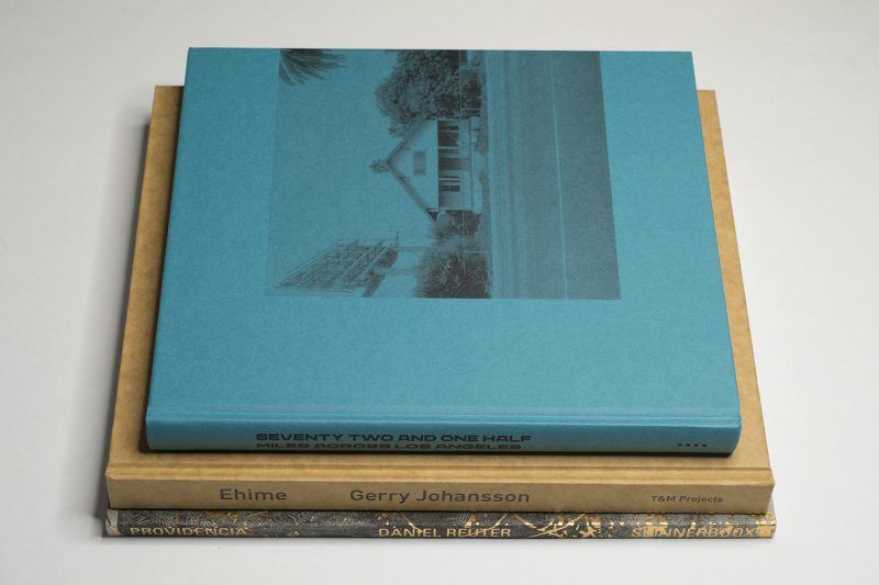
In 1999, Gerry Johansson spent four weeks in Japan’s Ehime prefecture, which covers the western part of the Shikoku Island and lies directly to the south of Hiroshima. His trip had been financed by a grant that would bring European photographers to Japan, to make work there. The resulting photographs have now been published as Ehime by T&M Projects.

Johansson is mostly known for his work with the square format (over the years, I have reviewed a number of books containing such pictures — you can find them through my index of photobook reviews). But there also was an earlier book with pictures made in Japan, specifically in Tokyo. Using an 8×10 camera, he had scoured the Japanese capital’s cityscape, focusing mostly on the many brand new buildings there (as a city, Tokyo is constantly in flux as older buildings get torn down, to be replaced by newer ones).

I remember that the Tokyo pictures had left me cold. They were very good pictures, but the surfaces and shapes of the buildings had reduced them to be more or less exercises in form. This is good, if that’s your thing (I personally find it mostly tedious). But focusing on just form eliminated the bulk of what makes Johansson such an interesting photographer when working with the square: the visual wit.

When I first went to Tokyo, I noticed how off putting I ended up finding many of those shiny new areas: they’re not only not very good in front of one’s camera, they simply lack all soul. But it’s a problem even outside of Tokyo. Japan has invested an enormous amount of money into its infrastructure, which has resulted in a lot of areas being covered with all kinds of concrete structures to hold them into place. There are these structures that just beg for formal treatment everywhere.

As a body of work, Ehime is another animal that sits somewhere in between Tokyo and most of the square work. By its very nature, an 8×10 camera has a very strong pull towards formal considerations. It’s such a hassle to set up and you can spend so much time studying a picture on the ground glass that all humanity might simply evaporate. While this happens occasionally in the new book, for the most part Johansson was able to evade the problem.

There are many pictures of neatly organised built structures and neatly pruned trees of bushes. But there are also many pictures of locations that at least at the time had not been reached by concrete mixers and construction crews, yet.

In a sense, the Japan that is described in these pictures is one that resist easy categorisation or description. It is that aspect that I appreciate the most. In some ways, anything you might expect is there; but it’s there in a way that doesn’t merely confirm, while presenting itself in a visually engaging and pleasing manner. And all of this comes in a very elegant and nicely produced book.

Recommended.

Ehime; photographs by Gerry Johansson; 184 pages; T&M Projects; 2020

Rating: Photography 4.0, Book Concept 3.0, Edit 3.0, Production 5.0 – Overall 3.9

One of the defining feature of much of contemporary photography is that it holds its viewers at arm’s length. This works really well for a lot of work. But with it being so widely used, the accumulation of all of these arm’s lengths also has created an overall atmosphere that is a bit too detached. Over the years, I have become increasingly sensitive to this issue. This is not to say that I now prefer work that is in my face (which only creates a different form of tedium). Instead, I tend to look for modulation, for a push and pull. I couldn’t say how this push and pull might work; in fact there might be no universal “recipe” for it.

I had think about all of this again when looking at Daniel Reuter‘s Providencia. According to the publisher’s website, the book was edited and sequenced by Milo Montelli. Thus, there is another pair of eyes and hands at play here. In addition, the book employs a few production tricks, such as, most prominently, the use of vellum paper upon which photographs are printed. These pages allow for the images on the neighbouring pages to shine through.

Photographed in Chile (in one image, the word “Chile” can be clearly read on the license plate of a car), these pictures could have been taken anywhere where the promises of late capitalism have just reached their tipping point: the beauty of the eventual outcome has just been revealed as hollow, the rising tide is not at all lifting all boats, and the next essentially man-made and entirely prevantable disaster is just one freak meteorological event away.

There are many surfaces in the book, too many actually: rocks and the sides of buildings and semi-translucent windows and gaudy plastic coverings. There are landscapes, too, some arid, some lush yet equally uninviting. And there are a few pictures of people, none of whom look at the camera, all trapped in their own thoughts.

I don’t know what’s missing. But I feel as if something were missing: a counterpoint of sorts, that rare opening where as a viewer you can move closer in, however briefly. Ultimately, the book makes it clear that there is a promise that is being betrayed. But its own shrinking away from giving a glimpse of what that might mean has been leaving me in a position where I’d like to care a little bit more about this place. And yet I don’t.

Maybe that’s the idea. If it is, then it’s done successfully. If it is, though, then for me, that’s not quite enough (as usual, your mileage might vary). If it is not, if the book wants me to care about the lives of all those people living in a place (why else would I look at it?), then I think I need to be offered very slightly more: an opening, a crack (metaphorically, I’m not speaking of the many literal cracks displayed in the pictures), a glimpse not of the promise but instead of what that promise has done with people, done for people.

People want to believe. In a photobook, I’d like to believe with them, even if it’s just for a moment. But maybe that’s something that contemporary photography operating at arm’s length simply cannot offer. Or maybe this is just me getting old. If it is that, though, me getting old, then I actually quite like that it does this to me: pulling me away from pure judgment, from cynicism, and wanting me to go to the inside of those arms.

Providencia; photographs by Daniel Reuter; essay by Alejandro Zambra; 112 pages; Skinnerboox; 2020

Rating: Photography 3.5, Book Concept 3.5, Edit 3.0, Production 5.0 – Overall 3.8

I have the theory that basically every city is good only for certain people, and I know that Los Angeles is not for me. To begin with, I find riding in or driving a car awful. So a city organised (if that’s even the right word for it) around having to drive everywhere is farthest from the kind of place I tend to enjoy.

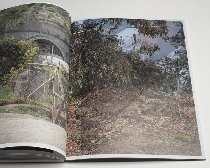
Obviously, you don’t actually have to drive in Los Angeles, you could just walk. Fair enough. But then walking in a place that is organised around driving also is not very enjoyable. Still, some people do it, such as, for example, Nigel Raab who walked 72.5 miles across the city in four days. Raab then approached Mark Ruwedel and asked whether he would be interested in making pictures along the route. Ruwedel was (he used a car), which eventually resulted in Seventy Two And One Half Miles Across Los Angeles.

In the world of astronomy, one would describe the outcome of the exercise as a pencil-beam survey: a narrow, yet deep look at a small, selected part of the Universe that despite its restrictions still offers possibly a lot of interesting results. Raab’s route across Los Angeles follows a similar idea, as becomes clear from Ruwedel’s photographs. As much as there is ample repetition — the same types of houses, the sheer endless expanses covered with roads — there is a progression that, I suspect, someone familiar with the place would be able to pick up on even more easily than an outsider like me.

In some ways, the book itself reminded me of especially technical books from before I was born. I don’t know enough about typefaces to know better — or maybe the connection was made on purpose. But I appreciate this aspect of the book. This also includes the placement of the photographs on the pages, with those of their edges closest to the fore-edge always touching it: the design invokes the idea of something continuing, even though unlike in some contemporary Dutch design parts of the same picture are not printed on the obverse and reverse of a page.

What I’m going to take away from the book other than confirmation that this place indeed is not for me I don’t know. But I appreciate that challenge in a book: it makes me look again and again, to see whether I’m not in fact missing something. After all, I might. There also is that connection with the tradition of art/photography made in Los Angeles (hard not to think of echoes of Ed Ruscha), a connection that reminds me of how there’s an underexplored spot in my own way of looking at photography made in the US.

Seventy Two And One Half Miles Across Los Angeles; photographs by Mark Ruwedel; texts by Nigel Raab and Mark Ruwedel; 160 pages; Mack; 2020

Rating: Photography 3.5, Book Concept 3.5, Edit 3.0, Production 4.5 – Overall 3.7

Woman Go No’Gree

Article main image

When speaking with Japanese friends, I noticed that cross-cultural misunderstandings are always just one statement by me away, my own good intentions notwithstanding. Given my origin and age, I have been trained to follow what we could loosely call the Western tradition of enlightenment (which for the longest time, has not really been all that enlightened after all, and it’s not even that clear to what extent it is now).

We people volunteer out thinking, because that’s the tradition. Japanese people, in contrast, operate very differently even when a large part of their education is based on the same or similar principles. In Japanese society, the role of the individual is very different, and people are extremely mindful of social differences. Almost inevitably, this will make you, as someone not familiar with how things are expressed, stumble into what is perceived as rudeness.

Beyond linguistic nuances — for example you want to avoid addressing people directly, there are societal and cultural ones. It’s easy to assume that larger abstract ideas that are based in political activism — such as, for example, feminism — translate the same way in both contexts. But as I found out they don’t necessarily do that.

It would be tempting to think that such issues arise only when one is faced with someone from another culture. But even within our own society, we run into similar problems, such as when well-off people wonder or complain about what poor people might spend their money on. If you’re well off, you might want to think twice before you dive into this topic, because what you might think of as benevolence might actually reveal something a lot less wholesome underneath.

Obviously, the ultimate goal of dealing with cross-cultural (or cross-class) misunderstandings must be to arrive at a deeper recognition of what’s going on. This goal stands in contrast to the supposed end result of moral relativism that typically is evoked by conservatives: namely that the end result of this all is “anything goes” (this conclusion reveals a lot about an authoritarian mindset in the background).

Gloria Oyarzabal‘s Woman Go No’Gree provides a prime example of a recent photobook that directly addresses the above. In a nutshell, the work resulted from the artist realising that the application of Western feminist thinking to the situation of women in Africa was running into a series of problems.

Obviously, Africa is a huge and diverse continent. Specifically, Ovarzabal talks about the Yoruba society. The Yoruba are an West African ethnic group that mainly live in Nigeria and Benin, with a population of roughly 44 million (the fact that they live across a number of countries might serve as a reminder of the arbitrariness of borders arbitrarily imposed by colonial rulers).

Through a combination of text and images, the book dives into the complexities of the topic at hand. There is text that serves as an introduction to chapters, and there is a longer appendix that casts a wide net over various aspects that are important here: imperialism, the role of women in traditional and contemporary thinking, post-colonialism, and more.

Given the various images from the book re-appear in the appendix as thumbnails and are cross-referenced in the text, it could easily serve as study material for a teaching context. With its many quotations and references it is this text that I’ve found myself coming back to time and again. I suspect, though, that the more populist minded parts of photoland might decry it as being “too academic” (which I don’t think it is, but your mileage might vary).

In terms of its pictures, the book contains a wide variety of material and approaches, including colonial-era archival photographs, straight photographs, and staged photographs, with additional post-production in the computer in some cases. This mix and the very smart edit and sequence help convey the overall idea that the text itself talks about. The viewer is made to look at women living in Africa in a variety of ways, and the overall feeling is one of self-determination: these women neither need colonial administrators to tell them what to do nor contemporary men from their own or any other culture.

In an obvious sense, photographs can only do so much — compared with the text, they cannot convey all of the details. At the same time, because of their purely visual nature, the photographs are able to arrive at a felt immediacy that the text cannot deliver. It is this back and forth between text and images that works incredibly well in this book.

As it is becoming more and more clear that large parts of photography have to face their own ugly past, a book like Woman Go No’Gree is able to provide one model for how this can be done. For sure there is the need for voices other than those from the previous colonial powers to be heard. At the same time, Westerners need to deal with the heritage of photography’s past abuses to deal with their own medium’s legacy.

With  Woman Go No’Gree Gloria Ovarzabal has provided a model for what the confrontation with photography’s past might look like. As is demonstrated in the book, this confrontation must involve a reckoning with the Western mindset, a mindset that too often takes itself as the yardstick for how to understand the world.

Highly recommended.

(not rated)

Woman Go No’Gree; photographs and text by Gloria Ovarzabal; 176 pages; RM; 2020

The Green Helicopter

Article main image

A little while ago, John Edwin Mason sent me a Twitter thread, in which Chris Wade had compiled what he considered photography highlights from the Trump years. I had seen most of the pictures, but I still ended up being amazed by them.

In fact, I had expressed my surprise about the Trump team being so inept at visuals many times on Twitter. Having thought about this for a few days, though, I now think I had had it all wrong. Or rather, what I had commented on was not an ineptitude to produce visuals per se. It was the ineptitude (or unwillingness) to produce the kinds of pictures we expected to see.

The difference between what was presented and what we might have expected is crucial. It doesn’t say all that much about the Trump regime, while it says a lot about the visual ecosystem surrounding politics that we take for granted.

This ecosystem cannot be separated from the underlying economy of it all: the corporations that own and run photography agencies, newspapers and news sites, etc. Given I am not an industry insider, I will ignore this aspect in the following. I don’t have solutions for the industry’s basic business problems (if I did, I obviously wouldn’t be writing articles about photography for free).

Our political visual ecosystem is fuelled by photography’s immediacy. A relatively large number of photographers, most of them very gifted individuals, follow political proceedings wherever and whenever they happen. You mostly don’t see them, but you always hear them: a political event would be incomplete without the soundtrack provided by single-lens-reflex cameras’ mirrors rattling against their cages.

Photography’s immediacy is maybe its biggest curse (please note that in the following, I’m using the term “photography” to stand for photography in the news context). We now have access to pictures of events as they happen, whether it’s a mob storming the US Capitol or, two weeks later, a new president being sworn in. This immediacy has spawned its own visual culture — just think of how the picture of Bernie Sanders sitting somewhat grumpily on a chair turned into a widely created and shared meme instantly.

In other words, photography is able to achieve something that Francis Bacon said he hoped his paintings would do: coming from his own nervous system, they would bypass a viewer’s critical facilities and directly address their nervous system. It’s debatable to what extent painting can do this. Photography, however, is able to achieve this effect simply by being a part of our widely networked information system.

Photography’s immediacy inherently stands in the way of producing understanding. It’s not that clear what kind of understanding a photograph can produce anyway — what exactly do we learn from a picture of a president signing a document? Whatever that understanding might be, it would arise out of thinking things over and discussing them in more detail. In out political visual ecosystem, there is no time for that.

It seems obvious to me that all participants in this ecosystem are aware of the problem, and they all attempt to make the best of it. For those in front of the camera, this means that they have to be aware of what an event looks like in a picture, given the system’s requirements and traditions (it is this aspect that the Trump regime so blatantly violated where it wasn’t simply abysmally bad at it). I grew up in the German political visual ecosystem, so I’m still amazed by everything that is different in the US. I suspect that someone who grew up here simply won’t notice — they will only notice when something is different.

For those behind the cameras, the goal is to get the pictures that essentially conform to implicitly agreed upon conventions. For example, when a president leaves office, the expectation is to see him get into that green helicopter, and there will have to be some picture made around that. How do you get anything out of a scene that has already been photographed hundreds of times? That’s the challenge. (Alternative answer: you don’t get anything out of it because you can’t.)

Thus, the transfer of power in the US would be incomplete without the helicopter taking off. It would also be incomplete without the new president arriving at the White House in some enormous motorcade. At some stage, the new president will get out of his enormous car and walk (so far, US presidents have all been men; I’m looking forward to the hopefully not-so-distant day when my choice of pronoun will be able to reflect a reality that many other countries already arrived at decades ago).

If you didn’t know anything about the country’s political visual ecosystem, you would have imagined Joe Biden could have made it to the White House in ten minutes, to get to work immediately. But no, just like in every inauguration year, the whole production was staged — even though this year, there were no spectators other than mostly security personnel. He got out of his car, and he waved to people who weren’t there (there were a few people — reporters and security personnel, but you know what I mean). If memory serves me right, it was called it a “virtual inauguration”. Jean Baudrillard might have called it a “simulation”. I prefer the term “theatre” — in the sense of the highly stylised and very strictly scripted form present in classical Japanese culture (Noh or Kabuki).

There would have to be a picture of a certain kind, namely the president walking down Pennsylvania Avenue, and the Biden team did very well. They made sure the whole family, in particular the very lively grandchildren, were always present. In a very obvious sense, this was a form of propaganda. But it’s a form of propaganda that is inherent in the US’ political visual ecosystem. Everybody knows their role — performers, recorders, viewers. Everybody plays along.

Something is thought to happen in the small moments where there possibly is a crack appearing. Just think about how the media became obsessed with the relationship between Donald Trump and his wife Melania: would they hold hands? Or would they not? I think the reason why there was so much focus on something that is this irrelevant for anyone other than the parties involved is not that the US inherently is a shallow country (trust me, if you look at German tabloids, you’re facing an abyss of shallowness and pettiness). The main reason for the media focus on whether the Trumps would be able to behave like a happily married couple simply was that everybody had agreed on the idea that political pictures have to conform to agreed upon conventions (“happy couple”).

There are a lot more conventions. Think about US politicians campaigning with their shirt sleeves rolled up. Think about how politicians show remorse in public: the biting of the lip, the looking down. It’s all completely fake. But the fakeness is besides the point, much like it’s besides the point that in Noh theatre, emotions are expressed with a set of very simple masks, or that in any Hollywood movie a few very well known actors appear in very different roles. It’s all fake in a very obvious sense. But we know that the actual message appears beyond the artifice (for a different in-depth exploration of this idea in a different context, have a look at my book Photography’s Neoliberal Realism).

As a consequence, possible meaning tends to be inferred from someone breaking the visual conventions, whether it’s the Trumps not holding hands, Bernie Sanders showing up to the inauguration as if he were at a Vermont farmers market, or whatever else there might be. I probably don’t have to explain how problematic such an approach is: as a US politician, you can get away with a lot of stuff — as long as you are able to let photographers produce the right pictures.

But there is another major problem here that I haven’t addressed, yet. Not surprisingly, most discussions around political imagery happen along parameters set not by those looking at the pictures but by the larger ecosystem itself. For example, nobody has questioned why we would need to see the green-helicopter picture. Instead, people have been trying to slice and dice which helicopter picture expresses best the idea of the Trump presidency ending.

My main concern is that the whole political visual ecosystem violates the rule “show, don’t tell.” Most events are essentially pre-visualized. Thus, the story is being told in the head of every participant before the pictures arrive. To make this very clear, this is not a problem of the photographers — it’s our collective problem, whether we’re politicians, photographers, editors, publishers, viewers. We know the story before we see it.

Unlike in theatre, where we tend to know the story very well before we see (experience) it, to be then taken by the larger ideas expressed (whether it’s love or loss or human folly or whatever else), in contemporary politics, there are no larger ideas any longer. Politicians have essentially become technocrats, offering solutions for problems, most of which are entirely artificial. When an actual problem — or crisis — comes along, underlying assumptions aren’t challenged. Instead, technocratic solutions (that adhere to party dogma) are applied.

As a consequence, in our political visual ecosystem, most of the time when there is a derivation from conventions, the discussion does not revolve around what the derivation tells us about these conventions (which could provide insight), but around what the derivation tells us about the person depicted that way.

In the absence of discussions around fundamental, systemic problems (for example neoliberal capitalism), instead the system deflects everything onto a single person and turns what could be a deeper discussion into something that’s just only one step away from mere entertainment (if even that: Bernie Sanders’ mittens). As a result, almost inevitably the possibility of gaining no deeper insight does not present itself, and neither does the possibility of deeper, meaningful change. Instead, at best we’ll get giddy excitement about the Trumps’ marriage or Bernie memes (Memefy your dissent!). That’s it.

In Sanders’ case, the ecosystem has adapted to him in such a way that there is an expectation that he would do what he did. Just imagine if he had showed up in a finely tailored suit to the inauguration. In that case, collectively we would have turned against one of the most vocal critics of neoliberal capitalism, and we would be talking about hypocrisy (his — not ours obviously).

It’s not clear to me how the immediate visual journalism that forms news photography would be able to provide insight into what it depicts. On its own, it simply can’t. Pictures can only show so much as can captions added maybe an hour later. In principle, we are in desperate need of another, very distinct component, a component that would entail deeper reflection and a look beyond the conventions, beyond what we all expect to see.

Whatever you want to say about the picture magazine that has now disappeared, this was one of its strengths: diving into stories more deeply. This is not to say that those were the golden days of visual journalism. There obviously were many problems. But the form itself, the longer-form connection of a number of photographs, combined with quite a bit of text to establish context — that form had more promise than anything we have seen ever since.

In a nutshell, the United States just faced one of its most desperate political crises in its existence, where a corrupt authoritarian president almost managed to destroy the country’s democracy. Do we have a visual record of that? No, we don’t. All we’re left with are the weird pictures in that Twitter thread I mentioned in the beginning, almost none of which come even close to hinting at what happened.

That’s pretty scary. After all, next time when there’s such an attempt to overturn the democratic will of the people, the country might not be so lucky.


I’ve set up a tip jar. If you’ve enjoyed this article (or site), feel free to leave a tip to support my work. Thank you!

Also, there is a Mailing List. You can sign up here. If you follow the link, you can also see the growing archive. Emails arrive roughly every two weeks or so.