Three Reviews: Faminsky / Southam / Milach

Article main image

“During my service for the Military Medical Museum of the Red Army, from November 1943 to May 1945” wrote Valery V. Faminsky in an autobiographical sketch, “I served on seven fronts in WWII. […] From the 22nd of April to the 24th of May 1945, I covered the Russian entry into the suburbs of Berlin and then inside the city.” Cue forward 70 years. Arthur Bondar: “In 2016 I saw an advertisement online that somebody was selling the negatives of a Soviet photographer from the WWII period. […] the seller […] briefly spoke of the photographer, Valery Faminsky. After his death […] relatives discovered this collection at Faminsky’s apartment. Nobody was interested in the photography, so the family decided to sell it.” These two texts can be found at the end of Berlin Mai 1945, a book that now presents the photographs Faminsky took during the final days of World War 2.

There’s something staggering about the history of the book itself. Without the history that can be found depicted in the photographs, its relevance would of course be vastly diminished. After all, photographers die all the time, and their archives are then being sold off online. These days, a book made about or from a find has become a regular occurrence in the world of photography. In fact, some artists and publishers have turned this approach into an industry of their own.

Still, the frequency with which pretty amazing material is being discovered for me points at the fact that the history of photography as written is at best the tip of a vast iceberg. What is known, in other words, or what is famous and/or celebrated often enough is not necessarily the best. It’s often known simply because it’s known and because something else has been suppressed or not discovered or dismissed. It’s very possible that some of the most amazing photographs ever taken will never see the light of day again (pardon the pun) simply for that reason — while the same old tiresome stuff is being peddled in museums all over the world.

What makes Faminsky’s photographs so interesting isn’t just that he happened to be in the right place at the right time. He was also an extremely skilled photographer who took pictures of a bewildering variety of scenes (I have seen other books of somewhat similar WW2 era material, and many of them fall short in that regard). For example, there’s a photograph of an almost a little bourgeois looking Soviet soldier who is depicted painting (in front of a shop named “Panther” whose shutters are drawn). A few pages before him, there’s another painter holding what might be a small watercolor (in the back of the book, he is identified as “Kitayko, a painter from the Grekov studio”; this is the second Grekov studio painter in the book).

There are ample photographs of an utterly devastated Berlin, there are what can only be called propaganda pictures (such as one of some meeting around a table in front of a tank — a good example of Socialist realism if there ever was one), there are more photojournalistic pictures of the military advancing and wounded soldiers retreating, there are what look like more casual snapshot portraits, etc. It’s a truly incredible archive that is now widely available again and that adds visuals to a widely known story.

Berlin Mai 1945; photographs by Valery Faminsky; test by Arthur Bondar, Valery Faminsky, Peter Steinbach; 184 pages; Buchkunst Berlin; 2018

(not rated)

Almost three years ago, I wrote a short opinion piece entitled Why does it always have to be about something? It garnered some attention from photographers who don’t work with projects that are “about” this or that, who, in other words, make pictures, and that’s it. In principle, that approach should be fine — and it is, but it has become somewhat uncommon. These days, every photographer is “exploring” or “investigating” something, and s/he then produces a project about that something before moving on to some other something (or the same thing in some sort of variant).

I’ve even noticed that many young photographers I speak with get nervous when facing the prospect of making pictures without knowing what it’s all going to be about. It’s almost as if the thinking well known from the editorial part of photoland has taken hold everywhere: everything has to always be about something, and you work on everything in chunks that then — inevitably — become a narrative-driven photobook.

If you’re someone who doesn’t work with that approach, you might feel that you’re on your own, that you’re not en vogue (it escapes me personally what would be so terrible about that, but that might be my age or lack of or actually complete and utter disinterest in competitiveness showing). Another way to approach this situation might simply be to go about what you’re doing, and with an increasing archive of seemingly unrelated pictures at hand you’ll then pull out the strands that might show up after all.

I don’t want to make it sound as if that’s how Jem Southam‘s The Moth came about — I don’t know. The book’s afterword makes me think my hunch is correct, but since as a critic I question everything photographers say about their own work, I can’t go with that. What I can say, though, is that the book feels to me as if it were made this way, with the artist (who for me is one of the very finest contemporary landscape photographers there is) pulling a particular strand out of thirty years of work, to arrive at this very melancholic and introspective book.

Looking at the book had me think of being in the presence of the man behind the book, of sitting near him, watching him. Without a single word said there’d still be a lot communicated about a life lived, about what it means to be alive. I couldn’t necessarily say what it’s all about, but it certainly doesn’t matter at all. It’s beautiful.

The Moth; photographs and short text by Jem Southam; 72 pages; MACK; 2018

Rating: Photography 4.0, Book Concept 3.5, Edit 3.0, Production 4.0 – Overall 3.7

As Jason Stanley outlines in How Fascism Works, there is a neo-fascist assault on democratic institutions happening in many countries all over the world. In some countries, that assault has been hugely successful, turning previously democratic societies into shadows (if that) of their former selves; in others, the struggle over the future is still undecided. In some countries, its institutions that have led the resistance (for example in the US), in others, it has been the people themselves.

For a large variety of reasons (most of which are beyond the scope of this review), I have been watching events in  Poland very intently. Faced with an onslaught of illiberal laws by the neofascist party in power (PiS), Poles have taken to the streets time and again to protest and make their voices heard. In light of the  country’s recent history, with its Solidarnośč movement ousting the communist dictatorship imposed on the country after World War 2, this might not come as a surprise.

But still, I find the many expressions of civil resistance hugely inspiring, especially given how adept it has been at using very simple and effective visual symbols. For example, to fight PiS’ undermining of democratic institutions, the fact that the Polish word for constitution (konstytucja) contains the words for you (ty; strictly speaking this is the informal you, which makes this even more effective) and I (ja), a protest poster makes use of these details (see above), with the main word’s two constituent parts highlighted in the country’s national colours (white and red; see this article for details; this one has a lot of details and other posters).

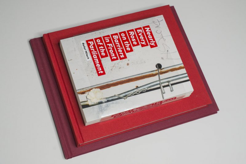
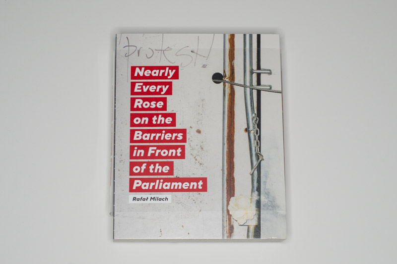
There have been other symbols as well, such as white candles and white roses. In a nutshell, Nearly Every Rose on the Barriers in Front of the Parliament by Rafał Milach  is really “only” what its title says it is: a collection of such photographs, with the barriers providing the rough canvas against which the fragile flowers seem so powerless and powerful at the same time. It’s an accordion book that when unfolded present the viewer with a barrier of her or his own. On its back, there is a collection of anonymous uniformed men, made ever more ominous through the clever use of a heavy dot pattern.

In a variety of ways, the book is as inconsequential as photobooks are: they’re not going to change the world. But it’s an individuals gesture of resistance, which neatly ties in with his fellow citizens’. So I find the fact that a visual artist would actively engage with his country’s convulsions hugely inspiring (this isn’t Milach’s first project around the topic, and I suspect it will not be his last).

I wish I would see this more in other parts of the world. There simply is too much at stake for all of us. If photoland really cares as much about the state of the societies it operates in as it proclaims, then it would be awfully nice to see this expressed a bit more: where is all the protest art?

Nearly Every Rose on the Barriers in Front of the Parliament; photographs by Rafał Milach; accordion; Jednostka; 2018

Rating: Photography 3.0, Book Concept 5.0, Edit 3.0, Production 5.0 – Overall 4.0

Littoral Drift + Ecotone

Article main image

The New York Public Library (NYPL) had a companion exhibition to Blue Prints: The Pioneering Photographs of Anna Atkins (find my review of the catalogue produced at this occasion here). Entitled Anna Atkins Refracted: Contemporary Works, it showcased artists whose work could be seen in relation to Atkins’, many — but not all — of them using the cyanotype process. Of these, my favourite pieces were made by Meghann Riepenhoff, in particular the algae ones.

At first I was baffled and most curious: how do you create cyanotypes that feature all these colours? Walking closer, I realized how: you don’t. Or rather, Riepenhoff had followed Atkins’ lead, placing algae on sensitized paper — without ever removing the specimen. For Atkins, this would have constituted a bad mistake. After all, her goal was to produce images that would be allow themselves to be used in a scientific context. Here, though, the assemblages shone most gloriously, with a variety of shapes of all kinds of colours sitting on top of the cyanotype outlines of the plants’ original shapes.

“Of course!” I found myself thinking — of course, this is how one would do this if one actually thought of it. It’s not scientific, and it’s probably iffy in an art-conservational context, but the idea of pushing the process further by adding the fragile materiality of the plants seemed entirely appropriate to me. I wish I had thought of that, but, alas!, I hadn’t.

Over the course of the past few years, Riepenhoff has made use of the cyanotype process in a variety of ways. Other artists use cyanotypes simply as a way to produce photo-sensitized paper, the idea being that the final image — whether a photogram or a photograph — ought to be as perfect as possible: a photographic approach. Seen that way, the cyanotype is not that different than a platinum print, except that, of course, the latter is a lot harder to produce.

Riepenhoff, however, focuses her attention on the material itself and on the way it might develop, given exposure to light under conditions that defeat all chances of getting anything photographic. There is, in other words, ample chance involved, and the resulting images don’t look like photograms, let alone photographs. It shudders me to think someone might use this fact to contest the photographic nature of the work (following how large parts of photo history have mistreated Atkins) — if they do, I honestly don’t want to hear about it.

For Ecotone, a sensitized sheet of paper might be placed on top of a tree’s branch, resulting not only in a specific pattern of exposure but also in parts of the photosensitive emulsion getting prematurely washed away by rain. Littoral Drift uses a somewhat similar approach, except here the sheets of paper are laid out at the edge of the sea, and the moving water — the waves — will produce an unpredictable pattern as it washes away the emulsion while the sun’s UV light does its job. In both cases, the resulting images contain abstract patterns, with the process leaving more of a trace in Drift.

A new catalog — Littoral Drift + Ecotone — now presents these bodies of work to a larger audience. As is, the images suffer from the same problem that is so well known from the world of painting: many of them are simply too large to allow for life-size reproduction in a book. This is especially true for the largest assemblages, which comprise of dozens of individual images grouped together. In addition, there is a surface quality to the images that while not reaching what is common in the world of paintings still is integral to the work.

The catalog does a very good job conveying the various qualities of these two bodies of work. Separated into two joint volumes (the publisher’s website calls this a “Z binding”), the viewer gets to experience the images in a variety of ways, whether in the form of reproductions, details, or as installation photographs in which the presence of viewers gives a sense of scale. A variety of gatefolds allows for the presentation of images whose shape cannot be fit easily into the catalogue’s vertical rectangle.

The production value is high, making for an immersive experience. It’s a hefty package, though. Even though it’s “only” a 11×13″ (27x33cm) book with a total of 224 pages it feels like a lot more (I’ve found its weight listed online as almost 7 pounds). In fact, after looking through it a few times, I was surprised it was only 224 pages. Somehow, it had felt like a lot more. And this really is the one thing that I’d say for me isn’t quite right here: it’s just too much. This could have been a simpler one-volume catalog with fewer images, without anything being lost. The whole package feels excessive without there being a real reason for that.

This quibble aside, I thoroughly enjoy being able to engage with Riepenhoff’s work now, without having to travel to some museum or gallery. I tend to have qualms about processed-based photography simply because all-too-often, it becomes too centered on its own process, too centered on its maker’s craftiness or cleverness — too often, in other words, it stays in the realm of photocraft without being able to do more.

This concern doesn’t apply here. Interestingly enough, the work is about the underlying process, yet at the same time, the resulting images are lifted out of it. Riepenhoff’s ability to exceed photocraft is also what made her work stand out in the NYPL exhibition: it’s clever while it doesn’t just stay clever, it’s crafty while it doesn’t just stay crafty, and it’s process based while also being more than that. Being able to do that is quite an achievement.

Littoral Drift + Econotone; images by Meghann Riepenhoff; texts by Charlotte Cotton and Joshua Chang; 2×112 pages; Radius Books; 2018

(not rated)

Sun Gardens

Article main image

For literally everything that is in my view right now, there must have been someone who thought first of any of the many, many aspects that go into the making of all of these objects. Only when I turn my head to the left do I see objects for which this does not apply: trees outside. I personally find this aspect of the world very interesting, because even the seemingly simplest solution might have come at the end of an arduous process that possibly entailed many failed attempts to find it.

How this general process played out in the world of photography is relatively well known. But still, at times it amazes me, especially when I look at pictures made by people who were very close to the point in time when something was invented. It’s so easy to pick up one’s phone and snap a quick picture now. When I grew up you’d be able to also snap a picture, but to see it there’d be a lot more work involved (yours or someone else’s): someone would have to develop the film etc. Even earlier, there was no such thing as “film” – you’d have to make the equivalent yourself — in a time when there was no electricity.

Make no mistake, I’m no romantic. I don’t think the “olden days” were better (they were absolutely not) or more desirable (ditto) or simpler (ditto). I’m simply in awe of the dedication with which some people in the past must have approached the making of, let’s say, a photograph, given that without this dedication there wouldn’t have been a photograph (in contrast, all I need to do to take a photo is to press a button, swipe, and press another button). My own amazement about this dedication is directly tied to my being in awe of the result, with the latter driving the former (the other way around doesn’t necessarily work for me in the arts: craft might make art, but it also might just remain craft).

In the world of photography, Anna Atkins‘ cyanotypes of algae clearly belong to these types of images. The process itself was invented in 1842 by Sir John Herschel, and very shortly after, Atkins already used it to make hundreds and hundreds of images, sets of which she gave or sold to other people who, in turn, would have the sheets bound into proper books (so even as a recipient, you had some work to do, assuming you’d want to see what Atkins actually had in mind). A catalog produced at the occasion of an exhibition at the New York Public Library (NYPL), Sun Gardens, now offers deep insight into the artist, both in terms of her life story and the images in question.

Turns out, the NYPL owns two copies of Algae books, one — the so-called Herschel copy — acquired in 1985, the other one in 2016. Along with a variety of related material, these copies were put on display in the exhibition co-curated by Joshua Chang and Larry J. Schaaf (the former is curator of photography at the NYPL, the latter wrote the seminal 1985 version of the book which is out of print). Being able to see these books in person for me was one of the highlights of 2018 (beyond the scope of this review, but still: the accompanying exhibition of contemporary artists working with cyanotypes was also very good, even though the quality of the included pieces varied greatly).

Sun Gardens demonstrates how the format of the catalog can be used perfectly to bring the material in the exhibition to an audience that might not have had a chance to see it. For example, right after the table of contents and preface, Part I of the Herschel copy is reproduced in its entirety as a facsimile. With the attention to detail that clearly went into this effort — colours and tones were accurately matched, and the catalog’s paper choice is exquisite — the reader/viewer is brought as close as possible to what Herschel would have been able to hold in his hands in 1843.

A lavishly illustrated fifty-page section by Schaaf reveals the full story of both the artist and her work, placing her into the societal and scientific context of her time, and diving deeply into the process of making the prints itself. Reading this part had me deeply fascinated — more so, in fact, than looking at many of the actual images. I have the same reaction for various other well-known bodies of work by other artists. For example, I yet have to be able to look through the copy of the Bechers’ water towers book I own. Theirs — much like Atkins’ — is a magnificent achievement, the point of which for me lies in the unfaltering dedication to the subject.

Beyond the aforementioned facsimile, Sun Gardens contains a large number of images from the various volumes of Atkins’ books. Consequently, the viewer can experience the variety of material her or himself. There also are more detailed sections on what is known about the books — where they are, where they came from, etc. Plus, there is a section on the process itself, written by Mike Ware, for those who want to know a lot more about it.

There possibly is no need to stress the importance of Anna Atkins’ work in light of increased efforts to bring to light (pardon the pun) previously underrepresented if not outright ignored efforts by female artists (c.f. my review of How We See). Still, the timing of the release of this catalog is fortuitous.

It will hopefully help lay to rest whatever concerns that might still exist about the validity of this work in particular (concerns that I actually never understood — the discussion centering on the camera-less aspect of the work has always seemed positively pointless if not outright petty to me) and about the contribution of women artists to the history of the medium in general.

Sun gardens: Cyanotypes by Anna Atkins; images by Anna Atkins; essays by Joshua Chang, Larry J. Schaaf, Emily Walz, Mike Ware; 216 pages; Prestel; 2018

(not rated)

The Universal Photographer

Article main image

The art of photography does not consist of being able to take a good picture. Anyone can — and actually will at some stage — take a good picture. The art is to be able to do it on a consistent basis, in a consistent manner. Of course, over the past decades the idea of what the word “art” means has become sufficiently watered down for any photograph to be considered good (plus, what does “good” mean anyway?). So it would be straightforward to throw all art ideas out of the window and simply enjoy things as they come.

There’s a small industry of people who have been doing exactly that — think, for example, Erik Kessels, Joachim Schmid, or Melissa Catanese (if you don’t throw the idea of art out of the window, you’re in Christian Boltanski territory). Their is a fun game that in part derives its appeal from the fact that using photographs by people who according to the professionals have limited skills is a somewhat subversive maneuver, which pokes holes into photoland’s vast pretensions.

As much as I find these pretensions tiresome myself, I personally couldn’t spend too much time with the work produced in this industry, though: with enough holes poked, the idea of doing that gets a little stale, a little too self-satisfied. Plus, as is the case for all kinds of activities, too many low hanging fruits picked tend to spoil the overall experience.

Luckily, there still are plenty of gems being produced, such as the most recent The Universal Photographer by Anne Geene and Arjan de Nooy (larger parts of the industry appear to be based in the Netherlands). The basic idea is simple: the book presents the work of a fictitious photographer, whose name is reduced to merely one character — U.

The book starts out by establishing U.’s relationship to the well-known world of photography. This is a tongue-in-cheek endeavour that where it succeeds particularly well manages to perform the aforementioned calling out of of pretensions (“Where Winogrand said: ‘I photograph to find out what something will look like photographed,’ U. stated ‘I photograph to find out if I am still looking’ and sometimes ‘I am looking to find out if I am still photographing.'”).

The book then presents the artist’s presumed bodies of work much like a serious catalogue would, starting with — of course — “Early Work” (in b/w), moving to Tichy style “Voyeur”, and from there onward to “Wedding Photographer”. I suspect at this stage, things could have easily got tedious, but with the next section, “Theories”, things take a turn towards the unexpected. “Theories” is comprised of photographs onto which someone types text with a typewriter. “Collages”, the following section, then involves photographs getting stapled together. And on and on it goes — I won’t give it all away here.

So whatever expectation the viewer (well, this one anyway) might have had (“Oh, I know where this is going”), they are being subverted. It’s mad fun. Deftly, Geene and De Nooy manage to re-insert a lot of fun into their industry that of late had felt a bit too predictable.

In addition, the authors are clearly aware of what already has been done, to push things a little further to an absurd conclusion. An example would be the chapter “Corrections” where sections are cut out of photographs; however, instead of just faces (to be used in passports, say), a knee might be cut out (needless to say, this description falls far short of what the visuals are able to deliver).

The Universal Photographer concludes with a 70 page section entitled “Notes.” This section is subdivided into a larger number of smaller parts, each of which contains dozens of quotes. For example, under “Authorship,” you find “Cameras don’t take pictures.” (A.D. Coleman) or “Can an art without an artist still be an art?” (Pierre Bourdieu). This is good stuff. The section “Character” alone is enlightening, as it reveals the sheer pomposity with which some of photography’s “greats” have spoken about themselves.

All of this makes this book one to get. It’s hugely enjoyable, it’s clever, but it’s never too glib about its own cleverness.

The Universal Photographer; various photographers and authors; edited/appropriated by Anne Geene and Adrian de Nooy; 420 pages; De Hef; 2018

(not rated)

As a postscript of sorts that seems oddly connected to the above: I came across Failed Images: Photography and Its Counter-Practices by Ernst van Alphen by chance. When I found it, the cover look interesting enough for me to flip through its pages, and the plethora of images I encountered had me look further. Truth be told, I ended up being intrigued about the inclusion of a seemingly bewildering variety of photographers and theorists — here, someone clearly was approaching photography from a somewhat unusual angle.

The general idea of the book isn’t all that different than your run-of-the-mill book of writing around photography. But instead of setting out from solid ground, Van Alphen decided to do the opposite, specifically to test ideas around photography based on images that clearly deviate from the ones usually considered.

These images comprise staged photographs, blurry/blurred images, over- or underexposed images, and archival material (actually, the photographs in the “over- and underexposed” category all are actually properly exposed — they mostly conceal information through a variety of techniques). The basic premise is that theories around photography ought to be able to apply for all kinds of photographs and not merely “straight” ones.

In addition, the book casts a very wide net around existing theoretical writing, including not just Susan Sontag and Roland Barthes, but also Villem Flusser, Siegfried Kracauer (whose writing around photography deserves to be read a lot more widely), and others. In addition, Van Alphen combines a variety of artists in an initially slightly perplexing but ultimately very rewarding manner.

I’m not sure I agree with all conclusions in the book, but for sure the general insight offered makes it a very worthwhile book to get.