Photobook Reviews W48/2017

Article main image

Given all the hype around narrative-based photobooks that might or might not make use of archival materials (possibly using facsimile reproductions) I’ve been feeling increasingly bad for all those photographers who “merely” take pictures without being concerned at all about any of that. As nice as it is to see a book that tells some story, I derive equal enjoyment from seeing what you could call a collection of individual pictures that somehow speak of something larger, but that mostly remain there. There is, after all, a lot to be said for that kind of photography.

To begin with, where narrative-based photography often gets away with a lot of crummy material, this type doesn’t. A picture that won’t hold up simply won’t hold up, instead of serving as a segue picture in a sequence. You’d imagine it must be pretty simple to make a good photobook if you have no narrative to contend with, but that’s not true. It’s just as hard. After all, even in the absence of narrative the edit and sequence matter. The challenges of putting the pictures together are just as big, if not bigger.

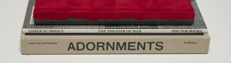
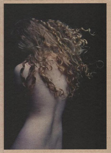
I have been following the work made by Carla van de Puttelaar for quite some time. In a world of photography that too often is geared towards either novelty or working from one fair to the next, this particular artist appears to be immune to those kinds of concerns. Much like her colleagues Hellen van Meene and Awoiska van der Molen, Van de Puttelaar continues to explore her artistic sensibility at her own pace. In this particular case, it’s all about the fragility of the very surfaces photographs can describe, here mostly the skin of women and, as a somewhat recent addition, the textures of flowers. For me, there’s something refreshing about artists not following the hectic flock, to dive deeply into what they’re concerned with.

Adornments now presents photographs made over the course of the past six years. Specifically, the book showcases a handful of different bodies of work that blend into each other very organically and that consequently are presented in an intertwined fashion (as opposed to a simple catalog approach, where a viewer would see the pictures grouped into the projects). Visually, the photographs all operate along the very same line of a body, body part, or plant emerging from darkness using the kind of somewhat cold Dutch light coming in from a window. The book then weaves around what the light reveals, how it helps the camera describe a surface, whether it’s the gnarly bark of a tree, the d(r)ying petals of a flower past bloom, or the skin of a young woman.

In many of the pictures, there is surprising little information, forcing the viewer to look carefully at what is being presented. In a picture of an arm for example, only partly visible against a sea of darkness, the blond hair is made to shine, forming a very delicate and fragile cocoon of sorts, a layer of protection that clearly wouldn’t withstand any sort of intrusion.

From what I can tell, the idea of the female gaze is becoming more and more discussed — a much needed development, given how dominant the male gaze has been in the history of photography (and elsewhere). If I were asked on the spot to describe the female gaze I would probably say that it’s a gaze that is content with how much can be revealed by not revealing it all — unlike the male gaze that just wants it all (and that, where it uses shadows or forms, tends to be always a bit too sure of itself). The female gaze’s default never is to sexualize. Instead, it is celebratory in a way that involves the artist, the subject, and the viewer — again, unlike the male’s, whose default is predatory and whose main mode of work treats its subject as something not equal, something only good to be ogled at. That’s why the dominance of the male gaze in contemporary societies is so toxic: it excludes, and it dominates (one could argue that the neofascism that is now threatening to destroy so many Western democracies — Trump, Orban, Kaczynski, et al. — is a political manifestation of the male gaze).

Coming back to the book, while all in all I prefer the minimalist pictures, some of what you could call the portraits here — young women being made to pose as if sitting for a classical Dutch painter — are absolutely stunning. Having said that, though, I feel that some more restraint in the editing process would have helped the book. There simply are too many pictures in the book, and I’m not sold at all on seeing so many variants of so many different pictures. That aside, Adornments clearly deserves to be seen widely.

Adornments; photographs by Carla van de Puttelaar; text by Marianne Berardi; 270 pages; Fw: Books; 2017

Rating: Photography 4.0, Book Concept 4.0, Edit 1.5, Production 4.0 – Overall 3.6

There is ample talk of and interest in how photographs can operate alongside text. Photographer often assign text some sort of minor supportive role, which I can understand. But still, more often than not, it’s a mistake to do that. For a photobook containing pictures and text to work well, the words will have to operate on the same level as the pictures. If they’re not allowed to do that, the resulting discrepancy will reflect poorly on the whole.

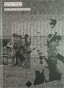
There are plenty of good books that rely on a combination of photography and text. One of this year’s highlights for me is The Theater of War by Roman Ehrlich (text) and Michael Disqué (photographs). The book was published by Leipzig based Spector Books, a publishing house that doesn’t quite seem to get the attention it deserves. I have quite a few of their books, and they all deliver outstanding quality without ever being predictable.

The book centers on a German army camp in Afghanistan, part of what is billed as the Resolute Support Mission. In this particular context, one can’t quite leave aside the question what sense that mission still makes after 16 years (or ever made). Their government’s noises notwithstanding, I don’t think most Germans bought the case for German soldiers operating in Afghanistan. So the German military and government have had a bit of a PR problem, which isn’t made any easier by the pictures that can be made and used. The kinds of pictures the US military uses — soldiers engaged in brave combat — would probably remind too many people of World War 2: obviously is a touchy subject for Germans.

The Theater of War focuses on exactly that aspect of the war, namely on its depiction, more precisely on the uneasy relationship between what can be photographed because it’s there and/or allowed and what that might tell an audience back home. As far as I can tell, the photographs were all taken inside the camp, which definitely is not the most picturesque location. It’s the kind of place where wherever you look there’s no picture there: a non-place for photographers. Disqué is adept at taking the photographs: I can’t remember a single picture, even though I have looked at the book many times. But within the book, they serve their purpose perfectly.

It might be tempting to see the text as carrying the book, but that wouldn’t be fair. It’s true, the text talks about all the various things that cannot be photographed, and there are quotes by various sources. But it’s not as if there is a lot happening, either. In fact, text and photographs are engaged in this strange dance around something that really doesn’t seem to make too much sense at all: German soldiers being present in Afghanistan for reasons nobody really believes in. It’s like a very strange and heavily ritualized form of theater that, unfortunately, has cost dozens of soldiers their lives.

The Theater of War; photographs by Michael Disqué; text by Roman Ehrlich; 120 pages; Spector Books; 2017

Rating: Photography 3.0, Book Concept 5.0, Edit 3.0, Production 3.5 – Overall 3.6

It’s no secret that in recent years, the book-publishing scene in Spain has not only blossomed but exploded, with numerous photographers, designers, and publishing houses contributing to the photobook boom we’ve been witnessing for a while now. Fuego Books was founded by Ángela and Gustavo Alemán, and they’ve published a number of very interesting books so far, A Place Both Wonderful and Strange being the latest one. This particular book is a diversion from their regular programming, though. It’s a centered on an idea, with a large number of contributors (photographers and writers alike). In their own words, the book contains “a narration inspired by Twin Peaks and the work of David Lynch.”

Up until the other day, I thought I knew how I would approach the review. But then last night, I had one of those realizations that will — hopefully — lead to some related, but vastly expanded writing elsewhere. So I’m not going to dive much into the whole Twin Peaks/David Lynch thing. I don’t mean this as a criticism at all, it’s just for a different day. That aside, though, the idea to bring together a group of artists, to have them produce work around the same idea, has always interested me. It’s an idea fraught with risk: as a producer, you basically need to rely on those artists giving their all, which, if you’ve ever dealt with artists, you just know is not a given. Herding cats is a lot easier and more enjoyable than working with a group of artists.

In the case of A Place Both Wonderful and Strange, the Alemáns’ gamble has paid off. The book is utterly engaging, without any of the weak sections that could have resulted from someone phoning it in or simply just missing the point. In fact, it holds up as a whole in ways that I might not have expected. In part, this might be because of what’s possible when you approach the topic Twin Peaks/David Lynch. In part, it definitely is because of the smart choices made here concerning which artists to involve. In the description of their publishing venture, Ángela and Gustavo Alemán note they want to make “Beautiful books. Dangerous books. Fiery books.” (their emphasis) So far, they have succeeded very well, and I’m looking forward to whatever it is going to be they’ll do next.

A Place Both Wonderful and Strange; photographs by various artists; texts by various artists; 208 pages; Fuego Books; 2017

(not rated)

Reading Raymond Carver

Article main image

One of the advantages of being a photography writer is that when faced with an issue I can — and often do — ask myself: if I were to write about this topic at hand, what I would do about it? This is not to say that as a writer I’m necessarily a different person than my usual self. But writing involves an element of impulse control: could what you have just written be different or more complex or not true? And if that’s the case, what would the repercussions be?

So were you to ask me in person, I’d tell you that, yes, there are too many photobooks. Too many because, and I think that’s just a natural way of how most people would approach dealing with such a question, it’s impossible to keep track of what’s out there. The sheer flood of announcements arriving via social media doesn’t help, either. As a consumer (ugly word, I know, but let’s just gloss over that) and a critic (ditto?), I have a very hard time keeping track. But as a critic I also know that there is a flip side to the problem, namely the fact that many more books are now being made that would not have seen the light of day before.

There is a flip side to that as well, namely that many of these books really don’t have to be made (I mean: really?). Often enough, the archives of some well known (often old white male) photographer are being dredged, and out comes another photobook. So boring! But — flip side again — there also are genuine discoveries of material by photographers who are not the usual suspects. Those discoveries make you wonder: why have these pictures been hidden away in that artist’s archive for so long? Wouldn’t it have been wonderful if they had become a part of the canon already?

A good case in point is provided by Mary Frey‘s Reading Raymond Carver. A disclaimer first: Mary is not only a colleague of mine (we taught together), she’s also a friend. What is more, when seeing the material (in the form of old contact sheets) for the very first time, I pulled out some sort of very first edit and told her there was great material for a book. So clearly, I’m biased, and this isn’t really a review.

I remember that rather heavy box of contact sheets, each one of them, if memory serves me right, with four view-camera (4×5) pictures. The material itself clearly had aged. But there was an astounding freshness to the pictures that I hadn’t quite expected. The photographs often spoke of the times when they were taken. Hair styles, clothing, wall decorations, maybe that odd eight-track tape player… But none of that truly mattered because the personal drama of those depicted could at any given moment happen somewhere next door. In fact, while I’m writing this it does happen somewhere.

By “drama” I hear mean nothing major — that wouldn’t be Mary. Instead, it’s these tiny little moments when there’s a slight rupture between two or more people that they might not even notice, the kind of rupture that only a camera can record. “For me,” Mary writes in the foreword, “a simple gesture, the quotidian moment, or a descriptive element could hold significance beyond its purpose.” Having seen the contact sheets, I know how hard she worked to achieve that goal of capturing what the camera would transform into these ruptures: for every successful attempts (that would look effortless), there were many others (that just looked like something had been photographed).

This, of course, is the real problem of large parts of photography: to put so much effort into the pictures that they don’t betray any of that. To do that with people in or outside of their homes, using a 4×5 camera and a flash — that takes some real skill and dedication. And that’s really what attracts me to these pictures here. How can they look so effortless? How is this even possible? Knowing Mary, I have some idea how she would be able to essentially disappear with her rather large camera in someone’s home, while guiding them towards the picture.

Consequently, as viewers we get to witness the spectacle of ordinary life in Reading Raymond Carver, or rather: we get to see what it looks like when a camera is used to dissect little, seemingly meaningless moments out of ordinary life. There’s a difference, and it’s this difference that makes photography what it is: a well-constructed fiction that works best when it manages to convince us that it’s not that.

Being able to see Mary’s pictures and to add them to the canon — where, I believe, they ought to be placed — is a gift for the world of photography. As is widely known, said canon is still too dominated by too few (old white male) voices. Having that canon expand not only does the medium and its neglected practitioners more justice, it also offers a — pardon the pun — fuller picture of what can be done with a camera.

“Where does the meaning of a photograph reside,” Mary asks in her foreword, “now that the intentions have faded from memory?” The answer is obvious, but it’s also filled with tremendous potential: the meaning is right here, in these pictures. We need to look and to see what these pictures do to us, do with us. Mary makes it easy for us to look past the signifiers of the past, helping us to see the larger meaning of photographs that for too long only existed in that box of contact sheets in her house.

Reading Raymond Carver; photographs and text by Mary Frey; quotes by Raymond Carver; 96 pages; Peperoni; 2017

Annie Leibovitz’s Capitalist Realism

Article main image

In the first chapter of his book Artists Under Hitler Jonathan Petropoulus describes how after coming to power, there was a relatively brief struggle over which direction German art was to take. As is widely known, the völkisch (nationalist) faction won over those who wanted to keep some of the country’s recent modernist art around. Nazi Germany’s art then embraced (or rather had to embrace — resisters were driven out) the pompous, overblown, outright tacky kind of realist form it is now remembered for, a type of art that on a purely visual level has strong resemblances to what artists in the Soviet Union had to produce. 

If Nazi art were only ludicrous, it would provide one of those curious blips in the history of art, its role in the larger Nazi endeavour notwithstanding. But that’s not the case. Sculptures by, let’s say, Arno Breker look like they had come out of an alternate ancient Greece without any knowledge of human folly and weaknesses. But the moment you look at the movies or photographs produced by Leni Riefenstahl, you realize that in the realms of the visual arts, where its makers tried their hardest to have their pictures follow the Brekerian model, the ludicrous isn’t so ludicrous. It’s also deeply appealing, at least on a very reptilian level, and it still has its appeals to many people today, regardless of their political orientation: the pathos very successfully shortcuts critical thinking.

Riefenstahl’s achievement is remarkable: her photographs and movies work because she took selected elements from the very modernism the Nazis had rejected and made them serve her völkisch purpose. Modernist photographs play with unusual angles was reduced to only those that would enoble a subject, to make her or him look heroic and dynamic. At the same time, this approach wasn’t entirely new, given that, for example, Hollywood had already been working with these kinds of ideas for a while (again, with a vastly wider visual spectrum than the one used by the German propagandist).

The obvious problem with talking about Nazi art and its appeal is that it’s Nazi art. You cannot disassociate it from everything else that happened at the time, in particular the regime’s murderous wars and, of course, the Holocaust. With that in mind, though, if watching a Leni Riefenstahl movie has a viewer admire its visuals and the way it manipulates its audience, that doesn’t make that viewer a Nazi (unless s/he is an actual one). Being aware of Riefenstahl’s mastery is an essential skill to have, given that it has never lost its visual appeal. Riefenstahl’s ability to manipulate an audience with well-executed, fairly basic techniques can teach us about more than merely what it supported during the Nazi era. This is especially important given that many of Riefenstahl’s basic photographic methods have been used ever since, in a large variety of contexts.

When I looked through Annie Leibovitz: Portraits 2005-2016, my first reaction was experiencing a sense of shock over to what extent the Riefenstahlian spirit runs through most of the photographs. Before continuing, I want to make one thing very clear, though: what I’m talking about here are the pictures. Riefenstahl’s and Leibovitz’s photographs were made in very different times, by very different artists, for very different purposes. Pointing out that this looks like that does not mean that this is that. But if this looks like that, there are lessons to be learned, even when the general contexts are very different.

So here is what I’m after — think of this as the overall premise of this piece: given that Leibovitz’s photographs have become so successful and widely admired, looking at how they operate will tell us something about our times.  That looking will have to be done with historical models in mind — given the history of photography, it would be a terrible omission not to do so.

Such an approach to looking at photographs is not very common. Ordinarily, photographs are approached as saying something about their makers and, possibly, about whatever or whoever is being depicted. But especially for work that enjoys success on a larger scale, that is, in other words, widely seen and celebrated, that reception itself will tell us something about the audience and the times it lives in.

To begin with, we might note that many of the pictures in the book were produced for print publications. Leibovitz’s photographs appear regularly on the covers of the US editions of Vogue or Vanity Fair. Those aren’t niche publications. It might be tempting to point out that given the photographs were commissioned, we needn’t look further into them. After all, what can possibly be said about such commissions? But that’s really where and why it gets interesting. Given that editors of such magazines want these kinds of depictions of people on their covers, there is much to learn.

The first immediate property of the photographs in Annie Leibovitz: Portraits 2005-2016 is the sheer amount of post-processing that went into them, to the extent that some of the pictures almost look as if they were the results of CGI rendering. That part of their artifice is hard to ignore. But it’s also their least interesting aspect. That said, it also is the one part of Leibovitz’s work that brings her closest to the world of fine-art photography.

Aren’t Leibovitz’s celebratory pictures of wealthy, successful Americans and Gregory Crewdson‘s ominous depictions of anonymous, downtrodden Americans in effect obverse and reverse of the very same coin? In both cases, large amounts of post production are employed to arrive at essentially the very same result: pictures that describe the country’s very core, while refusing (or maybe being unable) to consider alternatives. This is the way it is, both artists tell us, this is who we are. And you can’t have one — the wealthy and celebrities in Leibovitz’s images — without the other — the armies of people who are very far from wealth and fame, existing in a barely concealed form of misery from one paycheck to the next, accepting their fate, waiting to vote for the next lesser evil.

One side couldn’t exist without the other. If this symbiosis of the many and the few hadn’t been shaken up so forcefully by Donald Trump (who is the subject of one of Leibovitz’s pictures), things might have gone on forever. As it turned out, there is an alternative, the Trumpian one: whipping up the bottled-up resentment of many into a frenzy, to maintain and sustain a political movement that on the surface is made for the many, but in reality only works for the few, while eroding the very basic democratic principles the country has been relying on. This raises the stakes of the game considerably: if Trump can offer an alternative, can we allow for it to be the only one? A recent piece in Politico Magazine details what this might lead to.

If we accept that Leibovitz’s and Crewdson’s photographs are obverse and reverse of the same coin, we might as well spell out how Leibovitz’s depictions of the wealthy and successful in heroic, vaguely fascist poses is related to Crewdson’s depictions of the rest in non-heroic, dejected poses. It’s the country’s underlying myth that sustains, no: necessitates the celebrity pictures. You cannot, after all, maintain the illusion of a country where you will enjoy success if you work hard enough without showing that this is in fact doable (the lottery operates using the same idea: your chances of winning are negligible, but someone does win, and you could be that person).

In other words, we need to see the winners to believe that we could one day be one of them. This is the role Leibovitz’s pictures fulfill. They provide the depictions of the country’s most basic myth, with those who enjoy wealth or success shown as the heroes they need to be for the whole system to work. At the same time, being able to buy Crewdson’s photographs at a blue-chip gallery helps the wealthy see the role they play, as those providing the (crucially) concerned pillars of society (Trump and his family, with their open disdain for the less fortunate, broke with this mechanism, too).

The Trump picture in Annie Leibovitz: Portraits 2005-2016 might serve as a good illustration for some of the details involved here. A heavily pregnant Melania Trump is shown on the back steps of an airplane. She is wearing a robe or thin coat of sorts that, however, has conveniently fallen off, to reveal her pregnant body in a gold bikini. There is a car with an open door to the plane’s side, in which the viewer can see Donald Trump, one hand on the steering wheel, the other (the one closer to the camera) on his knee. He is shown in profile, facing away from his wife whose gaze is directed at the camera (it’s that strange squinty gaze that Melania Trump appears to think is what you use when being photographed).

If you had no idea who these people are, you would still get most of its message: the man is sitting at the steering wheel (in the driver’s seat) of a very expensive car, the woman is little more than a sex object. It is mostly her heroic pose, though, that shields the picture from parts of such possible criticism: after all, pregnancy is a very important and powerful aspect of a woman’s life, and it rightly deserves to be celebrated. The fact that such a celebration serves to deflect all the other criticism is, well, a bit unfortunate. Needless to say, it would be conceivable to celebrate one aspect while criticizing another. For that to happen, we would consciously not allow the picture’s artifice to guide us towards the kinds of simple reads that are being invited here.

Leibovitz’s visual heroism is all-inclusive. Once you’re rich and/or famous enough, you will be celebrated in a picture, whether you’re Donald Trump, Harvey Weinstein, Gary Cohn, Viola Davis, Barack Obama, Lin-Manuel Miranada, or whoever else. The problem here is not that some of those depicted in the book don’t deserve to be treated like heroes. The problem is the ubiquitous heroism, in which often vastly overblown and contrived poses are employed to make everyone look grandiose and deserving of endless admiration.

Of course, that’s not the photographer’s fault — after all, it’s her job. It’s what the job requires, a job done so that the covers of magazines can show the enjoyment of success and wealth that in principle is available for everybody if they just work hard enough. Then again, that was Richard Avedon‘s job, too, and yet he still made Nothing Personal in collaboration with James Baldwin (which, thankfully, is now being re-released). Just saying.

Back to these pictures, though. Again, the fact that some of those in the book did (and still do) work hard is besides the point. Given that those who didn’t work very hard still get the same treatment erases whatever distinction could be made. Plus, any actual heroes, such as someone who ran into a burning building to save a child, say, are completely absent from the book. It is, in other words, ideology more than anything else, an ideology that cannot be sustained without a heavy reliance on photographic effect, a celebration and re-affirmation of capitalism, which is the driving force behind the country’s myth.

As such, both Crewdson’s and Leibovitz’s photography can be seen as belonging to Capitalist Realism — our hypercapitalist world’s equivalent of Socialist Realism, which initially was developed under Stalin. As Boris Groys outlines in The Total Art of Stalinism: Avant-Garde, Aesthetic Dictatorship, and Beyond, Socialist Realism was a bit more complex than its seemingly tacky realist aesthetic would hint at. At its core, it shares its main characteristics with Capitalist Realism, which really is just the application of the ideas of Socialist Realism to a capitalist world.

A key quote from Groys’ book might shed further light on this: “The art of socialist realism […] is not realistic in the traditional sense of the word; that is, what it provides is not a reflection of the worldly events in their worldly contexts and motivations, but hagiographic, demonological, and other such depictions of transcendental events and their worldly consequences. It is not for nothing that socialist realist aesthetics always speaks not of ‘portraying’ positive or negative heroes but of ‘incarnating’ them by artistic means. In and of themselves the positive and negative heroes have no external appearance, because they express transcendental demiurgic forces. However, to demonstrate these forces in a manner that is ‘intelligible to the people’ (the ‘people’ here meaning not actual consumers of art but mortals who lack transcendental vision), they must be symbolized, incarnated, set upon a stage. Hence the constant concern of social realist aesthetics with verisimilitude.” (Boris Groys: The Total Art of Stalinism, Verso, 2011; loc. 1057 in the Kindle ebook edition)

Leibovitz’s photographs are “not realistic in the traditional sense of the word”, beginning with their excessive post production. And they are clearly hagiographic, with every subject heroically depicting “transcendental demiurgic forces.” These forces can easily be as problematic as what is on view in the Trump picture, but as I outlined above, the photograph attempts to shut off any critical entry points. This understanding of the pictures as expressing “transcendental demiurgic forces” allows us to understand Crewdson’s pictures as being the same thing, their seeming difference in subject matter notwithstanding. In particular, it makes clear why I think of Crewdson and Leibovitz as obverse and reverse of the same coin.

Much like Socialist Realism, Capitalist Realism aims at visually overwhelming the viewer, to celebrate its underlying ideology, while preventing a viewer from considering any alternative. Aesthetically, there are many similarities, while the underlying ideologies couldn’t be any more different. But as I noted in the very beginning, the key is that a clever application of the right aesthetic can easily work towards bypassing a viewer’s critical thinking, regardless of what political system a viewer lives in. As we have learned over the past couple of years, there simply is no guarantee that in a democracy tools will only be used only to further democratic progress. That’s why even in a democracy we need to carefully look at how pictures are made and used.

There are many very urgent problems still to be solved, whether it’s prevalent racism or sexism, or large — and steadily growing — economic inequalities. With the world of visuals having become ever more important, we have to interrogate how these visuals work. As the pictures in Annie Leibovitz: Portraits 2005-2016 make clear, even the depiction of progressive forces can ultimately serve to preserve the very status quo these forces are fighting against. In part, it is seeing the same aesthetics applied to Donald Trump and, for example, Lin-Manuel Miranada that makes it clear that those who commissioned these pictures (as part of the larger corporate interests they serve) have little, if any, interest in these two men as anything other than being beautiful illustrations to bolster the status quo.

This is not to say that there’s something wrong with the status quo per se. It does work very well for those very few, some of whom are included in the book. But it doesn’t work so well for those many unfortunate ones who are excluded, and whose belief of the system working towards a better world for them as well is being — somewhat cruelly — toyed with. With Capitalist Realism relying on showing us heroes (Leibovitz) or people too dejected to do anything (Crewdson), it tells us: resistance is futile. But with the underlying system having now delivered a President Trump, it might have become obvious that resistance is not just not futile, it’s also necessary.

Annie Leibovitz: Portraits 2005-2016; photographs by Annie Leibovitz; essay by Alexandra Fuller; 312 pages; Phaidon; 2017

(not rated)

Views of Japan

Article main image

At a recent visit to SFMOMA with students, I was able to see in person a set of prints by Japanese photographers from the museum’s collection that curator Adam Ryan had pulled. The business of prints, he noted (and I’m paraphrasing here) was tricky. Especially older ones often had been prepared for print publications, causing some photographers to give their dates as the ones when they appeared in print (in a magazine or book), but not when they had been produced in the darkroom. What is more, some of the prints had been handled in a variety of ways that would give a lot of photo professionals shivers, causing them to be “non-mint,” or however else the business of selling photographs describes such objects.

At that moment (and even later), I couldn’t have cared less if those prints by the likes of Daido Moriyama or Shomei Tomatsu looked maybe just a tiny bit creased: I had seen them so many times in reproduction that to be in the presence of actual prints was nothing short of a spectacular moment. However, later on I wondered whether I hadn’t been misguided approaching the prints that way, given so much emphasis had been placed by their makers on the printed (mass-reproduced) picture itself, copies of which (mostly later and not period ones) I have in my possession in the form of books.

Especially in this day and age, this problem appears to have become even more relevant, without there being an obvious answer I think: for any photograph and ignoring the way this topic has historically — in the West — been approached, why would one realization be preferable to all the others? I approached that rabbit hole as part of a piece I wrote for a German photo biennial, and it certainly is something to come back to again later.

Here, I will merely note that I had seen many of the photographs in Views of Japan, albeit not in this particular form, and by that I mean Steidl’s way of printing pictures, which packs quite the punch, with layers and layers of ink on the pages. Those prints at SFMOMA didn’t look this way — after all, how could they, given that they were produced in a very different way, as silver-gelatin prints?

None of my comments about the book should be seen as a criticism. Prints can — and often do — look very different than what is reproduced in books; it’s important to keep this in mind. What is on view in this particular book is very visceral on a visual level. But it also is a particular interpretation of the material at hand that makes everything look like a latter-day digital Daido Moriyama book (or a contemporary Provoke-era reprint), leveling the b/w images in ways that make the differences clearly visible in the SFMOMA prints for the most part disappear.

In the West, Japanese photography is often equated with a Provoke-style aesthetic (which is exactly what this Steidl printing is getting at), with some crazy sex pictures (Araki) thrown in for good measure. However, that is a very unfortunate simplification that very clearly needs to be corrected (especially also in light of pretty much all of the well-known and widely exhibited artists being male). Seen that way, Views of Japan comes as a very welcome corrective. The pictures in the book form a selected part of the collection of Gloria Katz and Willard Huyck who have been collecting photographs by Japanese artists for a long time and who — good for them! — did not stop at assembling those few well-known suspects.

Collectors play a powerful and mostly invisible role in the world of art photography. If you were to approach what’s on view at most of the world’s galleries, especially the ones in the West’s photography centers, as showing the best of photography, that idea would be true only to some extent. Obviously, it’s highly debatable what constitutes the best anyway. I could make my case for this or that, and then someone else might agree or disagree. That aside, though, galleries are businesses, and like all businesses, they hope they remain in business. How do you do that as a gallerist? You show work that will sell. It sounds so crass when I write it like that, doesn’t it? And it is crass, despite the fact that many gallerists work closely with the photographers they represent, to help them grow and/or generate often much needed income, while keeping the desires of their collector base in mind. Work that won’t sell will have a hard time finding a space in the world of commercial galleries. Given so much focus is currently still placed on the importance of such galleries, it’s important to keep this in mind.

Most collectors have a particular focus. In a sense, this makes such collections interesting, provided the focus is, well, interesting. As I mentioned, in the case of Gloria Katz and Willard Huyck, that focus is Japanese photography. There is a longer narration in Views of Japan that outlines some of the collectors’ thinking, along with assorted, let’s say, colourful anecdotes about various artists and their interactions. Those anecdotes aside, the book isn’t simply a display of this particular collection. It also outlines a lot of the history, which here and there places a focus on artists that aren’t very well known. A reader/viewer thus not only learns why some artists might be interesting for the collectors, but also where they are placed in their larger historical context.

In addition, while the full-bleed layout of the book again nods at Provoke, the photographs are shown without captions, often using thought-provoking juxtapositions (there is an index at the end of the book, which allows the viewer to identify photographs). So if you approach the book only knowing the usual suspects, you’ll be in for a very pleasant surprise, as a much deeper view of the very varied and deeply layered history of Japanese photography is being revealed. This is most welcome, in particular since many of the artists who are a lot less well known in the West (think Issei Suda, Miyako Ishiuchi, Toshiko Okanoue, or Ei-Q) allow the viewer to get a much more nuanced picture (pardon the pun) of Japan.

We all can only gain from seeing such broader pictures: imagine American photography being mostly equated with William Klein’s early aesthetic, or imagine what it feels like for German photographers to have only the Düsseldorf school represent them. Such broad simplifications are bad for all parties involved: entire often very complex countries get reduced to almost cartoonish groups of people. Given the sheer breadth of photography practiced in pretty much every country I know, such an approach, however convenient it is, really does not do the medium any justice. But it also reduces the experience we can have with the world through pictures to a lot less than what it could be. Views of Japan does its part to reveal a much larger fraction of the beauty of photography made in Japan to a non-Japanese audience.

Recommended.

View of Japan; photographs by various artists; text by Willard Huyck and Gloria Katz; 144 pages; Steidl; 2017

(not rated)