How and why photographs matter

Article main image

It’s a bit of an understatement to say that there’s a lot going on in the world of US politics right now. I believe that a much larger majority than the one that already exists will come to regret this time bitterly. But I’ll leave it to others to comment on the various injustices committed in the name of the American people. If there’s one thing I had not quite anticipated is what role and importance photographs would have and play, though.

Specifically, while I have always spent a lot of time looking at how a photograph’s form and content might inform each other, I had not expected such discussions to spill out into the larger area of the news, which to some extent they now have done. Outside of the narrow confines of photoland, photographs mostly tend to be discussed based on what they show and not how they do it.

Under the Obama presidency, for example, this fact helped create an image of the man that, for me at least, is at odds with what that man actually achieved in office. But Obama knew how to look and act cool, especially in photographs — something that was part of his appeal. His supporters very clearly enjoyed the idea of having a cool president, someone who would drop the mike and do all the stuff the cool kids do.

You can’t say the same thing about Donald Trump. It’s not up to me to attempt to analyze these two men’s personalities from the distance. I’m neither qualified to do so nor interested. Based on the photographs that have emerged, it’s obvious that they both are incredibly image conscious.

This observation might not surprise anyone who is familiar with the incredibly shallow world of presidential campaigns where a single “bad” photograph can ruin your whole candidacy, however qualified you actually might be for the job. You just have to be good with pictures to become president — those who will vote for you must like what they see. It’s very visual. You must attempt to project exactly those qualities your voters want (and make sure the photographers deliver them — here, you’re usually in collusion with the press, which will be happy to go along).

This is the background against which I look at photographs from the political arena. The other day, I burst out laughing when I saw the photograph on top here, which Donald Trump tweeted on 18 January, 2017: “Writing my inaugural address at the Winter White House, Mar-a-Lago, three weeks ago.” It’s a pretty amazing picture, isn’t it? To begin with, he is so obviously not writing anything — you would have to be a complete and utter fool to believe this. Yet somehow, he seems completely unaware of the fact that the picture gives this away in such an obvious way. That’s comedy, right there, Alan Partridge style.

Once my laughter subsided, I couldn’t stop looking at the picture, though. To begin with, everything about this picture gives me the impression I’m dealing with an image straight out of the Soviet Union — or maybe one of those landlocked post-Soviet Asian republics that are ruled by some pompous autocrat. To begin with, the colours are just so weird. It looks like what you’d find in an older book that was printed using some pre-CMYK process, where all the colours would be a little strange, and only red (the Soviet colour) would stand out so much. Of course, the decor plays into that, those weird tiles (where do you even find those?), plus what might be a completely tacky desk statue of an eagle. I’m still incredibly fascinated by the picture for all these different reasons, including, of course, that it was made and disseminated in 2017.

“He’s very difficult to photograph,” Martin Schoeller said after having been tasked to do exactly that. “He literally has one angle. If I ask him to smile, he puts on a big grin and then he goes back to his Zoolander ‘blue steel’ look.” So clearly, the “speech-writing” picture features that Zoolander look. And you’ve probably seen this look quite a bit, given it’s what Trump prefers for his official photographs. It’s quite different than the cerebral, yet somehow cool Obama look, isn’t it? But ignoring the differences between these two men, the overall idea is exactly the same, namely to project an image.

How much Trump is obsessed with image became even more clear when the “controversy” erupted over the turnout at his inauguration. I put quotes around the word “controversy,” simply because I’m not even going to entertain the idea that “alternative facts” should somehow be taken seriously. Obviously, a lot less people showed up for Trump than for Obama eight years earlier, and obviously that was clearly visible in the photographs.

There’s something in Trump’s personality that has him pick fights that make him look even worse when he already looks bad. So he not only kept talking about it himself, he also sent his minions out to make complete fools of themselves (which they happily did). I found that all completely fascinating, because at the basis of this all were discussions about photographs. The photographs very clearly showed what had happened. Yet here were people who had been just handed a lot of power arguing that somehow this all was wrong. Only explanation: There had to be other photographs that showed a larger crowd. There weren’t.

Why does this matter? Or how? There are a lot of discussions now about photography and the news especially, and how about people don’t trust the news any longer. The irony here is that the people who create fake news and spread it around do so claiming you just can’t trust the news. Anyway, given it is so strongly connected to the news, this lack of trust supposedly has repercussions about photography, in particular with respect to the topic of “manipulation”.

I think all in all this problem is very similar to the issue of voter fraud: it does exist, but it’s a very small number. Voter fraud is not a problem because it exists. Especially right now, it’s a “problem,” because there’s simply no other way to account for the fact that Trump got almost 3 million less votes than Hillary Clinton. In other words, it’s a conspiracy theory.

In much the same fashion, image manipulation is not a major problem for (news) photography. People don’t mistrust photographs because they’re manipulated, they mistrust photographs because they don’t show them what they want to see. Donald Trump just provided a clear example (follow the link about the crowd size). This doesn’t necessarily mean that we, in the world of photoland, should relax our concerns about manipulation and what can or should be done etc. But we ought to realize that a large part of the problems that are attached to photography come from the outside and have nothing to do with the medium.

I’m getting to the point where I’m becoming a bit exasperated that discussions around manipulation never seem to talk about this simple fact. If people don’t want to believe your pictures because there’s a conflict with what they believe in or want to see, that’s not your problem. That’s not an issue of how much you can tweak this or that adjustment layer in Photoshop (or Lightroom or whatever else you might do). This is a much more fundamental problem, and you simply cannot solve it by buying into it (if you don’t believe me, try arguing with a conspiracy theorist about UFOs — you just can’t win, because every fact that refutes their idiotic ideas simply points at an even larger conspiracy).

Consequently, I believe photographers ought to play to their strengths. We need to have open and honest and in-depth discussions about photography, without buying into the crazy. Where unacceptable manipulation happens, we need to point it out. But the world of photography will only gain trust by producing high-quality work that has been done with integrity and respect. That’s all it takes. Not more, but certainly not less.

On top of that, given that discussions around photographs are now being started, we should make sure they get expanded. The conspiracy theorist in the White House wants to talk about what the pictures show? OK, let’s do it! That’s great! Let’s give the larger public more insight into what pictures show, how they do it, and how the “what” and “how” are related.

Larger problems such as vast parts of the population angling for “alternative facts” aren’t a problem for photography. This complex is a larger societal problem that, of course, we all need to work on as well — not as photographers, editors, critics, but as engaged citizens. So we need to step outside of our photoland bubble just as much as reach out of it: of all the people qualified to speak about photographs, it’s the members of photoland that are most educated and capable of doing exactly that.

A Conversation with Katrin Koenning

Article main image
Katrin Koenning

Katrin Koenning is one of the winners of the Conscientious Portfolio Competition in 2016. The same year, her book, Astres Noirs (a collaboration with Sarker Protick), caused quite the stir, ending up on quite a few of the inevitable “best of” lists. I spoke with Katrin via email.

Jörg Colberg: Can you talk a bit about your background? You grew up in Germany, but now you live in Australia? And how did you come to photography?

Katrin Koenning: I was born and grew up in Germany’s Ruhr Area, once the country’s hub of industry. I went to Steiner school over there, and in my head I was going to be a painter, a singer or an astronaut. There is a history of fascination with the ‘away’ that runs through my ancestry; my grandmother was an abstract painter, my great-grandfather a singer at the Berlin opera… suggesting to me a desire to practise an act of yearning, and to create (other) worlds, if that makes sense.

Photography and I came to each other through the death of my oldest childhood friend Tobias whom I grew up with and whose mother is my godmother. Tobi died only weeks after we graduated from high school, in a plane crash above Iceland. He wanted to be a pilot and was passionate about photography. I inherited his old Minolta with thousands of strange filters and left for Iceland to allow myself to be with the loss. I was there for three months during deep winter, working in remote greenhouses. At night I would walk and walk, the only sound was of snow and I touching, the Minolta in my hand. I didn’t fully realise it then, but this thing – the walking, the camera, the thoughts and the silence – became the thing that would make me feel ok. When I returned home to Germany from Iceland and developed all those rolls of film, every single one was pitch black. Not a single picture. I understood quickly that somehow this needed to be exactly what it was; one thing in my mind, another in the world. There, not there – an interplay of presence and absence right at the ignition of my practice.

I interned with the German photography department in charge of all the former Ruhrzechen, the mines that had been turned into museums. Here I learned the darkroom. They gave me a key and I’d spend all my weekends there, alone, locked away with radio and chemicals. At that point my interest was definitely in story but I hadn’t decided on the visual just yet and so was working in print and broadcast journalism also.

In 2003, four things happened: 1) I was in a really shit place 2) I fell in love with an Australian man 3) I became obsessed with the idea of learning photography in the English language 4) I re-read Cees Nooteboom’s Das Paradies ist Nebenan. Subsequently to all of the above, I migrated to Australia where a fraction of my family have lived since the late 90’s, and in March 2004, I started studying photography at the Queensland College of Art, Brisbane. Since 2009 I’m based in Melbourne, where I practise and work as a freelance photographer and lecturer in photography.

JC: Your first book, Astres Noirs, is a collaboration – or maybe joint book would be a better way to describe it – with Sarker Protick. How did this come about? Books co-authored by two different photographers are so rare – I’m curious to learn more about it.

KK: Actually it was Chose Commune (the publisher) who came up with the thought for the book and who initiated the idea of a more direct dialogue. They’d been following both our practices for a while and saw a link between the works; something in common, which is what made them approach us about publication. Mind you, Protick and I first met at a festival in Germany in 2014 and became close, so any resonance between works we were making probably goes back to that.

JC: How would you describe the result, the book? And I’m still amazed you’d have your work blend with someone else’s so easily. Is that a model you could imagine to do again?

KK: I sort of think of it being not too different from any other thing of togetherness, where everyone offers their part so that collectively those parts can make a new entity. I’m very happy with how the book worked out, and one of my favourite things about it is that a changed light offers a changed reading of it, making it experiential. Looking at it at different times of the same day, or even in a different room, will remarkably alter how the reflective ink will reach your eye. The ‘under’ pages suggest something hidden or out of reach, which works very well too within the overall tone and origin of the images.

It’s interesting – I get asked often about the process, and whether or not it was difficult to give the work over to someone else to make the book. The answer, in my case, is no. I actually enjoyed this immensely. I’m an avid photobook collector and own copies of most of CC’s other publications, all of which I think are very good. I’d been following their work and when they approached, they weren’t just anyone to me. They were someone who knew what they’re doing, with the highest aspirations and attention to detail. Their books are quiet and elegant, and never ruled by design. I knew that I could trust their vision fully, and felt very comfortable in the process. I’m not a designer, so it was great to be working with someone who is an expert. Would I have my work paired with that of another artist again you ask? Well my next book will be a solo-venture. In general, if it felt right- why not?

JC: Can you introduce the work that won the competition, Indefinitely? How did this come about?

KK: Indefinitely grew out of another long-form work of mine called Near, which is a documentation of my family over many years and continents, through cancer and suicide. I started working on Near when I was studying photography in Brisbane, having freshly migrated to Australia from Germany. The work originated from an agony over the distance. Years later, Indefinitely assumes a different format. It’s less direct and more suggestive. Here, I am less interested in representing the family as it is – and describing the distance between us – but rather I want to fill this distance with the world if that makes sense.

The migratory experience is often connoted so negatively; void, hole, empty and lonely and so on. Of course the longing for what you left behind is always present, but there’s more. The world in its entirety presents as the in-between here, profound and insane, and Indefinitely then talks to my view of this world as much as my experience of distance. It creates a space that is both real and imagined. To me, practice is a way of sense making and of being-in-the-world, and making Indefinitely is, not only but also, an attempt to presence absence. It’s storying as a tool to navigate and reconfigure (my) distances. In Austerlitz, W. G. Sebald maintains, “The history of countless places and objects which themselves have no power or memory is never heard, never described or passed on”. The camera enables the giving of story to things, rendering visible.

The title of the work plays with this idea that the experience of something has no fixed limit or coordinate. Here, the migratory space as something felt presents as an indefinite time and place. The pictures are made all over the place. There are even pictures of pictures made by my grandmother who had migrated to Colombia, for example the frame of the aeroplane wing above Earth, surrounded by black. In the context of the greater work to me this is a marker picture, layered with meanings – was she arriving or was she departing? What was left behind, and what was waiting? Either way it is a picture about world and Abschied (a great German word for departure or exit which borrows from abgeschieden, meaning distant). I made this picture during a family slide-night, so in this sense it is about the connection between photography and memory. Here, again, is that idea of storying as a tool to navigate distances – her making the picture to hold on to or let go of a story of distance, us viewing the picture to give story or draw closer to something distant, heightened still by the collective reading. Slide nights aren’t really about pictures – they’re all about stories.

JC: Indefinitely (and some of your other projects) offer a strong contrast in terms of very dark photographs versus very bright ones, there is the occasional glaring bright figure in the dark – how do you approach making these pictures? What is it about that stark contrast that attracts you?

KK: If I have to be philosophical about it, perhaps it’s a good reflection of myself. In general, I like using a language of suggestion and a methodology of documentary thinking that allows me to translate the seen into something felt. Emotionality in pictures interests me, and their ability to move. Contrast of course is a device that draws attention to a particular thing within the frame, highlighting it and making it ‘matter’. It can create drama.

Dark works are often the ones I feel most drawn to, maybe because they make me feel that I’m looking at something broken – something in an unfixed state, something uncertain. We don’t normally like looking at broken things. We label them ugly and unworthy. I mean we don’t like sharing wounds and we prefer a pretty landscape (the grand) to the gutter (the trivial). But you know, I think the gutter holds a lot of honesty. I suppose that’s it – the raw throws us up against ourselves. The gutter is a mirror.

Coming back to your question about the bright in the dark – in a practical sense, sometimes I use flash and mostly I work around sunlight hitting reflective surfaces. The whole thing is also intuitive of course, particularly the way one works with light I think. Not everything is planned out or follows a step-by-step guide. Often the world leads me, and to say otherwise would be pretentious. I also don’t work to one single taxonomy of imaging. To me, the narrative has priority, and the language adjusts according to what it is I try to communicate or translate.

JC: In general, where/how do you find the inspiration for your work?

KK: Music and writing. Anouar Brahem, John Zorn, Michel Serres, Rilke, Sebald, Solnit… For example I launched The Crossing earlier this year, another long-form work about Athropocene, ecology and human impact. It draws a lot of inspiration from Serres’ The Natural Contract, a genius book or work of urgent poetry he wrote in 1990, arguing for the need of the extension of the social contract into a natural contract. Twenty-six years on, the book seems more relevant than ever and goes with me everywhere.

Probably the one I’ve read the most is Sartres’s Nausea, but Serres is on his heels. Other than that – proximity. When Chris killed himself and I first started working around this, I’d walk up to the corner store and be completely overcome by something like the way the wind moved through a tree. Through his exit, the presence of worldly things intensified, advocating an immense sense of urgency to me.

So it’s kind of like this; I think that life is a slither of light between the abyss – how lucky and how daunting then, to be a double-witness.


Kicking the Can of Complicity Down the Road

Article main image

In 1993, photographer Kevin Carter took a picture of a starving child in Sudan that showed a vulture in the background. The picture caused quite the stir for a large variety of reasons. Specifically, the photographer faced accusations of not having come to the child’s aid. A little over a year later, Carter committed suicide. Part of the note he left read “I am haunted by the vivid memories of killings and corpses and anger and pain… of starving or wounded children, of trigger-happy madmen, often police, of killer executioners…”

In 2016, Omran Daqneesh became just one of the thousands and thousands of other victims of the Syrian war. Rescued out of the ruins of a bombed-out house and taken to a nearby ambulance, a video and photographs showing the dazed five-year old sitting inside went around the world. Alex Myteberi, an American child roughly the same age, saw the images and sent a letter to his president who then went on to share it with the United Nations. The American boy got to meet his president.

I was unable to find information online of what happened to the Syrian boy. Of the Sudanese child we learn that “research seemed to reveal that the child did survive yet died 14 years later from malarial fever.”

Here, the obvious lessons aren’t necessarily the ones I’m after. But we might state some of them anyway. To begin with, two children who were at the center of so much attention in the (Western) world press, have now become mere cyphers, known for roles they played in iconic photographs. Such photographs can do a lot. But it would seem that more often than not they do something not necessarily for those depicted, but for those involved in a different capacity, whether it’s their makers or viewers. And it’s often viewers and makers fighting it out over what is being depicted — true to the spirit of the act of photography, by which you create an artifact out of something in the world.

We profess we’re interested in what is depicted. Often enough, though, we fight over the depiction, over how something is depicted — as if that and only that were always the deciding factor concerning what is depicted, over whether or not it is ethically sound to show something or someone depicted — as if not showing something somehow made a problem or an injustice go away. Hence the discussions around photography being exploitative, say.

This is not to say that photography is always harmless. Photography can be an act of exploitation, and we should talk about it. At the same time, given what photography is and what it does, photography that exploits someone or something often piles on: it’s an exploitation of the exploited. The history of photography is filled with examples of this.

What we do when we talk about the exploitation of photography is valid. Yet mostly, it avoids talking about the other exploitation, the more basic, larger, underlying one. We want to know that the starving Sudanese child did reach a feeding center. Young Alex Myteberi, though, wanted a bit more. He asked the most powerful man he knows of, the president, to invite the bombed-out child to his home. He didn’t ask whether Omran Daqneesh made it to a hospital, or whether he was given shelter somewhere (far away), he offered his own home. Unlike us grown ups, Alex Myteberi doesn’t know about the artifact that is the picture, yet. He is thus incapable of letting his concern for someone depicted stop somewhere along the chain of things, somewhere where it’s about the picture — and not what’s depicted and how what is depicted hints at a much larger injustice.

Another way of looking at all of this is to say that as viewers, we usually don’t want to be complicit. We do not want to face the consequences of our own involvement, even when that involvement is indirect. Obviously, we wouldn’t want to be responsible for that Sudanese child to die and to get eaten by the vulture — even though, in some indirect fashion, we Westerners are quite responsible for the fact that these kinds of conditions in Africa existed and still do. In much the same fashion, we don’t want to be responsible for the death of Syrian children.

Photographs like the ones discussed above can make an impact concerning our own not wanting to be complicit, or wanting to do something. A recent study just found that the publication and wide dissemination of a photograph showing another Syrian child, this one lying dead on a beach in Turkey, resulted in a spike of donations to the Red Cross. Using data from the Swedish branch, the study found that “the average number of daily donations to a Syrian refugee fund run by the Swedish Red Cross rose 100-fold” in the week after Alan Kurdi’s death. But the interest also faded very quickly again.

We might not even be aware of our complicity in so many injustices in this world. As long as we don’t get to see them (or their direct or indirect consequences), we’re not being made to face a reality we’d probably rather not deal with. Seeing makes the difference. Many statements can be made about the Syrian civil war or about the larger topic of refugees. But once they’re connected to the face of a five-year old child that was just pulled out of some rubble something snaps, and our emotions demand we care more than we usually do.

Often, there then will have to be some lashing out to be done. This might be directed at the photographer in question, a very popular mechanism (“How can they photograph, when they should help?”). If that is no option (it’s hard to do that if the injured boy is already sitting in an ambulance) our anger might be directed at the largest possible power that, ideally, can make the kind of well-meaning, yet innocent statements we crave (cue any one of Obama’s statements about Syria). We need to kick the can that says “complicit” and that has our names on it down the road. May it land wherever it does, as long as it’s not on our door steps, as long as we’re not reminded of our role, however direct or indirect it may be in whatever injustice is shown in a photograph.

The reality is that the world is a horribly complicated place. Somehow, we are responsible for a lot of things, whether we are aware of it or not. It is true, our responsibility might be small. But still, it exists. The gadgets or clothes we buy are made by people far away under often horrible circumstances. Our retirement money might be indirectly invested in companies that make a lot of money exploiting people (including, ironically, ourselves). Our leaders wax lyrically about how well-meaning they are, while doing the opposite of what they should be doing (interestingly, the neo-fascists openly admit their own cruelty, throwing our own disinterest back at us). This is a lot to deal with, and it’s just easiest not to deal with it at all.

But then come the photographs of the starving children, of people getting shot to pieces, of people dying in the rubble of a factory that made our cheap t-shirts. If photography does anything really well, it’s short-circuiting all these mechanisms we have established in our heads to keep the horrors away. Francis Bacon described his interest in his paintings as “record[ing] one’s own feelings about certain situations as closely to one’s own nervous system as one possibly can.” Photographs can operate along these lines, except that they connect something out in the world to our own feelings “as closely to one’s own nervous system” as possible. This is their power, and this is their curse.

We will never be able to solve all the world’s problems, especially not if we have only the kind of very limited power the 99% of us have. But, and this is where and how I want to conclude this, what photographs tell us about our own being involved, our own being complicit, in whatever minute way — we need to listen to that. We need to listen, because it’s pointless to blame the photographers, and it is pointless to ask of our leaders to solve our own problems (this will be even more obvious after 20 January, 2017). If our own complicity is small, our own attempts to do something might be as well.

But there need to be attempts.

The late John Berger concluded his 1972 essay entitled “Photographs of Agony” writing “Confrontation with a photographed moment of agony can mask a far more extensive and urgent confrontation. Usually the wars which we are shown are being fought directly or indirectly in ‘our’ name. What we are shown horrifies us. The next step should be for us to confront our own lack of political freedom. In the political systems as they exist, we have no legal opportunity of effectively influencing the conduct of wars waged in our name. To realise this and to act accordingly is the only effective way of responding to what the photograph shows. Yet the double violence of the photographed moment actually works against this realisation. That is why they can be published with impunity.”

Berger’s challenge, to come to the realization of what it is shown “and to act accordingly” still stands. That impunity must go. If it can’t go it must be diminished. It’s not enough any longer to have the same pointless arguments over this or that photograph being exploitative, all the while the larger exploitation it depicts remains unchanged.

(French: Sommes-nous complices? on verra plus tard…)

Photobook Reviews W01/02 2017

Article main image

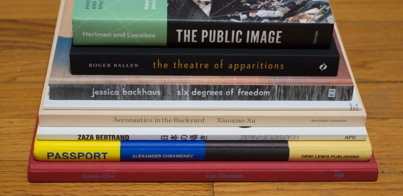
There still is quite the pile of photobooks waiting to get reviewed in my office. Given I’m starting into 2017 with a little trip to re-charge my batteries I’m going to use the opportunity to review as many as I can. I’ll be back in mid-January. So here goes…

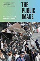
The first book isn’t a photobook. Instead, it’s a book about photography. Robert Hariman and John Louis Lucaites are the masterminds behind the No Caption Needed blog. Their new book, The Public Image: Photography and Civic Spectatorship, is a vastly expanded continuation of the blog, a book that, I believe, deserves to be read very widely in the world of photography. While focusing mostly on the world of news photographs and how those affect (or don’t affect) public discourse, vast parts of the book apply to the general world of photography.

In particular chapters 2 and 3, For Interpretation and Realism and Imagination, offer a passionate and at times blistering criticism of some of photography’s most cherished — and, as these authors make very clear, overrated — theories, in particular Susan Sontag’s. How or why her On Photography came to be seen as so revelatory has always escaped me. Hariman and Lucaites make a very strong case for ditching what often is little more than ill-informed fortune-cookie “wisdom,” however well it is being delivered (that’s my way of describing On Photography, not theirs).

The authors then apply their reasoning to a large number of news photographs. While those kinds of photographs often are problematic, doing so still offers many lessons. To begin with, aside form advertizing photography, images in the news are the most widely seen types of photographs, and here I mean collectively most widely seen. What lessons are to be learned from what we’re seeing is not clear. As 2016 has shown, despite a history of photography that is now approaching its 200th year, as viewers we are still woefully unprepared to make sense of images and to then apply the lessons to our lives, cultures, societies.

Hariman and Lucaites provide us with many invaluable ways of thinking about photography that go beyond the often narrowly ritualistic ways we use when encountering images. We ought to take note. Or we might as well continue on the path that has served us so poorly so far, continuing our march into what right now looks like a very bleak future.

The Public Image: Photography and Civic Spectatorship; written by Robert Hariman and John Louis Lucaites; 352 pages; The University of Chicago Press; 2016

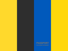
How to review a book like Alexander Checkmenev‘s Passport? Maybe by stating the obvious right away. First, the book is filled with a lot of pretty amazing pictures. Second, many of those pictures make for very uncomfortable viewing. Third, The preceding is likely to trigger a discussion around the ethics of either taking the pictures in the first place or publishing them.

I’m fully sympathetic to these kinds of concerns regarding the ethics of photography. But I also feel that something is amiss in photoland. While part of it behaves as if any of the discussions around, say, the male gaze or the ethics of photographing have never happened, another part is only too eager to essentially squash almost every even remotely uncomfortable discussion with vastly overblown outrage, usually using the tools of social media.

My feeling is that both approaches to what the medium can do are ultimately reactionary and counterproductive. Pretending that the history of photography is a blank slate and you can basically do whatever you want as long as you just express the presumably right intentions obviously isn’t going to solve any of the problems at hand. At the same time, drowning out possible discussions out of a sense of self-righteous outrage isn’t going to advance anything, either.

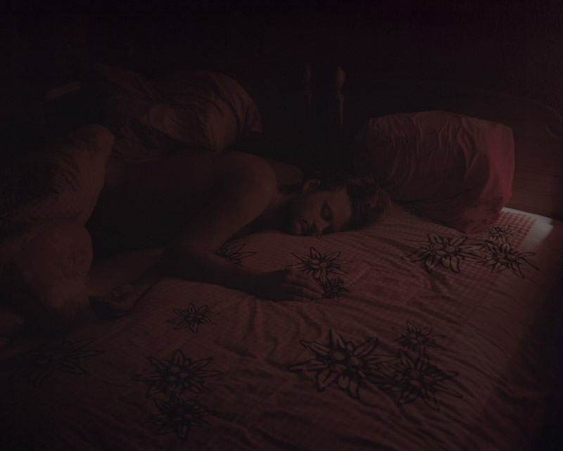
To bring this back to Passport, what are we actually looking at here? In the early 1990s, after Ukraine became an independent country, the country required its citizens to get rid off their Soviet passports and to replace those with Ukrainian ones. Those who were too sick, fragile, old, or any combination of these were visited by social services and a photographer so that new passport pictures could be taken. Chekmenev was one of those photographers.

Someone would hold up a white backdrop (while someone else might prop up an invalid subject), and Chekmenev photographed the sitter. But the photographer didn’t just focus on the subject’s face. Instead, he photographed the larger scene at hand, the conditions in which these elderly now Ukrainians were living in. In some, but not all, cases, these photographs make for uncomfortable viewing, given the state of outright squalor and/or distress of the sitters.

You could now either pretend as if there was no problem whatsoever with these pictures, or you could engage in the usual exploitation “discussions.” Neither would lead anywhere really. Instead, I think the most appropriate response would be to do both at the same time, in other words to accept the pictures as exposing the reality they depict while to feel a sense of outrage over what is on view. After all, photographs are merely cultural artifacts that we too often overload with unrealistic expectations (see, for example, how images coming out of Syria right now are being discussed). If we want to break out of running in circles, this would seem to be the best approach.

It is exactly that conflict that is at display in this particular book, and it is amplified even further by the fact that many of the photographs are simply amazing, however painful they might be to look at. This is photography depicting the human condition. If we don’t like what we’re seeing, the best approach to doing so is not to have a discussion about photography. Instead, we need to talk about the larger issues first.

Passport; photographs by Alexander Chekmenev; 156 pages; Dewi Lewis; 2017

Rating: Photography 4.0, Book Concept 4.0, Edit 3.0, Production 4.0 – Overall 3.9

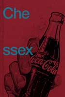
I thought if there was one thing I didn’t need it was another book with photographs taken in Cuba. You know, the usual fare of pictures of old cars, plus run-down, yet very colourful interiors. I’m under no illusion that the production of such cliche imagery will stop any time soon, though. Regardless, whatever you can say about Luc Chessex’s Coca-Che, a collection of the usual cliche imagery it is not.

Instead, the book presents photographs that each show either a portrait (or rendition thereof) of Che Guevara in some larger context or an advert for Coca Cola (or both). That’s it. Photographed between 1960 and 1975, these b/w photographs of the Communist icon and its ur-capitalist equivalent point at a larger truth behind the differences in ideology: without proper branding, neither a communist revolution nor a sugary syrup are worth much, if anything.

In both cases, the intended messages are made to clash with the actual reality of life. A man missing a leg hobbling by a happy Coca Cola advert. Children living in poverty next to a Che Guevara mural. Combining these photographs really makes you question the supposed differences behind these ideologies.

Coca-Che is produced to look like a book from an older era, with a printing that resembles gravure, two different types of paper (one somewhat coarse and brown), and photographs all oriented the same way, regardless of whether they’re landscape or portrait format.

All of this combined makes for a very carefully considered and engaging book, where all the bells and whistles are just right, without overwhelming the photographs in question.

Coca-Che; photographs and text by Luc Chessex; 96 pages; RM; 2017

Rating: Photography 3.5, Book Concept 3.5, Edit 3.0, Production 4.0 – Overall 3.6

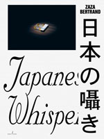
Japanese love hotels are another one of those overphotographed topics, aren’t they? But just because it’s overphotographed doesn’t mean it can’t get covered — assuming there’s an interest in a new angle. This is what Zaza Bertrand went after. If you’re looking to see funky looking interiors with lots of garish colours, possibly including women dressed in all kinds of exotic ways — in other words the usual cliches, Japanese Whispers is likely to disappoint you.

Instead, the book is a somber and somewhat disheartening affair, presenting the world of rented sex as one of loneliness and outright desperation — a business filled with mostly sad looking people. Instead of exotically othering the Japanese women and men in the pictures, they are simply depicted as the human being they are. This means they are also not shown in the often condescending ways photographers tend to use to cover sex for sale when photographing in the West.

It would seem to me that even though we have seen our fair share of images of prostitution, of sex for sale, the human dimension of it all-too often has been delegated to the back, to instead have us ogle over freaks who sell their bodies, or over grimy demiworlds inhabited by people who might drink too much, or over supposedly brave people “simply” going about a business like any other. For me, none of these approaches has much appeal: there’s just too much cliche going on in all of these.

Instead, we need to be presented with the human condition, unadorned with any of the ballast sex inevitably comes with. That’s hard to do. Zaza Bertrand pulls it off well here.

Japanese Whispers; photographs by Zaza Bertrand; 96 pages; Art Paper Editions; 2016

Rating: Photography 3.5, Book Concept 3.5, Edit 3.0, Production 3.0 – Overall 3.3

Tu Me Dis by Titus Simoens shouldn’t really work as a photobook, but it does. It doesn’t really have a cover. Rather on the cover, the book already unfolds in the form of a grid of photographs, all of which are more or less a variant of the same picture. This strategy continues inside, with grids and grids of pictures. The essay is reproduced on the back. The book’s title and photographer are printed in miniscule letters around the spine, near the bottom of the book.

In a nutshell, Tu Me Dis is a great example of how to break all rules of photobook making and still succeed (don’t try this at home), proving that rules exist for a reason — they can be broken, provided it makes sense. The book follows what I’m tempted to think of as a series of photobooks that I file under The New Male Gaze.  Obviously, the male gaze has a long history, and there is plenty of literature discussing it.

Lately, a new generation of younger photographers who seem very much aware of the medium’s history (unlike those who simply go about business as usual, as if feminism had never happened) have taken the model of books such as Rene Groebli‘s Das Auge der Liebe to continue work in this vein. For example, Thomas Boivin‘s A Short Story comes to mind (which I reviewed here). Tu Me Dis fits right in.

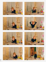
The book contains 2016 photographs of a young woman whom the photographer is compelled to photograph. Roughly half of the photographs were taken in an apartment at night, with the subject sitting at a table, in front of a window. The other half have her photographed against the sea, right before the final light of a day is gone. The viewer is made to look at the young woman just like the photographer does. The repetition enforces a sense of urgency to look, of wanting to look at her. Near the end, we see the young woman, mostly from the back, with her top taken off.

It’s all very male gaze, but it’s a kind of male gaze that knows that merely repeating the past’s simple patterns might not suffice, while not photographing also wouldn’t be right. So just like before, there we are again, stuck in this strange position where opting for just one of the two possibilities would leave us with less than trying to have it both ways. And this works for me.

Tu Me Dis; photographs and text by Titus Simoens; 24 pages; Art Paper Editions; 2016

Rating: Photography 3.0, Book Concept 4.0, Edit 5.0, Production 3.0 – Overall 3.6

The closest you can get these days to entering one of the innermost circles of hell is to engage in air travel. It’s an infantilizing, thoroughly unpleasant affair, where in the name of “security” you allow yourself to be treated like shit — unless, of course, you are able to fork over a lot of money for a space in “business class” or beyond (this all is just a mirror of our societies at large, though). I personally would happily forgo air travel if I could. But that’s not an option.

It’s not an option because I enjoy traveling (or rather the experience of being somewhere else) as much as I enjoy being on a plane. Whenever possible, I will book window seats, and I yet have to get tired of seeing the planet from above, of flying through the clouds, of seeing places approach or disappear in the distance. Unlike many people, I’m not afraid of flying — in between those exhilarating moments of joy I’m usually just bored to death.

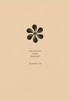
There’s something endearing about the characters in Xiaoxiao Xu‘s Aeronautics in the Backyard. They all decided to build their own helicopters or planes from whatever materials they deemed necessary or had available. They’re Don Quixote characters if you imagine the Spanish wannabe knight had actually existed in the age of chivalry, with actual knights being around. One man, Cao Zhengshu, is working on building a helicopter, run with an old car engine, whose desired flight altitude is 1 m (3 ft). So far, he has not achieved his goal. To me, that’s an amazing goal, much more impressive than, let’s say, Wang Qiang’s (3500 m). I admit I have a soft spot for the world’s Don Quixotes.

Most of men appear to have taken their various contraptions off the ground. Some have crashed, with some of those having injured themselves quite severely. But they’ve all been working on their dream, of building a plane or helicopter and seeing the world from above. Organized in chapters, Aeronautics in the Backyard presents them and their machines. To this end, the book relies on a lot of text to get its story across. It might as well, given it’s a book in the tradition of contemporary documentary photography. The result is entertaining and charming, a well-rounded book made just the right way.

Aeronautics in the Backyard; photographs and text by Xiaoxiao Xu; text by Gover Meit; 160 pages; The Eriskay Connection; 2016

Rating: Photography 3.0, Book Concept 4.0, Edit 3.0, Production 3.5 – Overall 3.4

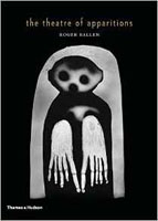
Over the course of his career, Roger Ballen has steadily moved further and further away from the initial straight photography he first got known for. To an increasing extent, elements of staging have made their way into his work, with surrealism now more made than found. I personally don’t find one better than the other. I do enjoy the early photographs as much as his later work. This is probably because in that debate over whether or not the world is able to present a photographer with thing s/he could hardly think of, I’m in the camp of what essentially is the history of art: human imagination has brought us thousands of years of art — why should any of that not be valid only because you’re taking pictures with a machine?

Ballen’s latest work, The Theatre of Apparitions, falls flat for me, though. Adopting an idea he had seen in a prison, the images presented therein were created by Ballen and his assistant on glass, using paints and a variety of tools, in what essentially could be considered quite similar to woodblock printing: material being removed results in light areas. The images in the book are photographs of these glass panes.

This is not to say that there aren’t quite a few arresting and visually very interesting images in the book, quite on the contrary. But there are also many images that simply fall way short of what the good ones achieve, and the sorting into different categories (called “Acts,” such as “burlesque” or “eros”) plus the somewhat clumsy titling further undermines the power of the good imagery. As a much condensed book, with only the strong images and no further text, this could have been quite amazing. As is, though, the book comes across as deliberately heavy handed.

The Theatre of Apparitions; photographs and text by Roger Ballen; text by Colin Rhodes; 192 pages; Thames & Hudson; 2016

Rating: Photography 1.5, Book Concept 2.0, Edit 2.0, Production 3.5 – Overall 2.2

Jessica Backhaus is no stranger to making books, having produced six of them over the course of the past decade. That’s a lot. As a photographer, Backhaus could maybe be described as someone making inconsequential observations. I don’t mean the use of this term in any kind of negative sense: it’s simply a photographer paying attention to details that most of us wouldn’t bother looking at twice, infusing the resulting pictures with a sense of magic (another artist working in this vein would be Rinko Kawauchi).

Much like all other types of photography, this one has its pitfalls, namely the severe risk of the end result might be a bit twee, as, I think, some of this artist’s books are. Not this one, though, a book entitled Six Degrees of Freedom. I suppose what pulled Backhaus out of tweeness here was the sense of gravity that probably is unavoidable when dealing with one’s biography.

I had a feeling that something like this was going on leafing through the book, while ignoring the texts. While there are images that skirt dangerously close to being either twee or merely formal exercises in the book, all in all a sense of longing is communicated, a sense of wanting to come to terms with one’s past. Refusing to fully reveal itself at first, the feeling gets stronger and stronger, the more often one looks through the book; and there might be simply no resolution, either for the viewer or the artist.

Six Degrees of Freedom; photographs and text by Jessica Backhaus; texts by Caroline von Courten, Lars Mextorf; 112 pages; Kehrer; 2015

Rating: Photography 3.0, Book Concept 3.5, Edit 3.0, Production 3.5 – Overall 3.3