A Spectacle and Nothing Strange (plus a few thoughts about photobook design)

Article main image

In the world of photography, hang ups concerning graphic design are very common. To begin with, a lot of photographers think they can produce their own design, even though they have no or very little experience as designers, let alone training. In addition, especially in the US many photographers will not talk of design. Instead, they will discuss “too much design,” as if design were something that could be measured in some way, and thus as if there could be such a thing as “too much” or “too little” design. Approached that way, design instantly becomes a problem. But doing just that, treating design as a problem, is the actual problem here.

When you open a photobook, it’s designed, whether or not an actual graphic designer got to work on it or not. The arrangement of photographs and text, the choice made for the type — all of that is part of graphic design. If there was no designer, if in other words the book was put together by the photographer, more often than not the design might adhere to its maker’s idea of “just enough” design (whatever that might be). In all likelihood, the book will be poorly designed, with little (or even big eye) sores everywhere. Pictures might be placed a bit awkwardly, the type choice and setting might be grim, etc. We’ve all seen these kinds of books. And maybe it’s because we’ve seen so many of them and also know so little of what design does that we have come to accept it.

Just like photography, graphic design finds itself somewhere in the world of the arts. As much as I love photography, I could easily make the case that graphic design actually is more of an art form than photography. But let’s not even go there. So ignoring that, there is good design, and there is bad design. We might not easily be able to have an agreement concerning what is good or bad. We might have different levels of expertise to come up with the criteria or words to describe why something is good or bad. But that then simply is the arts, where we struggle equally to come to an agreement about what is good or bad in photography.

I will have to say this, though, what really, really gets me is the often open disdain reserved for graphic design that I run into in the world of photography. Just because you can download InDesign and plop down some pictures fairly easily you’re not a designer. It just doesn’t work that way. The other day, I read a book designer’s description of how what he did mattered, and there was ample talk on Twitter along the lines of “of course, a designer would say that.” Is that how you would talk about your dentist, too? “Of course, a dentist would say I should get this cavity in my tooth taken care of.”

Coming back to the “too much design” complaints when photobooks are concerned, what this comment appears to reflect, based on how and where I tend to hear it, is a combination of the following. First, many photographers are incredibly conservative, being just flabbergasted by many of the options and choices available in contemporary graphic design. So that’s a matter of taste. Which is fine. If you want to live in a barren apartment, with concrete walls exposed and no ornamentation, that’s fine. But you also want to at least have an open mind concerning other options and not dismiss them outright as “too much.”

Second, it’s often really about a photographer wanting the photographs do all the lifting. This is fair enough, even though it’s obviously no excuse to simply pretend design is unnecessary.

Third, many photographers think they need to be in total control of all aspects of their photobooks. What makes this type of micromanaging so bad is not just that such an approach to management is bad per se. It’s also that many photographers simply lack the expertise to know everything about editing/sequencing, design, and production (if you want to hear stories, treat me to a beer or two if you happen to run into me in a bar somewhere).

Lastly, the design in question might actually be bad. Obviously, that’s entirely possible, and there are many books that employ a lot of very contemporary design in ways that ruin things. Honestly, to take those extreme examples as cases against graphic design is just foolish. Plus, there are many books where the design actually enhances the photographs in question quite a bit, and cherry picking only problematic cases is not a very good idea.

So when thinking about design, or when there’s a case where you think there’s “too much,” try to disentangle what’s going on. Try to figure out to what extent these factors come together and how. Maybe there even is something else. A good way to learn more is to simply talk to a graphic designer and see what s/he might think. It’s likely you’ll be in for a big surprise.

In the world of photobooks, the issue of design is just one of the various aspects that have to be dealt with. What everything comes down to in the end is that all the elements of the book have to come together successfully without one crowding out any (or all) of the others. This concerns the edit and sequence of the photographs, the design, the production, the text, etc.

The reality is that production issues might mar a book just as easily as bad design or bad pictures. However, here photographers usually only complain about bad production (bad printing, say), while generally drooling over the most overly expensive and ridiculous looking books. Yes, you can “fuck the midtones,” say, but that won’t get you a good looking book in every case. Unfortunately, many photographers and some publishers fetishize their photobooks, without putting much consideration into whether using inks produced with minerals harvested on the moon really is necessary.

Over the course of the past two years, I had to think about these aspects of photobook making more than I previously thought was healthy, while working on a book about photobook making. But I won’t, and really can’t, complain. As far as I can tell, my health also hasn’t taken a it. I’m still not a design expert, and I have also learned that there are many things I still don’t know about production. But I know that I have to consider them, I know a lot better what to look for, and I know that if I need advice I will speak to an expert.

In general, it’s good to have these different aspects of photobooks in mind, to be able to consider more than merely the pictures, to look beyond whether, possibly, the object in question satisfies one’s own photobook fetish (whatever that might be).

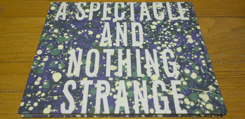
While the above might read like an impossibly long introduction for a book review, there is a clear reason why it exists here (beyond me really needing to get it off my chest). I had to consider the aspects of photobook making, in particular design, because I was looking at Ahndraya Parlato‘s A Spectacle and Nothing Strange. It’s a book that at least initially resists revealing itself easily. Whatever narrative is present is elliptical and at times disorienting. What struck me was the role design was allowed to contribute to the overall idea.

For a start, the designers made some very smart choices concerning the whole “package.” It’s a cloth-covered hardback, with a floral pattern on the cloth. There’s a picture on the front, and the title of the book is printed on its back, very large, with the text running all the way to the book’s head and tail (which I quite like). The book’s endpapers contain the book’s title (slightly abbreviated in the front) and part of the colophon plus the title page (in the back).

Inside, the book starts off with a couple of cryptic quotes, and then it’s a strange world of pictures. For the most part, the spreads adhere to the simple format of a picture on the right-hand side facing a blank page (there are no titles or page numbers). If it were just that, with the occasional pairing thrown in, I don’t think the book would succeed. But every now and then, a picture might get thrown all the way to the edge of a page, which makes for a very drastic effect (a bold and confident choice by the book’s makers, given that during production, when the book gets trimmed, you might lose a slice of your picture).

Whatever gallery-show-on-paper lull a viewer might have been in, s/he is being jolted out of it. Something is going on. What might this be? The book employs these kinds of attention-grabbing devices often enough for it, the whole, to come together. I personally don’t think the book would succeed without them, given that the photographs’ visual language tends to often be rather oblique, and it’s very hard to add up a lot of oblique photographs without having a viewer simply give up. This is a tricky path to follow.

A Spectacle and Nothing Strange is an entirely experiential book, featuring photographs depicting (or being based on) experiences and then trying to make its viewers connect. These are not experiences that can be easily conveyed through photographs. They are conflicted, at times disturbing, at times seemingly mundane. The book asks of its viewers to invest the time (well, the money first obviously) to make the connection needed to see and then feel what is going on. But there’s feeling and, thankfully, no attempts at displaying a degree of visual cleverness (which probably is my pet peeve with large parts of contemporary photography right now).

In fact, some of the photographs are disarmingly simple. I quite like that. As a viewer, you’re being kept on your toes. You don’t quite know where it’s all going. There are moments of confusion and maybe even terror. But in the end, the book offers a rewarding experience, even though it’s not even that clear what it actually is.

A Spectacle and Nothing Strange; photographs by Ahndraya Parlato; essay by Christian Hawkey; 104 pages; Kehrer; 2016

Rating: Photography 4.0, Book Concept 4.0, Edit 3.0, Production 4.5 – Overall 4.0

ZZYZX

Article main image

I was researching a Raymond Chandler quote about Los Angeles on the internet (to the extent that running Google and clicking on various links qualifies as that), when I came across a page entitled The 10 Sickest Burns About Los Angeles. This had me learn a couple of things. First, the Chandler quote I had been looking for exists in such a large variety of versions online that it really is more of an idea than an actual quote. One of the variants might be the original (maybe the one quoted in the piece: A big hard-boiled city with no more personality than a paper cup.”).

The second thing I learned is that a large variety of truly gifted artists have already expressed their disdain of Los Angeles in beautiful ways. My own feelings are quite close to John Lennon’s, thinking of Los Angeles as essentially “a big parking lot.” Thing is, I couldn’t care less about cars, and I’m really not fond of driving. So a place that is centered on just that, driving, can’t be very high on my list of places I’d like to go to.

Gregory Halpern photographed ZZYZX in and around Los Angeles. I had a bit of an inkling of that looking at the pictures, until a brief text at the end confirmed it. I’m not sure this matters much, to me anyway. While the photographs do look and especially feel Southern Californian, their essence isn’t necessarily that. Every photograph per se is a visual description of something first. But especially when assembled together in book form, good photographs can easily become a lot more: their descriptiveness falls away, to open up a new space to be explored. So let’s forget about Los Angeles.

(As an aside, I don’t know why that new space here had to be entitled ZZYZX. I’m not smart enough to figure this out. I’m too busy looking at and enjoying the pictures. Still, do things always have to be so damn clever, especially in the house of MACK? As much as I enjoy the books produced by this particular publisher, I often find myself being driven to the point of exasperation by the attempts at showcasing someone’s visual and conceptual wit. In this case, it’s the title. And if you read the following, maybe you’ll agree that a different title — and a less abstract cover — might have been a good idea.)

The photographs are sequenced as going from the desert to the sea, and there indeed there is a trek present in the book. That trek has people who have nowhere to go trying to get somewhere regardless. It’s not the sea that’s preventing them from getting anywhere, it’s simply that the world simply doesn’t provide any opportunities to do it. The Pacific Ocean for sure provided the natural border for how far the big American trek out West would be able to go. But this is not the 1800’s any longer, and it’s not about the physical trek, the move out West in search of opportunities. The land has been fully explored, and whatever opportunities there once were, they now appear to have disappeared.

The other day, I came across an article asking Where is today’s Dorothea Lange? Well, here she is, albeit in an obviously very different form, employing very different means. I’m not sure what Halpern would make of this comparison. Undoubtedly, I’m reading a lot into the work.

But still, where Lange photographed many of those suffering from a lack of opportunities, people aged prematurely to look a lot older, trekking out West, Halpern puts their contemporaries who already are there into his pictures. That West, Halpern’s West, is devoid of opportunities. While not being without beauty, it’s a relentless place, a brutal place. Even a blue tarp stretched over what might be a construction site looks like a grimacing monster as the light shines through four holes that happen to be in just the right place.

So there’s that brutality, the depriving of people of what they were (and still are) being promised. And there are the people dealing with it, in whatever ways they can. That includes a tenderness that provides a counter point to what otherwise would be just a completely depressing experience. The tenderness is included both in how many of the photographs were treated, how they were made, but also in many of the gestures on display. Even where people are depicted as being openly defiant, they cannot help but also be a bit tender, as if to say, hey, I’m not going to let this beat me down, and I’m also not going to become that mean, brutal person this place wants me to be.

Inevitably, we read things into pictures and collections of pictures based on where we are coming from, based on our ideologies and the times we find ourselves in. Who knows what you will be seeing in these pictures. Then again, this book is being published at a specific time, a time that is presenting us with a flurry of challenges. How will we react to them? What will we say when in the future, we are being asked about this particular point in time?

However metaphorical you might want to treat ZZYZX, it is not just a book of pretty pictures. It does have a specificity to it that builds as you make your way from its beginning to its end, a specificity that grows with each repeated viewing. This is a book dealing with our times, with our predicament.

I believe that for art to mean anything, there has to be something at stake both for those who make art and for those who engage with it. In both cases, there always is a choice, though: am I going to face what might make me uncomfortable? Halpern made his decision, and now the onus is on us, the viewers. Are we willing to face and deal with this view of the world, of our world? Are we then willing to maybe do something about it?

Do we want to live in a world devoid of opportunities, being fed empty promises left and right, while trying to remain as human as possible? Or do we want to aspire to something more?

Really, the choice is ours.

ZZYZX; photographs by Gregory Halpern; 128 pages; MACK; 2016

Rating: Photography 5.0, Book Concept 3.0, Edit 3.0, Production 5.0 – Overall 4.2

Update (24 Aug 2016): In my original version of this review, I had the title wrong, ZZYXZ instead of ZZYZX.

Photobook Reviews (W33/2016)

Article main image

Things have been a bit quieter her not because it’s summer, but because of a string of work-related trips, the latest of which a two-week long intense teaching stint and another week of nursing a bad cold. I enjoy teaching very much, because of the amount and intensity of engagement with the medium photography. Anything I say might get challenged, and I’ll have to defend it. Unlike here (aka the outrage and anger machine that the internet has become), challenges during teaching are a lot wider and usually a lot more productive.

During the summer, it’s always the time to let the graduates “fly.” Coming into the summer means not really having an idea what will be on the walls and in the books. The one thing I’ve learned is that there will be surprises, usually pleasant ones. I try not to walk through the graduation exhibition thinking about the role I might have played, but at times, it’s good to feel that a lot of the work and effort that went into teaching might have paid off.

Obviously, you didn’t come here for the sentimentality, so onto some new book reviews. These past few weeks, I’ve been a bit down on photobooks, or rather I’ve been down on the overall shallowness of what is being produced these days (cue angry tweets and Facebook rants). While part of my feeling is caused by teaching a photobook-history class, during the course of which I look at a string of amazing books with students, there also is the fact that I do feel that right now we’ve reached a time of exhausted excess.

The photobook is alive and well, and it will remain that way for a long time (so please, no “the end of the photobook” pieces!). But there appear to be periods when there are a lot of good books, and there are periods when there merely are a lot of books. Inevitably, someone asked me the other day what photobook has excited me the most recently, and I couldn’t think of one (btw, this might be my least favourite question, just after how I went from science to photography). For me, that answer is perfectly OK, because if you’re always excited about something, there really isn’t anything that sticks out, is there? But I can see how it’s a disappointing answer.

Maybe I shouldn’t preface a series of book reviews saying that no book has excited me lately. But at the same time, if we make that our benchmark for looking at photobooks, talking about “exciting” books, then maybe that is exactly what is causing what I called the exhausted excess we’re witnessing right now?! So yeah, I’m a bit tired of the excitement, of the coolness, of announcements of super-limited editions, of book makers trying too damn hard. Photobooks should not be about bells and whistles, not about throwing the kitchen sink at their viewers (possibly at some exorbitant price). They should be about telling stories, in whatever way, however superficially exciting or boring an approach a story might ask for.

The Russia on display in Dmitry Lookianov‘s Instant Tomorrow is unlike the one usually presented in photobook form. Here, there are no young people partying heavily. Neither are there people living in quaint, isolated Russian villages. Instead, the viewer is presented with a series of people whose blandness perfectly matches that of the towering apartment blocks they are living in. These people are depicted as being so devoid of any personality that it’s almost amazing.

As if to counter that, or to possibly bring some form of excitement into their lives, many of them are seen engaging with some form of gadgetry, large parts of which appear to be designed to enhance one’s physical appearance (in what ways or, crucially, why is completely left to the imagination). Even a young woman holding on to a vacuum cleaner and a cat toy looks like she is engaging with the most alien of all contraptions. And it is not because the photographer is awkward or inept. Instead, it’s the game he’s presenting.

So if this is the new Russia (or one of them anyway), it’s inhabited by drones, by people who might look a little different, but who, in the end, are really all just alike, aspiring to what really just seem to be the weirdest and possibly most useless goals.

Aren’t we all?

While some of the portraits just look a tad too posed, in this particular context this is actually made to work. Where in almost any other body of work portraits that look too posed suck all the life out of what could be had, here it’s the complete opposite: it almost seems as if even the photographer somehow got affected. So the photographic lifelessness works, given it supports the overall idea. Having looked through the book, you almost want to run out of your house and grab the next available piece of dirt just to feel alive again, to be in — and with — a world that’s not so relentlessly alien.

Instant Tomorrow; photographs by Dmitry Lookianov; 104 pages; Peperoni Books; 2016

Rating: Photography 3.5, Book Concept 3.5, Edit 3.0, Production 3.5 – Overall 3.4

I always tell people that in order to make a good photobook you will have to have good pictures. It sounds like fairly obvious advice, even though it would be straightforward to think of exceptions. For example, you could make a book only with really terrible pictures, and that would be fun. Think Martin Parr’s Boring Postcards. But then the fun usually only lasts for so long, because how many times do you really want to or need to look at a whole book filled only with “boring postcards”? Yeah, I thought so, not that often.

So books with bad pictures sell, but they’re mostly catering to the lifestyle-impulse buyer who might pick up some “ironic” photobook at stores like Urban Outfitters to match whatever other (overpriced) stuff they’re getting there (as an aside, that would be culturally very interesting, and probably very depressing book: a book on photobooks on sale in such lifestyle stores).

You really need good photos to make a good photobook, because it’s the pictures that will make people look at it again. However much you think you understand pictures, they behave differently than text. A picture doesn’t necessarily reveal itself in the way text does.

This all makes the medium photobook a bit tricky for more conceptual approaches. For a start, I do think conceptual photographers tend to get away with lousy pictures much more easily than everybody else. But that aside, once you get the concept, there’s usually not that much more to do other than to move on. There are very few conceptual artists who in my book manage to successfully subvert the underlying mechanism of their field, such as Broomberg & Chanarin, or Thomas Ruff (if you want to accept the premise that he really is a conceptual photographer, which I think he is).

This then leads me to Jan McCullough‘s Home Instruction Manual. The book’s idea is basic and simple: using instructions found online, the artists furnished a rented, blank home and photographed the results. If you’ve ever looked for advice online, you probably know where this is going, as it does. The bulk of the book is provided by the various tips, tricks, and suggestions, all of which are rather innocent and well-meaning, albeit at times a bit absurd.

The only problem I have is that the pictures aren’t really interesting enough. They hover in a strange, unresolved space. They’re not snapshotty enough to look like snapshots. Yet they also don’t look quite deliberate enough, beyond trying to get the basic point across. I feel this is a bit of a lost opportunity, given that the rest of the book holds up quite well.

Home Instruction Manual; photographs by Jan McCullough; 124 pages; Verlag Kettler; 2016

Rating: Photography 1.5, Book Concept 4.0, Edit 3.0, Production 4.0 – Overall 3.0

With Le Collège, Florian van Roekel roughly follows the trajectory of his earlier very successful How Terry Likes His Coffee, training his eye on a school and on what’s going on there. So that’s all good. It is a very attractive package, carefully laid out and designed and produced, and from what I can tell, it has also been received well. The book present school as a slightly strange space, in which its hapless inhabitants are stuck in a series of odd situations — clearly, the visual strategy (fill flashing etc.) does a lot of the lifting here.

That said, maybe this insistence of relying on these specific strategies is what ultimately gets a bit in the way of the work achieving its full potential. For a start, the photographs are all incredibly center weighted in what looks like a 35mm frame. In picture after picture, there’s not much, if anything, for the eye to explore than what’s in the very center. In my repeated viewings of the book I’ve found myself going faster and faster through it, which I think is in part caused by just that.

In addition, while the photographs that involve human forms for the most part are very interesting, many of the others are not. In part this could be because of the center weighting — there’s only so much mileage you’ll get out of an object in a 35mm frame if you put it smack in the center.

My current desire to see human faces in photographs clearly is just my personal hang-up, but I’m finding that I react more and more to not getting that when there are actually people in the pictures. I understand that by excluding faces, the subjects are being depicted as anonymous people without any real agency. But this idea actually cuts both ways: it does make the place look positively stifling. At the same time, by adopting a fairly anonymous place’s treatment of people, you basically sign up for doing just that as well. Whose side are you on, though?

Le Collège; photographs by Florian van Roekel; 102 pages; self published; 2016

Rating: Photography 2.0, Book Concept 3.0, Edit 3.0, Production 5.0 – Overall 3.2