Things have been a bit quieter her not because it’s summer, but because of a string of work-related trips, the latest of which a two-week long intense teaching stint and another week of nursing a bad cold. I enjoy teaching very much, because of the amount and intensity of engagement with the medium photography. Anything I say might get challenged, and I’ll have to defend it. Unlike here (aka the outrage and anger machine that the internet has become), challenges during teaching are a lot wider and usually a lot more productive.
During the summer, it’s always the time to let the graduates “fly.” Coming into the summer means not really having an idea what will be on the walls and in the books. The one thing I’ve learned is that there will be surprises, usually pleasant ones. I try not to walk through the graduation exhibition thinking about the role I might have played, but at times, it’s good to feel that a lot of the work and effort that went into teaching might have paid off.
Obviously, you didn’t come here for the sentimentality, so onto some new book reviews. These past few weeks, I’ve been a bit down on photobooks, or rather I’ve been down on the overall shallowness of what is being produced these days (cue angry tweets and Facebook rants). While part of my feeling is caused by teaching a photobook-history class, during the course of which I look at a string of amazing books with students, there also is the fact that I do feel that right now we’ve reached a time of exhausted excess.
The photobook is alive and well, and it will remain that way for a long time (so please, no “the end of the photobook” pieces!). But there appear to be periods when there are a lot of good books, and there are periods when there merely are a lot of books. Inevitably, someone asked me the other day what photobook has excited me the most recently, and I couldn’t think of one (btw, this might be my least favourite question, just after how I went from science to photography). For me, that answer is perfectly OK, because if you’re always excited about something, there really isn’t anything that sticks out, is there? But I can see how it’s a disappointing answer.
Maybe I shouldn’t preface a series of book reviews saying that no book has excited me lately. But at the same time, if we make that our benchmark for looking at photobooks, talking about “exciting” books, then maybe that is exactly what is causing what I called the exhausted excess we’re witnessing right now?! So yeah, I’m a bit tired of the excitement, of the coolness, of announcements of super-limited editions, of book makers trying too damn hard. Photobooks should not be about bells and whistles, not about throwing the kitchen sink at their viewers (possibly at some exorbitant price). They should be about telling stories, in whatever way, however superficially exciting or boring an approach a story might ask for.

The Russia on display in Dmitry Lookianov‘s Instant Tomorrow is unlike the one usually presented in photobook form. Here, there are no young people partying heavily. Neither are there people living in quaint, isolated Russian villages. Instead, the viewer is presented with a series of people whose blandness perfectly matches that of the towering apartment blocks they are living in. These people are depicted as being so devoid of any personality that it’s almost amazing.
As if to counter that, or to possibly bring some form of excitement into their lives, many of them are seen engaging with some form of gadgetry, large parts of which appear to be designed to enhance one’s physical appearance (in what ways or, crucially, why is completely left to the imagination). Even a young woman holding on to a vacuum cleaner and a cat toy looks like she is engaging with the most alien of all contraptions. And it is not because the photographer is awkward or inept. Instead, it’s the game he’s presenting.
So if this is the new Russia (or one of them anyway), it’s inhabited by drones, by people who might look a little different, but who, in the end, are really all just alike, aspiring to what really just seem to be the weirdest and possibly most useless goals.
Aren’t we all?
While some of the portraits just look a tad too posed, in this particular context this is actually made to work. Where in almost any other body of work portraits that look too posed suck all the life out of what could be had, here it’s the complete opposite: it almost seems as if even the photographer somehow got affected. So the photographic lifelessness works, given it supports the overall idea. Having looked through the book, you almost want to run out of your house and grab the next available piece of dirt just to feel alive again, to be in — and with — a world that’s not so relentlessly alien.
Instant Tomorrow; photographs by Dmitry Lookianov; 104 pages; Peperoni Books; 2016
Rating: Photography 3.5, Book Concept 3.5, Edit 3.0, Production 3.5 – Overall 3.4

I always tell people that in order to make a good photobook you will have to have good pictures. It sounds like fairly obvious advice, even though it would be straightforward to think of exceptions. For example, you could make a book only with really terrible pictures, and that would be fun. Think Martin Parr’s Boring Postcards. But then the fun usually only lasts for so long, because how many times do you really want to or need to look at a whole book filled only with “boring postcards”? Yeah, I thought so, not that often.
So books with bad pictures sell, but they’re mostly catering to the lifestyle-impulse buyer who might pick up some “ironic” photobook at stores like Urban Outfitters to match whatever other (overpriced) stuff they’re getting there (as an aside, that would be culturally very interesting, and probably very depressing book: a book on photobooks on sale in such lifestyle stores).
You really need good photos to make a good photobook, because it’s the pictures that will make people look at it again. However much you think you understand pictures, they behave differently than text. A picture doesn’t necessarily reveal itself in the way text does.
This all makes the medium photobook a bit tricky for more conceptual approaches. For a start, I do think conceptual photographers tend to get away with lousy pictures much more easily than everybody else. But that aside, once you get the concept, there’s usually not that much more to do other than to move on. There are very few conceptual artists who in my book manage to successfully subvert the underlying mechanism of their field, such as Broomberg & Chanarin, or Thomas Ruff (if you want to accept the premise that he really is a conceptual photographer, which I think he is).
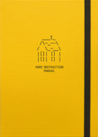
This then leads me to Jan McCullough‘s Home Instruction Manual. The book’s idea is basic and simple: using instructions found online, the artists furnished a rented, blank home and photographed the results. If you’ve ever looked for advice online, you probably know where this is going, as it does. The bulk of the book is provided by the various tips, tricks, and suggestions, all of which are rather innocent and well-meaning, albeit at times a bit absurd.
The only problem I have is that the pictures aren’t really interesting enough. They hover in a strange, unresolved space. They’re not snapshotty enough to look like snapshots. Yet they also don’t look quite deliberate enough, beyond trying to get the basic point across. I feel this is a bit of a lost opportunity, given that the rest of the book holds up quite well.
Home Instruction Manual; photographs by Jan McCullough; 124 pages; Verlag Kettler; 2016
Rating: Photography 1.5, Book Concept 4.0, Edit 3.0, Production 4.0 – Overall 3.0

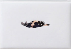
With Le Collège, Florian van Roekel roughly follows the trajectory of his earlier very successful How Terry Likes His Coffee, training his eye on a school and on what’s going on there. So that’s all good. It is a very attractive package, carefully laid out and designed and produced, and from what I can tell, it has also been received well. The book present school as a slightly strange space, in which its hapless inhabitants are stuck in a series of odd situations — clearly, the visual strategy (fill flashing etc.) does a lot of the lifting here.
That said, maybe this insistence of relying on these specific strategies is what ultimately gets a bit in the way of the work achieving its full potential. For a start, the photographs are all incredibly center weighted in what looks like a 35mm frame. In picture after picture, there’s not much, if anything, for the eye to explore than what’s in the very center. In my repeated viewings of the book I’ve found myself going faster and faster through it, which I think is in part caused by just that.
In addition, while the photographs that involve human forms for the most part are very interesting, many of the others are not. In part this could be because of the center weighting — there’s only so much mileage you’ll get out of an object in a 35mm frame if you put it smack in the center.
My current desire to see human faces in photographs clearly is just my personal hang-up, but I’m finding that I react more and more to not getting that when there are actually people in the pictures. I understand that by excluding faces, the subjects are being depicted as anonymous people without any real agency. But this idea actually cuts both ways: it does make the place look positively stifling. At the same time, by adopting a fairly anonymous place’s treatment of people, you basically sign up for doing just that as well. Whose side are you on, though?
Le Collège; photographs by Florian van Roekel; 102 pages; self published; 2016
Rating: Photography 2.0, Book Concept 3.0, Edit 3.0, Production 5.0 – Overall 3.2
Ratings explained here.
