Provoke

Article main image

Art movements don’t arise out of a vacuum. Instead, they are being triggered by other movements or political, cultural, or societal events, and this is what makes them often so interesting. Provoke, the short-lived, yet influential photography movement originating in Japan, was no exception. While in general not well-known in the world of photography as a movement, Provoke style photographs still are easily recognizable, with their high-contrast b/w, often with gratuitous amounts of grain and/or blur thrown in for good measure. Add to that the facts that the three publications produced by the movement have long been out of print and that much of the writing produced around them has been only accessible to those who can read Japanese, and it’s easily understandable that many people think Provoke merely was just another aesthetic or style, much like any of the various Instagram filters today.

Thankfully, a new book, a catalog produced at the occasion of an exhibition (Provoke – Between Protest and Performance), has now arrived to not only set the record straight, but to also place the movement into its proper art-historical context. In a nutshell, this essentially is the book we have all been waiting for: those who always wanted to know more about Provoke, and everybody else who is going to be in for a real photo history treat.

As its title indicates, the book extends the range of what it covers. The 1960s saw a huge wave of protests and demonstrations all across Japan, by students, farmers, and other people. These protests were triggered by a variety of specific and more general causes. Having emerged from World War 2 defeated and utterly devastated, Japan had undergone a rapid transformation into one of the most industrialized and wealthy nations in the world (granted, much of that was still going to happen well into the late 20th Century, until the bubble finally popped), embracing consumerism with a vengeance. One of its islands, Okinawa, had essentially been turned into a huge US military base, from which bombers would take off to then drop off their loads over Vietnam. Large parts of the younger and some parts of the older, traditional generation took massive offense at these developments, resulting in the aforementioned protests.

Photography played a considerable role in this development, as photobooks were produced around the protests. The first third of the book dives deeply into these, presenting a large variety of selected spreads from publications, texts written around that time, for example a diary written by Tomatsu Shomei, and essays produced at the occasion of the exhibition. Protests formed the breeding ground for some Provoke photographers, and a very fertile backdrop against which they would develop their movement.

In much the same fashion, performance and its documentation through photography emerged at roughly the same time as an art movement. This is covered in the final third of the book. Again, there was considerable exchange of Provoke photographers with this aspect of photography in Japan around the time. In fact, as the middle third, which focuses on Provoke itself, makes clear, the movement was a lot more than merely a funky aesthetic. The aesthetic itself really was quite secondary, and when its photographers realized things would get tied too much to it, they stopped (with the exception of Moriyama Daido, who has made a handsome career out of producing the same kinds of pictures for decades). In one of the interviews in the book this transition is described as Provoke turning from a language into a style, destroying its very essence.

What that difference between a language and a style really means is being made clear by the book. A key essay in the book is provided by Nakahira Takuma, writing about William Klein‘s New York book. A very important passage is provided by the following: “William Klein’s work differs from that of [Henri] Cartier-Bresson and Robert Frank in one key aspect: Klein thinks of photography as a method of searching and recognizing, as a plan for adventure in an endless world. Cartier-Bresson and Frank think of it as a means of direct expression of a specific view on the world or on life, such as the viewpoint are lonely and miserable.” (Nakahira Takuma, “William Klein,” in Provoke – Between Protest and Performance, p. 362ff., Steidl, 2016; the quoted passage can be found on p. 366 [my emphasis]) Here is the key driver of Provoke.

In addition to discussing Western influences, the book also places Provoke into its Japanese photography context, featuring work by Shomei Tomatsu or Araki Nobuyoshi (the latter apparently wanted to join Provoke, but never managed to do so). The difference between a language and a style, the difference between genuinely looking for what can be found and looking for confirmation of what is already known — these aspects of photography have never left us, and they probably never will. We could use these polar opposites as tools for criticism — isn’t, say, New Formalism so insufferable exactly because it’s merely a style that affirms what’s already known (and shouldn’t the curators who have been hyping it know, actually: demand a lot better)?

So Provoke – Between Protest and Performance is not just a book of interest for those curious about a short-lived photography movement. It also teaches us a lot more about the role of photography in society, which, and this is quite important, means the role photographers demand to play in society. Almost gloriously failing, the Provoke photographers wanted a lot more, generating one of the visually most exciting movements in the medium’s history. Who says that something like that isn’t possible today?

For that to happen, though, we’d all need to shed the neoliberal thinking that is so firmly embedded in the world of photography: if you want more, you certainly won’t get it by whining or whimpering, or by fighting over the tiny crumbs someone with a lot of money and/or power might throw at you. You get it by doing something, by brushing against the grain, by making pictures that, at least to you, mean something. Even if you might ultimately fail, the resulting ripples might have lasting impact — much like Provoke‘s.

Provoke – Between Protest and Performance; edited by Diane Dufour and Matthew Witkovsky; 680 pages, 600 images; Steidl; 2016

Into the Forest (part 2)

Article main image

(This article is the second in a series of two. The first part can be found here.)

The first volume of The Democratic Forest was photographed using a different format, and it is intended to serve “as an overture.” (quoted from the introduction by co-editor Mark Holborn, vol. 1, p. 8) After the formal introduction, the journey (“geographical progression” – Holborn, ibid.) begins in volume 3, in Dallas, TX, and from there it moves to Pittsburgh, PA, and beyond. But it’s not all geographic. Further volumes dive into the pastoral (vol. 6), there are interiors (vol. 7), finally the forest itself (vol. 9)…

Whatever you want to make of the way Holborn and William Eggleston III organized the books, there would have to be some form of organization: books have a beginning and an end, and their makers have to take a viewer from one to the other. To present these hundreds and hundreds of photographs in random order, in just one impossibly thick volume, might have been the most radical gesture. But it would also stood in the way of it allowing most viewers access, because only the most dedicated ones might have the stomach to dive into what essentially would have been a completely unorganized mess.

The country Forest portrays, though, the US, is a mess. That’s what Eggleston makes very clear with his photographs. Of course, there are pleasant enough landscapes, even sometimes buildings (or cars). But usually, it’s a mess that is presented, and the only reason why you want to look at it is simply because with his camera the photographer transforms it into a large number of beautiful images. Addressing that transformation, in his (2015) introduction, Holborn addresses the artist’s history and how it had him arrive with these pictures. Eggleston, writes Holborn, realized “the possibility that everything that crossed his view was a worthy subject if he could apply the language with which to contain it.” (vol. 1, p. 7)

If that’s not photography, though – and not merely Eggleston specific, then I don’t know what photography is. My read is based on just two characters that form a word, “if”: “a worthy subject if he could apply the language with which to contain it” (ibid., my emphasis now). If a photographer can apply their language to something, if, in other words, they can make it their own, then, yes, they’re in business. In their business. Seen that way, what makes Eggleston stand out is not that he does what photographers do. Instead, it is the seemingly unlimited breadth of his vision, the taking for granted that anything, any piece of crap, can make for a good picture.It’s a profoundly American approach, establishing a democracy of everything.

But that’s also not quite correct. I don’t think that Eggleston photographed democratically, training his cameras at everything in equal manner. Instead, we see a photographer who it seems very familiar with his medium’s history, picking up – or adopting, or using – approaches used by those that came before him. Walker Evans already employed a very similar democracy of imagery (just look through American Photographs), and there are certainly echoes of the likes of Stephen Shore or Lee Friedlander here, to mention just two other photographers. In no way does this reduce Eggleston’s achievement. Instead, it places it into its proper context.

In line with the work produced by these other practitioners, here then lies the genius of Forest, and its own subversive power at the same time: the land, the US, is portrayed in all its glory (and lack thereof), in the most glorifying way possible. This clearly follows Evans’ and Frank’s directions in their respective books (especially Evans’). I’d even go a little further: Forest essentially is American Photographs Redux, albeit in an exploded, garishly colourful form.

Of course, this fact has long been made to disappear through the general acceptance and reception of this particular photographer: Eggleston as the ground breaker for colour, for this particular type of photography. Parts of that are very valid. But I’d like to not have the established perception of the work get in the way of re-appreciating, re-evaluating it. Not to do that would violate my understanding of what criticism ought to do (it’s not a critic’s role to be a hagiographer).

I want to go back now to that idea of the democracy of pictures. For a start, we’re really talking more about ideology here than about anything else. It is the idea that, of course, the way these very glorious American pictures were made was democratic. And I don’t buy that. Sorry. It’s true, Eggleston tore down visual hierarchies that were – and, let’s face it, often still are – well established. But that doesn’t make this way of photographing necessarily democratic per se. For a start, there are those visual connections to other practitioners.

Beyond those connections, we might note, for example, that in most of these pictures people are absent (unlike in Evans’ book). That’s just one example, this most curious exclusion of the people. Speaking of the inclusion of what is photographed, simply through Eggleston’s making of decisions, through him photographing this and not that, he was imposing a hierarchy, imposing his will onto what people can see (and what they can’t see). That’s simply not democratic. Art isn’t democratic (and that makes it great).

In some sense, the editors amplify Eggleston’s approach through the organization of the work. This becomes more obvious in some volumes than in others, making them curiously uneven. I guess you can’t help but pick up on larger themes, especially once you’re provided with some. Volume 6, for example, gives us “the pastoral,” and this volume falls mostly very flat for me. It could have been edited down to maybe 10 to 15 pictures, and it would still be flat. Looking through these photographs, I can’t escape the impression that ultimately, Eggleston didn’t have much of an interest in the landscapes or trees or flowers he photographed, other than possibly making a good picture.

In contrast, the volume following right after, “the interior,” is a lot more interesting. Here, the photographer is shown as tickling vastly more out of the interiors of the built environment, covering a much wider ground, producing a lot more interesting photographs. There just seemed to be more around that would trigger Eggleston’s instinct for making a good picture.

Volume 8, “the surface,” operates on the same visual level, maybe on an even higher one (ask me in one or two years when I have had a chance to look at all of this often enough). It is as if Eggleston really isn’t interested so much in what is around, but rather in what is around because it was put there by someone else, with him picking up on how much people cared (or – usually? – didn’t). Seen that way, Forest is not so much a portrait of the country in the pictures, it is a portrait of the country through the pictures, where every picture hints at something else, usually the care or lack thereof that led to what’s in the pictures.

If that read is correct (or maybe “has merit” would be a better way to phrase this), then we would be in Stephen Shore territory here (American Surfaces as much as Uncommon Places). Where to me Shore feels a bit too patrician in the pictures, ultimately making me realize they’re just that, pictures, the result of a willful act, Eggleston is more convincing: I am made to look at pictures and through them at the same time, wondering about why that window is so dirty or why that strange doll is so tacky. In other words, Eggleston makes me care in ways that Shore does not (I appreciate Shore’s work for different reasons, though).

Compared with the thematic volumes, the geographical ones operate in slightly difference ways again (of course, geography is simply another theme, but you probably understand what I’m getting at here). I did anticipate that the Pittsburgh volume would be very different than the Berlin one (which also includes pictures that look like they were taken in southern Germany), and it does. Given I lived in Pittsburgh around ten years ago, I looked at that volume first, before then moving on to the Berlin one. Both volumes present Eggleston as a visiting flaneur, with different levels of visual comfort. The pictures from the American city have so far given me the impression that he was a lot more comfortable visually there than in what was then that strange West German enclave in East Germany (which since reunification has been gentrified into oblivion).

What might be at play here is what I have come to think of as the idea of photographic recognition, by which I mean a photographer’s ability to see something and to then recognize that it presents an opportunity to create a good picture, essentially to recognize that one has stumbled upon a picture that is just waiting to be taken. This is a somewhat tricky concept, given it appears to deny a photographer the chance to grow. To grow, to be able to take more or different or better pictures inevitably means expanding photographic recognition. And you always have the choice to do that or not (the history of photography is filled with examples from both camps, with the latter, however, being a lot more numerous than the former).

I don’t mean to imply that Eggleston did not want to grow or change as a photographer. What I do see in the Berlin pictures (and to some extent maybe even in parts of the non-Southern US pictures) is a reduced level of visual comfort, where what is on view cannot be photographically recognized so easily. So for example, the Berlin car pictures are very good, as are many photographs that appear to have an obvious US correspondence. But many of the other pictures look as if they had been taken by a visually very adept tourist. And I don’t really see that as a problem, just in case you’re wondering. We should all be so lucky to take these kinds of quality pictures, instead of our selfies in front of what’s left of the Berlin Wall, say.

What this all adds up to, Eggleston’s Forest, I don’t know. It is as mesmerizing and fascinating and beautiful and infuriating and gratuitous and obscene and unresolved as the country it portrays, the country it makes us confront. That might ultimately be its real achievement, because while it’s good to see resolved books, some things might just be too complex to attempt to resolve them. Any attempt to arrive at something fully realized might just fall way too short. Seen that way, as I already noted above, The Democratic Forest in its 2015 Steidl edition is probably the best way to present these pictures.

Unfortunately, its form (especially price) will not make it easy for many people to see them. And there will have to be a significant investment of time by any viewer. But the rewards are well worth it. The Democratic Forest is William Eggleston’s crowning achievement. I’m hoping enough university and public libraries will acquire copies so that there is some chance for those interested in the pictures who cannot afford the cost of the set to see them.


Into the Forest (part 1)

Article main image

Robert Frank gave us his vision of the United States with The Americans. Before, Walker Evans had done the same (American Photographs). William Eggleston‘s The Democratic Forest, in its Steidl 2015 incarnation, is another one. A set of ten volumes of photographs, with a total of well over 1,000 pages, Forest is all that The Americans is not: it is garish, gratuitous, and bursting with unordered life, much like the country itself. But it is also follow Frank’s book, being unapologetic and over the top in a way that seems necessary and not merely self-indulgent.

OK, I might have to walk back that very last sentiment a little bit, but that’s for later.

Three brief diversions:

First, I didn’t consider myself one of the many Egglestonians out there. I was very much aware of his work, but certainly no fan (make of that what you will).

Second, I do realize there is a Berlin volume in the set, and obviously Berlin isn’t part of the US. Neither are any of the other non-US locations. Given the vision presented in that particular volume, the one of a visually adept tourist, this isn’t at odds with the main observation.

Lastly, much has already been said about William Eggleston. Given the quality and provenance of much of that, I can only hope the Egglestonians will forgive me if the following falls short of their expectations.

There is, of course, an entirely different incarnation of The Democratic Forest, a one-volume book published in 1989. The 2015 incarnation and the 1989 book do not have much to do with each other. Granted, they share the photographer, and they share an editor, Mark Holborn (Holborn is the sole editor of the 1989 book; the 2015 version was edited by him and William Eggleston III). But beyond that they might as well be treated as two entirely different entities.

One could argue that the 1989 Democratic Forest is what happened when Holborn attempted to press the work into the form The Americans adopted so successfully. The fact that that exercise did not succeed so much is certainly not Holborn’s fault. Eggleston’s photographs ultimately might simply resist being treated that way.

What do you get then, when you give these pictures the chance to live in an altogether different form of book? To begin with, The Democratic Forest isn’t really a photobook in its traditional sense (please note that where I’m not explicitly mentioning the publication year, I am going to refer to the 2015 Steidl version). Ten volumes – that’s not really a book, that’s more like a collection.

I do think that we gain something from expanding the notion of the photobook to have Forest fall inside, not outside its confines. It does, after all, include most of the aspects that are extremely important for photobooks, such as having a clear concept and a way that concept is communicated (both through editing – down from an original 12,000 or so pictures – and physical form). If we treat the separate volumes simply as chapters, it’s a book.

That said, at least in part the idea backfires with Forest, given that ten volumes of pictures, hundreds and hundreds of them, are just too much to comprehend even with the loosest idea of what “the photobook” might be. That’s a risk its makers appeared happy to bear, and it’s a risk that at least in part points at something deeper in the pictures, in their very nature. I might even be happy to argue that this really is the perfect incarnation of this body of work, at least in principle.

When I wrote “in principle” just now, I obviously had the specific realization of the ten volumes in mind. There are ten hardbound volumes, contained in a slipcase. The chosen format of the volumes is a square, which allows for horizontal and vertical photographs to have the same sizes in individual spreads. The square is rather large, though, (roughly) 12.5” (or 32cm) on the side. So those are large books, and if you stack up ten of them, with a grand total of 1,328 pages, you end up with an object that’s quite hefty, in size, weight (something like 31.2 pounds or 14.15kg), and price (“€550.00 incl. VAT” on Steidl‘s website – free shipping, though). That seems a tad excessive.

I noticed this before in another book review, but I’m not sure Steidl‘s recent tendency to increase the sizes of their books is based on a real necessity. In this particular case, the photographs would have been able to shine just as much in volumes say, 10” on the side (assuming the number of page would remain the same that would reduce the size/weight of the set by one third). I think it’s fair to say that at a certain scale, bigger doesn’t result in any further improvements.

Having said this, the production quality of the books is impeccable. Each volume is clothbound, with an image printed on the cover, wrapping around the whole book (something that worked so well for, say, the first edition of Alec Soth‘s Sleeping by the Mississippi). The printing of course is noticeably different and much improved compared with the 1989 version. The colours are a lot punchier, making the older book look lifeless almost. While some viewers might find the colours maybe even a tad too punchy – especially the reds almost appear to take on a life of their own, it’s Eggleston, and Eggleston is all about the colours. If you have ever seen one of the older dye-transfer prints, you’ll know the importance of colour in this photographer’s work.

With the original body of work having 12,000 pictures, the viewer is exposed to a sizeable fraction in Forest. Anyone already in awe of Eggleston is likely to start drooling over the prospect of being able to now have available many previously unseen photographs. Everybody else also is in for a treat, even those who really weren’t fans at all. Both factions surely must feel like the proverbial kid in a candy store, the only difference being that the former know (or think they know) what to expect, whereas the latter don’t.

My previous comments concerning the sheer scale of it all also apply here. The overall edit could have been narrowed down without losing anything. It’s not going to be the thirty percent I came up with by simply making the books smaller. Still, there are quite a few pictures that could have been omitted. Just to give one type of example, when two pictures of essentially the same scene (with slightly different vantage points) are shown right next to one another, in almost all cases I would have preferred seeing just one. Showing both for me doesn’t add anything; instead, it lessens the better picture’s impact.

Various sections in the individual volumes could have been slimmed down. The reality of Forest is that I don’t think anyone could actually look at all ten volumes in one go. I personally can look at a lot of pictures without getting tired, but there’s a limit. And some of the volumes could have lost some of their contents without a reduction in punch. Interestingly enough, this comment applies differently to individual volumes – having not discussed what they actually are, I will refrain from going into more details for now.

As outlined by Mark Holborn in his introduction, there is a logic to the ten volumes, with only the second one aiming to “define the [photographic] language in the most explicit manner” (quoted from the introduction, vol. 1, p. 8). Holborn also edited and sequenced the 1989 version, so working on this new one might (or might not) have been an interesting exercise. Then, writes Holborn, “a single publishable sequence […] meant about 150 photographs.” Now, it’s a lot more (and that might say something about the photobook market as well), getting more in line with the idea that “it never had a finale. It was truly endless and there was nothing it could not accommodate, hence the title.” (ibid.) But still, there would have to be some sort of sense for a viewer, unless one would allow her or him to essentially become editors themselves. As interesting as that idea might be, it probably would be too radical a gesture.

(this is the first article in a series of two)

Photography and Narrative (part 2)

Article main image

(This article is the second in a series of two. The first part can be found here.)

Once you move from one photograph to a group, you’re in the dreaded territory of editing and sequencing. Editing and sequencing photographs for a book (or a wall presentation) amounts to making sure that the final group of pictures and the way they are presented most clearly succeed in pointing at whatever it is that is being pointed at, a story, a feeling, an idea… Working on a photobooks often involves approaching it from both ends. There is the original set of pictures, edited in such a way that the selection works most clearly. And there is the overall idea or theme or concept, which is determined by the edit, but which in turn also has repercussions for the edit, by forcing out everything that does not fit.

The overall narrative would then be the way this all comes together to best express the desired end result, regardless of whether it’s a book with a clear story, something more elliptical, a selection of portraits, a catalog, or whatever else. In other words, the best way to approach narrative is by finding out first what the overall idea is and then to determine how to get there. In yet other words, your narrative is a tool that is important for the outcome, but it is not the outcome itself.

The moment you put two photographs together, whether they’re being seen side to side or one after the other, there will be a dialogue between them. That dialogue can be based on either their individual forms, their contents, or on a combination of both. Over the past couple of years, I spent a long time trying to figure out how to best describe this idea of the dialogue: there just are too many possibilities. But if we think about narrative, things might become clearer.

Both pictures will allude to something, however vague or specific that something might be. When seen in combination, those allusions will inevitably get compared. And then in the viewer’s minds there will be connections, or maybe not. As the maker of a photobook, it’s essentially your job to make sure that the right connections are being made. These connections can be very specific, such as when for example a viewer needs to recognize (or made to believe) that the person in the first picture is the mother of the person in the second picture. But the connections can also be quite vague, such as when two pictures taken together evoke a feeling of sadness or dread or joy or whatever else.

Whatever it is, as someone assembling the edit and sequence, you’ll have to understand the repercussions in terms of what these pictures do when presented that way. That’s your narrative. That’s your way of telling that specific story you’re interested in, of conveying that general feeling you want to speak of, or whatever it is you’re after. So while there are many different types of photobooks if we approach them based on the idea of story, approached based on narrative, they all work the same way. There is a narrative underlying the books, regardless of how different the ends these narratives are in support of might be. And a book’s narrative either succeeds (doing what it is intended to do), or it doesn’t (people won’t understand the book).

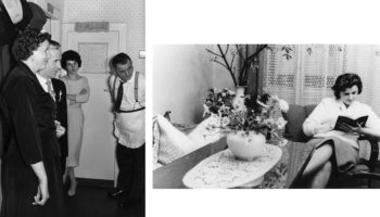
In Figure 2, I linked the photograph from Figure 1 with another one, which I also found (in the same location, but not necessarily on the same day – I don’t remember). In that second picture, a woman is depicted reading a book in what looks like an otherwise deserted living room. What is more, she finds herself at the right edge of the frame, leaving ample space next to her. Of course, now the three people on the left are looking at her, or at least that is what the viewer is made to believe. And these people looking at her trigger all kinds of ideas in a viewer’s head.

The thing with pictures is that once you put two together, a viewer will intend to figure out what’s going. In a photobook, there certainly is an expectation that the way things are being put together makes sense, that it is done for a reason: making a photobook is directorial, and a reasonably attentive viewer should be put into the position where s/he can figure out what’s going on.

So the game that is being played with photobooks works not just because of the pictures and the way they were put together. To a large extent it works because its intended viewers are familiar with or at least have some sort of educated idea of how this works. In other words, you can’t make a photobook without considering your audience (or rather you can, if you’re happy with potentially making some unintelligible nonsense).

The combination of the two pictures in Figure 2 forms a more specific narrative than what you get from looking at the photographs on their own. Remember, by narrative I don’t mean the implied or alluded to story. With these two pictures, that story might be fairly different for different people. But the kind of pointing in the two pictures, and the way how those two combine, starts building a narrative that is more specific.

In Ingrid Sundberg’s words, “the juxtaposition of images can spark a narrative relationship in the viewer’s mind. […] There is no sequence of events, thus no story.” It’s just two pictures. “However,” she continues, “the viewer begins to create a story by connecting these images in his or her mind, and that story […] will be different for each viewer.” I think this approach to narrative is incredibly helpful. You will – inevitably – get some sort of narrative in your photobook, built by the edit and sequence (and by design and production – showing two pictures right next to each other operates slightly differently than showing them one after the other). So you have to consider your book’s narrative.

Whether or not there is a story, though, is an entirely different matter. If you want a specific story, you’re basically obliged to make sure it materializes. In that case, the use of text can help massively (think Laia Abril’s The Epilogue). In the extreme opposite case, you’d still have a narrative, even if all you’re after is to a general emotion or feeling (or maybe more than one). That emotion or feeling will have to be evoked, with pictures, and to do that you need a narrative.

One final thought. While it’s important to think carefully about narrative, it can be a good idea to consider it first, without even looking at the pictures. But often enough, the pictures determine the narrative, given the overall idea of the project (let’s just assume there’s a project – if there isn’t, the same applies). In other words, the narrative doesn’t necessarily materialize out of thin air. So to understand your narrative, you’ll have to understand what your pictures do – and how they do it. And it always gets back to that, doesn’t it?

Photography and Narrative (part 1)

Article main image

“I often find the terms Narrative, Story, Plot, and Structure to be used interchangeably (on blogs, in articles, tweeted, and talked about),” writes Ingrid Sundberg, “and personally, much confusion has ensued as a result.” This statement can easily be applied to how most photographers approach these terms, especially when attempting to work on a photobook. I tend to mostly run into the resulting confusion since the MFA program I teach in is photobook centric – one component of the graduation requirements is a fully realized photobook. But outside of the program, things are hardly any different.

To argue over the different meanings of these terms would appear to be the kind of exercise in semantics that in the world of photography is often belittled. Of course, such exercises can be tedious and pointless – where they are in fact tedious and pointless. Here they are not. Often enough, photographers get confused about the differences between, say, narrative and story, usually mistaking one for the other. That’s when things get iffy.

We all know (or think we know) what a story is. And narrative then is just the same thing, isn’t it? Well, not necessarily. According to Dictionary.com, narrative can be “1. a story or account of events, experiences, or the like, whether true or fictitious”, “2. a book, literary work, etc., containing such a story”, or “3. the art, technique, or process of narrating, or of telling a story.” Those three options really aren’t the same at all. A photobook’s story is not the same as the book itself, and those two aren’t the way that story is being told. What I tend to find is that many photographers use the term narrative in the sense of it being the same as story (option 1), but what they mean is that it is the way the story is told (Option 3).

In part because many photographers don’t realize there is that difference, much fretting about the idea of story itself can happen. “Does my book have to have a story?” is an actual question I have been asked multiple times. Well, no, it obviously doesn’t. But even if it doesn’t have a story, it will – by construction – still have a narrative. This is because it will contain a set of photographs that are being presented in a very specific way: there is an edit, a sequence, and very specific decisions about design and production were (hopefully) being made. As I’m trying to explain in the following, the edit and sequence (and to a lesser extent design and production) form a specific narrative that, in turn, might or might not produce or allude to a story. How to approach this then?

For a start, in line with Sundberg’s approach I suggest taking the terms narrative and story as meaning different things. Photographers have much to gain from following this approach since easily most photobooks don’t necessarily have a very specific story. They are clearly about something, but that “something” usually is not working along the lines of “Sue and Joe got married, and then they had a baby.” Obviously, if your photobook does have a story, there’s really no need to worry, because the following gets a lot easier. But if you don’t have a very specific story, if there is, instead, more like a general idea or some larger theme you’re aiming to convey, then you need to figure out how to do that.

When we speak of photobooks, we tend to conflate what in reality often are very different beasts. It’s good to keep this in mind. If you compare, say, Laia Abril‘s The Epilogue with Awoiska van der Molen‘s Sequester, you’ll find that they operate in very different ways even though on the surface, they’re both two examples of contemporary photobooks (and they’re then also very different than, say, Robert Frank‘s The Americans). The real reason why I think photographers need to understand how photobooks operate is not to just know about as many books as possible. It is mostly to figure out which type might apply to the group of pictures in question.

This is where understanding the term narrative comes in. As Sundberg outlines, it applies to the visual arts, and in particular to photography, in more ways than one. For a start, there is what is known as staged-narrative photography, images created (staged) purposefully with the idea of narrative in mind – think Gregory Crewdson. Like every photograph, these pictures depict an event. Unlike most other photographs, though, the way the photographs are produced is intended to very specifically allude to a story that we are all familiar with (so obviously, you can’t create staged-narrative photographs around a story, however broad it might be, that nobody has ever heard of: Kaspar Hauser would be very baffled by Crewdson’s work). In Crewdson’s latest case, Cathedral of the Pines, that’s the somewhat Lynchian sense of psychological comfort and ennui of American life (which, admittedly, has become rather stale by now, but that’s another issue): we don’t know why these people all look the way they look, but we all have some idea, even though the specifics of our ideas might be quite different. There’s an event depicted, and that event alludes to a larger story it is part of. In Sundberg’s words, “these artworks are considered narrative because they recall a story through association.” So this is interesting, because as a maker of such work you will have to get the association right (otherwise, it wouldn’t really qualify as staged-narrative any longer).

“Herein lies the truth of narrative,” writes Sundberg, “it can be a story but it does not have to be. A narrative is about story, and creates connections to story and storytelling but does not in and of itself have to be a story.” (emphasis in the original) This last phrase is supremely important for photography, because it defines the distinction between narrative and story. But it also helps to expand the discussion of staged-narrative photographs to many other types of pictures. It might not be too much of a stretch to say that all photographs allude to some sort of story, however vague it might actually be. Staged-narrative photographs merely attempt to make the allusion as obvious and strict as possible, following conventions that for hundreds of years have served painters well.

The idea of photographs alluding to stories lies behind such fortune-cookie sentiments as “a photograph is worth a thousand words,” or the various ideas that photographs operate like poems, say. Whichever way of talking about this you might prefer, photographs aren’t really entities of their own. Instead, they point at something else, whether that something else is a story, a feeling, an idea, or simply its maker’s expression to affirm her or his presence.

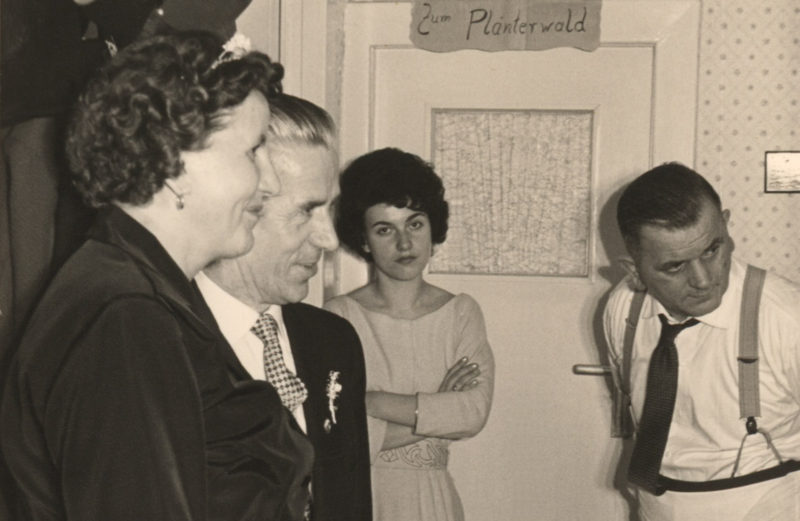
The photograph shown in Figure 1 is one I found in Berlin in a box filled with hundreds of others, all apparently taken from old albums. It’s the kind of picture I have a hard time not buying, no doubt to a large extent because for me, it’s filled with potential. There are all kinds of details to be noted here. What mostly interested me is the fact that the photo almost begs to be put into some context, into some interaction with other pictures. The four people depicted here are all looking at something. The three older ones’ attention is devoted to something outside of the frame. Whatever that might be, it’s interesting enough for the man on the right to bend and turn around (which, given his attire, adds a degree of humour and levity). That would be fairly interesting, if if weren’t for the fourth person, a young woman, who in what I take as a mix of boredom and exasperation is looking directly at the camera, and thus at the viewer. There really is no specific story here I can think of, but there certainly are many situations. For a start, many social occasions bore me just as much that they appear to bore than young woman. So she found her accomplice here (if you can make the viewer your accomplice – or make her/him believe s/he is – that’s always great). And whatever is happening outside of the frame, getting all that attention, I’m actually dying to know, even though in all likelihood I might react just like that young woman… Who knows? So this picture for me behaves like a puzzle piece that is just waiting to be linked to another one.

(this article is the first in a series of two; the second part can be found here)