A Conversation with David Fathi

Article main image
David Fathi

David Fathi is one of the winners of the 2015 Conscientious Portfolio Competition. Wolfgang, based on photographs from the CERN archives, is a slightly tongue in cheek look behind the scenes of science, using Wolfgang Pauli as its main character (Pauli might be most well known for having invented particle spin). I spoke with Fathi about his original motivation and details of this project.

Jörg Colberg: Can you talk about your background? Who are you as a photographer, what are your main interests and/or motivations?

David Fathi: My background is in science, as I studied mathematics and computer engineering. Photography and art came a little later, at first as an escape route, but quickly my geeky side came biting back. It became a vector for my obsessions around the limits of human knowledge.

In my artistic practice I start working with weird facts about science, politics, history, psychology and try shining a different light on them. I hope that using and illustrating small absurd stories helps comprehend larger abstract ideas.

JC: For Wolfgang, you used images from the CERN photography archive, and you then manipulated them. How did you come across that archive? Where did the idea for the project come from?

DF: The archive is all accessible online. It started a little over a year ago, when CERN realized that they had a huge archive of photos spanning from the end of the 1950s to the late 80s, but did not know what was pictured in most of them. So they asked the general public to crowdsource their knowledge, if they knew what was pictured, who was photographed, anything. Maybe scientists working in that field, maybe relatives could help.
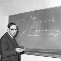
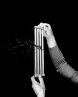
The photos are amazing, they look like science-fiction, but are just science from 50 years ago. My goal wasn’t to just curate some esoteric selection of scientific weirdness, but to search for some story that I could grasp, in line with my own artistic work and obsessions. I found a way to batch download every single photo available. They are still scanning the archive as we speak, but at the moment I have browsed through 120,000 photos.

When I started looking through the images, I stumbled upon a few which mentioned someone named Wolfgang Pauli (on a blackboard, or a memorial plaque). I didn’t know who he was at the time, even though he is actually one of the founders of quantum physics, and he was seen by his peers as Einstein’s successor. I did a bit of research on him, and that’s when I first heard of the Pauli Effect. They’re anecdotes according to when Wolfgang Pauli entered a room experiences would fail and machinery would break down.

Pauli actually believed in this effect and used it in his correspondence with Carl Jung as examples of the idea of “synchronicity”, a Jungian theory that events can be related by meaning instead of causality.

I had a lot of difficulty understanding how one of the greatest minds in science would also believe in a theory that sounds like pure superstition.

But then I started thinking about quantum theory, and how the greatest scientific minds can come up with theories of elementary particles that seem totally at odds with the macroscopic world we live in. Quantum physics is non-intuitive, and the implications of how matter can behave on a subatomic level can send chills down the spine of any rational being. The trailblazers in science often theorize on the craziest ideas, and seeing them as stuffy, old, rational professors is kind of an invention of the second part of the 20th century. After the Second World War, science needed to be rehabilitated, as the image of the scientist was quite frightening, given Nazi medical experients or the creation of the atomic bomb. So it was reassuring to see science as an objective practice without emotion or chaos – even though science is anything but order.

So I wanted to confront science and myth and represent their battle through the comical “Pauli Effect”. I imagined a semi-fiction where Wolfgang Pauli, who died shortly before the beginning of the archive, continued to haunt everyday life at CERN.

JC: Can you talk about your process of going through the archive? How did you decide which pictures to pick?

DF: The photos I show can be classified in three general categories :

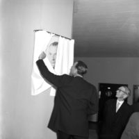
Pauli’s presence: I search throughout the archive for any photos where Wolfgang Pauli’s presence could still be found. I found his name on road signs (streets at CERN are named after famous physicists), blackboards, books, etc. I found photos of the inauguration of his bust, with his widow attending the event. I found photos of the “Salle Pauli”, the commemorative room named after him.
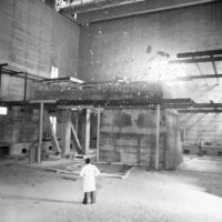
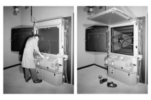
Weird experiments: Scenes that seem to be at the crossroads of science and fiction. Research in quantum physics is often a crazy endeavor, and CERN released this archive because they didn’t know themselves what was going on in a lot of the photos.

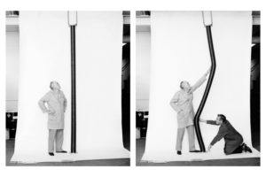
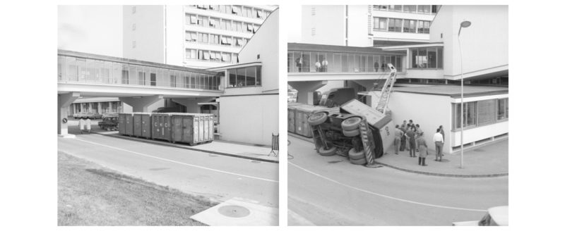
Accidents: As if the Pauli Effect still was at work. Accidents can be of different nature; the photographed result (a car accident, a broken machine), an ambiguous scene (a man hanging from a ledge, a box in midair), the photograph itself (double exposure, damaged negative), or even the scanned archive (corrupted photos)

But for any of these categories, some photos are totally true, directly extracted from the archive, while others are manipulated by me.

JC: And how did you decide about how to manipulate the images?

DF: The manipulations are made to blur the line between fact and fiction, and to make the viewer a participant in the outcome of the photos.

In quantum physics there is an important principle called the “Observer Effect”. The act of observation fixes the outcome of the scene. As long as a particle is not observed, it exists in a linear combination of multiple states. I like the parallel in the act of photography, which in a way also fixes the outcome of a scene.

So for this project, the aim was for the spectator to act as an observer. He or she is the one deciding what is true and what is false, what is science and what is myth.

But often, fact is weirder than fiction. One of the photos I found in the archive is an accident where a cinder block falls off a truck, right next to a road sign with the name of the street “Route W. Pauli” (Pauli Road). That photo is 100% real, and I couldn’t have dreamt a better illustration of the Pauli Effect!
Photobook Reviews W03/16

Article main image

There’s the widespread idea that someone’s suffering might cancel someone else’s. We probably wouldn’t be fighting around 90% of all wars if we didn’t subscribe to this idea as a species. And we might ultimately collectively perish because of it, too (we haven’t yet, but given there appear to be no limits to human folly, there’s no guarantee). Engaging in discussions about this, or even just attempting to, will inevitably result in what I tend to think of as the arithmetic of death, where each amount of suffering is put onto a spectrum, is assigned a value, and the outcome of the discussion then arises from simple numbers: well, their suffering isn’t quite as valid, because, you see, there’s ours, and ours happens to have more weight.

There also exists the idea that someone’s suffering might – really very mysteriously – cancel out or make invalid someone else’s. I personally find all of that very hard to accept. But at the same time, I know that as a human being that is the situation I will have to deal with. I insist, though, that nobody’s suffering cancels out anyone else’s. And I also insist that it is exactly this idea that someone’s suffering is more relevant or important or whatever else than somebody else’s that will perpetuate the circle of violence that has gripped our species. It is not, after all, as if we were somehow doomed to endlessly repeat the cycle of violence and terror that we have inflicted on ourselves (and the rest of the planet). We have a choice. It’s ours to make, and we make it anew every day.

If we think the choice we have is too hard to face, there are ample opportunities for us to try to understand the suffering some people had to endure. Kazuma Obara‘s Silent Histories offers an opportunity to do so. Originally self-published in a very small edition size – each copy was handmade, the Western trade edition of the book was just released. The book deals with the aftermath of the indiscriminate bombing of Japan by the US during World War II, which killed or injured roughly three quarters of a million people.

As those familiar with the history of photography in Japan will know, it’s not the first book to address the suffering of survivors. But with the nuclear bombings of Hiroshima and Nagasaki being most prominent in the world of photography so far, Obara focuses on survivors of the other bombing campaign. And unlike artists such as Ken Domon or Shomei Tomatsu, he does so by mostly utilizing other people’s photographs (or materials), making Silent Histories a radical departure in form from books such as Hiroshima Nagasaki Document 1961.

In fact, Silent Histories relies very heavily on archival materials, larger sections of which are included as facsimiles of, say, propaganda magazines, photographs, or ID cards. Production-wise, considerable effort went into the making of the trade edition. How faithful it is to the handmade version I don’t know (and frankly, it doesn’t matter).

In a series of chapters, the book describes the lives of survivors of the bombings. Having lost limbs as young children and living in a society not too kind to the weak, the survivors have had to struggle mentally and physically to get through life. For each, there is introductory text, and then there are photographs, many of them archival, some by Obara. Interspersed is the larger picture, in the form of archival photographs of bombers and destroyed cities, of photographs of contemporary Japan, and of those magazines that were handed out during the war so people could prepare themselves, should they get bombed.

I’m going to be assuming that the usual instincts will kick in, and they might as well. As I noted in the beginning, as a species we have the capacity to empathy and compassion, but they’re not a given. All too often, we decide not to use those facilities, because we’d rather engage in the arithmetic of death. As an artist (photographer, writer, painter, …) all you can hope for is that there will be enough people who might pause, and then enough people who might learn something or decide to change their minds, however hard this might be as one ages. As an artist, I believe, you also have the duty to make those materials available, such as this book, so that people will have that option. This is what Obara has done here. Not more, but certainly not less.

Highly recommended.

Silent Histories; photographs, text, and materials assembled by Kazuma Obara; 162 pages; RM; 2016

Rating: Photography 3, Book Concept 4, Edit 3, Production 5.0 – Overall 3.8

Reviewing a photobook will inevitably ask of its author to be aware of her or his own biases or preferences. I cannot speak for other critics, but I personally spend a lot of time on that. The idea is to try to separate out what is in the book from what I bring to it – not that one is more important than the other, though. Instead, there is a balance. There has to be a balance. Reviewing photobooks only on their own terms is a pointless exercise: that’s not criticism, that’s – at best – description. Reviewing photobooks only on its viewer’s terms is equally pointless: that’s just ideology.

Over the past few years, the number of photobooks presenting materials found in some archive has exploded. I’m using the term “archive” in a somewhat loose sense, meaning nothing other than a stash of images that the author has somehow come across. Such an archive could be an actual institutional archive, it could be a collection of images online, or it could be photographs acquired in some way.

Once you have acquired such material you have crossed a bar. But it’s a low bar to cross, especially these days where anything that looks even slightly vintage is automatically considered to be cool or noteworthy. Consequently, I personally don’t think that’s the final bar that needs to be crossed. Instead, I personally want to see something else, something that in the context of US copyright law is referred to as “transformative use”: what exactly do you, the author, bring to the material, lifting it out of the world it is in and bringing it elsewhere. In a courtroom, that’s a problematic term. But in the world of art, it is the central aspect of this all.

To give you an example, if you find a set of cool postcards and you put them into a book, for me the novelty of seeing the material usually quickly wears of. After all, to paraphrase a notion I found in an interview with Richard Hollis, excitement usually isn’t exciting a year or two later. This is especially true in this day and age, where vast parts of the internet operate on presenting something cool or exciting every day (lest we get bored and have to deal with our own, somehow inadequate existences). Let’s face it, how many times will you look at a book containing “boring postcards”? Right, I thought so.

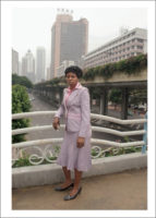
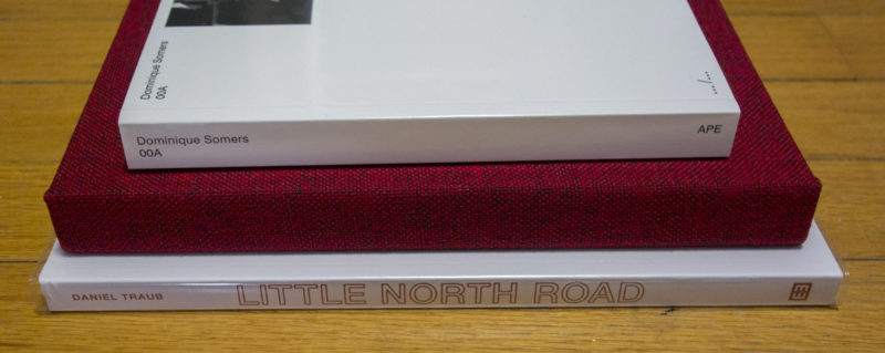
This then brings me to Daniel Traub‘s Little North Road, which features photographs by Wu Yong Fu, Zeng Xian Fang, and Traub. If you’ve never heard of either Wu or Zeng, you needn’t necessarily feel bad. Both work on a bridge in Guangzhou (China), photographing those that come by and are interested in getting photographed. They’re not necessarily the greatest photographers, even though their customers appear to be satisfied.

Of course, there is a story here, given that there are many migrants in the area, coming to look for work. And, you know, that story is interesting, albeit in the sense that most stories are interesting. But Little North Road does little, if anything, to try to do anything other than presenting the story and the pictures, with a focus on migrants from Africa. For me, it doesn’t add up to much beyond that.

Mind you, it’s not a bad book. But what little there is to be discovered reveals itself quickly, and I am not sure there is much of a pull for a repeated viewing. It’s a bit like the stories that you’ll hear on NPR, on your morning or evening commute. They’rejust interesting enough to prevent you from changing the station, allowing you to nod along while you’re stuck in traffic. But ultimately, they’re just infotainment for the slightly better off, guaranteed not to ruffle any feathers.

What feathers could have been ruffled with the material presented in the book I don’t know. That’s not my job as a viewer (or critic) to figure out. But with the flood of interesting material presented as a photobook washing over us, I do think photobook makers operating along those lines need to look for that higher bar to cross.

Little Road North; photographs and text by Wu Yong Fu, Zeng Xian Fang, and Daniel Traub; 178 pages; Kehrer; 2015

Rating: Photography 2, Book Concept 3, Edit 3, Production 4.5 – Overall 3.0

In 1972, Japanese photographer Daido Moriyama published a book entitled Bye, Bye Photography, Dear. It was Provoke on steroids, and it’s tempting to think that it demonstrated what that would mean, namely a dead end. Where, after all, can you still go, when you throw out all conventions, when you radically push photography to the extremes?

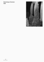
I’d like to see Dominique Somers00a as a variation on Moriyama’s theme. The book is a collection of the very first frames found on strips of 35mm film, that strange space that perfectly acts like film, but that photographers usually would neglect because you were never sure whether or not there would be a picture. Someone just gave me an old Minox 35EL camera, and I just went through those motions. I put the film into the camera, closed it, and then I advanced the film, having to press the shutter, and again, to have the camera’s exposure counter get to “1” (it never did, since it seems to be broken).

So all of those pictures are 00a ones (technically speaking, on the exposed and developed film there will only be one frame underneath where it says “00a”). They’re pictures of no consequence, pictures that you don’t know whether you’ll get them or not. You might advance the film and press the shutter aiming the camera at nothing, or maybe you’ll just take some picture, not knowing whether you’ll get it after all.

Collecting these kinds of pictures and putting them into a book, as Somers did for 00a, is an act like putting together Bye, Bye Photography, Dear. These non-pictures don’t deserve to be given this kind of attention, but they get it anyway. This replaces Moriyama’s slightly self-indulgent Provoke gesture with a more restrained conceptual approach. Whether ultimately, it amounts to more (or less) I’m not sure. I’m intrigued, though.

Given we’re being flooded with photobooks, many of them following the same few trodden paths, 00a is a book that strays from the crowd. I doubt the book will find many fans – the photographs resist a viewer’s enjoyment too much. But still, the book and the way it is made provide a perfect vehicle for looking at a type of photographs that were eliminated by digital cameras.

00a shows that even in this day and age where it seems everything has been done, you can push the medium photography in imaginative ways. This had had me come back to the book again and again, to find myself repeatedly baffled. What does this amount to? I don’t know. But the not knowing, the not being told that this or that is interesting, the fact that here is an archive that makes so little sense, but that somehow speaks of so much — that makes for a good book.

(The book resists being put into my rating schema, but I’ll apply it regardless – you’ll have to take the overall rating with a grain of salt)

photographs collected by Dominique Somers; 318 pages; Art Paper Editions; 2015

Rating: Photography 1, Book Concept 4, Edit 3, Production 4.0 – Overall 2.9

Indexicality vs. Interpretation

Article main image

I don’t know how or where you would draw the line between art photography and non-art photography. But it might have something to do with the idea that art photography is open to interpretation, is fluid, and non-art photography is not. This might be a somewhat strange discussion still to have (we’re over a week into 2016), but the world of photography is sluggishly conservative, and many of the ideas and debates that have washed over the medium in the wake of postmodernism actually do need to get reevaulated.

There is no field of photography where this struggle plays out more clearly and openly than news or press photography, or however we want to call it. The past few iterations of the World Press Photo (WPP) contest were haunted (or maybe marred) by discussions over image manipulation: how much manipulation is allowed? Or: at what stage does a photograph cease to become non-WPP-worthy?

If WPP were a haiku competition, things would be a lot easier. You’d start out by looking at the form (counting the syllables etc.), and any submission that violates the rules is dismissed. In photography, things aren’t quite so simple. David Campbell wrote a report about the issue entitled The Integrity of the Image, which looks into how to approach things. Chapter 6, Accepted Standards and Current Practices, outlines what it announces it does, with entries ranging from what could have been expected (“The alteration of images—where alteration means the digital addition or subtraction of elements—is forbidden.”) to what sounds good, but what’s impossible to enforce (“Adjustments made by image-processing software […] are acceptable so long as they are deemed ‘minor/normal/subtle/moderate’, while ‘excessive use’ is not acceptable” — given you can’t count syllables, what exactly are “excessive” adjustments?).

But there is manipulation, and there’s manipulation. There is the trickery you do on your computer, and there is what you to get your picture. For example, last year Giovanni Troilo won first prize in Contemporary Issues for his series The Dark Heart of Europe. First, the mayor of the town he had portrayed complained. And then the claims about possible problems with the work kept rolling in, complaints about staging (or posing — interestingly enough, these different terms are often used in the same way) or misrepresentation. The latter then had WPP withdraw its prize (link; if you want something a bit more breathless click here).

At the heart of these troubles lie two different aspects of photography, indexicality and interpretation. In a nutshell, indexicality means that what’s in the picture was actually in front of your camera. That already creates a whole slew of problems, given that’s where the various problems with manipulation play out. Interpretation, however, is a very different beast. In this particular context, the approach chosen by WPP appears to be that if we all look at the same picture, we all come to the same conclusion. So as long as the picture isn’t manipulated, we’re good. The only problem with that approach is that it doesn’t work at all.

For a start, we could come to the same conclusion by looking at very different photographs. Various issues are addressed in often vastly different ways by different photographers. This includes many of the issues that appear in contests such as WPP. In the world of art photography, the ideas about how to get the photographs that talk about an issue are much wider than elsewhere. For example, you could easily and happily stage something, and few people would worry about that. After all, your staging would just be a tool to get the picture that says what you want it to say.

Of course, we could now have a long debate about who does it better, or who approaches the idea of photography in a more appropriate way, and what any of that might tell us about photography. I don’t mean to say that such debates lack merit. But, and this is my main problem here, such a debate will have to take into consideration the world of photography as it exists today (and not, say, in the 1950s).

It seems fair to say that our collective visual literacy has come to accept and easily deal with approaches to photography that simply didn’t exist in the past. Most of us use some app on our smartphones that adds some filter on top, to arrive at essentially heavily manipulated photographs. And most of us have no problem with that. Of course, such approaches have long infiltrated the world of news photography. For example, in 2010 Damon Winter produced Hipstamatic photographs for the New York Times. He later defended his approach in a piece entitled Through My Eyes, not Hipstamatic’s.

At the same time, most of the various manipulation examples where elements of a picture were added or removed were done so amateurishly that they were detected rapidly. If you look at the examples in this article you’ll probably be amused how simple and obvious they are. A little verification will do the trick.

What I’d argue is not necessarily for contests such as WPP to relax all their ground rules. But in a world where many of those rules are being violated by all of us on a daily basis and where we are surrounded by such violations everywhere (including in the news), being dogmatic about them makes absolutely no sense any longer.

This is particularly important because the real fight over photographs is now happening in the domain of interpretation. You could show pictures of melting glaciers to climate-change deniers, and guess what? They’ll still deny climate change. You could show people pictures of desperate refugees, and guess what? They’ll still ask for border fences or come to even more inane conclusions (in both the US and Europe, the far right are making huge gains right now). On top of that, the idea that our media somehow are not to trust — mostly because they do not show us the things we want to believe — is gaining more and more traction. Your fights over how much you can manipulate a photograph are really not going to have any effect on that.

Given how important news images still are, we thus need to have a different debate about them. Instead of talking about manipulation of photographs, we need to talk about their interpretation, in particular the manipulation of interpretation. We need to talk about what pictures do, given their context — not what they’re allowed to look like.

Ideally, organizations like World Press Photo would expand what they do, to face these kinds of issues. Whether it still makes sense to identify those handful of photographs out of thousands and thousands that somehow are the best I don’t know (I think not, but people love their prizes). But the reality also is that the exhibitions created by WPP are being seen by a lot of people. By their own accounts, the yearly WPP prize exhibition tour happens in “nearly 100 locations every year that attract around 3 million visitors.” What better opportunity would there be to finally have an expanded discussion around photographs and how we extract meaning from their content (which might or might not conform to our ideas of proper indexicality) through interpretation?

Photobook Reviews W01/2016

Article main image

Happy New Year! Now that Listmas is over, and every photobook has appeared on some “best of” list, we can get back to dealing with them in a more meaningful way. I finished work on the book I was writing (at least for now), leaving me with a lot more time to attend to this site than I had all of last year. I’m looking forward to it. So without further ado, here are some reviews.

A truly good photobook will offer you a unique experience. Ideally, it will do that to you effortlessly, drawing you into and immersing you in this world created with pictures that is contained within its covers. My favourite experiences are those that operate on multiple levels, but that make me feel something first, before having me think. To create such a book isn’t easy. You can’t try too hard, and you’ve got to keep your inner control freak in check. Instead, the pictures will have to do the lifting, guided and helped by the form of the book.

There now exist quite a few photobooks that manage to create such a world of their own. Examples include Awoiska van der Molen‘s Sequester, Lorenzo Vitturi‘s Dalston Anatomy, or Cyril CostilhesGrand Circle Diego. Note how each of these books was published by a smaller publisher. Might this tell us something? I’m not sure. For a start, it’s a small sample. But then, larger publishers tend to be more conservative, shying away from anything too far from their standard fare. So it might indeed be smaller publishers that are right now pushing the boundaries of photobook making.

Not that I want to push this point too far, but Pierre Defaix‘s 2224 Kolkata, another book that falls into the small and exclusive category of books I was talking about, also does not come from a major publishing house. The book was published by Berlin based Peperoni Books, which is owned and operated by Hannes Wanderer (who also mysteriously finds time to maintain a great photobook shop in Berlin, 25books — make sure to visit next time you’re in the city). Much like Sequester, Dalston Anatomy, and Grand Circle Diego, 2224 Kolkata throws the viewer into its own world of pictures, photographs taken in Kolkata, India.

By construction, photobooks appeal to more senses than merely the visual one. Beyond its immediate, literal experience — beyond the feel of the cover, of the pages, and the smell of its materials — the book conjures up the experience of being in the world depicted inside its covers. Its tightly cropped images bled to the pages’ edges, it has the viewer participate in an exploration of what can be found just in front of the camera’s lens.

2224 Kolkata clearly is an outsider’s book, made by someone too dazzled to be able to comprehend. It does not make many efforts to do so, either. What is to be taken in is simply taken in, reducing the viewer almost to a childlike state. There is a sense of wonder, a sense of being bewildered. It’s a visceral book, and seeing examples of its spreads (or photographs) online doesn’t even remotely come close to seeing the book itself.

I will admit I thirst for such books, coming out of a world — the world of photography — that has become so joyless, so cerebral, and, frankly, so boring lately. And it looks like it’s the small photobook publishers that are offering us a way out, giving these mostly not-very-well-known(-yet) photographers a chance.

Rating: Photography 3.5, Book Concept 5, Edit 4, Production 4 – Overall 4.1

2224 Kolkata; photographs by Pierre Defaix; 148 pages; Peperoni Books; 2015

There is no single approach to looking at photobooks, though. While 2224 Kolkata had me right away, I almost didn’t buy Michael Schmelling‘s My Blank Pages, putting it back after having leafed through it briefly. David Strettell made me look again, so I did, and that did the trick.

Of course, there is really nothing wrong with cerebral books, provided they’re done well. They can, after all, create a world of their own just like the punchy ones, except their job is a little bit more difficult in a variety of ways. For a start, the pictures usually don’t do as much lifting, at least in an immediate sense. The world conjured up is not offered — the viewer will mostly have to create it on their own, channeling considerable amounts of their own inner space into it.

That’s what My Blank Pages does so well. A collection of initially not necessarily terribly exciting photographs, these photographs are given more and more weight with each repeated viewing. There is text in the book, right next to the pictures, handwritten by the artist. And that is what does so much of the work here.

Of course, it must be a tremendous pain in the neck to write the same text into hundreds of books. But that’s not why that text matters. It matters because the words get a completely different sense of immediacy, which you couldn’t get any other way. The text, the viewer/reader realizes, was written just for you (and, mind you, hundreds of other strangers, but that’s besides the point). Someone is very clearly communicating with you, right there, right then.

I’m hoping this book is not going to spawn hundreds of copyists — much like Redheaded Peckerwood had everybody and their grandmother add all kinds of material to their books. But even if it did, the copyists are not going to succeed so easily.

My Blank Pages is a book about photography, about being a photographer, about being visually clever, about all that kind of stuff. It sounds boring, and while being a photographer etc. probably is (much like that being a writer is, or an astrophysicist), the book is profoundly engrossing. It’s the kind of situation where a lot of clever stuff ends up as something that is clever, but that also is a lot more than that.

I’m tempted to think — and I realize that the following is a bad cliche (so buckle up!) — that this book essentially is about life, about how frickin’ mundane and seemingly pointless everything is. But we go about it anyway. And we make the best of it, collecting our scraps and pictures and receipts and personal memorabilia and useless junk here and there, with all that stuff becoming a manifestation of said life, kinda sadly.

We wouldn’t want it any other way (not that we could).

Seriously, a great book.

Rating: Photography 4, Book Concept 5, Edit 4, Production 4.5 – Overall 4.4

My Blank Pages; photographs and text by Michael Schmelling; 192 pages; The Ice Plant; 2015