Reminder: Conscientious Portfolio Competition 2015

Article main image
Emine Gozde Sevim

The deadline for this year’s Conscientious Portfolio Competition is approaching rapidly. If you have thought about submitting work, yet have not done so, now is the time!

The Conscientious Portfolio Competition is free to enter. There are no costs involved for you other than the time it takes to decide about and send in your work. There are two guest judges joining me to determine the winners, Melissa Catanese and Stanley Wolukau-Wanambwa.

The competition happens in two stages. The first stage – where we are now – is the submission stage. Photographers are asked to send in their application via email in the following form:
name
email address
website URL (a proper website: no Flickr, no blogs/Tumblrs)
name of the portfolio/body of work (please do not forget this part – surprisingly often, photographers forget to mention which project they’re submitting)
Send your email to review at jmcolberg.com (you’ll have to replace the “at” with @ and remove the spaces for this to work, of course), subject line “CPC 2015”. One submission per photographer. Please do not submit images or pdfs directly by appending them to the email.

The deadline in 31 October 2015, 11:59pm ET.

From the pool of submissions, 25 candidates will be picked for the second round. The photographers in this pool will receive an email, and they will have to send in ten jpeg images, in a uniform format (size etc.).

This is where Melissa and Stanley will come in. They will each pick their personal favourite from the pool of 25. I will pick one, too. Here’s the twist: There will be three or two winners, or maybe just one, if a photographer is picked more than once.

Having a second round is based on the idea of making everything as equal as possible. With uniform file sizes, fancy websites won’t be able to beat out simple ones. With a special naming convention for the jpegs (which will hide the full names), the winner will be solely chosen based on the quality of the work.

The winner(s) of the competition will have their work featured on this website, in the form of an extended conversation.

Good luck!

Paul Graham and the Whales

Article main image

In 2010, an essay by Paul Graham entitled The Unreasonable Apple made the rounds. Perhaps not surprisingly, it was applauded and endorsed, given it appeared to express a widely felt sentiment: “there remains a sizeable part of the art world that simply does not get photography.” The art world — that strange conglomerate of mostly poor or middle-class artists and insanely rich people — doesn’t get a lot of things, so if photography is one of them who cares? But let’s ignore the question as it is posed, given that it does indeed point at a larger problem with photography: a lot of people don’t get photography. For example, a sizeable part of the world of photography doesn’t get selfies (to wit).

When I grew up, doing something that a lot of people — especially older ones — wouldn’t get was seen as one of the ultimate goals: could it get any cooler than being at the forefront of some activity, doing something that was so, let’s say, avant-garde that people just won’t get it? As you grow older, you realize that such an attitude is, well, mostly just that, an attitude and less of a sign that something actually has merit (instead of being just ungettable). But I still want to think that doing something that requires a combination of skill, determination, and some form of inspiration, something that by extension requires effort to get, is actually a lot more worthwhile than, well, everything else. So people don’t get photography? How wonderful! What a magnificent medium we got!

The irony here is that large parts of Graham’s recent work have a lot more in common with what Jeff Wall, or Cindy Sherman or Thomas Demand have produced (artists mentioned by Graham as examples the art world can understand) than Walker Evans, Robert Frank, Garry Winogrand, or any other of the usual “straight photography” suspects. This point is driven home by The Whiteness of the Whale, the book published on the occasion of an exhibition at San Francisco’s Pier 24. Billed as “three bodies of American photographs,” the exhibition/book contains American Night, a shimmer of possibility, and The Present. I’m going to go on that limb that writers can go on and state that the America aspect is if not a red herring, then at least secondary to what this particular artist is doing here.

Before ditching the aforementioned idea of the art world not getting straight photography, none of the three projects truly falls under that category. Bleached out/overexposed photographs are hardly going to be someone’s idea of a straight photography, and neither are carefully controlled photography sequences or pairings. No, seriously, we’re in Wall/Sherman/Demand territory here, where the medium becomes concerned with itself, with its own artificiality, the same artificiality that straight photography asks us to ignore or overlook.

And I don’t mean this as any kind of negative criticism at all, quite on the contrary. Paul Graham has to be looked at as one of the artists exploring how photographs do what they can do. I find that aspect of his work a lot more interesting and deserving of attention than the talk of America and its somewhat dubious record dealing with poor or non-white people, say. This is not to say that I’m not concerned about that. I do care about this quite a bit. But I will admit that it leaves a bit of a funny taste in my mouth to see a body of work centering on the invisibility of poor or non-white people in a space where, well, the same applies.

It’s not very hard to argue at all that the art world, to bring back that lovely piñata, is the embodiment of the very problem this kind of photography intends to shed a light on. Which doesn’t mean that rich people can’t look at photographs of poor people. But if that looking at doesn’t go beyond the process of buying prints or expensive books, if it doesn’t translate into something else that might help those very poor people, then a lot of people might find that problematic. So there’s that whale, one that the world of photography as a whole, or at least the parts that want to focus their attention on social problems and be part of the larger art world, need to deal with.

And there’s the other whale, the big problem of a medium that is just too easy and simple and deceptive. I’m tempted to think that Paul Graham is much closer in spirit to Thomas Ruff than to Jeff Wall, or Cindy Sherman or Thomas Demand. Much like his German contemporary, Graham relentlessly pushes the boundaries of photography, seeing what (or maybe where) he can get with it. Where Ruff seems intent on really just doing whatever tickles his fancy, whether it involves computers or real or imaginary cameras, Graham remains a lot closer to straight photography, focusing less on the making of images than on how meaning can arise from their use. The combination of these two artists makes for an incredibly interesting investigation into their chosen medium.

If anything, The Whiteness of the Whale makes this very clear. If you wanted to see how far photography can be pushed, what you can do with photographs at this point in time, you’d be well advised to get a copy of this book (along with, say, Thomas Ruff’s Lichten or Surfaces, Depths; and while you’re at it, you might as well also get Sally Mann’s The Flesh and the Spirit). This is the forefront of contemporary photography.

In each of the three series, here beautifully assembled, Graham rides that line of seeing how far photographs can be stretched in terms of their process, while still keeping at least one foot in straight photography. Ruff, in contrast, really doesn’t care about straight photography, and there is a lot to be said for that approach as well. But in their own ways, both Ruff’s and Graham’s approaches suffer from minor shortcomings. Where Ruff’s approach is maybe too playfully reckless, Graham’s is too cerebrally careful.

Both artists’ eyes are on their respective balls, but they each might gain a little from focusing less on the ball and more on the play. As a viewer, as much as I enjoy their work, I feel too much thinking in both. Where are the errors? Where are the fuck ups? Where do we get to see that something didn’t quite work out? Not that I want to easily and possibly superficially invoke ideas from a culture that is not my own, but couldn’t there be a bit wabi-sabi?

It’s obvious that everybody reacts to art from their own points of view, their own preferences, this writer included. Still, I just wish Paul Graham’s work were just a little bit flawed, a little bit less careful, less cerebral. That said, unlike, say, Thomas Demand’s work Graham’s never drowns in its own artifice, leaving behind the feeling that what we’re really supposed to admire is the maker’s skills, not the work.

Of course, that’s what you get when you’re an artist like Graham, having pushed your artistry to such high levels. People are never satisfied. But then, neither is the artist himself. He could have just made variants of the early work he got well-known for, playing it safe. But he never did. There is a hunger for something more that, let’s face it, is not that common in the world of photography. That hunger has given us the work in The Whiteness of the Whale, and I’m sure it will bring us a lot more.


Photobook Reviews (W42/2015)

Article main image

We live in an age in which technology is our salvation. We’re focused on data, and we believe that anything that works with data will make our lives better (whatever evidence to the contrary there might be notwithstanding), will provide relief from the vast uncertainty that is life. The more there is at stake, the more data are seen as what will make the difference, that somehow there will come meaning out of numbers or graphs, whether it’s the stock market, or numbers resulting from medical tests.

We attach the same importance to photographs as well (and there now is ample talk that digital cameras deliver not just pictures, but – somehow – data). Photographs, we think, give us vital clues about the world, in particular if they’re portraits. If they’re portraits, they show us not just the surface of the portrayed person’s skin, they give us a window into her or his soul.

These ideas come together in Reinier van der Lingen‘s It could have been you if it hadn’t been me. The book contains a larger portrait of Babet Boon, covering the period of a little over two years while she was fighting breast cancer. Combining portraits of the woman’s face with medical data, taken at regular intervals, the book traces a life in limbo. Only medical professionals, and possibly those with experience dealing with cancer, will understand the relevance of the acronyms, medical terms, and numbers. But we all will be able to see something in Boon’s changing face.

Smartly designed by Sybren Kuiper, the book resembles a clinical report. And all those overwhelmed by the flood of data might just want to go from the portrait taken on 2 February 2012 to the one on 15 May 2013 to get some idea of the kind of experience Babet Boon must have had.

It could have been you if it hadn’t been me; photographs by Reinier van der Lingen; 152 pages; Komma/d’jonge Hond; 2014

Rating: Photography 3, Book Concept 3, Edit 3, Production 4 – Overall 3.3

Right after the internet, book fairs are possibly the absolute worst possible places to look at photobooks, especially if they are very large. The way I usually approach them is to do repeated visits, going back and back and back, to be able to get beyond what strikes me right away and to then look for what I might have overlooked. This approach will not guarantee I get to see every book. But it does make sure that I end up looking at books I didn’t consider picking up once, twice, three times…

At Unseen 2015, this approach had me pick up Makoto Azuma & Shunsuke Shiinoki‘s Encyclopedia of Flowers II at the very end of what I thought was really just a final, somewhat bored walk across the photobook market that I had visited four of five times before. What happens next I remember very well. It doesn’t happen very often that looking at a photobook causes the kind of reaction I experienced that late afternoon. I gasped. And then I scrambled to get my wallet out.

This particular book is an unlikely candidate for anyone from the world of art photography to get excited about. Certainly, most people I told about the book didn’t appear to get excited at all, only to then experience the same reaction I had when looking at it. Strictly speaking, Encyclopedia of Flowers II is a sort of encyclopedia, given that there is ample information about each and every one of the various flowers used in the arrangements photographs of which can be found inside.

But it really is one the most visceral experiences with photography I have come across in a long time. Open the book anywhere, and your eye will be overwhelmed by a massive assault of colour. This is no minimalist ikebana flower arranging. These are vast groups of flowers, carefully put together, yet designed to overwhelm. Whether it is shades of red or green or white, or combinations of colours, their abundance engulfs the viewer. If there ever was a pornography of colour, here is one (and I mean that in the best possible sense).

Utterly brilliant.

Encyclopedia of Flowers II; flower arrangements by Makoto Azuma; photographs by Shunsuke Shiinoki; 544 pages; Seigensha Art Publishing; 2015

Rating: Photography 5, Book Concept 4, Edit 3, Production 5 – Overall 4.5

On Cliches

Article main image

A fairly large segment of photography has become solely focused on the production of visual cliches. This development concerns all types of photography, however different they might appear at first (whether visually or functionally). The appeal of cliches is that they provide an instant sense of satisfaction for the viewer, thus creating a connection between her or him and the larger purposes the cliches serve.

Before proceeding any further, it is important to realize that the actual production of cliche photography might in fact entail considerable amounts of work. It is easy to photograph a sunset with a camera phone, say, resulting in a blown-out sun against a dark landscape. It is a lot harder to photograph the same scene in such a way that the resulting picture avoids whatever technical flaws can be easily had.

Cliche photographs always come with a purpose. The cliche itself is not the purpose. It merely serves as the connector, much like a plug that fits into a specific outlet. We see and handle plugs and outlets, but what we are really interested in is the (invisible) electricity that is made to flow. A cliche photograph is like a plug for which viewers provide the outlet: they have to be able to recognize the cliche for it work as such. Once the connection is made, that recognition triggers everything else, at least in part bypassing the viewers’ ability to think critically. When discussing cliches, we need to focus on the underlying “electricity,” and not on the visuals.

The aforementioned mechanism explains why cliches are so commonly used, why, in fact, many people are interested in working with cliche photography. Take, for example, the US presidential campaign. As is obvious from the visual diet served in the media, candidates are eager to get just the right photographs of themselves, and for the most part, photographers are happy to play along (this is a discussion of the kind of push and pull playing out between a candidate and a photographer). This dynamic usually only changes once a candidate, for whatever reason, has fallen out of favour with the general public or the media, in which case the hunt for gotcha pictures (which are cliches of a different kind) is on.

Note that of course not all cliches work equally well with each and every member of a group, society, or culture. Inevitably, their degrees of visual literacy (in the form of awareness of how photographs operate) will be different. What is more, the strength of cliches also varies. One might say that those aiming for very basic biological urges are the strongest: Pornography, for example, is heavily cliched.

Also note that cross-culturally, cliches often don’t work at all. A German weekly recently showed a number of “typically German” photographs to a group of refugees from Eritrea, Iran, Afghanistan, or Syria and asked them what they thought the pictures showed. Perhaps not surprisingly, unless the viewers had become acquainted with what was depicted, the responses were refreshing (here’s the link; note the text is German only). Cliches are not universal, and they often tend to be bewildering or outright nonsensical for someone who is not part of the group that maintains them. But this fact provides an opening to see beyond cliches — we just have to force ourselves to ignore the clear symbols depicted. It might be a photo of Donald Trump, but it’s also a photo of an old man with a rather questionable taste for visuals.

Per se, there is nothing wrong with cliche photography. Considerations of such photography must include the context it is embedded in. Someone looking at a pornographic image for the sake of sexual gratification is unlikely to be bothered by the cliches thus encountered — much like someone looking at a friend’s photograph of her or his young baby is unlikely to point out any problems (unless, of course, there is a severe lack of the kinds of basic social skills that enable societies to function). But not all contexts carry equal weight. Consequently, while the use of cliches in some contexts (such as family photographs or pornography) provides little, if any, reason for concern, the same cannot be said for other contexts. For a cliche to be if not dangerous then at least harmful, there has to be something at stake for a larger group.

An example might provide more clarity. It is fairly safe and obvious to proclaim that journalism provides an essential role in and for most societies (“An informed citizenry is at the heart of a dynamic democracy.” – Thomas Jefferson). By design, and I’m explicitly excluding the Fox News variety here, journalism’s role is to provide its viewers or readers with a chance to further educate themselves, to learn more about a topic. Visual journalism, whether in the form of either photojournalism or documentary photography, should serve that purpose. Obviously, this aim excludes the use of cliches.

Of course, the reality is very different. In particular photojournalism has become a vast cliche-production machinery (this is not to say that all photojournalism fulfills that role: I would estimate that maybe up to 10% of all photojournalism does not). Driven by neoliberal commercialization, the original form of photojournalism has been replaced by one that quickly (and at low, if any, cost) has to deliver dramatic pictures that, ideally, provide constant fodder for news websites’ “pictures of the day” galleries.

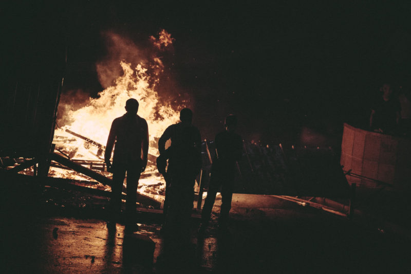
Maybe one of the reasons why the photograph of Aylan Kurdi, the dead Syrian toddler found dead on a Turkish beach, shocked and moved so many people (this writer included) is because it was no cliche image. Our capacity to filter out or mentally file away became impotent, and the picture hit us in a spot usually carefully guarded. Cliche photography allows us to engage with pictures on our terms, and not on any others, essentially giving us the option to decide whether we want to learn something (instead of making us learn, whether we want to or not). A picture is not what it depicts, but the photograph of Aylan Kurdi had no other terms than its own — which essentially means the terms of all of those trying to reach the Europe’s safe haven from whatever hell hole they are escaping from. This then would point at the power photojournalism can still have, well could have, if it stopped chasing after easy, simple cliches.

In the context of visual journalism, it’s easy to see how cliches are the exact opposite of what is needed. Only in the case of Fox News (or its left-wing equivalents) can the idea of journalism be to not only confirm, but actually strengthen viewers’ pre-existing ideas. The goal of actual journalism is to properly cover a topic, regardless of whether it confirms or challenges pre-exisiting ideas. Cliches do not challenge anything. Instead, they confirm. So cliches have no role in serious journalism other than to serve as examples of what needs to be investigated (and this usually means to be challenged). And you can’t fight cliches with other cliches. That just doesn’t work.

The same is true for cliches in many other types of photography. The more is at stake for a viewer, the more harm can be caused by cliches.

In the area of “art photography,” cliches mostly result in turning photographs into entertainment. There is nothing wrong with entertainment, which clearly is a form of art. But while we can easily view all entertainment as art (however much or little actual merit it might have), not all art is intended to be entertainment. An artist embracing entertainment thus might want to ask her or himself whether s/he wants to be an artist or an entertainer first: is there a larger goal that contains the risk of challenging the viewers’ ideas, thus possibly resulting in highs and lows of popularity (a concept that clearly has no role in serious art)?

Art can be entertaining, but the entertainment should be more like an added bonus, a possibly unintended consequence, than the main goal. One might argue that excluding cliches from art photography has become impossible, given that “everything has already been photographed.” I often think that when I hear an art photographer argue along those lines, that might say more about where that particular artist is at with their own practice than about photography itself.

This is not to say that cliches can or should be avoided. Given that there are so many photographs in the world, and given that there is such a breadth of visual recognition of tropes, cliches can serve an important role in art: they disarm, creating an opening for a message (this is assuming that a photographers wants to have a message, which isn’t a given). Cliches, when carefully used, can turn artists into undercover agents. But the key here lies on “when carefully used.”

The temptation always is to give in to the cliches, because they are so appealing on so many different levels. When making a cliche photograph, there is that tingle of instant satisfaction, and you just know you’re mining a well-trodden territory that will create easy access to an audience. Many of us — this writer included (see that “lovely” example at the top of this piece, taken from a plane with a phone) — take cliche photographs on a regular basis, and there’s nothing wrong with it.

But again, context matters. The moment your aspiration lies in the area of art, you’re in a kind of trouble you might get out of only partially. In the arts, cliche photographs act like cat urine: it’s very hard to get rid off the stench once it has attached itself to the wrong location. Cliche photographs can work in the arts. But if they aren’t made to work carefully, you not only find yourself outside of what art aspires to be, you often also end up being in the territory of lousy entertainment.

Ultimately, given that cliches are so easy to be had and so hard to avoid, they ask of photographers to be cognizant of the territory. Regardless of what context you work in, that’s a tough job. You have to know what you’re doing, you have to be able to identify cliches (not all cliches are equally simple and easily identifiable). That sort of engagement happens at the level of editing, of looking at your — and everybody else’s — work (as if editing wasn’t hard enough already!). But in a day and age where photographs are so widely used, and where so many people use photographs very specifically because of that, photographers have to more deeply engage with their history’s medium, with what photographs say and do (and why).

Photographs “are not made just to be seen,” Francis Hodgson just wrote, “They are made to be thought about.” Is this a good picture? If it is why and how? Given they create so much immediate satisfaction and recognition, cliches are tempting us to think of them as good. They might be. But usually, they’re not. We need to see more. We should ask of photography to do better.