The Helicopterism of Art-Editorial Photography

Article main image

I had a conversation with a friend of mine the other day, the kind of conversation where two people end up talking about how the state of things is, well, not so great in photography. Needless to say, that’s what you get as you age, and there is absolutely nothing new about older people complaining about exactly that (given I’m in my forties I’m old, at least as photography is concerned).

This is not to say that there is a problem with photography, on the contrary. Photography appears to be doing quite well, given there are more people than ever who take photographs on a regular basis, regardless of whether they aspire to do more with those photos or not.

At the same time, I can’t help but feel that a lot of photography’s vitality is wasted on efforts that have little, if any, lasting value. Mind you, I’m not talking about people sharing snaps on Instagram or Facebook. I think that form of visual communication is just great. I’m talking about many of those who aspire to do – or be – more than that, those who consider themselves photographers and/or artists.

Maybe I’m looking at too much photography online. I’m not sure that’s really the problem, though, since I also receive quite a few photobooks in the mail. But it seems to me that a lot of photography never goes beyond a simple and obvious degree of descriptiveness that, frankly, doesn’t add up to much.

Touted as, say, “revealing photographs” that are “memorable” and/or “empower” this or that person or group of people, these photographs appear to essentially merely record what is there to make an audience that is already in the know feel good about themselves. No beliefs are being questioned, no fist is shaken, however furtively, at those in power, and, crucially, no lasting impressions are being made.

Of course, I don’t need my photography to always be challenging. But this onslaught of photography that doesn’t do much other than describing something has me a bit dismayed about the state of things. It’s not even that I don’t care about any of the various issues discussed in the work. I do care, like we all care. But the helicopterism with which these issues are being addressed leaves me wanting for deeper engagements.

I know “helicopterism” isn’t a word, but it should be one: it’s the approach taken by so many photojournalists who fly in for a day or two, snap some dramatic pictures without any deeper engagement and are then off to the next spot. Turns out the fine-art crowd is just as guilty of it. Note that helicopterism really refers to the depth of the engagement, not necessarily the time spent.

There’s a simple question that can be asked to see if there is helicopterism at hand in any given body of work (in whatever form it might exist): what does this tell me that I don’t already know?

I tend to think of the bodies of work that don’t have a very good answer as “art-editorial” photography. It’s essentially editorial photography that illustrates something and that exists in the larger “fine art” context – as opposed to actual editorial photography, which is made for and lives in magazines etc. So, yeah, I have a problem with art-editorial photography.

There is more than one problem with approaching topics with helicopterism. At best, it turns them into easily commodifiable units, good for a article on some blog that makes you “see the topic in a new light” (to use the kind of language now widely used, despite the fact that it’s usually not true) or for some photobook that’s a “hit” at one of the many festivals or fairs, both to be forgotten the day after (when some other body of work pops up). This already is bad enough, given that something that would require serious attention becomes a part of our attention economy.

At worst, and there is some overlap with the preceding here, an important topic becomes essentially devalued, to be used mainly for that: “eye balls” (to use the internet’s lingo for how many people will bother looking at an article), something to be seen not for its inherent values, but simply because it might attract attention for a day.

Boy, if I had some affliction or problem that tied in with a larger issue, would I be pissed if it were used mostly for the benefit of say, some corporate blog’s click count and possibly some photographer’s CV.

I can only speak for myself (which is what I have been doing for over a decade now on this site), but helicopterism is just not enough for me. I crave for more. I’d just like to think that around the corner, there is some photography that will move or shake me to the core, in whatever way, to jolt me into looking at something more deeply, differently, to make me appreciate something more, or maybe less, to change me into a slightly different person, a person that might actually do a little more – or less – about something, a person a tad more conscious.

It’s not an activism I’m looking for per se, even though so many issue these days are begging for more activism and engagement. As Colin Pantall wrote recently, “Have an opinion, tell some truth, show some emotion.” Some emotion would do for me. And an opinion can be a lot more than, well, what we’d imagine it is. Show me that there’s something at stake for you – and me.

In an article about photography as a whole, David Campany writes “Art is a matter of pursuing ‘new pictures of the world,’ and this pursuit can take place anywhere. In this sense art is not an institution or even a discourse, but a disposition characterized by the desire for things to be other than, or better than they are. Art can be found anywhere and the medium aids the expression of that wish.” To which I’d add: if that wish in fact exists. I want to assume it does. But often, I’m not so sure. It’s fine to be a photographer, to show things the way they are. But it’s much more interesting to see an artist depict the things that are to talk about what could be or maybe should be.

Needless to say, that’s a challenge for anyone, whether as photographers or viewers, to accept the challenge and have something be at stake, express that “desire for things to be other than, or better than they are.” Some, if not much comfort, will be lost, and treacherous ground awaits. What if someone might be offended? What if there will be a discussion that, God forbid, might question the photographer’s motives?

If, however, you look at the photography that was made decades ago and that still resonates with us – ask yourself why we still talk about it. Why do we still look at Robert Frank’s The Americans, for example? Or look at the utterly marvelous Nothing Personal by Richard Avedon and James Baldwin: where are the Richard Avdeons and James Baldwins today, being willing and able to voice their despair over the course of a country that, if polls are to be believed, the majority of its citizens think has been on a clearly wrong track for years now? With all that New Formalism churning out forgettably decorative images, where is today’s Hannah Höch, infusing the decorative with substance?

So how come so much photography is being produced that is so devoid of life, so afraid of ruffling any feathers, so afraid to touch the status quo and point out that we are in fact hurting, hurting not just where we know it hurts, but also in all those places where we’d rather not look?

Helicopertism ultimately runs the risk of bordering on phoniness. It is being comfortable with uncomfortable subjects, not really challenging anything, while confusing taking pictures and covering all bases with a deeper, possibly much more unresolved engagement. It acknowledges everything, and changes nothing.

Of course, I don’t know whether photography can change anything. It probably can’t. But the gesture of making the attempt to change something – isn’t that where we might find our impetus to ask for change?

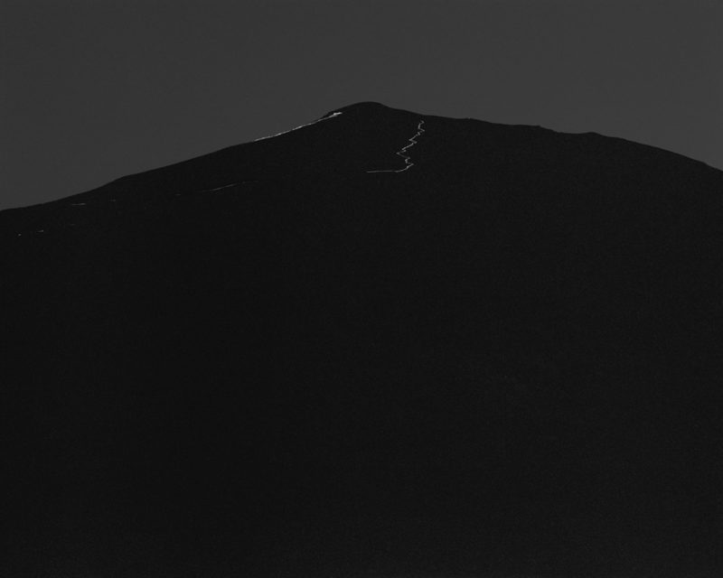
Awoiska van der Molen: Sequester

Article main image

However much (or little) you might enjoy the images that accompany this article, they are merely approximations, if not simulations of the original photographs. If photographs lack much of a surface anyway, a computer’s screen is the most slippery one. In addition, the backlit display changes what photographs look like considerably. For most photographs, the backlit displays adds a gloss that in actuality might not exist. Part of the reason why so much “viral” photographs ultimately fall completely flat is because of that: when confronted with a printed version, the shine is gone. Add to that the fact that many photographers don’t appear to know what a good printed picture should look like, with most inkjet prints being dishearteningly similar, dishearteningly lacking character, let alone soul.

However much we are approaching the completely digital age in photography, the medium’s materiality still matters. I spend a lot of time looking at photographs on computer screens. But my own true engagement with photography is based on the printed pictures, mostly in the form of looking at photobooks. Photobooks offer half of a litmus test for photographs. If a photograph (or a photo project) holds up to be turned into a set of printed pages, to being looked at repeatedly, then there is something that might have lasting value. And if its maker knows how to make a good print, the test is passed.

Photobooks and printed photographs have a presence that an image on a computer screen can’t aspire to. In a literal sense, computer screens change constantly, and pictures are being put where other ones were before. But in a much less literal sense, the material presence of a framed photographs or of a photobook results in a psychological presence. Find yourself in front of Awoiska van der Molen‘s prints, and you know. Comparisons such as the following obviously are a bit superficial and hyperbolic, but still, such prints are not unlike many of the other artifacts human being have been making, and leaving behind.

I suppose what I’m talking here in some way is connected to the idea of an aura, to use Walter Benjamin’s term, even though the philosopher argued that mass-production (or mass-reproducibility) posed massive problem for just that. Benjamin’s essay might be in dire need of some updating, I think, not because it’s necessarily flawed, but to incorporate the developments of both consumerism (which has forcefully re-inserted an aura, however little we might think of it, into mass-produced items) and the digital age. Maybe it would be appropriate to say that in the digital part of photography, images now in part lack an aura because they are viewed on devices that have such a specific one.

Photobooks, however, definitely possess an aura, even though they are mass produced (I’m specifically talking about monographs here, not necessarily albums or catalogues). Regardless of how you want to define that aura, whether in a strict Benjaminian sense or otherwise, it’s gone once you look at a pdf reproduction of any photobook. The photobook gives photography a very specific presence, a presence that is both physical and psychological. The latter is the one that matters (unless you’re a collector, in which case both matter equally).

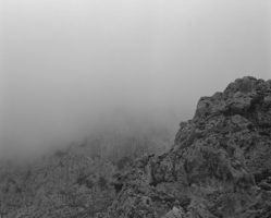
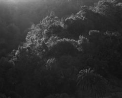
Thankfully, Van der Molen’s landscapes have now been turned into a book, Sequester. As if making a book from a set of photographs wasn’t hard enough, these particular images posed one of the toughest challenges. Black and white photographs with a varying degree of abstraction, often obliterating all sense of the physical scale that was in front of the camera, many of them using very narrow ranges of tonality, from the blackest black to maybe a dark grey – only high-quality printing can do them justice.

However, it’s one thing to make a nicely printed book and quite another to be able to translate the experience of standing in front of the prints into book form. Hans Gremmen, the designer and publisher, decided to break up the flow of the “regular” pages (black and white photographs on white paper) with sections of black pages, onto which parts of photographs are printed full bleed. In fact, the book begins with such a section, having the viewer enter a bewildering world. This makes for a stunning, immersive experience. It’s photobook making at its finest, a prime example of what can be achieved with the medium.

If the prints, when viewed on a wall, draw the viewer in, the book does the very same thing. The landscapes, at times abstractly rendered to the point of dissolving into abstractions, engulf the viewer, taking her or him away from whatever photographic description might still be present, to evoke emotions and feelings. Van der Molen’s world is one in which much of what we take for granted eludes us, in which the most technical of all artistic media most forcefully speaks of our innermost worlds.

It’s a book that, at first, seems “easy,” almost too easy. The form itself just makes so much sense (at least if you’re familiar with what the medium can do). But the book’s form quickly falls away to give the photographs the breathing space they need. If many photobooks today will be mostly remembered for the various gimmicks employed in their making, Sequester will (or at least should) remain memorable for unfolding a particular artist’s vision in front of our eyes.

Easily one of the best photobooks in a long time.

Sequester; photographs by Awoiska van der Molen; 80 pages; Fw:; 2014

Rating: Photography 4.5, Book Concept 5, Edit 4, Production 5 – Overall 4.7

Review: Hans Eijkelboom’s People of the Twenty-First Century

Article main image

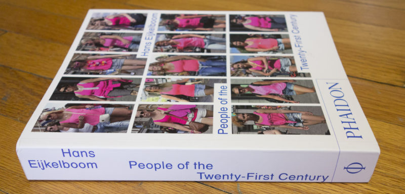
There is something incredibly unsettling about Hans Eijkelboom’s People of the Twenty-First Century. Or rather there are a few of those things. They cannot be fully comprehended without pointing out that the book clearly references August Sander’s People of the Twentieth Century.

Both titles are each off by one century. Sander’s pictures informed large parts of what we consider modern and contemporary photography. But his ideas and sensibilities were firmly rooted in the Nineteenth Century, in the mostly studio photography of that era, in the – misguided – belief that people could be categorized based on rather strange categories, in the attention – crucially – that the individual was given. It is the latter that makes Sander stand out, possibly forever stand out: his photographs are portraits of a large number of people, but one can feel a concern for the person(s) in front of the camera’s lens that today is largely gone (remember, ours are the “selfie” times).

Working mostly during the first three decades of the Twentieth Century, Sander recorded what was carried over from the Nineteenth, most of it changed, discarded, destroyed before his century was half over (this includes large numbers of the photographer’s work: glass plates destroyed in one of the many Allied bombings of Cologne). Modern democracies, whether failing or not (and when failing resulting into neo-Neanderthal political systems, the most gruesome of which – Sander’s own, the German – reverted to Stone-Age style barbarism), in combination with modern capitalism and its most important consequences, modern warfare and the consumer society, made minced meat out of most of the ideas of the Nineteenth Century.

This is part of what makes looking at Sander’s photographs so interesting. They’re not only fantastic photographs. They also seem to speak about a time that was so different, even though the people in the pictures look so similar to those around us. If we had photographs from, say, the Dutch Golden Age, I don’t think we’d see the same similarities. Even many photographs from the Nineteenth Century feel very different. Those portrayed by David Octavius Hill and Robert Adamson don’t look like they could at any moment emerge from the pictures, to walk down the streets along us. Sander’s subjects, in contrast, feel a lot more familiar.

Especially when dealing with photographs of people (whether we want to classify as portraits or not), the issue always becomes whether we feel the portrayed are of our time or not. This might seem like a trivial and irrelevant point to make, but I think it’s quite important. Hans Eijkelboom’s essentially work centers on the (late) Twentieth Century (carried over into these first years of the Twenty First), or more accurately on the results of that period, with decades of consumerism having made their impact. We can find ourselves in those pictures, we could imagine walking around any town alongside those depicted.

November 9th, 1992, Arnhem (NL), a lunch hour: fifteen people wearing bright red jackets. So it begins. December 5th, that same year and town, in the early afternoon: fifteen women sporting rather loud winter coats, featuring colours made popular in the 1980s (luckily all gone now). And on it goes, with jackets and trench coats, short pants, people carrying business suitcases, pushing strollers, riding their bicycles, holding hands etc. etc. etc. We finally arrive on November 10th, 2013, in Amsterdam, in the afternoon, with sixteen women wearing pink jackets.

Whatever distance we can (or simply automatically will) establish between the person(s) in a photograph and us will determine to what extent we will allow ourselves to be affected by what we see. Through the fashions of the days, Eijkelboom’s photographs feel a little distant or fairly close to us. But given there are always grids of photographs, the portrayed become specimen. We don’t really look at those sixteen women, photographed on November 10th, 2013, we look at sixteen pink jackets.

If the point is to be made that the fashion of our day, provided we stick to it, reduces us to people who are willing to give up their individuality, at least to some extent, then the presentation of these photographs underscores that very point. Which is fine. But at the same time, it also has faint echos of the idea that you can classify people based on their appearance. I suppose photography simply can’t run away from that (see the marvelous Police Pictures for some of the history).

But apparently, that’s not the point, The essay at the end of the book, written by David Carrier, focuses on the issue of individuality and how this individuality could be tied to what one decides to wear. “Judging people by their clothes,” Carrier asserts, “is not as superficial as it may seem.” And: “the closer you look at any page of this book, the more diverse you will find the people who are dressed in similar way.”  I’m not sure to what extent I buy this. After all, it is one thing to look at a grid of gas tanks in a Becher typology to study the differences in their structures. But gas tanks aren’t people. We don’t look at a picture of a gas tank the way we look at a picture of a person. We could never imagine being that gas tank, but we could certainly imagine that person (at least to some extent).

And even if I want to believe that a grid of people forces me to look at people individually, which to be honest I never did until I learned from the essay that that’s what I was supposed to be doing, it’s still a grid of people, a collection of specimen. If you want me to look at people’s struggle to express their personality given the choices they face, then don’t show me that struggle in a way that points at the complete opposite, at people being conformist and sticking to the same thing.

This all leaves me a bit torn about People of the Twenty-First Century, which is engrossing in all kinds of ways, but which also at least in part seems to be doing the exact opposite of what it claims to be doing. But then that is bound to happen in a book filled with photographs of human beings – we react to those in ways that are hard to predict and certainly hard to control.

People of the Twenty-First Century; photographs by Hans Eijkelboom; essay by David Carrier; 512 pages; Phaidon; 2014

No rating since I can’t make up my mind how to adapt the rating system to this book without getting a skewed number.

Let’s talk about Pier 24

Article main image

In the American landscape of exhibition spaces for photography, Pier 24 holds a somewhat unique position. Bankrolled by a very wealthy investment banker, Andy Pilara, the space has quickly turned into the darling of photographers and the press alike. “There is a fascinating air of indulgence about San Francisco’s Pier 24.” croons the BBC. “It’s the largest exhibition space in the world dedicated solely to photography, and it displays a broad range of work, including some of the medium’s most iconic, instantly recognisable images.” What you will hear, at least in public, from photographers themselves, mostly mirrors this level of adoration. It might be time to offer a different opinion.

It’s becoming increasingly clear to me that even though I have come to photography fairly recently, both to the making of and the writing critically about, I appear to be rather more old-fashioned than you might imagine from someone who found his feet, still however shakily, engaging with the medium. My belief that photography not just deserves but needs, if not craves, to be talked about critically to me feels to be at odds with many of the trends we are currently witnessing. But given this position is where my own development as a critic, photographer, teacher, and writer has taken me, I am going to apply what I think needs to be done to Pier 24. A place that positions itself as an equal of, let’s say, SFMOMA and that produces well-received exhibitions noted nationally and internationally deserves and asks to be treated like, well, SFMOMA.

In principle, there would be a lot to discuss, not all of which might make sense here. In part because of my personal expertise, I am going to ignore various aspects of Pier 24 that are important to some (even to me, in a more uninformed fashion), such as, for example, its business model (a non-profit working with volunteers). Instead, I want to focus on those aspects that – at least for me – are closest to some of today’s issues in or with contemporary photography.

If you are unfamiliar with the space, Pier 24 essentially is a vast space that consists of almost 20 interconnected galleries. These galleries range in size, just like those you will find in Chelsea (New York), from smallish to rather large. Admission to the space is free. You need to make an appointment, though, since the number of visitors is strictly limited so that in principle, at any given time there will only be one visitor per gallery space.

Even though the Rothko Chapel has been mentioned as an inspiration for Pier 24, the space reminds me more of a tomb or crypt in which artifacts of the present are to be deciphered by that very small group of adventurers who have gained access. This makes for a somewhat strange experience, given many of the exhibited artists certainly aren’t Rothkos. Make no mistake, if you enjoy looking at photographs on your own in a somewhat dimly lit oppressive-feeling space, this is great. If you are more like me, however, being able to take in work even in the presence of large groups, acknowledging that while being art, photography is a form of art closest to the what is in part represented by those very people around you, then there is no need for this supposedly contemplative environment. Contemplations happens in one’s head, not outside of one’s body.

Moving away from the space, one of the biggest problems Pier 24 has yet to address is the incredibly skewed representation of male and female photographers in the exhibitions. The map made for the present exhibition, Secondhand, lists 12 men and two women. The ratio of male and female photographers for the anonymous galleries, among them a selection from the Archive of Modern Conflict, is unknown. But given those galleries mostly showcase photography made in the often rather distant past, we can assume the ratio is similar. Secondhand is not the first Pier 24 exhibition suffering from this problem. In fact, it appears to be a constant there.

The history of photography has been grossly unfair to female photographers. A recognition of this fact and attempts to rectify the problem both have appeared on the scene somewhat recently. But it’s absolutely fair to say that there still is a lot of work to be done. Having as skewed a misrepresentation of the work of female photographers as has been the case at Pier 24 not only is a step in the very wrong direction, it also sends a very bad message. The “the largest exhibition space in the world dedicated solely to photography” – mostly for men? I do not want to assume that this is the idea behind the space in the mind of either Pilara or its director, Chris McCall. But if it’s not the idea, then it certainly comes across as that.

I understand that Pier 24 essentially is a showcase for Pilara’s collection (plus the collections of various other very wealthy individuals). It’s their collections, I get it. They can do whatever they want. But the moment you create a space like Pier 24 and position yourself in the world of photography the way it has been done over the past few years, it’s your responsibility to be aware of a problem like this. Having one or two or maybe three female artists in a space with almost 20 galleries in the second decade of the 21st Century is a big problem. It’s not like there are no female artists who could have easily been added to any of the exhibitions, past or present. In other words, even if historically there is less material to pick from (an assertion that I’m not sure I fully believe in, but that’s for another day), there certainly is an abundance of very strong work made by female artists today.

Speaking of abundance, Pier 24 is a place of just that. Typically, for any given exhibition, there will be displays of either the complete set of some given project, or there will be a very large selection of some photographer’s work. Needless to say, this is a photography fan’s dream, and I suspect this is in part responsible for so many people being so uncritical of Pier 24.

What’s not to love about seeing all the pictures from, say, Richard Avedon‘s The Family? For me, that’s exactly the problem, though. It’s not that I don’t want to see all those pictures, I want to be able to engage with them in a meaningful way, and often enough, the wall hangings/presentations at Pier 24 do not allow me to do that. If you have 50 or 60 photographs how do you hang them in often relatively small gallery spaces? The solution offered by Pier 24 usually steps away from what you would expect to see at a museum, where curators usually opt for a more conservative hanging, which allows the viewers to engage with individual photographs.

At Pier 24, you tend to get vast clusters or overly designed salon-style hangings, as a result of which engagement with individual photographs is made very, very hard. I have occasionally wondered whether treating the hanging of a show like a design exercise is a good idea for photography. For example, in Secondhand, there were all photographs from Melissa Catanese‘s Dive Dark Dream Slow, a truly marvelous group of vernacular photographs. Those were hung in two rows, with framed imaged alternating up and down from two lines that delineated the rows. I was later told the up and down reflected the spreads in the book. Well, OK, but an exhibition on the wall is not the same as a book. You don’t engage with photographs that hang on a wall the way you do in a book. So the install was not just overly designy, for me it completely failed to do the work any justice. If I want to look at the book, I look at the book. If I get to see the work on the wall, I expect to see something that translates the experience the book conveys – the experience here meaning not seeing one photo after another, but rather the overall feel created in one’s mind.

I am aware that the exhibitions at Pier 24 are hung with very specific ideas in mind. But I do think that more often than not it just doesn’t work. Honestly, I hated going into room with lot of August Sander photographs a few years ago (hung in two or three rows if memory serves me right). I love Sander’s photographs, but I really don’t want to see them displayed as if they are merely stamps in an album. And that’s what many of the individual displays that make up the larger exhibitions feel like: “Let us show you all the picture we have amassed by this or that guy.” That’s not only bad for the work on display, it’s just gratuitous, and not in a good way. It does not do the photography on display any justice.

Essentially, we’re talking about the curatorial approach here. I’m sure museum curators or people who went through a program teaching curatorial studies will have very specific ideas. Some time ago, I made it clear what I think of the kind of fare presented by American photography museums. In a sense, Pier 24 presents the other extreme, where most of the crucial elements of curating are done away with, and curating becomes less about making selections to help people see than about designing cool-looking clusters of photographs around some rich person’s collection. For me, that’s not curation, that’s just graphic design on the wall. It essentially is a refusal of curation that, crucially, does not help the viewer engage with the work.

In a sense, Pier 24 in part is a missed opportunity. Why are the photographs in any given exhibition not made to talk to each other, given the exhibitions are very clearly themed? What if in the show about portraiture, for example, some of Avedon’s Family photographs had been placed opposite Hiroshi Sugimoto’s photographs taken in historical wax cabinets?

The issues I mentioned about translate into a larger issue with the exhibitions. Their visions usually appear rather myopic, focusing on the usual suspects. Secondhand is broadly about recent bodies of work created around or with vernacular photographs (this is not quite correct, given that Daniel Gordon really only superficially falls into this category, as does Viktoria Binschtok, but let’s not quibble). But to pretend that any of this is really new certainly misses parts of the history of photography. I think an artist like Hannah Höch would certainly have her opinions about all of this, were she alive today. Collage, after all, uses found imagery, and it has been around for a long time. You wouldn’t know it from the exhibition. So you get Matt Lipps (essentially graphic design with magazine pictures), but no Hannah Höch (actual art).

In much the same fashion, the thinking that Laszlo Moholy Nagy developed around photography and its uses is entirely absent from the exhibition. In much the same way that the New Formalists appear to be happy to ignore Moholy Nagy, this exhibition creates no connections to the past. This might in part be a consequence of the thinking around this show being based so much on the internet and recent trends (“the digital age”). The reality is that the more distant past has a lot of things to offer and teach, and by cutting yourself off from it, you’re essentially missing out.

The somewhat weak concept behind Secondhand and the postage-stamp style presentation amplify the weaknesses of some of the work on display, or they make it clear why refusing to have wall text does the work a disservice. In principle, it should excite everybody to see Larry Sultan and Mike Mandel‘s Evidence in exhibition form. But seeing it presented as if it were a badly organized student show – a long row of prints in what looked like thin plastic frames tacked to the wall – only made me appreciate the original book a lot more. I absolutely love Erik Kessels‘ In Almost Every Picture series of books. But having a room filled to the brim with almost every book, walls and walls plastered with blown-up versions of these charming photographs, with enlarged plastic photo cubes standing cluttering the gallery – there’s just no way anyone can engage with the work. The rooms that did work were the ones where there was less work, and where the viewer’s engagement with the work wasn’t made hard by bad wall design.

If Pier 24 wants to reject the model of museums, they still might want to pay a little bit more attention to how museums (or commercial galleries) hang shows. Having seen four of the exhibitions, I can’t help but think that clinging stubbornly to a concept that makes great sense in theory, in practice makes the space itself and the photography itself suffer. If the viewers’ engagement with the photographs is supposed to be based on the work then the presentation can’t be either overly designy or so gratuitous, with many rows of prints crowding the walls. That’s a lesson most photo students who have to hang a thesis show learn in school before graduating.

In much the same fashion, the lack of wall text only amplifies the weaknesses of the concepts and/or the selection of the material. Group exhibitions in principle offer a great opportunity to bring work together that, as a group, can speak of more than what is in the individual projects. But these connections need to be established. Otherwise, it’s really just a group show in the most literal sense – a group of projects that somehow fall under some broader theme (that might or might not be a bit vague – the portrait show About Face was fine, but A Sense of Place felt and looked disjointed and unresolved).

So I think the people behind Pier 24 might want to re-evaluate if not their mission, but at least the very basic concepts used to organize the exhibitions. There is a lot to be learned from the exhibitions done by major museums, whether it’s the presentations or the way the curatorial concepts are built. As I noted before, I do think that major (US) museums have stopped being the places where cutting-edge photography exhibitions are held. They are mostly busy with organizing the past, usually in the form of safe “blockbuster” exhibitions. Given the vast amount of money behind Pier 24, there is a unique opportunity to build something better. That said, just like in the case of photography itself, restrictions are what makes good work. Having all photographs from almost all included projects in a given exhibition actually might be a bad thing. The work of a curator, after all, is not to pander to a photographer. Her or his job is to make the kind of sense of the work that the artist her/himself can provide, often by establishing connections to other work. For me, the refusal by Pier 24 to showcase this essential curatorial work does the place itself – and the work on display – a huge disservice.

Mikhael Subotzky and Patrick Waterhouse: Ponte City

Article main image

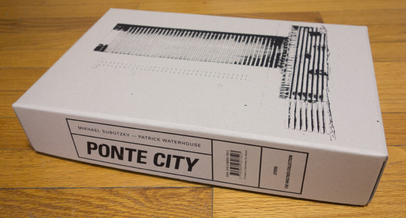
There is something gratuitous about Ponte City, the book, that mirrors Ponte City, the apartment building that towers over Johannesburg. It literally towers, given it resembles a wide, inhabitable smokestack: a round structure, hollow inside, with windows all around (and inside) – a panopticon of sorts. It’s the kind of architecture that at some stage in the past made a lot of sense to those who commissioned and built it. Previously envisioned for those well off – white people in apartheid South Africa, Ponte City has now become a symbol for urban decay, standing – metaphorically – for all that ails the new, post-apartheid society.

Right around the time when developers attempted to “revitalize” the building, a term generously used when there is talk of gentrification, Mikhael Subotzky and Patrick Waterhouse went to Ponte City to document it, in the form of photographing every door and the view from every window. There are 54 floors and around 30 windows facing the outside (if my counting of a floor plan is correct), resulting in a lot of photographs. In addition, they collected discarded material from empty – abandoned – apartments.

There is a story here, even though it’s not quite clear what it is, given that however you want to look at it, you’re essentially not looking at one story, you’re looking at multiple ones. One could, conceivably, use the archive – the collection of the photographer’s images plus all the material they accumulated – to talk about vast parts of contemporary photography’s history, themes, and strategies.  Abandoned apartments, with material left behind by those long gone; a ruin – or not quite ruin – of the past; the transition from one regime to another; immigration; wealth and the lack thereof… The list goes on.

How do you deal with this when you want to make a photobook?

Depending on where you’re coming from, the solution picked for Ponte City is either the only one that does the material any justice, or it’s the equivalent of a baseball bunt (or both actually). The book isn’t a book, it’s a book in a box that also contains – wait for it – 17 separate booklets. The main book (sized 22cm by 34.5cm – 8.5″ by 13.5″) can – and does – easily serve as the core of the box. With the exception of various essays (each of which has its own booklet), most of the material is represented in some form in it, however briefly. The booklets themselves each focus on one particular aspect, be it an essay, or selections from the different types of materials.

I’ll admit that I have been – and probably will be – unable to make up my mind to what extent Ponte City is successful as a photobook (let’s be open to treating objects that consist of more than one book as photobooks as well). On some days, I think it’s just a brilliant way to throw back contemporary photography’s indecisiveness at those who can’t make their minds up where the medium is supposed to go, a brilliant way to do all the collected material at least some sort of justice. On other days, however, the sheer gratuitousness of the box bothers me. I get it, it’s a big building, and there’s a lot of material, but what is this supposed to tell me?

I suppose what this comes down to is my own struggle trying to deal with what essentially comes across as a refusal to go beyond a fractured authorship. It works very well, yet at the same time I’m itching for more – and by “more” I don’t mean more material, I mean more of a view point (which could easily mean a lot less material).

The box will undoubtedly appeal to those who value a well-produced smorgasbord (as, I’ll admit, I do). Steidl, the publisher, for sure knows how to produce a photobook. But then, where am I going to put this tombstone of an object in my library? Will it not, if found in a store or library or wherever else, intimidate some of the very people it is designed for? And will it not, to pick up a thread I wrote about recently, exclude some of the very people who might want to look at it, given they’re living in similar circumstances in places all over the world?

I realize this is the internet, so it’s likely people will just pick that one bit from the above that claims one thing, while ignoring all the others that do the opposite. Given you’ve made it this far into this review, if you read anywhere that I love or hate the box, you know that’s just baloney. I thought long and hard about how to possibly review this box to avoid just that situation – simplistic claims, supported by quotes taken out of context. But in the end, I decided to write the review that I feel had to be written. There’s no way of defeating those practices on the internet that so often make it almost unbearable.

Ponte City definitely is a photobook that deserves to be widely seen and carefully looked at, however much it makes exactly that harder than it maybe should have. Its presentation certainly is a very valid strategy to deal with a vast cache of material that will suffer when you reduce it down to something smaller, a vast cache of material that will offer a lot more with a lot less. The contradiction inherent in the material cannot easily be resolved, certainly not by me – it’s not my book, I’m merely reviewing it.

So in the spirit of its makers bunting over what to do with the material, I’m going to do the same with my rating. There’ll be two, one by the reviewer who’s in awe of the boldness of the venture (A), the other one by the reviewer who would have enjoyed to see more decisions (B). Recommended either way.

Ponte City; photographs and materials collected by Mikhael Subotzky and Patrick Waterhouse; essays by various authors; book plus 17 separate booklets; 192 pages; Steidl; 2014

Rating A: Photography 3, Book Concept 4, Edit 3, Production 5 – Overall 3.8

Rating B: Photography 3, Book Concept 2, Edit 1, Production 5 – Overall 3.0