However much (or little) you might enjoy the images that accompany this article, they are merely approximations, if not simulations of the original photographs. If photographs lack much of a surface anyway, a computer’s screen is the most slippery one. In addition, the backlit display changes what photographs look like considerably. For most photographs, the backlit displays adds a gloss that in actuality might not exist. Part of the reason why so much “viral” photographs ultimately fall completely flat is because of that: when confronted with a printed version, the shine is gone. Add to that the fact that many photographers don’t appear to know what a good printed picture should look like, with most inkjet prints being dishearteningly similar, dishearteningly lacking character, let alone soul.
However much we are approaching the completely digital age in photography, the medium’s materiality still matters. I spend a lot of time looking at photographs on computer screens. But my own true engagement with photography is based on the printed pictures, mostly in the form of looking at photobooks. Photobooks offer half of a litmus test for photographs. If a photograph (or a photo project) holds up to be turned into a set of printed pages, to being looked at repeatedly, then there is something that might have lasting value. And if its maker knows how to make a good print, the test is passed.
Photobooks and printed photographs have a presence that an image on a computer screen can’t aspire to. In a literal sense, computer screens change constantly, and pictures are being put where other ones were before. But in a much less literal sense, the material presence of a framed photographs or of a photobook results in a psychological presence. Find yourself in front of Awoiska van der Molen‘s prints, and you know. Comparisons such as the following obviously are a bit superficial and hyperbolic, but still, such prints are not unlike many of the other artifacts human being have been making, and leaving behind.
I suppose what I’m talking here in some way is connected to the idea of an aura, to use Walter Benjamin’s term, even though the philosopher argued that mass-production (or mass-reproducibility) posed massive problem for just that. Benjamin’s essay might be in dire need of some updating, I think, not because it’s necessarily flawed, but to incorporate the developments of both consumerism (which has forcefully re-inserted an aura, however little we might think of it, into mass-produced items) and the digital age. Maybe it would be appropriate to say that in the digital part of photography, images now in part lack an aura because they are viewed on devices that have such a specific one.
Photobooks, however, definitely possess an aura, even though they are mass produced (I’m specifically talking about monographs here, not necessarily albums or catalogues). Regardless of how you want to define that aura, whether in a strict Benjaminian sense or otherwise, it’s gone once you look at a pdf reproduction of any photobook. The photobook gives photography a very specific presence, a presence that is both physical and psychological. The latter is the one that matters (unless you’re a collector, in which case both matter equally).

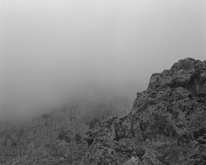

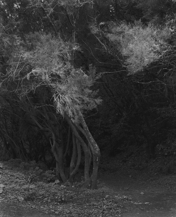
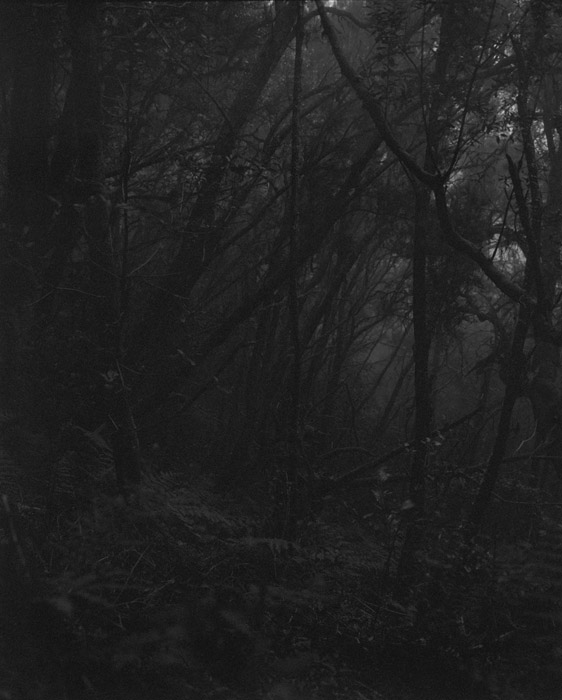
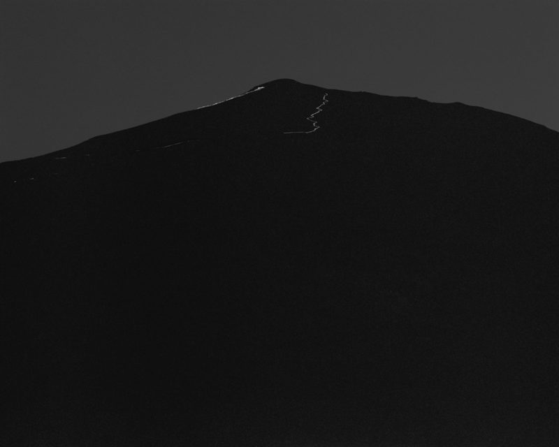
Thankfully, Van der Molen’s landscapes have now been turned into a book, Sequester. As if making a book from a set of photographs wasn’t hard enough, these particular images posed one of the toughest challenges. Black and white photographs with a varying degree of abstraction, often obliterating all sense of the physical scale that was in front of the camera, many of them using very narrow ranges of tonality, from the blackest black to maybe a dark grey – only high-quality printing can do them justice.
However, it’s one thing to make a nicely printed book and quite another to be able to translate the experience of standing in front of the prints into book form. Hans Gremmen, the designer and publisher, decided to break up the flow of the “regular” pages (black and white photographs on white paper) with sections of black pages, onto which parts of photographs are printed full bleed. In fact, the book begins with such a section, having the viewer enter a bewildering world. This makes for a stunning, immersive experience. It’s photobook making at its finest, a prime example of what can be achieved with the medium.
If the prints, when viewed on a wall, draw the viewer in, the book does the very same thing. The landscapes, at times abstractly rendered to the point of dissolving into abstractions, engulf the viewer, taking her or him away from whatever photographic description might still be present, to evoke emotions and feelings. Van der Molen’s world is one in which much of what we take for granted eludes us, in which the most technical of all artistic media most forcefully speaks of our innermost worlds.
It’s a book that, at first, seems “easy,” almost too easy. The form itself just makes so much sense (at least if you’re familiar with what the medium can do). But the book’s form quickly falls away to give the photographs the breathing space they need. If many photobooks today will be mostly remembered for the various gimmicks employed in their making, Sequester will (or at least should) remain memorable for unfolding a particular artist’s vision in front of our eyes.
Easily one of the best photobooks in a long time.
Sequester; photographs by Awoiska van der Molen; 80 pages; Fw:; 2014
Rating: Photography 4.5, Book Concept 5, Edit 4, Production 5 – Overall 4.7
Ratings explained here.